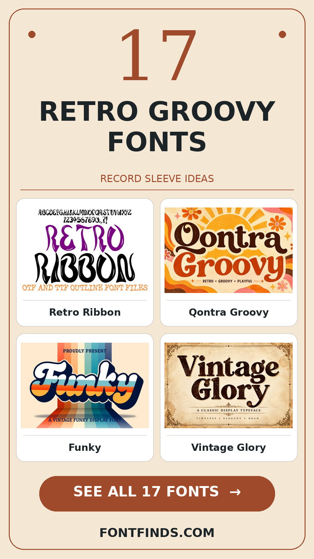
17 Best Retro Groovy Fonts for Record Sleeve Ideas
A record sleeve can make a decade feel present without recreating somebody else’s artwork. Retro groovy fonts are good at supplying the rhythm: wide curves, compressed shapes and a little visual swagger. The challenge is saving that expressive energy for the artist name or album title while the tracklist remains legible.
Retro Groovy Fonts: what to test first
Mock up a 12-inch sleeve and a tiny streaming thumbnail. Strong silhouettes may be instantly recognizable at both scales, while fine inlines and distressed details deserve a larger setting. Check whether the title stays balanced when the words are stacked.
Editor’s test: place the longest phrase for an album title in your mockup before comparing the individual specimens.
Psychedelic movement and playful curves
1. Retro Ribbon
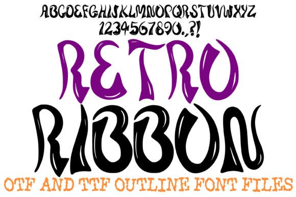
Retro Ribbon is a display option marked by visible stroke contrast. A second detail to notice is thick-to-thin contrast. Its strongest role here may be an album title. Build a one-color proof and test the thin parts on your actual printing stock; the vendor mockup alone is too generous a test.
View Retro Ribbon and download options →
2. Qontra Groovy
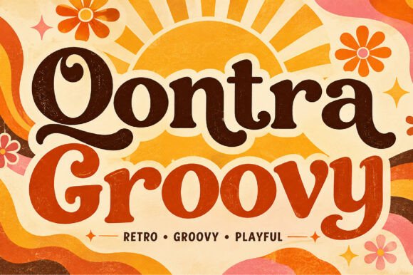
Qontra Groovy can give a concert poster a different pace through a distinct display silhouette. I would place it beside a simple text face for the smaller information, then check the longest word and the smallest practical size before making a final choice.
View Qontra Groovy and download options →
3. Funky
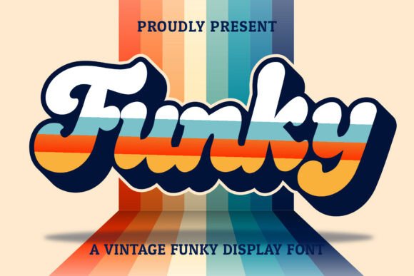
Funky leans on a distinct display silhouette, a useful starting point for a vinyl label. If the design has lots of tiny copy, let the expressive type stay large. For the main phrase, test its legibility away from the enlarged sample before you settle on the layout.
View Funky and download options →
4. Vintage Glory
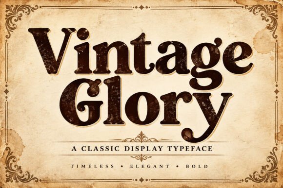
The appeal of Vintage Glory is rounded contours. A second detail to notice is generous curves. Try it first as a tour shirt, then shrink the artwork to a phone preview. If the word still lands immediately, it can lead; otherwise, use it for a single accent.
View Vintage Glory and download options →
5. Funky Street
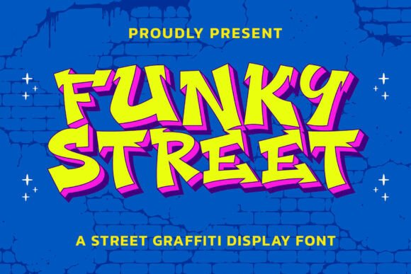
Try Funky Street on a playlist cover. It uses a distinct display silhouette to set the mood. Type your complete phrase, test its legibility away from the enlarged sample, and inspect a print-size draft before trusting the enlarged preview.
View Funky Street and download options →
6. Groove Heart
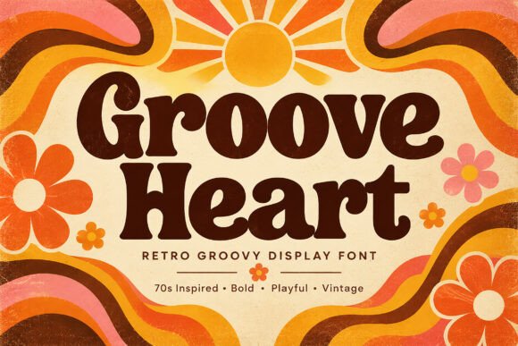
In this shortlist, Groove Heart is worth testing for an album title because of its rounded contours. A second detail to notice is generous curves. Set the actual copy in one color, use a simple text face for the smaller information, and check how the spacing changes after a line break.
View Groove Heart and download options →
7. Friezy
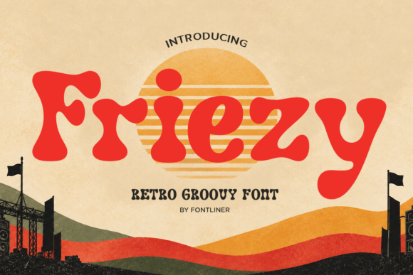
For a concert poster, Friezy offers rounded contours. A second detail to notice is generous curves. Give it one clear task in the composition. Before choosing it, test the counters with a longer line of text and compare the result with a plain companion face at actual size.
View Friezy and download options →
8. The Good Vintage
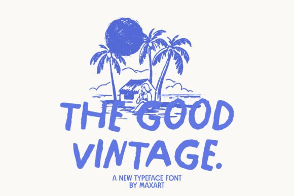
Consider The Good Vintage for a vinyl label: connected script movement gives the phrase a clear personality. Leave breathing room around the letters and check the transitions between your actual letters. Pair it with a plain sans for practical details rather than another competing display style.
View The Good Vintage and download options →
9. The Vintage
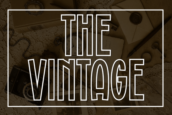
At first glance The Vintage reads through an informal handwritten rhythm. A second detail to notice is human irregularity. Put it on a tour shirt, but keep the adjacent information quiet. The real proof comes at final size: check the exact capitals and punctuation you need.
View The Vintage and download options →
Vintage weight with contemporary control
10. Taya
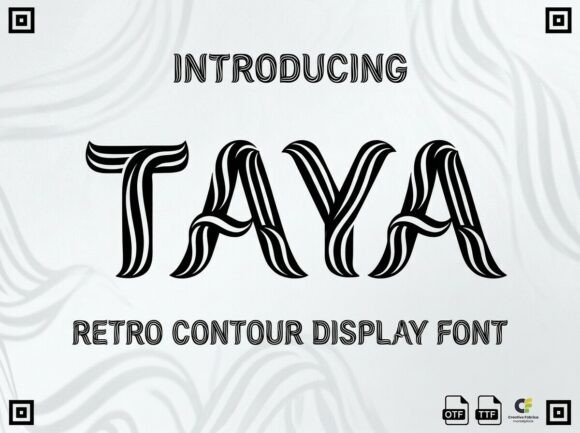
Taya brings a serif-led word shape to a playlist cover. I would compare the same title in upper and lower case, then choose a simple text face for the smaller information for the details. That division keeps the headline expressive and the information easy to scan.
View Taya and download options →
11. Poison Groove
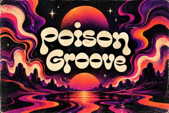
Poison Groove is a display option marked by rounded contours. A second detail to notice is generous curves. Its strongest role here may be an album title. Build a one-color proof and test the counters with a longer line of text; the vendor mockup alone is too generous a test.
View Poison Groove and download options →
12. Esme
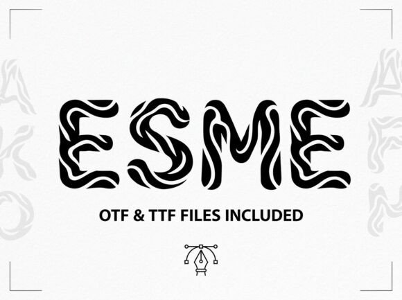
Esme can give a concert poster a different pace through visible stroke contrast. A second detail to notice is generous curves. I would place it beside a simple text face for the smaller information, then check the longest word and the smallest practical size before making a final choice.
View Esme and download options →
13. Zinnia

Zinnia leans on a distinct display silhouette, a useful starting point for a vinyl label. If the design has lots of tiny copy, let the expressive type stay large. For the main phrase, test its legibility away from the enlarged sample before you settle on the layout.
View Zinnia and download options →
14. Asya
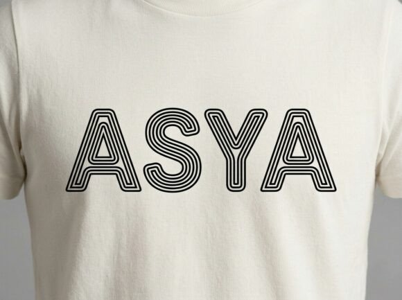
The appeal of Asya is a distinct display silhouette. Try it first as a tour shirt, then shrink the artwork to a phone preview. If the word still lands immediately, it can lead; otherwise, use it for a single accent.
View Asya and download options →
15. Prestige Typewriter
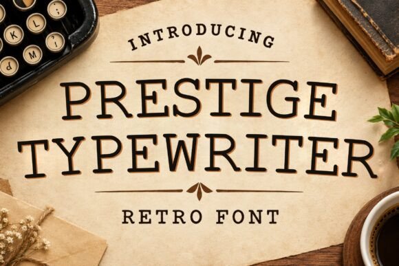
Try Prestige Typewriter on a playlist cover. It uses a serif-led word shape to set the mood. Type your complete phrase, compare the same title in upper and lower case, and inspect a print-size draft before trusting the enlarged preview.
View Prestige Typewriter and download options →
16. Hardon
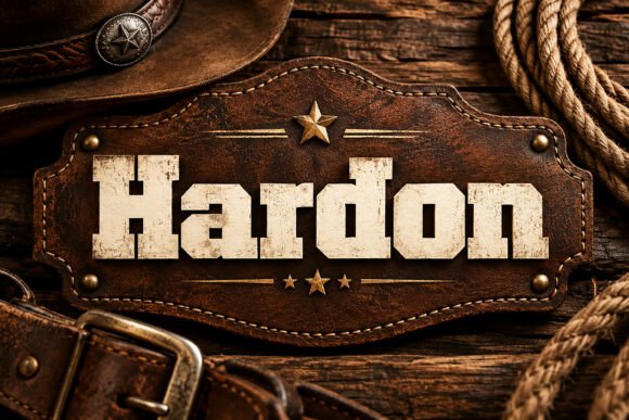
In this shortlist, Hardon is worth testing for an album title because of its a serif-led word shape. Set the actual copy in one color, use a simple text face for the smaller information, and check how the spacing changes after a line break.
View Hardon and download options →
17. Black Agic
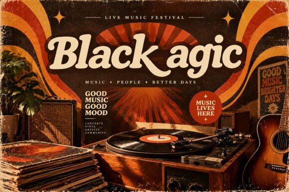
For a concert poster, Black Agic offers rounded contours. A second detail to notice is generous curves. Give it one clear task in the composition. Before choosing it, test the counters with a longer line of text and compare the result with a plain companion face at actual size.
View Black Agic and download options →
From specimen to finished project
Build a three-level type system: one display face for the album, a quieter supporting face for the artist and plain text for the tracklist. A restrained palette can make the lettering feel more authentic than adding grain, shadows and stickers to every line.
Frequently asked question
Can a groovy display font carry a tracklist?
Usually it is stronger on the title or artist name. A simpler face makes track names and credits comfortable to read.
Want another direction? Compare this shortlist with a related FontFinds font guide. Open each typeface above to inspect the complete character set, current price and license before downloading it for your project.