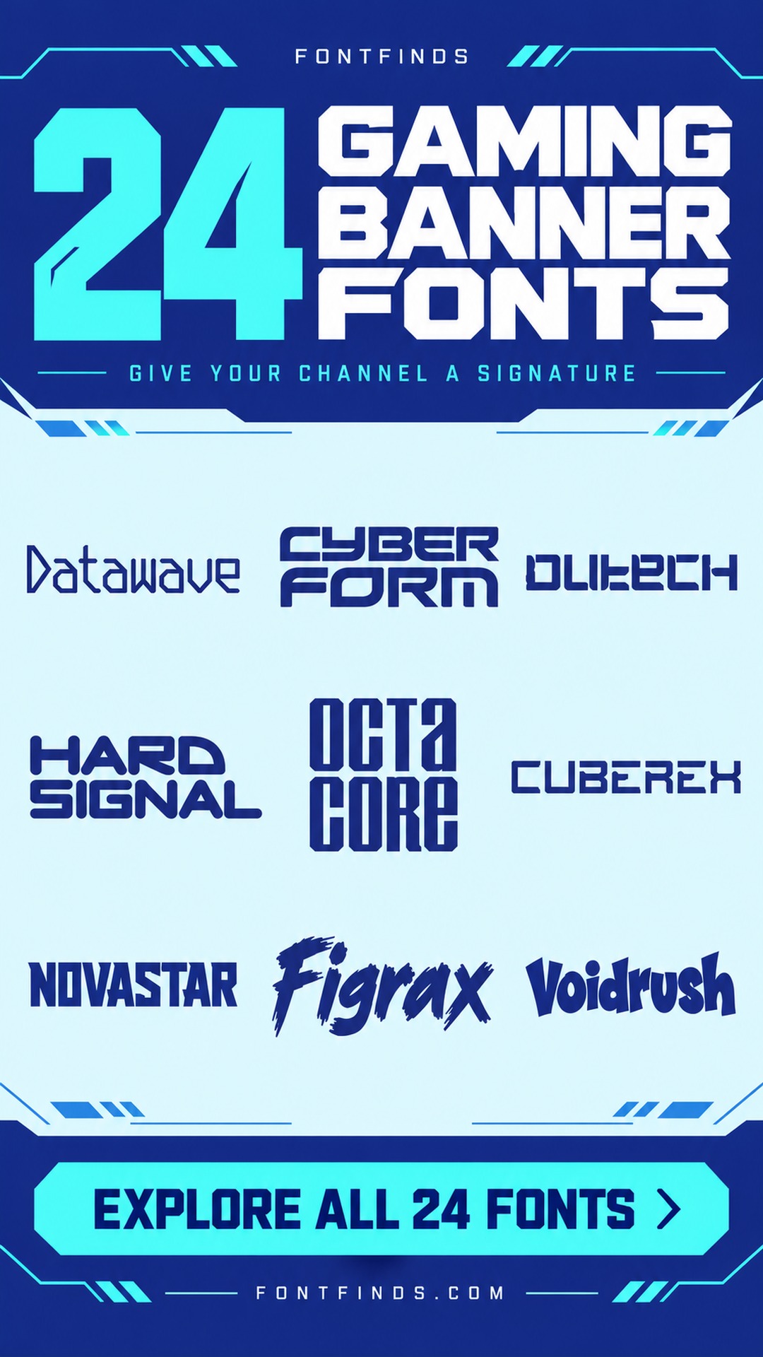
24 Gaming Channel Banner Fonts to Give Your Name a Voice
This article contains affiliate links. If you buy through them, I may earn a commission at no extra cost to you.
I want a gaming banner to tell me whose channel I am looking at before it tells me how many effects the designer can add. These gaming channel banner fonts are a shortlist of different voices for the channel name: technical, forceful, cinematic and occasionally playful.
I would choose according to the content, not just the word gaming. A relaxed variety channel and a competitive team need different identities. The previews below help compare those directions, with my notes on how I would keep the name clear inside a banner.
Match the channel voice before adding effects
- Clean and technical: Hard Signal — A strong geometric name for a consistent identity.
- Dark and atmospheric: Drakvexil — Gothic forms for a focused fantasy or horror channel.
- Playful and personal: Voidrush — Lively shapes for variety content and creator personality.
My first test is the name without the glow
I would set the channel name in one flat color and check its most unusual letters. If the name is hard to recognize, glow and metallic effects will not fix the structure. A strong plain wordmark is also easier to reuse on thumbnails and small profile graphics.
Then I would place the name in the platform template currently being used and check the visible area on different devices. Keep essential words away from crop-prone edges. A short tagline can support the name, but schedules and social handles should not compete with the main identity.
1. Sotech: A wide technical channel name
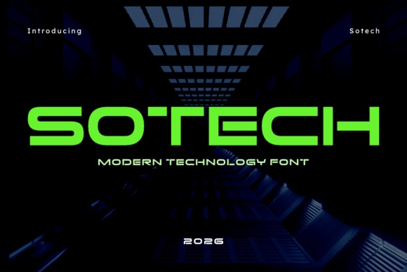
Sotech has low, broad geometric forms with a smooth technological character. I would shortlist it for a channel focused on futuristic games or precise, technical presentation.
Keep the name short enough to preserve its width. A plain secondary line can provide context without competing with the distinctive main shapes.
Preview This Gaming Font →Preview & download options
2. Skyvorn: A substantial cinematic identity
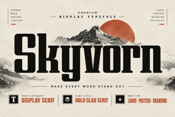
Skyvorn has tall, strong slab-like forms with a dramatic display presence. I would try it for a channel whose content leans toward large adventures or cinematic playthroughs.
The name can sit on a quiet section of the banner. It does not need an elaborate metallic effect to feel substantial.
Preview This Gaming Font →Preview & download options
3. Drakvexil: A dark fantasy channel voice
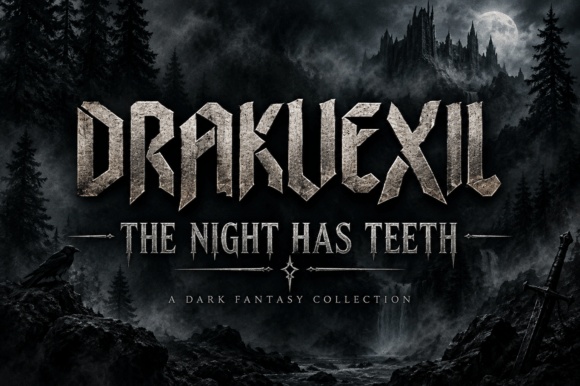
Drakvexil has sharp gothic forms with a forceful silhouette. I would use it for a channel centered on dark fantasy or horror games, where that atmosphere is relevant.
Check the actual channel name for ambiguous letters. A clear small tagline can help new viewers understand the content without weakening the main identity.
Preview This Gaming Font →Preview & download options
4. Movie Stars: A playful outline for variety content

Movie Stars has broad rounded outline forms with a cheerful display character. I would consider it for a relaxed variety-gaming channel rather than a severe competitive identity.
Use a flat background behind the name. The outline needs enough contrast to remain visible when the banner is reduced or cropped.
Preview This Gaming Font →Preview & download options
5. Figrax: A brush name with energy
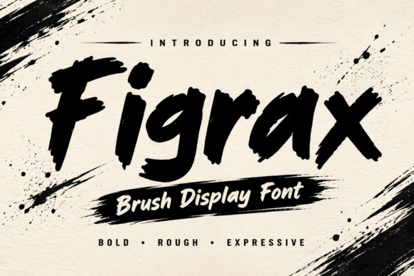
Figrax has thick, rough brush forms and a strong forward rhythm. I would try it for an energetic creator identity that should feel personal and expressive.
Keep the name in one clear block. Too many motion streaks behind the letters would compete with the movement already in the strokes.
Preview This Gaming Font →Preview & download options
6. Kryvorax: A sharp constructed fantasy mark
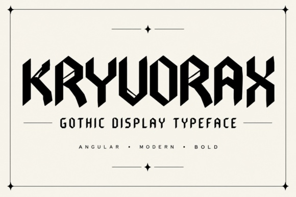
Kryvorax combines angular geometry with gothic influence. I would shortlist it for a channel that moves between fantasy worlds and more competitive content.
Use the exact name as the test, especially repeated narrow letters. The sharp construction needs enough space to remain distinct.
Preview This Gaming Font →Preview & download options
7. Noxdraven: A formal gothic channel signature
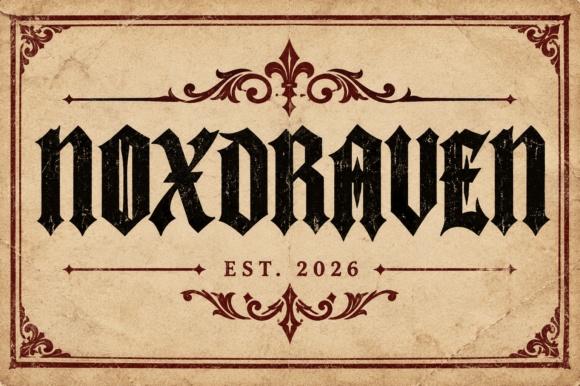
Noxdraven has dense, pointed blackletter-style forms. I would use it for a short name on a channel with a clearly established dark or medieval theme.
Keep all supporting information plain. The main wordmark can establish the atmosphere while the rest of the banner remains easy to navigate.
Preview This Gaming Font →Preview & download options
8. Thryvexor: A tall technical identity
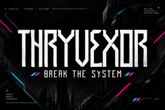
Thryvexor has narrow, angular capitals with a strong vertical rhythm. I would consider it when the channel name needs a condensed, futuristic presence.
Avoid squeezing it further. A smaller, well-spaced version is more useful than a large wordmark whose internal shapes become difficult to recognize.
Preview This Gaming Font →Preview & download options
9. Cuberex: A low geometric wordmark
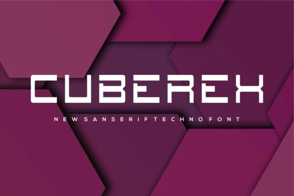
Cuberex uses wide, squared technical forms with open construction. I would try it for a clean gaming identity that does not need heavy texture.
Keep the background simple and allow horizontal breathing room. The restrained geometry can become a consistent signature across banners and related graphics.
Preview This Gaming Font →Preview & download options
10. Structure: A modular identity with unusual cuts
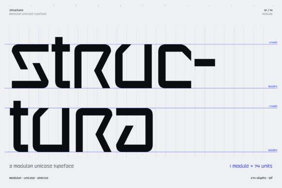
Structure shows a modular, angular alphabet with distinctive open sections. I would explore it for a channel with a technical or experimental visual direction.
Preview every letter in the actual name. The unusual construction is the attraction, but it should not make a new viewer guess the wording.
Preview This Gaming Font →Preview & download options
11. Vayrax Extend: A broad futuristic banner title
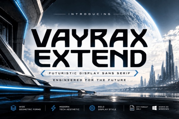
Vayrax Extend has wide, substantial geometric forms. I would use it for a short channel name that can occupy a generous central area.
Keep the name inside the reliable visible area of the platform template. The extended proportions need room, especially when the surrounding artwork is detailed.
Preview This Gaming Font →Preview & download options
12. Regvion: A gothic mark for a focused niche
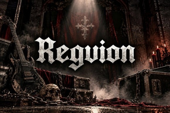
Regvion has dense blackletter forms with a ceremonial character. I would consider it for a channel focused on dark role-playing games or historical fantasy.
Use it for the name only and keep the rest of the banner restrained. A highly styled wordmark works best when its role is unmistakable.
Preview This Gaming Font →Preview & download options
13. Quantum Nrg: A decorative mechanical accent
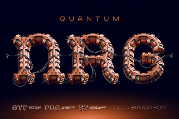
Quantum Nrg is presented as a richly detailed color bitmap style with a mechanical appearance. I would explore it for a short hero word on a technologically themed channel.
Check the actual file support and software compatibility before choosing it. The detailed rendering needs a larger display area than a simple flat alphabet.
Preview This Gaming Font →Preview & download options
14. Univex: A strong competitive silhouette
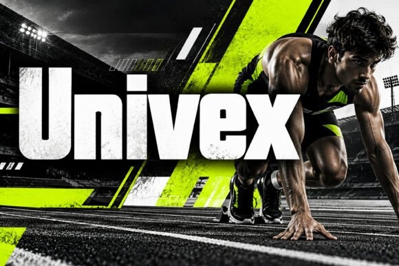
Univex has heavy condensed forms that create a direct, substantial block. I would shortlist it for a competitive channel where the name needs to read quickly.
Keep the background contrast strong and the tagline modest. The plain lettering should work before any lighting or speed effects are added.
Preview This Gaming Font →Preview & download options
15. Novastar: A structured geometric name
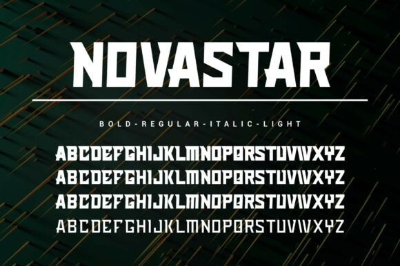
Novastar has angular, substantial capitals with a controlled rhythm. I would try it for a channel identity that needs a technical mood without excessive ornament.
Check the exact supplied styles and compare the real name. A consistent weight across the banner can create a cleaner identity than mixing several treatments.
Preview This Gaming Font →Preview & download options
16. Xivrak: A rough hand-drawn alternative
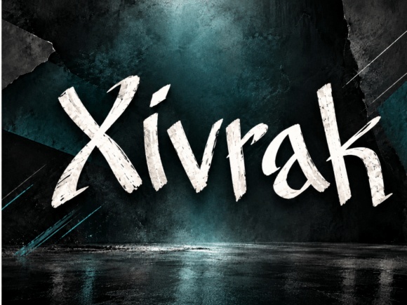
Xivrak has irregular brush-like forms with a strong diagonal energy. I would use it for a creator whose channel voice is lively and less polished.
Let the name sit on a quieter part of the banner. The rough strokes will remain more recognizable without a similarly rough background.
Preview This Gaming Font →Preview & download options
17. Vexarch: A heavy digital wordmark
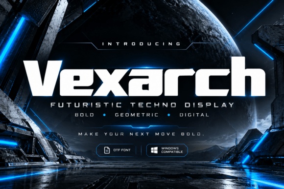
Vexarch has broad, rounded-square forms with a substantial technical appearance. I would consider it for a short gaming name that should feel bold and contemporary.
Preserve the open interior shapes and avoid excessive tightening. A simple supporting line can give the channel context without competing for attention.
Preview This Gaming Font →Preview & download options
18. Octacore: A condensed industrial title
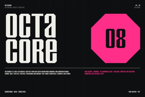
Octacore has tall angular forms with a deliberately constructed appearance. I would shortlist it for a compact name block or a two-line gaming identity.
Keep the line break meaningful and check the narrow counters. The industrial character is strongest when the surrounding layout stays precise.
Preview This Gaming Font →Preview & download options
19. Datawave: A retro-computer direction
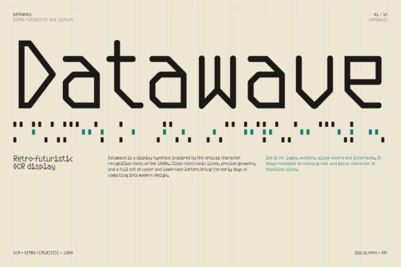
Datawave has angular, lightly constructed forms with a technical rhythm. I would try it for a channel interested in retro computing, strategy or a more analytical gaming voice.
Use a simple dark-on-light test first. Decorative code can support the atmosphere, but the actual channel name should remain the easiest line to read.
Preview This Gaming Font →Preview & download options
20. Cyber Form: A broad futuristic signature
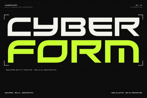
Cyber Form has low, wide geometric forms with a strong sci-fi character. I would consider it for a short name that needs a distinctive horizontal silhouette.
Give the word enough room and avoid placing detailed artwork directly behind it. A restrained accent color can reinforce the identity without changing the letters.
Preview This Gaming Font →Preview & download options
21. Dutech: A digital name with distinctive shapes
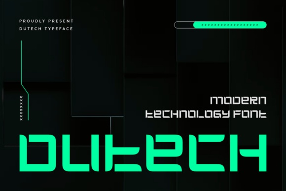
Dutech has squared forms and unusual technical cuts. I would use it when those details fit the channel's subject and the actual name remains recognizable.
Test numbers and punctuation separately if they are part of the handle. A visually interesting alphabet still needs to communicate the exact identity.
Preview This Gaming Font →Preview & download options
22. Voidrush: A playful gaming personality
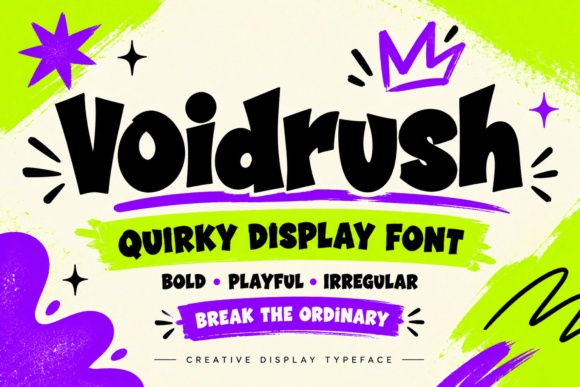
Voidrush has thick, uneven forms with a cheerful, slightly rebellious rhythm. I would try it for variety content or a creator whose personality matters more than a futuristic theme.
Keep the layout stable and let the letters provide movement. A small accent shape can be enough additional decoration.
Preview This Gaming Font →Preview & download options
23. Hard Signal: A clean broadcast-style wordmark
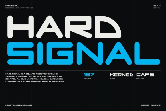
Hard Signal uses broad, rounded-square forms with a clear technical structure. I would shortlist it for a channel that needs a strong name across banners and thumbnails.
Start with one flat color and check the smallest use. The clean silhouette can provide consistency even when the game artwork changes.
Preview This Gaming Font →Preview & download options
24. Techros: A restrained technical option
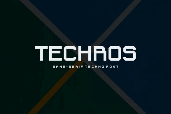
Techros has squared geometric capitals with a comparatively straightforward appearance. I would consider it for a gaming identity that should feel modern without becoming highly ornamental.
Keep the supporting text simple and give the main name a clear margin. The restrained structure can make the banner easier to reuse across different content themes.
Preview This Gaming Font →Preview & download options
How I would choose a channel signature
I would compare one technical option with one more expressive alternative and ask which matches the actual videos. Then I would preview the exact channel name, including numbers or punctuation. Use the product links to inspect those characters before committing to a complete banner system.
My recommendations are based on a visual review of the supplied product previews, not installation or production tests. The cover is an illustrative lettering montage. Open the linked listing to check the full character set, supplied files and current license before downloading.
More font ideas
Frequently asked questions
Do I need a different font for every gaming series?
I would keep the main channel identity stable and vary supporting graphics for different series. A recognizable name is more useful than a completely new wordmark for each game.
Should I use the effects shown in the product preview?
Treat them as presentation inspiration. Confirm what is included, and make the plain lettering readable before applying your own glow, texture or metallic treatment.
How should I handle banner cropping?
Use the current template for the platform and test the visible area on the devices your audience uses. Keep the channel name within the reliable central area.