31 Essential Monospace Fonts for Developers and Designers in 2026
In the world of digital typography, monospace fonts play a crucial role by providing uniform character spacing that enhances readability and organization. Whether you’re a developer, designer, or tech enthusiast, choosing the right monospace fonts can significantly impact your projects in 2026. This article presents 31 standout options to elevate your typographic toolkit.
1. Borgen Monospace Font
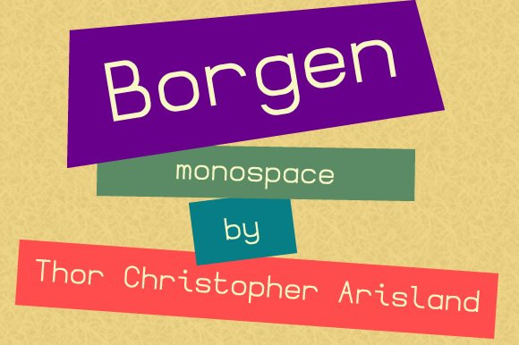
Borgen Monospace is characterized by its straightforward geometric design, delivering a minimalistic and highly legible appearance. Its clean lines and uniform character widths make it an excellent choice for projects that prioritize clarity and precision, especially in contexts like coding, technical documentation, or digital interfaces where monospaced fonts are essential for maintaining alignment.
This typeface’s simplicity does not compromise its aesthetic appeal; rather, it offers a timeless, versatile foundation for designers aiming to create a modern, uncluttered look. Its neutral style ensures it adapts seamlessly across various branding and editorial projects, from user interface design to technical reports, where maintaining consistency in spacing is paramount.
Incorporating Borgen Monospace into your design toolkit grants you a stable, professional tone that enhances readability without distraction. The font’s geometric roots make it perfect for digital environments, especially when presenting data, code snippets, or menu systems that demand uniformity and clarity. Its sleek, unobtrusive profile ensures your content remains front and center, making it ideal for systematic layouts that require a clean visual flow.
Download Borgen Monospace Font
My Recommendation: I find Borgen Monospace incredibly useful for technical projects where precision and clarity are critical. Its minimalist geometric structure lends itself well to coding environments, dashboards, and data visualization, making information easy to scan and interpret. It’s a subtle yet effective choice whenever a no-nonsense, contemporary monospace font is needed.
2. Nalaloka Mono Monospace Font
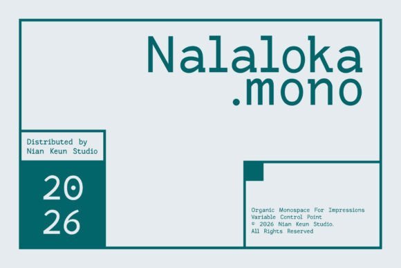
Nalaloka Mono is a standout among modern monospace fonts, bringing together technical precision with an inviting, organic aesthetic. Its expressive character set balances clean, consistent spacing with subtle handcrafted details, resulting in a typeface that feels both systematically engineered and inherently human. This makes it exceptionally versatile for projects that require a contemporary edge with a touch of personality.
Designed to work across wide-ranging applications—from editorial layouts and branding systems to digital interfaces—Nalaloka Mono excels at maintaining readability while adding unique visual interest. Whether used for editorial design, posters, or UI/UX elements, its modern yet approachable style delivers a fresh take on traditional monospace conventions. The font’s balanced proportions and subtle organic nuances allow for a dynamic visual presence without sacrificing functional clarity.
In practice, Nalaloka Mono can elevate the aesthetic of tech startups, creative agencies, or publication layouts that aim to combine a systematic structure with an approachable feel. It performs especially well on digital screens where clarity and personality are equally valued, making it an ideal choice for coding-style layouts, conceptual typography, or branding projects that benefit from a methodical yet warm tone.
Download Nalaloka Mono Monospace Font
My Recommendation: Nalaloka Mono has become my go-to for projects that need a modern monospace font with a human touch. Its combination of technical precision and organic detail makes it perfect for editorial layouts, branding, and digital interfaces that require both structure and personality. I love using it in creative environments where visual warmth enhances functional clarity.
3. Boliand Font
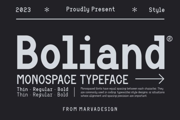
Boliand stands out as a modern monospace typeface with a versatile, contemporary flair. Its balanced proportions and clean design make it suitable for a variety of creative projects—ranging from invitations and product packaging to logos and watermarks. The font’s consistent spacing and approachable appearance lend themselves well to branding exercises that need a professional yet friendly tone.
One of Boliand’s key strengths is its adaptability across different mediums, whether in printed materials, digital branding, or craft-oriented layouts. Its streamlined form makes it an excellent choice for projects that demand clear communication, such as labels, product descriptions, and social media graphics. Using a monospace font like Boliand elevates the visual impact of designs that aim for a modern, cohesive aesthetic with balanced readability.
For designers working on product branding, packing materials, or creative watermarks, Boliand offers a practical yet stylish solution. Its contemporary look ensures that your message remains accessible at a glance, while its distinct character gives your project an individualistic edge. It’s especially effective for hybrid projects that blend traditional craftsmanship with modern digital presentation.
My Recommendation: I enjoy incorporating Boliand into branding and packaging projects because of its contemporary feel and versatility. It lends a polished yet approachable look to labels, logos, and promotional materials, making it a dependable option when you want a clean, modern aesthetic with a touch of personality on all kinds of products.
4. La Haula Font
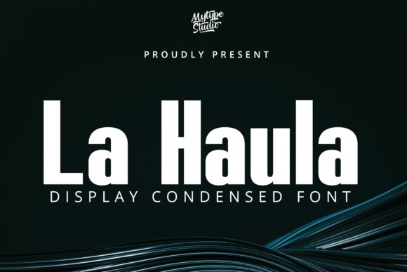
La Haula stands out as a versatile sans-serif typeface, specifically designed to make bold titles and display text highly legible and visually striking. Its condensed form allows designers to optimize space without sacrificing clarity, making it especially suitable for headlines, posters, and branding materials where impact is paramount. The inclusion of a distinct monospace style within La Haula ensures uniformity in character width, which is crucial for precise alignment in digital interfaces, code snippets, or data displays.
This font’s trio of styles—Bold, Condensed, and Monospace—empowers creatives to craft cohesive visual narratives across different media. The Monospace variation, with its fixed character spacing, is perfect for contexts where consistent rhythm and alignment are essential, such as in programming environments or technical dashboards. La Haula’s unique shape and bold presence turn simple typography into an experience, making it a perfect choice for brands seeking a modern, authoritative aesthetic that commands attention while maintaining clarity.
My Recommendation: I find La Haula particularly useful when creating striking title sequences or branding elements that demand immediate visual impact. Its bold, condensed, and monospace styles bring a fresh energy to digital projects, from tech startups to creative campaigns. This font transforms straightforward text into a memorable visual statement, especially when precision and boldness are required.
5. Delko Font
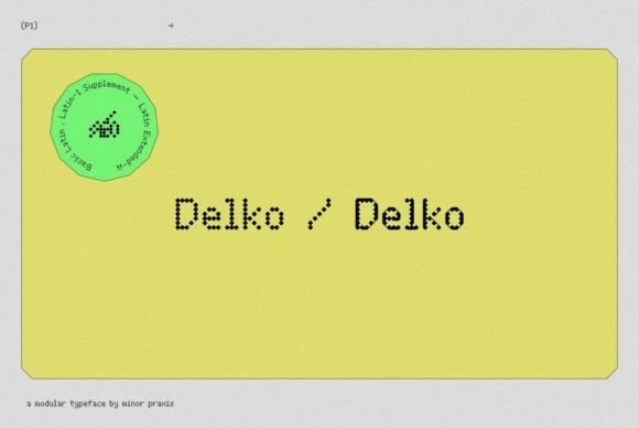
Delko is a modern, visually engaging sans-serif font inspired by scrolling LED banners and traditional monospace typefaces like OCR-A and OCR-B. Its modular construction, based on an octagonal shape with 45-degree slopes, gives it a laid-back yet digitally-inspired personality. This casual digital aesthetic makes Delko well-suited for headlines, posters, and medium-sized body copy where a tech-forward vibe is desired.
Although it isn’t explicitly marketed as a monospace font, Delko’s structural design echoes the precision and uniformity characteristic of monospace types, making it adaptable for projects that benefit from consistent character spacing. Its readability, combined with a distinctive angular motif, lends itself to creative branding, display advertising, or digital interfaces that aim for an approachable yet modern tone. Delko’s unique shape sets it apart from traditional fonts, making it a fun and functional choice for projects demanding a clean, digital-inspired look.
My Recommendation: Delko is a fantastic choice for adding a playful yet modern touch to digital banners, headlines, or promotional posters. Its distinctive angular style helps a brand stand out while still maintaining a clear and structured appearance. I enjoy using Delko when I want to inject a contemporary, tech-savvy feel into my designs, especially for digital campaigns or eye-catching displays.
6. Brixela Font
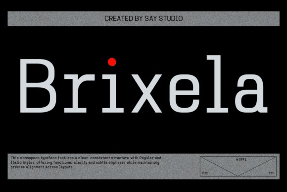
Brixela exemplifies a sleek, modern approach to monospace sans serif typography, crafted to balance clarity with a cutting-edge aesthetic. Its geometric structure and meticulous proportions ensure each letter maintains uniform width, making it ideal for projects that require rigorous alignment and visual harmony. Brixela’s sharp, technical appearance complements digital interfaces, dashboards, and editorial layouts where both readability and precision are key factors.
This typeface’s versatility shines through in its application across branding, UI design, and motion graphics, where its contemporary personality supports a clean, professional image. The inclusion of italic styles expands its expressive potential, allowing designers to add emphasis or dynamic movement while preserving the overall sleekness. Whether you’re creating a futuristic tech brand, designing a developer-focused website, or producing minimalist posters, Brixela offers a high level of functionality and visual harmony that elevates any project.
My Recommendation: I use Brixela when working on projects that demand impeccable structure—like dashboards, code snippets, or minimal web interfaces. Its precision and modernity make it an excellent choice for technology-driven brands or editorial layouts that seek a clean, professional look without sacrificing visual interest. Brixela helps create designs that are both functional and visually compelling, perfect for the digital age.
7. Monopack Regular Font
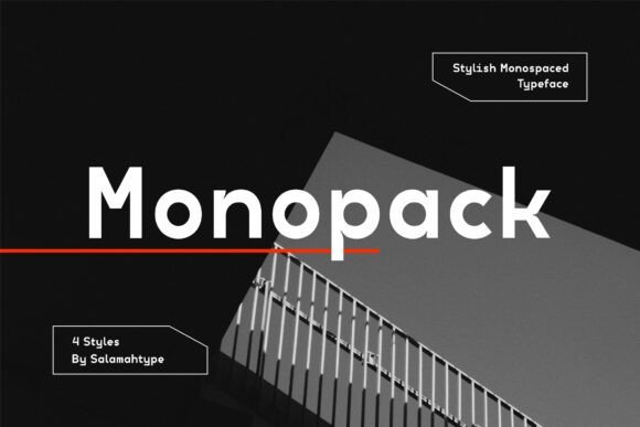
Monopack Regular stands out as a contemporary monospace font characterized by its sleek and versatile design. Available in four distinct styles—Regular, Oblique, Condensed, and Condensed Oblique—this typeface offers a perfect balance between modern minimalism and technical finesse. Its subtle inktraps on select characters introduce a unique visual texture, adding an element of sophistication without sacrificing clarity or legibility. Such nuanced detailing makes it highly suitable for uses that demand a clean, yet distinctive aesthetic, like branding, UI elements, or editorial layouts.
Designed with accessibility and versatility in mind, Monopack is fully PUA-encoded, ensuring you have access to an extensive range of glyphs and swashes for creative customization. Its crisp lines and structured form lend themselves well to digital interfaces, logos, or titles where a contemporary, professional appearance is desired. Incorporating this font can elevate the technical feel of your project while maintaining viewer engagement through its stylish, detailed glyphs.
Download Monopack Regular Font
My Recommendation: I recommend Monopack Regular for projects that require a refined, modern take on monospace typography. It performs exceptionally well in digital branding, app interfaces, or tech-focused editorial designs, thanks to its clarity and subtle detailing. Its wide glyph support also makes it a practical choice for creative projects that need a touch of elegance without complexity.
8. Monospace Tech Block Font
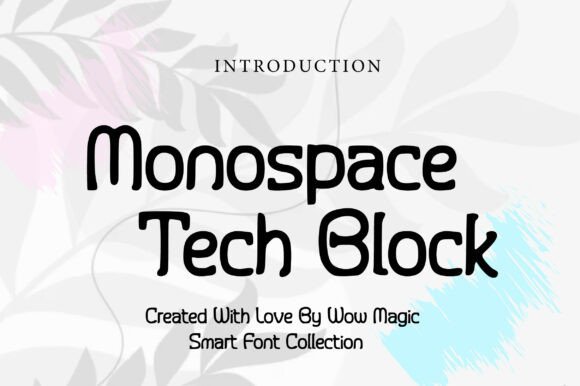
Monospace Tech Block is a bold, futuristic display font rooted in the aesthetic principles of technology and modern design. Its block-style letterforms boast an industrial robustness, making it an ideal choice for projects that aim to evoke a high-tech, innovative vibe. As a distinctive monospaced typeface, it excels in digital branding, futuristic UI interfaces, gaming titles, and tech product packaging, where clarity and a commanding presence are paramount. The evenly spaced, precise shapes facilitate easy recognition even at smaller sizes, ensuring maximum impact across various digital environments.
This font’s streamlined, clean lines and geometric structure serve to reinforce themes of precision and technological advancement. Its design encourages creativity in digital projects, especially those wanting a strong visual identity that celebrates modernity and innovation. Monospace Tech Block’s adaptability makes it a reliable workhorse for a wide spectrum of tech-centric applications, standing out with its bold and professional aesthetic.
Download Monospace Tech Block Font
My Recommendation: I’d turn to Monospace Tech Block when working on branding for tech startups, digital campaigns, or gaming interfaces where a modern, eye-catching typeface is crucial. Its bold presence pairs exceptionally well with high-contrast color schemes and sleek design layouts, pushing your project towards a cutting-edge look that’s both professional and memorable.
9. Joystix Monospace Font
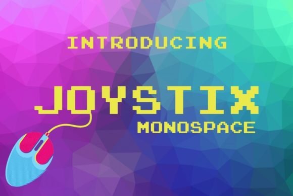
Joystix Monospace transports viewers straight into the classic arcade era with its pixel-inspired design. The typeface’s nostalgic, pixelated style makes it a rich choice for projects that seek to evoke retro gaming culture or vintage digital aesthetics. This decorative monospace font is perfect for themed posters, game interfaces, or branding elements centered around gaming, nostalgia, or pixel art. Its monospaced nature ensures a consistent, grid-like appearance that enhances the authentic arcade vibe, while also facilitating seamless integration into pixel-based graphic compositions.
While it excels in providing a nostalgic visual tone, Joystix Monospace also offers a flexible decorative element that can spice up the visual identity of digital art, t-shirts, or themed event promotions. The font’s character-driven design lends itself well to creative projects that aim to celebrate retro gaming history in a playful, engaging way. Whether for a game’s title screen or a digital marketing campaign, its distinctive style makes a memorable statement.
Download Joystix Monospace Font
My Recommendation: For projects centered around gaming, retro branding, or pixel art, Joystix Monospace offers an authentic and playful aesthetic. Its pixel-perfect design will bring a touch of nostalgia to any digital or print media, making it especially effective in projects that cherish vintage gaming culture or evoke a fun, arcade atmosphere.
10. Column Font
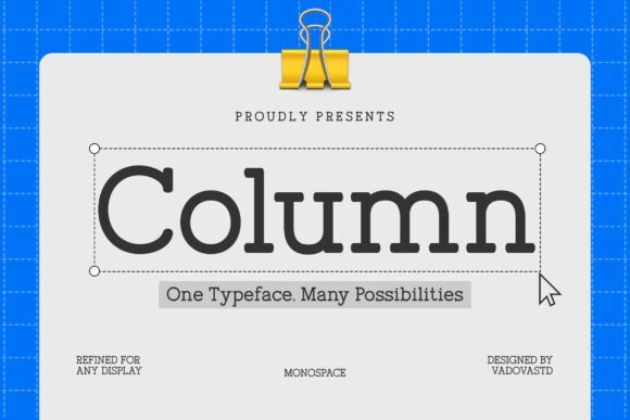
The Column font exemplifies a modern approach to monospace fonts with its sharp geometric structure and consistent rhythm. Crafted for professional environments, it ensures clear readability whether used in technical documentation, branding projects, or interface designs. The precision of its design makes it particularly effective for conveying a sense of order and sophistication, especially in digital settings where clarity is paramount.
Its multilingual support, including punctuation and symbols, amplifies its utility across diverse markets and content types. The soft yet structured character of Column strikes an elegant balance, making it ideal for applications that demand both professionalism and visual minimalism, such as tech startups’ websites, modern editorial layouts, and corporate branding assets.
My Recommendation: I love using Column when building sleek, professional interfaces or branding materials that require a modern, structured aesthetic. Its balanced design enhances readability and lends a contemporary feel to both digital and print projects, especially in industries like technology, finance, and professional services.
11. Maisney Font
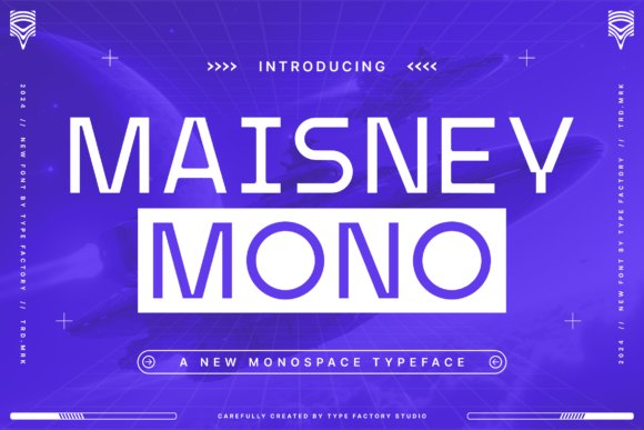
Maisney presents itself as a contemporary monospace typeface characterized by its clean, technological structure. The consistent character spacing and geometric simplicity create a highly organized appearance that resonates with digital environments and coding interfaces. Its design subtly incorporates futuristic details, making it an excellent choice for projects that aim to convey innovation and forward-thinking concepts.
Perfect for UI design, tech branding, and editorial layouts, Maisney’s modern aesthetic complements projects rooted in technology, digital media, or science themes. Its precise and futuristic vibe ensures that it stands out in display typography, posters, and branding assets targeting a tech-savvy audience or emphasizing modernity.
My Recommendation: Since I work on tech-related interfaces and digital branding, Maisney is my go-to for projects seeking a sleek, futuristic touch. Its clean structure and modern vibe make it ideal for high-tech campaigns, app interfaces, or futuristic editorial designs that need a touch of digital sophistication.
12. Monospace Font
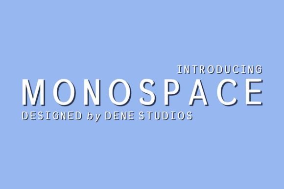
Monospace stands out as a straightforward yet highly effective sans serif font, distinguished by its clean, minimalistic design. Its uniform character width lends it a modern, utilitarian appeal, making it exceptionally well-suited for coding screens, technical documentation, and any context where perfect alignment and clarity are crucial.
This monospace font’s simplicity supports effortless readability and a professional tone, making it a favorite among developers and designers looking to evoke a sleek, contemporary look. Its versatility means that it can also pair seamlessly with more elaborate fonts in branding materials or interface components, providing balance without sacrificing style.
My Recommendation: I find Monospace especially useful in coding projects, technical presentations, or digital interfaces where clarity and precision are top priorities. Its timeless simplicity makes it a dependable choice for modern design, especially when you need a clean, distraction-free visual that still feels contemporary.
13. Terminal Mono Font
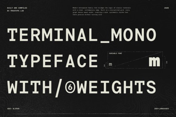
Terminal Mono is a meticulously crafted modern monospace font that functions as much more than a simple collection of characters—it’s a comprehensive typographic system rooted in precision and structural harmony. Designed on a disciplined grid, each character shares identical width, fostering a stable visual rhythm that lends clarity and order to any layout. This meticulous approach makes it particularly suitable for projects requiring text that is both highly legible and systematically organized, such as coding environments, data visualization, or technical interfaces.
Inspired by the terminal and digital data environments, Terminal Mono introduces a contemporary, softer aesthetic while retaining its technical clarity. Its versatile family includes six balanced weights, from Light to Extra Bold, allowing for nuanced hierarchy and contrast without sacrificing consistency. The presence of a variable font version further enhances its adaptability, enabling seamless transitions across weights while preserving proportional integrity. With extensive language support and over 400 glyphs, Terminal Mono excels in accommodating diverse linguistic requirements, making it an ideal choice for creative projects that demand a harmonious blend of precision, stability, and modernity, whether in print, UI design, or data-driven visual storytelling.
My Recommendation: I love utilizing Terminal Mono when working on interfaces that require a clean, structured look—such as dashboards, code editors, or technical documentation. Its precise grid layout and extensive glyph set make it a reliable choice for environments where clarity and consistency are paramount, especially across digital and print applications that demand a sense of order and control.
14. Maziglow Font
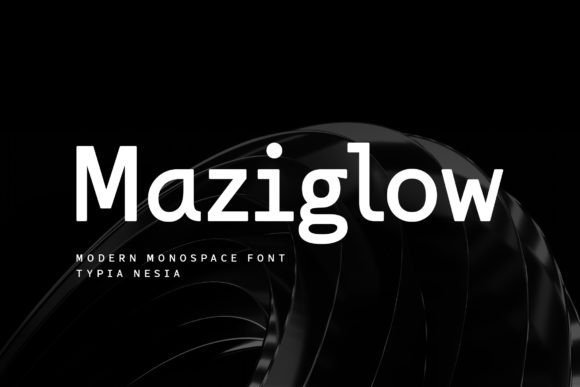
Maziglow is a modern monospace sans serif font that blends contemporary minimalism with versatile functionality. Its clean, crisp letterforms make it highly adaptable for a range of design projects, from branding and editorial layouts to promotional materials. The monospaced structure offers a consistent rhythm across text blocks, enhancing readability in contexts like magazine spreads, ticket designs, stationery sets, or online blogs. Its modern aesthetic provides a fresh perspective that pairs well both in digital interfaces and print media, lending a professional yet approachable feel.
Perfect for designers seeking a sleek, neutral typeface with a touch of distinctiveness, Maziglow lends itself seamlessly to projects needing uniformity and punch. Whether used for headlines, body copy, or logo treatments, this font ensures visual cohesion without sacrificing style. Its versatility extends further into creative applications such as album covers, fashion promotions, or specialized branding assets for a broad spectrum of industries, notably in arts, entertainment, and lifestyle sectors.
My Recommendation: Maziglow is my go-to for projects that require a modern, clean aesthetic paired with consistent character spacing. Its versatility makes it an excellent choice for editorial designs, branding, or promotional materials where clarity and style need to coexist harmoniously. It adds a polished touch to both digital projects and printed collateral in creative or commercial contexts.
15. Higasper Font
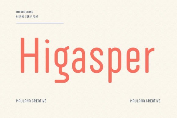
Higasper stands out as a stylish semi-monospace font renowned for its sleek design and remarkable versatility. Its unique character set balances the rigidity of traditional monospace with a contemporary flair, making it suitable for a variety of branding, editorial, and creative applications. The slightly relaxed spacing integrated into its design offers a level of visual interest and personality, which can be advantageous in projects like headlines, logos, or promotional graphics where a modern yet approachable voice is desired.
The adaptability of Higasper allows it to enhance everything from fashion magazines and artistic posters to digital interfaces and mobile app designs. Its semi-monospace nature offers a delicate balance—providing enough uniformity for coherence in technical contexts while delivering enough stylistic edge to set your project apart. Whether you’re working on brand identity or content-heavy layouts, Higasper delivers a blend of style and function that can elevate your visual storytelling.
My Recommendation: I find Higasper an excellent option when I want to inject some personality into a modern design without sacrificing legibility. It’s perfect for editorial layouts, branding elements, or UI components that benefit from a semi-structured look with a distinctive character, making every project feel fresh and contemporary.
16. Sharmin Font
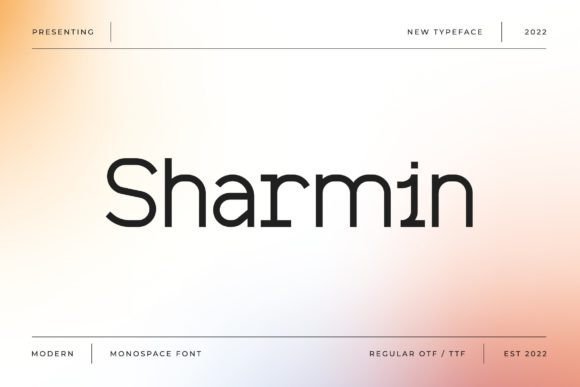
Sharmin is a distinctive monospace display font that excels in capturing attention within a wide array of creative projects. Its structured geometric forms and clean lines make it ideal for branding materials, headlines, posters, and digital interfaces aiming for a modern and compelling aesthetic. As a display font, Sharmin allows designers to craft visual hierarchies with clarity, making it especially suitable for headlines in magazines, promotional banners, or website hero sections where immediate visual impact is crucial.
What sets Sharmin apart is its PUA-encoded glyphs, granting seamless access to a rich collection of ligatures, alternate characters, and decorative glyphs. This feature empowers designers to infuse their projects with nuanced typographic details, elevating the visual interest. Its versatility makes it an excellent choice for creative agencies looking to craft memorable logos or for digital artists building immersive visual narratives that demand a bold, stand-out typeface.
My Recommendation: I love using Sharmin when I need a font that screams creativity and grabs attention instantly. Its geometric and display qualities make it perfect for branding and promotional materials that need to be memorable. It’s especially handy when designing eye-catching social media graphics or event posters that require a touch of modern flair.
17. Ersiqust Font
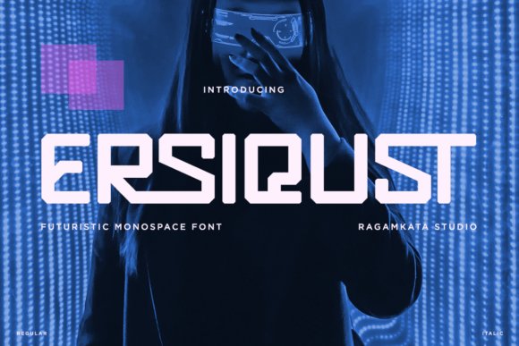
Ersiqust is a highly adaptable sans-serif typeface that embodies a futuristic design ethos, making it suited for a diverse array of digital and print applications. While it was not explicitly crafted as a monospace font, its sleek, modern lines lend themselves well to projects requiring a contemporary visual language. Perfect for sci-fi themed posters, tech branding, or digital interfaces, Ersiqust’s clean and minimal aesthetic effortlessly communicates innovation and precision.
Its versatile design allows it to perform well in various contexts, from product packaging to social media graphics, especially where a cutting-edge look is desired. By incorporating Ersiqust into your design toolkit, you can craft logos, promotional materials, and event invitations that resonate with a futuristic, high-tech vibe, making it an excellent choice for creative professionals aiming to emphasize innovation and modernity.
My Recommendation: Though not a monospace font, Ersiqust’s sleek lines make it perfect for projects that need a contemporary, high-tech feel. I often recommend it for branding in the digital realm, especially when a clean yet futuristic aesthetic is required—think of sci-fi posters or cutting-edge app interfaces.
18. Matech Monospace Font
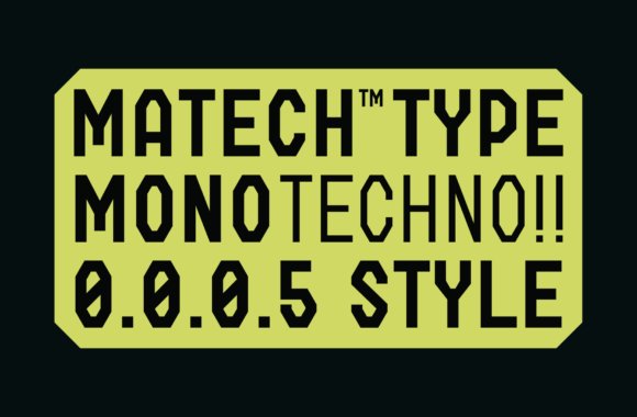
Matech Monospace Font stands out as a modern, tech-inspired typeface with a geometric, highly functional design. Its uniform character width and clean lines position it as an excellent choice for projects requiring excellent readability and a sleek, contemporary look. This typeface’s versatile weight options—from light to extra bold—allow for nuanced typographic hierarchies, making it suitable for everything from subtle interface elements to prominent headlines in technology-focused branding.
Designers working on coding environments, tech blogs, or software interfaces will appreciate Matech’s clarity and modern aesthetic. Its consistent structure and crisp appearance also make it perfect for creating visually cohesive digital layouts, appealing not only for their functionality but also for their forward-looking style. Whether you’re designing a startup website or a product packaging project in the tech sphere, Matech Monospace provides the precision and sophistication that such projects demand.
Download Matech Monospace Font
My Recommendation: I find Matech Monospace particularly useful when creating interfaces or branding for cutting-edge tech companies. Its balanced weights and geometric structure make it perfect for code snippets, headlines, or any project where clarity and modern style are non-negotiable. It’s my go-to for projects that need a sleek, high-tech vibe with professional polish.
19. Bittypix Monospace Font
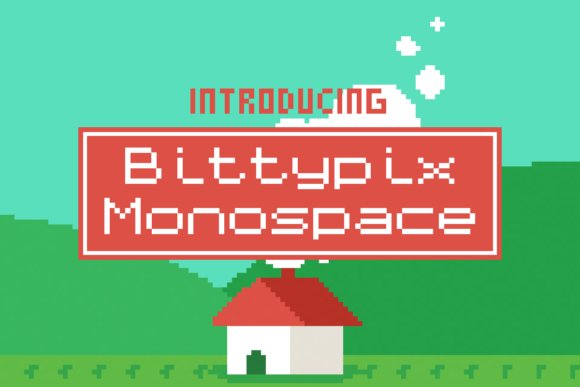
Bittypix Monospace is a pixel-perfect typeface designed by Chequered Ink, featuring an 8-pixel grid that emphasizes clarity and precision in digital environments. Its clean, blocky aesthetic makes it ideal for projects that echo the nostalgic charm of early computer interfaces, pixel art, or tech-centric interfaces. The uniform character width across all glyphs ensures consistency, making it an excellent choice for coding displays, terminal animations, or custom digital signage where legibility at small sizes is paramount.
While not explicitly labeled as a monospace font, its deliberate monospaced structure aligns perfectly with the core principles of monospace fonts, ensuring each character occupies the same width. This design trait enhances readability in structured layouts and simplifies font pairing in UI design. With its minimalist design, Bittypix Monospace lends itself well to retro-themed branding, indie game UI, or creative projects that celebrate vintage computing aesthetics.
Download Bittypix Monospace Font
My Recommendation: I would choose Bittypix Monospace for projects that demand a pixelated, tech-inspired look—think game interfaces or digital dashboards. Its grid-based design ensures clarity when used in small digital applications, making it perfect for projects that want to evoke nostalgia while maintaining modern simplicity. It’s particularly appealing for interface designers who require a clear, evenly spaced font that retains a playful yet functional character.
20. Candlepin Monogram Font
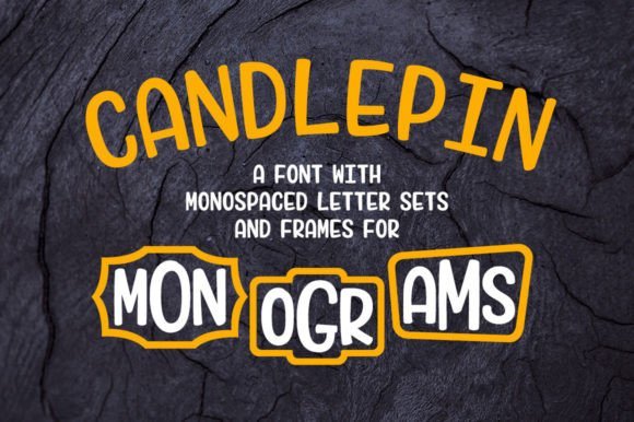
Candlepin Monogram is a playful and informal typeface crafted to breathe new life into traditional monogram design, often perceived as overly formal or stiff. Its light-hearted, whimsical style offers a fresh take on classic monograms, making it well-suited for projects that require a friendly and approachable tone. The font includes a versatile set of uppercase and lowercase letters, along with an extensive collection of numbers, frames, and graphic options, all of which are designed to facilitate creative, personalized monogram compositions.
Perfect for crafting customized logos, decorative stationery, or fun branding elements, Candlepin Monogram excels at adding personality and uniqueness to visual identities. Its fully PUA-encoded glyphs allow easy access to a variety of decorative elements and graphics, enabling users to effortlessly generate intricate monograms or embellishments without needing advanced design skills. Whether for personal projects like invitations or commercial branding that benefits from a distinctive, friendly vibe, this font injects versatility and charm into any design toolkit.
Download Candlepin Monogram Font
My Recommendation: I love using Candlepin Monogram when I want to add a touch of personality and creativity to monograms or decorative branding. Its playful design makes it perfect for party invitations, personal branding, or packaging that needs a friendly, approachable feel. Plus, the extensive graphic options save a lot of time creating customized, eye-catching monograms for various projects.
21. Asterik Reborn Font
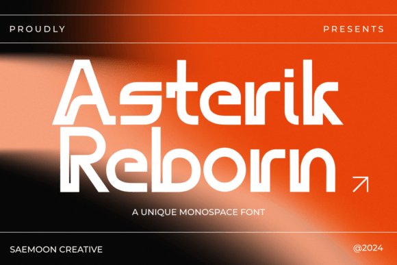
Introducing Asterik Reborn, a striking monospace font from Saemoon Creative that combines modern aesthetics with sporty energy. Designed with crisp outlines and sharp angles, this typeface evokes speed, agility, and technological sophistication. Its geometric structure ensures consistent spacing and balanced proportions, making it highly legible even at small sizes. The font’s futuristic appeal makes it ideal for brands and projects that aim to communicate innovation, dynamism, and a cutting-edge vibe.
While not explicitly a monospace font, its uniform character width across all glyphs aligns with critical monospace font characteristics, ensuring a harmonious, grid-like visual when used in tabular data, code snippets, or digital interfaces. The energetic design elements are perfectly suited for digital branding, tech startups, sports-related marketing, or any creative content seeking a high-impact, modern look. Asterik Reborn also pairs well with minimalist and high-tech design schemes, providing a visually compelling yet clear typographic choice for forward-thinking projects.
My Recommendation: I find Asterik Reborn to be an excellent choice for projects that require a dynamic and futuristic appearance—think app interfaces, digital branding, or promotional graphics. Its sporty yet modern design elevates any project that aims to appear energetic and innovative, making it especially useful for brands that want to stand out with a high-tech, lively personality.
22. Heaven Mono Font
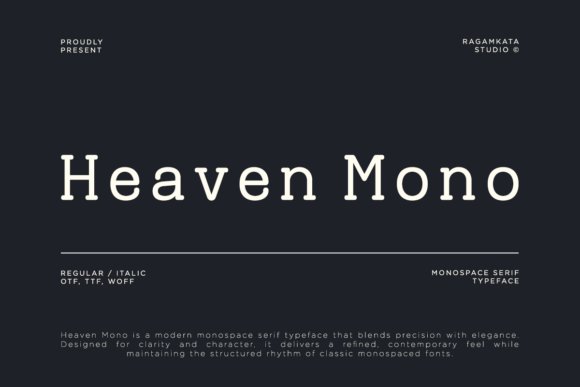
Heaven Mono is a modern monospace serif typeface that masterfully combines technical precision with a touch of refined elegance. Its meticulously balanced proportions, sharp detailing, and subtle serif accents give this typeface a distinctive rhythm that feels both forward-thinking and timeless. Its structured, uniform letterforms ensure clarity and consistency, making it highly effective in contexts where readability and aesthetic harmony are paramount.
Designed with versatility in mind, Heaven Mono is particularly well-suited for digital interfaces such as coding environments, UI/UX design, and branding systems that demand a clean, professional look. Its refined details lend themselves to editorial layouts, posters, packaging, and experimental visual projects, where a balance of structure and personality is valued. In both print and digital applications, this monospaced serif stands out for its ability to elevate the perception of technology-driven or modern branding initiatives, providing a sense of trustworthiness and style. Its unique blend of contemporary minimalism and subtle sophistication makes it an ideal choice for projects requiring both clarity and an elegant touch.
My Recommendation: I find Heaven Mono particularly compelling for tech-focused branding, coding dashboards, or editorial work where a disciplined yet elegant typeface enhances professionalism. Its balanced design ensures your message stays clear, whether on a website, app interface, or printed brochure. It’s a versatile font that bridges the gap between functionality and aesthetics effortlessly.
23. Astro Nomos Font
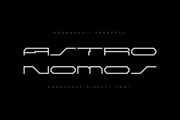
Astro Nomos is an experimental monospace display font characterized by its ultra-wide treatment and futuristic sci-fi aesthetic. Its unconventional proportions and distinctive spacing make it an eye-catching choice for creative projects that aim to evoke a sense of innovation and otherworldliness. While it does not specifically target the
24. Reality Font
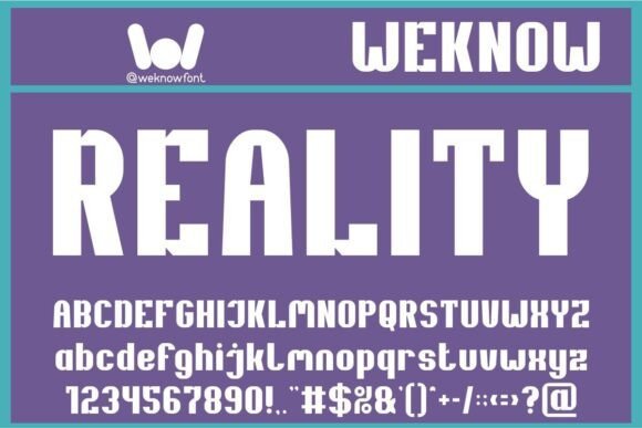
Unveiling Reality, a futuristic sophistication to your digital canvas that echoes a harmonious blend of geometric and modular design. Imagine a typeface that encapsulates bold strength, shining brightly with its high-contrast, blocky allure. A monospace display font, Reality stands out as a visual embodiment of authority and innovation. Ideal for enhancing logos, emblazoning headlines, and breathing fresh life into your corporate identity or brand imprint. A perfect match for the fashion industry, it shines in the glossy pages of magazines and books and adds a cinematic flair to music, movies, and gaming experiences. With Reality, let your comics and cartoons radiate a captivating charm on YouTube and Instagram platforms. Amplify your website’s presentation or fire up your creative ventures, adding a futuristic touch with this exceptional typeface. Infuse your designs with the dimensions of Reality, the font that commands attention.
25. Bova Monospace Font
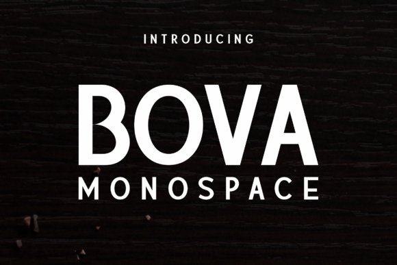
Exuding a distinctive fusion of elegance and strength, Bova Monospace offers a versatile typographic solution that balances contemporary design trends with timeless appeal. Its sharp, clean lines and structured letterforms make it an excellent choice for high-impact editorial layouts, branding projects, and striking visual compositions. The font’s ability to adapt seamlessly across various mediums—be it print or digital—makes it particularly valuable when creating magazine spreads with bold headlines or eye-catching posters that demand attention.
Designed with a subtle sophistication, Bova Monospace elevates both assertive titles and delicate body texts, ensuring each component of your project receives the attention it deserves. Its professional appearance is ideal for projects where clarity, modernity, and visual authority are paramount, such as corporate branding, creative campaigns, or event posters. The balanced proportions and modern aesthetic help communicate messages with confidence and style, regardless of the context.
“
Recommendation: I find Bova Monospace to be a superb typeface for projects that need a commanding yet refined presence. Its versatility in both bold and subtle applications makes it a top pick for creative agencies working on branding, editorial design, or poster art that aims to impress and broadcast professionalism.
My Recommendation: I love using Bova Monospace for branding projects that require a strong visual identity. Its sophisticated look adds depth to magazine layouts and poster designs, making visual statements that stand out while maintaining a polished edge.
26. Monoglyphic Font
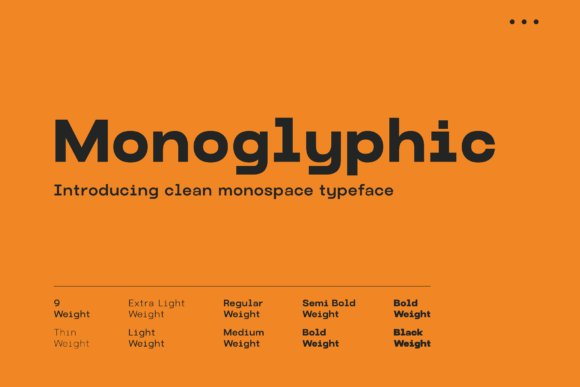
Introducing Monoglyphic, a meticulously crafted monospace font that champions clarity in even the most cluttered visual environments. Its precise, consistent character design ensures optimal readability and aesthetic harmony, making it a superb pick for digital interfaces, technical documentation, and creative coding environments. Monoglyphic’s balanced and straightforward letterforms eliminate visual noise, allowing content to breathe while maintaining a modern and sophisticated appearance.
This typeface is especially beneficial for projects that demand precision—such as coding environments, data visualization tools, or minimalist web designs—where every character’s alignment contributes to overall clarity. Its clean, harmonious style also lends itself well to branding materials aimed at tech companies, modern startups, or digital art projects seeking a no-nonsense, elegant aesthetic.
“
Recommendation: Monoglyphic is my go-to monospace font when I need a crisp, uniform look that emphasizes readability without sacrificing style. It’s particularly effective for web design, UI elements, and content-heavy technical layouts that require a refined touch without any distractions.
My Recommendation: I use Monoglyphic for technical projects, such as web development and digital interfaces, where clarity and consistent spacing are critical. Its sleek form helps communicate complex information effortlessly and elegantly.
27. Basic Inktrap Font
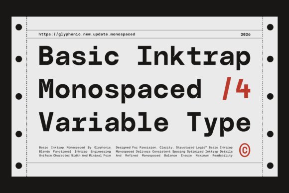
Basic Inktrap is a modern mono-typeface that emphasizes precision through innovative inktrap engineering, ensuring every character maintains flow and consistency. Its sharp geometric forms and uniform spacing deliver a clean, technical aesthetic that’s well-suited for contemporary digital environments. Designed with functionality in mind, Basic Inktrap’s distinctive inktrap details enhance readability and visual rhythm, making it a perfect fit for developer tools, technical interfaces, and innovative branding initiatives.
Thanks to its balanced structure and well-calibrated letterforms, Basic Inktrap excels in contexts requiring clarity, especially in grid-based layouts, coding editors, and interface design. The font’s refined cuts and consistent character widths improve legibility at various sizes, supporting a seamless user experience in modern tech-oriented projects. If you are creating a cutting-edge app, a sleek tech website, or a clean editorial layout, Basic Inktrap provides the structured visual foundation you need.
“
Recommendation: I appreciate Basic Inktrap for its technical precision and modern geometric design—ideal for interface mockups, software UI, and digital branding. Its clarity and inktrap detail add a layer of sophistication to any project requiring a crisp, professional look.
My Recommendation: I often choose Basic Inktrap for interface and tech branding projects, as its geometric style and precise spacing help communicate innovation and clarity. It’s particularly useful in scenarios where structured alignment and readability are paramount.
28. Morequiet Font
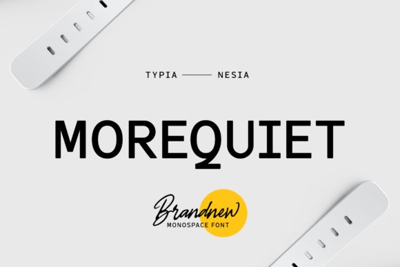
Morequiet is a modern monospace font that offers a sleek, minimalistic aesthetic perfect for establishing a clean and contemporary visual identity. Its sans serif structure provides excellent readability and a structured appearance, making it highly suitable for branding, editorial projects, and editorial design that demand clarity and sophistication. The typewriter-inspired elements of Morequiet lend a subtle nostalgic touch, which can be leveraged creatively in magazine layouts, fashion promotions, or even in ticket and stationery designs where a touch of vintage charm meets modern minimalism.
As a carefully crafted monospace font, Morequiet excels in projects requiring uniformity and precision, such as logo design, promotional materials, or custom typography for art quotes and home decor displays. Its versatility allows it to blend seamlessly into various media, from web blogs to print publications, emphasizing clarity and visual impact. When working on projects that aim to communicate professionalism while maintaining a stylish edge, Morequiet stands out as an excellent choice for creating memorable branding assets or editorial headlines. Its balanced proportions and clear-cut letterforms ensure it remains highly legible at different sizes, making it a practical, yet visually compelling, asset in your typographic toolkit.
My Recommendation: I find Morequiet to be a go-to monospace font when aiming for a modern yet nostalgic look in branding or editorial design. Its clean lines and versatile style make it ideal for projects that need a straightforward but stylish textual foundation, especially in logo creation or magazine headings where clarity and aesthetic appeal are paramount.
29. Feldiora Font
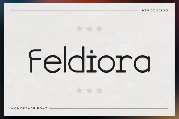
Feldiora is a striking display font distinguished by its unique monospace design, offering a bold and eye-catching aesthetic for creative projects. Its distinctive glyphs and ligatures give each letter a sense of character, making it particularly effective for headlines, posters, or branding materials that require a high visual impact. Though not explicitly a
30. Perfect Mansion Font
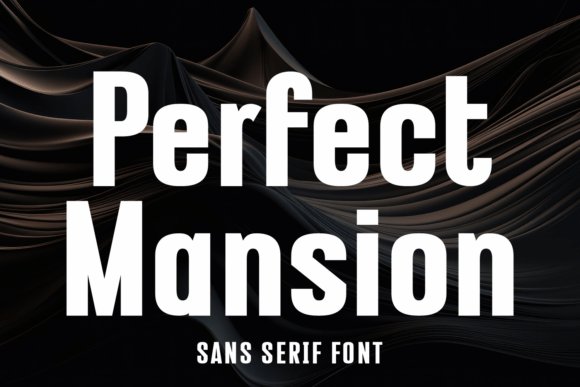
Immerse yourself in the world of typography with the stunning “Perfect Mansion Condensed Grotesque Display Font.” Engineered with singular precision, it excels as a headline font, showcasing a neatly readable condensed style. The fluidity of this variable font makes it versatile as a logo or packaging design element, refracting contemporary charm with its classic sans serif and bold slant compositions. This exceptional font graces your brand logo with an extra edge, and elevates your flyer design efforts into a new realm. Being a digital font, it effortlessly instills a modern, fresh, and clean aesthetic in editorial and magazine layouts. Perfect Mansion isn’t just a font, it’s an expression of modern design ethos blending informal softness and stark legibility. This contemporary monospace embodies smoothness, easily adaptable for web design, and showcases superior design versatility in all print manifestations. Harness the essence of this extraordinary font and take your design palette to the next level!
31. Vefile 89 Sans Serif Font
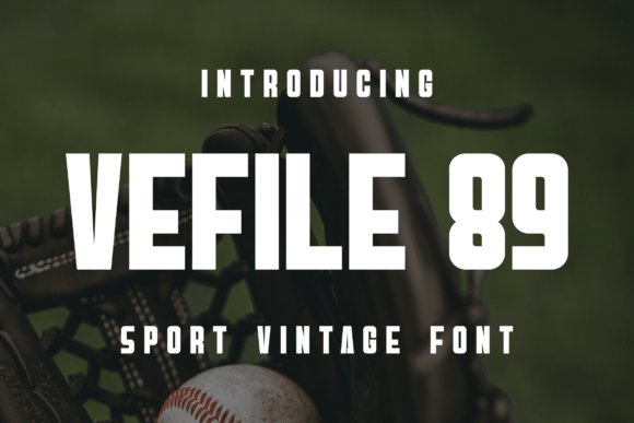
Vefile 89 stands out as a bold and assertive sans serif font that commands attention and delivers clarity in any visual context. Its robust weight and clean lines make it an excellent choice for headlines, branding, or impactful display text. When incorporating this type in your projects, especially those emphasizing modernity and strength, it can significantly enhance visual hierarchy and readability.
While not explicitly categorized as a monospace font, Vefile 89’s strong geometric structure can also lend itself well to designs that require uniformity and precision, such as digital interfaces or technical documentation. Its commanding presence makes it ideal for projects where a confident tone is necessary—whether on posters, signage, or bold web banners. As a versatile addition to your font library, Vefile 89 can elevate creative outputs that demand both authority and legibility.
Download Vefile 89 Sans Serif Font
My Recommendation: I find Vefile 89 particularly useful for creating striking headlines and branding elements that need to grab attention immediately. Its bold weight and simple forms work well in design projects aiming for a modern, no-nonsense aesthetic—especially suited for tech startups or product packaging where clarity and impact are paramount.
Selecting the right monospace fonts can improve the clarity, aesthetic, and professionalism of your digital content. With this curated list of 31 options for 2026, you’ll find the perfect monospace fonts to suit your coding, design, or presentation needs, ensuring your projects stand out with both style and functionality.