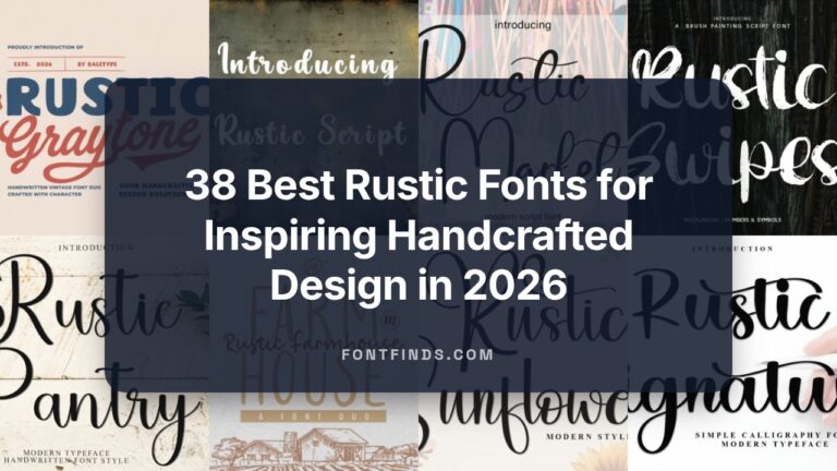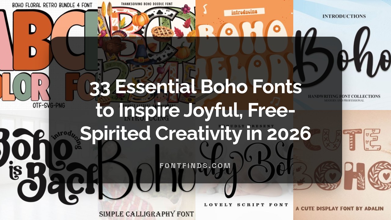
33 Essential Boho Fonts to Inspire Joyful, Free-Spirited Creativity in 2026
Boho Fonts unlock a free-spirited aesthetic that blends handwritten charm, rustic textures, and earthy display styles for modern creatives. Whether you’re designing wedding invites, logos, or social media graphics, these 33 selections bring bohemian typefaces and artisanal warmth to every project.
In this 2026 roundup I highlight versatile boho lettering, script and decorative fonts with practical tips for pairing, licensing notes, and use-case ideas. Expect a mix of vintage-inspired scripts, organic sans alternatives, and ornamental display faces to help you craft soulful, joyful designs.
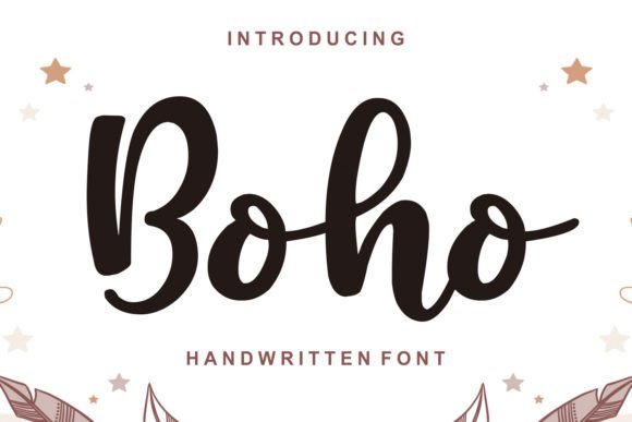
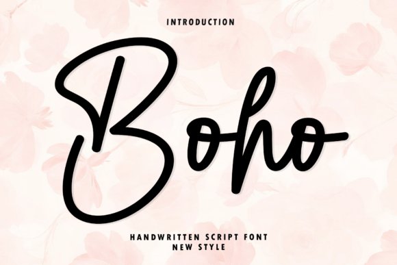
1. Boho Font
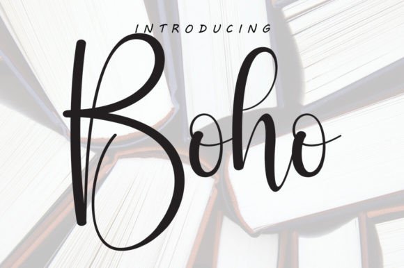
Boho strikes a graceful balance between spontaneous handwriting and refined calligraphy. Its flowing strokes and delicate terminals create an intimate, artisanal feel while remaining surprisingly versatile for headlines, social media graphics, and boutique branding. The typeface delivers generous alternates and tasteful swashes that let you craft bespoke wordmarks without heavy editing, and its subtle baseline shifts add a human touch that reads as authentic rather than manufactured.
Technically, Boho performs well as an OpenType family: the kerning is thoughtfully tuned and contextual alternates reduce collisions in long words. For web and app use you’ll want to test at smaller sizes-its charm lives in display contexts where the swoops can breathe. Because it includes multiple language glyphs and stylistic sets, Boho works across locales while preserving a cozy, handcrafted personality.
Design-wise, Boho responds beautifully to textured backgrounds, muted earthy palettes, and natural photography, bringing a bohemian warmth to stationery, wedding invitations, and artisanal packaging. Pair it with a clean geometric sans for contrast or a thin serif for editorial elegance. If you need a readable, stylish script that reads intimate and modern, Boho is a strong choice for elevated, craft-forward projects-especially where a romantic, free-spirited aesthetic is the goal.
My Recommendation: I’d reach for this Boho Font when the brief calls for warmth and personality-think boutique wedding suites, handmade product labels, or lifestyle blogs. Its alternates let me create distinct logotypes without heavy vector work, and the font’s balanced kerning keeps design time down. It’s my go-to when I want a handcrafted look that still feels polished and professional.
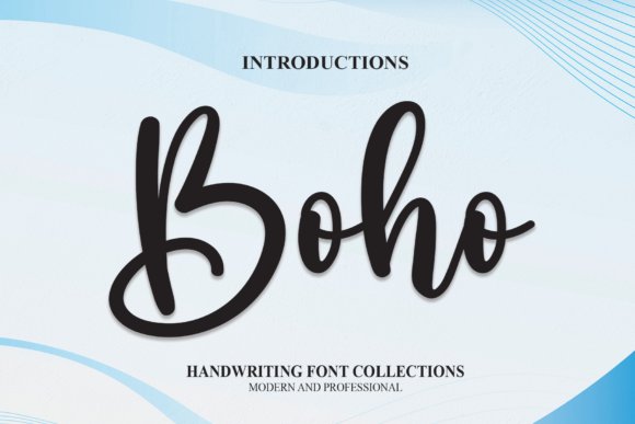
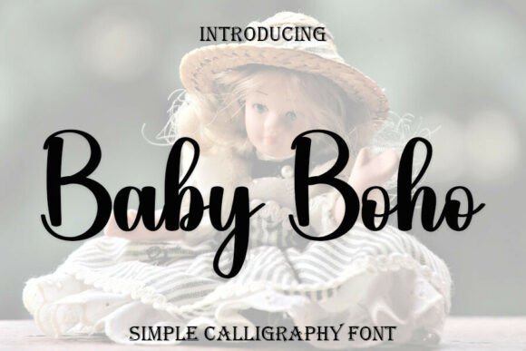
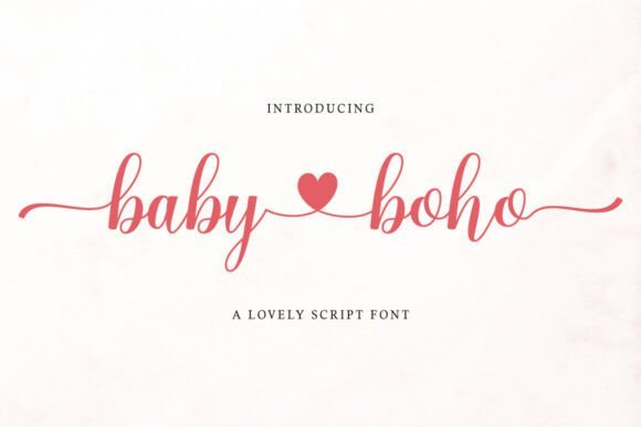
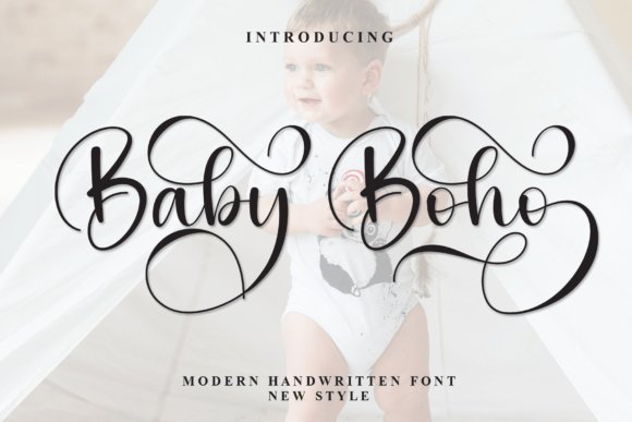
2. Baby Boho Font
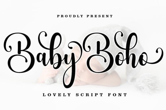
Baby Boho delivers a modern calligraphy voice with playful swashes and smooth stroke endings that feel effortless on invitations and product packaging. The regular weight sits comfortably between casual handwriting and structured script, making it legible at mid-size headlines while still offering flourish options for emphasis. What stands out is the font’s PUA encoding: every decorative glyph, swash, and alternate is easy to access even without advanced design software, which speeds up production for non-designers.
Because Baby Boho includes a generous set of stylistic alternates and ligatures, you can create unique signatures and branding marks simply by swapping characters. It pairs exceptionally well with minimalist sans-serifs for contemporary baby-product labels or with textured backgrounds for organic skincare branding. When using for cut crafts, test single-line conversions carefully-some swashes may need simplification for clean vinyl or embroidery paths.
In practical terms, Baby Boho is a pragmatic pick for small-batch packaging, social post headers, and hand-lettered quotes where charm and clarity must coexist. The PUA mapping is a real time-saver for teams that don’t have Glyphs access; just pull characters from Font Book or Character Map and you’re ready to style. For anyone needing an accessible, stylish script with decorative options, Baby Boho earns its keep.
My Recommendation: I use Baby Boho when a project needs approachable elegance-think boutique baby-brand identity, labels, or delicate wedding pieces. The PUA extras let me add flair quickly without relying on heavy software, which is great for fast-turn mockups. It’s ideal when you want hand-lettered warmth but need practical, production-friendly files.
3. Boho Font
This incarnation of Boho leans into seasonal craft and DIY uses, offering beginning and ending washes that read like playful brushstrokes. The decorative terminals work beautifully in holiday greetings, Cricut projects, and embroidery monograms where a stitched or cut flourish adds instant charm. Because the characters were designed with ornamental washes, they layer well over textured papers and photographic backdrops-a handy trait for greeting cards and product tags that need visual depth.
From a workflow perspective, Boho is versatile: its alternates make it straightforward to compose repetitive motifs without obvious repetition, and the thicker strokes hold up well when converted to SVG for vinyl cutting or laser engraving. Be mindful that extreme swashes can create overlapping shapes in small-scale uses; trimming or selecting simpler alternates solves this while preserving the typeface’s whimsical energy. It pairs particularly well with condensed sans-serifs or light-brushed serifs for contrast.
Overall, this Boho Font is crafted for makers and seasonal designers who want a spirited, crafty look that scales from greeting cards to embroidered goods. Its ornamental features encourage experimentation-stacked compositions, foil accents, and layered textures all play nicely with the font’s expressive personality. If your project benefits from hand-drawn warmth and festive flourish, this version brings a lot to the table.
My Recommendation: I’d pick this Boho Font for craft-driven projects-holiday stationery, custom apparel, and Cricut-ready designs are perfect fits. Its beginning and ending washes make items feel handmade and celebratory, while the stronger strokes survive physical production processes. It’s my preference when a design needs a whimsical, artisanal edge that photographs and cuts cleanly.
4. Boho Floral Dingbat Font
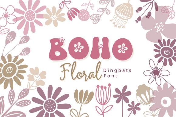
Boho Floral Dingbat is a meticulously drawn collection of floral icons that reads like a botanical sketchbook. As part of the Boho Fonts ecosystem, this dingbat set maps charming hand-drawn blooms and foliage across letters and numbers so you can insert ready-made illustrations by simply typing-no vector editing required. The approach makes it ideal for quick composition work while preserving an artisan, hand-crafted feel.
The glyphs range from delicate buds and wildflower stems to stylized daisies and leafy sprigs, each balanced for standalone use or layered combinations. Line weights are restrained and organic, producing a soft, rustic aesthetic that pairs beautifully with thin modern scripts or textured display faces. Use these motifs to create borders, corner flourishes, repeating patterns, or single focal icons.
Technically, the font is highly practical: it supports A–Z, a–z and 0–9 mappings, works in any app that supports custom fonts, and scales cleanly for print and digital. For richer compositions try overlapping characters, changing color fills, or grouping multiple glyphs to form wreaths and badges. This dingbat set is particularly useful for wedding suites, boutique branding, packaging, planners and social media assets that need a natural, feminine touch.
Download Boho Floral Dingbat Font
My Recommendation: I would reach for Boho Floral Dingbat whenever I need fast, handcrafted botanical artwork without opening a vector editor. Its mapped glyphs save design time and keep visual coherence across projects, especially wedding invitations, product labels, and planner pages. The icons are versatile enough to be used as small accents or as repeating pattern elements for a cohesive brand look.
5. Boho Kalesta Outline Font
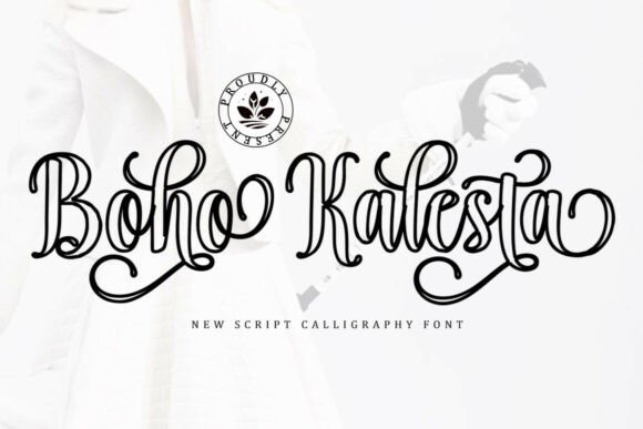
Boho Kalesta Outline is a refined calligraphic script with an airy outline treatment that reads both elegant and modern. The letterforms are drawn with graceful strokes and include alternate characters and ligatures that let you tailor the flow of words for a natural handwritten effect. Its outline style maintains legibility while adding a delicate, couture-like edge perfect for upscale projects.
Character set completeness is a strong suit here: anticipate uppercase, lowercase, punctuation, numbers, multilingual accents, alternates and carefully curated ligatures. That breadth makes the typeface work across editorial spreads, product packaging, romance novels and luxe stationery where stylistic variety and language support matter. The alternates provide multiple flourish options without overwhelming a layout.
From a production perspective the font is clean and easy to apply: the outline form reproduces well in letterpress mockups and digital emboss effects, and the thin strokes translate nicely to both web headers and printed invitations. Pair it with a muted serif or a soft textured background to amplify its romantic, feminine sensibility and preserve readability at smaller sizes.
Download Boho Kalesta Outline Font
My Recommendation: I recommend Boho Kalesta Outline for projects that need a poised, romantic script with design flexibility. Its alternates and ligatures let you craft bespoke wordmarks and invitation headers with a luxury feel. Use it when you want the sophistication of calligraphy but need a type solution that’s predictable and production-friendly across print and digital.
6. Boho Spring Bundle Font
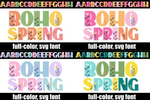
Boho Spring Bundle is a full-color SVG display family that fuses bold, rounded letterforms with integrated hand-drawn wildflowers and stitched-line accents. The result reads like a textile sampler: lively, tactile, and unmistakably artisanal. Because the illustrations are built into each glyph, you get high-impact typographic statements without layering separate graphics.
The font’s heavy structure and warm, earthy palette make it excellent for boutique branding, seasonal packaging and festival signage where you want to evoke a handcrafted marketplace vibe. The stitched-line motifs nod to embroidery and woven crafts, giving headlines and social media banners a rhythmic, handcrafted personality that stands out in crowded feeds.
On the technical side, this is an SVG color font, so compatibility is strongest in modern design apps that support multi-color glyphs (for example recent versions of Photoshop and Illustrator). It’s best used for large-scale display, short headlines, and logos rather than dense body text. Combine with minimal neutral backgrounds and simple subheads to let the floral detailing sing without visual clutter.
Download Boho Spring Bundle Font
My Recommendation: I’d choose Boho Spring Bundle when a brand or event needs joyful, handcrafted typography that reads like seasonal art. Its built-in color and floral elements deliver immediate personality for headers, posters and packaging. Use it for boutique product lines, spring festival marketing, or any project that benefits from bold, artisanal charm and strong visual presence.
7. Boho Melody Font
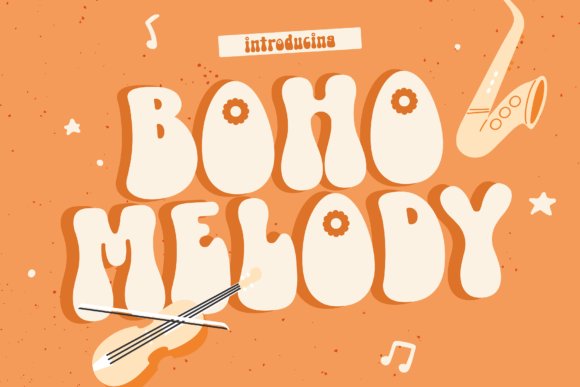
Boho Melody channels a playful 1970s spirit through rounded, chubby letterforms and rhythmic curves that instantly read as retro yet modern. As a display typeface it leans into flamboyant shapes-think disco signage and vinyl-era posters-while remaining structured enough for legible headlines. Because of its nostalgic-meets-contemporary personality, Boho Fonts enthusiasts will appreciate how it brings instant era-specific character without feeling gimmicky.
On the technical side, generous counters and measured spacing make each word breathe even at large sizes; alternates and lively ligatures create motion within copy, so short headlines feel like they’re dancing. The face is optimized as a display weight, favoring bold compositions and graphic treatments rather than long body text. Designers will value its clear curves and consistent stroke contrast when working in print and on-screen environments.
In practice, Boho Melody excels on album covers, event posters, boutique packaging, and social campaigns that need a vivid vintage voice. Pair it with a neutral sans for contrast or a restrained serif for editorial flair; textured backgrounds and warm palettes amplify its seventies charm. Use it where personality and presence are priorities-it’s a statement display that reads well across modern branding and retro-inspired projects.
My Recommendation: I’d reach for Boho Melody when a design brief calls for bold, nostalgic personality-festival posters, retro-brand refreshes, or boutique product labels are perfect fits. Its strong, rounded shapes make headlines pop while stylistic alternates let you tailor the mood from playful to sultry. If you want instant seventies charisma without sacrificing legibility, this is a dependable, characterful display choice.
8. Boho Font
Boho Font is a refined modern script that blends smooth connections with clear letter anatomy, producing a handwritten feel that stays readable. The strokes are elegant but restrained, avoiding excessive ornamentation so the script adapts well to a range of contexts from classy invitations to polished branding. Its overall rhythm gives a warm, intimate voice suitable for lifestyle and fashion work.
OpenType support includes contextual alternates and discretionary ligatures, enabling subtle customizations-tighten joins for formal applications or introduce swashes for logo marks. The designer kept baseline consistency, which helps when pairing this script with sturdy sans-serifs or delicate serifs for editorial layouts. The balance of glamour and simplicity makes it a versatile tool for stationery, labels, and identity systems.
Because of its many stylistic variants, you can craft signature-ish wordmarks without needing bespoke calligraphy. Pay attention to tracking and line-height: a little extra space preserves its airy charm and prevents overcrowding. Overall, Boho Font reads as fashionable and approachable, making it a go-to script when you want elegance with everyday legibility.
My Recommendation: I’d choose this script for wedding invitations, boutique branding, and beauty packaging where a polished, feminine touch is desired. Its alternates let you personalize copy without custom lettering, speeding up workflow while keeping designs unique. For projects needing both sophistication and readability, this font strikes an excellent balance.
9. Thanksgiving Boho Doodle Font
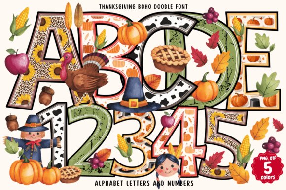
Thanksgiving Boho Doodle is an OpenType-SVG color font packed with hand-drawn autumnal motifs and textured brushwork embedded directly into each glyph. Leaves, pumpkins, woven patterns, and doodle accents are built into the letter shapes, delivering instant seasonal charm without adding separate artwork. That makes it ideal for quick-turn festive designs that benefit from a homemade, rustic aesthetic.
Technically, this is a color font that requires software with SVG font support-Photoshop, Illustrator, Silhouette, and Inkscape are compatible-so plan your workflow accordingly; the OTF/TTF variants won’t reproduce the embedded color art. For environments lacking SVG support, export colored text as vectors or prepare layered artwork in a supporting app to preserve the look. The format offers designers a fast route to richly decorated typography when used in the right tools.
For best results, use the font at medium-to-large sizes so the pictorial details remain legible; pair it with a simple neutral type for body copy to avoid visual competition. It’s fantastic on greeting cards, stickers, seasonal signage, classroom projects, and social posts that want a handcrafted, cozy vibe. The font’s integrated colors and doodles give projects immediate personality while saving time on illustrations.
Download Thanksgiving Boho Doodle Font
My Recommendation: I recommend Thanksgiving Boho Doodle for seasonal campaigns, classroom crafts, and small-batch product labels that need an instant handmade look. Its embedded artwork speeds production-no separate illustrations required-so you can iterate quickly in supported apps. Just remember to work in software that handles SVG fonts or export flat artwork to ensure the colorful details hold up across platforms.
10. Boho Beach Font
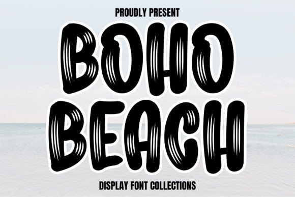
Boho Beach is a sunny, playful display font that channels beachy bohemian vibes into every curve. As a member of modern Boho Fonts trends, it combines hand-drawn warmth with tidy letterforms so your craft projects look both charming and intentional.
The letterforms include soft terminals and subtle swashes that feel handcrafted without sacrificing legibility at headline sizes. Use it for stickers, signage, or packaging to add an inviting, artisanal personality – perfect for makers and small-batch brands.
Technically generous with clear spacing and friendly counters, it pairs beautifully with a minimal sans for balance or a light script for more flourish. It also translates well to Cricut cut files, heat-transfer vinyl projects, and digital hero headers where an organic, coastal look is desired.
My Recommendation: I’d reach for Boho Beach when designing lifestyle and craft projects that need warmth and personality-think product labels, market stall signs, or wedding welcome boards. Its readable curves make it easy to use at large sizes while still feeling handmade. If you want a relaxed, beach-inspired aesthetic that’s instantly approachable, this font delivers.
11. New Boho Font
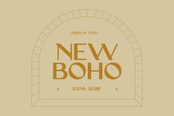
New Boho is an off-kilter sans serif that embraces playful imbalance to create characterful headlines and logos. Its large library of ligatures and alternate glyphs lets you compose unexpected letter combinations that feel artisanal and polished at the same time.
Although rooted in minimalist sans construction, the font’s quirky details lend a whimsical bohemian spirit ideal for modern lifestyle brands, editorial headers, and bold web hero text. The many stylistic sets let designers fine-tune tone from refined to free-spirited without switching typefaces.
For best results pair New Boho with a clean serif or a subtle script to introduce contrast while preserving readability; adjust tracking for long strings to maintain rhythm. Its versatility makes it great for logo marks, social graphics, and identity work where a distinctive but restrained voice is required.
My Recommendation: I recommend New Boho when you want a contemporary brand voice that’s both elegant and a touch quirky-perfect for boutiques, cafés, and creative studios. The ligature set is a real asset for crafting unique logotypes and hero text. Use it when you need personality without abandoning a clean, modern aesthetic.
12. Boho Feather Dingbats Font
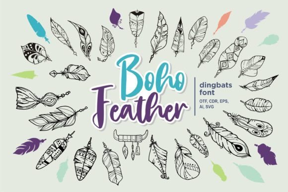
Boho Feather is a curated dingbats font filled with delicate feather illustrations and bohemian ornamentation designed to complement hand-lettered work. Each glyph reads as a tiny hand-drawn motif, making it straightforward to add organic details without sourcing separate vector files.
This set excels for decorative uses: separators, corner flourishes, pattern building, and bullet icons for wedding stationery, product tags, or lifestyle branding. The cohesive style of the icons helps maintain a unified look across collateral while introducing tactile, natural themes.
Because the elements are font-based you can scale, color, and combine them directly in layout apps via the glyph panel or character map. They’re ideal for rapid prototyping of packaging, social templates, or laser-cut pieces where consistent, lightweight ornamentation is required.
Download Boho Feather Dingbats Font
My Recommendation: I’d pick Boho Feather when a project needs handcrafted iconography without the hassle of managing many SVGs-weddings, boutique packaging, and social templates come to mind. The motifs are easy to mix and match and keep designs feeling cohesive and artisanal. It’s a fast way to layer subtle bohemian details that elevate otherwise simple layouts.
13. Boho Chic Font
Within the family of Boho Fonts, Boho Chic brings an artisanal, hand-crafted personality that reads equally well on boutique packaging and wedding suites. Its letterforms have a relaxed, slightly irregular rhythm with extended swashes that feel deliberate rather than fussy, making it a strong choice when you want a designer script without appearing ostentatious. The overall balance of open counters and graceful stroke endings gives it a readable warmth even at display sizes.
Technically this face is PUA encoded, so every alternate, decorative swash, and special glyph is immediately accessible from standard glyph panels – no complex OpenType workflow required. That makes exploring contextual alternates and layered flourishes quick, which is especially useful when customizing logos or creating multiple headline styles from a single font file. Because the alternates are varied, you can generate distinct looks for stationery suites while keeping a unified typographic voice.
Boho Chic scales nicely from laser-cut signage down to social thumbnails: the thicker downstrokes hold up to printing effects such as foil and embossing, while the finer details remain elegant in high-res digital files. When pairing, try a simple geometric sans for contrast or a textured paper background to enhance the handmade vibe. If you want a single script that gives you both ornate swashes and practical legibility, Boho Chic is a versatile addition to a designer’s toolkit.
My Recommendation: I’d reach for Boho Chic when designing artisanal product labels, personalized wedding invitations, or boutique identity systems because it provides both decorative swashes and practical readability. The PUA-encoded alternates save time in production and let you create varied compositions without additional fonts. For projects needing a refined but friendly bohemian aesthetic, this font delivers customizable charm and strong visual presence.
14. Boho Font
This Boho script reads as a warm, handwritten cursive with soft terminals and easy-going connections that evoke approachable, everyday elegance. The rounded shapes and modest stroke contrast give it a friendly voice, perfect for short headlines, social graphics, and casual event invites. Its informal rhythm makes layouts feel personal rather than formal or overly stylized.
Designed with a moderate x-height and compact letterforms, the font holds up well at small to medium sizes, so it’s useful for product tags and web banners where space is limited. Expect a touch of baseline bounce and slightly irregular spacing that enhances its hand-lettered charm; minor kerning adjustments may polish tight pairings. For color-forward projects, it harmonizes with playful illustrations and textured backgrounds without competing for attention.
Because it’s primarily a display script, treat it as an accent rather than body copy and avoid heavy type treatments that obscure its crisp strokes. Pair it with a clean sans for hierarchy or use it alone in single-word logos for instant friendliness. If you need a quick, attractive script that feels handmade and modern, this Boho works well for approachable branding and lifestyle graphics.
My Recommendation: I’d use this Boho for cheerful greeting cards, kid-focused packaging, and lively social media headers because it conveys warmth and accessibility. Its compact forms are great when layout space is tight, and it pairs effortlessly with simple sans-serif companions. For projects that require an inviting, casual script with a handcrafted feel, this font is an excellent choice.
15. Boho Font
This Boho variant is a refined, fluid handwritten script that leans toward luxury and editorial elegance rather than rustic playfulness. The strokes show a tasteful contrast between hairlines and fuller downstrokes, and the letter connections are elongated to produce graceful ligatures and flowing words. It reads as sophisticated and deliberate, ideal for projects that need a polished, couture touch.
OpenType features such as discretionary ligatures, stylistic sets, and contextual alternates expand creative options, allowing subtle variations across a wedding suite or brand identity without breaking visual cohesion. It performs beautifully in foil stamping, embossing, and high-resolution print where its fine details can be appreciated. For digital use, consider slightly increased tracking to preserve legibility at small sizes and to showcase the script’s ornate forms.
As a display face, this Boho pairs exceptionally well with a minimalist serif or a modern sans to anchor layouts while letting the script shine. Avoid using it for dense copy; instead, use it for signatures, logos, mastheads, and luxe packaging where one or two words can make a statement. If your goal is elegant personalization with high-end production finishes, this font delivers a sophisticated, timeless look.
My Recommendation: I’d choose this Boho for upscale wedding invitations, boutique brand logos, and editorial bylines because it offers refined stroke contrast and customizable alternates that elevate premium projects. Its strength is in creating a sense of handcrafted luxury while remaining distinctly modern. When you want a script that reads as bespoke and elegant-especially for print treatments like foil or emboss-this design is a go-to.
16. Boho Floral Retro Font
Boho Floral Retro is an attention-grabbing color OpenType-SVG serif with bold, chunky letterforms and decorative floral fills that read like printed stickers. As a color font it brings instant texture and personality to headlines and packaging, and if you collect Boho Fonts for mood-driven identity work this one is a standout for playful, craft-forward projects. The floral fills are vector-based within the font file, so every character carries its own multicolor artwork rather than relying on layered artwork tricks.
Technically, this font is optimized for modern design apps: it works smoothly in Photoshop and Illustrator (current versions), and is also supported by Silhouette and Inkscape. Note the limitation: OTF/TTF exports of this design are not compatible with Cricut – you’ll either use native SVG support in apps that accept it or export artwork as vectors/PNGs for cutting machines. Always test a sample glyph in your target software before committing to a large batch.
For best results pair Boho Floral Retro with understated sans-serifs or clean script accents so the rich color fills remain the visual hero. Reduce tracking slightly for display copy, avoid very small sizes where complex fills blur, and consider using a single dominant color palette when printing to maintain legibility. If you need a fallback for older apps, create flattened SVG/PNG assets or provide a monochrome outline version to preserve the shape while losing the embedded color.
Download Boho Floral Retro Font
My Recommendation: I’d reach for Boho Floral Retro when I want an instant handcrafted, artisanal headline that reads as both vintage and contemporary. Its built-in multicolor fills save time in mockups and social posts, and it’s perfect for boutique packaging, festival posters, and lifestyle branding that benefits from floral, tactile detail. I’d avoid it for long text or tiny labels – use it where display impact matters most.
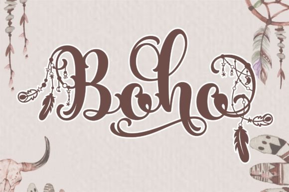
17. Boho Font – Boho Fonts
Boho is a gentle, cursive handwritten font with flowing connections and a relaxed calligraphic rhythm that feels both romantic and modern. Rather than rigid pen strokes, its lines show subtle variation that gives designs a personal, human touch – excellent for projects that want warmth without looking overly ornate. The letterforms maintain good openness, which helps readability at display sizes like logos and invitations.
Functionally, Boho works beautifully across branding, wedding stationery, and fashion lookbooks because it reads as elegant but not precious. It pairs well with minimalist sans-serifs for contemporary logos or with light, textured serifs when you want a vintage boutique vibe. Look for alternate characters and ligatures in the font file to introduce natural-looking variation for repeated letters.
When using Boho for print or web, pay attention to spacing and kerning; a small negative tracking often tightens the word shapes into a cohesive mark. Use it as a primary headline or signature wordmark, and reserve simpler type for body copy to avoid visual clutter. For more handcrafted outcomes, layer the font with subtle textures or watercolor backgrounds to amplify its intimate feel.
Download Boho Font – Boho Fonts
My Recommendation: I’d use Boho when I need a friendly, sophisticated script that reads like a hand-signed note – ideal for boutique branding, wedding suites, and high-end social posts. Its natural flow and alternates make logos feel bespoke without hiring a letterer. Pair it with neutral supertypes and give it room to breathe so its personality shines.
18. Baby Boho Font
Baby Boho is a playful, cursive script whose rounded strokes and gentle bounce are crafted to feel whimsical and approachable. The lowercase forms tilt slightly and include soft terminals that suggest hand-drawn ink brushes, making the type especially suited to projects aimed at families, nurseries, and lifestyle brands with a cozy aesthetic. Visibility is strong at headline sizes thanks to open counters and friendly proportions.
This font is a great option for baby shower invites, children’s apparel tags, and social graphics that need warmth rather than formality. It harmonizes with muted palettes, soft textures, and simple geometric sans-serifs for contrast; for a more organic feel try pairing it with hand-drawn icons or watercolor backgrounds. Consider using stylistic alternates to introduce variety in repeated words for a handcrafted look.
Keep an eye on small-size legibility – Baby Boho shines in medium-to-large display use and can lose some detail when reduced too far. For packaging or labels, test printing on textured stock since the font’s charm often improves with tactile materials. When used thoughtfully, it helps brands feel intimate, trustworthy, and delightfully human.
My Recommendation: I recommend Baby Boho for any project that needs a soft, friendly script voice – think baby announcements, boutique children’s brands, and cozy product packaging. Its rounded shapes make designs feel personal and inviting, while alternates keep repeated copy interesting. Use it large and let simpler type handle supporting text so the playful character isn’t overwhelmed.
19. Baby Boho Font
Baby Boho is a delicate, hand-drawn script that balances airy loops with surprisingly controlled structure. The strokes feel organic and intimate-perfect for projects that need that handmade charm-yet the letterforms remain consistent enough for short blocks of text like social captions or taglines. This design reads as both whimsical and refined, an ideal fit if you want a warm, artisanal voice in your work.
Under the hood, Baby Boho delivers a generous set of alternates, contextual ligatures, and swashes which let you craft bespoke wordmarks and greetings. It’s optimized for web and raster use, and it behaves well at Instagram header sizes while still holding up on printed invites. For designers searching for authentic bohemian assets, Baby Boho sits comfortably among modern Boho Fonts for blended modern-vintage looks.
In practice this font shines on baby shower stationery, boutique product labels, and intimate branding where emotion matters more than rigid geometry. Pair it with a clean sans for contrast or a light serif to lean into vintage romance; the alternates make each lockup feel custom-made without needing advanced vector edits. Overall, it’s a focused script with personality and practical utility.
My Recommendation: I’d pick Baby Boho when I want warmth and approachability-its soft, flowing strokes create immediate emotional connection. It’s especially useful for baby-related goods, wedding stationery, or Instagram assets where hand-crafted flair sells. The alternate glyphs let me customize layouts quickly, so it’s a go-to when I need something that feels bespoke without a long design process.
20. Tranquilo Monoline Boho Font
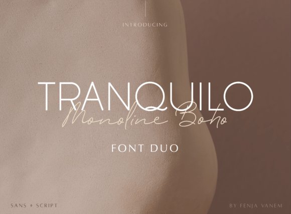
Tranquilo Monoline Boho is a considered duo: a restrained monoline script paired with a minimalist sans, producing a refined and contemporary voice. The script has graceful, even-weight strokes that read cleanly at display sizes, while the sans provides structure and balance-together they form a polished aesthetic suited to premium branding. The overall effect is serene, never fussy, which helps projects feel confident and uncluttered.
Technically this family is thoughtfully built: consistent x-heights, smooth joins, and carefully adjusted kerning let typeset lines sit harmoniously. The package includes PUA-encoded glyphs so you can access swashes and alternates without specialized tools, which speeds up layout work. Because the elements are intentionally restrained, they adapt well across print and digital touchpoints from labels to editorial spreads.
Use Tranquilo for luxury product labels, clean editorial mastheads, or boutique identity systems that need an elevated yet approachable voice. My pairing tip: let the sans carry body copy and deploy the monoline script sparingly-on logos, callouts, or signature lines-to keep the look sophisticated. It’s a quiet, elegant choice when over-the-top ornamentation would feel out of place.
Download Tranquilo Monoline Boho Font
My Recommendation: I reach for Tranquilo when a client asks for understated luxury-think skincare, boutique hospitality, or elegant packaging. Its calm monoline script adds personality without overpowering a minimalist layout, and the sans gives dependable readability. The PUA glyphs make it easy to introduce subtle flourishes, so it’s great when you want restraint with moments of handcrafted detail.
21. Boho is Back Font
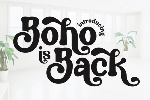
Boho is Back is a joyful, retro-inspired display face that channels 1970s warmth through chunky letterforms and playful curves. Its heavy weight and rounded terminals give text an approachable, tactile presence-ideal when you want to spark nostalgia or convey a free-spirited identity. This type shines at large sizes where its personality can breathe and make an immediate visual statement.
Designed primarily as a display font, it excels on posters, apparel, and social posts rather than dense body text. The exaggerated counters and wide forms create bold silhouettes that stand out on stickers and t-shirts, and the generous tracking helps maintain legibility across uneven print surfaces. Small alternates and stylistic caps add the kind of quirky detail that makes headlines memorable.
Stylistically it pairs well with a thin geometric sans or a subdued serif to ground the exuberance, and it’s especially effective for retro-branding, festival materials, and lifestyle merchandise. Because it evokes a handcrafted vibe, avoid using it for formal documents or tight copy blocks; instead let it lead hero graphics and brand moments. It’s a spirited display face built to attract attention and personality-driven appeal.
My Recommendation: I’d use Boho is Back when the brief calls for bold personality-think band posters, vintage-themed collections, or eye-catching merchandise. It gives immediate character and nostalgia, making designs feel tactile and memorable. For projects that need loud, friendly headlines, this is one of my first choices because it communicates warmth and attitude in a single glance.
22. Boho Charm Font
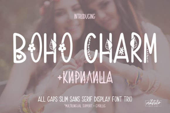
Boho Charm is a slim, hand-drawn all-caps trio that mixes retro bohemian flair with contemporary minimalism. The family typically includes a clean outline, a textured distress version, and a filled weight, giving designers layered options for depth and vintage character. The letterforms are narrow but well-proportioned, so they read clearly in headlines while retaining a handcrafted, artisanal vibe.
This font set is built to be versatile across branding and product work: it cuts crisply for Cricut and silhouette projects, prints beautifully on shirts and stickers, and translates into attractive phone-case and home-decor mockups. As part of the wider Boho Fonts aesthetic, the trio lends an authentic retro warmth without overwhelming modern layouts. Use the textured weight to suggest age and the clean weight for contemporary, airy compositions.
For pairing, let a soft script or a neutral serif play second fiddle to Boho Charm’s all-caps personality; metallics, sun-faded palettes, and natural paper textures amplify the boho-retro mood. Keep tracking slightly condensed for tight stacked logos, and increase spacing when the font is used at very small sizes to preserve legibility. Overall, it’s an economical toolkit for designers creating boutique branding, apparel lines, and social templates with a nostalgic, handmade edge.
My Recommendation: I reach for Boho Charm when I need a vintage-inspired yet clean display face that still feels handmade. Its trio approach lets me build layered compositions-use the textured version for apparel and the clean cut for brand marks. It’s ideal for small businesses, retro shirt collections, craft-product labels, and any project needing a tasteful boho-retro accent.
23. Boho Farmhouse Font
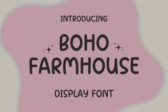
Boho Farmhouse is a cheerful sans-serif with rounded terminals and friendly proportions that evoke cozy, rustic interiors. The design leans into a handcrafted sensibility while staying geometric enough for modern layouts, giving it strong legibility across display and body sizes. Subtle quirks in certain letter shapes add personality without sacrificing clarity, making it a dependable choice for both print and digital use.
Where this face shines is in packaging, signage, and lifestyle branding: it feels right at home on product labels, recipe cards, café menus, and social media banners that aim for a warm, approachable tone. Its straightforward shapes also make it excellent for cutting machines and vinyl work, where clean contours matter. Designers will appreciate how it harmonizes with textured backgrounds and muted, earthy color palettes often found in farmhouse-inspired projects.
Pair Boho Farmhouse with a delicate script or a light serif to introduce contrast and hierarchy; keep headline sizes bold enough to let the friendly letterforms breathe. Kerning is naturally balanced, but watch spacing on all-caps combos to avoid crowding. For anyone building cottage-core or rustic lifestyle collections, this typeface is a practical, attractive workhorse.
My Recommendation: I use Boho Farmhouse when I want a warm, approachable headline that reads well across print and digital. Its rounded, craft-focused shapes make it perfect for product labels, food packaging, and cozy lifestyle branding. It’s a versatile choice for makers, cafés, and small brands that want a modern yet homely aesthetic.
24. The Boho Script Font
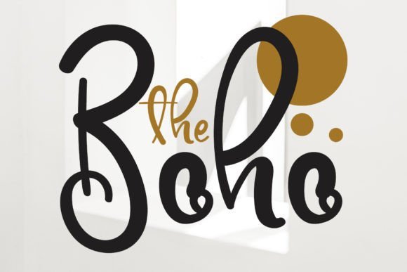
The Boho is a delicate, cursive handwritten script that fuses relaxed charm with refined flourish. Strokes show modest contrast and natural pen flow, producing an inviting, romantic quality perfect for projects that want to feel personal rather than overly formal. Letter connections are smooth and organic, so words maintain an elegant rhythm across lines and sizes.
It’s especially suited to wedding stationery, boutique branding, fashion lookbooks, and greeting cards where a touch of intimacy helps sell the concept. The typeface usually contains alternate characters and contextual ligatures that let you tailor letter joins for better readability and aesthetic variety. When scaled down for labels or scaled up for signage, the script maintains its character but benefits from careful tracking adjustments to avoid tangle in dense text blocks.
To get the most from The Boho, combine it with restrained sans-serifs or thin serifs to maintain hierarchy and let the script breathe. Consider warm metallics, watercolor textures, or soft neutrals to amplify the romantic mood. This script is a strong choice whenever you need typography that feels handcrafted, feminine, and effortlessly chic.
My Recommendation: I pick The Boho when a project needs an intimate, handwritten tone-wedding invites and boutique logos are natural fits. The flowing ligatures and alternates let me create unique wordmarks that feel bespoke. Use it sparingly as a display face to preserve its elegance and pair it with clean sans-serifs for balance.
25. Boho Baby Font
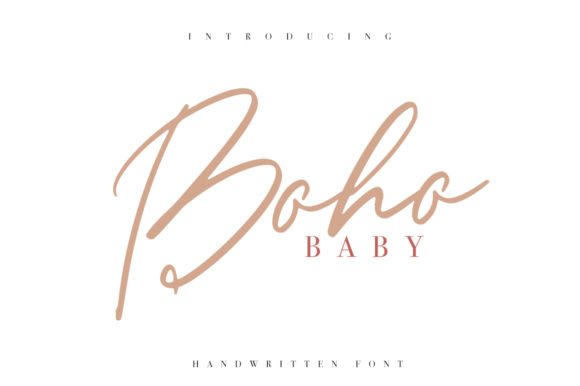
Boho Baby is a warm, hand-drawn script that blends classic typographic structure with relaxed, bohemian charm. Its flowing strokes and casual baseline shifts give headlines an inviting, artisanal quality while still remaining legible in longer lines-ideal for lifestyle blogs, boutique branding, and wedding collateral. As part of a broader boho aesthetic, Boho Baby pairs beautifully with textured backgrounds, muted palettes, and simple sans companions to create contemporary rustic compositions.
The font contains a generous set of alternates and stylistic endings that let you tune the personality from playful to sophisticated without changing families. Because it renders cleanly at a range of sizes, Boho Baby works equally well in web hero banners, social media posts, and printed stationery. For designers seeking type that feels handcrafted but reliable, this font is a strong candidate among Boho Fonts and modern script options.
Technically crisp with organic warmth, Boho Baby balances decorative flair and usability. Kerning and letterforms are thoughtfully handled, minimizing awkward gaps when used in headlines or subheads, and its weighted strokes translate well into both digital screens and high-resolution print. If you’re building a brand that needs approachable elegance-think artisan shops, boutique packaging, or intimate event invites-Boho Baby delivers personality without sacrificing clarity.
My Recommendation: I’d reach for Boho Baby when I want a handcrafted headline that still reads cleanly across formats. Its alternates let me craft bespoke wordmarks and invitations without juggling multiple type families. Use it for boutique brands, editorial covers, or wedding suites where a cozy, artisanal vibe is essential.
26. Boho Signature Trio Font
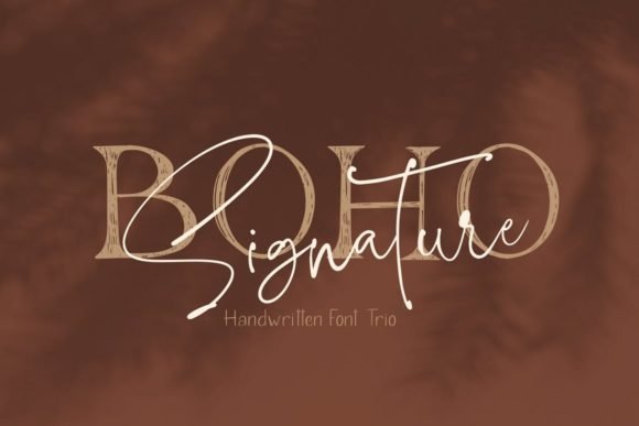
Boho Signature Trio is a coordinated type system that combines a lively script, a neutral sans, and an elegant serif to give designers an instant branding toolkit. The script brings personal, signature-like flourishes; the sans provides modern structure for body copy; and the serif lends editorial poise for headings or pull quotes. Because these three styles were conceived together, they maintain consistent stress and x-height, which simplifies pairing decisions and preserves visual harmony across layouts.
This family is PUA encoded, so decorative glyphs, swashes, and alternate characters are accessible even in basic apps-useful for rapid mockups or client presentations. The trio shines in packaging, social templates, and identity systems where a unified voice is needed across printed labels, web banners, and marketing collateral. Its balanced contrast makes it comfortable for both display applications and short blocks of text, giving you versatility without complexity.
What sets this set apart is the thoughtful interplay between the three styles: the script adds warmth, the sans offers clarity, and the serif supplies gravitas-together they form a cohesive visual language. For projects that require a polished but approachable look, this trio streamlines design workflow and reduces the guesswork of font pairing. Keep it in mind for lifestyle brands, boutique retailers, and seasonal campaigns that need consistent typographic identity.
Download Boho Signature Trio Font
My Recommendation: I’d use the Boho Signature Trio when I want a full typographic system that feels curated from the start. The matching script, sans and serif save time on pairings and keep brand work cohesive. It’s perfect for packaging design, multi-channel branding, and editorial projects where consistency and character matter.
27. Sweet Boho Font
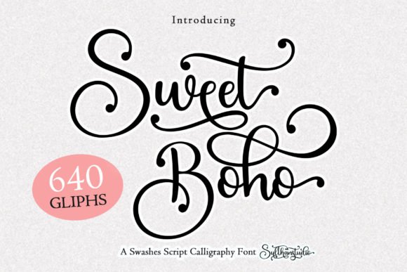
Sweet Boho is a delicate, graceful script with refined swashes and soft terminals that lend a romantic, handcrafted quality to any composition. Its flowing letterforms favor smooth connections and elegant curves, making it especially attractive for invitations, logo marks, and fashion-oriented layouts. The design reads as both modern and slightly vintage, which helps it bridge contemporary digital use and tactile printed pieces.
PUA encoding gives straightforward access to a variety of alternates and decorative glyphs, so you can add flourishes without specialty software. Sweet Boho performs best at display sizes where its subtle details and contextual alternates can be appreciated, yet it remains surprisingly legible in short paragraphs or pull quotes. Pair it with a restrained sans for readability or a light serif for a more editorial, feminine look.
This font excels when the goal is elegant personality rather than loud ornamentation; it enhances rather than overwhelms your layout. I’d recommend Sweet Boho for boutique branding, wedding stationery, lifestyle blogs, and product labels that need a soft, sophisticated accent. Its combination of charm and control makes it a dependable choice for tasteful, intimate design work.
My Recommendation: I’d choose Sweet Boho when the brief calls for refined, feminine charm-think high-end invites, fashion tags, or beauty branding. Its swashes add personality while remaining tasteful, and the PUA glyphs let me customize words quickly. It’s a go-to when I want understated elegance rather than bold expression.
28. Boho Love Font
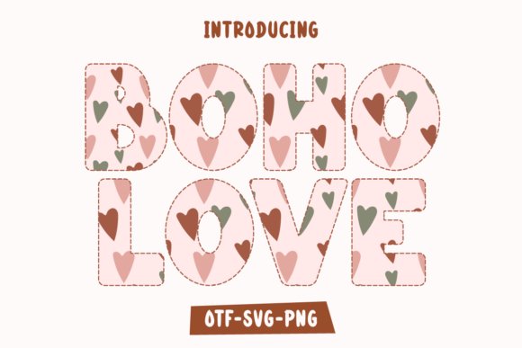
Boho Love is a playful, decorative color font built to add instant personality to apparel, stickers, and social posts. Its layered, multicolor aesthetic reads like hand-painted lettering – a perfect match for bohemian branding and craft projects that need a warm, artisanal touch. This design leans into lively alternates and ornamental details that let you create varied looks from a single typeface.
Because it’s designed as a colorful display face, Boho Love performs best at larger sizes where its textures and color layers can breathe; it’s ideal for T-shirts, tote bags, and product mockups. If you use design software that supports color fonts or layered SVG fonts, you can unlock multi-hued effects without building separate artwork layers. Pair it with a simple sans or thin serif to keep compositions balanced and to let the font remain the focal point.
For makers using Cricut, sublimation, or print-on-demand, the font speeds up production with ready-made color styling while giving projects an authentic hand-crafted vibe. Consider swapping in alternate glyphs for monograms or to create playful logotypes; the built-in quirks are what make this face feel bespoke rather than mass-produced. Overall, it’s a cheerful, tactile tool in any boho-oriented toolkit and works well across seasonal collections and market stalls.
My Recommendation: I love Boho Love for craft markets and seasonal product drops – it immediately reads handmade and joyful. Its color-ready layers save hours when producing mockups for apparel or mugs, and the alternates help you make each piece feel unique. Use it when you want designs that feel warm, casual, and unmistakably bohemian.
29. Nice Boho Font
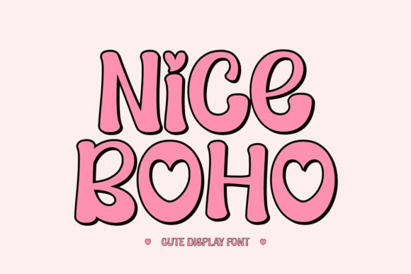
Nice Boho is a versatile display family that blends retro sensibilities with contemporary punch, offering designers a broad toolbox of groovy, chunky, and stylized letterforms. The collection’s strength is its range: you can jump from a nostalgic headline to a fashion-forward brand mark without switching typefaces, which makes it economical for multi-platform identities. Thoughtful weight contrast and generous x-height help it maintain legibility even when used at mid-size for social graphics or packaging labels.
What sets this display pack apart is its adaptability – several stylistic flavors echo eras from mid-century to modern streetwear, letting you tune the mood from warm and vintage to bold and trendy. It plays well with simple sans-serifs for body copy and with textured backgrounds when you want a tactile, handcrafted vibe. Designers working on T-shirts, banners, or seasonal collaterals will appreciate how quickly Nice Boho establishes visual personality.
Technically, the family is tuned for headline impact: strong kerning, distinctive terminals, and high-contrast shapes that read clean on both screen and print. The variety of decorative options reduces the need for additional ornamentation, making layouts feel intentional rather than overcrowded. If you need a single display system that can span social media, apparel, and promotional banners, Nice Boho is a practical and stylish choice.
My Recommendation: I’d reach for Nice Boho when building a cohesive campaign that needs one type family to do many jobs. Its stylistic range helps maintain brand consistency across seasons and product lines, and the bold display weights are perfect for merch and headlines. Use it when you want instant visual attitude without juggling multiple fonts.
30. Boho Astro Font
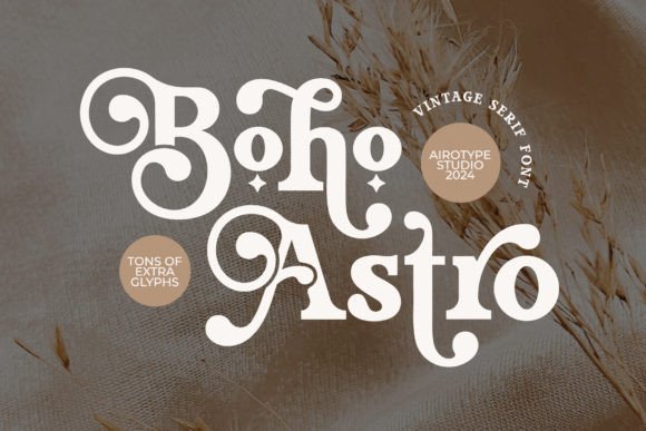
Boho Astro is a modern serif with vintage undertones, offering strong, confident letterforms softened by subtle curves – a marriage of classic editorial style and contemporary warmth. Its character set includes a generous number of alternate glyphs, which invite creative typographic treatments and make the font especially flexible for identity work. The overall voice reads refined yet approachable, which suits boutique brands and sophisticated craft projects alike.
Accessing the alternate characters can elevate logos, monograms, and wedding suites; while the original description mentions Font Book and Character Map, using OpenType-aware apps (such as Adobe Creative Cloud or Affinity) unlocks stylistic sets, ligatures, and contextual alternates more easily. At display sizes the serifs gain personality and texture, but Boho Astro keeps good letter spacing and rhythm for short blocks of text in editorial layouts and signage.
It excels in projects that require a vintage-modern hybrid: think photography branding, boutique packaging, and printed invitations where a touch of nostalgia is desired without sacrificing contemporary clarity. The wealth of alternates makes it a playground for typographic exploration, so designers who enjoy micro-adjusting letter shapes will find a lot to love here.
My Recommendation: I recommend Boho Astro for branding and stationery projects that demand a timeless yet fresh serif. Its alternates make it a great choice for bespoke logotypes and upscale wedding invitations, and the balance between vintage charm and modern structure keeps designs from feeling dated. Use it when you want an elegant, slightly retro touch with room to customize letterforms.
31. Boho Celestial Font
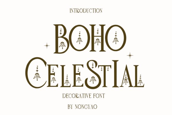
Boho Celestial blends airy, hand-drawn letterforms with delicate celestial motifs-think tiny stars, crescent accents, and tapered stroke endings that feel both personal and mystical. The overall rhythm is loose and slightly irregular, giving each word a notebook-sketched charm that reads as intimate without becoming hard to decipher.
If you are assembling a collection of Boho Fonts for lifestyle or stationery work, this design stands out for its decorative details while remaining highly usable. It’s particularly effective on greeting cards, journaling spreads, boutique product labels, and social media headers where a dreamy, handcrafted voice is desired.
In practice Boho Celestial performs well at display sizes and on textured backgrounds; spacing tends to be forgiving, so modest tracking adjustments are usually enough to refine word shapes. Pair it with a simple sans or a neutral serif to balance the ornamentation, and consider using the celestial glyphs as repeating motifs in pattern work or stamp-like branding elements.
My Recommendation: I’d reach for Boho Celestial when I want a design to feel handmade and slightly mystical-perfect for small-batch stationery, boutique packaging, or an Instagram post that needs character. Its decorative stars and moons give projects a unique signature without overpowering supporting graphics. Use it with clean, minimal layouts to let the letterforms sing.
32. Cute Boho Font
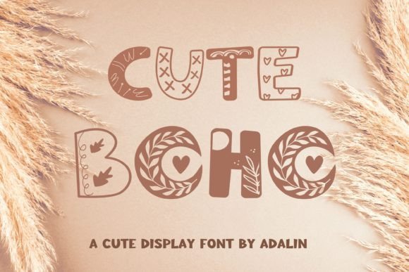
Cute Boho presents a playful take on bohemian style with rounded terminals, jaunty baselines, and an upbeat personality that feels friendly rather than rustic. Letter shapes are compact and approachable, lending a cheerful mood that works well for products aimed at a youthful or lifestyle-focused audience.
The font excels on invitations, posters, and boutique branding where a touch of whimsy is welcome; its legibility at headline sizes makes it reliable for short phrases and names. For best results, pair Cute Boho with a restrained sans-serif for body copy, and consider using pastel color palettes or hand-drawn illustrations to amplify its carefree spirit.
Because the design favors consistency over elaborate alternates, it’s easy to implement across packaging, social posts, and web banners without heavy typographic tweaking. Slight tracking adjustments can tighten longer words, and the font’s inherent warmth makes it an excellent choice for lifestyle labels, kids’ products, and cheerful marketing materials.
My Recommendation: I’d use Cute Boho when I want branding that reads as joyful and modern-think boutique stationery, children’s apparel tags, or event invites with a friendly tone. It’s versatile and easy to mix with clean supporting fonts, so it speeds up design work while still delivering a distinct personality. Great for projects that need charm without complicated type setups.
33. Baby Boho Font
Baby Boho is a soft, handwritten script with gentle curves and a casual flow that evokes warm, homemade craft projects. Its letterforms are rounded and slightly condensed, creating an intimate, nursery-friendly aesthetic that translates beautifully to prints, photo overlays, and delicate packaging.
Technically, this family ships as an OTF file compatible with both PC and Mac platforms and can be accessed from common design apps such as Adobe Illustrator, Photoshop, and InDesign as well as Microsoft Word. The set includes PUA-encoded characters so you can use decorative glyphs and alternates without specialized software, making it practical for quick-turn production and hobbyist designers alike.
For application, Baby Boho works best at display sizes on invitations, labels, and wall art where its handcrafted feel adds warmth. Pair it with a neutral sans for readability in longer text, and take advantage of the included alternates and ligatures to introduce subtle variation for repeated names or phrases in a layout.
My Recommendation: I recommend Baby Boho for projects that benefit from a tender, homespun voice-nursery prints, bespoke baby shower invitations, and artisanal product labels are perfect fits. The broad compatibility and PUA-encoded extras make it easy to implement across programs without fuss. Use it where emotional connection matters and a polished yet personal handwritten look is desired.
Each of the 33 Boho Fonts in this guide offers a distinct personality-perfect for adding character to brands, stationery, and digital designs. Use the pairing tips and licensing reminders above to choose fonts that match your project’s tone and distribution needs.
Ready to experiment? Download samples, test on real mockups, and embrace the bohemian aesthetic to create memorable, delightful work in 2026 and beyond.