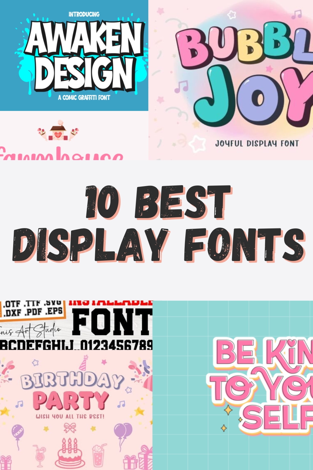
The 10 Best Display Fonts for Creative Branding and Crafting
Welcome to my creative corner! As a designer, I know that the right typography can either make or break a project. Whether you are working on a nostalgic 70s poster, a high-energy sports brand, or a whimsical children’s book, your choice of a display font is the most powerful tool in your arsenal to grab attention instantly.
In this post, I’ve curated a personal list of my top 10 favorite typefaces that I use to bring character and professional flair to my work. Each display font in this collection has been chosen for its unique personality and ease of use—from bold, bubbly forms to gritty, urban graffiti styles. Let’s dive into these hand-picked gems that will help your designs stand out from the crowd!
1. The Crafty Marie Display Font
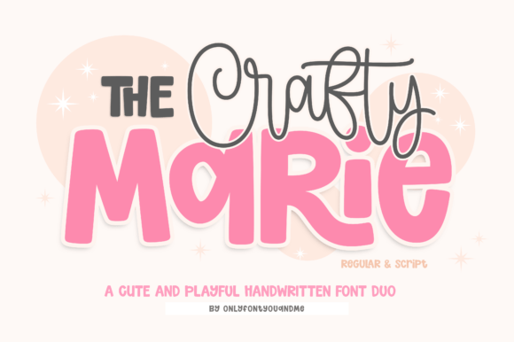
As a designer, I’m always on the hunt for that perfect balance between “playful” and “professional,” and I truly believe The Crafty Marie Display Font duo hits that sweet spot. I designed this typeface to take the guesswork out of font pairing, blending a bold, rounded display font with a whimsical handwritten script that shares the same energetic DNA. It’s become my personal go-to toolkit for children’s branding and classroom materials because it offers an instant visual hierarchy; I usually lead with the “Regular” style for the big headers and let the “Script” handle the charming accents.
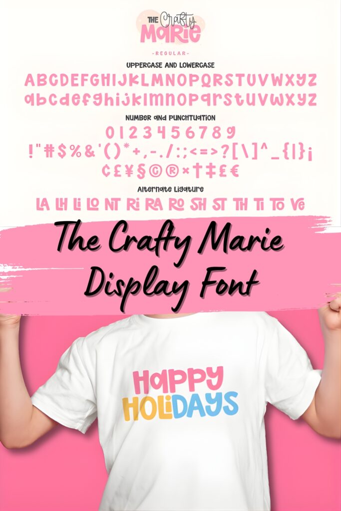
What makes this display font a real dream for my fellow DIY creators and Cricut enthusiasts is the set of clean, easy-to-cut outlines. Whether I’m crafting SVG designs or nursery art, I love layering these with a thick white offset for a sticker effect or playing with vibrant “candy” colors to make the typography pop. Plus, I’ve made sure it’s fully PUA encoded, so you can access every decorative flourish and special character easily, ensuring your projects look polished with zero extra effort.
2. Twinkle Dreams Display Font
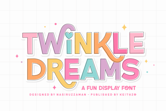
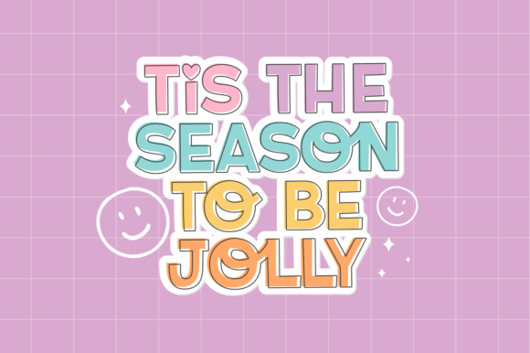
When I first started sketching Twinkle Dreams, I wanted to capture that pure, unadulterated holiday magic—the kind that feels like a cozy Christmas morning. This display font is my personal love letter to festive design, blending a spirited, bouncy rhythm with a friendly feel that works wonders for children’s themes. I’ve crafted it with a full set of all-caps characters for bold impact, but the real secret sauce lies in the lowercase letters, which add a distinct sense of whimsy and movement to any layout.
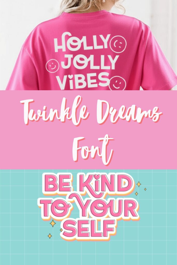
As a designer who obsesses over the finer details, I’ve packed this display font with thoughtful OpenType features. I find myself constantly playing with the artistic ligatures and charming swashes to give my invitations and posters a custom, hand-lettered look. To keep things stress-free for you, the font is fully PUA-encoded, meaning you can access every single decorative glyph and alternate character without needing any fancy software. Whether you’re designing holiday cards or playful nursery art, I hope this typeface helps your creative imagination truly soar!
3. My Wednesday Night Display Font
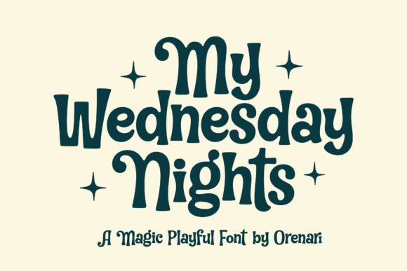
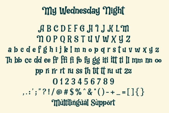
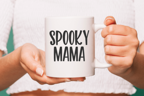
There’s something incredibly satisfying about a font that can be both “creepy” and “cute” at the same time, and that’s exactly what I aimed for with My Wednesday Night. I’ve always been a fan of that quirky horror aesthetic—think dark fairytales meets playful mischief. This display font is built with bold, intentional strokes and whimsical curves that give it a slightly eerie, hand-drawn form. It’s my top recommendation for Halloween projects or any design where you want to add a touch of mystery without losing that friendly, approachable vibe.
In my own studio work, I love using this display font for children’s book titles and spooky party invitations because the “wonky” proportions give the text so much personality. To make sure you have total creative freedom, I’ve ensured it’s fully PUA-encoded. This means you can dive into all the alternate characters and unique glyphs to customize your headers with ease. Whether you’re designing a poster for a haunted house or just want a “Wednesday” vibe for your social media, this typeface brings that perfect blend of fun and spookiness to the table.
4. Stay Chunky Display Font
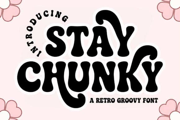
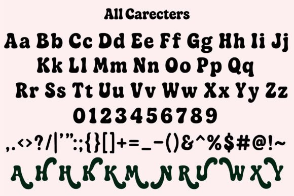
If you’ve been following my work lately, you know I’m obsessed with the 70s revival, and Stay Chunky is my absolute go-to for capturing that nostalgic energy. I designed this display font with thick, bubbly curves and smooth edges to bring a sense of joy and “groove” to any project. It’s a love letter to vintage letterforms, but with a clean, modern finish that looks just as good on a digital sticker as it does on a physical screen-printed tee.
When I’m working on branding or eye-catching quotes, I love diving into the unique stylistic alternates included in this set. This display font isn’t just about bold stems; it’s about those fun swashes that let you customize the flow of your words to create truly aesthetic, standout artwork. Whether you are designing a psychedelic poster or a cheerful modern brand, Stay Chunky provides that perfect bold, retro flair that makes people stop and look. Plus, with full support for uppercase, lowercase, and punctuation, it’s as functional as it is stylish.
5. Remember Things Display Font
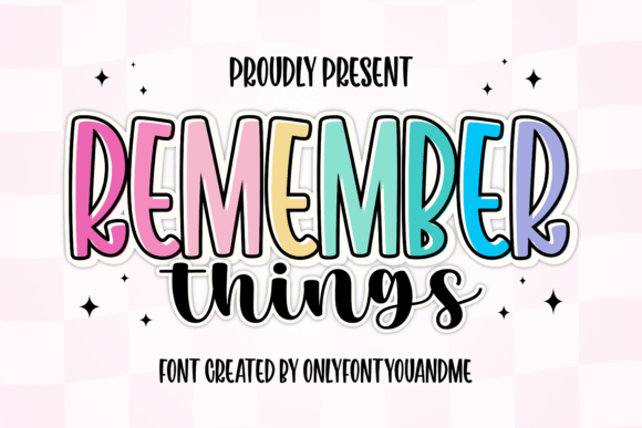
Whenever I’m stuck on a project that needs both “punch” and “personality,” I find myself reaching for Remember Things. This duo is a designer’s secret weapon because it does the hard work of pairing for you. The primary display font is tall and bold with these wonderfully smooth curves, and I’ve included an outline layer specifically so you can achieve that trendy, sticker-like effect effortlessly. It’s high-impact without feeling heavy, which is a rare balance to strike in typography.
To soften the boldness of the main display font, I paired it with a casual, brush-style handwritten script. In my personal projects, I love using the tall sans-serif for the “hero” text and weaving the script in for sub-headlines or little personal notes. This combination creates a lively, versatile look that feels incredibly modern and warm. Whether you are working on a vibrant brand identity or a creative social media campaign, this duo brings a professional, layered aesthetic to your canvas with absolutely zero stress.
6. Awaken Design Display Font
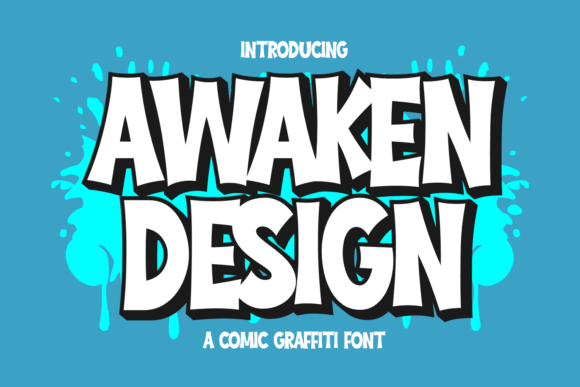
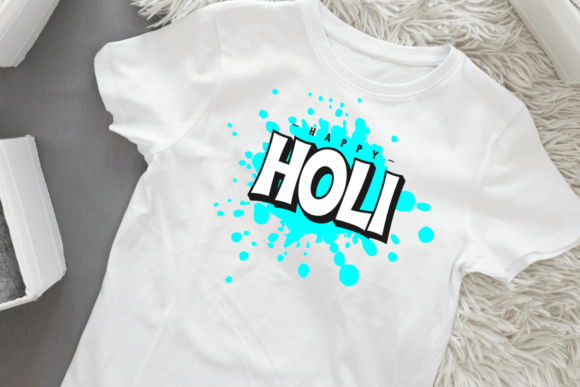
When I want to inject a shot of pure adrenaline into a project, Awaken Design is the first typeface I pull from my library. I created this display font to bridge the gap between polished comic book art and the raw, expressive energy of street graffiti. It’s all about those chunky letterforms—I gave them exaggerated curves and sharp edges to mimic the confident strokes of a spray-paint can. It’s a font that doesn’t just sit on the page; it demands attention with an urban, playful vibe that’s perfect for gaming graphics or bold apparel designs.
The real magic happens when you play with the two included styles. I designed the “Regular” style as a solid, punchy foundation, but the “Extrude” version is where the 3D comic-book feel really comes to life. By layering this display font, you can easily create striking, dimensional titles that look like they’ve been pulled straight from a superhero headline or a city mural. Whether you’re going for a clean look or a layered, edgy aesthetic, Awaken Design gives you the flexibility to make your text pop with a professional, hand-crafted flair.
7. Bubble Joy Display Font
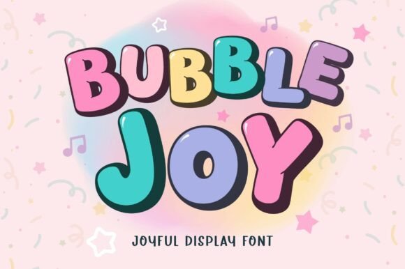

There is something so satisfying about a perfectly rounded, chunky typeface, and I created Bubble Joy to be exactly that—pure, unadulterated fun. As a designer, I know how frustrating it can be to find a “cute” font that actually holds up across different media, which is why I made sure this display font stays incredibly legible whether it’s shrunk down for a tiny planner sticker or blown up on a giant birthday banner. It’s all about those soft, friendly curves that instantly bring a smile to any project.
One of my favorite ways to use this display font is by taking advantage of the two styles I’ve included: Regular and Outline. They are designed to stack perfectly, allowing you to build colorful, layered titles or that trendy “sticker-style” shadow in just a few seconds. In my own studio, I’m constantly using Bubble Joy for everything from kids’ T-shirts and classroom prints to vibrant social media posts. It’s a versatile, cheerful toolkit that takes the stress out of creating high-energy, professional designs for party décor and beyond.
8. Varsity Signature Display Font
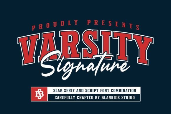
When a client comes to me looking for that classic collegiate look, Varsity Signature is the first thing I load onto my canvas. I designed this display font combination specifically for professional branding that needs to feel established, athletic, and high-energy. Every letter is infused with that traditional “varsity” soul—think letterman jackets, championship banners, and campus spirit—but with a refined finish that works perfectly for modern logotypes and product packaging.
What I love most about working with this display font is its versatility across different “sports-luxe” projects. While it has that bold, sporty uppercase impact you’d expect from a college font, the inclusion of a full set of lowercase letters, numerals, and punctuation makes it a complete workhorse for complex layouts like posters or promotional campaigns. Whether you’re creating a watermark for a fitness brand or designing a team logo, Varsity Signature provides that confident, professional edge that makes your work look like it belongs in the big leagues. Happy designing!
9. Farmhouse Valentine’s Display Font
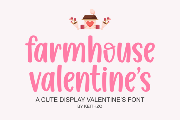
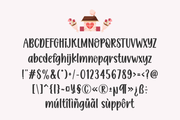
There is something so special about the “comfort” of a design, and Farmhouse Valentine was created to bring that exact feeling of countryside simplicity to your screen. As a designer, I often find that script fonts can become too cluttered, so I focused on a handwriting-inspired display font that balances natural rhythm with exceptionally clean lines. It’s that perfect “lovingly handmade” look that feels personal but remains incredibly tidy and readable, whether you’re printing it on a tiny gift tag or a large wooden sign.
In my own daily routine, I love using this display font for digital planners and habit journals because it makes organization feel like an aesthetic treat rather than a chore. It’s also my top pick for rural branding, pantry labels, and country-inspired wedding stationery. If you’re looking to evoke a sense of nostalgia and warmth—like a handwritten note left on a kitchen table—Farmhouse Valentine is the ideal choice. It turns simple text into a sentimental experience, making every stroke feel intentional and cozy.
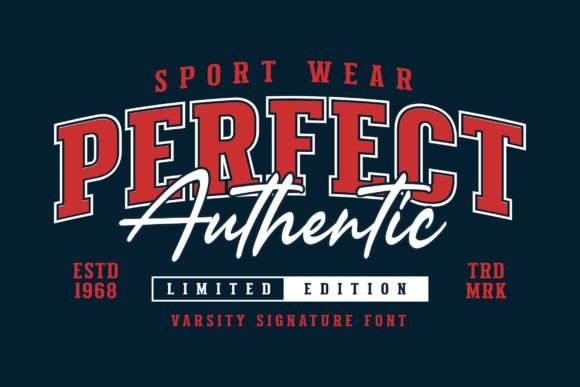
10. Sports Varsity Display Font
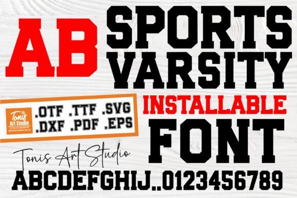
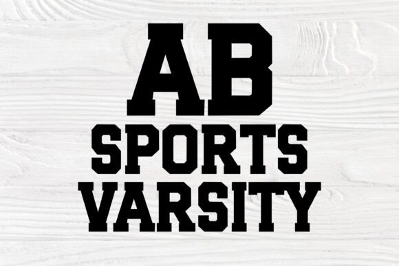
When it comes to team spirit, there is no style more iconic than the classic block letter, and I’ve designed this Sports Varsity typeface to be the MVP of your design toolkit. As a designer, I know that “athletic charm” is all about boldness and precision. This display font captures that timeless college aesthetic, making it incredibly easy to create personalized team gear or spirit wear that looks officially licensed. It’s got that heavy, authoritative weight that immediately says “Game Day.”
I personally love using this display font for home decor projects and sports event branding because the letters and numbers are so well-balanced. Whether you are cutting vinyl for a custom jersey or designing a high-energy poster for a local tournament, the clean lines ensure a professional finish every time. It’s a versatile typeface that takes the complexity out of sporty layouts, allowing you to make a winning statement with minimal effort. If you want your projects to radiate confidence and energy, this is the varsity style you’ve been looking for.
Conclusion
Choosing the perfect display font is more than just a design decision; it’s about setting the right mood and connecting with your audience. I hope this curated list inspires you to experiment with new styles, whether you’re layering “Bubble Joy” for a birthday invite or channeling classic spirit with “Sports Varsity.”
Typography is where the soul of a design lives, and with these ten versatile options, you’re ready to tackle any creative challenge that comes your way. I can’t wait to see how you use these fonts to bring your own unique visions to life. Happy designing, and keep creating magic!