Most collections of logo design ideas are galleries: a hundred marks scrolling past with no explanation of why any of them work. That is fine for a mood board and useless when you actually have to choose. This guide is organised by logo type instead, because the type you pick determines almost everything that follows, from which typeface will work to whether your mark survives being shrunk to a favicon.
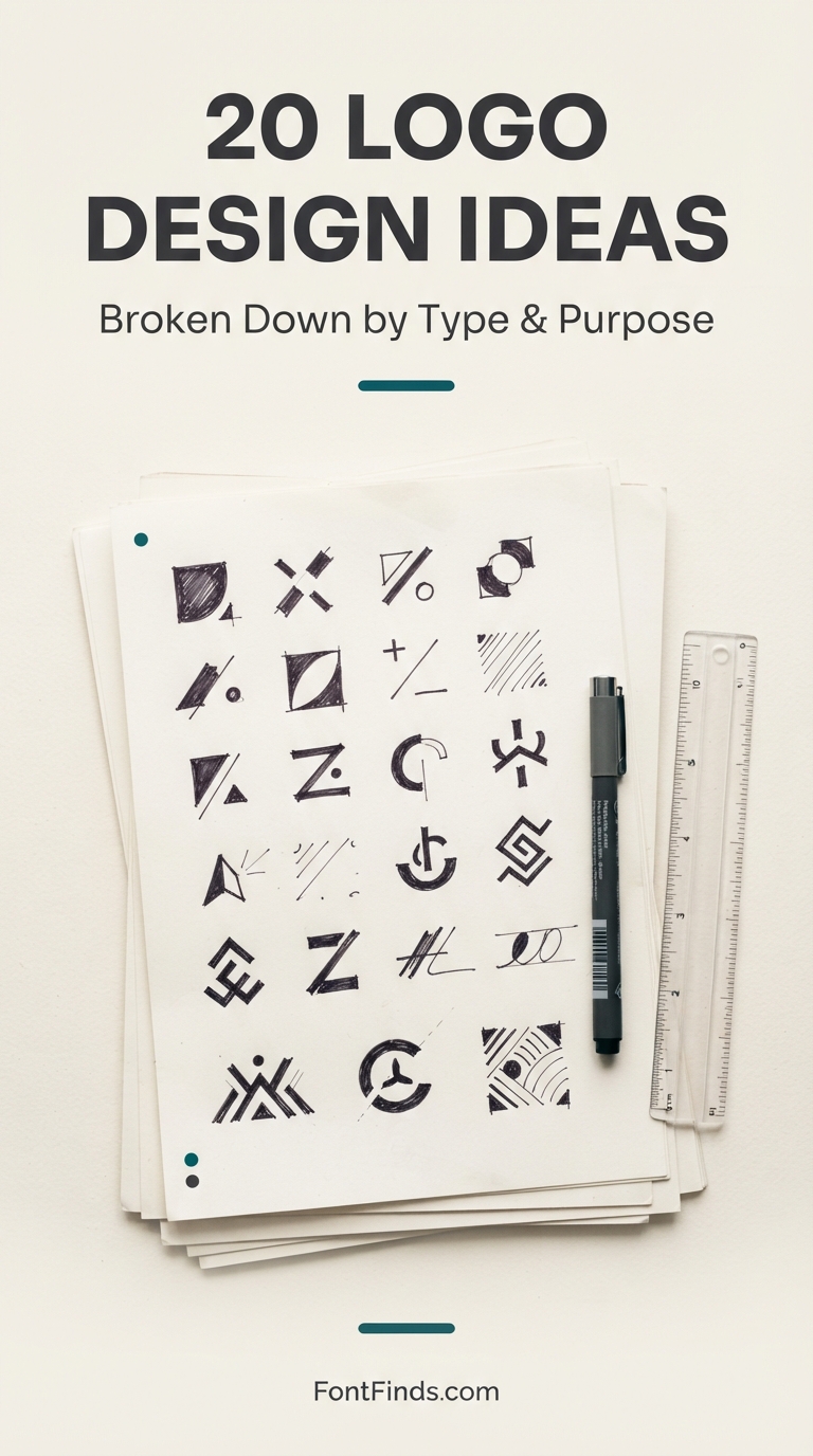
The Seven Logo Types, and Who Each One Suits
Before browsing logo design ideas, narrow the field. Each type carries built-in trade-offs that have nothing to do with taste.
| Type |
Works when |
Struggles when |
| Wordmark |
Distinctive, short names you want people to read and remember |
Long names, or brands needing a standalone app icon |
| Lettermark |
Long or multi-word company names |
New brands with no recognition to trade on |
| Monogram |
Personal brands, boutiques, two-founder businesses |
Companies whose initials spell something unfortunate |
| Combination mark |
Most businesses, most of the time |
Situations demanding extreme simplicity from day one |
| Emblem |
Heritage positioning, food, education, institutions |
Brands needing a tiny app icon or heavy digital use |
| Abstract mark |
Tech, finance, anything crossing language barriers |
Small budgets, since abstraction needs marketing spend to gain meaning |
| Mascot |
Family brands, sports, food service |
Formal or premium positioning |
A note on the examples below. Every mark shown here is an original concept created for this guide using fictional brand names. None represents a real company, and none should be reproduced as a working logo, since a genuine identity has to be drawn for a specific business rather than borrowed.
Twenty Logo Design Ideas, Broken Down
The logo design ideas below span all seven types. Each example is followed by what the design is actually doing, why that decision works, what typography it needs, and where it will fail if you are not careful.
Wordmark
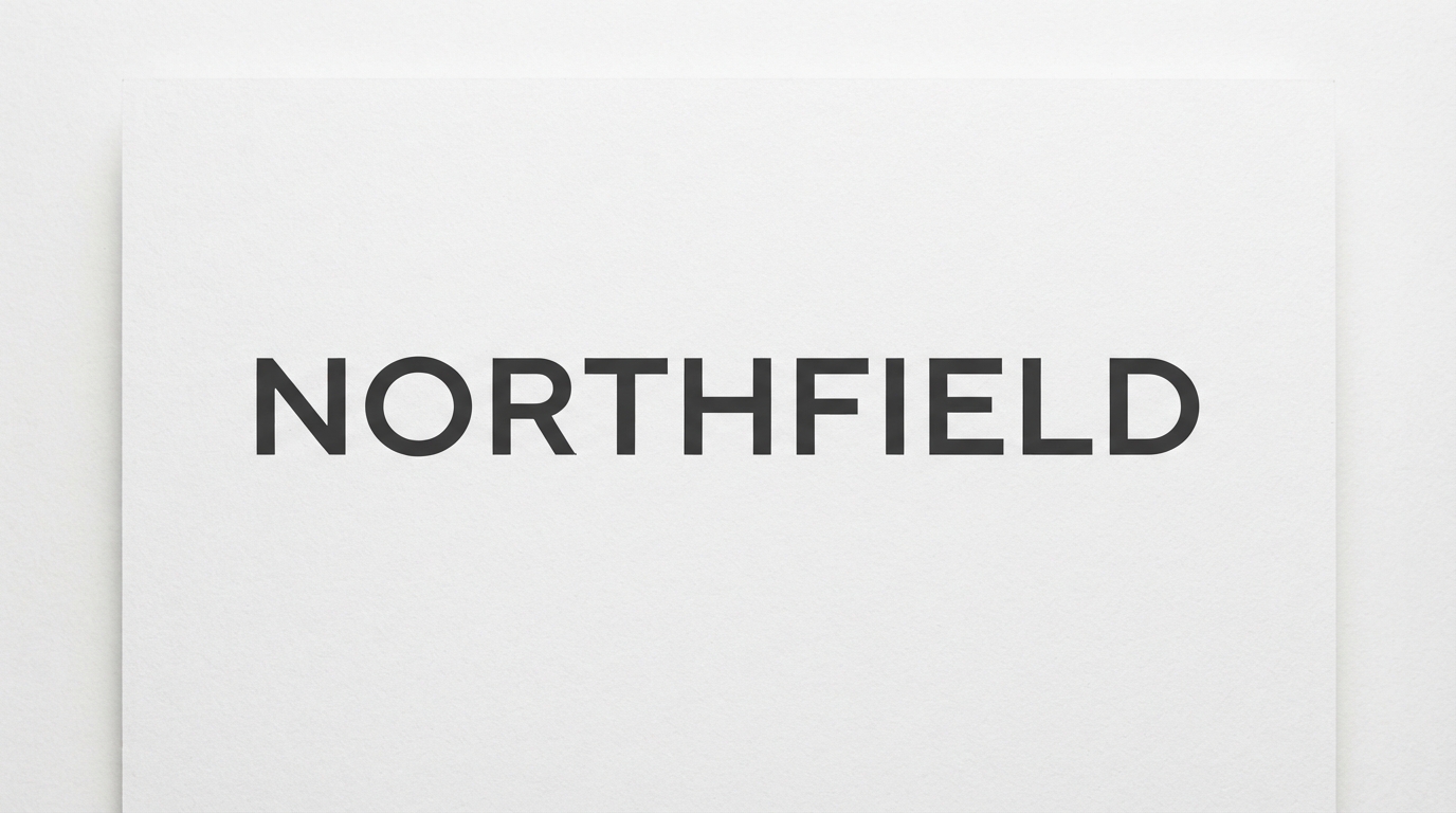
Geometric sans wordmark
What it is doing: The entire logo is the company name, set in a geometric sans serif with tracking opened up well beyond the default.
Why it works: With no icon to carry meaning, every decision lands on the letterforms. The wide tracking buys authority, which is why property, architecture and consultancy brands keep returning to this formula.
Typography: A geometric sans with a true circular O. Track it out between 80 and 150 units and never justify the spacing by eye alone.
Where it breaks: Long names. Past about ten characters the wide tracking pushes the mark too wide for a website header or a profile avatar.
Wordmark
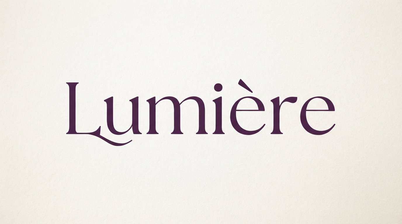
High-contrast serif wordmark
What it is doing: A name set in a modern serif with dramatic thick-to-thin stroke contrast, coloured rather than black.
Why it works: Stroke contrast is the fastest visual shortcut to perceived price. The eye reads the thin hairlines as precision, which is why beauty and fashion lean on this style so heavily.
Typography: A Didone or transitional serif. Keep tracking modest here, since contrast serifs already carry enough visual interest.
Where it breaks: Small sizes and embroidery. Those hairlines vanish below roughly 14px on screen and clog completely in thread.
Wordmark
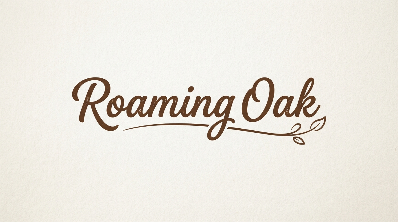
Script wordmark with swash
What it is doing: A handwritten script with a swash extending from the final letter to underline the whole name.
Why it works: The swash does two jobs: it visually anchors an otherwise floating script, and it signals handmade without the brand having to say the word.
Typography: A script with genuine ligature and alternate support, since default connections between letters are where cheap scripts give themselves away.
Where it breaks: All-caps settings. Most scripts have unusable capitals, and a script logo in caps reads as a mistake rather than a style choice.
Lettermark
Geometric single-letter mark
What it is doing: One letter constructed from simple geometry rather than typed in an existing typeface.
Why it works: A single letter is the most scalable mark there is. It survives being shrunk to a 16px favicon, which almost no wordmark manages.
Typography: None strictly required, since the letter is drawn. But whatever font sits beside it in a lockup must share the same geometric logic.
Where it breaks: Ambiguity. Heavily abstracted letters stop reading as letters. Show the mark to five people cold and ask what letter they see.
Lettermark
Two-letter interlocked mark
What it is doing: Two initials locked into a compact square with even stroke weights throughout.
Why it works: It solves the long-name problem. A four-word company becomes a two-letter mark that fits anywhere, which is exactly why law firms and agencies default to this.
Typography: Even, monolinear strokes. Mixing a thick letter with a thin one inside a monogram makes the whole thing look unbalanced.
Where it breaks: Letters that fight. Some pairs, especially with round letters beside straight ones, will never lock cleanly and need a divider instead.
Monogram
Intertwined circular monogram
What it is doing: Two serif initials woven together inside a thin ring, executed in gold on a dark ground.
Why it works: The circular frame gives the mark a fixed silhouette regardless of which letters sit inside, which makes it reusable across an entire product line.
Typography: A serif with elegant thin strokes. Our guide to elegant script fonts for branding covers typefaces built specifically for this.
Where it breaks: Thin rings in print. A hairline circle that looks crisp on screen can drop out entirely in foil stamping or letterpress.
Monogram
Divided badge monogram
What it is doing: Two initials separated by a thin vertical rule and set inside a rounded square.
Why it works: The divider solves what interlocking cannot. When two letters refuse to nest, separating them deliberately reads as considered rather than as a failure.
Typography: A restrained sans or a low-contrast serif. This layout is already doing the work, so a decorative face would overcrowd it.
Where it breaks: Uneven optical weight. If one initial is visually heavier, the divider sits off-centre even when it is mathematically centred.
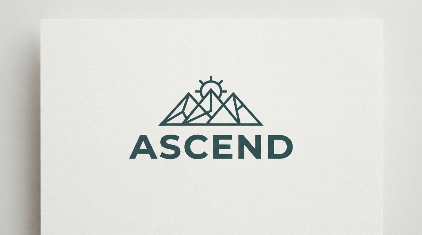
Combination mark
Stacked icon and wordmark
What it is doing: A simple line-art symbol sitting directly above the name, both sharing a centre axis.
Why it works: This is the most flexible structure in branding. The icon can eventually operate alone, but only after the paired lockup has taught the audience what it means.
Typography: A clean sans with stroke weights that echo the icon’s line weight. Mismatched weights are the single most common flaw in this layout.
Where it breaks: Narrow spaces. A stacked lockup becomes unreadably small in a website header, so build a horizontal version at the same time.
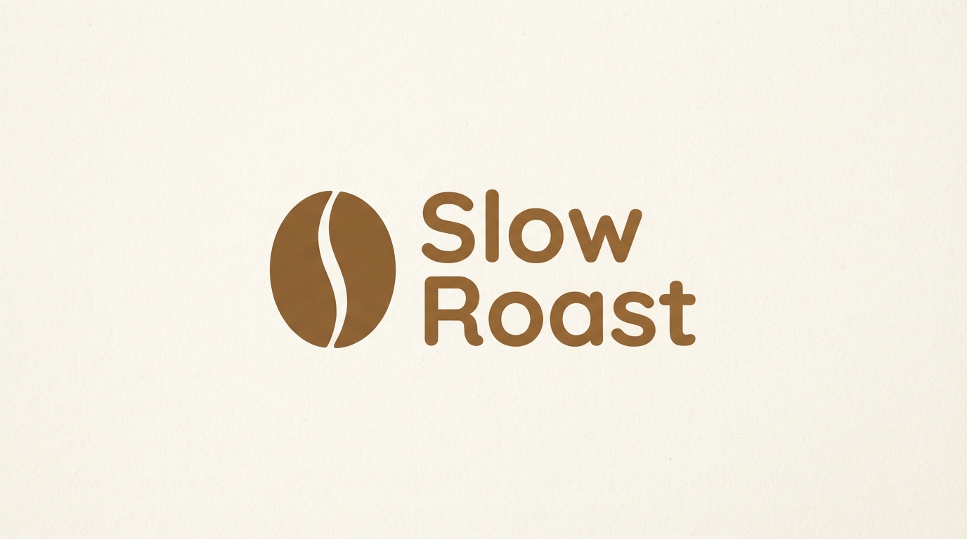
Combination mark
Horizontal icon and wordmark
What it is doing: An icon placed to the left of the name, aligned to the cap height of the lettering.
Why it works: Horizontal lockups fit the places logos actually live: site headers, email signatures, invoice tops. This is the workhorse orientation.
Typography: A rounded or humanist sans for approachability. The icon and letterforms should share the same corner radius logic.
Where it breaks: Optical alignment. Aligning the icon mathematically to the text baseline usually looks wrong. Trust your eye over the numbers.
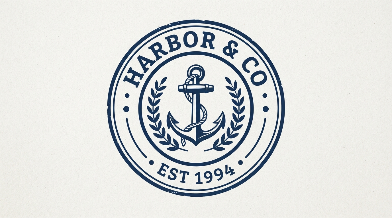
Emblem
Circular badge emblem
What it is doing: Text curved around a ring, a central symbol, and a founding date locked into one indivisible unit.
Why it works: Emblems signal heritage and permanence because they borrow from seals, crests and stamps. The enclosed form implies something official.
Typography: A sturdy slab or condensed serif that stays legible when curved. Delicate faces distort badly on a tight radius.
Where it breaks: Detail density. Every element inside an emblem shrinks together, so what reads on a signboard turns to mush on a business card.
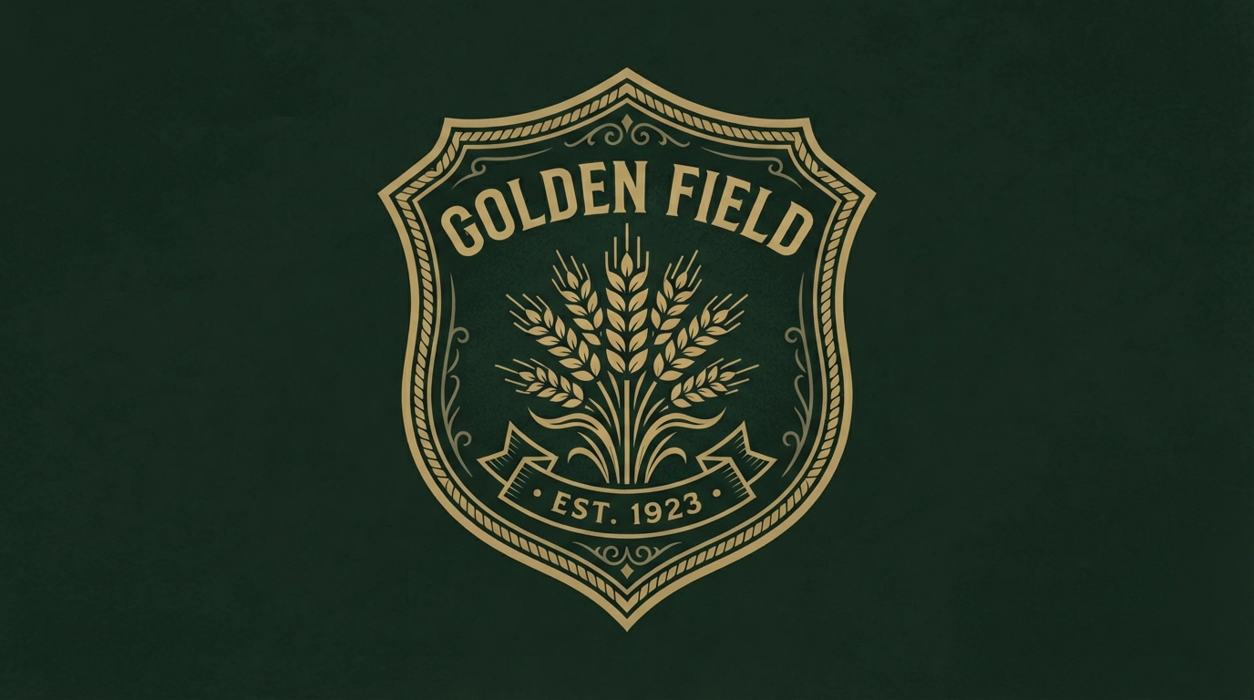
Emblem
Shield crest emblem
What it is doing: A shield silhouette containing an illustrated symbol and the brand name.
Why it works: The shield shape carries centuries of association with protection and provenance, which is why food, brewing and education brands use it constantly.
Typography: Traditional serif or blackletter. For the latter, see our guide to free blackletter and specialty fonts.
Where it breaks: Cliche. Shields are so common in heritage branding that a generic one makes a brand invisible rather than distinguished.
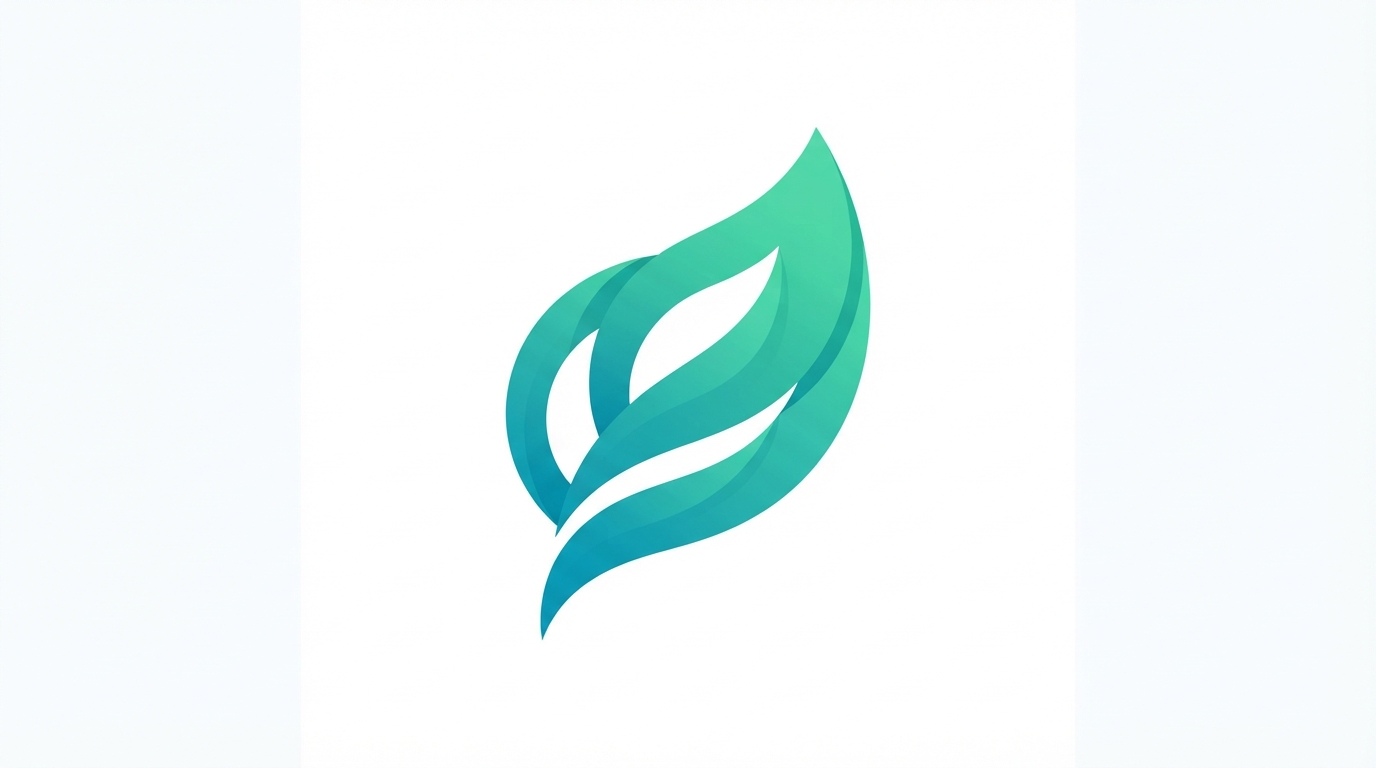
Abstract mark
Implied-form abstract mark
What it is doing: Overlapping shapes that suggest a leaf without literally drawing one, finished with a colour gradient.
Why it works: Implied forms let a brand own a shape outright rather than competing with every other literal leaf icon in the category.
Typography: A neutral geometric sans. Abstract marks carry all the personality, so the type should recede.
Where it breaks: Meaninglessness. There is a fine line between an implied form and a shape that communicates nothing at all.
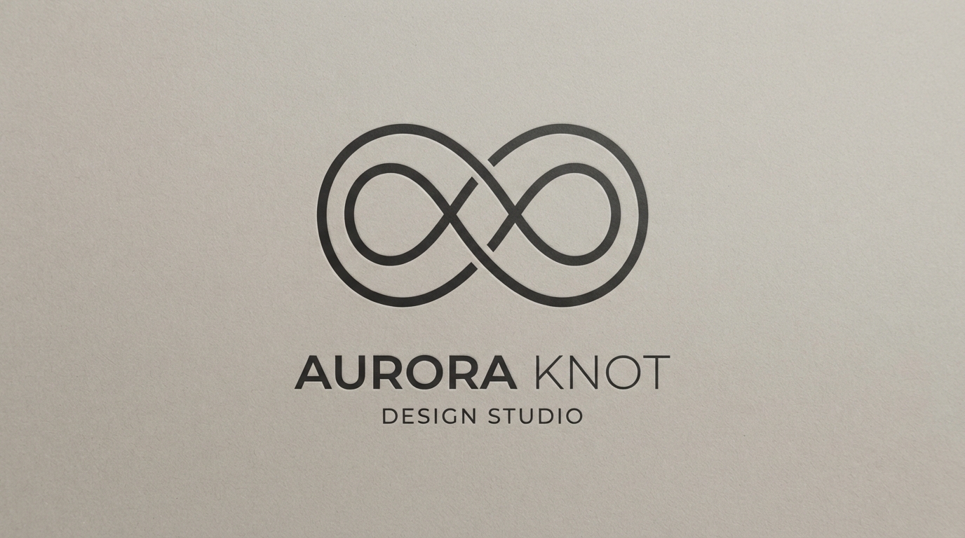
Abstract mark
Single-line continuous mark
What it is doing: One unbroken line folded into a knot, drawn at a single consistent weight.
Why it works: Continuous-line marks read as clever without being fussy, and the fixed stroke weight makes them trivially easy to scale and recolour.
Typography: A monolinear sans matching the stroke weight of the mark itself creates a genuinely unified system.
Where it breaks: Stroke weight at small sizes. A line that is elegant at 200px can disappear entirely at 20px, so build a heavier small-size variant.
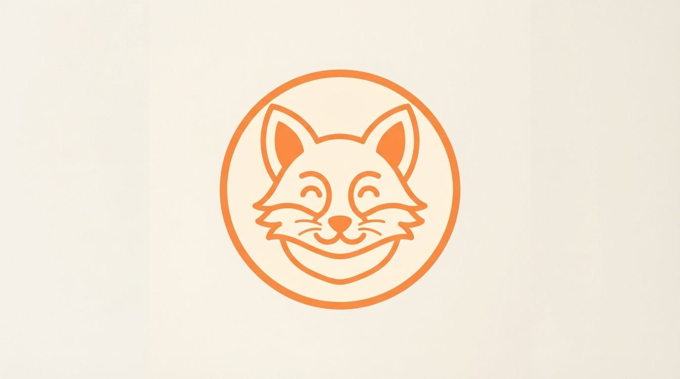
Mascot
Simplified mascot
What it is doing: A friendly animal reduced to a small number of clean shapes inside a containing circle.
Why it works: Mascots create emotional attachment that abstract marks cannot. Simplifying to a handful of shapes keeps the warmth without the reproduction problems of detailed illustration.
Typography: A rounded sans with generous curves that echo the mascot’s construction.
Where it breaks: Over-illustration. Every extra detail is another thing that fails when the logo is embroidered, engraved or shrunk.
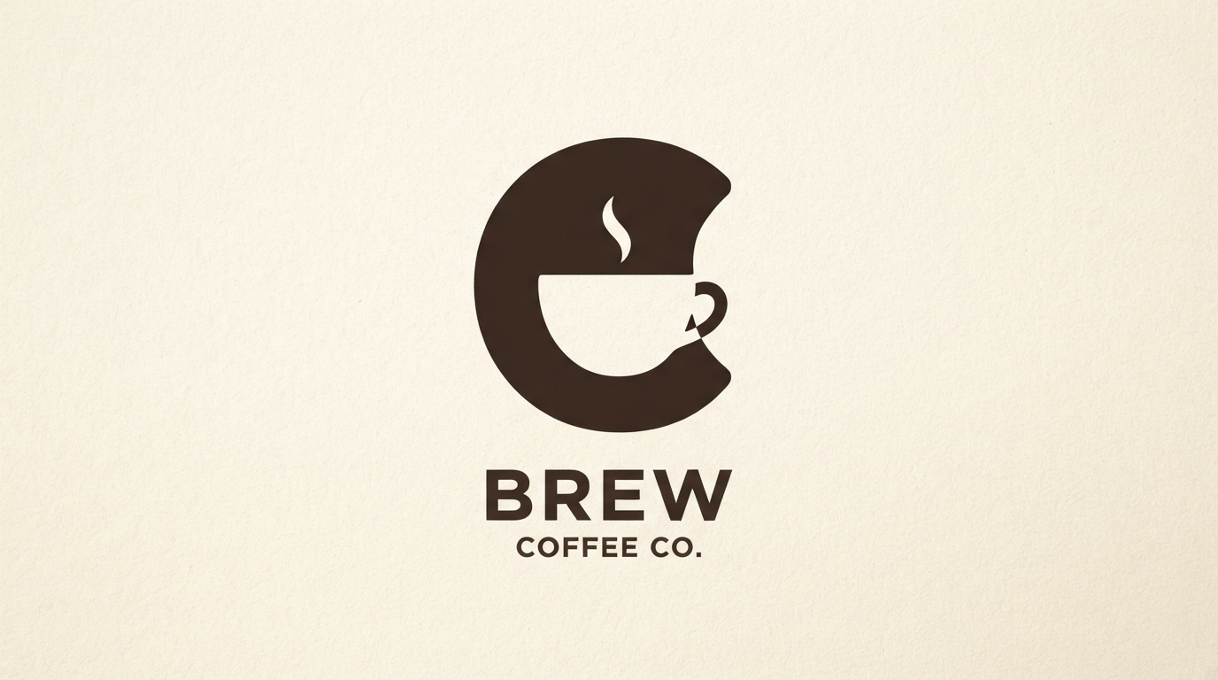
Abstract mark
Negative-space mark
What it is doing: A second image hidden inside the counter of a letterform, so the mark reads two ways.
Why it works: Negative space rewards a second look, and that moment of recognition is what makes a logo memorable rather than merely competent.
Typography: A typeface with large, open counters. Tightly drawn faces leave no room for a hidden shape.
Where it breaks: Forcing it. If the hidden image needs explaining, it is not working. Test it with people who know nothing about the brand.
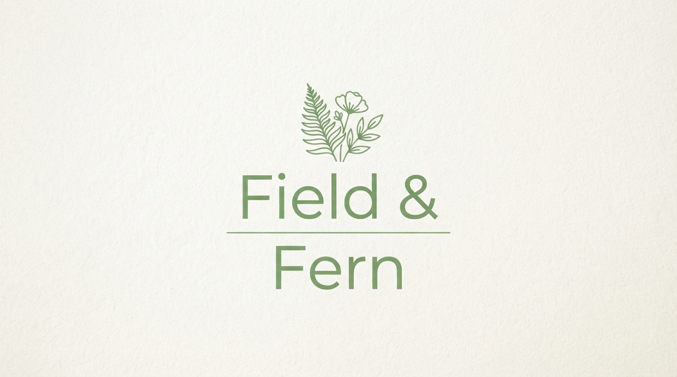
Lockup
Stacked lockup with rule
What it is doing: A name broken over two lines and separated by a thin horizontal rule.
Why it works: Stacking converts a wide name into a near-square footprint, which fits social avatars, stamps and packaging seals far better than a single line.
Typography: A refined serif or clean sans. Our roundup of elegant fonts for branding covers strong options here.
Where it breaks: Rule weight. Too heavy and it divides the name into two unrelated words rather than joining them.
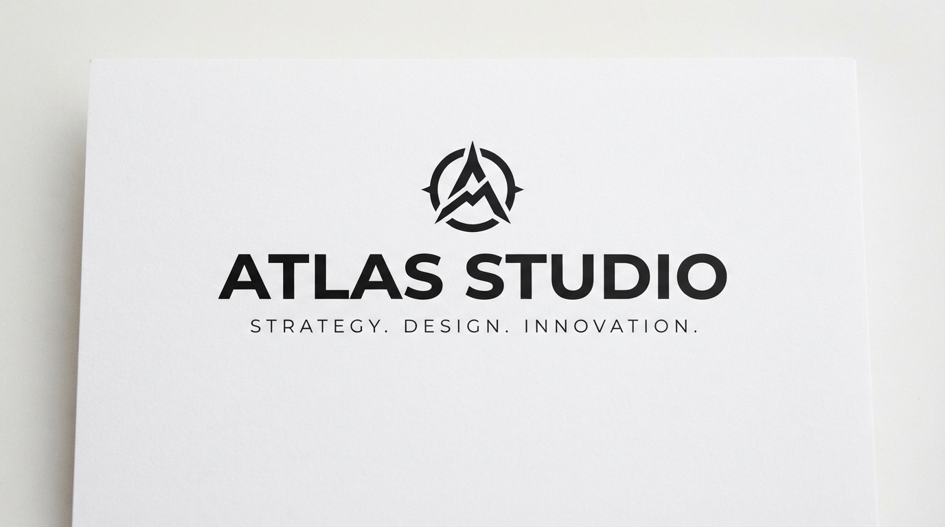
Lockup
Wordmark with tagline
What it is doing: A bold name above a small all-caps tagline set in very wide tracking.
Why it works: The size and tracking contrast creates instant hierarchy. The eye takes the name first and the tagline second, exactly as intended.
Typography: Same family in two weights, or two families with clearly different roles. See our modern serif font guide for the underlying principle.
Where it breaks: Tagline legibility. Below about 8pt in print, wide-tracked caps stop being readable and become texture.
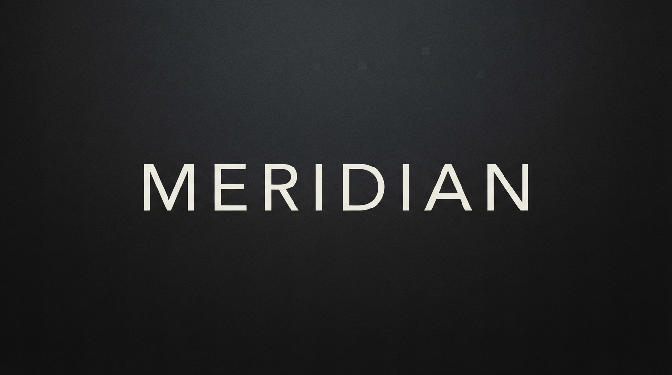
Application
Reversed wordmark
What it is doing: The same wordmark logic executed light-on-dark rather than dark-on-light.
Why it works: Every logo needs a reversed version, and it is rarely just a colour inversion. Light type on dark optically thickens, so the reversed cut often needs to be a weight lighter.
Typography: A family with multiple weights, so you can drop a step for the reversed version without redrawing anything.
Where it breaks: Assuming inversion is automatic. Test the reversed version at real size rather than trusting the software preview.
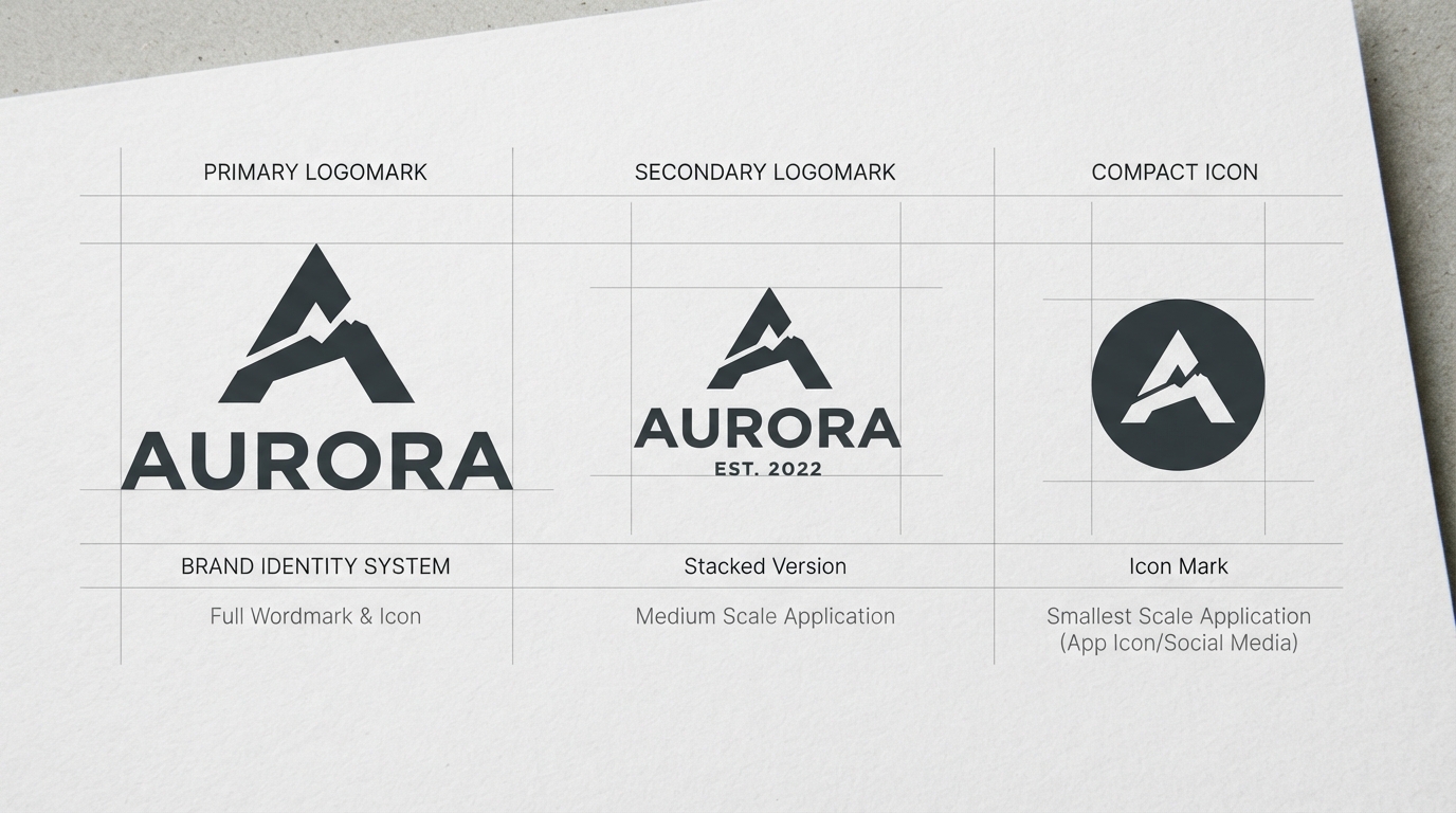
System
Responsive logo system
What it is doing: One brand expressed as three marks: full lockup, simplified version, and a compact icon.
Why it works: A single logo file cannot serve a billboard and a favicon. Building the system upfront prevents someone else crudely cropping your logo later.
Typography: Consistent across all three tiers. The simplification should remove elements, never substitute the typeface.
Where it breaks: Tiers that look unrelated. Each step should feel like the same brand losing detail, not like three separate logos.
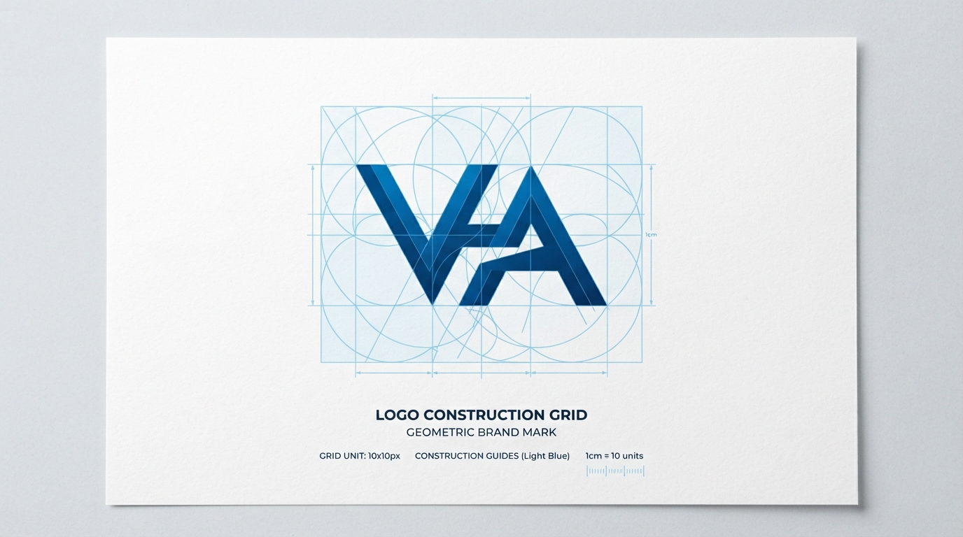
Method
Grid construction
What it is doing: The mark shown over the circles and squares used to draw it, with proportional relationships exposed.
Why it works: Grid construction is why professional marks feel resolved. The curves relate to each other mathematically rather than being drawn freehand and nudged.
Typography: Not applicable directly, but the same discipline governs how a wordmark’s tracking and alignment get set.
Where it breaks: Grid worship. A mathematically perfect mark can still look optically wrong. The grid is a starting point, and your eye makes the final call.
The Four Tests Every Logo Has to Pass
Whichever of the logo design ideas above you gravitate toward, the mark has to clear four practical hurdles before it is finished. These are not matters of taste.
1. The 16-pixel test
Shrink the mark to favicon size. If it becomes an unreadable smudge, you need a simplified variant. This is where emblems and detailed mascots fail most often.
2. The single-colour test
Flatten it to pure black on white. Embroidery, engraving, stamps and fax-quality scans all strip your colour away. If the mark relies on a gradient to be legible, it is not finished.
3. The memory test
Show it to someone for five seconds, then ask them to sketch it. What they draw is what the mark actually communicates, which is frequently not what you intended.
4. The category test
Line it up beside five competitors. If it disappears into the row, the problem is not craft, it is differentiation, and no amount of refinement will fix that.
Five Mistakes That Show Up Constantly
These come up again and again when logo design ideas move from sketch to production.
Designing at the wrong size. Marks drawn at 2000px on a large monitor carry detail that evaporates in real use. Zoom out to actual size regularly while working.
Using a trend typeface. A logo should outlive its decade. Whatever font is dominating design feeds right now will date the mark precisely, and rebranding is expensive.
Too many concepts inside one mark. A logo that tries to communicate innovation, heritage, sustainability and trust communicates none of them. Pick the single most important idea.
Ignoring the reversed version. Half of all logo applications sit on dark backgrounds. Design both from the start rather than inverting at the last minute.
Skipping trademark research. Search your category before committing. Discovering a conflict after printing packaging is an expensive way to learn this.
Choosing the Typeface
For wordmarks and lettermarks, most logo design ideas succeed or fail on the typeface alone, since there is no icon to carry the concept.
For wordmarks and lettermarks the typeface is not a supporting decision, it is the logo. A few starting points depending on the direction you are heading:
One licensing warning worth taking seriously: not every font licence permits use in a logo, and some explicitly prohibit trademark registration of the resulting mark. Read the licence before you commit, because unwinding this later means redrawing the logo entirely.
Questions People Ask
What makes a logo actually good?
It reproduces cleanly at any size, works in a single colour, is distinct from competitors, and communicates one clear idea. Aesthetic preference matters far less than most people assume.
How many colours should a logo use?
One or two. Every additional colour raises printing costs and creates another way for the mark to fail in constrained applications. The primary version should always work in solid black.
Can I use a font directly as my logo?
Technically yes if the licence allows it, but a typed name in an unmodified typeface is weak differentiation. Most professional wordmarks start from a typeface and are then customised.
Where should I start when I have too many logo design ideas?
Narrow by type first using the table above, then by the four tests. Most concepts eliminate themselves once you check them at favicon size and in single colour.
Which logo type is best for a small business?
A combination mark, most of the time. It gives you a memorable symbol plus the name for recognition, and it can be simplified into an icon later once the brand is established.
How do I know when a logo is finished?
When it passes all four tests above, works across every application you can list, and you have stopped adding to it. Most logos are improved by removal rather than addition.
Looking for typefaces to build your mark on? Browse the full Creative Fabrica font library →