22 Best Bold Display Fonts for T-Shirt Merch Ideas
Merch lettering has to earn its place twice: it needs to look good on fabric and to read clearly in a tiny product listing. Bold display fonts for T-shirts can supply that instant shape, from broad blocks to compressed headline styles. The choice becomes clearer once you test a real slogan at actual print width.
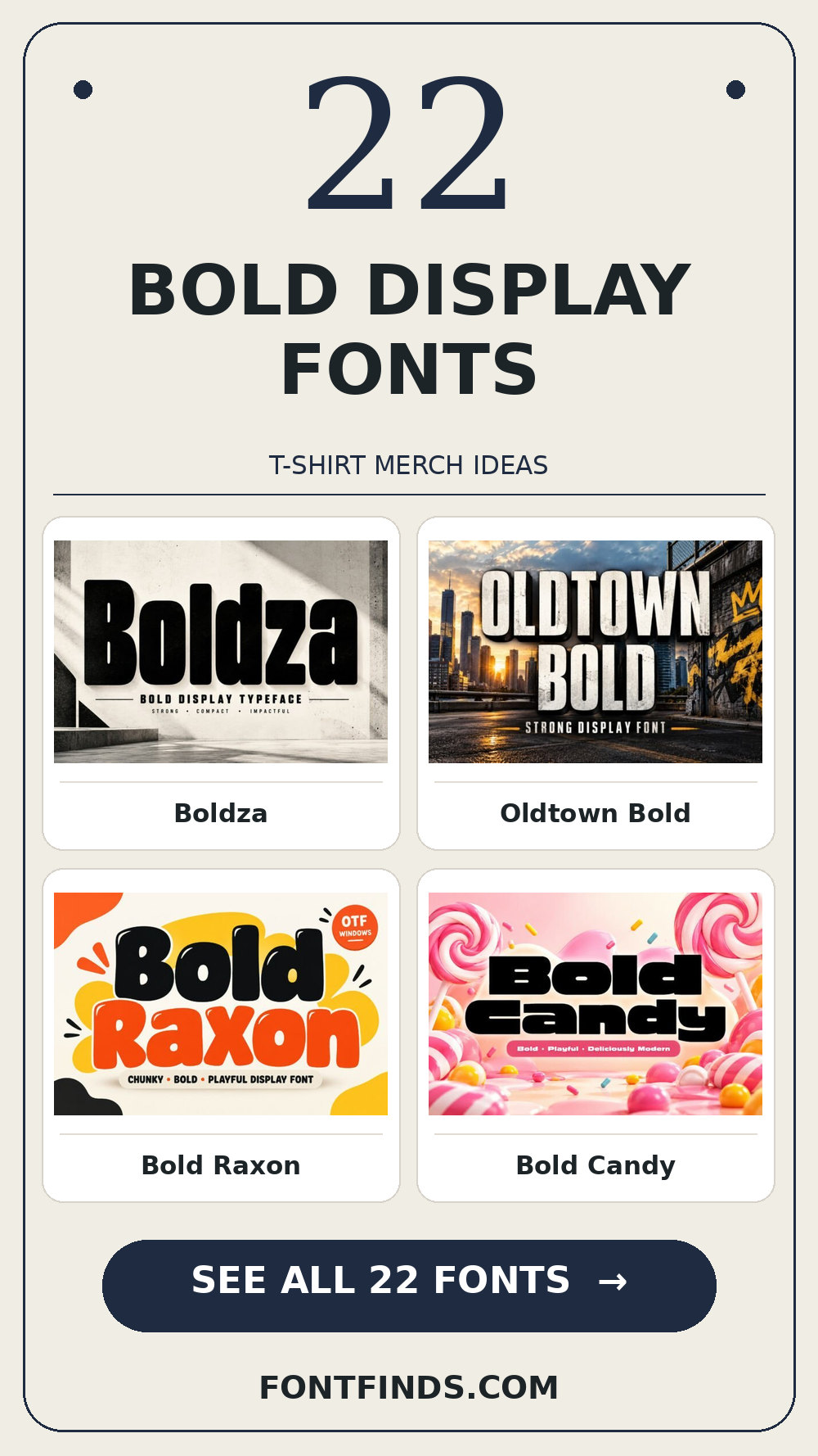
Bold Display Fonts: what to test first
Put the longest line of the slogan on a 30 cm chest print and reduce it to a small storefront thumbnail. Wide letters may require a line break; distressed details may fill in on fabric. Keep the message to one visual hierarchy rather than stacking four different effects on top.
Three places to start
| Font | Try it on |
|---|---|
| Boldza | a two-word chest graphic |
| Oldtown Bold | a club merch drop |
| Bold Raxon | a band T-shirt |
Big blocks for short slogans
1. Boldza
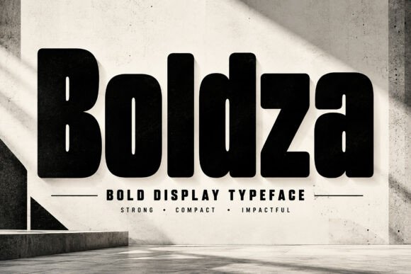
Boldza leans on a distinct display silhouette, a useful starting point for a two-word chest graphic. If the design has lots of tiny copy, let the expressive type stay large. For the main phrase, test its legibility away from the enlarged sample before you settle on the layout.
View Boldza and download options →
2. Oldtown Bold
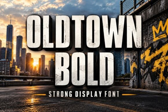
The appeal of Oldtown Bold is compact letter proportions. A second detail to notice is tight proportions. Try it first as a club merch drop, then shrink the artwork to a phone preview. If the word still lands immediately, it can lead; otherwise, use it for a single accent.
View Oldtown Bold and download options →
3. Bold Raxon
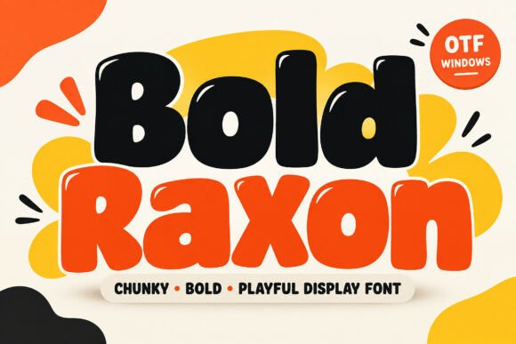
Try Bold Raxon on a band T-shirt. It uses rounded contours to set the mood. A second detail to notice is generous curves. Type your complete phrase, test the counters with a longer line of text, and inspect a print-size draft before trusting the enlarged preview.
View Bold Raxon and download options →
4. Bold Candy
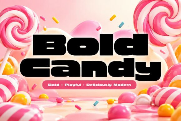
In this shortlist, Bold Candy is worth testing for a tote bag slogan because of its rounded contours. A second detail to notice is generous curves. Set the actual copy in one color, use a quieter sans for captions and credits, and check how the spacing changes after a line break.
View Bold Candy and download options →
5. Nexablock
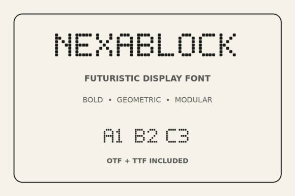
For a print-on-demand listing image, Nexablock offers deliberate geometric construction. A second detail to notice is geometric rhythm. Give it one clear task in the composition. Before choosing it, compare similar letters at the smallest planned scale and compare the result with a plain companion face at actual size.
View Nexablock and download options →
6. Junke Bold
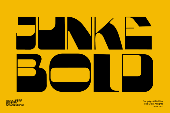
Consider Junke Bold for a two-word chest graphic: deliberate geometric construction gives the phrase a clear personality. A second detail to notice is geometric rhythm. Leave breathing room around the letters and compare similar letters at the smallest planned scale. Pair it with a simple text face for the smaller information rather than another competing display style.
View Junke Bold and download options →
7. Sandora
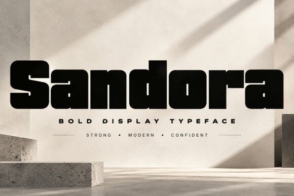
At first glance Sandora reads through a distinct display silhouette. Put it on a club merch drop, but keep the adjacent information quiet. The real proof comes at final size: test its legibility away from the enlarged sample.
View Sandora and download options →
8. Drevkor
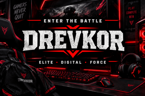
Drevkor brings angular blackletter structure to a band T-shirt. A second detail to notice is geometric rhythm. I would keep the inner spaces open at smaller sizes, then choose a quieter sans for captions and credits for the details. That division keeps the headline expressive and the information easy to scan.
View Drevkor and download options →
9. Gotenor
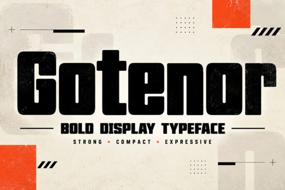
Gotenor is a display option marked by deliberate geometric construction. A second detail to notice is geometric rhythm. Its strongest role here may be a tote bag slogan. Build a one-color proof and compare similar letters at the smallest planned scale; the vendor mockup alone is too generous a test.
View Gotenor and download options →
10. Gauden
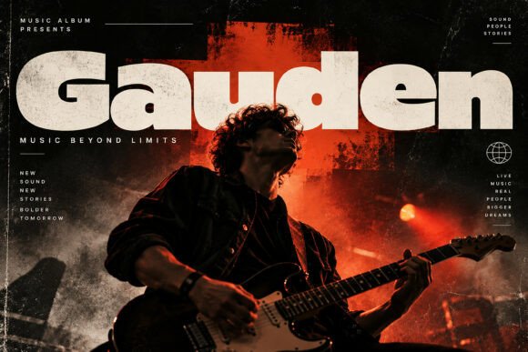
Gauden can give a print-on-demand listing image a different pace through rounded contours. A second detail to notice is generous curves. I would place it beside a simple text face for the smaller information, then check the longest word and the smallest practical size before making a final choice.
View Gauden and download options →
11. Breakfire
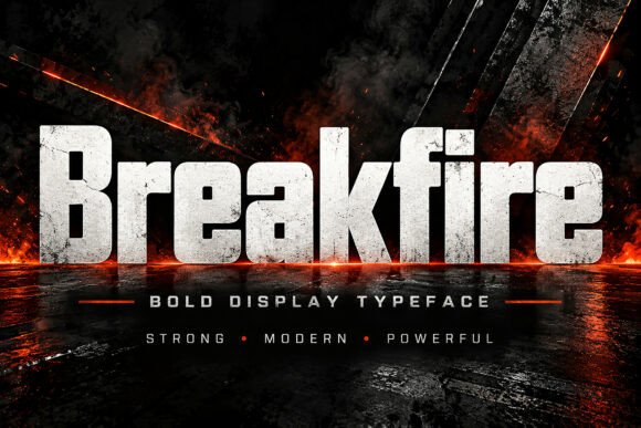
Breakfire leans on a distinct display silhouette, a useful starting point for a two-word chest graphic. If the design has lots of tiny copy, let the expressive type stay large. For the main phrase, test its legibility away from the enlarged sample before you settle on the layout.
View Breakfire and download options →
Condensed energy and texture for longer lines
12. Royal Haven
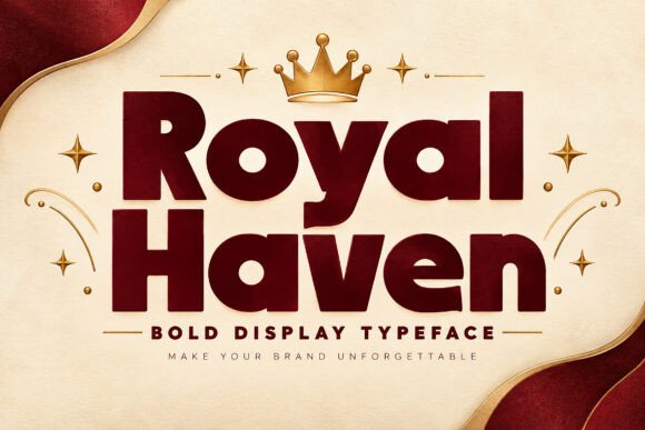
The appeal of Royal Haven is rounded contours. A second detail to notice is generous curves. Try it first as a club merch drop, then shrink the artwork to a phone preview. If the word still lands immediately, it can lead; otherwise, use it for a single accent.
View Royal Haven and download options →
13. Uachmont
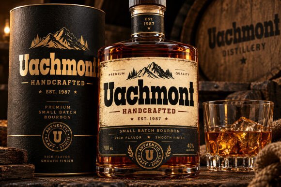
Try Uachmont on a band T-shirt. It uses compact letter proportions to set the mood. A second detail to notice is tight proportions. Type your complete phrase, make sure adjacent capitals do not collapse together, and inspect a print-size draft before trusting the enlarged preview.
View Uachmont and download options →
14. Vandrix
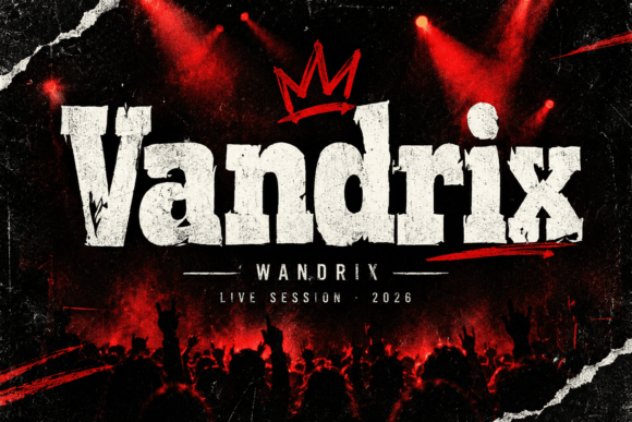
In this shortlist, Vandrix is worth testing for a tote bag slogan because of its a distinct display silhouette. Set the actual copy in one color, use a quieter sans for captions and credits, and check how the spacing changes after a line break.
View Vandrix and download options →
15. Bloko
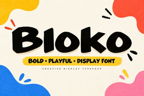
For a print-on-demand listing image, Bloko offers rounded contours. A second detail to notice is generous curves. Give it one clear task in the composition. Before choosing it, test the counters with a longer line of text and compare the result with a plain companion face at actual size.
View Bloko and download options →
16. Baltron
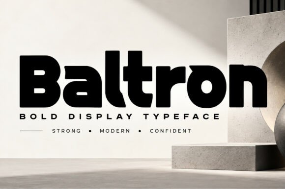
Consider Baltron for a two-word chest graphic: deliberate geometric construction gives the phrase a clear personality. A second detail to notice is generous curves. Leave breathing room around the letters and compare similar letters at the smallest planned scale. Pair it with a quieter sans for captions and credits rather than another competing display style.
View Baltron and download options →
17. Aivon
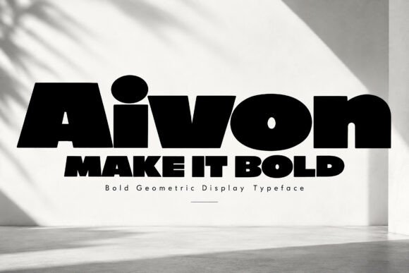
At first glance Aivon reads through deliberate geometric construction. A second detail to notice is generous curves. Put it on a club merch drop, but keep the adjacent information quiet. The real proof comes at final size: compare similar letters at the smallest planned scale.
View Aivon and download options →
18. Rexton Kairo
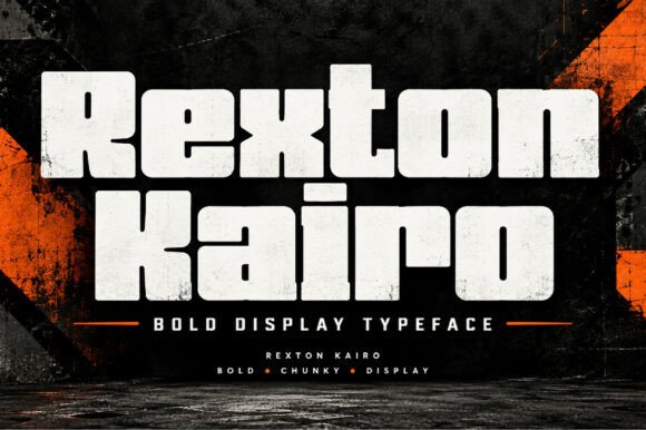
Rexton Kairo brings deliberate geometric construction to a band T-shirt. A second detail to notice is geometric rhythm. I would compare similar letters at the smallest planned scale, then choose a simple text face for the smaller information for the details. That division keeps the headline expressive and the information easy to scan.
View Rexton Kairo and download options →
19. Blackridge
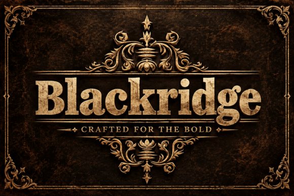
Blackridge is a slab serif option marked by a distinct display silhouette. A second detail to notice is ornamental details. Its strongest role here may be a tote bag slogan. Build a one-color proof and test its legibility away from the enlarged sample; the vendor mockup alone is too generous a test.
View Blackridge and download options →
20. Vexrion
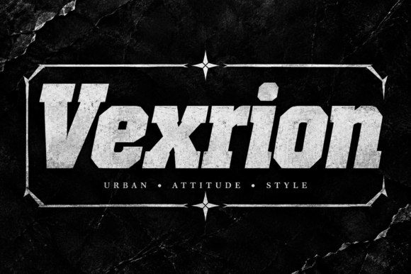
Vexrion can give a print-on-demand listing image a different pace through deliberate geometric construction. A second detail to notice is geometric rhythm. I would place it beside a quieter sans for captions and credits, then check the longest word and the smallest practical size before making a final choice.
View Vexrion and download options →
21. Ravelle
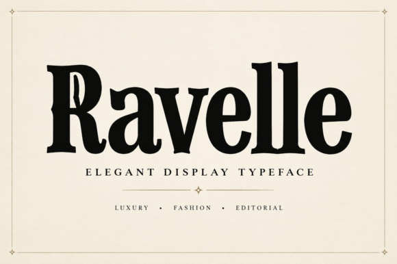
Ravelle leans on a serif-led word shape, a useful starting point for a two-word chest graphic. A second detail to notice is ornamental details. If the design has lots of tiny copy, let the expressive type stay large. For the main phrase, compare the same title in upper and lower case before you settle on the layout.
View Ravelle and download options →
22. Lasta Nova
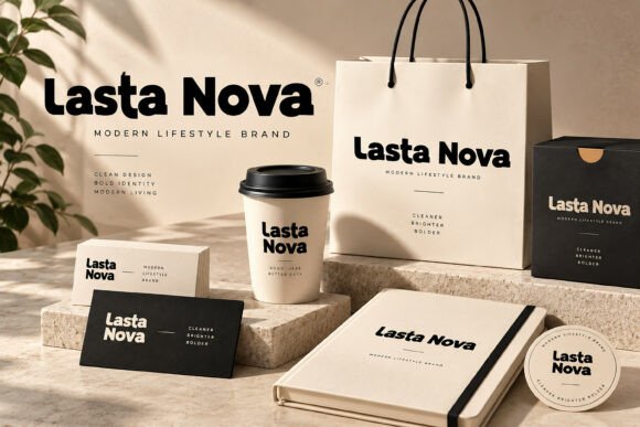
The appeal of Lasta Nova is deliberate geometric construction. A second detail to notice is generous curves. Try it first as a club merch drop, then shrink the artwork to a phone preview. If the word still lands immediately, it can lead; otherwise, use it for a single accent.
View Lasta Nova and download options →
From specimen to finished project
Ask for a production proof if the print method changes: screen printing, transfer and embroidery preserve detail differently. Verify the specific license for merchandise or print-on-demand use on the product page. A large sample image is useful for style, but it is not a license summary.
Frequently asked question
What makes a display font work on a T-shirt?
Clear silhouettes, strong counters and print-friendly detail. Test at both physical print size and thumbnail size before committing.
Want another direction? Compare this shortlist with a related FontFinds font guide. Open each typeface above to inspect the complete character set, current price and license before downloading it for your project.