Handwritten fonts are the most competitive category on any marketplace, which means new releases arrive daily and most describe themselves in identical language. Charming, warm, playful, organic. These twenty recent handwritten fonts are covered with attention to the details that genuinely differ: baseline bounce, stroke weight, connection quality, and whether the letterforms stay clear enough for the audience reading them.
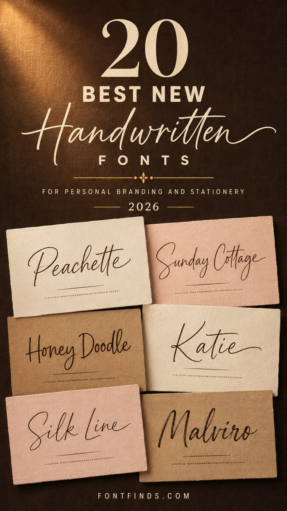
Four Things That Separate Good From Filler
Baseline bounce. Real handwriting does not sit flat. Letters rise and fall slightly, and a font holding every character at the same height reads as typed no matter how casual the letterforms look. Bounce is hard to fake and it is the most reliable quality signal.
Stroke momentum. Written letters carry speed through the connections. Constructed ones show a visible hesitation at every junction, which reads as careful rather than natural.
Letterform clarity. Check the lowercase a against the o, and the l against the capital I. Ambiguity there is tolerable in a decorative headline and unacceptable in anything children or customers need to read.
Weight. This decides whether the font survives leaving a screen. Bold handwriting cuts on vinyl, embroiders and reverses cleanly. Light handwriting fails at all three.
A note on descriptions. Handwritten fonts sell on emotional language, and dozens of releases use nearly identical wording because those words are what customers search for. Judge from the specimen image and from the four tests above, because the copy will not differentiate anything.
20 New Handwritten Fonts
Playful Casual
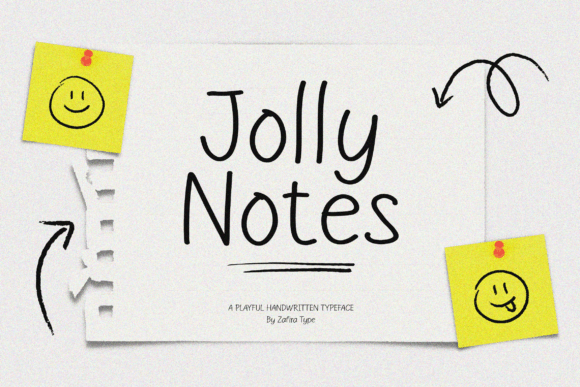
1. Jolly Notes
Jolly Notes adds carefree charm and casual warmth through relaxed letterforms. Casual handwriting fonts work through irregularity, and the amount of irregularity is what determines the register.
Slight variation reads as neat handwriting. Heavy variation reads as hurried notes. Neither is better, but they suit different projects, and a font marketed as casual can sit anywhere on that spectrum.
My take: Judge the amount of irregularity, not whether it exists. That is what separates neat handwriting from scrawl.
View This Font →
Cheerful Classroom
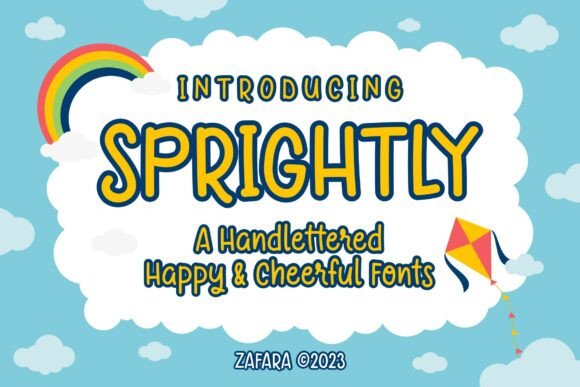
2. Sprightly
Sprightly infuses playful classroom charm into handlettered forms. Classroom-positioned fonts have a requirement most handwriting fonts ignore entirely: letterform clarity for developing readers.
A lowercase a that could be read as an o, or an l identical to a capital I, causes real problems in teaching material. If the font is going in front of children learning to read, check those specific characters before anything else.
My take: Check the a, o, l and I before using any handwriting font in teaching material. Ambiguity costs more here than anywhere.
View This Font →
Bouncy Organic
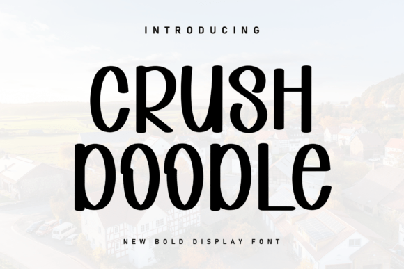
3. Crush Doodle
Crush Doodle brings friendly organic warmth with bouncy energy. Bounce refers to baseline variation, and it is the single most reliable indicator that a handwriting font was drawn rather than constructed.
Constructed handwriting sits on a rigid baseline and reads as typed no matter how casual the letterforms look. Bounce is difficult to fake convincingly, which is why it separates good releases from filler.
My take: Baseline bounce is the quality tell. Constructed handwriting reads as typed however casual the letters look.
View This Font →
Tall Carefree
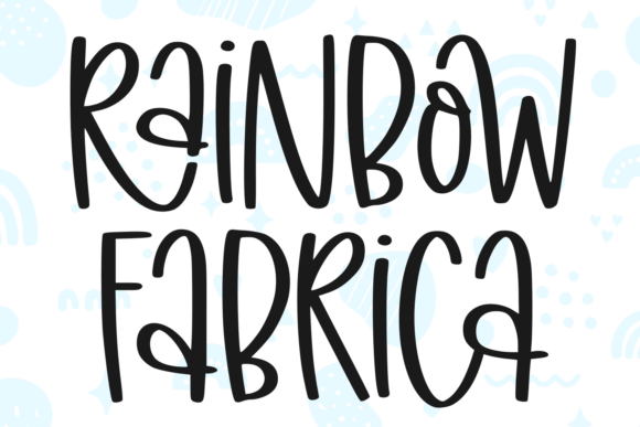
4. Rainbow Fabrica
Rainbow Fabrica has a tall carefree rhythm with charming imperfection. Tall proportions in handwriting are unusual and they change the feeling considerably.
Extended ascenders and descenders read as expressive and slightly theatrical, where compact handwriting reads as practical. The trade-off is line spacing, since tall letters need vertical room and cramped leading makes them collide.
My take: Tall handwriting needs generous line spacing. Cramping it destroys the quality you bought it for.
View This Font →
Slender Relaxed
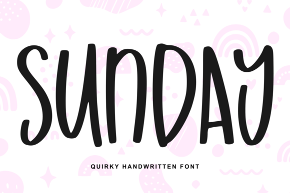
5. Sunday
Sunday pairs tall slender characters with a relaxed carefree rhythm. Slender handwriting occupies a useful middle position between delicate script and casual print.
It reads as personal without being decorative, which suits lifestyle brands, journalling products and social content where a formal script would feel overdressed and a bold marker font would feel loud.
My take: The middle register between script and marker. Personal without being decorative, which most projects actually want.
View This Font →
Whimsical Handmade
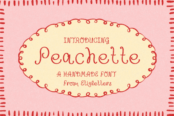
6. Peachette
Peachette is a whimsical handmade font full of personality. Personality-led handwriting has a specific commercial limitation worth understanding.
Strong character means strong association, and a distinctive handwriting font will feel like a specific person. That is powerful for a personal brand and awkward for a company, where the implied individual conflicts with the idea of an organisation.
My take: Distinctive handwriting implies a specific person. Great for personal brands, awkward for companies.
View This Font →
Cozy Simplicity
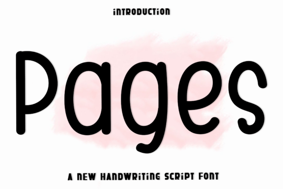
7. Pages
Pages brings effortless simplicity and cozy handwritten warmth. Simple handwriting fonts are undervalued because they are hard to market.
A font without a distinguishing quirk cannot be sold on that quirk, which pushes designers toward exaggeration. In practice, most projects need handwriting that feels human and stays out of the way, and plain releases do that better than characterful ones.
My take: Plain handwriting is undervalued because it is unmarketable. It is also what most projects actually need.
View This Font →
Warm Display
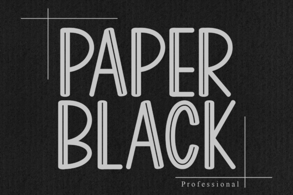
8. Paper Black
Paper Black is a playful handwritten display font radiating warmth. Display handwriting differs from text handwriting in weight and spacing.
Display versions are heavier and tighter, built to work as a headline. That makes them useless for the paragraph of casual text you might have planned underneath, so check whether the family includes a lighter cut before assuming one font covers both roles.
My take: Display handwriting cannot carry the paragraph beneath it. Check for a lighter cut in the same family.
View This Font →
Cheerful Personal
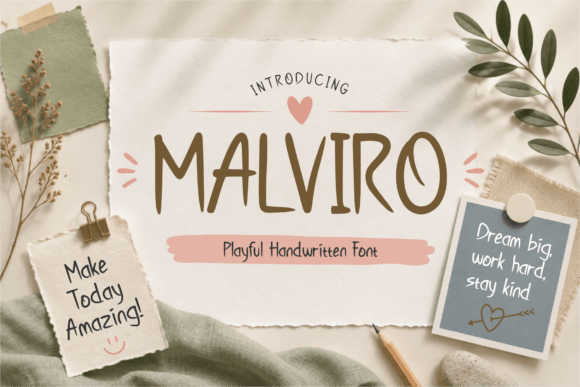
9. Malviro
Malviro delivers a warm cheerful personal touch. Cheerful is a specific register achieved through upward baseline drift and rounded terminals rather than through decoration.
Those two details are worth recognising because they are the mechanism behind almost every font described as happy or friendly. Once you can see them, choosing between similar releases becomes a matter of degree rather than guesswork.
My take: Upward drift and rounded terminals are the mechanism behind every friendly font. Look for them directly.
View This Font →
Bold Expressive
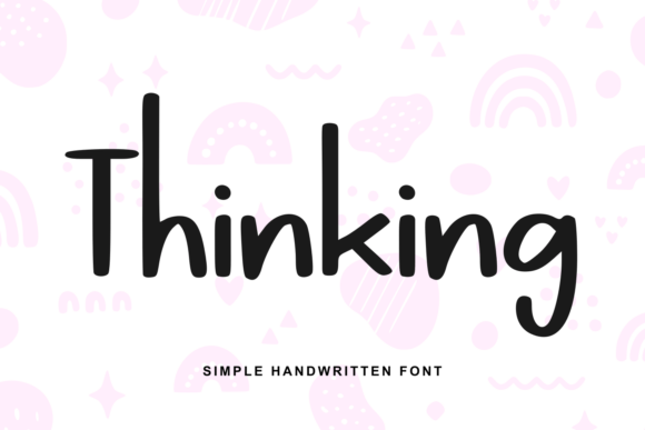
10. Thinking
Thinking is a playful handwritten font with bold strokes and an expressive feel. Weight in handwriting fonts matters more than in most categories.
Bold handwriting survives vinyl cutting, embroidery, small print and reversed-out use on dark backgrounds. Light handwriting survives none of them. If the design is heading onto a physical product, weight is the deciding factor rather than character.
My take: Weight decides whether handwriting survives production. Light handwriting fails on every physical method.
View This Font →
Fluid Penmanship
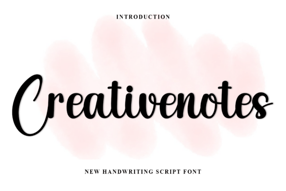
11. Creativenotes
Creativenotes brings soft casual warmth and fluid penmanship. Fluid penmanship means the strokes maintain momentum through the letters rather than stopping and restarting.
That continuity is what makes handwriting look written rather than drawn. Fonts that construct each letter independently show a visible hesitation at every junction, which reads as careful rather than natural.
My take: Momentum through the letters is what makes handwriting look written rather than assembled.
View This Font →
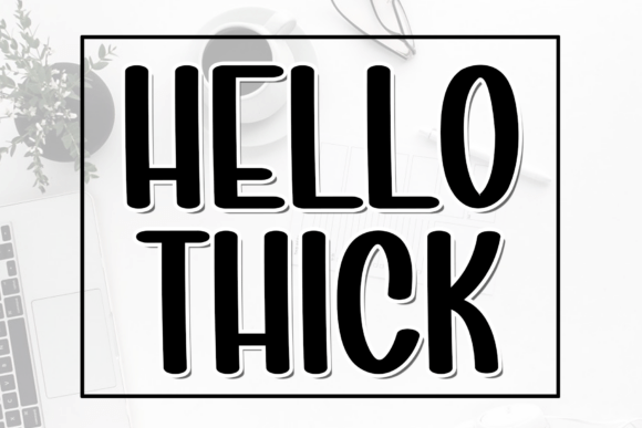
Friendly Presence
12. Hello Thick
Hello Thick commands big friendly presence with crisp readability and hand-cut charm. Hand-cut refers to letterforms that look trimmed with scissors or a blade rather than written with a pen.
That is a distinct aesthetic from pen-based handwriting, with flat terminals and slightly angular curves. It reads as crafted and deliberate, which suits packaging and product labels better than flowing pen styles do.
My take: Hand-cut and pen-written are different aesthetics. Cut styles suit packaging where pen styles suit correspondence.
View This Font →
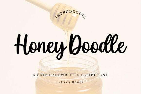
Smooth Script
13. Honey Doodle
Honey Doodle is a charming handwritten script with smooth flowing strokes. Script handwriting differs from print handwriting in that the letters connect.
Connection introduces a specific failure mode: increase letter spacing and the connections break, leaving visible gaps that look like a rendering error. If your layout software has default tracking applied, set it to zero before judging a connected script.
My take: Connected scripts break if tracking is above zero. Check that before deciding a font is poorly made.
View This Font →
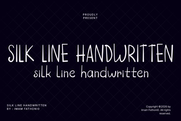
Delicate Monoline
14. Silk Line
Silk Line brings soft minimalist charm through delicate monoline strokes. Monoline means one consistent stroke weight throughout, with no thick-thin variation at all.
That consistency is a production advantage. Monoline handwriting cuts cleanly on vinyl, embroiders without collapsing and reverses out of dark backgrounds without thinning, all of which contrast-based scripts cannot manage without redrawing.
My take: Monoline is the pragmatic choice for anything manufactured. Consistent weight survives every production method.
View This Font →
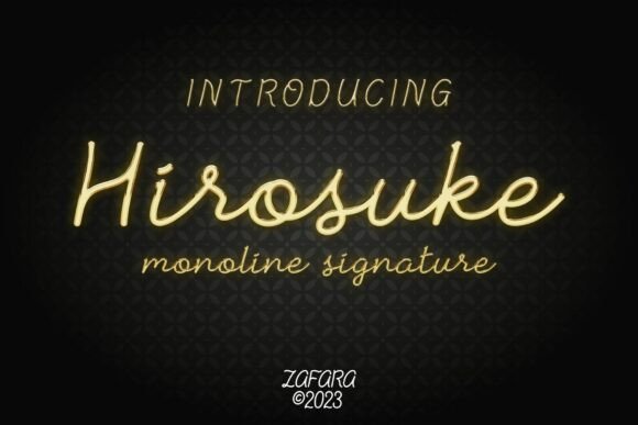
Monoline Signature
15. Hirosuke
Hirosuke defines sleek contemporary luxury through monoline signature styling. Signature fonts are optimised for short strings, typically two or three words.
That optimisation shows up in the spacing, which is tuned for a name rather than a sentence. Set a full line in a signature font and it often looks subtly wrong without anything being obviously broken, which is frustrating to diagnose after the fact.
My take: Signature fonts are spaced for names. A full line will look slightly off in ways that are hard to identify.
View This Font →
Raw Expressive
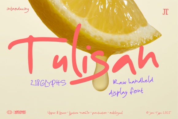
16. Tulisan
Tulisan is a raw expressive handwritten display font. Raw handwriting sits at the opposite end from neat handwriting and serves a completely different market.
It suits streetwear, music, activism and anything positioned as urgent or unpolished. It fails entirely in contexts requiring trust or calm, where the same energy reads as unstable rather than authentic.
My take: Raw handwriting reads as urgent to one audience and unstable to another. Match it to the positioning deliberately.
View This Font →
Cozy Neat
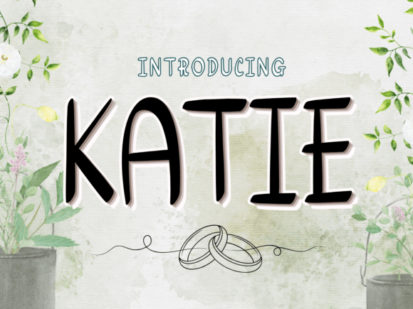
17. Katie
Katie is a cozy charming handwriting font for people who like neat writing. Neat handwriting is genuinely harder to draw well than messy handwriting.
Messy styles hide imperfection because variation is expected. Neat styles expose it, since the eye notices when one letter sits fractionally off in an otherwise regular line. A well-made neat handwriting font is a better indicator of craft than a well-made messy one.
My take: Neat handwriting exposes drawing flaws that messy styles hide. It is a better test of the designer’s skill.
View This Font →
Modern Stylish
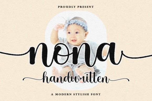
18. Nona
Nona is a modern stylish handwritten script with smooth flowing character. Modern in handwriting usually means reduced ornament and more consistent stroke weight than traditional script.
That modernisation improves durability. Traditional scripts carry calligraphic hairlines that fail in production, while modern handwriting flattens the contrast and survives considerably more reproduction methods.
My take: Modern handwriting flattens the contrast, which is exactly why it survives production better than traditional script.
View This Font →
Quirky Friendly
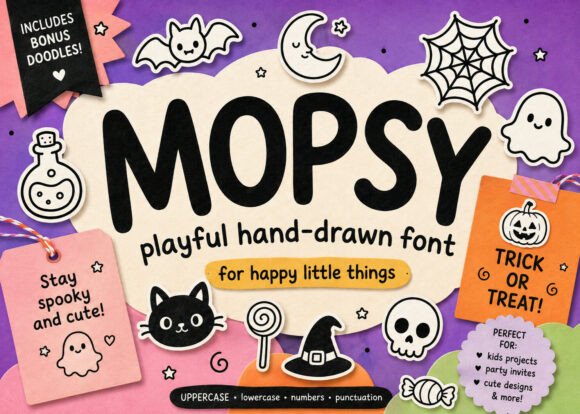
19. Mopsy
Mopsy is a playful hand-drawn font with a cute, slightly quirky look. Quirk in handwriting comes from specific letterform decisions rather than from general irregularity.
An unusual lowercase g, a distinctive e, an unexpected crossbar. Those decisions are charming when the letters appear in your text and irrelevant when they do not, which is why typing your actual words matters more here than in any other category.
My take: Quirks only matter if your words contain those letters. Type the real text before deciding.
View This Font →
Soft Modern Script
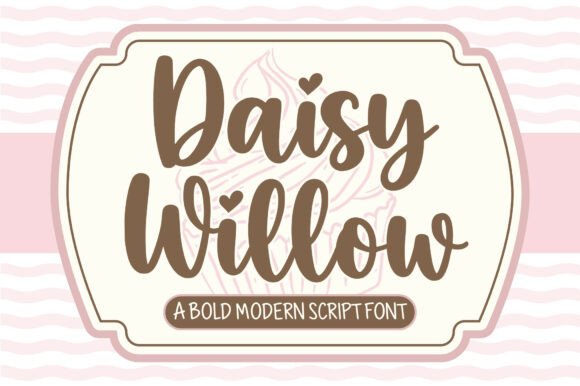
20. Daisy Willow
Daisy Willow blends soft handwritten strokes with modern script structure. Blended fonts sit between categories deliberately, aiming at versatility.
Versatility is genuinely valuable for a small brand that cannot afford multiple licences, since one font covering a logo, a label and social content keeps everything consistent. The risk is that fonts designed to suit everything sometimes lack a quality worth remembering.
My take: Versatile fonts save money and risk being forgettable. Fine as a supporting face, riskier as the whole identity.
View This Font →
Choosing by Register
Neat
Consistent, legible, minimal bounce. Suits teaching material, planners, instructions and anything where the text has to be read carefully rather than admired.
Casual
Moderate irregularity, relaxed rhythm. The broadest register, covering social content, small business branding, packaging and greeting cards.
Expressive
Heavy bounce, strong personality, distinctive letterforms. Powerful for personal brands and artists, awkward for companies where the implied individual conflicts with the organisation.
Raw
Deliberately unpolished, urgent, often bold. Suits streetwear, music and activism, and reads as unstable rather than authentic in contexts needing trust.
Questions People Ask
What are handwritten fonts used for?
Personal branding, greeting cards, packaging for small businesses, social content, planners and anywhere a design should feel made by a person rather than an organisation.
Why do my handwritten letters look disconnected?
Letter spacing has been increased above zero. Connected handwriting depends on letters touching, so set tracking back to zero and the joins return.
Which handwritten fonts work for products I sell?
The bolder and monoline options. Light handwriting with varying stroke weight fails in vinyl cutting, embroidery and small-scale printing without being redrawn.
Are handwritten fonts suitable for children’s material?
Some are. Check the lowercase a against the o and the l against the capital I. Ambiguity in those characters causes real difficulty for developing readers.
How many handwritten fonts should I own?
Three or four covering different registers: one neat, one casual, one bold for production, one expressive. Buying a fifth in the same register you already have adds nothing.
Related: free handwritten fonts, signature fonts for logo design, or browse Creative Fabrica →




5 Comments