8 Best Cozy Winter Fonts for Greeting Card Ideas
A winter greeting card can lean into Christmas color or take a quieter route with snow-inspired type and a soft handwritten line. This roundup puts cozy winter fonts into three card situations: a short cover message, a personal note inside and a small sender line on the back. The preview should help you choose how festive the finished piece needs to feel.
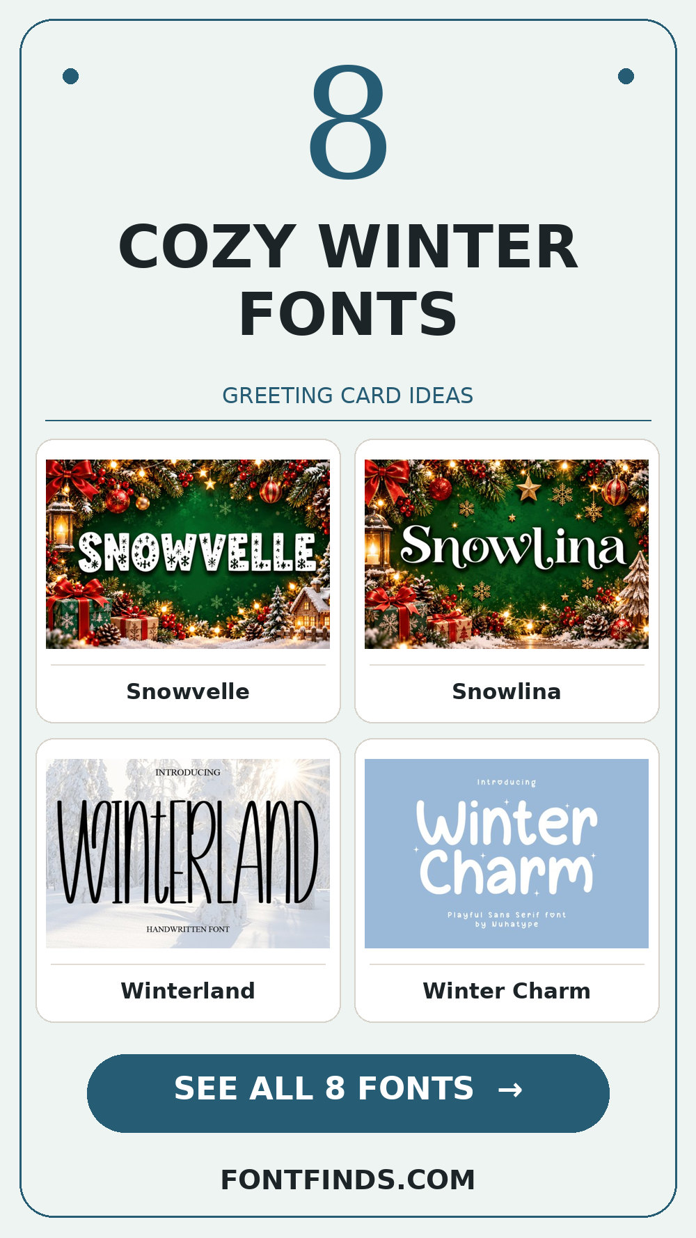
Cozy Winter Fonts: what to test first
Test a candidate on both a light cream card and a deep blue one. Thin strokes may disappear on an uncoated stock, while chunky snow details can clog when scaled down. Keep the inside message in a companion typeface if the display font asks the reader to decipher every word.
Before you choose
- Set the real headline, not the sample word.
- Check a small preview and a one-color proof.
- Read the individual product page for available glyphs and license terms.
Snowy cover lettering
1. Snowvelle

Consider Snowvelle for a winter card cover: a distinct display silhouette gives the phrase a clear personality. Leave breathing room around the letters and test its legibility away from the enlarged sample. Pair it with a simple text face for the smaller information rather than another competing display style.
View Snowvelle and download options →
2. Snowlina

At first glance Snowlina reads through a distinct display silhouette. Put it on a hot cocoa gift label, but keep the adjacent information quiet. The real proof comes at final size: test its legibility away from the enlarged sample.
View Snowlina and download options →
3. Winterland
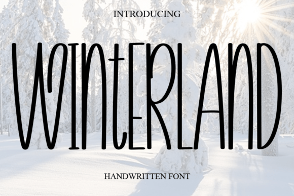
Winterland brings an informal handwritten rhythm to a January sale card. A second detail to notice is human irregularity. I would check the exact capitals and punctuation you need, then choose a plain sans for practical details for the details. That division keeps the headline expressive and the information easy to scan.
View Winterland and download options →
4. Winter Charm
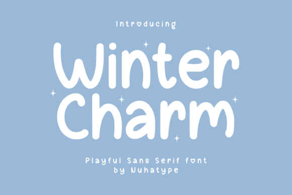
Winter Charm is a sans serif option marked by an informal handwritten rhythm. Its strongest role here may be a snowy social announcement. Build a one-color proof and check the exact capitals and punctuation you need; the vendor mockup alone is too generous a test.
View Winter Charm and download options →
Gentle notes and companion styles
Use the snowiest specimen once, on the outside. A contrasting, uncomplicated face inside makes the message feel handwritten rather than crowded. If the font contains pictorial characters, check whether the alphabet and punctuation still include everything your message needs.
5. Winterelle

Winterelle can give a seasonal thank-you note a different pace through connected script movement. I would place it beside a plain sans for practical details, then check the longest word and the smallest practical size before making a final choice.
View Winterelle and download options →
6. Snowloria

Snowloria leans on a distinct display silhouette, a useful starting point for a winter card cover. If the design has lots of tiny copy, let the expressive type stay large. For the main phrase, test its legibility away from the enlarged sample before you settle on the layout.
View Snowloria and download options →
7. Frostara
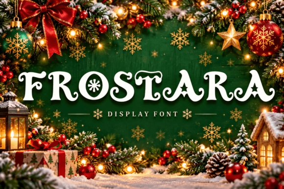
The appeal of Frostara is a distinct display silhouette. Try it first as a hot cocoa gift label, then shrink the artwork to a phone preview. If the word still lands immediately, it can lead; otherwise, use it for a single accent.
View Frostara and download options →
8. Snowman

Try Snowman on a January sale card. It uses decorative details and flourishes to set the mood. A second detail to notice is ornamental details. Type your complete phrase, reserve the largest alternates for a short heading, and inspect a print-size draft before trusting the enlarged preview.
View Snowman and download options →
Build a card that feels warm and stays readable
A winter card can separate mood from message. Put one generous word on the cover, then give the inside note a comfortable line length and a typeface that does not demand attention. If the outside has snow-shaped characters, repeat their color as a small rule or border inside rather than setting the entire paragraph in novelty lettering.
Proof the design on the intended paper. Deep blue ink can lose fine detail on absorbent stock; pale blue can become weak on cream. The sender line on the back is a useful final test: when it remains clear at a small size, the card feels deliberately designed from cover to edge. Save a phone-sized image too, since many recipients first see the card in a message.
Frequently asked question
Should the whole greeting card use the same winter font?
Usually no. Let the expressive face carry the cover; set the personal message and address in a readable companion.
Want another direction? Compare this shortlist with a related FontFinds font guide. Open each typeface above to inspect the complete character set, current price and license before downloading it for your project.