6 Best Cozy Autumn Fonts for Fall Market Sign Ideas
A fall market sign has only seconds to make a jam jar, candle or baked good feel worth picking up. These cozy autumn fonts cover handwritten warmth, quieter structure and one richly decorative accent. Rather than treating every leaf-shaped flourish as an improvement, we look at what survives on a small tag and what deserves the larger entrance sign.
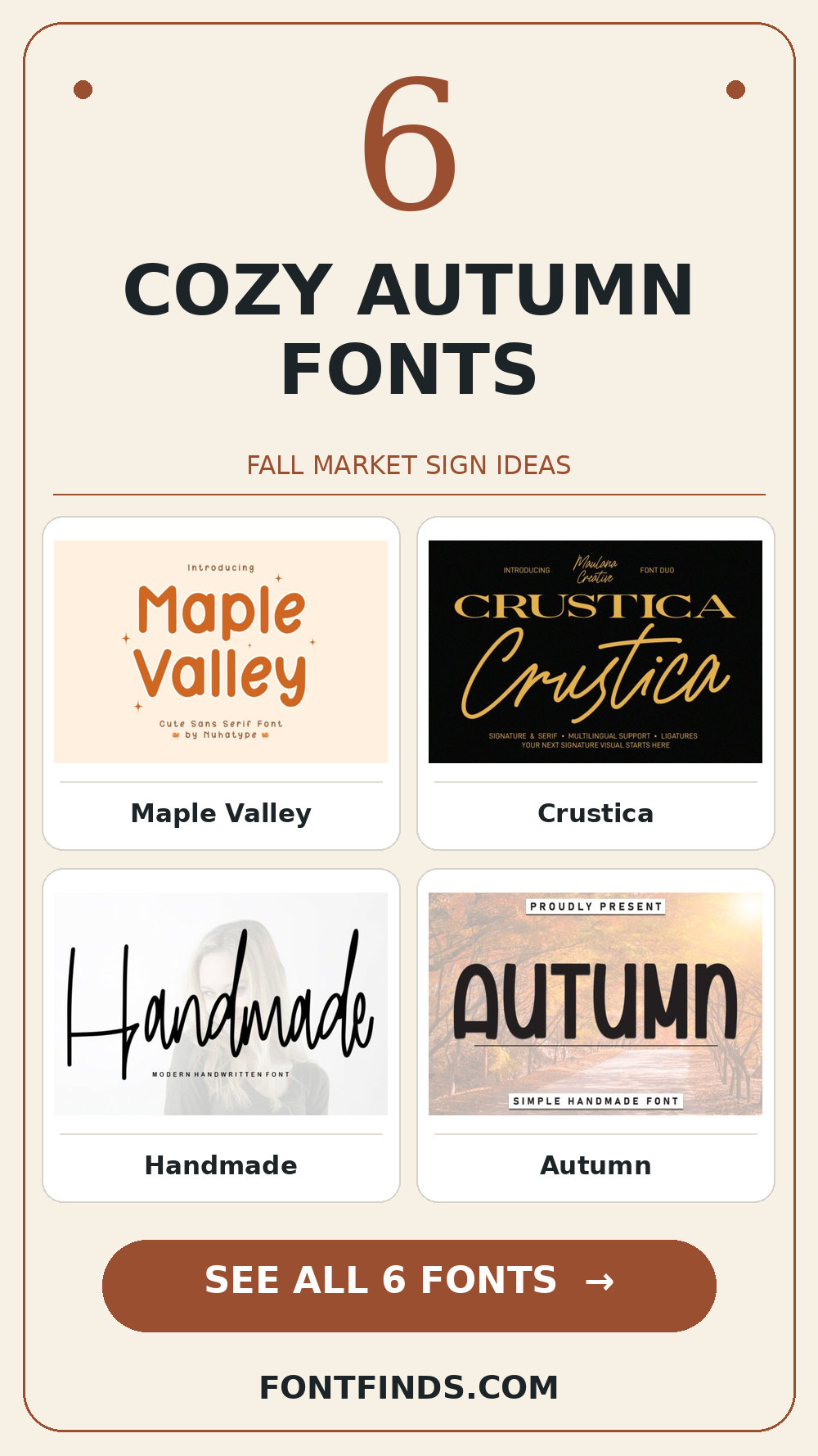
Cozy Autumn Fonts: what to test first
Make three versions of the same phrase: a two-word stall sign, a 35 mm product label and a phone-sized marketplace listing. If the name remains clear across all three, the style is doing useful work. Earthy colors, textured paper and maple illustrations can supply the season; the letters still need room to breathe.
Editor’s test: place the longest phrase for a hand-painted-looking harvest stall header in your mockup before comparing the individual specimens.
Warm lettering for maker signs
1. Maple Valley
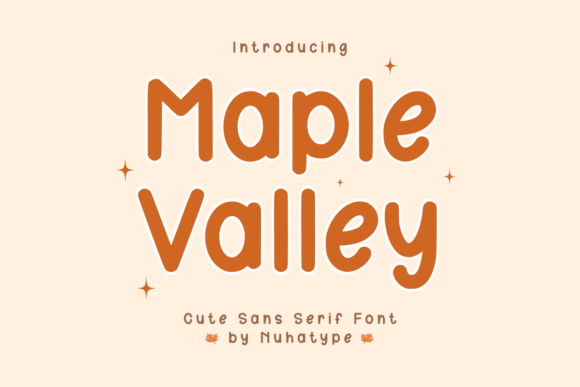
Try Maple Valley on a hand-painted-looking harvest stall header. It uses an informal handwritten rhythm to set the mood. Type your complete phrase, check the exact capitals and punctuation you need, and inspect a print-size draft before trusting the enlarged preview.
View Maple Valley and download options →
2. Crustica
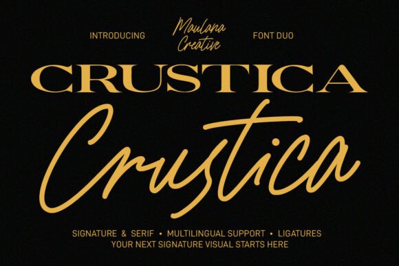
In this shortlist, Crustica is worth testing for the name on a jam label because of its visible stroke contrast. A second detail to notice is optional letterforms. Set the actual copy in one color, use a plain sans for practical details, and check how the spacing changes after a line break.
View Crustica and download options →
3. Handmade
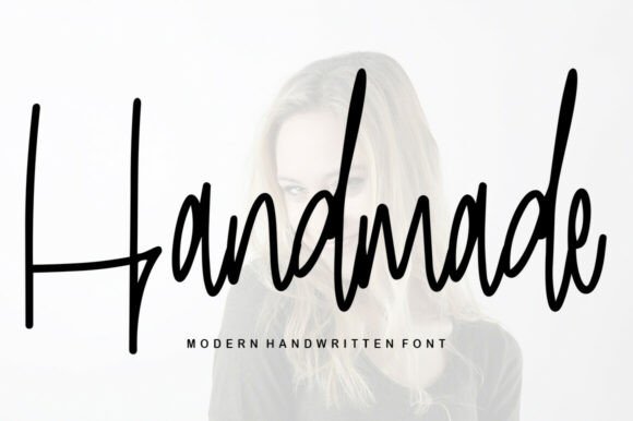
For an autumn candle sleeve, Handmade offers an informal handwritten rhythm. A second detail to notice is human irregularity. Give it one clear task in the composition. Before choosing it, check the exact capitals and punctuation you need and compare the result with a plain companion face at actual size.
View Handmade and download options →
Quiet support for labels and packaging
4. Autumn
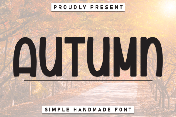
Consider Autumn for a farm shop announcement: an informal handwritten rhythm gives the phrase a clear personality. A second detail to notice is human irregularity. Leave breathing room around the letters and check the exact capitals and punctuation you need. Pair it with a simple text face for the smaller information rather than another competing display style.
View Autumn and download options →
5. Tina
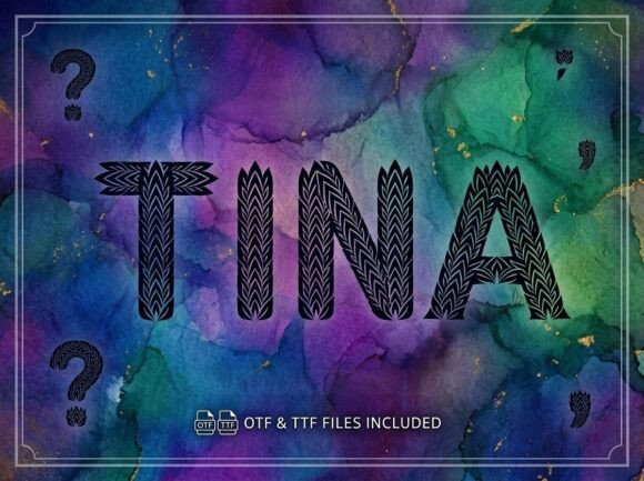
At first glance Tina reads through visible stroke contrast. A second detail to notice is generous curves. Put it on a fall market tote, but keep the adjacent information quiet. The real proof comes at final size: test the thin parts on your actual printing stock.
View Tina and download options →
6. Cozy Autumn
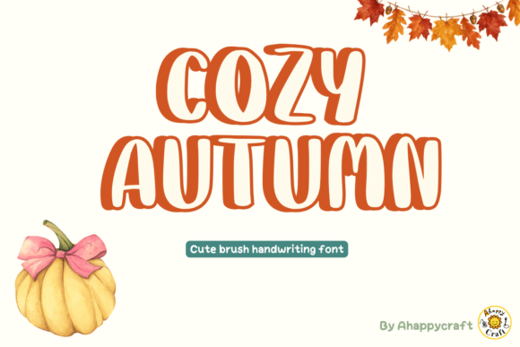
Cozy Autumn brings brushlike changes in stroke weight to a hand-painted-looking harvest stall header. A second detail to notice is generous curves. I would check how the energetic joins behave in a long word, then choose a plain sans for practical details for the details. That division keeps the headline expressive and the information easy to scan.
View Cozy Autumn and download options →
From specimen to finished project
For a sign, try the expressive face on the maker name and a plain companion for opening hours. On a small label, reverse the roles: keep ingredients, weight and scent in an easily read text face. A leaf motif is optional; the stronger seasonal cue often comes from color and paper.
One font, three fall market pieces
Begin with the stall sign: write the maker name large, then add just one short line describing what is sold. Next, carry the same heading style to a kraft-paper product tag, where the scent or flavor should remain readable at arm’s length. Finally, try it on a narrow social image that someone might see while scrolling. The third version usually reveals whether the warm character comes from the letters or only from the surrounding fall artwork.
Try a dark chestnut wordmark on cream, then a single-color version on a natural label. Avoid placing thin, expressive strokes across a busy wood photograph. If one style struggles on a small label, keep it for the large welcome sign and let a clean companion handle ingredients or opening hours. That is still a coherent identity.
Frequently asked question
Can a cozy autumn font work after fall?
Yes. Choose it for its warm letter shapes rather than a baked-in pumpkin or leaf, then change the palette and illustration for another season.
Want another direction? Compare this shortlist with a related FontFinds font guide. Open each typeface above to inspect the complete character set, current price and license before downloading it for your project.