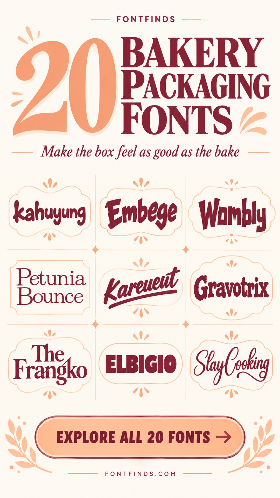
20 Delicious Bakery Packaging Fonts for Boxes and Bags
This article contains affiliate links. If you buy through them, I may earn a commission at no extra cost to you.
I want bakery packaging fonts to make the box feel worth opening before anyone sees what is inside. That does not mean every bakery needs a sugary script. A bread-focused brand can look warm and substantial; a pastry studio can feel elegant; a cookie shop can have a louder, more playful voice.
This selection is about the front-facing name and the moment of recognition. I would give detailed product information a quieter typeface and let the display lettering do one job well. Think about the actual box, bag or sticker you use, then compare the fonts against that surface rather than an imaginary perfect mockup.
How I test bakery packaging fonts on real formats
A large box lid and a small round sticker ask different things of a font. I would set the name once, then place it in both shapes. If a letter has to be cropped or squeezed to fit the sticker, the layout needs a compact alternative. A secondary arrangement is more useful than distorting the original lettering.
For a rustic bread brand, I would compare heavier forms and a slightly imperfect rhythm. For delicate pastries, a more controlled serif or flowing script can create a different expectation. Neither direction is automatically better. The useful question is whether the typography matches the product people will receive when they open the packaging.
Kraft paper changes colors and reduces contrast. A pale peach ink that looks beautiful on white may disappear on a brown bag. Start with a dark one-color version and make sure the name still has a clear outline. Add a second color only when it helps the hierarchy or distinguishes a product range.
I would keep the flavor, quantity and other practical details separate from the decorative name. That makes the packaging easier to update and gives the main font room to breathe. Reusing the same display face across a sticker, a box and a simple thank-you card can create consistency without filling every surface with identical large text.
One bakery identity across a box and a small sticker
A cake box has room for a generous wordmark, but a small seal sticker is much less forgiving. I would compare both formats at the same time. Keep the bakery name consistent, then simplify the surrounding elements on the smaller piece. The sticker does not need to carry every line from the larger box to feel like part of the same identity.
For a mixed range of breads, cookies and celebration cakes, choose a main face that can support the whole business. Product names can change in a quieter companion font. I would avoid assigning a new decorative style to every item unless the ranges are deliberately separate. Print the smallest version first: it reveals fine-stroke and spacing problems before an elaborate packaging mockup makes them easy to overlook.
20 bakery packaging fonts to compare
1. Kahuyung: A soft name for a cheerful bakery
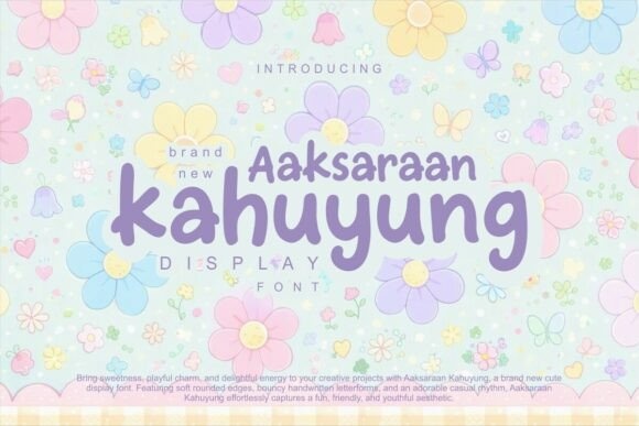
Kahuyung’s rounded handwritten forms feel friendly and informal. I would compare it for a cookie or cupcake label with a simple color palette. Keep the name comfortably large and let a quieter companion handle the flavor, so the playful rhythm remains the main impression rather than one of several competing elements.
Preview This Font →Preview & download options
2. Bowo Embege: An angular twist for a bolder brand
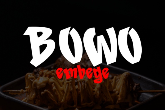
Bowo Embege has irregular, assertive forms that offer a less sugary bakery direction. I would try it for a short bread or snack brand name with a lively tone. It needs a restrained layout; the sharp shapes already create plenty of movement without a busy patterned background.
Preview This Font →Preview & download options
3. Wombywood: A retro word with handmade energy

Wombywood’s uneven, substantial letters suggest a playful vintage identity. I would compare it for a cookie box or a bakery bag where the name can take up a broad line. Keep the supporting text plain and allow the unusual letter rhythm to supply the personality.
Preview This Font →Preview & download options
4. Petunia Bounce: A light serif with a playful bounce

Petunia Bounce feels more delicate and whimsical than a heavy bakery display face. I would try it for a pastry studio or a small gift label on a clean background. Its finer details need enough scale, so compare the smallest sticker before choosing it for the whole packaging system.
Preview This Font →Preview & download options
5. Kareueut: A confident brush-script name
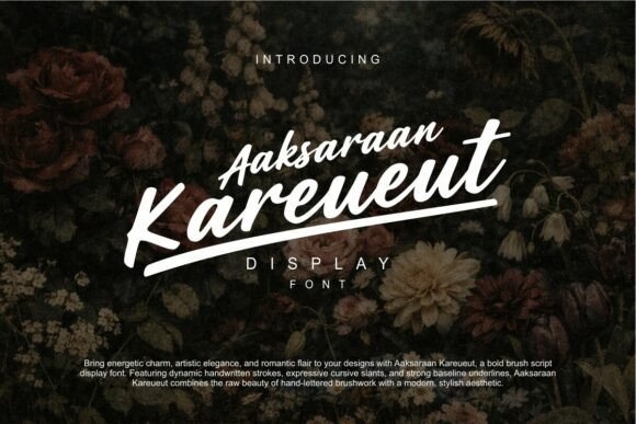
Kareueut’s slant and underline give the lettering an energetic, hand-painted feel. I would compare it for an independent bakery with a short name. Let the script sit prominently on the bag, and keep the flavor or product description well away from the underline so the two lines stay distinct.
Preview This Font →Preview & download options
6. Gravotrix: A warm, textured retro direction
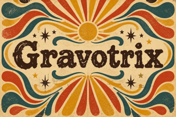
Gravotrix’s heavy serif shapes and worn-looking texture can create an established, nostalgic mood. I would use it for a bread bag or a larger box label rather than a tiny sticker. Check whether the texture remains attractive in one-color print instead of becoming a set of distracting specks.
Preview This Font →Preview & download options
7. The Frangko: A refined serif for a pastry studio
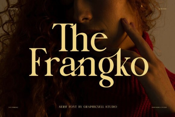
The Frangko has elegant contrast and a shaped rhythm that could suit a more polished bakery identity. I would compare it for a short name on a plain box lid. Keep the smaller product information in a simple companion and let open space provide the premium feeling.
Preview This Font →Preview & download options
8. Elbigio: A bold, friendly front-panel name

Elbigio’s broad display forms can make a short bakery name feel confident and easy to notice. I would try it on a box seal or a bag with a clear, uncomplicated layout. Compare a solid treatment before adding outlines so the shape remains strong on the smallest packaging format.
Preview This Font →Preview & download options
9. Stay Cooking: An expressive script for a homemade mood

Stay Cooking has generous loops and a flowing rhythm that could suit a personal bakery brand. I would use it for the main name on a larger label, with plenty of room around the descenders. A small plain line beneath it can carry the product type without interrupting the script.
Preview This Font →Preview & download options
10. Butterie: A graceful name for a giftable box
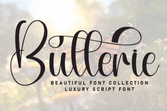
Butterie’s large loops create a decorative, elegant silhouette. I would compare it for a pastry or celebration-cake studio where the box has enough empty space. Keep the surrounding graphics minimal; the script already offers the kind of flourish that can make the packaging feel special.
Preview This Font →Preview & download options
11. Megasour: An organic, playful headline
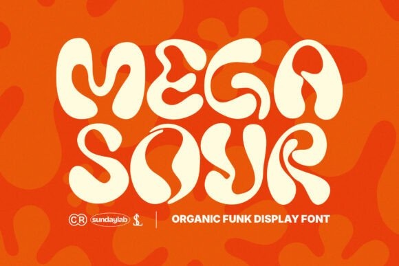
Megasour’s soft, irregular shapes bring a lively contemporary mood. I would try it for a cookie or sweet-snack brand with a short name and bold color. Its broad forms need room, so compare a compact secondary layout for small seals instead of shrinking the main word until it loses its character.
Preview This Font →Preview & download options
12. Palmello: A warm brush-like wordmark

Palmello’s thick, flowing letters feel friendly and confident. I would shortlist it for a bakery name that should look welcoming on both a bag and a box. Keep the supporting text upright and simple, and test whether the full name needs one line or two to avoid a cramped silhouette.
Preview This Font →Preview & download options
13. Super Kimberly: A light, narrow handwritten option
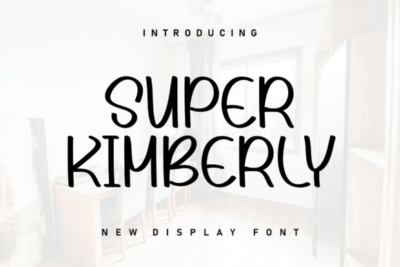
Super Kimberly has tall, slender forms that could add a personal note to a small bakery label. I would use it for a short product or collection name with strong contrast. It is a quieter choice, so do not bury it among large illustrations or dense practical information.
Preview This Font →Preview & download options
14. Swirvanta: A grounded retro bakery voice

Swirvanta’s substantial slab-like shapes offer a warm, established feeling. I would compare it for artisan bread or a bakery with a vintage visual direction. Let the name sit in a clean block and keep any distressed texture subtle enough that it still prints clearly on the intended material.
Preview This Font →Preview & download options
15. Zesty Munch: A cheerful face for an energetic range

Zesty Munch has broad, playful letters that feel immediate and informal. I would try it for cookies, snack boxes or a bold seasonal promotion. Use a simple background and give the name a clear margin; the letterforms already provide enough energy to carry the front of the package.
Preview This Font →Preview & download options
16. Wavely Groovy: A rounded retro mood
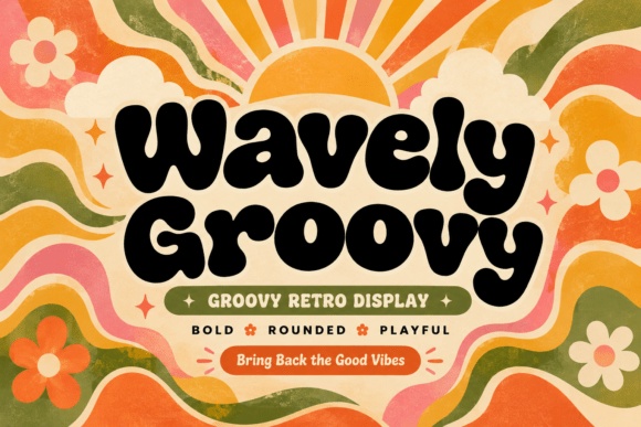
Wavely Groovy’s thick, soft shapes could make a cookie box feel upbeat and nostalgic. I would compare it for a short brand name with a restrained two-color palette. Keep the flavor line quieter and avoid repeating the same large decorative treatment on every piece of supporting text.
Preview This Font →Preview & download options
17. Groovumbo: A compact, substantial display option

Groovumbo’s rounded block letters offer a more contained retro silhouette. I would use it for a strong name panel on a bag or a rectangular box label. Test the actual word before adding an outline; the solid shape may already provide all the recognition the packaging needs.
Preview This Font →Preview & download options
18. Meal Gourmet: A casual handwritten food identity

Meal Gourmet has a loose, friendly rhythm that could suit a relaxed bakery brand. I would compare it for a name or a short product headline on a plain label. Keep the smaller details in a clearer companion and make sure the irregular proportions remain comfortable in the final layout.
Preview This Font →Preview & download options
19. Coast Royale: A broad, nostalgic wordmark

Coast Royale has a heavy, rounded presence that can make a short name feel confident and welcoming. I would try it for a playful bakery with bold packaging colors. Its width is part of the character, so use a generous label or a deliberate stacked arrangement rather than compressing it.
Preview This Font →Preview & download options
20. Cookies: A classic serif with a direct message
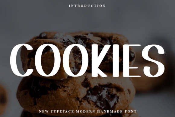
Cookies has a clean, substantial serif appearance in the preview. I would compare it for a restrained bakery label where the product itself should feel central. A simple name, a small flavor line and a generous margin could create a complete design without adding another decorative font.
Preview This Font →Preview & download options
Choose the smallest label first
My first comparison would be a warm retro face against a more restrained serif. Open the previews that fit your bakery’s personality, type the real name and test the smallest packaging format you sell. The strongest option should make that small label feel complete.
My recommendations are based on a visual review of the supplied product previews, not installation or production tests. The cover is an illustrative lettering montage. Open the linked listing to check the full character set, supplied files and current license before downloading.
More font ideas
Frequently asked questions
What kind of font works for bakery packaging?
I would match the type to the product: sturdy lettering for an artisan bread identity, a more refined face for pastries, or a playful display style for cookies. Keep the smaller information readable in a companion font.
How many fonts should bakery packaging use?
One main display font and one supporting text face are usually enough to start. Create hierarchy with size and spacing before adding another style. A consistent pair can work across boxes, bags and stickers.
Should I use a script for my bakery name?
A script can add warmth, but it is not a requirement. Test the full name on your smallest sticker. If the joins become crowded or the capitals are difficult to read, compare a serif or a rounded display face.
For another perspective on the design principles behind this selection, see bakery packaging typography guidance informing editorial questions.