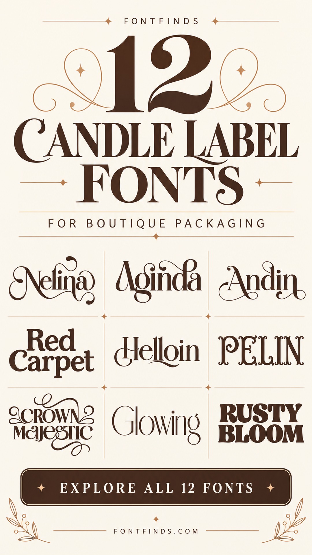
12 Candle Label Serif Fonts for Boutique Packaging
This post contains affiliate links. If you buy through them, we may earn a commission at no extra cost to you.
A candle label has very little space to establish a mood. A scent name, a small brand mark and one confident type choice can do more than a crowded collection of ornaments. These candle label serif fonts range from fine editorial lettering to a warmer retro option for a less formal collection.
The useful comparison is not simply which font looks most luxurious. Consider the length of your scent names, the color of the vessel and how the label appears around a curved surface. The previews below show the fonts themselves; each accompanying idea is a suggested packaging direction.
Choosing candle label serif fonts that survive small sizes
Type your longest scent name first and compare it with your shortest. Keep the type size consistent across the collection where possible. Fine hairlines need a clear background and a printed proof, especially on textured paper. Use the decorative face for the brand or scent name, then choose a more functional font for supporting information. A swash that looks balanced on a flat screen can wrap awkwardly around a small jar, so check a paper mockup around the actual vessel before printing a batch.
1. Nelina: A soft editorial scent name
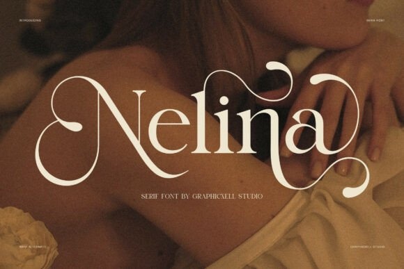
Nelina’s contrasting serif forms and sweeping details suit a label where the scent name is the main event. I would try a short floral name on warm white paper with very little surrounding decoration.
Let a single flourish reach into open space. Keeping the remaining text quiet will make the expressive lettering feel more considered on a small vessel.
View Font on Creative Fabrica →Preview • Download options • License details
2. Aginda: A tall, refined label
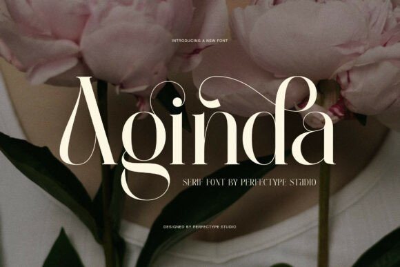
Aginda has tall proportions and fine hairlines, suggesting a more vertical label composition. It could suit a slim vessel with the scent name on two carefully balanced lines.
Print a proof before choosing a subtle ink color. The finer strokes need enough contrast to survive at the actual label size, especially against textured stock.
View Font on Creative Fabrica →Preview • Download options • License details
3. Andin: A confident boutique collection
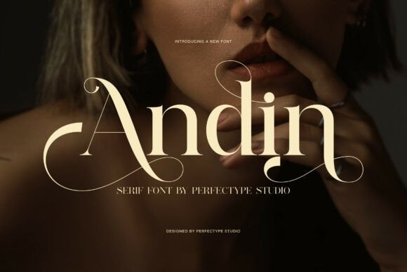
Andin combines stronger strokes with delicate hairlines for a fashion-oriented serif direction. I would test it with a short, direct scent name and a compact brand line above.
Keep the scent and brand visually distinct through size rather than extra fonts. That simple hierarchy can make a small collection feel coherent across several different names.
View Font on Creative Fabrica →Preview • Download options • License details
4. Red Carpet: A flexible modern label system
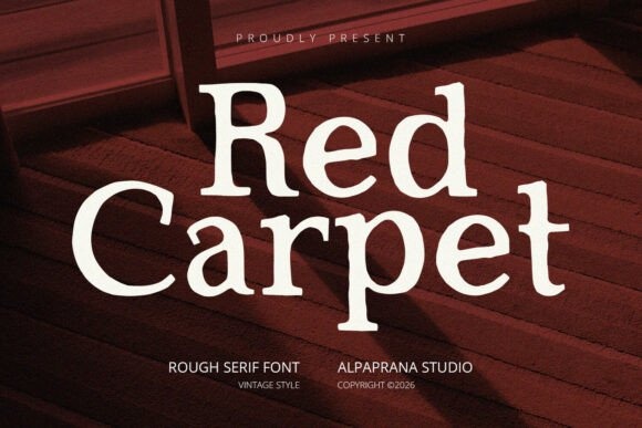
Red Carpet is a modern serif option with a listing that mentions alternates and ligatures. It is worth comparing for a candle range where several scent names need to share the same typographic system.
Begin with the default letters, then test the available alternatives in your software. A restrained recurring detail is more useful than a different flourish on every jar.
View Font on Creative Fabrica →Preview • Download options • License details
5. Helloin: An expressive signature scent
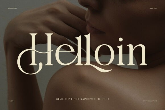
Helloin brings high contrast and decorative swashes into a more expressive label. I would reserve it for a signature scent with enough space to let the name form a distinctive central shape.
Try the word without a frame first. A border can crowd the flowing details, while an open layout gives the curves room to define the package.
View Font on Creative Fabrica →Preview • Download options • License details
6. Pelin: An apothecary-inspired collection
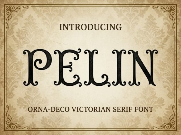
Pelin’s curling serif details and Victorian influence make it a strong candidate for an apothecary direction. Imagine a rectangular label with a short scent name, a fine rule and neatly aligned supporting text.
Avoid adding too many vintage motifs. The decorative letterforms already establish the mood, so a simple label structure will keep the design from looking overloaded.
View Font on Creative Fabrica →Preview • Download options • License details
7. Crown Majestic: A ceremonial gift edition
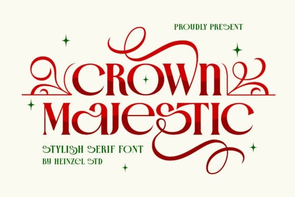
Crown Majestic suggests a more formal presentation through its contrast and decorative serif character. I would use it for a gift edition or a short collection name rather than for every small line.
Give the title a clear center and wide margins. A compact supporting block beneath it makes the hierarchy easier to follow on the curved vessel.
View Font on Creative Fabrica →Preview • Download options • License details
8. Glowing: A delicate minimalist label
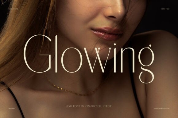
Glowing has particularly fine hairlines and a clean contemporary serif mood. It is a candidate for a sparse label with a short name, ample empty space and a strong dark-on-light contrast.
This is a font to proof carefully. I would avoid making the lettering pale and tiny at the same time, because those choices can erase its most delicate details.
View Font on Creative Fabrica →Preview • Download options • License details
9. Malguit: A tall floral collection name
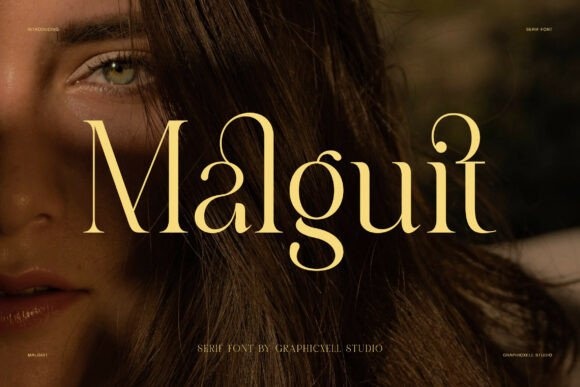
Malguit combines tall proportions with soft curved details and firm vertical strokes. It could support a floral collection that needs elegance without a large decorative illustration.
Try a narrow, centered layout and check the spaces between individual letters. The label should look balanced with the actual scent name, not just with the attractive specimen word.
View Font on Creative Fabrica →Preview • Download options • License details
10. Aldiner: A sharper editorial direction
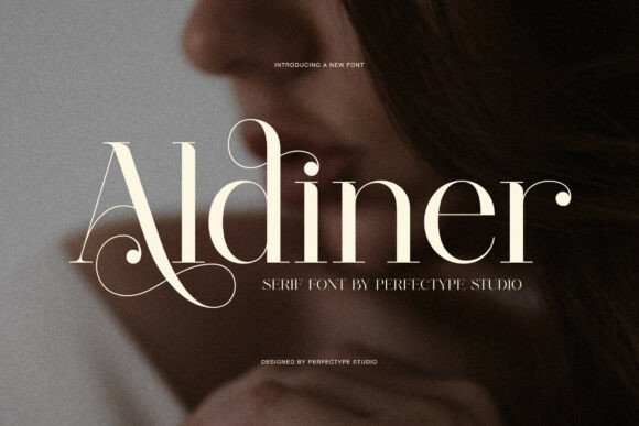
Aldiner’s high contrast and sharper serif details create a more structured editorial look. I would compare it on a simple label with a strong baseline and neatly spaced secondary text.
Keep the longest scent name in view while designing the system. A label that only works for a short word will be difficult to extend consistently.
View Font on Creative Fabrica →Preview • Download options • License details
11. Nadien: A quiet modern candle range
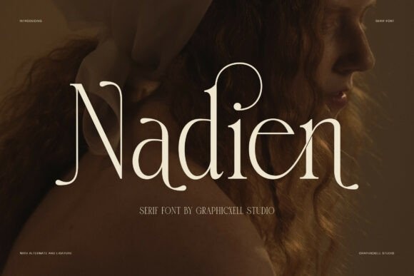
Nadien offers a polished serif direction with graceful proportions and a restrained modern character. It is a good candidate to test when the vessel color and scent name should carry most of the personality.
Use the same alignment and spacing across the range. A small consistent system can feel more refined than giving every candle a different decorative treatment.
View Font on Creative Fabrica →Preview • Download options • License details
12. Rusty Bloom: A cheerful retro scent collection
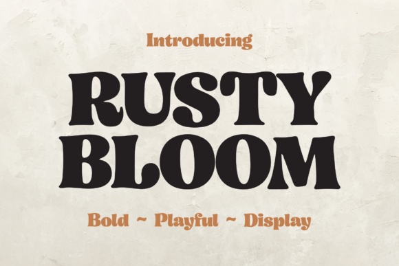
Rusty Bloom takes the group in a warmer, chunkier direction with soft curves and a groovy serif character. I would try it for a playful fruit or dessert-inspired collection with a plain, bright label.
Keep the name short and generous in size. It can bring personality without relying on the delicate hairlines found in many of the other choices.
View Font on Creative Fabrica →Preview • Download options • License details
Which style would I start with?
For a quiet editorial label, compare Nadien and Aldiner. Pelin brings an apothecary direction, while Rusty Bloom is a better starting point for a cheerful retro collection. I would decide between these moods before choosing foil, a border or an illustration.
Font previews are supplied product artwork. Layout suggestions are editorial ideas; fonts have not been installed or production-tested for this guide. Check the linked listing for the current files, supported characters and license.
More font ideas
Frequently asked questions
Can a thin serif work on a small candle label?
It can, but the result depends on size, contrast, paper and printing. Make a proof with the final words and material rather than judging only from an enlarged preview.
Should the brand and scent use the same font?
They can, provided size and spacing create a clear hierarchy. Alternatively, use one expressive serif for the scent and a quiet companion for the brand and supporting details.
Does a gold preview mean I will get gold lettering?
Not necessarily. Many previews apply color, texture or lighting to ordinary font outlines. Verify what is included, then create the desired finish in your artwork or printing process.