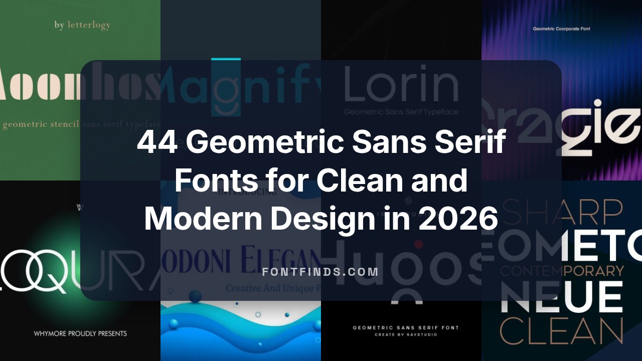
44 Geometric Sans Serif Fonts for Clean and Modern Design in 2026
Finding the right typeface often feels like the hardest part of a project, but nothing beats the clean lines and mathematical precision of geometric sans serif fonts. In 2026, these versatile styles continue to dominate everything from high-end branding to mobile app interfaces. Whether you are looking for something inspired by the Bauhaus movement or a futuristic take on classic shapes, this collection of 44 geometric sans serif fonts provides the perfect foundation for any professional layout.
1. Tower Font
Tower stands out as a robust architectural typeface that expertly balances mathematical precision with approachable aesthetics. As a premier example of geometric sans serif fonts, it features a remarkably large x-height and minimal contrast, ensuring that every character remains legible even at small sizes in dense body text. The expansive weight range, spanning from delicate light to commanding black, allows designers to establish a clear typographic hierarchy within complex branding systems and high-end editorial layouts.
This typeface is particularly effective for large-scale advertising and digital UI projects where clarity is paramount. Its sophisticated, low-contrast design creates a clean, modern look that thrives in contemporary web environments and professional packaging. Whether you are crafting a minimalist logo or an information-heavy magazine spread, Tower provides the versatility of a true workhorse font with a distinctive, refined edge.
2. Pogonia Font
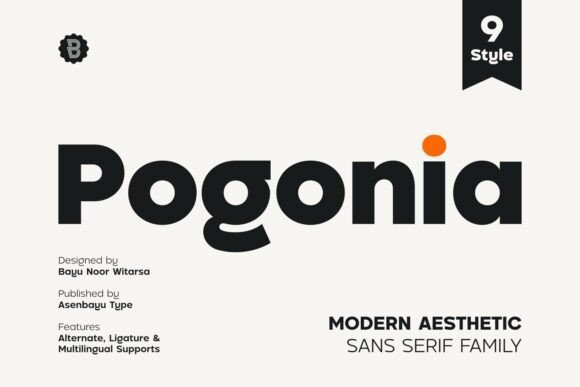
Pogonia offers a refreshing take on the geometric sans serif fonts category by blending rigid structural integrity with humanist warmth. This hybrid approach softens the coldness often associated with purely mathematical shapes, resulting in a typeface that feels both professional and inviting. Its timeless appeal is rooted in its simplicity, making it a versatile tool for creators who need a font that can transition seamlessly between digital social media assets and high-fashion print materials.
Ideal for lifestyle brands and boutique identity projects, Pogonia excels when used in lifestyle-oriented logo designs and aesthetic posters. The balanced proportions and open counters give the text a breathable quality, which is essential for maintaining a premium feel in minimalist web design. If you are looking to convey a sense of modern elegance without sacrificing readability, this typeface provides the perfect typographic voice for a variety of creative ventures.
3. Montreal Font
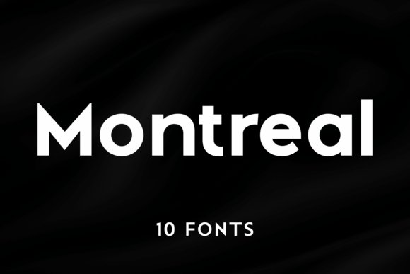
Montreal is a comprehensive typeface system designed for those who demand ultimate flexibility and a modernist aesthetic. With 10 distinct styles ranging from thin to heavy, this family exemplifies the core principles of geometric sans serif fonts: even proportions, sharp angles, and clean, unadorned lines. Each weight has been meticulously crafted to ensure harmony across the entire family, allowing for sophisticated pairings that look intentional and professionally polished.
The heavier weights, such as Montreal Black, are perfect for high-impact headlines and futuristic tech branding, while the lighter weights offer an understated elegance suitable for corporate stationary and editorial copy. This typeface is a valuable asset for any designer working on complex corporate identities or sleek app interfaces, as it provides the consistency needed for large-scale visual systems while maintaining a contemporary, high-contrast impact in display settings.
4. Mansfield Font
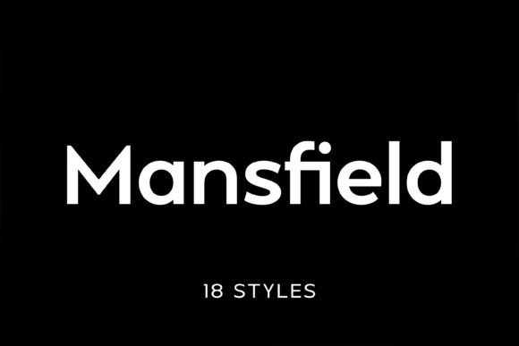
Mansfield is a masterclass in modern typography, drawing deep inspiration from the 20th-century giants like Futura and Avant-Garde to create a contemporary powerhouse. As one of the most versatile geometric sans serif fonts available, it balances the rigid mathematical precision of the Bauhaus movement with the softer, more readable nuances of neo-grotesque design. The result is a typeface characterized by a tall x-height and minimal stroke contrast, ensuring that every character remains legible whether it is rendered in a tiny mobile UI or a sprawling billboard.
With a comprehensive family of 18 styles across 9 distinct weights, Mansfield offers designers an incredible level of typographic control. This flexibility makes it an essential tool for complex editorial layouts where establishing a clear visual hierarchy is paramount. Beyond print, its clean silhouettes and sharp edges make it an ideal choice for high-end SaaS branding, professional web interfaces, and corporate identities that require a sense of permanence and modern sophistication.
5. Gragien Font
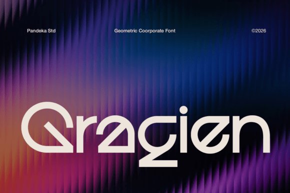
Gragien is a refined entry into the world of geometric sans serif fonts, specifically engineered for brands that demand a sense of structured innovation and corporate clarity. Its design is built upon a foundation of perfectly balanced proportions and smooth, circular curves that reflect a forward-thinking, technological aesthetic. Unlike more decorative typefaces, Gragien prioritizes efficiency and readability, making it a reliable workhorse for architectural firms, engineering consultancies, and modern financial institutions.
While many font families rely on sheer volume of weights, Gragien focuses on a single, impeccably crafted Regular style that excels in digital environments. Its clarity makes it particularly effective for data-heavy dashboards, tech presentations, and intricate user interfaces where every pixel counts. The inclusion of comprehensive multilingual support and precise punctuation ensures that it can carry a professional brand identity across global markets without losing its sleek, minimalist charm.
6. Savior Sense Font
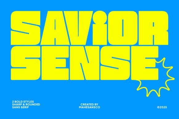
For projects that require a high-decibel visual impact, Savior Sense Font stands out among geometric sans serif fonts as a radically bold and heavy display face. It features aggressive, blocky letterforms with extremely tight internal counter spaces, creating a dense typographic texture that commands immediate attention. This font is designed to dominate the visual field, making it the perfect choice for title sequences, hero banners, and any advertising campaign that needs to project a sense of raw power and urban energy.
The family is split into two distinct personality types: Sharp and Rounded. The Sharp style offers a hard-edged, crystalline intensity suitable for competitive e-sports branding and edgy tech startups, while the Rounded version provides a slightly softer, more approachable take on the massive weight, ideal for streetwear labels and modern lifestyle magazines. Whether used in hip-hop album art or oversized exhibition posters, Savior Sense provides a youthful, confident aesthetic that is impossible to ignore.
7. Boho Wedding Duo Font
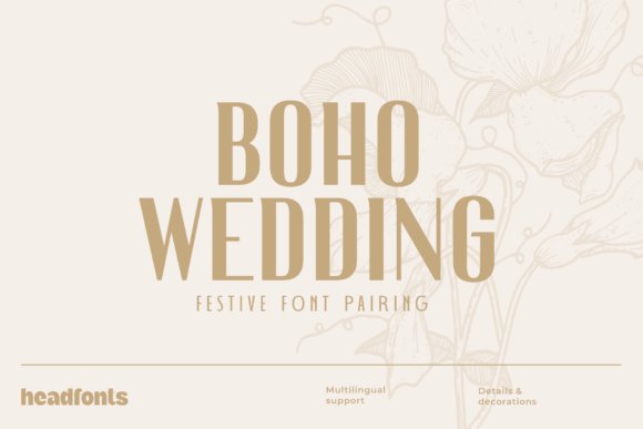
The Boho Wedding Duo offers a sophisticated masterclass in typographic contrast, pairing the intricate Nailhead Nova with the structured, art-deco-inspired Decohead. This combination thrives on the tension between ornate decorative elements and the clean, rhythmic lines of geometric sans serif fonts. By balancing a high-fashion display style with a functional sans-serif companion, designers can create a visual narrative that feels both organic and meticulously organized, perfect for high-end boutique branding or lifestyle editorial layouts.
Beyond the typical wedding suite, this duo excels in experiential design and luxury event planning. The geometric foundation of the secondary typeface ensures that fine print on menus, place cards, and seating charts remains legible even in dim lighting, while the more expressive partner handles the heavy lifting of headlines and logotypes. It is a versatile toolkit for any project that requires a fusion of bohemian whimsy and modern architectural precision.
8. Hugos Font
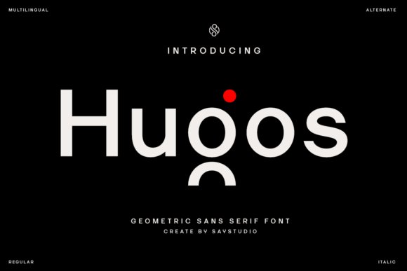
Hugos stands as a testament to the enduring appeal of mathematical harmony in typography, serving as a quintessential example of how geometric sans serif fonts can define a modern digital identity. Its letterforms are built on a framework of circular and linear shapes, resulting in a typeface that feels inherently professional yet approachable. This structural integrity makes it an ideal candidate for corporate rebranding projects where the goal is to project stability, innovation, and a forward-thinking ethos.
In the realm of UI/UX design, Hugos shines by offering exceptional clarity at various scales, from micro-copy in mobile applications to bold, impactful hero banners on desktop sites. The inclusion of a slanted italic style provides a necessary tool for creating emphasis and visual hierarchy without breaking the consistency of the grid-based design. Whether you are crafting a sleek tech interface or a minimal portfolio, this font provides the neutral yet distinct canvas needed to let content lead.
9. Drixon Font
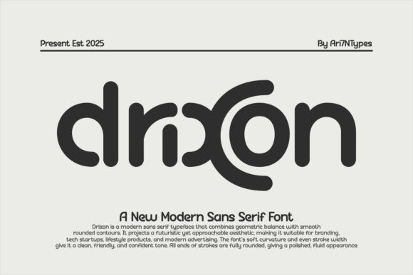
Drixon redefines the futuristic aesthetic by softening the edges of traditional geometric sans serif fonts to create a “human-friendly tech” vibe. While many sci-fi typefaces lean into aggressive angles, Drixon utilizes a smooth, rounded geometry that suggests innovation and fluid movement. This makes it particularly effective for hardware branding, app development, and any industry where the intersection of advanced technology and user accessibility is paramount.
The typeface’s polished and symmetrical construction offers a sense of calm confidence, making it a powerful choice for large-scale environmental graphics or automotive dashboard interfaces. Because the strokes maintain a consistent visual weight, Drixon remains highly readable even when applied to translucent textures or glowing digital displays. It is a distinctive choice for creators looking to move away from rigid, boxy shapes toward a more organic, futuristic visual language.
10. Spatha Fold Font
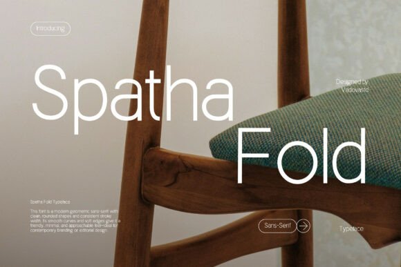
Spatha Fold Font stands as a masterclass in the intersection of organic softness and structural rigor. As a premier choice among geometric sans serif fonts, it trades the often harsh, clinical edges of the genre for fluid, inviting curves that suggest a refined touch. This typeface is particularly effective in editorial environments where the text must breathe, offering a sense of airy sophistication that works perfectly for high-end interior design portfolios or lifestyle magazines. The generous letter spacing and deliberate stroke weight ensure that every word maintains its legibility while exuding an aura of contemporary calm.
For designers tasked with building a cohesive visual identity, this font provides a versatile foundation for branding concepts that require a professional yet approachable demeanor. Its unique geometric construction makes it a standout option for minimalist posters and architectural signage, where the purity of form is paramount. By choosing this typeface, you are not just selecting a set of characters, but adopting a design philosophy that prioritizes clarity, elegance, and the soft-modern aesthetic essential for today’s luxury markets.
11. Inertia Matte Edition Font
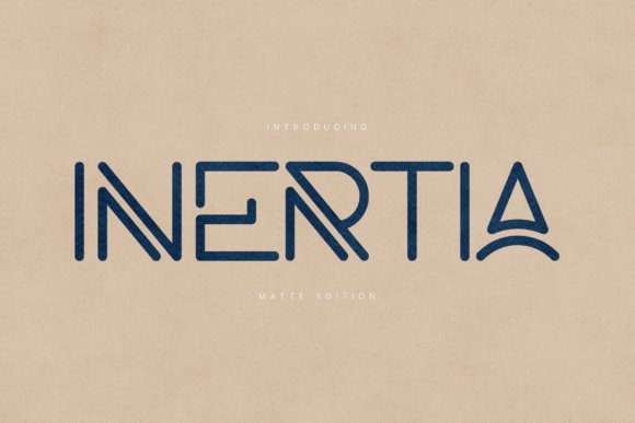
The Inertia Matte Edition Font is a high-performance display family that draws heavy inspiration from the world of industrial design and modern aerospace engineering. Unlike more traditional geometric sans serif fonts, this edition introduces a compelling structural rhythm through the use of subtle stencil-like gaps and interlocking strokes. These technical nuances create a sense of forward motion and mechanical precision, making it an ideal candidate for tech startups, luxury automotive brands, and high-end manufacturing firms looking to project an image of innovation and durability.
Beyond its striking visual weight, Inertia Matte Edition offers a distinctive set of character shapes, such as the elegantly arched ‘A’ and the dual-line ‘N’, which transform standard headlines into works of typographic art. This typeface is engineered for impact, thriving in large-scale formats like exhibition graphics, packaging, and digital interfaces. With its support for extended Latin characters and a robust set of symbols, it provides global brands with the tools necessary to maintain a consistent, sophisticated presence across diverse international markets.
12. Moonhost Font
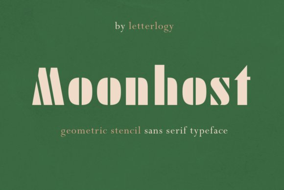
Moonhost Font serves as a bridge between the opulence of the Roaring Twenties and the sterile precision of the space age. This stencil-based display typeface reinterprets the classic Art Deco aesthetic through the lens of modern geometric sans serif fonts, resulting in a look that is both regal and technologically advanced. The strategic use of negative space within each letterform creates a rhythmic pulse that is perfect for luxury branding, boutique hospitality identities, and premium spirits packaging where a sense of exclusivity is required.
The typeface is particularly adept at handling creative projects that demand a strong, authoritative voice without sacrificing stylistic flair. Whether applied to a minimalist movie poster or a high-concept fashion campaign, Moonhost commands attention through its unique geometry and historical weight. By blending traditional design philosophies with contemporary stencil mechanics, this font offers a fresh perspective for designers seeking to create a visual narrative that feels timeless yet undeniably rooted in the future.
13. Ropan Font
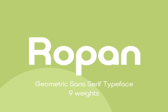
Ropan distinguishes itself through a comprehensive weight system, spanning nine distinct levels from an ethereal thin to a commanding black. This architectural approach to type design ensures that the typeface maintains its structural integrity whether it is being used for intricate fine print or bold, high-contrast display headlines. Its clean lines and balanced proportions make it a quintessential example of how geometric sans serif fonts can adapt to the rigorous demands of modern digital interfaces and physical branding materials alike.
The font is particularly effective for designers who need a workhorse family for multi-layered projects such as magazine layouts or complex corporate identities. By leveraging its OpenType features, users can unlock a level of typographic nuance that elevates simple labels and packaging into sophisticated pieces of visual communication. Whether you are crafting a minimalist logo or a data-heavy annual report, the neutral yet contemporary aesthetic of this typeface provides a stable foundation for any creative direction.
14. Rainis Font
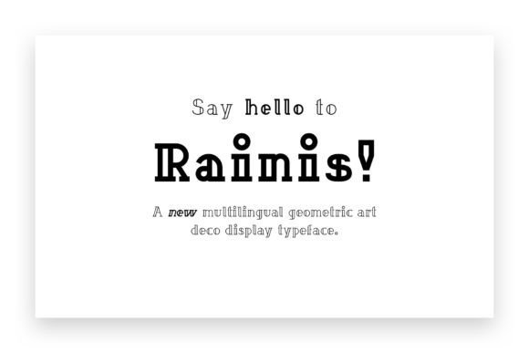
Rainis serves as a bridge between the historical elegance of the Art Deco period and the crisp efficiency of contemporary display design. While many geometric sans serif fonts prioritize utility above all else, Rainis embraces its decorative roots to act as a bold visual anchor in posters and web hero sections. The sharp, calculated geometry of its letterforms reflects a sense of luxury and architectural precision, making it an ideal candidate for high-end fashion branding or editorial illustrations that require a touch of mid-century flair.
Because it functions primarily as a display typeface, it pairs exceptionally well with more restrained, utilitarian fonts. Using it as a headline face allows for a sophisticated interplay of shapes, where the exaggerated curves and straight-edge terminals create a rhythmic flow across the page. It is a specialized tool for designers who want to break away from the monotony of standard neo-grotesques while still maintaining the clean, logical structure inherent in geometric typography.
15. Magnify Font
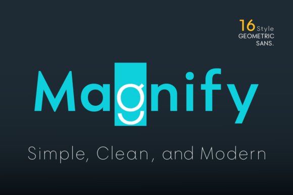
Drawing deep inspiration from the 1927 classic Futura, Magnify Font introduces a subtle but significant evolution to the rigid circularity often found in the genre. By utilizing slightly oval-shaped structures for key characters like the ‘O’, ‘G’, and ‘C’, it achieves a more natural optical balance that reduces the harshness typically associated with purely mathematical designs. This intentional deviation results in a typeface that feels more breathable and legible in long-form paragraphs without sacrificing the clean and modern ethos of the geometric sans serif category.
The family consists of eight weights, complemented by matching obliques, providing a granular level of control over typographic hierarchy. The inclusion of unique alternate characters for lowercase letters such as ‘a’, ‘g’, and ‘y’ offers a bespoke feel, allowing designers to customize the personality of a headline or a logo on the fly. From the delicate precision of the Hairline weight to the authoritative presence of the Bold, this font family is a sophisticated tribute to the Bauhaus movement, refined for the high-resolution requirements of today’s design landscape.
16. Perfect Corporate Font
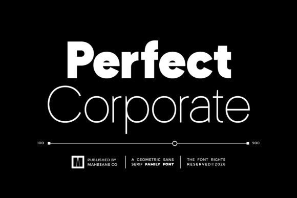
Perfect Corporate Font serves as a cornerstone for designers seeking a balance between clinical precision and approachable warmth. By utilizing a diverse range of nine specific weights, from the ethereal Thin to the commanding Black, this typeface enables a sophisticated typographic hierarchy that is essential for complex information design. Its geometric sans serif fonts foundations are evident in the mathematically balanced circles and clean intersections, ensuring that even in dense corporate annual reports or multi-layered web interfaces, the text remains exceptionally readable and visually cohesive.
Beyond its aesthetic versatility, the typeface is engineered for high-stakes business environments where consistency across platforms is non-negotiable. Whether it is applied to a minimalist tech startup’s landing page or a legacy firm’s internal documentation, the font provides a sense of established authority. The inclusion of PUA encoding simplifies the workflow for creative professionals, allowing easy access to a rich set of glyphs and special characters without requiring specialized layout software, making it a highly efficient tool for both print and digital production cycles.
17. Noemia Dreams Font
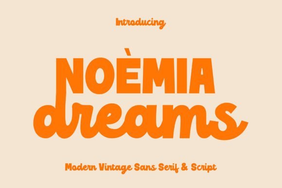
Noemia Dreams Font offers a masterclass in the ‘retro-revival’ aesthetic, pairing a structured sans with a rhythmic, expressive script to evoke the soul of the 1970s. This duo leverages the inherent stability of geometric sans serif fonts to provide a solid visual anchor, while the accompanying script adds a layer of organic human touch. This juxtaposition is particularly effective for boutique branding projects, such as luxury candle packaging or high-end apparel labels, where the goal is to feel both nostalgically familiar and modernly curated.
The typeface excels in editorial environments, where its dual nature can be used to create dynamic title treatments and pull-quotes that jump off the page. The sans component is crafted with a spacious x-height and circular proportions that maintain clarity even in smaller captions, while the script flourishes provide a decorative contrast that mimics hand-painted signage. By integrating these two distinct styles, designers can achieve a complex, multi-dimensional brand identity that captures the ‘analog’ warmth of vintage vinyl records without sacrificing the technical requirements of high-resolution digital displays.
18. Bager Font
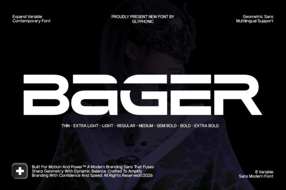
Bager Font is a high-octane interpretation of modern typography, specifically engineered for industries where speed and technological prowess are key. Its wide-proportioned characters and architectural stability differentiate it from more traditional geometric sans serif fonts, creating a sense of forward momentum and horizontal expansion. This makes it an ideal candidate for automotive branding, sports apparel, and cinematic title sequences that require a font with a ‘heavy’ visual footprint and an aerodynamic aesthetic.
The typeface’s versatility is anchored by its eight variable weights, allowing designers to transition smoothly from the sleek elegance of the lighter styles to the industrial strength of the Extra Bold. In digital environments, Bager’s sharp terminals and open counters ensure crisp rendering on high-density screens, making it a reliable choice for futuristic UI/UX designs and gaming interfaces. By prioritizing a sense of physical presence and precision, this font empowers creators to build visual identities that feel both permanent and pulse-pounding, perfectly suited for the fast-paced world of tech innovation.
19. Geometos Neue Font
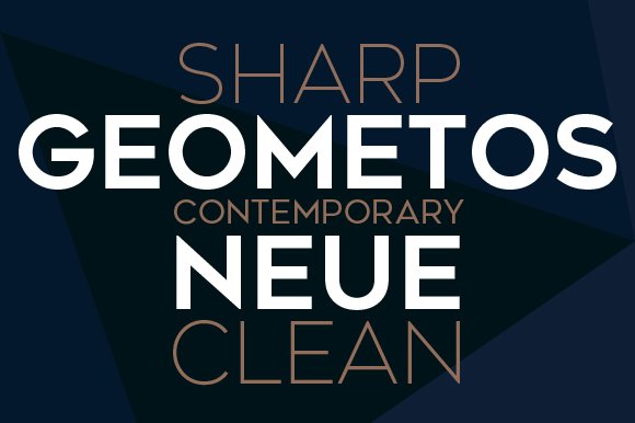
Geometos Neue Font stands out as a masterclass in architectural precision, offering an all-caps display family that commands attention through its seven diverse weights. This typeface strips away unnecessary ornamentation to focus on the raw power of the circle and line, making it a quintessential example of how geometric sans serif fonts can define a visual space. From the light, airy presence of its thinner weights to the thunderous impact of the extra-bold versions, this family provides designers with a consistent, sharp-edged toolkit for high-stakes branding and editorial hierarchies.
Ideally suited for environments where clarity and authority are non-negotiable, Geometos Neue excels in large-scale applications such as environmental signage, movie titles, and digital headers. The emphatic form of each glyph ensures legibility across various distances, while the uniform stroke widths maintain a cohesive aesthetic throughout complex layouts. Whether you are developing a modern corporate identity or a minimalist poster series, this font delivers a polished, professional finish that feels both timeless and aggressively contemporary.
20. Gorva Font
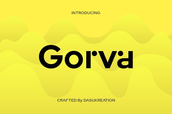
Gorva Font reimagines the standard construction of geometric sans serif fonts by infusing a sense of high-fashion elegance and rhythmic flow. While many geometric typefaces can feel rigid, Gorva introduces modern, unique stylistic flourishes that elevate it beyond mere utility. It is fully PUA encoded, granting designers seamless access to a rich library of special glyphs and decorative swashes without the need for complex software workarounds. This makes it an exceptionally user-friendly choice for creators looking to add a custom, hand-crafted feel to their digital typesetting.
The inclusion of sophisticated ligatures and alternate characters allows for a high degree of customization in logo design and boutique packaging. Its balanced proportions and wide apertures ensure that it remains readable while still making a bold stylistic statement. If you are working on a luxury brand project or a lifestyle magazine where the typography needs to bridge the gap between structural geometry and artistic flair, Gorva provides the necessary versatility to take your creative vision to the next level.
21. Novaris Font
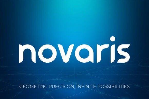
Novaris Font is a premium typographic solution that brilliantly navigates the intersection of futuristic aesthetics and organic minimalism. Characterized by a harmonious blend of sharp, clean cuts and smooth, futuristic curves, this typeface represents a sophisticated evolution within the realm of geometric sans serif fonts. Its versatility is its greatest strength, offering a visual language that feels just as at home in a high-tech gaming interface as it does in a luxury skincare campaign. The typeface communicates a sense of progress and innovation, making it the perfect vehicle for brands that want to position themselves at the forefront of their industry.
Beyond its obvious applications in sci-fi and tech sectors, Novaris offers a surprising level of warmth that makes it ideal for sustainable branding and eco-conscious initiatives. The minimalist lines evoke a sense of purity and clarity, which is essential for projects related to conservation or high-end architectural design. By prioritizing balanced geometry and visual impact, Novaris ensures that every word carries weight, providing a striking presence in both digital UI environments and high-resolution print materials.
22. Noar Font
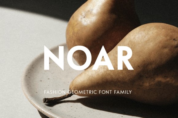
Noar is a masterclass in architectural clarity, offering a refined interpretation of modern typography. This typeface family distinguishes itself through a five-weight system ranging from a delicate Extra Light to a commanding Bold, all accompanied by perfectly matched italics. By adhering to the core principles of geometric sans serif fonts, Noar utilizes low visual contrast and open apertures to ensure that every glyph remains distinct, whether rendered on a high-resolution display or a printed editorial spread.
While many display fonts sacrifice utility for style, Noar bridges the gap by functioning as both a loud headline tool and a subtle informative face. Its all-caps character set is particularly effective for branding projects that require a sense of authority and permanence. Designers can leverage the stylistic alternates and PUA-encoded features to create bespoke logos or unique book covers that feel custom-tailored rather than template-driven, making it a cornerstone asset for any professional design toolkit.
23. Luminova Font
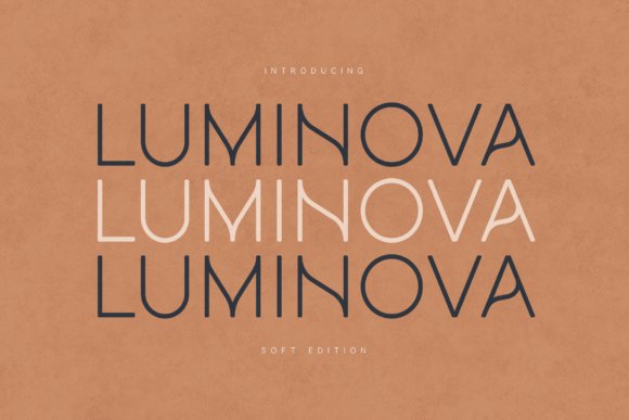
Luminova introduces a humanistic warmth to the often rigid world of geometric sans serif fonts. By softening the standard mathematical precision of modern letterforms with gentle curves and airy spacing, this typeface achieves a sense of approachability without losing its professional edge. Its minimalist construction is built on a soft geometric rhythm that prioritizes eye comfort, making it an exceptional choice for long-form reading on digital interfaces and lifestyle-oriented mobile applications.
Beyond its technical merits, Luminova serves as a versatile visual voice for brands that value transparency and modernism. The open shapes and generous tracking allow the font to breathe, ensuring that messaging remains legible even in cramped UI environments or small-scale packaging. Whether you are developing a new corporate identity or crafting a clean editorial layout, this font provides the perfect balance of personality and functional simplicity, proving that geometric structures can feel remarkably organic.
24. Cadera Font
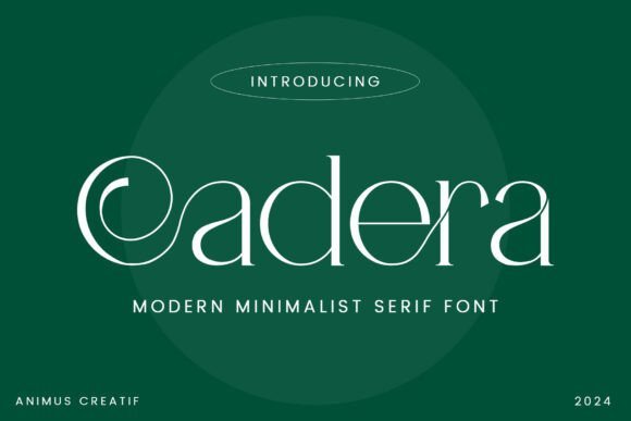
Cadera Font represents a sophisticated intersection between classical Roman proportions and contemporary minimalism. As a high-contrast serif, it provides a sharp, artistic counterpoint to the uniform stroke weights typically found in geometric sans serif fonts. The typeface is defined by its dramatic hairlines and bold stems, creating a rhythmic visual tension that is ideally suited for luxury fashion editorials, artisanal packaging, and high-end architectural branding where every character must exude elegance.
What truly elevates Cadera is its collection of sweeping curves and fluid ligatures that transform standard text into a piece of static art. While its primary role is that of a hero display font, it functions exceptionally well when paired with a clean, low-contrast sans-serif to handle body copy. This contrast allows Cadera’s decorative elements and sharp serifs to command the viewer’s attention, making it a go-to selection for designers looking to inject a sense of quiet confidence and timeless sophistication into their creative projects.
25. Loqura Font
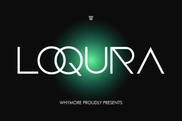
Loqura introduces a sharp, techno-modern aesthetic to the realm of geometric sans serif fonts, channeling a distinct Y2K futurism that is both nostalgic and forward-looking. Its architecture is defined by condensed shapes and high-contrast geometric precision, making it an ideal choice for creators looking to establish a dominant visual identity. The typeface excels in digital-first environments where bold headlines and sleek logos need to command attention without sacrificing minimalist elegance.
Beyond its striking visual weight, this font is meticulously crafted for versatility across modern design suites like Adobe Illustrator and Canva. It is particularly effective for high-impact branding projects, stationery mockups, and experimental editorial layouts. Whether you are building a tech startup’s landing page or designing a streetwear lookbook, the sleek lines and sharp curves of Loqura provide a sophisticated edge that ensures your typography stands out in a crowded digital landscape.
26. Holgada Family Font
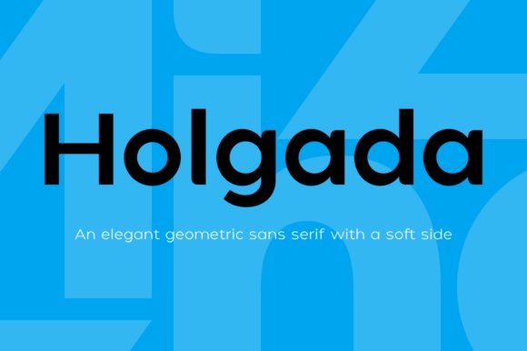
Designed by Pablo Balcells for Graviton Font Foundry, the Holgada Family is a masterclass in balancing structural rigidity with an approachable, friendly personality. While many geometric sans serif fonts can feel cold or overly mechanical, Holgada utilizes refined rounded endings to soften its appearance, creating a welcoming feel for the viewer. This 12-style family is engineered for extreme legibility, making it a reliable workhorse for everything from dense technical documentation to sprawling corporate identities.
The typeface’s versatility is its greatest strength, offering a full range of weights and small caps that adapt seamlessly to different scales. In small sizes, its clear apertures and balanced proportions ensure readability in long-form body text, while in large display formats, the rounded terminals provide a distinctive, contemporary character for logos and headers. Supporting multiple languages and diverse typographic needs, Holgada is an essential tool for designers who require a neutral yet warm geometric foundation for multi-platform projects.
27. Caplove Font
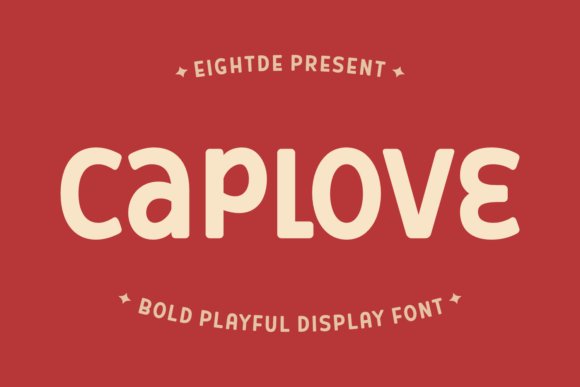
Caplove breaks the traditional mold of geometric sans serif fonts by infusing a playful, sophisticated flair into a clean typographic structure. It is characterized by its unique character alternates—most notably the expressive ‘C’ and ‘E’—which allow designers to create a custom, hand-lettered look with the efficiency of a digital typeface. This balance of thick, bold strokes and unexpected curvy flourishes makes it a powerhouse for the fashion and beauty industries, where personality and luxury must coexist.
Functionally, Caplove serves as a high-impact display face that turns standard messaging into a piece of digital art. It pairs beautifully with light-weight serifs for a high-fashion editorial vibe or with more rigid geometric faces for a modern, tech-forward aesthetic. It is exceptionally well-suited for luxury packaging, book cover designs, and social media tiles that require a bold, recognizable mark. By integrating designer-level character variations directly into the font, Caplove empowers creators to build distinct, memorable brand narratives without needing complex manual adjustments.
28. Fringk Font
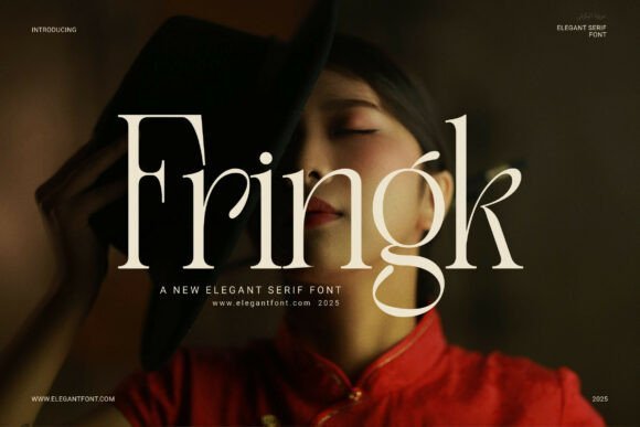
Fringk Font represents a masterclass in high-contrast elegance, offering a sharp, sophisticated aesthetic that bridges the gap between classic editorial style and modern display requirements. While it features refined serifs and polished letterforms, its structured proportions allow it to harmonize beautifully alongside modern geometric sans serif fonts in complex typographic hierarchies. This typeface is particularly effective for luxury branding where a sense of prestige and timelessness is paramount, providing a crisp visual texture that commands attention in high-end fashion magazines or bespoke wedding invitations.
Beyond its sharp terminals, Fringk offers a level of versatility that designers often seek when building a multi-layered brand identity. It excels in large-scale applications such as boutique storefronts and premium product packaging, where its delicate yet confident strokes can truly shine. To achieve a perfectly balanced contemporary look, consider pairing this font with minimalist sans serif families; the interplay between Fringk’s organic warmth and the rigid precision of geometric sans serif fonts creates a dynamic visual tension that feels both current and authoritative.
29. Cult Font
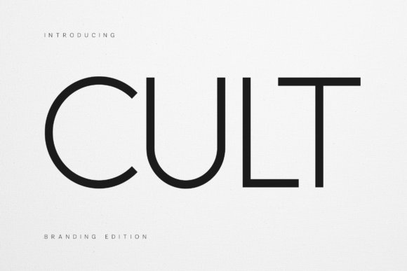
Cult Font stands out as a premier example of contemporary typography, meticulously engineered for brand identities that value clarity and structural integrity. As one of the most versatile geometric sans serif fonts in a designer’s toolkit, it utilizes precise circular curves and consistent stroke widths to deliver a sense of modern objectivity. This makes it an exceptional choice for architectural firms or creative agencies looking to project a forward-thinking and highly organized image across both digital interfaces and physical environmental signage.
What distinguishes Cult from other minimalist options is its inherent confidence; the typeface possesses a vertical stability that ensures legibility at any scale, from micro-copy on mobile apps to massive outdoor billboards. Its clean proportions offer a neutral yet sophisticated canvas that doesn’t distract from the core message, allowing the geometry of the letterforms to speak for themselves. When integrated into a luxury brand system, this font reinforces a sense of premium quality, proving that geometric sans serif fonts can be both functional and deeply evocative of modern high-fashion aesthetics.
30. Massive Geometric Font Bundle
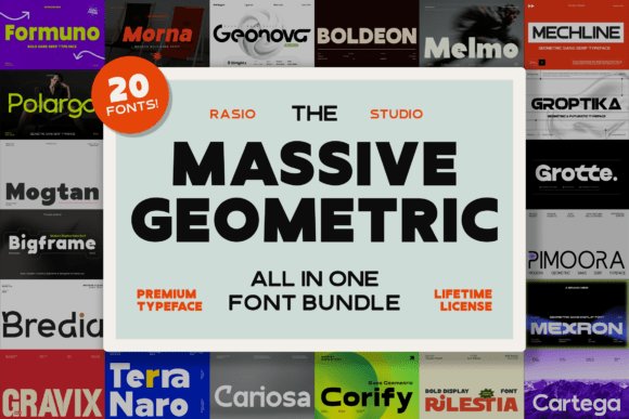
The Massive Geometric Font Bundle is an expansive library designed for professionals who require a diverse range of weights and styles within the realm of modern typography. This collection features 20 distinct typefaces, each rooted in the fundamental principles of Euclidean geometry, ensuring that every character across the entire set maintains a strict adherence to balance and proportion. By offering a spectrum of geometric sans serif fonts, this bundle provides the necessary flexibility to tackle everything from tech-focused editorial layouts to minimalist corporate stationery without ever sacrificing visual cohesion.
For designers tasked with creating scalable design systems, having access to such a wide variety of geometric sans serif fonts is invaluable. The fonts in this bundle are optimized for high-performance rendering on digital screens while maintaining the crisp, tactile quality required for premium print production. Whether you are developing a user interface for a fintech startup or a comprehensive signage system for a museum, these typefaces provide the structural clarity and functional beauty needed to communicate complex information with ease and style.
31. Keager Font
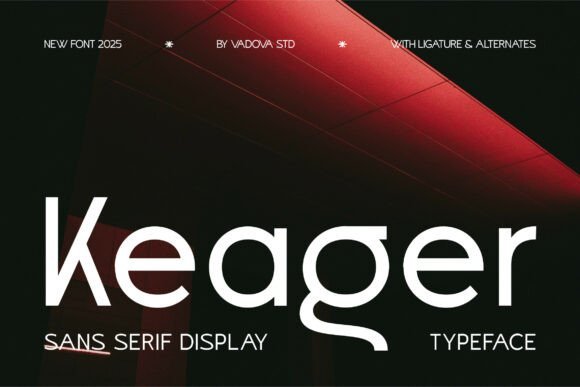
Keager Font stands as a testament to the versatility of contemporary geometric sans serif fonts, blending rigid structural integrity with a distinctive, assertive personality. Its letterforms are characterized by a clean, rationalized skeleton that prioritizes readability while maintaining a bold, heavy-weight presence. Unlike more sterile typefaces, Keager introduces subtle, unique nuances in its joints and terminals, making it a premier selection for designers looking to inject a sense of premium power into high-impact branding projects and modern logotypes.
When implemented in display contexts, this typeface thrives across digital and physical mediums alike. Its robust construction ensures clarity in social media storytelling and high-resolution packaging, where visual weight is paramount. For art directors seeking a typeface that balances the mathematical perfection of geometric shapes with a raw, energetic flair, Keager provides a sophisticated solution that bridges the gap between editorial elegance and street-ready graphic design.
32. Duoline Modern Font
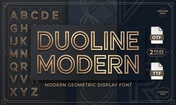
Duoline Modern Font offers a high-tech reimagining of traditional geometric sans serif fonts by introducing a sophisticated inline, double-stroke architecture. This stylistic choice creates a sense of depth and motion, making it particularly effective for industries centered around innovation, such as aerospace, software development, and automotive design. The parallel lines are meticulously spaced to maintain optical balance, ensuring that the typeface remains legible even when the aesthetic leans heavily into a futuristic or industrial vibe.
Beyond its technical appeal, Duoline Modern excels in minimalist poster design and architectural branding where negative space plays a critical role. The font’s sporty and rhythmic cadence makes it an ideal candidate for luxury athletic apparel labels or trend-forward monograms. By departing from solid-fill characters, it allows designers to play with transparency and layering, providing a toolset that feels both structurally sound and visually light.
33. Benzin Font
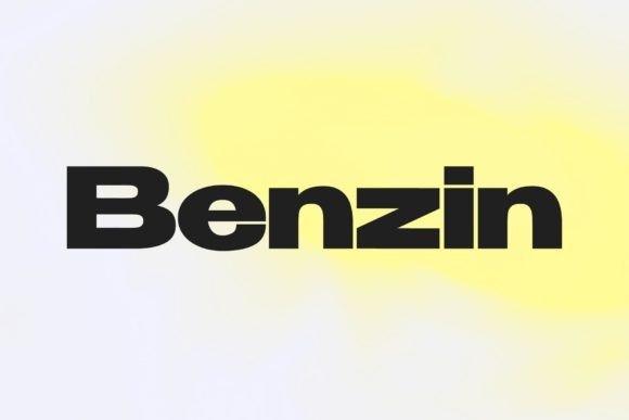
Benzin Font is a masterclass in functional utility, offering a comprehensive family of five weights that cater to a full spectrum of typographic needs. As one of the more versatile geometric sans serif fonts on the market, it addresses the common struggle of kerning adjustments through built-in optical optimization. The family is engineered so that the Thin weights feature naturally wider letter-spacing for breathability in long-form body copy, while the Bold and Black weights are tightened for maximum impact in massive headlines and aggressive poster layouts.
This out-of-the-box readiness makes Benzin a favorite for UI/UX designers and editorial layout artists who require a cohesive visual language across various interface scales. Whether you are crafting a dense informational brochure or a minimalist web landing page, the geometric consistency of Benzin ensures a professional, harmonious look. It eliminates the guesswork of manual tracking, allowing creators to focus on the hierarchy and composition of their message rather than the minutiae of character spacing.
34. Geonowa Font
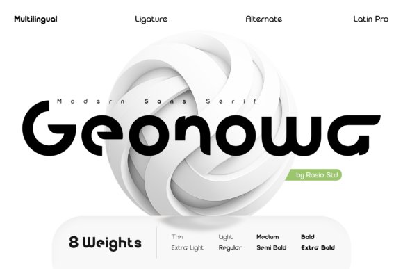
Geonowa represents a masterful execution of the contemporary geometric sans serif fonts movement, prioritizing optical balance and fluid circularity. Its design philosophy centers on a harmonious blend of mechanical precision and soft, approachable terminals, which effectively removes the coldness often associated with strictly mathematical typefaces. For creative directors building comprehensive digital design systems, this font offers a versatile foundation that remains legible across diverse screen densities, ensuring that brand personality is never sacrificed for functionality.
The typeface shines particularly bright in corporate identity projects and tech-focused branding where a sense of reliability and modern innovation is required. Because of its wide weight range and meticulously spaced characters, Geonowa excels in both high-contrast website headers and intricate mobile app interfaces. It is an essential tool for designers seeking a clean, professional aesthetic that feels both futuristic and grounded, making it a top-tier choice for everything from startup pitch decks to global editorial layouts.
35. Morlen Regular Font
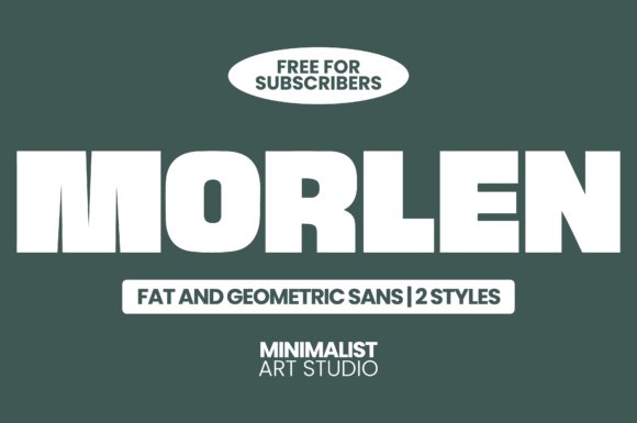
Morlen Regular is a powerhouse in the world of bold geometric sans serif fonts, specifically engineered for high-impact visual communication that demands immediate attention. Unlike its more delicate counterparts, this typeface utilizes heavy, chunky letterforms that dominate the layout, making it an ideal candidate for aggressive headline treatments and outdoor advertising. The sheer mass of the characters provides a solid, immovable presence on the page, perfect for designers who want to create a sense of authority and uncompromising modernism in their work.
This font is especially effective when utilized in contemporary packaging design or bold streetwear branding where the typography itself serves as the primary graphic element. Its geometric construction ensures that even at extreme weights, the negative space remains balanced, preventing the “clogging” often seen in lesser heavy fonts. Whether you are crafting a social media campaign that needs to stop the scroll or a large-scale poster for a music festival, Morlen Regular delivers a punchy, memorable aesthetic that translates perfectly from ink on paper to pixels on a screen.
36. Groptika Font
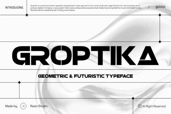
Groptika is a high-concept display typeface that pushes the boundaries of futuristic geometric sans serif fonts by incorporating sharp, stencil-like breaks and aggressive angularity. Its architectural design is heavily influenced by aerospace aesthetics and cyberpunk visuals, making it a standout selection for projects rooted in technology, gaming, and speculative fiction. The intentional gaps in the letterforms create a rhythmic visual texture that suggests data streams, mechanical assembly, and the high-speed motion of the digital age.
Because of its highly stylized and distinctive character, Groptika is best utilized as a hero font for logos, e-sports branding, and cinematic title sequences where the goal is to establish a unique, tech-forward identity. When paired with a more neutral, minimalist secondary typeface, Groptika acts as a focal point that communicates innovation and forward-thinking design. It is the perfect choice for AI startups, software developers, and luxury tech brands looking to escape traditional corporate tropes in favor of a bold, engineered look that feels decades ahead of its time.
37. Full Sans Font
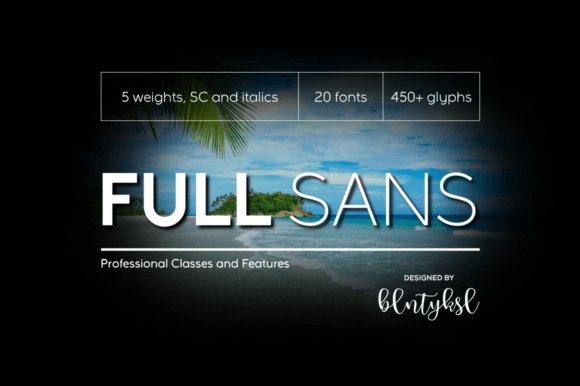
Full Sans Font represents a masterful evolution of the classic geometric sans serif fonts that defined early 20th-century modernism. While it clearly draws inspiration from the legendary structures of Futura and Avant Garde, it refines those rigid forms through a meticulous harmonization of character proportions. By optimizing the relationship between x-height and width, this typeface achieves a superior level of legibility that many of its predecessors lacked, making it an exceptional choice for both high-resolution editorial work and complex digital interfaces.
This font serves as a core component of a broader typographic ecosystem, designed to work seamlessly alongside its slab and neo-grotesque siblings. With a robust library of 20 styles—including small caps and multiple weights—it offers designers a sophisticated toolkit for global branding projects. The inclusion of comprehensive OpenType features, such as case-sensitive forms and old-style figures, ensures that whether you are designing a wayfinding system or a mobile app, your typography remains polished and technically flawless.
38. Monsta Fectro Font
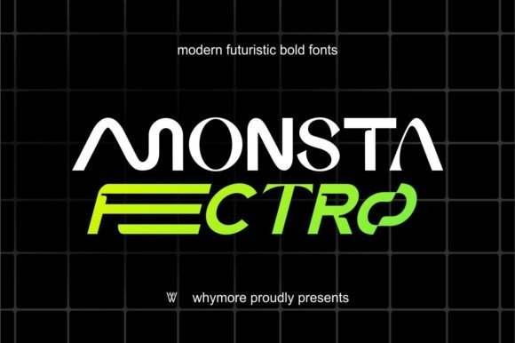
For designers seeking a bold departure from conventional minimalism, Monsta Fectro Font delivers a high-impact, condensed aesthetic that bridges the gap between industrial design and urban streetwear. This geometric sans serif font is characterized by its sharp, aggressive edges and a distinct Y2K techno-influence that captures the raw energy of contemporary digital culture. It is specifically engineered for display use where the objective is to command attention and project a sense of forward-thinking momentum.
Beyond its striking visual weight, this typeface excels in contexts like experimental posters, motion graphics, and futuristic visual identities. Its condensed nature allows for dense, powerful headlines that remain legible even at extreme scales. By integrating elements of grunge and techno aesthetics into a structured geometric framework, Monsta Fectro provides a unique solution for brands looking to establish a disruptive presence in the fashion, gaming, or entertainment sectors.
39. Lorin Font
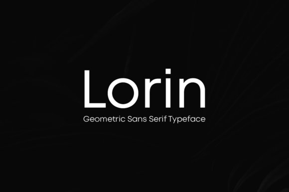
Lorin Font is a sophisticated interpretation of the modern geometric sans serif fonts genre, prioritizing aesthetic balance and understated elegance. Rather than following the purely mathematical path of traditional geometry, Lorin introduces a subtle charm that gives it a more approachable, humanistic personality. This makes it an ideal candidate for luxury branding and high-end editorial layouts where a sense of quiet confidence is required rather than loud, decorative flourishes.
The true versatility of Lorin is revealed through its four distinct weights, which allow for a clear and graceful typographic hierarchy. When used with generous letter-spacing, the font takes on a breathable, airy quality reminiscent of high-profile fashion magazines and minimalist art portfolios. Whether utilized for a sleek logo type or extensive body copy, Lorin maintains a consistent visual rhythm that elevates the overall perceived value of any creative project.
40. Geometrica Font
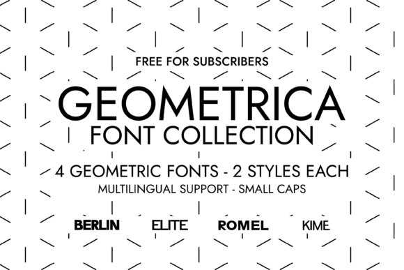
The Geometrica Font Collection draws heavily from the rigorous traditions of Swiss graphic design, offering a comprehensive suite that includes the KIME, ROMEL, BERLIN, and ELITE variants. Each of these four typefaces captures the essence of mathematical harmony, stripping away unnecessary ornamentation to focus on pure form. By integrating these geometric sans serif fonts into your toolkit, you gain access to a balanced aesthetic that feels both authoritative and approachable, making it an essential resource for architects of digital identity and print layout experts alike.
Beyond its structural integrity, the collection excels in high-stakes environments like luxury packaging and corporate branding. The inclusion of both Regular and Italic styles across all four families allows for sophisticated typographic hierarchies that are often hard to achieve with single-weight sets. Whether you are developing a minimalist web interface or a high-end cosmetic label, these fonts provide the grotesque legibility and contemporary polish required to communicate credibility and effortless timelessness.
41. Aero Font
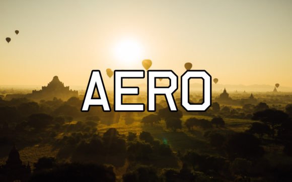
Designed by the prolific Peter Wiegel, Aero Font is a masterclass in weight distribution and circular proportions. Unlike more rigid traditionalists, this typeface introduces a subtle fluidity into the geometric sans serif fonts category, ensuring that each glyph feels organic yet disciplined. It is particularly effective for designers who need a face that avoids the clinical coldness sometimes associated with pure geometry, offering instead a rhythmic warmth that breathes life into creative layouts and bold headlines.
Its versatility makes it a reliable workhorse for diverse applications, from mobile app interfaces to large-scale environmental signage. The balanced apertures and consistent stroke widths contribute to exceptional readability even at smaller scales on retina displays. When seeking geometric sans serif fonts that bridge the gap between mid-century modernism and 21st-century digital requirements, Aero stands out as a premier choice for projects demanding a clear, optimistic, and highly professional visual voice.
42. Bodoni Elegant Font
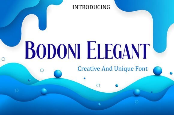
While rooted in the neoclassical tradition, Bodoni Elegant Font reimagines the iconic high-contrast serif for a contemporary audience. It features extreme modulation between its thick verticals and razor-thin horizontal serifs, creating a visual drama that is perfect for editorial hero moments. This typeface functions as a sharp, architectural counterpoint to the softer curves of geometric sans serif fonts, allowing designers to build tension and sophistication in high-fashion branding or modern art gallery identity systems.
The liquid-smooth personality of this face makes it exceptionally well-suited for large-format displays like billboards or website landing pages where its intricate details—like the needle-fine terminals—can be fully appreciated. It thrives in environments that demand an aura of established authority mixed with an innovative edge. By pairing Bodoni Elegant with a clean, low-contrast geometric sans serif, you can achieve a balanced, futuristic look that feels both grounded in history and ready for the avant-garde.
43. Groominu Font
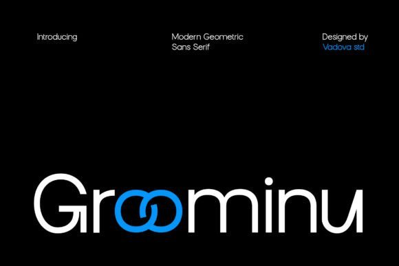
Groominu Font stands out as a masterclass in modern minimalism, blending strict mathematical ratios with soft, rounded terminals. As one of the more versatile geometric sans serif fonts available for digital-first branding, it utilizes custom ligatures to break the monotony of standard typesetting. This creates a rhythm that feels both engineered and approachable, making it an ideal candidate for high-end fashion labels or innovative tech startups looking to convey transparency and precision.
Beyond its aesthetic appeal, this typeface is engineered for superior legibility across various screen resolutions. The balanced x-height and generous spacing ensure that whether it is used for a sprawling hero banner or a compact mobile interface, the message remains clear. It provides a complete character set including uppercase, lowercase, and essential punctuation, allowing designers to maintain a cohesive visual identity throughout complex UI/UX projects or editorial layouts.
44. Propaganda Font
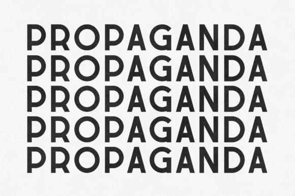
Propaganda Font delivers an uncompromising visual presence inspired by the utilitarian grit of mid-century industrial signage. Its heavy stroke weights and sharp, architectural corners differentiate it from softer geometric sans serif fonts, leaning instead toward a sense of permanence and authority. The steady rhythm of its letterforms commands attention immediately, making it the perfect vehicle for bold political statements, cinematic title cards, or urban lifestyle branding that requires a rugged, established feel.
While many display faces sacrifice readability for style, this font maintains a solid construction that holds up even under demanding printing conditions. The massive visual density makes it particularly effective for large-scale applications like protest posters, environmental graphics, and high-impact editorial headers. By choosing this typeface, designers tap into a legacy of powerful communication, ensuring their headlines resonate with an unmistakable voice of strength and conviction.
Choosing one of these 44 geometric sans serif fonts ensures your work remains timeless yet modern throughout 2026. These typefaces offer the legibility and aesthetic balance needed for both print and digital platforms. Experiment with different weights and pairings to see how these geometric styles can ground your visual identity and improve overall user experience.