27 Refined High End Sans Serif Fonts for Editorial and Luxury Packaging in 2026
The list below gathers 27 high end sans serif fonts selected for designers who need measured typographic voice and reliable legibility. You’ll find options from crisp geometric families to warm humanist cuts, each chosen with tone and function in mind.
Alongside each recommendation there are quick notes on weight range, optical sizes, pairing ideas, and licensing pointers so you can test candidates fast in editorial layouts, luxury labels, app interfaces, or boutique e-commerce. Short examples show how contrast and spacing change perception at display sizes versus body text.
1. Modern Heritage Font
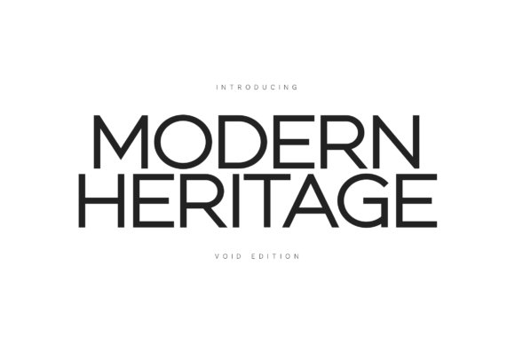
Modern Heritage (Void Edition) is a high-contrast sans that reinterprets classic Swiss proportions with razor-clean geometry and generous counters. The typeface pairs an elevated x-height with monolinear strokes and carefully cut terminals, producing expansive negative space that makes block text and display headlines breathe without losing presence.
For projects that demand unmistakable polish, this family sits among the best choices when you need high end sans serif fonts: it reads strong on signage, luxury packaging, and editorial covers while keeping a restrained, architectural voice that reads both contemporary and familiar.
╰┈➤ Download Modern Heritage Font
My Recommendation: I turn to Modern Heritage when a project needs a poised, architectural sans that still feels human. Its Void Edition works brilliantly for upscale identities, gallery signage, and fashion editorials where white space and proportion matter. Use it for large-scale headlines, minimal logotypes, and any application that benefits from a commanding yet airy typographic tone.
2. Laura Font
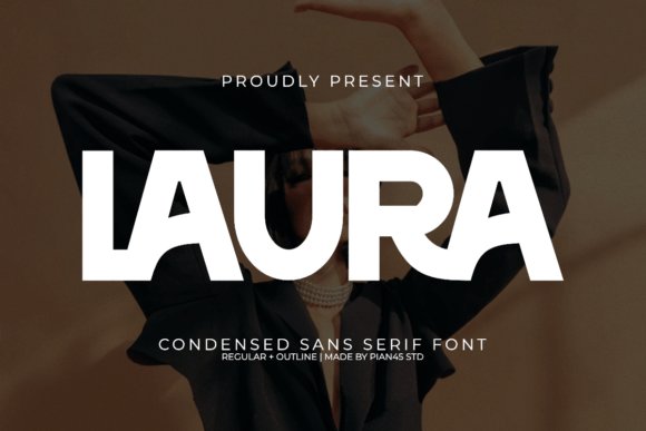
Laura is an ultra-condensed sans with statuesque proportions and a refined vertical rhythm that nods to vintage fashion mastheads. The family includes a solid and an outline style plus subtle ligatures, making it ideal for tight, impactful headlines that occupy narrow columns without feeling cramped.
Because of its tall, elegant letters and razor-thin counters, Laura shines on luxury labels, fashion editorials, and boutique packaging where space is limited but typographic personality must register at a glance. Its compressed forms also make striking wordmarks and stacked logotypes that cut through busy photographic backgrounds.
My Recommendation: I use Laura when the brief calls for chic, space-conscious typography with a couture attitude. It’s perfect for magazine covers, boutique brand identities, and high-end product packaging where slender letterforms convey exclusivity. Pair Laura with roomy body text to keep contrast and maintain readability in hierarchies.
3. Gaglio Font
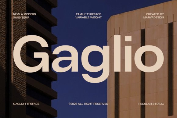
Gaglio is a geometric sans family built around architectural clarity and a contemporary voice that performs across scales. With multiple weights and matching italics, its large x-height and open apertures deliver excellent legibility on screens while retaining a crisp, stamped quality in print.
Design systems and corporate identities benefit from Gaglio’s variable weight range: it provides a coherent visual language from UI labels to full-page mastheads, giving brands a confident, orderly presence without feeling cold. Use it where precision and on-screen clarity matter most, such as tech product interfaces, annual reports, and editorial grids.
My Recommendation: I recommend Gaglio for projects that require consistent typographic structure across digital and print touchpoints. The family’s weight spread and clear letterforms make it an excellent choice for UI work, corporate branding, and long-form editorial where readability and a modern, composed tone are essential. It’s my go-to when a neutral but characterful sans is needed to hold systems together.
4. Modern Sans Serif Bundles Font
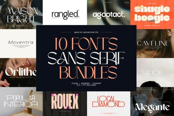
The Modern Sans Serif Bundles gather an eclectic mix of minimalist typefaces-narrow grotesques, clean humanists, and geometric cuts-each supplied with multiple weights, italics, and thoughtful OpenType features like small caps and stylistic alternates. Webfont-ready files and variable-font options make responsive typography easier to manage, while meticulous kerning and hinting ensure crisp rendering across screens. Licensing is laid out clearly so teams can apply the same families for print, web, and packaging without surprises.
Use the collection to build consistent brand systems: pair a bold display face for logos with a lighter companion for body copy, or stack condensed headings over roomy captions to create visual rhythm. For clients who expect luxury presentation, these selections work well in editorial spreads, high-end packaging, and premium websites, and they include options tuned for small sizes and large-format signage. If you maintain an archive of high end sans serif fonts for client work, this bundle will save hours of font hunting while offering families that are intentionally matched for real-world projects.
╰┈➤ Download Modern Sans Serif Bundles Font
My Recommendation: I reach for this bundle when a client brief demands a refined, consistent typographic toolkit across print and digital. The curated families and clear licensing mean faster mockups and fewer version headaches. For brand systems, packaging, or premium websites where typography must feel coordinated, this collection is highly practical and time-saving.
5. Sublime Font
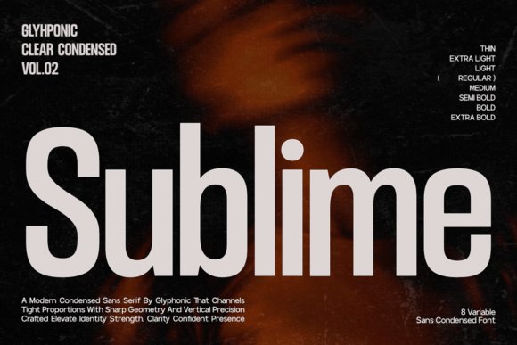
Sublime is a condensed sans serif built around a tall x-height and a strict vertical rhythm, so letterforms read with authority at display sizes. Its eight weights span Thin to Extra Bold, and the geometry favors crisp terminals and purposeful counters that hold up in tight tracking. The typeface excels in editorial headers, corporate wordmarks, and cinematic posters where space is limited but impact is required.
Set in all caps with compact tracking, Sublime becomes a headline engine; loosening the tracking makes it comfortable for UI headings where legibility still matters. Designers will appreciate the precision in kerning and the option of glyph alternates to avoid awkward joins. Use it to give a brand an architectural, composed voice that reads as confident without resorting to ornament.
My Recommendation: I pick Sublime when headlines need to assert presence in narrow columns or bold hero treatments. Its condensed proportions let layouts stay compact while keeping strong visual hierarchy. For tech brands, magazines, or posters that need a poised, vertical tone, Sublime is my first choice.
6. Existo Font
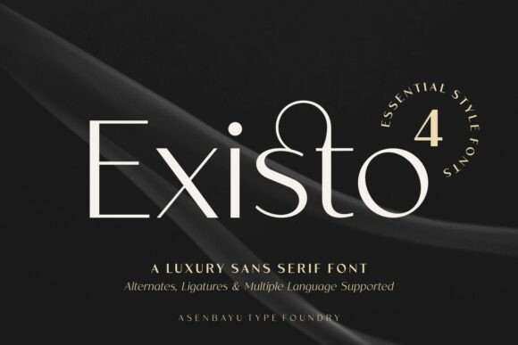
Existo blends the clarity of a contemporary sans with subtle serif-like inflections-short flared terminals, gentle stroke modulation, and open counters-that give text a refined personality without losing neutrality. The result is a face that reads comfortably at body sizes while offering character in headlines, thanks to balanced proportions and considered spacing. Its construction makes it a dependable choice for publications, product manuals, and premium retail catalogs.
Pair Existo with a geometric display for striking contrast, or let it carry both headings and supporting copy when you need a unified, upscale voice across collateral. The readable forms and modest contrast perform well in print and on screens, and careful kerning produces polished logotypes. For briefs that ask for clarity with a hint of heritage, Existo keeps layouts poised rather than ornate.
My Recommendation: I use Existo when a project needs modern neutrality with a whisper of personality-think boutique catalogs, stationery, or editorial features. Its letterforms are forgiving in long reads yet distinct enough to anchor a logotype. Choosing Existo helps balance legibility and character without over-designing the type treatment.
7. Sorell Sans Font
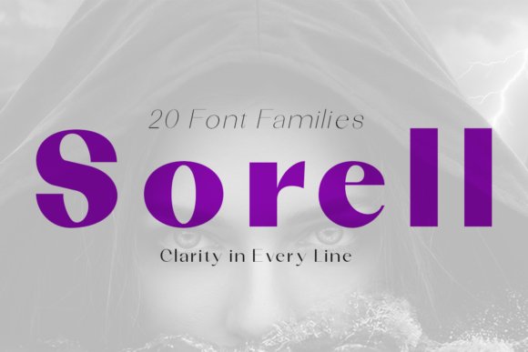
Sorell Sans presents statuesque letterforms that merge classical proportions with geometric restraint, producing a formal yet modern tone. High-contrast strokes, wide apertures, and firm terminals sustain crisp legibility across both printed spreads and tight-screen interfaces. The family includes twenty weights and styles, so designers can tune emphasis and hierarchy without borrowing extra typefaces.
When your brief calls for high end sans serif fonts for luxury branding, Sorell handles logotypes, editorial mastheads, and architectural signage with equal authority. It proves especially capable in large-format display work where measured curves and generous counters must remain readable at distance and in small caps. For identity systems that must read confidently across scale and material, this collection is a practical investment.
My Recommendation: I reach for Sorell when a project needs a poised, upscale voice across print and digital touchpoints. Its wide range of weights lets me craft subtle differences between headlines and subheads without adding extra families. Use it for corporate identities, premium packaging, or any application that benefits from a composed, authoritative sans.
8. Megante Font
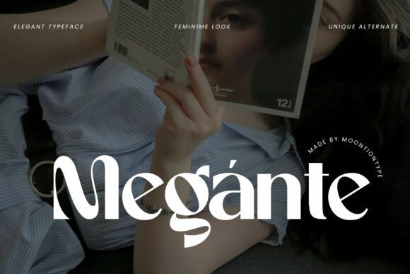
Megante Font balances delicate strokes and subtle calligraphic inflections to project a refined, feminine character. Its alternates and swash options let you craft bespoke wordmarks without overworking letterforms; careful spacing preserves clarity from business cards to mastheads. The design sits comfortably between contemporary sans proportions and ornamental warmth, giving typography an artisanal touch.
OpenType features and ligatures make it easy to introduce tasteful flourishes into headlines and logotypes while keeping body copy legible and composed. The alternate set invites playful pairings-swap a standard ‘g’ for a swash in a hero headline and retain a clean base text for paragraphs. If you want personality without excess ornament, Megante achieves that balance.
My Recommendation: I pick Megante for fashion and beauty projects where typography should feel handcrafted yet professional. The alternates are terrific for logo work and editorial mastheads, and the core alphabet holds up nicely in short blocks of text. It’s my go-to when a design needs a soft, elegant identity with decorative options on demand.
9. Angelin Font
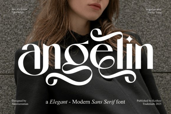
Angelin Font delivers a poised, modern sans serif with smooth curves and a narrow, high-contrast skeleton that suits premium identities. Its letterspacing favors airy headlines while retaining clean forms at small sizes, so it performs well across web, print, and packaging. The typeface leans on measured restraint rather than ornament, producing a refined presence that reads as deliberate and composed.
Angelin ships with PUA-encoded glyphs and ligatures, which simplifies access to alternate characters and stylistic sets for logotypes and invitations. Pair it with a neutral geometric face or a light serif for body text to create a calm, hierarchical system that feels polished. Designers who want a minimal but elegant voice will appreciate how Angelin supports messaging without calling excessive attention to itself.
My Recommendation: I use Angelin when a project needs a clean, understated personality-luxury web headers, bridal stationery, or premium packaging are all good fits. The PUA glyphs let me experiment with alternate forms quickly, which speeds up logotype exploration. For any brief that asks for quiet sophistication, Angelin reliably delivers.
10. Glamour Extra Light Font
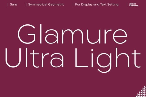
Glamour Extra Light is an ultra-fine sans serif whose hairline strokes and carefully tapered terminals read like precision engraving. Its airy counters and measured contrast create a whisper of opulence without bulk, making it an ideal voice for couture labels and invitation suites. As one of the high end sans serif fonts I reach for, it gives packaging and editorial headlines a refined, high-value tone while still feeling modern and breathable.
Technically, this face benefits from generous letterspacing and careful kerning to keep the thin strokes legible across print processes; consider optical sizes or slightly heavier display settings for smaller reproductions. Use its subtle alternates and ligatures to add personality, pair it with a sturdy slab or bold serif to build contrast, and reserve it for large-scale branding moments-logos, perfume cartons, and fashion mastheads are where it thrives.
╰┈➤ Download Glamour Extra Light Font
My Recommendation: I turn to Glamour Extra Light when a project needs a quiet but unmistakable sense of luxury-perfume labels, boutique stationery, and wedding collateral are perfect fits. Its delicate strokes reward precise production and thoughtful spacing, so I recommend it for premium print work or high-resolution digital headers. If you want a brand to read as exclusive without being loud, this font delivers that refined signature.
11. Quasar Soft Font
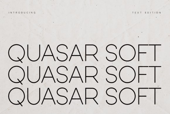
Quasar Soft is an ultra-light rounded sans serif that balances geometric structure with softened terminals to produce a warm, contemporary voice. The typeface’s monoline strokes and elevated x-height give it surprising clarity for a delicate weight, resulting in a breathable, minimalist appearance suited to wellness, fashion, and lifestyle brands. Its calm personality makes it especially effective in spacious layouts where simplicity and approachability matter.
Functionally, Quasar Soft works best as a headline or brand wordmark rather than dense body text; boost tracking for small sizes and pair it with a strong, contrasting serif or condensed sans to establish hierarchy. It adapts well across web and print when served as responsive webfonts, and its rounded forms translate cleanly to packaging, UI headers, and editorial spreads that need a soft modern presence.
My Recommendation: I’d pick Quasar Soft for projects that demand a friendly, contemporary tone-wellness labels, boutique packaging, and sleek app headers benefit most from its airy construction. The font reads as sophisticated without sterility, so I use it when warmth and minimalism must coexist. For maximum impact, pair it with a heavier serif or a bold geometric for contrast in logos and hero typography.
12. Mondrich Font
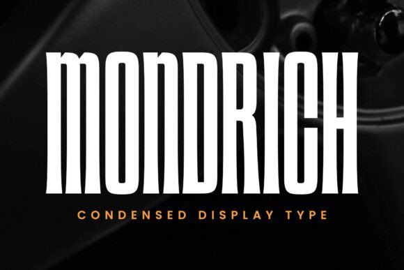
Mondrich is an ultra-condensed display sans serif defined by tall proportions and widened stroke tips that push a compact, assertive silhouette. Its vertical emphasis slices through crowded layouts, making it an excellent tool for posters, mastheads, and athletic branding where presence matters more than ornament. The face projects disciplined energy and reads well at large scale, delivering an architectural, forward-moving aesthetic.
Designed for space-conscious messaging, Mondrich comes in Regular and Slanted styles and includes PUA-encoded extras for quick access to alternates. For strong typographic systems, pair it with a wide-spaced sans or a neutral grotesk to create breathing secondary layers; it excels on motion graphics, storefront signage, and product apparel where condensed impact is required.
My Recommendation: I reach for Mondrich when a headline needs maximum impact within tight horizontal space-movie posters, stadium signage, and sports apparel are ideal applications. Its tall, narrow letterforms cut a bold profile without resorting to ornament, so it works well with minimalist color systems and modern grids. Use it where you want typography to carry the attitude and presence of the design.
13. Modamode Font
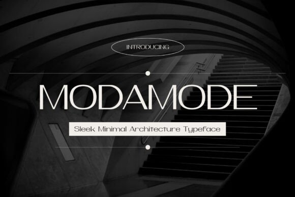
Modamode marries modern architectural geometry with fashion-house polish, producing letterforms that read as both precise and poised. With a short x-height, crisp open counters and slightly condensed proportions, it sits among high end sans serif fonts intended for premium identity work. Finely trimmed terminals and restrained stroke contrast keep word shapes elegant at display sizes.
Designers will value the well-tuned kerning, a thoughtful weight range, and alternate glyphs that introduce subtle personality without shouting. It performs strongly in logotypes, mastheads and boutique packaging where measured restraint matters. Pair Modamode with a neutral serif for longer copy or let it carry pared-back editorial spreads.
My Recommendation: I choose Modamode when a brand needs a precise, architectural voice-ideal for studios, luxury fashion labels and high-end editorials. Its metrics make tight mark-making and lockups straightforward to execute. I recommend using the alternates sparingly to create a discreet signature without overworking a logo.
14. Vosage Font – high end sans serif fonts
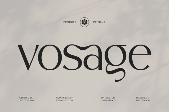
Vosage compresses minimalist ideas into a face that reads calm and assured, with even stroke modulation and generous counters that improve legibility. Thoughtful letterspacing produces quiet microtypography so headlines can breathe without losing presence. Small caps and tabular figures are handled cleanly, which helps across both print and screen applications.
The family covers a useful span of weights and keeps tonal consistency across sizes, preserving typographic hierarchy. In premium packaging and refined editorial settings, Vosage reads as understated support for imagery rather than ornamentation. Tested at large display sizes, its subtle terminals reward closer inspection and lend a handcrafted touch.
╰┈➤ Download Vosage Font – high end sans serif fonts
My Recommendation: I pick Vosage for projects that call for discreet refinement-product labels, lookbooks and elegant web headers. It supports photography and layout without competing for attention, which is great when imagery is the focal point. Use mid-to-light weights for body copy and reserve bolder cuts for restrained headlines.
15. Vorue Font
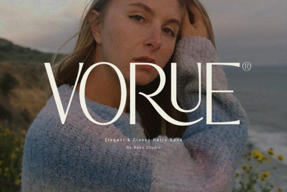
VORUE blends soft curves with firm structural anchors to give headlines a composed, slightly nostalgic character. Gentle retro hints appear in rounded terminals and tapered joins, while overall proportions remain contemporary and highly readable. That balance makes it suitable for identities that want warmth without theatricality.
The face really sings at display sizes where its distinctive letter shapes and intentional spacing build strong presence. Stylistic alternates add personality for beauty and fashion work, while the standard caps hold up in tight logotype lockups. Pair it with unobtrusive body type to let its headline personality shine without clutter.
My Recommendation: I reach for VORUE when a brand needs a touch of personality that still feels premium-perfect for fashion campaigns, boutique retail signage and editorial headlines. It adds a soft vintage nod without drifting into cliché. Combine it with simple body typography to maintain clarity across longer reads.
16. The Solveige Atelier Font
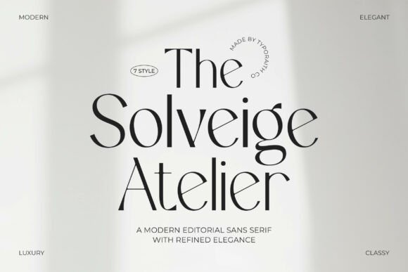
The Solveige Atelier pairs restrained geometry with soft, sculpted terminals to produce an editorial voice that feels both refined and modern. Among high end sans serif fonts, Solveige Atelier stands out for its poised letter proportions and subtly flared curves that read as luxury rather than ornament. Its presence is calm but unmistakable on covers, mastheads, and upscale product labels.
The family spans seven styles from hairline to bold, each built with tight metrics and considered kerning so text blocks remain composed at any scale. Small caps and italic contrasts are kept understated, which makes mixing it with serif bodies or minimalist iconography straightforward. Use it where you want a polished typographic system that behaves predictably across print and screen.
╰┈➤ Download The Solveige Atelier Font
My Recommendation: I pick Solveige Atelier when a project requires an editorial, high-fashion tone-its letterforms deliver elegance without fuss. The seven-style family gives me consistency from logo to packaging, and the careful spacing reduces micro-adjustments in production. Great for magazines, boutique identities, and premium product labels where typography must feel deliberate and refined.
17. Gorga Romantic Font
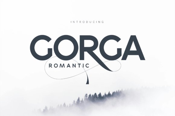
Gorga Romantic marries broad, geometric letterforms with a single, dramatic flourish: a long, calligraphic tail on the uppercase R that threads beneath neighboring letters. That ornamental stroke reshapes headings, turning clean sans shapes into something unexpectedly lyrical while keeping reading comfort intact. The balance of heavy stems and an airy swash gives the face a contemporary yet slightly nostalgic personality.
Weight options favor wide-stanced display use, so tight tracking and generous leading help the decorative elements breathe. When paired with a neutral text face or set alone at large sizes, Gorga Romantic lends character to wedding suites, fashion headers, and boutique packaging. Choose it for projects that need a headline with a handcrafted twist rather than a fully ornamental script.
╰┈➤ Download Gorga Romantic Font
My Recommendation: I use Gorga Romantic when a brand needs a single signature flourish to stand out-the R creates instant recognition. It shines on invitations, beauty packaging, and fashion editorials where a handwritten hint reads as premium. Pair it with a plain sans or a subtle serif to keep the overall look balanced and modern.
18. Manoco Font
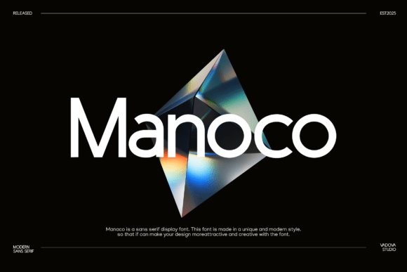
Manoco is a crisp display sans built around consistent geometric rhythms and an economy of stroke, giving it an architectural clarity. Narrow counters and a steady x-height make it read cleanly on screens while retaining authority in print, so headlines and UI labels feel composed rather than decorative. The overall voice is minimal and assured, suited to brands that prize restraint.
Offered in several weights, Manoco balances tight letterspacing with open internal shapes so short phrases hold their form at small sizes, which is useful for interface work and compact logotypes. Its restrained geometry pairs well with grid-based layouts and monoline icon sets, integrating smoothly with photographic art direction. Reach for it when you want a modern sans whose presence reads deliberate and calm rather than trendy.
My Recommendation: I turn to Manoco for projects that need a pared-back, professional tone-architecture studios, fintech brands, and design-led apps are ideal fits. Its disciplined metrics save time on kerning and keep interfaces tidy across breakpoints. Use it for logotypes, headers, and UI where clarity and a controlled aesthetic are priorities.
19. First Memoirs Font
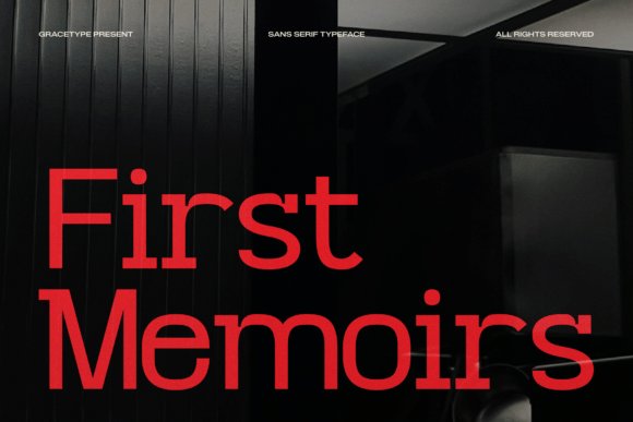
First Memoirs channels cinematic restraint through geometric letterforms and a balanced x-height that reads cleanly on screen and in print. Minimal stroke contrast and sharply cut terminals give it an editorial temperament that stays legible at small sizes while still commanding attention in display use. As part of a curated set of high end sans serif fonts, it sits between magazine typography and refined brand systems.
Wide apertures and precise counters lend text an intellectual yet approachable tone, so headings feel authoritative without sounding cold. It excels in documentary-style branding, architecture portfolios, modern editorial spreads, and upscale apparel labels where a quiet, professional voice is needed. The typeface pairs well with classic serifs for contrast or with spare grotesques for a cohesive, modern identity.
╰┈➤ Download First Memoirs Font
My Recommendation: I reach for First Memoirs when a project needs a composed, editorial voice-magazine features, film title sequences, and minimalist retail identities are ideal fits. Its open forms keep long passages readable while headlines maintain weight and presence. For clients who want a serious but humane look, this font delivers consistent, professional results.
20. Akihiko Font
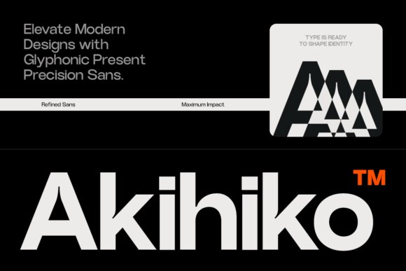
Akihiko Font marries exacting geometry with subtle humanist touches, creating a steady, confident typographic presence. The spacing and vertical rhythm are built for tight grids and interface layouts, so alignment and hierarchy feel intentional across platforms. Its neutral but poised voice suits projects that require careful visual order.
The family’s weight spread and compact proportions support bold headlines as well as dense information design without clutter. Small details-slightly tapered stems and open counters-separate it from generic grotesques and improve legibility at small sizes. Use it where precision and a calm, modern aesthetic are top priorities.
My Recommendation: I use Akihiko when briefs demand disciplined typography and predictable behavior across responsive layouts. It’s especially handy for corporate reports, modern UI work, and brands that want a clean, assured tone. The controlled geometry makes layout choices straightforward and repeatable, which speeds production without sacrificing style.
21. Balyt Font
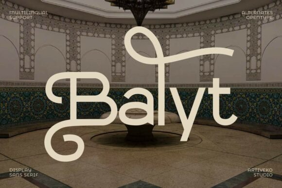
Balyt Font blends minimalist geometry with tasteful decorative flourishes that inject character without overpowering a design. Predominantly even strokes are punctuated by unconventional terminals and selective ornamentation, giving headlines a handcrafted feel while preserving overall clarity. The effect reads as deliberately designed rather than decorative for decoration’s sake.
Because those details are restrained, Balyt works well for logos, packaging, editorial mastheads, and branding that needs personality alongside function. Its modular skeleton tolerates tight tracking for impactful display use and remains legible at medium sizes, offering art-direction flexibility. Pair it with neutral sanses or soft serifs to keep hierarchy obvious and engaging.
My Recommendation: I recommend Balyt when a brand needs a recognizable typographic signature-boutique packaging, fashion editorials, and artisanal product identities are natural fits. It adds distinctive visual interest without complicating production or legibility. For designers aiming to balance craft and utility, Balyt is a lively, practical choice.
22. Six Sound Font
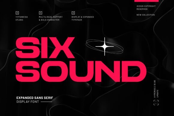
Six Sound is an expanded sans serif with a distinctly futuristic attitude; bold geometric strokes and wide proportions give it a headline-first personality that suits technology brands and gaming identities. As part of a shortlist of high end sans serif fonts, its crisp forms and aggressive rhythm make it a go-to for posters, esports marks, and app splash screens where presence matters.
The family ships with uppercase and lowercase, numerals, punctuation, ligatures and stylistic alternates plus broad language support, so you can craft distinctive wordmarks without hand-drawing. It holds character at large sizes and on merchandise, though the roomy letterspacing benefits from careful tracking in compact layouts; pair heavier weights for titles with a compact text face for balance.
My Recommendation: I reach for Six Sound when a project needs a bold, tech-forward voice-especially for game titles, streaming graphics, or futuristic branding. The wide letterforms help logos read from a distance, and the alternates let me tweak wordmarks quickly. In practice I pair it with a condensed sans for body copy and test tracking at display sizes to maintain rhythm.
23. Glamour Thin Italic Font
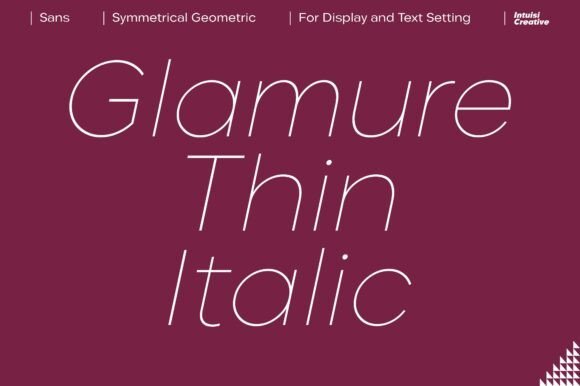
Glamour Thin Italic is a slender sans display that reads like an elegant signature rendered in clean geometry; its italics have refined terminals and a slight contrast that give headlines a luxury air. The narrow profile shines on boutique packaging, upscale labels and fashion mastheads where a refined, italic tone is required. Its restrained style translates well across premium product shots and editorial spreads.
Because the strokes are ultra-thin, reproduction quality is important-favor vector or high-resolution output and keep point sizes generous for legibility. Optical kerning and careful tracking make it a strong display choice, and pairing it with a sturdy neutral sans for body text maintains hierarchy. Multilingual support extends its usefulness for international branding projects.
╰┈➤ Download Glamour Thin Italic Font
My Recommendation: I recommend Glamour Thin Italic for luxury labels, beauty packaging, and fashion editorials that need a poised, italic voice. Treat it as a display face: give it breathing room and avoid tiny raster sizes to preserve hairline details. When used with a robust companion for body copy, it elevates layouts without overpowering them.
24. Visionary Font Ultra Delicate Edition
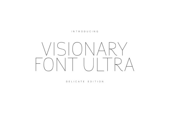
Visionary Font Ultra – Delicate Edition is a display sans built around whisper-thin strokes and balanced proportions that deliver a light, airy headline aesthetic. The restrained geometry emphasizes elegance through simplicity, making it excellent for contemporary logos, magazine covers, and premium invitations where subtlety is the goal. It maintains presence at large sizes while feeling soft and refined.
Designers get alternates and PUA-encoded flourishes for quick decorative work plus extended Latin coverage for international applications. For screen use, ensure high-resolution rendering or SVG export to keep hairlines intact; in print, choose quality stock and crisp artworking to preserve detail. Pair Visionary with a readable text face to add a delicate, modern voice to premium identity systems.
╰┈➤ Download Visionary Font Ultra Delicate Edition
My Recommendation: I’d use Visionary Ultra when a project needs understated elegance-think gallery invites, fashion lookbooks, or high-end editorial headlines. Its ultra-thin strokes reward careful production, so avoid tiny sizes and test on the final medium. Combine it with a solid text face to keep messaging readable while the headlines breathe.
25. Imperium Font
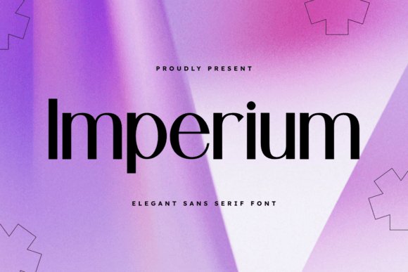
Imperium is a restrained geometric sans that reads like high-fashion typography. Its elongated proportions and narrow counters produce a statuesque presence, making headlines feel both assertive and refined. The overall rhythm comes from tight spacing and subtle stroke contrast, which keeps large-wordmarks legible while offering visual drama. As part of a toolbox for high end sans serif fonts, Imperium bridges editorial authority and minimalist branding.
Use heavier weights for mastheads and lighter weights for captions; optical sizes or tuned kerning pairs enhance clarity at small scales. It pairs beautifully with delicate scripts or with high-contrast serifs for fashion or architecture titles, and stacks cleanly in layered logotypes. The typeface performs well in print finishes-foil, embossing-and on-screen with generous hinting. For designers chasing a quiet but commanding typographic voice, Imperium provides precise options across media.
My Recommendation: I reach for Imperium when a project needs to feel luxe without ornament. Its tall, measured letterforms give headlines runway-ready presence while the weight range supports clear hierarchy across web and print. Use it for fashion editorials, premium packaging, and corporate identities that require a composed, authoritative face.
26. Centina Font
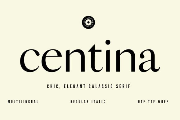
Centina bends space economy into an elegant tool: slightly condensed letterforms that conserve width without collapsing personality. The set includes extended language support and consistent terminals, so international layouts look native rather than patched. Subtle geometric cues-soft terminals and a moderate x-height-keep text readable while letting display settings feel modern and composed. Hinting and clear capitals make Centina reliable from mobile headers to printed hang tags.
In branding, Centina shines where signage, labels, or dense navigation must read at a glance; its compact metrics help maintain a tidy grid. Pair it with a humanist serif for long passages or a neutral grotesque for a pared-back brand voice. The predictable spacing eases responsive typography work and reduces reflow surprises. For projects that demand poise in tight spaces, Centina is a steady performer.
My Recommendation: I pick Centina for situations where space is limited but the tone must remain polished. It works especially well on product labels, mobile UIs, and editorial sidebars where concise headlines are essential. The multilingual glyph set and disciplined rhythm make it a practical choice for international brands.
27. Modern Romance Font
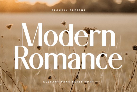
Modern Romance mixes restrained sans proportions with subtle calligraphic touches-slight terminal flares and gentle modulation add warmth without becoming ornamental. Higher ascenders and open counters create an airy texture that flatters mastheads and invitations where tone matters as much as legibility. The family holds character at large sizes while remaining comfortable in smaller text thanks to consistent metrics and considered spacing. These qualities let it convey refinement without feeling fussy.
Use Modern Romance for boutique hospitality, couture editorials, and premium stationery where a soft, upscale voice is needed. Its quirks inject personality into otherwise strict grids and reduce optical collisions in compact layouts. The typeface pairs well with neutral sans companions for body copy and with delicate scripts for accent lines. When a project needs an approachable yet polished sans, this one fits the bill.
╰┈➤ Download Modern Romance Font
My Recommendation: I choose Modern Romance when a design should feel intimate and refined-wedding invitations, boutique branding, or lifestyle magazine covers are ideal matches. The slight romantic inflections soften headlines while keeping control in layout. It’s a great way to add warmth without sacrificing typographic clarity.
These 27 choices save time when you need a premium sans serif that reads well and communicates restraint or luxury. Try a handful in your actual layouts to compare metrics, pairing, and color interaction before committing to a full palette.
Keep this list as a reference when selecting type for high-impact print and digital work. If you want deeper pairing examples or testing checklists, future posts will include side-by-side mockups and format notes to make implementation easier.