27 Best tech logo fonts for SaaS and AI Startups in 2026
Creating a brand identity in the digital space requires a balance between legibility and innovation. In this article, we showcase 27 tech logo fonts that are dominating the industry in 2026, offering everything from minimalist aesthetics to bold, futuristic shapes. Whether you are launching a new app or rebranding a software company, these typefaces provide the professional look needed to compete in today’s market.
1. Motech Font
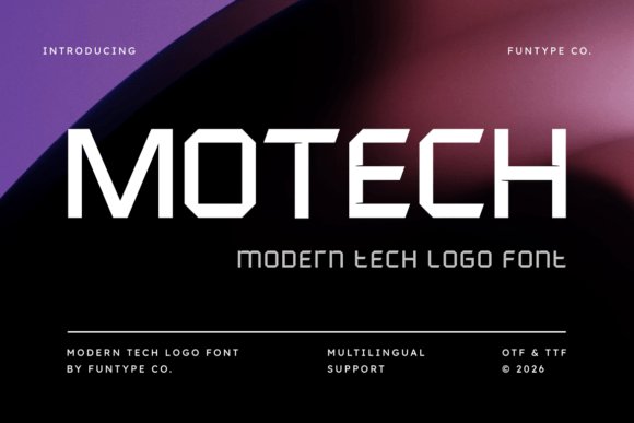
Motech stands out as a titan of modern geometry, offering a structural weight that feels both grounded and incredibly forward-thinking. Its sharp technical lines are meticulously crafted to convey a sense of reliability and architectural precision. This makes it an exceptional choice for industrial startups or software engineering firms that want to project a sense of stability and advanced engineering through their visual identity.
Beyond its primary aesthetic, the font provides extensive versatility through its multilingual support and clean, high-impact legibility. Whether you are designing large-scale digital billboards or minimalist app interfaces, the font’s refined proportions ensure that every character commands attention without overwhelming the viewer. It successfully bridges the gap between traditional sans-serif accessibility and the cutting-edge requirements of twenty-first-century digital interfaces.
My Recommendation: I would lean toward Motech for hardware manufacturers or fintech platforms because it has a ‘built-to-last’ quality. The thick, unwavering strokes really build trust with the audience while maintaining a sleek, modern edge.
2. Arcades Rivalries Font
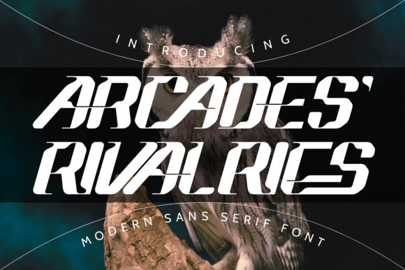
Arcades Rivalries captures the high-octane energy of the gaming world and translates it into a sophisticated sci-fi aesthetic. As one of the more versatile tech logo fonts available, it leans heavily into a futuristic look that feels right at home in the competitive esports scene or high-performance automotive branding. The inclusion of unique ligatures allows designers to customize letter pairings, creating bespoke wordmarks that look custom-made for the next big indie game or virtual reality experience.
This typeface isn’t just about sharp angles; it’s about creating a narrative of speed and innovation. The sans-serif base maintains readability while the stylized flourishes add a layer of hi-tech complexity. It is particularly effective for movie posters or event branding where you need to communicate a sense of a distant, more advanced timeline, making it a staple for anyone building a modern advertising campaign around technology.
Download Arcades Rivalries Font
My Recommendation: The ligatures are a massive asset here, allowing you to create really distinctive logos for streamers or tech startups. It hits that perfect sweet spot between readable and experimental that sci-fi projects often require.
3. Vanker Font
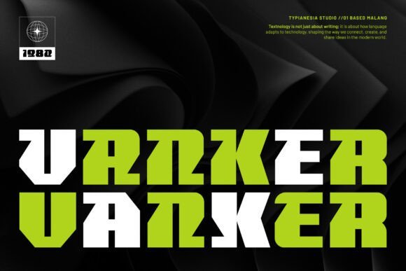
When your project demands a dominant presence, Vanker delivers a bold, display-oriented solution that echoes the vastness of deep space and the precision of digital circuits. This typeface is specifically engineered for high-intensity visuals, making it a top-tier choice among tech logo fonts for developers creating sci-fi game titles or aggressive marketing campaigns. Its geometric construction is thick and heavy, ensuring that headlines remain legible even against complex, textured backgrounds often found in cinematic art.
The beauty of Vanker lies in its unapologetic boldness. It doesn’t just sit on the page; it claims the space, making it perfect for brand identities that need to signal a cutting-edge, future-focused mission. From high-energy game interfaces to corporate tech identities, this font provides a sense of power and momentum that helps a brand stand out in a saturated digital landscape, ensuring your message is both dominant and future-proof.
My Recommendation: Use Vanker when you want your message to feel like a command rather than a suggestion. It’s perfect for hero sections on websites or heavy-hitting cinematic titles where visual impact is the absolute highest priority.
4. Glide Sans Font
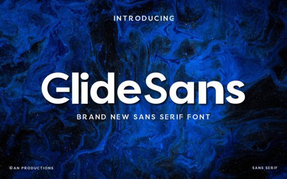
Glide Sans represents a masterclass in geometric stability, offering a robust visual framework that resonates with modern digital identities. By prioritizing balanced stroke widths and expansive apertures, this typeface achieves a level of clarity that is often missing in bolder sans-serifs. It is specifically engineered to function as one of those essential tech logo fonts that can scale from a high-resolution favicon to a massive physical billboard without losing its structural integrity or professional tone.
The font’s contemporary aesthetic is defined by its lack of superfluous ornamentation, favoring a sleek, streamlined look that mirrors the efficiency of high-performance software. Its bold weights are particularly effective for creating a sense of authority and reliability, making it an excellent candidate for corporate branding where trust and innovation must be communicated simultaneously. Whether applied to app interfaces or editorial layouts, its harmonious proportions ensure that the text remains legible and engaging across all screen resolutions.
My Recommendation: I would reach for Glide Sans when designing for a SaaS company that wants to appear both established and cutting-edge. It is particularly effective for heavy-duty header sections where you need to command attention while maintaining a clean, minimalist workspace feel.
5. Nexar Font
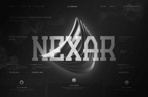
Nexar is a high-octane display typeface that draws heavy inspiration from industrial machinery and futuristic digital engineering. Its architecture is built on sharp, aggressive angles and a rigid mechanical structure, evoking the precision of robotic assembly lines and sci-fi aesthetics. Each character feels forged rather than drawn, providing an uncompromising visual energy that is ideal for projects requiring a sense of power, speed, and advanced technological prowess.
Beyond its striking visual weight, this font excels in environments where high-impact typography is non-negotiable, such as esports branding or cyberpunk-themed UI design. The sharp terminals and solid, blocky forms create a dominant presence on the page, ensuring that titles and headlines remain the focal point of the composition. It is a specialized tool for designers who need to bridge the gap between heavy industrial design and the sleek, high-definition interfaces of tomorrow.
My Recommendation: Nexar is my go-to choice for gaming-related overlays or hardware product packaging. Its machine-like precision gives any project an instant ‘advanced’ feel, making it perfect for brands that want to lean into a gritty, high-performance narrative.
6. Noreva Font
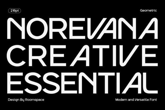
Noreva is a sophisticated geometric sans serif that manages to blend minimalist restraint with a warm, human-centric touch. Unlike more rigid geometric faces, Noreva features subtle curves and thoughtful proportions that make it feel approachable and friendly while retaining a professional polish. This balance makes it incredibly versatile, allowing it to transition seamlessly from the sophisticated world of boutique skincare branding to the fast-paced environment of a modern lifestyle blog.
The font’s clarity is its greatest strength, offering a crisp reading experience in both digital and print mediums. It performs exceptionally well in white-space-heavy designs, where its smart geometric shapes can breathe and provide a sense of calm organization. For designers looking to cultivate a brand image that is both stylish and highly accessible, this typeface provides a foundation of clarity that enhances user engagement and brand recall without feeling overly sterile or corporate.
My Recommendation: Use Noreva when you need a ‘soft-minimalist’ vibe for an Instagram-centric brand or a modern mobile app. It has a wonderful way of looking expensive and high-end while remaining completely readable and friendly to the average user.
7. Cranio Font
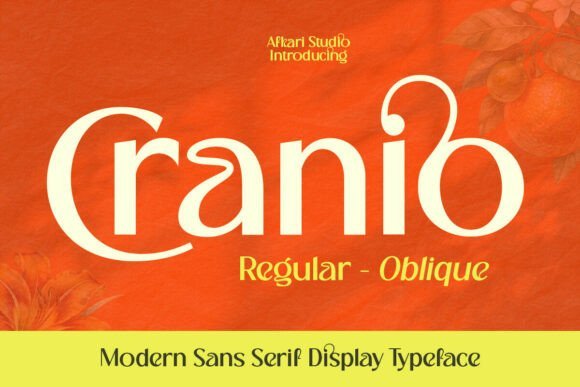
Cranio stands as a testament to the power of geometric precision in modern typography. Its letterforms are constructed with a deliberate focus on balance and structural integrity, making it a reliable choice for digital-first interfaces and minimalist corporate aesthetics. The sharp, unyielding edges provide a sense of authority, while the open apertures ensure that the font remains legible even when used in high-density web layouts or mobile application headers.
Beyond its utility in UI/UX design, this typeface excels in larger-than-life marketing materials where clarity is paramount. Whether you are developing a visual identity for a hardware startup or refreshing a software developer’s online portfolio, its contemporary proportions align perfectly with the ‘less is more’ philosophy currently dominating the industry. Its versatility allows it to transition from a bold headline on a physical billboard to a crisp, high-definition display on a retina screen without losing its distinct character.
My Recommendation: I would reach for Cranio whenever I need a clean, authoritative look that doesn’t feel cold or clinical. It is particularly effective for SaaS landing pages where you want the text to look structured and reliable. It really shines in monochrome palettes where the geometry can do all the heavy lifting.
8. Ketsana Font
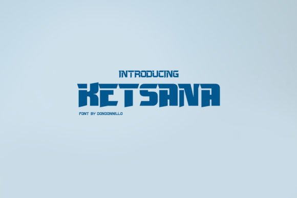
Ketsana is a masterclass in aerodynamic design, blending minimalist sans-serif traits with a distinctly fast-paced, techno-inspired vibe. This typeface is specifically engineered to convey movement and forward-thinking innovation, making it an exceptional candidate for tech logo fonts that need to communicate speed and efficiency. The letterforms are stripped of unnecessary detail, focusing instead on streamlined paths and subtle industrial curves that echo the aesthetics of high-performance machinery and future-proof engineering.
Its ability to maintain a sporty yet sophisticated profile makes it highly effective for brands operating at the intersection of athletics and high-tech wearable gear. The horizontal weight distribution adds a sense of stability and ground-speed, which is invaluable for creating memorable marks in the competitive landscape of digital startups and automotive tech. When applied to headers or logo marks, it creates a visual rhythm that feels both urgent and meticulously planned.
My Recommendation: Ketsana is my go-to for anything related to robotics or high-end performance gear. It has a sleek, almost ‘stealth’ quality that makes any short brand name look instantly faster and more advanced. If you are designing for a company that values the future of speed, this is your secret weapon.
9. Galaxy Tastic Font
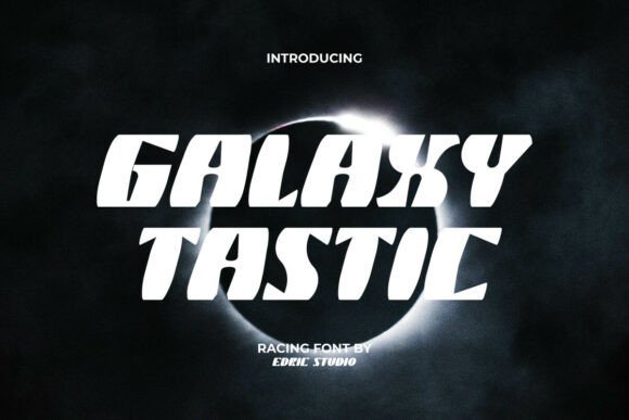
Galaxy Tastic breaks away from static design conventions by injecting a sense of velocity and cosmic exploration into every character. The font features a unique slanted architecture that suggests rapid acceleration, making it an ideal visual partner for the high-energy world of esports and interactive gaming media. Each glyph is balanced with smooth interior curves that contrast beautifully against its aggressive, sharp outer corners, creating a visual tension that demands the viewer’s attention and keeps the layout dynamic.
This typeface is remarkably versatile, functioning as a powerhouse for both print and digital assets ranging from editorial spreads to product packaging for gaming peripherals. Its bold presence ensures that titles and headings remain prominent against busy backgrounds, which is a common challenge in cinematic posters and streaming overlays. By combining futuristic flair with a rugged, athletic structure, it provides designers with a tool that bridges the gap between sci-fi aesthetics and modern competitive sports branding.
My Recommendation: I find Galaxy Tastic incredibly useful for projects that need to feel energetic without being messy. It works brilliantly for stream overlays or digital banners where you need an instant ‘wow’ factor to grab a viewer. It is the kind of font that makes a simple word look like it is about to jump off the screen at light speed.
10. Comet Font
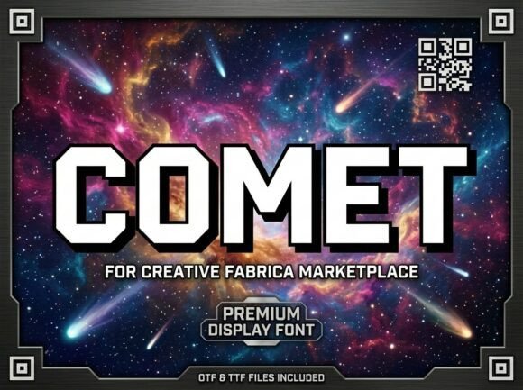
Comet Font stands as a monumental pillar in modern display typography, engineered specifically for high-impact visual storytelling. Its defining characteristic lies in its chamfered edges and heavy, geometric letterforms that project a sense of indestructible architectural strength. Unlike standard bold sans serifs, Comet uses sharp angles and wide horizontal proportions to command attention, making it an ideal choice for cinematic titles or aerospace branding that needs to look rooted in the future.
When searching for the right tech logo fonts to define a software startup or a disruptive engineering brand, Comet offers a rare blend of interstellar power and refined sophistication. It thrives in high-contrast environments—think neon on charcoal or silver gradients on deep blues—and works exceptionally well for e-sports identities and galactic-themed marketing materials. Its visual weight is balanced enough to remain legible in large-scale headers while retaining a distinctive digital-age precision.
My Recommendation: I love how the chamfered corners give this a structural, industrial feel without looking clunky. It is perfect for when you want a brand to feel like it was built in a lab or an aerospace hangar.
11. Stripe Block Font
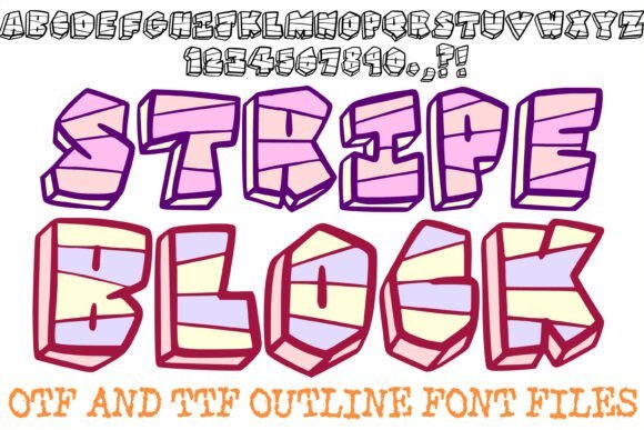
Stripe Block Font is a masterclass in adding texture to heavy-weight geometry, utilizing horizontal etching to break up the mass of its slab-like characters. This unique decorative choice creates a visual rhythm that suggests movement and digital scanning, making it a standout selection for projects that lean into a tech-inspired or glitch aesthetic. Its thick outlines ensure that the letterforms maintain their integrity across various media, from physical merchandise to high-definition digital interfaces.
The font bridges the gap between industrial sturdiness and playful urban design, making it incredibly versatile for modern streetwear labels or innovative event posters. Because of its built-in texture, it requires very little additional styling to look finished, which is a massive time-saver for designers working on tight deadlines for gaming graphics or creative brand identities. It is particularly effective when paired with vibrant color palettes that emphasize the depth of its striped patterns.
My Recommendation: The horizontal lines give it a distinct scanning or monitor vibe that is super effective for digital-forward branding. I would use this for a bold video intro or a streetwear line that needs a heavy, graphic punch.
12. Boundt Font
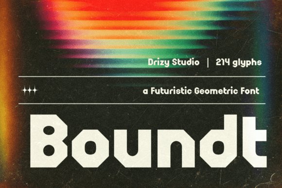
Boundt Font is a wide-set, futuristic powerhouse designed to project unshakeable authority and high-performance energy. Its low-slung profile and sharp, aggressive angles give the impression of a machine built for speed, making it a natural fit for aerospace branding and high-end automotive design. The typeface’s solid, industrial structure provides a grounding effect, ensuring that even the most experimental layouts feel intentional and professionally polished.
In the competitive landscape of tech logo fonts, Boundt distinguishes itself through its command of horizontal space and its ability to pair seamlessly with metallic finishes and glitch-inspired effects. It is the go-to resource for creating impactful headers on technology magazine covers or crafting the visual identity of a next-generation software suite. Whether applied to e-sports logos or digital app interfaces, its contemporary aesthetic serves as a visual shorthand for progress, precision, and modern engineering.
My Recommendation: This font has a fantastic sense of gravity—it feels heavy and fast at the same time. It is my top pick for a gaming project or a hardware brand that needs to feel cutting-edge and extremely reliable.
13. Cybercore Font
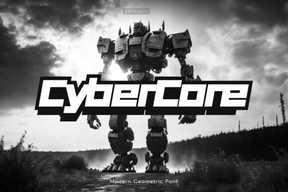
Cybercore is a powerhouse of geometric precision, drawing heavy inspiration from the rigid structures of industrial robotics and futuristic architecture. Its blocky, square-shaped characters create a sense of indestructible stability, making it one of the most reliable tech logo fonts for brands specializing in hardware engineering or cybersecurity infrastructure. The sharp angles and monospaced rhythm provide a clean, grid-based aesthetic that feels right at home in high-performance digital environments.
Beyond its visual weight, this typeface excels in readability within complex interfaces. The minimalist approach ensures that even in dense UI layouts or sci-fi-inspired heads-up displays, the character forms remain distinct and commanding. It is a versatile choice for any designer looking to evoke a sense of digital-age sophistication while maintaining a bold, authoritative presence across both print and screen mediums.
My Recommendation: I love using this for infrastructure projects because its rigid geometry feels incredibly secure and professional. It is the perfect choice for a developer tool or an AI startup that wants to project an image of raw technical power and reliability.
14. Gamero Font
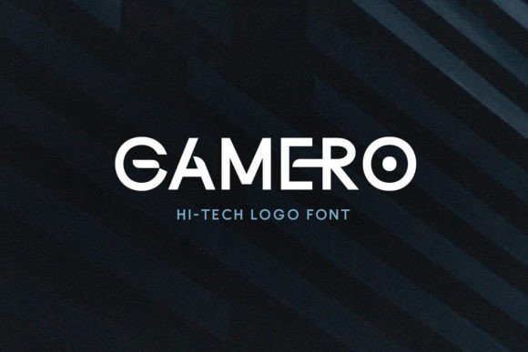
Gamero stands out as a highly stylized sans-serif that prioritizes visual flair and a forward-thinking attitude. The defining feature of this typeface is the intentional fracture found in its lowercase glyphs, which provides a sense of technological advancement or glitch-inspired aesthetics. By mixing uppercase and lowercase forms, designers can create custom-looking wordmarks that feel unique and tailor-made for the next generation of digital entertainment.
The font’s sleek, streamlined proportions make it an ideal candidate for e-sports branding, gaming peripherals, and modern mobile applications. While it maintains a clean overall profile, the subtle breaks in its letterforms suggest movement and energy, ensuring that any brand identity built with this typeface feels progressive and distinctly different from traditional, static sans-serif designs.
My Recommendation: This is my top pick for gaming or streaming brands because the fracture detail adds so much personality without the need for manual vector editing. It feels energetic and modern, which is exactly what a youth-oriented brand needs to stand out in a crowded market.
15. Loominaire Font
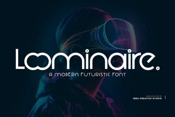
Loominaire represents the intersection of luxury and innovation, offering an elegant take on the futuristic aesthetic. Its wide letterforms and smooth, sweeping curves give it a cinematic quality that is often sought after in high-end tech logo fonts. This typeface avoids the harshness of traditional blocky fonts, opting instead for a fluid, sophisticated look that suggests cutting-edge research, clean energy, or aerospace exploration.
Its versatility allows it to transition effortlessly from large-scale movie posters to intricate website interfaces where white space and hierarchy are paramount. The font captures the essence of a forward-thinking brand that values both aesthetics and performance, making it a stellar option for companies looking to establish themselves as industry leaders in the software-as-a-service or electric vehicle sectors.
My Recommendation: I would reach for this when a client asks for modern elegance rather than just robotic tech. It is exceptionally well-balanced for luxury technology brands or innovative design agencies that want a high-end, spacious feel that breathes confidence.
16. Monswag Font
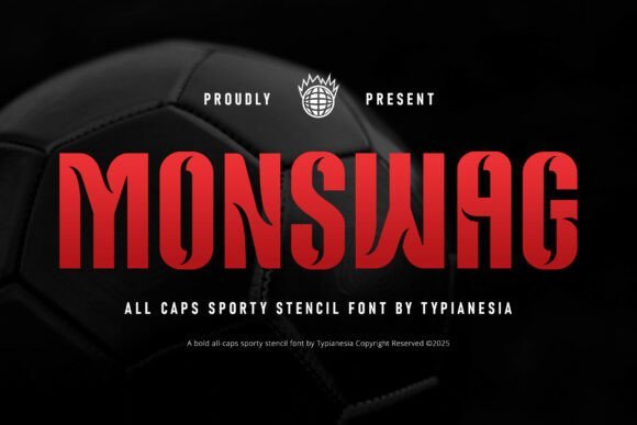
Monswag brings a high-velocity energy to the world of condensed typography, blending the grit of traditional jersey numbering with a sharp, digital-age edge. Its tall, bold structure and unique stencil-cut accents evoke a sense of precision and speed, making it a standout choice for high-performance gear or competitive gaming visuals. The tight spacing ensures that headlines remain impactful even when real estate is limited, providing a commanding presence that feels both modern and authoritative.
This typeface is particularly well-suited for projects that bridge the gap between urban streetwear and cutting-edge electronics. Whether you are designing for an app interface or an eSports tournament identity, the font’s aggressive yet clean lines offer a professional aesthetic that is hard to ignore. Its versatile nature allows it to transition seamlessly from physical merchandise to digital environments, maintaining its high-octane personality across all mediums.
My Recommendation: I would use Monswag for vertical-oriented designs or team branding where space is at a premium but you still need a heavy visual impact. It is perfect for creators who want to give their sports-tech projects a futuristic, high-intensity feel that looks great on high-resolution screens.
17. Detacher Font
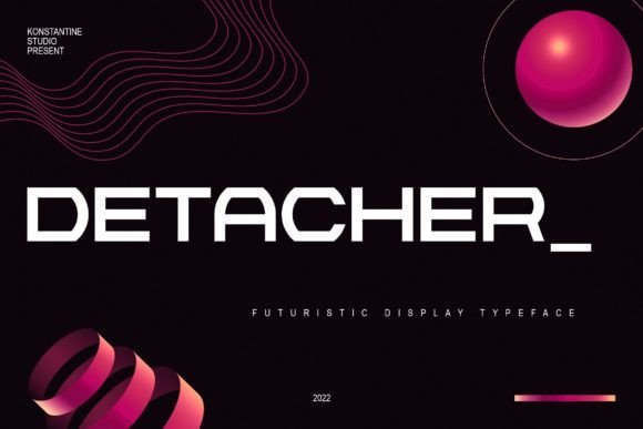
Detacher is a masterclass in wide-body futuristic design, offering a weight and breadth that immediately captures the viewer’s attention. Its expansive horizontal presence suggests a sense of stability and advanced engineering, making it a natural fit for industrial technology projects or high-end tech-wear branding. The bold strokes are balanced with clean negative space, ensuring that even at larger scales, the letterforms remain sophisticated and legible.
Beyond its obvious sci-fi applications, this typeface excels in environments where a loud visual statement is required without sacrificing clarity. Designers looking to craft digital posters or cinematic titles will find its minimalist yet powerful construction provides the perfect foundation for a modern visual narrative. It is an excellent tool for anyone aiming to project a vision of the future that is grounded in strength and industrial precision.
My Recommendation: Detacher is my go-to for branding projects that need a grounded, heavy-set presence, such as hardware startups or automotive tech. Its wide stance gives a sense of reliability and ‘space-age’ luxury that is very difficult to achieve with standard sans serif options.
18. Corush Font
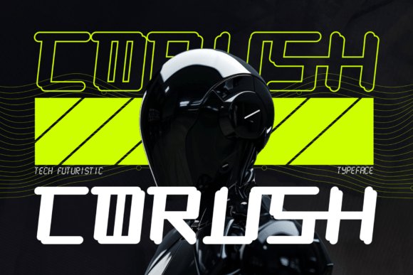
Corush stands at the intersection of geometric modularity and sci-fi elegance, drawing inspiration from the intricate world of robotics and cyberpunk aesthetics. Every character is a testament to digital craftsmanship, featuring sharp corners and subtle curves that create a symbiotic balance of power and grace. This modular approach makes it an ideal candidate for software interfaces, gaming dashboards, and any brand identity that wants to signal a forward-thinking, innovative ethos.
The inclusion of stylistic alternates and full PUA encoding allows for deep customization, giving designers the flexibility to create truly bespoke wordmarks. With its robust multilingual support and clean, high-tech lines, it serves as a global ambassador for modern artistry. Whether used in neon-lit advertising or sleek corporate presentations, this typeface delivers a level of sophistication that defines the contemporary digital landscape.
My Recommendation: Corush is fantastic for building a cohesive brand system for a high-tech startup or an AI-focused product. I love the modular look of the alternates, which lets you tweak individual letters to look like customized digital components rather than just standard text.
19. Poladots Font
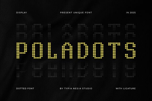
Poladots introduces a grid-based elegance that bridges the gap between mid-century halftone printing and high-resolution digital displays. By constructing each glyph from a series of perfectly aligned dots, it mimics the look of a vintage motherboard readout or a modern LED signage system, providing a visual texture that feels tactile yet entirely virtual. The meticulous spacing between the dots ensures that while the aesthetic is pixelated, the legibility remains incredibly high even at smaller display scales.
This typeface is exceptionally effective for software interfaces where a sense of connectivity and modularity is required. Its airy, dotted structure prevents the font from feeling too heavy, making it a sophisticated alternative to traditional blocky styles for firms in the electronics and telecommunications sectors. It excels in digital environments, adding a layer of data-driven sophistication to headers and landing page hero sections.
My Recommendation: I would reach for Poladots when working on a project that needs to feel ‘wired’ or data-centric without looking like a generic matrix screen. It’s a fantastic choice for cryptocurrency platforms or cybersecurity startups because it subtly hints at encryption and digital building blocks while remaining stylishly modern.
20. Duoline Modern Font
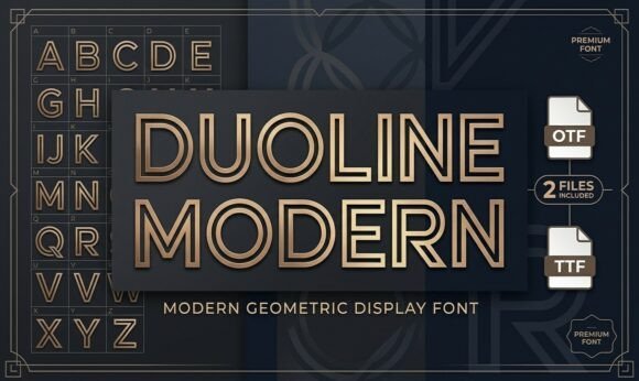
Duoline Modern is defined by its striking parallel strokes, offering an inline aesthetic that suggests movement, speed, and structural integrity. The geometric foundation of the letters creates a balanced rhythm, while the unique double-track design provides a decorative element that remains clean enough for high-end corporate identities and industrial applications. This linear approach helps the font stand out against busy backgrounds without losing its professional composure.
In a creative landscape often dominated by solid-fill typography, this font provides a breath of fresh air with its architectural hollow paths. It is particularly suited for branding projects related to civil engineering, smart home technology, or sustainable energy companies looking to project a forward-thinking and transparent image. The font’s airy interior makes it an excellent candidate for neon-style signage or high-contrast print layouts.
My Recommendation: Duoline Modern is my go-to for projects that require a ‘sporty’ but upscale vibe. It works beautifully for luxury hardware brands or boutique engineering firms that want to emphasize precision and innovation through their visual identity.
21. Wild Cyber Font
Wild Cyber pushes the boundaries of horizontal scaling with its ultra-wide, boxy proportions that command immediate visual authority. Drawing heavy inspiration from late-night neon aesthetics and high-spec computing hardware, its sharp corners and rigid structures evoke a sense of power and durability essential for modern digital environments. The expanded letterforms create a cinematic feel, making every word look like a mission-critical headline.
The wide-track nature of the characters makes it a powerhouse for large-scale applications such as hardware packaging and game interface titles. It excels in scenarios where the brand needs to appear indestructible and high-performance, such as in the automotive or aerospace industries. This font ensures that any brand using it is perceived as an industry leader with a solid, unshakeable foundation in the future of innovation.
My Recommendation: If you need to make a statement that feels heavy, powerful, and undeniably futuristic, Wild Cyber is the answer. It’s particularly effective for esports branding or VR game titles where you want the typography to feel as expansive and immersive as the virtual worlds themselves.
22. Braxio Font
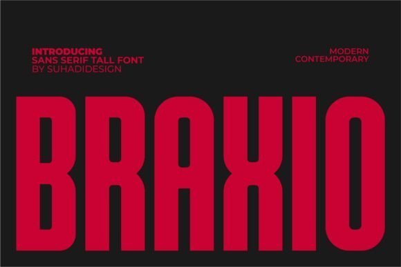
Braxio’s architecture is defined by its impressive verticality and structural confidence. This condensed sans-serif is a masterclass in modern minimalism, utilizing its tall x-height to maximize visual impact without sacrificing horizontal real estate. The clean lines and sharp terminals create a contemporary twist that is particularly effective in digital environments where mobile screen space is at a premium. Its authoritative yet sleek profile makes it an excellent candidate for bold editorial layouts and sophisticated branding identity projects.
Beyond its aesthetic appeal, Braxio offers a functional versatility that translates seamlessly from high-resolution digital interfaces to physical print media. Its bold weight ensures that headlines remain legible and striking even from a distance, making it a powerful tool for posters and cinematic titles. By stripping away unnecessary ornamentation, this typeface focuses on the strength of the character forms, providing designers with a reliable foundation for any project that requires a futuristic and professional atmosphere.
My Recommendation: I would reach for Braxio when designing a mobile app’s hero section or a luxury fashion lookbook where space is tight but the vibe needs to be loud. Its vertical stretch gives it a high-end, custom feel that makes standard sans-serifs look flat by comparison.
23. Broaven Font
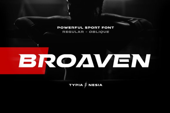
Broaven breaks the mold with its aggressive, expanded proportions and heavy slab-serif influence. Engineered for high-velocity branding, this typeface captures the essence of the racing and gaming industries through its wide, stable stance and industrial-strength letterforms. The deliberate horizontal emphasis conveys a sense of speed and durability, making it the perfect choice for automotive branding, e-sports logos, and hardware product packaging where a masculine, high-performance aesthetic is required.
The font’s thick stems and sturdy slabs provide an undeniable presence in modern advertising design. Whether it is being utilized for a supercar brand’s identity or a fitness gym’s promotional materials, Broaven commands attention through sheer mass and geometric precision. It excels in environments where the typography needs to feel as much like a structural component as a piece of text, bridging the gap between traditional slab-serif reliability and the cutting-edge needs of the gaming world.
My Recommendation: If you are working on a project that needs to feel indestructible and fast, like a gaming peripheral brand or an off-road vehicle logo, Broaven is your best bet. Its wide footprint creates a massive visual weight that feels incredibly grounded and powerful on the page.
24. Rondo Font
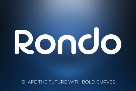
Rondo represents the softer side of digital innovation, blending geometric precision with a friendly, approachable aesthetic. As one of the more versatile tech logo fonts available today, its rounded terminals and smooth curves remove the cold, sterile feeling often associated with high-tech designs. This typeface is expertly crafted to create a sense of trust and accessibility, making it an ideal choice for consumer-facing software, mobile applications, and startup branding that aims to be both sophisticated and welcoming.
The balance within Rondo’s character set allows it to perform beautifully across diverse formats, from futuristic user interfaces to elegant physical product packaging. Its bold weights are particularly effective for creating memorable identities that stand out in a saturated market. By opting for a rounded geometric structure, Rondo provides a professional touch that feels human-centric, ensuring that complex technological concepts are presented with a sense of clarity and modern warmth.
My Recommendation: Rondo is my go-to for SaaS companies or smart-home products that want to look intelligent without being intimidating. The way the curves catch the eye makes any interface feel more polished and user-friendly, which is exactly what you want for a modern consumer brand.
25. Organic Font
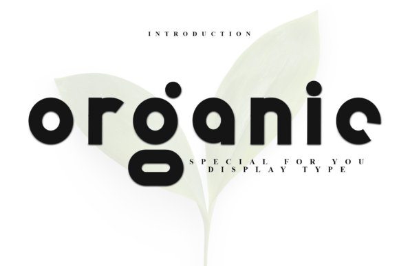
Organic is a masterclass in the intersection of structural engineering and contemporary typography. This bold, technical display font prioritizes a sleek, geometric aesthetic that feels both substantial and fluid. The thick letterforms are rendered with an unwavering stroke weight, while the perfectly rounded character joins introduce a tactile softness that balances its otherwise rigid, architectural foundation. This unique blend of characteristics allows it to bridge the gap between heavy industrial aesthetics and approachable digital design.
This font is particularly effective for branding that demands a sense of artisanal craftsmanship within a digital framework. Its organized horizontal rhythm and stable vertical axis make it a high-impact choice for product identities that need to convey precision and reliability. It excels in diverse environments, ranging from modern minimalist packaging to complex interface headers where visual clarity is non-negotiable for high-end software branding and hardware engineering firms.
My Recommendation: I would reach for this font when designing for a premium hardware brand or an engineering firm. Its thick, consistent strokes provide a grounded feel that suggests structural integrity, while the rounded corners keep the overall look from feeling too cold or impersonal.
26. Quadric Font
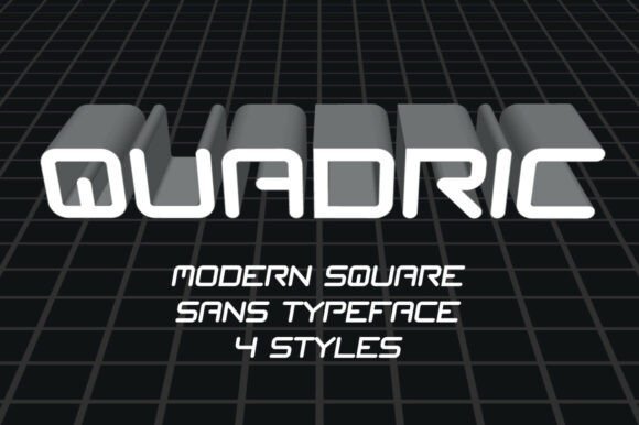
Quadric redefines the geometric sans serif category by introducing a near-square architecture that radiates innovation and logic. By mimicking the rhythmic spacing of traditional monospaced typefaces but optimizing for modern flexibility, it offers a distinct visual cadence that feels deeply rooted in computational history. The smooth, precise curves at the corners prevent the square frames from feeling overly aggressive, maintaining a sophisticated balance that is perfect for any forward-thinking digital identity.
In the realm of digital product design and sci-fi aesthetics, this typeface provides a sharp, distinctive edge that stands out against more traditional rounder fonts. It is an ideal tool for UI designers building intuitive dashboards or developers creating bold tags for immersive gaming environments. Its squared foundation ensures that whether you are designing a minimalist poster or a complex software interface, the text remains legible while projecting a distinctly advanced persona that resonates with tech-savvy audiences.
My Recommendation: Quadric is my top choice for data-heavy dashboards and futuristic UI projects. The squared-off proportions create an incredible sense of order and alignment that makes even complex information look clean, organized, and sophisticated.
27. Casual Passion Font
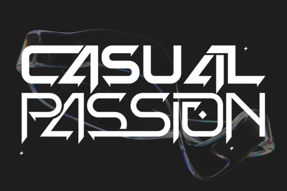
Casual Passion stands out as a visionary typeface, specifically engineered for designs that look toward the horizon of technological advancement. Its unique and original letterforms are influenced by modern innovation, featuring sharp angles and clean lines that suggest a high-performance identity. This strong, sophisticated presence makes it an immediate focal point for any visual composition, offering a contemporary flair that is essential for brands aiming to define the future of their respective industries.
Versatility is a core strength here, as the font adapts seamlessly from the rigid requirements of corporate stationery to the fluid needs of website headers and brochures. It is particularly well-suited for high-concept posters and cutting-edge packaging, where its unique character can shine without overwhelming the overall layout. The font’s sophisticated geometry helps it maintain a hi-tech appearance that works beautifully across both digital screens and physical print media, ensuring a consistent brand voice.
My Recommendation: Use this font if you want your project to feel fast and cutting-edge. It has an energetic, high-performance vibe that makes it perfect for e-sports branding, automotive startups, or any business that wants to project a sense of speed and momentum.
Selecting the right typography is a foundation of great design. With these 27 tech logo fonts at your disposal, you can create a memorable and scalable brand image for 2026. Take your time to test different weights and styles to find the perfect match for your technology venture.