29 Elegant Signature Logo Fonts for Personal Brand Marks in 2026
Want a type that reads like a real signature? signature logo fonts are designed to mimic handwriting while staying readable for marks, monograms, and product labels.
This roundup includes 29 script styles, from delicate calligraphic scripts to bold cursive typefaces. Along the way you’ll see suggestions for vintage, modern, feminine, masculine, and luxury moods so you can pick the right voice for a specific audience or medium.
Each entry notes character set coverage, pairing ideas, and sizing tips so you can test options quickly in mockups and on packaging or social headers.
1. Amellia Font
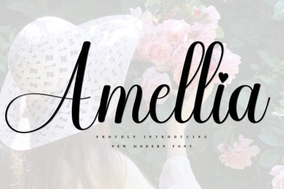
Amellia is a graceful script with airy, handwritten strokes that balance a fresh personality and refined shapes. Its flowing terminals and subtle weight shifts make it a reliable pick for YouTube banners, wedding stationery, signature logo mockups, ID cards, flyers, and craft labels, and its restrained personality works especially well as signature logo fonts in digital and print. A generous set of alternates and ligatures lets designers fine-tune the voice from casual to more formal without heavy manual editing.
The face reads cleanly across screen and paper thanks to moderate contrast and careful spacing; vowels and ascenders remain distinct without crowding. Use it when you want an approachable but polished signature mark – pair with a neutral sans for contrast or a soft textured background for a handmade feel. Amellia’s simplicity helps short names and monograms stick in the viewer’s memory.
My Recommendation: I reach for Amellia when a brand needs a friendly, handwritten signature that still reads clearly across platforms. Its alternates and ligatures make it easy to tune personality quickly, and it scales nicely for avatars, web headers, and printed invites. Great for lifestyle brands, boutique owners, wedding designers, and personal monograms where warmth and clarity matter.
2. Modelista Font
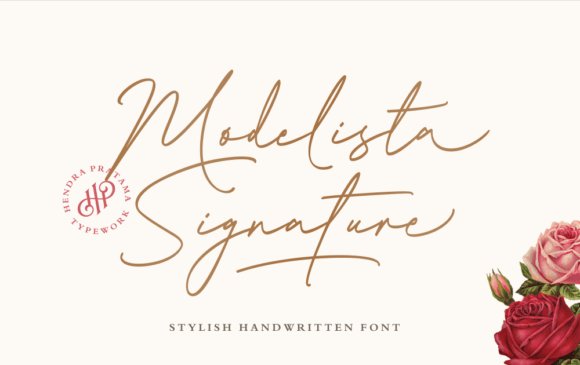
Modelista Signature reinterprets the signature-style script with elongated connections and a calligraphic rhythm that moves away from rigid copperplate traditions. Thin-to-thick stroke modulation and extended connecting strokes lend headlines and logos a couture-like air appropriate for wedding suites, event stationery, religious art, and on-screen titles. It ships with stylistic alternates and a rich set of ligatures so you can craft variations without fiddly manual edits.
Because its joins are measured rather than excessive, Modelista maintains legibility at display sizes while still feeling personal; capitals avoid swallowing lowercase forms. Pair it with a restrained serif or geometric sans for accompanying copy, and test single-word logotypes to find the best spacing between flourish and clarity. The family includes both more traditional calligraphic options and lighter contemporary cuts to match differing project tones.
My Recommendation: I use Modelista when I want a refined signature that reads like bespoke calligraphy but remains practical for branding. Its alternates and ligatures let me create custom-feeling wordmarks without manual drawing, and it pairs cleanly with neutral text faces. Ideal for wedding creatives, event branding, film title cards, and any application where elegance must still read at a glance.
3. Dense Font
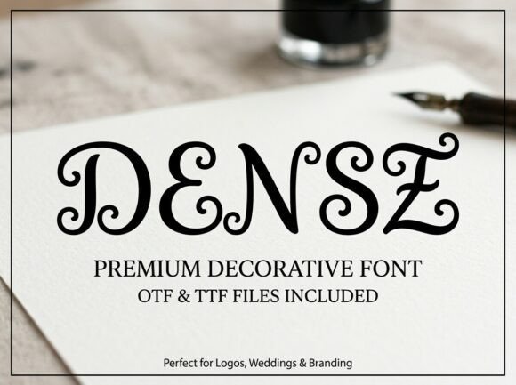
Dense is a decorative serif that embraces Victorian ornamentation: high-contrast stems, scrolling flourishes, and circular swash terminals that suggest engraved lettering. Upright proportions preserve legibility even as the decorative details add character, making it suited for wedding invites, boutique identity, luxury cosmetic labels, and editorial mastheads. At large sizes it reads as handcrafted prestige while remaining readable.
On the technical side, Dense benefits from careful tracking and selective alternate use to avoid visual clutter, which in turn makes it ideal for display applications and monogram-like marks. Pair it with a simple sans or a light-bodied serif to prevent layouts from feeling overworked, and consider foil stamping or embossing to enhance its faux-engraved texture. Reserve it for short phrases, initials, or focal branding elements to maximize impact.
My Recommendation: I pick Dense for projects that need ornate, heirloom character-luxury packaging, embossed invitations, and dramatic editorial covers are perfect fits. Its decorative flourishes make short headlines and monograms feel artisanal, so I avoid long text blocks and use it sparingly as the focal element. Best for brands seeking a vintage, handcrafted presence.
4. The Castellon Font
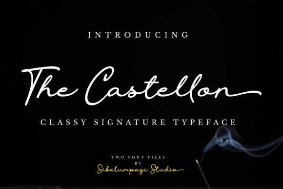
The Castellon is a refined signature-style typeface available in regular and slanted cuts, with graceful, hand-drawn strokes that read as both personal and poised. Its restrained flourishes and clear counters let it work as a visible yet unobtrusive mark, perfect for headlines, business cards, or tasteful watermarks; use it as the primary mark in signature logo fonts that rely on handwritten charm.
Technically, Castellon favors open shapes and smooth joins, so it holds up at small sizes and keeps character when blown up for signage or packaging. Alternate forms reduce repetition in long names, and the overall balance makes it easy to pair with a simple sans or an understated serif for contrast.
╰┈➤ Download The Castellon Font
My Recommendation: I reach for The Castellon when I need a personal, elegant signature that won’t dominate a layout-photographers, boutique makers, and wedding brands will find it especially useful. The slanted cut adds casual warmth while the regular stays formal, so it covers both refined and relaxed identities. Pairing it with a neutral sans keeps attention on the handwritten mark without competing for space.
5. Huntley Signature Font
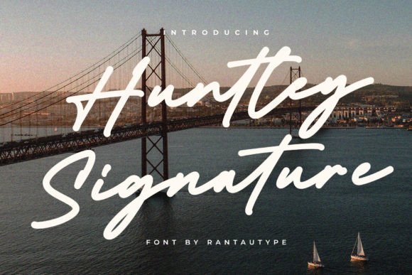
Huntley Signature presents a bold handwritten look that balances personality with legibility: thick downstrokes, deliberate connectors, and a tidy baseline give it a crafted, professional presence. The design includes ligatures and alternates that prevent mechanical repetition, making longer names and signatures feel naturally varied and expressive.
The package ships in OTF and TTF and comes with broad Latin support, so it behaves reliably across editorial, branding, and event materials. It shines on album covers, magazine mastheads, and high-end invitations where a confident hand style needs to read well in print and on-screen.
╰┈➤ Download Huntley Signature Font
My Recommendation: I use Huntley Signature when a project calls for a strong handwritten signature that still performs at small sizes-it’s ideal for editorial covers, bold branding marks, and premium event collateral. The alternates and ligatures make repeated words look human rather than clipped. If you need a single-font solution that feels crafted and readable, this is a solid pick.
6. Saphira Font
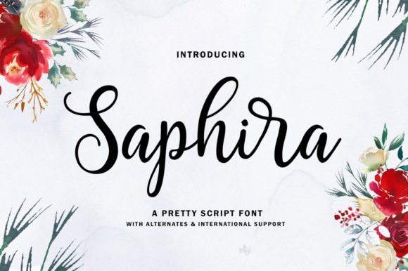
Saphira is a lively modern script with organic, sweeping strokes that inject movement into any layout; its energetic letterforms work well as focal headlines or friendly brand stamps. The type has airy counters and natural rhythm, which makes it attractive for wedding stationery, posters, and product labels where a touch of warmth is desirable.
On the technical side, Saphira maintains clear spacing across sizes and keeps its personality when used as a logo wordmark or as a display headline. For readable compositions, pair it with restrained sans typefaces so the script remains the visual centerpiece without competing shapes or clutter.
My Recommendation: I pick Saphira when I want a bold, expressive script that still reads cleanly-great for feminine brands, event invitations, and packaging that need motion and charm. It performs well in large scales and keeps legibility in small applications, too. Use it as the star of the layout and partner it with a simple sans to let the script breathe.
7. Football Font
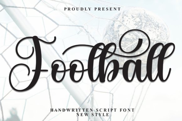
Football presents long, flowing strokes and delicate swashes that read like practiced handwriting rather than a generic script. The shapes are airy yet controlled, which makes it well-suited for wedding stationery, boutique branding, and editorial headers; it also performs nicely as a personal mark and is perfect for signature logo fonts when used for monograms and designer signatures.
At display sizes the flourishes add character without overwhelming the wordform, while tighter tracking keeps legibility for small captions. Pair it with a clean sans or a restrained serif to let the script sing, and be ready to tweak kerning around ornate ligatures for the smoothest result.
My Recommendation: I would pick Football for projects that need a romantic, handwritten presence-think luxury invitations, artisan labels, or a boutique fashion mark. Its elegant swashes give personality without sacrificing clarity, so it reads well on both printed invites and social media hero shots. For logos that aim to feel intimate and bespoke, this font delivers character with practical legibility.
8. Griselle Font
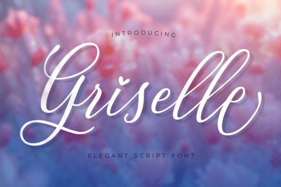
Griselle channels refined calligraphy with a rhythmic line quality that suggests movement and grace. Its rich set of alternates and swashes produces a range of looks, from restrained script to fully flourished signatures, which suits wedding suites, premium packaging, and expressive headlines. The PUA encoding ensures easy access to those decorative glyphs in design apps without hunting through complex menus.
Designers will appreciate how Griselle balances ornament with readability: thin hairlines and heavier entry strokes coexist so words remain readable at medium display sizes. Use it alongside minimal layouts or negative-space-driven compositions to let the letters breathe, and consider selective swash use to prevent visual clutter on smaller print items.
My Recommendation: I reach for Griselle when a project needs classic glamour-bridal stationery, boutique cosmetics branding, or elegant product labels. The built-in alternates let me craft unique wordmarks without creating custom lettering from scratch, saving time while keeping results bespoke. It’s a good choice when you want a luxurious, handcrafted feel with dependable typographic options.
9. Justone Font
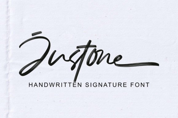
Justone is an all-caps, textured signature font that reads bold and human at the same time; its rough edges simulate ink on paper while staying tidy enough for logos and headlines. The typeface ships with OpenType features, alternates, and ligatures, and includes multilingual support and PUA encoding so special characters and stylistic forms are simple to apply across projects. File formats in TTF, OTF, and WOFF make it straightforward to deploy on web and print platforms.
Because it’s uppercase by design, Justone excels at strong wordmarks, apparel branding, and editorial displays where a confident, handcrafted voice is desired. The textured finish adds tactile warmth to packaging and social posts; I usually adjust spacing and pair it with a muted geometric sans to keep compositions balanced and modern.
My Recommendation: I use Justone when I want a bold, hand-drawn identity that still reads clearly at a distance-streetwear labels, bold product names, or campaign headlines. Its textured feel gives projects personality without feeling kitschy, and the OpenType extras let me vary the look across collateral. It’s particularly handy for designers who want a signature-style mark but need files that work across print and web quickly.
10. Dunya Font
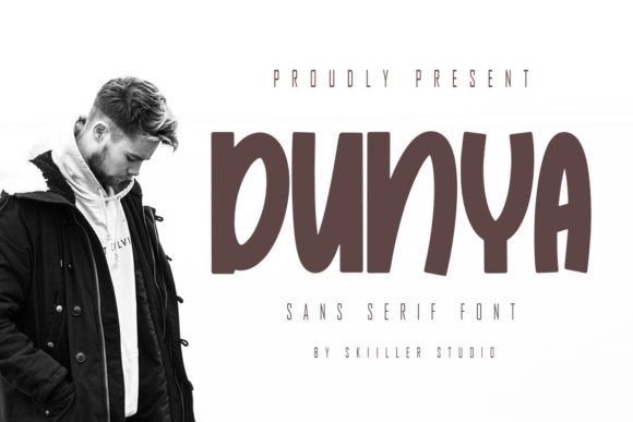
Dunya is a playful sans serif that balances an elegant, classy silhouette with contemporary proportions. Rounded terminals and a medium x-height give it an approachable warmth while keeping letterforms clean and modern. It reads confidently across fashion headers, magazine mastheads and social posts without feeling fussy.
The font’s spacing and subtle stroke modulation make it suited to both primary wordmarks and supporting logotypes, and it pairs neatly with script accents or minimalist icons; it also pairs well with signature logo fonts when you need a handwriting-style mark beside a structured face. Delivered in OTF with tuned kerning and a sensible weight range, Dunya holds up at display sizes and remains legible in small captions.
My Recommendation: I reach for Dunya when a brand needs a friendly sans with refined character. Its clean shapes keep layouts tidy while the playful curves inject personality. Use it for fashion lookbooks, social headers, or when pairing a structured type with a handwritten mark.
11. Bethany Avanue Font
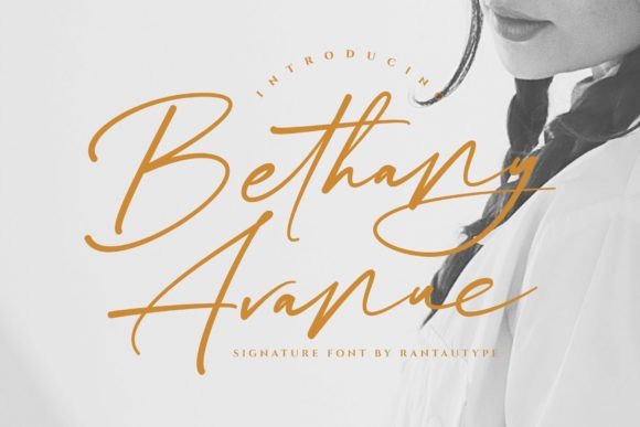
Bethany Avanue is a stylish handwritten script that reads as both professional and personal. The strokes are carefully drawn and the spacing keeps the letters legible, which makes the face reliable for photography watermarks and editorial use. Alternates and subtle swashes add handcrafted nuance without crowding the wordforms.
This font suits wedding stationery, signature marks and boutique branding where readable cursive is needed; it includes context-aware ligatures and swash options so you can craft distinct wordmarks without manual tweaking. Its restrained rhythm scales well on business cards and album covers while still standing out in hero headlines.
╰┈➤ Download Bethany Avanue Font
My Recommendation: I would use Bethany Avanue when a project calls for warm, handwritten charm with professional polish. The ligatures and swashes let you create custom-looking signatures without manual lettering. It’s ideal for invitations, photography watermarks, and boutique brand identities.
12. Grand Resort Font
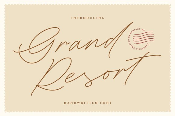
Grand Resort is a modern monoline script with a refined, feminine sensibility that stays crisp at display sizes. Consistent stroke weight produces an elegant silhouette perfect for logotypes and event branding. Slightly elongated connections and rounded terminals create a smooth, composed flow without heavy ornament.
The face reads cleanly as a watermark and adapts well to business cards, magazine covers and album art; alternate characters and careful kerning support signature and handwritten logo creation. Designers who want a couture mood without excessive loops will find Grand Resort easy to apply across print and digital pieces.
╰┈➤ Download Grand Resort Font
My Recommendation: I’d pick Grand Resort when the brief demands sleek, fashion-forward script that remains readable. It lends a couture mood to logos without overpowering the layout, and it scales well across print and digital materials. Great choices include wedding suites, boutique packaging, and premium lifestyle brands.
13. Huntberg Font
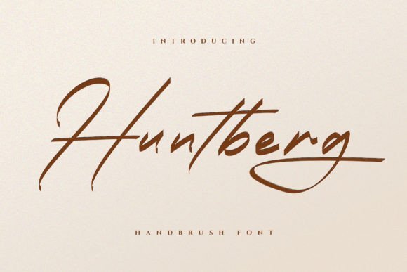
Huntberg reads like a quick, practiced signature – thin upstrokes, slightly bouncy baselines and airy counters that keep text readable even when scaled down for photo watermarks. Designers frequently pick Huntberg for photography credits, signature logo fonts for album covers and compact wordmarks because its connected strokes feel personal without becoming fussy. The overall rhythm sits comfortably between casual handwriting and refined script, so it photographs well on textured paper or behind a subtle vignette.
On the technical side, Huntberg’s spacing and moderate contrast make it surprisingly tolerant of tight tracking, which helps when you need a tiny watermark that still reads. Pair it with a geometric sans for a clean identity or use it alone as a single-word logotype to emphasize personality. I found it performs reliably across RGB and CMYK workflows and holds up in both gloss and matte print finishes.
My Recommendation: I’d reach for Huntberg when a client wants a human touch that doesn’t shout – ideal for photographers, indie musicians, and boutique labels. It preserves legibility at small sizes while delivering a handcrafted feel, so it’s perfect for watermarks and signature-style logotypes. Use it with a spare sans or simple badge to avoid visual clutter.
14. French Clover Font
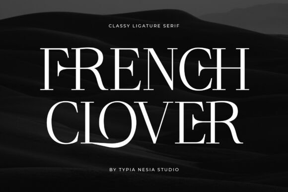
French Clover offers high-contrast serifs and refined stroke terminals that convey a regal but modern presence, making layouts feel intentionally curated rather than decorative. The type’s ligatures and careful axis give headlines and packaging copy a couture attitude without sacrificing legibility, so it reads confidently on perfume boxes, editorial covers, and cosmetic labels. Small caps and elegant italics keep brand names looking poised across boutiques and luxury social campaigns.
Use French Clover as the primary display face for identity systems that need a premium sheen; it pairs well with a neutral sans for body text or with a restrained script for accents. Watch for spacing in ultra-tight headline compositions and prefer optical kerning where available to maintain letter integrity. I’d reserve it for projects where class and clarity must coexist, such as high-end print ads or upscale product lines.
╰┈➤ Download French Clover Font
My Recommendation: I recommend French Clover when the brief calls for a fashion-forward, premium serif that still reads cleanly in packaging and mastheads. Its contrast and ligatures produce a refined mark that suits beauty and luxury brands. I typically pair it with simple sans-serif copy to keep the overall system elegant and readable.
15. Hintterland Signature – signature logo fonts
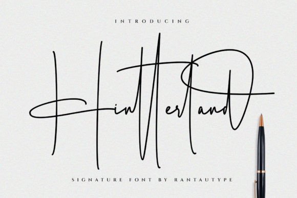
Hintterland Signature leans into a polished handwritten style, balancing flourishes with controlled letterforms so words remain legible across scales. The family includes alternates and ligatures that let you craft bespoke signature marks, while the overall rhythm reads as intentional and professional rather than casual. That clarity makes it suitable for wedding suites, personal branding, album art and editorial accents where a premium script is wanted.
The package ships with both OTF and TTF files and wide multilingual coverage, which is helpful for international identity work and multi-language packaging. Swap in alternates to avoid repetition in repeated names or to create distinctive logotypes, and pair Hintterland with a minimal sans to ground the composition. I appreciated how the alternates feel cohesive rather than gimmicky, giving real options for custom lettering without extra illustration work.
╰┈➤ Download Hintterland Signature – signature logo fonts
My Recommendation: I would choose Hintterland Signature when a project needs a luxe handwritten voice that still behaves predictably in layout. Its alternates and language support make it useful for boutique brands, weddings and editorial bylines that require a refined personal touch. It’s an especially good match when you want the warmth of script without sacrificing control over spacing and repeatability.
16. Gallufair Font
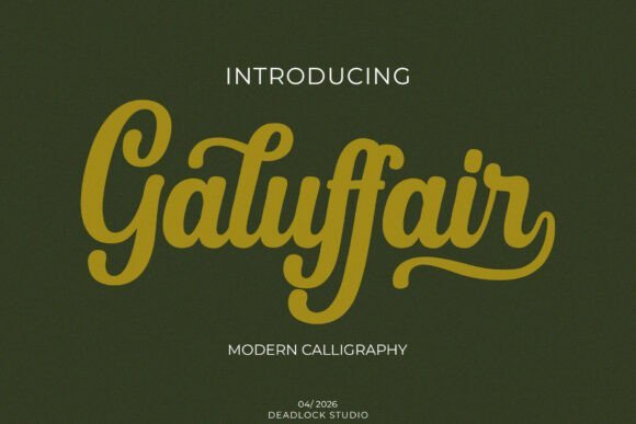
Gallufair is a modern calligraphy script with fluid upright stems and generous swashes that feel hand-drawn yet controlled. Its medium-bold weight and softly rounded terminals give text warmth without sacrificing clarity, so small sizes remain readable. Because of its artisanal strokes and balanced spacing, Gallufair sits naturally among premium identity work and hand-lettered headlines.
It’s a top choice for signature logo fonts used on boutique brands, wedding suites, and upscale packaging because the swashes can be dialed back or extended for different moods. Pair it with a neutral sans for contrast or let Gallufair serve as the primary wordmark; kerning behaves predictably in most design apps. The font’s tactile feel makes it ideal when you need handcrafted personality without sacrificing professional polish.
My Recommendation: I would reach for Gallufair when a brand needs a refined handwritten mark with a handmade touch. Its readable strokes and adjustable swashes let me create distinct wordmarks and pairing options quickly. Best for luxury boutiques, wedding suites, editorial mastheads and premium product labels.
17. Right Sign Font
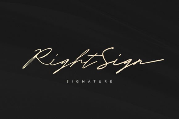
Right Sign is a compact handwritten signature font that ships with ligatures and alternate characters to mimic natural pen motion. It comes in Regular and Bold weights, so you can shift tone from delicate to assertive without changing families. The letterforms stay legible at small sizes, making this a solid pick for on-screen signatures and social graphics.
Use alternates to avoid repetition in repeated names and swap ligatures to create subtle variations for logotypes and watermarks. It pairs neatly with both sans and serif companions, and the extra weight helps when a bolder mark is needed on packaging or headers. Because of its straightforward construction, kerning and baseline tweaks are predictable in most design tools.
My Recommendation: I reach for Right Sign when a project needs an authentic-looking signature without too much fuss. The availability of alternates and two weights lets me craft both refined and bolder marks within the same visual system. Great for photographers, personal brands, digital signatures, and branding that calls for a human touch.
18. Rihania Smith Font
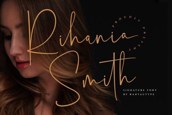
Rihania Smith presents a confident pen-style signature with several alternate characters, ligatures, and swashes built in for variety. Designers will appreciate its readable letterforms that still feel loose and personal, plus included OTF and TTF files for broad compatibility. Multilingual support and lowercase start/end swashes expand its use across international projects and decorative headlines.
This font shines as a watermark for photography, a nameplate on an album cover, or as a signature logo where personality matters. Swashes can be extended for invitations or trimmed back for tighter layouts, and the built-in alternates mean each application can look custom without hand-lettering. Its balance of flair and legibility makes it an accessible choice for wedding suites, business cards, and editorial accents.
╰┈➤ Download Rihania Smith Font
My Recommendation: I recommend Rihania Smith when I want a premium handwritten look with plenty of styling options. The alternates and swashes let me customize marks quickly while keeping consistent letter shapes. Perfect for photographers, stylists, boutique brands, and event stationery.
19. Tepinar Font
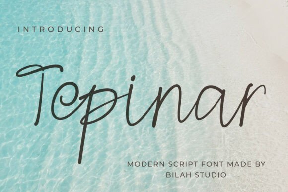
Tepinar sits between refined calligraphy and clean handwriting: thin, confident strokes give it a polished presence without ornamentation that competes with your layout. Its open counters and measured slant maintain readability at thumbnail sizes, while slightly tapered terminals add a handcrafted warmth that reads well in print or on-screen. The overall spacing is conservative, so text blocks and single-word marks both remain balanced.
Among signature logo fonts Tepinar holds up because its set of alternates and subtle swashes lets you craft a distinct mark without visual clutter. It makes a strong choice for photographer watermarks, boutique business cards, editorial bylines, and album covers where a restrained handwritten voice is required. Try it with a light sans for contrast or a soft serif to introduce a traditional tone.
My Recommendation: I reach for Tepinar when a project needs a neat, elegant handwritten identity that won’t dominate layouts. Its understated strokes are ideal for luxury small-business branding and photo watermarks where clarity matters. Use it when you want a signature feel that reads reliably across sizes and media.
20. Cottagecore Font
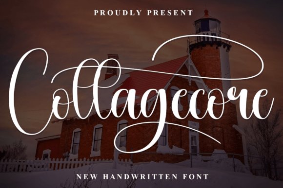
Cottagecore offers a flowing script that leans into romantic calligraphic gestures: generous bows, long entry strokes, and playful swashes deliver an inviting, handcrafted impression. The curves are soft and the terminals often end with a light flick, giving text a gentle, feminine personality that works well on stationery and social graphics. Despite its decorative nature, letter spacing remains open enough to preserve legibility in headlines and invitations.
This font shines when used for wedding suites, brand monograms, and social-media headers where a personable, handwritten tone is desired. Ligatures and contextual alternates expand creative choices-swap a familiar connection for a more ornate flourish without breaking rhythm. Pair it with a muted background and simple serif to keep decorative elements from overwhelming the composition.
My Recommendation: I recommend Cottagecore for projects that want to feel intimate and handcrafted, such as wedding invitations, boutique packaging, and lifestyle branding. The swashes and alternates let you customize names and monograms without extra illustration work. It’s less suited to dense body text but perfect for headlines and display uses that benefit from a romantic touch.
21. Rachelle Stone Font
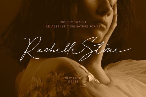
Rachelle Stone reads like a genuine live-signature: variable stroke widths, slightly irregular connections, and well-designed ligatures give it an authentic hand-drawn quality. The font includes a generous set of alternates and discretionary ligatures, so repeated names or words maintain visual interest instead of looking mechanical. It also keeps enough structural clarity to function as a logo wordmark at larger sizes.
Technical features such as OpenType alternates and expanded language support make this a practical tool for multinational brands or designers who need typographic variety. Use it for digital signatures, boutique identities, and quote graphics where personality matters but legibility cannot be sacrificed. When paired with a neutral sans, Rachelle Stone preserves its character while fitting into modern layouts.
╰┈➤ Download Rachelle Stone Font
My Recommendation: I use Rachelle Stone when a brand needs the honesty of a handwritten signature combined with flexible typographic features. Its alternates and ligatures let me avoid repetition in repeated names or product lines. Ideal for logos, personal branding, and editorial pull-quotes that require both warmth and typographic control.
22. Simple Relation Font
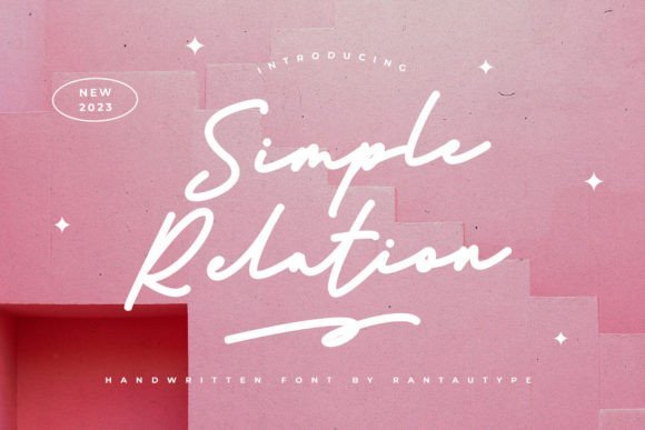
Simple Relation feels like a restrained handwritten script with clean strokes and moderate contrast. The letterforms are airy but purposeful, making it suitable for brands that need a personal touch without looking ornate. Designers often pick signature logo fonts for monograms and high-end watermarks because of its balanced baseline and tight counters.
On close inspection the alternate characters and ligatures add personality without sacrificing legibility at small sizes, which is rare in script faces. Its spacing and readable joins let it work on photography watermarks, wedding stationery, album covers and business cards with minimal tweaking. The overall effect is refined and approachable rather than fussy, giving logo marks a handwritten signature feeling.
╰┈➤ Download Simple Relation Font
My Recommendation: I would reach for Simple Relation when a project needs a neat, human signature that remains legible at small sizes. It fits boutique branding, photographer watermarks, and wedding collateral very well. The alternates let me vary wordmarks quickly without introducing a second typeface.
23. October Shine Font
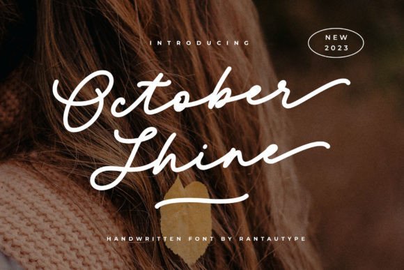
October Shine mixes a soft calligraphic hand with plentiful alternates and swashes, letting designers vary endings and initial strokes for custom wordmarks. The thin-to-medium stroke contrast preserves readability while keeping a graceful, feminine tone. Open counters and long descenders give it an airy presence when set at large sizes.
Its alternate set encourages playful combinations, so headlines and logotypes can avoid repetition even within a single project. Use the swashes selectively-too many long tails will compete with imagery-but a few well-placed alternates enhance panel or label designs. October Shine adapts nicely to boutique packaging, wedding suites, and fashion lookbooks.
╰┈➤ Download October Shine Font
My Recommendation: I pick October Shine for beauty, fashion, and lifestyle branding when I want a warm, handwritten flourish. The alternates are especially handy for creating distinctive logotypes from one font file. For best results I pair it with a simple sans for body copy so the script remains the focal point.
24. Bright Hills Font
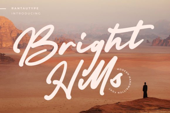
Bright Hills presents a confident, modern script with open counters and broad strokes that maintain clarity at display sizes. The brush-like terminals and controlled slant give it a contemporary handwritten voice without becoming ornate. Capitals are clean and supportive for logotypes, while lowercase forms keep short blocks of text readable.
Its steady rhythm and consistent slant suit magazine mastheads, album covers, and boutique product labels; kerning is generous but benefits from manual fine-tuning on long lines. The face responds well to tightened tracking for short headlines and looser spacing for multi-line phrases, which helps with signage and packaging. Bright Hills also holds up when layered over textured or photographic backgrounds.
╰┈➤ Download Bright Hills Font
My Recommendation: I choose Bright Hills when a brand needs a clean handwritten identity that reads well across print and digital. It works particularly well for editorial headlines, labels, and signage where legibility matters at scale. I always test spacing at the intended size to ensure the rhythm remains natural.
25. Bothaville Font
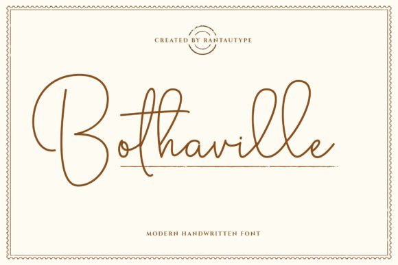
Bothaville is a modern monoline script whose steady strokes and open counters keep letterforms clean and legible across sizes. The restrained curves lean feminine without being fussy, making it a natural pick for watermarking photography and editorial mastheads. It sits comfortably among signature logo fonts when designers want a refined handwritten mark that reproduces reliably on print and screen.
The connecting strokes form believable signatures, while moderate slant and measured spacing keep text readable on business cards, album art and wedding stationery. Pair with a neutral sans for contrast or use solo as a personal wordmark; its controlled weight makes it reliable for both small watermarks and larger logo wordmarks.
My Recommendation: I reach for Bothaville when a client needs a neat, readable signature that feels personal but professional. Its monoline rhythm translates well to photo watermarks and printed tags, so deliverables stay crisp from Instagram thumbnails to letterpress. Ideal for photographers, wedding boutiques and lifestyle labels seeking an elegant signature wordmark.
26. Glendora Font
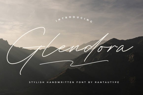
Glendora offers a soft handwritten voice that reads clearly at small sizes, which explains its popularity for watermarks and signature logo concepts. Letterforms balance casual loops with steady stems so the script feels friendly without losing legibility. On album covers, quotes and business cards it provides a relaxed, human touch that pairs well with clean layouts.
Subtle alternates and smooth joins give designers room to craft unique marks without heavy editing; the rhythm of the strokes makes it simple to build consistent brand wordmarks. It scales nicely from website headers to magazine spreads and integrates into branding systems where a warm, hand-drawn script is called for.
My Recommendation: I like Glendora for projects that need approachable handwriting which still reads on small touchpoints. It’s especially useful for photographers and indie labels who want a signature-style mark without ornate flourishes. Use it when you need warmth and clarity in equal measure.
27. British Poems Font
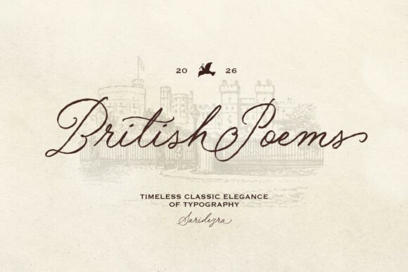
British Poems feels like jotted lines from a well-read notebook: uneven baselines and textured terminals lend a nostalgic, handcrafted character. The family includes a clean regular cut and a rough variant that adds surface noise and imperfect edges for an organic look. Alternates provide quiet variety so short phrases avoid repetition while keeping a period feel.
That tactile quality makes the typeface a strong choice for wedding invites, book covers and retro branding where authenticity matters; it also supports multiple languages for broader use. Use the rough style on kraft paper or layered over photography for visual depth, while the regular version reads neatly on stationery and logos. Mixing the two cuts creates contrast between headline warmth and body clarity.
╰┈➤ Download British Poems Font
My Recommendation: I turn to British Poems when a brand or project needs a timeworn, personal voice rather than a polished signature. The paired regular and rough styles let me craft consistent identity systems that still feel hand-made. It fits vintage-inspired weddings, boutique packaging and editorial spreads that benefit from grain and soul.
28. Meldyte Font
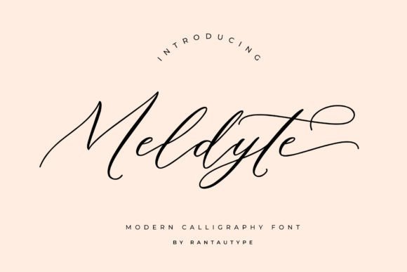
Meldyte is a flowing script font that pairs airy loops with compact letterforms, making it a refined option for signature-like marks and subtle branding. Its thin-to-medium strokes retain clarity as a watermark on photographs while maintaining personality for album covers and editorial headings. Meldyte sits among popular signature logo fonts thanks to its smooth ligatures and tasteful swashes that read well at small sizes.
The face includes alternates and contextual ligatures so you can craft a unique signature without tedious manual tweaking. On business cards and quotes it reads intimate yet professional, and its open counters keep legibility solid in print. Pair Meldyte with a neutral sans to create contrast, or use it solo to give packaging and social headers a boutique feel.
My Recommendation: I use Meldyte when a project calls for a handwritten sign-off that won’t compete with imagery. It behaves beautifully as a photo watermark and brings a handcrafted aura to small-brand identity. Ideal for wedding albums, boutique labels, and personal branding where warmth and legibility must coexist.
29. Babes & Bridal Font
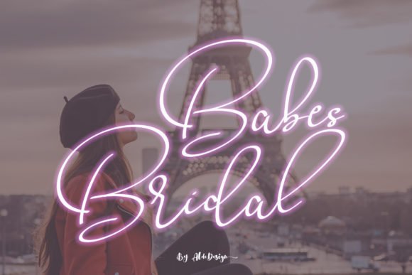
Babes & Bridal Font blends restrained elegance with decorative swashes at the start and end of words, producing a graceful signature look that remains approachable. Its steady stroke contrast and simple rhythm make it quick to apply across invitations, quotes, and logo wordmarks. Built-in titling alternates let you add flourish without complicated editing.
Kerning is thoughtfully set and the preset swashes speed up layout work for business cards and album covers. Use swash characters sparingly to avoid overcrowding; at small sizes the core letterforms stay clear and friendly. It pairs well with textured paper or subtle foil to amplify a feminine, upscale tone for bridal boutiques and lifestyle brands.
╰┈➤ Download Babes & Bridal Font
My Recommendation: I pick Babes & Bridal when a design needs fast, elegant handwriting that reads easily across formats. The included swashes cut down on manual tweaks and speed client approvals. Great for wedding stationery, boutique product labels, and social headers where a soft, refined voice is desired.
These 29 selections make it faster to narrow down a signature style that fits a project’s tone. Trying a handful in context-on a logo lockup, label, or hero image-reveals which strokes and spacing work best.
Remember to check licensing, test readability at small sizes, and consider complementary sans or serif pairings to support the signature without competing with it.