39 Stylish Display Fonts You Should Be Using for Bold Branding in 2026
When you’re working on a high-stakes project, standard typefaces just don’t cut it. You need something that grabs attention immediately, which is why I’ve curated this collection of 39 stylish display fonts for your 2026 toolkit. Whether you are designing a sleek magazine cover or a modern web interface, these unique typefaces offer the personality and flair required to make your headlines stand out. From sharp geometric edges to elegant hand-drawn curves, these options cover every aesthetic you might need this year.
1. Different Cultures Font
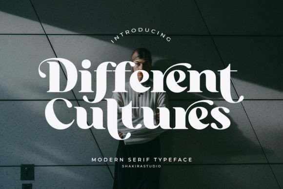
Different Cultures represents a sophisticated evolution in contemporary type design, merging the rhythmic weight of traditional serifs with a sharp, modern edge. This typeface excels at creating a visual dialogue between its heavy stems and delicate hairlines, resulting in a balanced aesthetic that commands attention on both digital screens and high-quality print. By integrating a vast library of alternates and ligatures, it empowers designers to break away from standard typesetting and craft unique, bespoke wordmarks that feel hand-tailored to specific branding needs.
Its versatility shines in contexts where a blend of global heritage and futuristic vision is required. Whether you are developing an identity for a boutique hotel or designing a high-concept magazine cover, this font provides the structural integrity and artistic flair needed to elevate the work. The meticulously crafted curves ensure that every character feels like a standalone piece of art, making it an essential tool for projects that demand a sense of worldly sophistication and refined elegance.
Download Different Cultures Font
My Recommendation: I’d pick this for a high-end travel or lifestyle magazine where the typography needs to feel as curated as the photography. Its unique ligatures allow you to create custom-looking logos without having to manually draw every letterform.
2. Stylish Alphabet Font
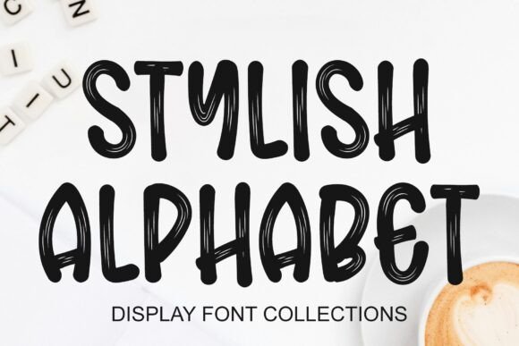
As the name suggests, Stylish Alphabet is built specifically for those who need high-impact visuals that bridge the gap between street style and editorial grace. This typeface is a quintessential example of how stylish display fonts can transform a simple headline into a powerful brand statement. It prioritizes artistic expression, utilizing exaggerated proportions and unique terminal shapes to ensure that any text set in large formats—like billboards, cinematic titles, or exhibition posters—instantly captures the viewer’s gaze and holds it.
In an era where digital noise is constant, this font offers a refreshing clarity through its bold silhouettes and expressive geometry. It is less about long-form readability and more about the visceral reaction a reader has to a single word. Perfect for edgy fashion labels or experimental art galleries, it provides a distinctive voice that feels both current and undeniably confident, ensuring your message is never lost in the crowd.
Download Stylish Alphabet Font
My Recommendation: This is my go-to for oversized poster designs or bold merchandise branding where the letters themselves are the main visual attraction. It has a certain cool factor that makes it perfect for streetwear labels or edgy digital portfolios.
3. Sovelis Font
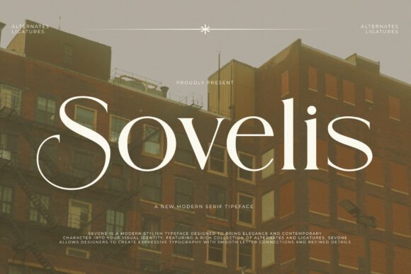
Sovelis is an architectural masterpiece in type form, designed for those who appreciate the intersection of high-fashion editorial aesthetics and structural precision. Its high-contrast letterforms are defined by sweeping, dramatic curves and needle-sharp serifs that evoke the feeling of luxury craftsmanship. This font doesn’t just sit on a page; it commands the space around it with a sense of urban-sophisticate energy, making it an ideal choice for high-end real estate developments or premium beauty brands looking to establish a prestigious presence.
The rhythmic flow of its ligatures and the sheer variety of its alternates allow for a high degree of customization, enabling designers to play with negative space and character interaction. When used in high-fashion layouts or minimalist social media headers, it brings a level of refinement that few other typefaces can match. It bridges the gap between the timeless elegance of heritage brands and the sleek, fast-paced world of contemporary design, offering a versatile yet deeply luxurious typographic experience.
My Recommendation: Use Sovelis when you want your project to scream expensive without being loud about it. Its sharp details work beautifully on wine labels or boutique hotel branding where every pixel needs to feel deliberate and upscale.
4. Cowboy Varsity Font
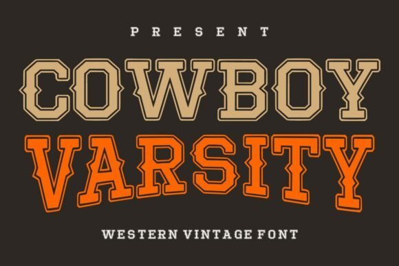
Cowboy Varsity Font creates a compelling intersection between the rugged spirit of the American frontier and the structured, competitive energy of collegiate athletics. This typeface utilizes a heavy slab-inspired base enhanced by intricate layered outlines, which provides a three-dimensional depth rarely seen in standard western styles. It acts as one of those stylish display fonts that can transition effortlessly from a retro rodeo poster to a modern athletic apparel line, offering a balanced aesthetic that feels both historic and high-performance.
When implementing this font in a design layout, its strength lies in its ability to command visual hierarchy. The bold, chunky letterforms provide exceptional readability at a distance, making it an ideal candidate for large-scale environmental graphics, varsity-style jackets, or branding for craft breweries that want to evoke a sense of heritage and craftsmanship. By mixing the traditional slab serifs of the Old West with the clean, rhythmic lines of a varsity letter, this font delivers a unique typographic voice that stands out in a crowded digital landscape.
My Recommendation: I would reach for this font when a project needs to feel masculine and authoritative but still approachable. It is particularly effective for outdoor lifestyle brands or sports-themed events where you want a punchy, nostalgic aesthetic without sacrificing legibility.
5. Darkwood Font
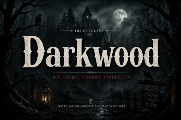
Darkwood Font is a masterclass in atmospheric typography, blending heavy serif structures with a sense of mysterious, old-world sophistication. The design features thick, compressed letterforms and sharp, angular serifs that evoke the aesthetic of artisanal woodcuts and vintage broadsides. This creates a powerful visual presence that feels both premium and slightly brooding, making it perfect for creative work that requires a strong, moody identity rather than a purely decorative flourish.
The versatility of this typeface is most apparent in branding projects for high-end spirits, artisanal coffee, or editorial titles for dark-themed fiction. Because the character widths are substantial, it holds up beautifully in print applications like embossed labels or textured packaging where the tactile nature of the font can shine. Its dramatic personality allows designers to create statement headlines that feel anchored and timeless, bridging the gap between historical elegance and contemporary graphic impact.
My Recommendation: This font has a weight and gravity that makes it feel incredibly permanent and trustworthy. I recommend using it for boutique packaging or album covers where you need the title to feel like a central piece of art rather than just a secondary label.
6. Stay Disney Font
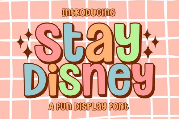
Stay Disney Font is a vibrant celebration of maximalism, channeling the groovy, bubble-letter aesthetic of the 1970s with a modern, candy-colored twist. It captures a sense of pure optimism through its rounded curves and fluid, interconnected shapes that seem to bounce off the page. As one of the most playful stylish display fonts available today, it serves as an essential tool for designers looking to inject a sense of joy and wonder into their digital assets, from social media graphics to interactive game interfaces.
Beyond its cheerful exterior, the font is remarkably functional, providing high readability even with its unconventional, bulbous forms. This makes it a top-tier choice for children’s product packaging, playful stationery, and trendy sticker designs. It fits perfectly within the ‘boho-retro’ trend, offering a soft but energetic vibe that works well for branding influencers, boutique toy stores, or any project that prioritizes a fun, approachable, and highly tactile visual language. The inclusion of multi-lingual support and swash variants further extends its utility for global creative campaigns.
My Recommendation: The infectious energy of these bubble letters makes them a fantastic choice for any project that needs to feel friendly and high-energy. I personally love using this for YouTube thumbnails or digital planner titles because the letters have such a satisfying, pillowy volume.
7. Maka Font
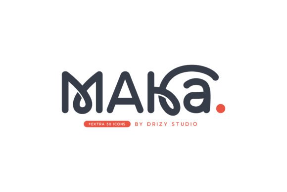
Maka Font introduces a compelling visual rhythm that instantly elevates any layout from standard to extraordinary. Its structure leans into a blend of organic fluidity and calculated precision, making it an ideal candidate for projects that require a strong personality without sacrificing legibility. The letterforms are crafted to command attention, ensuring that your headlines and title sequences possess a distinct, memorable quality.
Beyond its aesthetic appeal, this typeface is exceptionally versatile, adapting seamlessly to various creative contexts from digital interfaces to printed ephemera. Whether you are working on a high-end fashion magazine or a boutique branding project, its unique contours provide a sophisticated edge. The typeface encourages experimentation, allowing designers to push the boundaries of modern typography while maintaining a professional and polished finish.
My Recommendation: I’d pick this for a project that needs a touch of controlled chaos; it’s perfect for indie zines or experimental fashion branding. The way the characters interact creates a natural flow that makes long-form headings look much more dynamic than a standard sans.
8. Vera Font
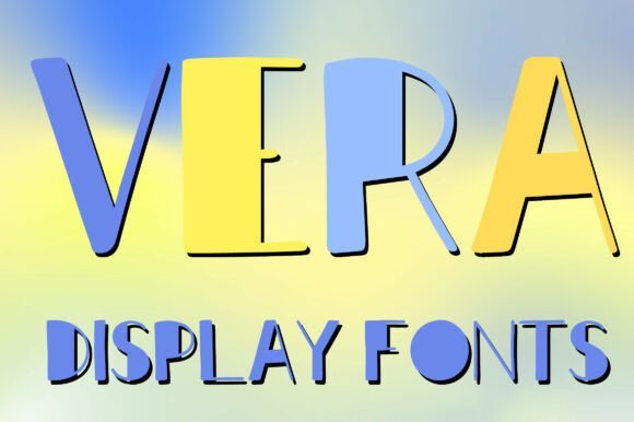
Vera Font stands out as a premier example of how height and shadow can redefine a page. This typeface utilizes tall, elongated letterforms and a playful mixture of stroke weights to create a sense of vertical movement. The integrated shadow details add a layer of three-dimensional depth, making it one of the most effective stylish display fonts for designers looking to create impact in crowded visual environments.
Equipped with a full set of uppercase characters and numerals, Vera is engineered for clarity and artistic flair. The soft rounded edges balance the sharpness of its tall proportions, providing a handcrafted feel that remains clean and professional. It is particularly well-suited for logo design, bold poster layouts, and social media assets where a fresh, eye-catching aesthetic is paramount to capturing audience interest.
My Recommendation: Use Vera when you need your headlines to literally pop off the screen as the built-in shadows save so much time in post-production. It is my go-to for summer-themed event posters or boutique packaging because of its breezy yet bold architectural vibe.
9. Annabeth Font
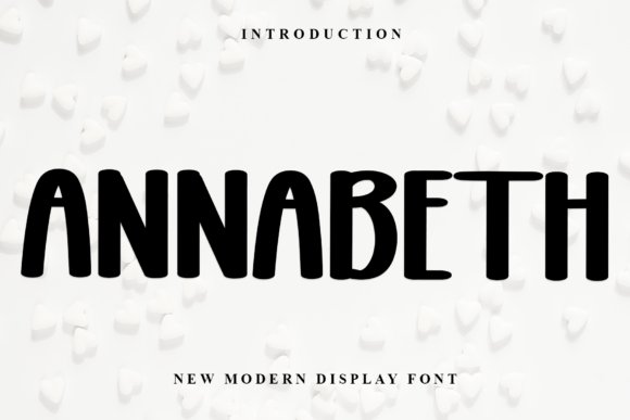
Annabeth Font is a sophisticated homage to classical calligraphy, reimagined through a contemporary lens for the modern designer. Its form is defined by impeccable balance and varied stroke widths that mimic the natural movement of a pen, resulting in a typeface that feels both timeless and current. By bridging the gap between traditional handwriting and high-impact display needs, it offers a level of typographic finesse that is hard to replicate with standard serif options.
A standout feature of this typeface is its PUA encoding, which provides effortless access to a wide array of glyphs and ligatures. This allows for a high degree of customization, enabling designers to tailor the look of every word to fit the specific mood of a project. From luxury invitations to high-end beauty branding, the graceful curves and refined structure of the typeface ensure that every application exudes elegance and premium quality.
My Recommendation: This is the font I reach for when a client asks for expensive-looking typography that does not feel stuffy or outdated. It works beautifully on wedding stationery or high-end lifestyle blogs where the goal is to communicate grace and attention to detail.
10. Vintage Font
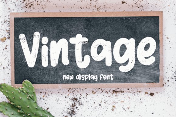
The Vintage Font stands as a masterclass in combining calligraphic tradition with the sharp requirements of modern digital displays. Drawing deep inspiration from timeless hand-lettering, this typeface features balanced proportions and a varied character set that mimics the natural flow of ink on parchment. Each stroke is meticulously polished to ensure that while it carries an old-world charm, it never feels dated or out of place in a contemporary layout.
When searching for stylish display fonts that can elevate a luxury brand’s identity, this font offers a unique solution by injecting personality into every headline. It is particularly effective for high-end wedding stationery, artisanal product packaging, and editorial mastheads where beauty and form are just as important as the message itself. The interplay between thick and thin lines creates a rhythmic visual interest that holds the viewer’s attention across various print and digital mediums.
My Recommendation: I would reach for this font when a project requires a touch of historical sophistication without sacrificing modern legibility. It is the perfect choice for high-end skincare packaging or custom invitations where you want the typography to feel curated and bespoke.
11. Simple Anime Font
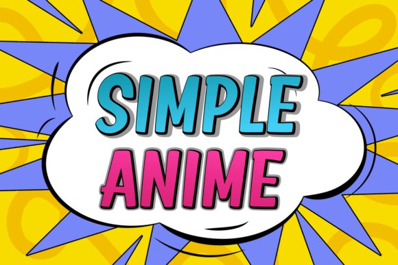
Simple Anime Font delivers a powerful visual punch through its thick, unapologetic character forms that demand immediate attention. While many typefaces in this genre overcomplicate their geometry, this design leans into a clean, minimalist approach that maximizes impact. The heavy weights are expertly handled to maintain excellent legibility even at smaller scales, making it a versatile tool for designers who need their message to stand out in a crowded visual environment.
This typeface is exceptionally well-suited for high-energy projects like gaming thumbnails, streetwear branding, and energetic social media graphics. Its chunky nature gives it a playful yet assertive personality that resonates with younger audiences and pop culture enthusiasts. Whether used for a bold T-shirt slogan or a dynamic video title sequence, the characters provide a solid foundation that supports vibrant color palettes and complex graphic overlays.
My Recommendation: This is my go-to for merchandise design or YouTube thumbnails because it cuts through the noise so effectively. Its weight allows for great texture overlays or neon glow effects, making it a dream for creative experiments.
12. Maghikle Font
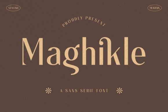
Maghikle Font is a sophisticated sans serif that redefines elegance through its unique character silhouettes and refined spacing. Unlike standard geometric faces, this typeface introduces subtle stylistic flourishes that give it a high-fashion edge, bridging the gap between minimalist utility and decorative art. Its lean, architectural structure makes it an ideal candidate for projects that aim for a look of understated luxury and modern exclusivity.
As one of the more versatile stylish display fonts in a designer’s toolkit, it excels in contexts like upscale magazine layouts, boutique logo design, and high-concept apparel branding. The font’s inherent grace allows it to carry the weight of a brand’s identity with very little assistance from supporting graphics. It works beautifully in high-contrast color schemes, such as gold foil on matte black, where the precision of its outlines can truly shine and convey a sense of premium quality.
My Recommendation: I highly recommend Maghikle for anyone working on a minimalist fashion brand or a high-end architectural portfolio. The way the characters interact creates a rhythmic, expensive feel that makes even a simple one-word logo look like a work of art.
13. Funny Hippo Font
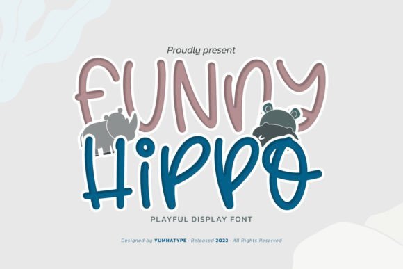
Funny Hippo breaks away from the rigid structures of traditional typography, offering a bubbly and approachable aesthetic that feels hand-crafted and welcoming. Its rounded, curvy accents create a soft visual texture, making it particularly effective for projects that require a friendly, informal touch. The varied letter proportions and dynamic angles give each word a sense of movement, ensuring that even static text feels energetic and alive.
This typeface excels in environments where personality is paramount, such as children’s educational materials, artisanal packaging, or casual blog headers. By balancing thick, friendly strokes with unexpected geometric shifts, it provides a unique character that stands out against more clinical sans-serif alternatives. It is a fantastic asset for designers looking to inject a bit of joy and spontaneity into their visual communication without sacrificing readability.
My Recommendation: I love using this for playful branding because it feels human and approachable. It is especially great for craft packaging or youth-oriented products where you want to avoid anything too corporate or stiff.
14. Valentine Font
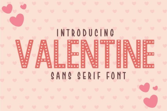
Valentine represents the pinnacle of modern minimalism, bridging the gap between high-fashion editorial and contemporary digital design. As one of those rare stylish display fonts that manages to be both striking and understated, it utilizes clean lines and precise geometry to convey a sense of prestige. Its letterforms are crafted with a focus on balance and negative space, allowing for a breathable layout that feels expensive and curated.
Whether you are designing a high-end logo for a jewelry brand or a sleek movie title, this typeface provides the structural integrity needed for luxury branding. Its versatile nature makes it equally at home on a minimalist book cover as it is on social media graphics for a boutique clothing line. The sharp, clean edges ensure that the text remains crisp across various media, from printed silk tags to high-resolution digital screens.
My Recommendation: This is my top pick for high-end fashion logos or minimalist wedding invitations. It has a beautiful, airy quality that makes any project feel instantly more expensive and professional.
15. The Paloma Font
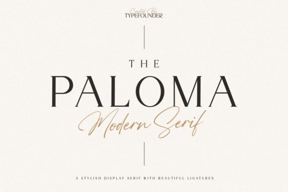
The Paloma is a masterclass in high-contrast design, blending the timeless tradition of classical serifs with a sharp, contemporary edge. Each glyph is defined by an extreme variation between its hairlines and stems, creating a dramatic visual rhythm that commands attention on the page. This refined aesthetic makes it an ideal choice for editorial layouts where the typography needs to act as a central design element rather than just a vehicle for information.
Its sophisticated silhouette is particularly effective for luxury identities and upscale lifestyle branding. The sharp, needle-like serifs add a level of precision that feels artisanal and bespoke, making it perfect for wine labels, high-end fragrance packaging, or minimalist gallery posters. By choosing this font, designers can achieve a look of quiet confidence and enduring elegance that bypasses passing trends in favor of a more permanent, sophisticated appeal.
My Recommendation: I would choose this for a luxury editorial spread or a premium lifestyle brand. The extreme contrast between the thick and thin lines creates a sharp, high-fashion look that is truly captivating.
16. Thick Font
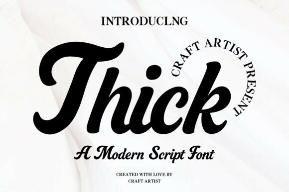
Thick offers a refreshing take on the retro script genre, blending heavy-weighted strokes with a lighthearted, handwritten rhythm. This typeface manages to feel both substantial and agile, making it a standout selection among modern stylish display fonts that aim for a nostalgic yet current aesthetic. Its smooth curves and organic flow are meticulously crafted to ensure that even at larger scales, the letterforms maintain a soft, approachable charm that resonates with contemporary audiences.
Beyond its visual appeal, this font is a powerhouse for branding and merchandise design. Whether you are creating a bold logo for a startup or a vibrant graphic for a T-shirt, its chunky architecture provides excellent legibility and a friendly vibe. It bridges the gap between vintage sign painting and digital-first design, making it particularly effective for product labels and invitation headers where a touch of personality is paramount.
My Recommendation: I would pick this font for a project that needs to feel like a warm hug—it has a bounce and friendly weight that works wonders for artisanal food packaging. It’s the kind of script that stands out on a hoodie or a coffee shop window without feeling overly formal or stiff.
17. Biges Font
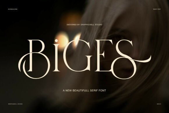
Biges is a masterclass in editorial elegance, featuring razor-thin serif details and sophisticated swashes that dance across the baseline. Unlike traditional heavy serifs, this typeface embraces a slender, elongated silhouette that projects a sense of luxury and calm. The interplay between its sharp edges and fluid flourishes creates a dynamic visual rhythm, transforming standard copy into a piece of high-end typographic art that demands a second look.
Designed with a focus on whitespace and balance, the uppercase characters offer a particularly refined presence. The generous kerning and open apertures make it an exceptional choice for minimalist headlines and premium identity systems. It excels in contexts where the goal is to convey prestige without shouting, providing a polished and graceful foundation for fashion magazines, luxury packaging, and boutique brand marks.
My Recommendation: Use Biges when you are aiming for that ‘Vogue’ aesthetic; its airy letterforms and delicate swashes are perfect for high-end skincare or jewelry brands. It brings a sophisticated silence to a layout that allows your imagery to breathe while still looking incredibly expensive.
18. Cowboy Outlines Font
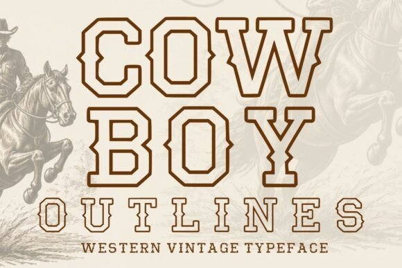
Cowboy Outlines brings a rugged, frontier-inspired spirit to the digital age, revitalizing the classic slab-serif look with a crisp outline treatment. As one of the more versatile stylish display fonts in the vintage category, it captures the essence of old-west posters while offering the clarity required for high-definition screens. The geometric precision of the hollow strokes allows for incredible flexibility, enabling designers to experiment with background textures and color overlays without losing the font’s structural integrity.
This typeface is perfectly suited for projects that require a bold, masculine presence with a hint of nostalgia. Its outlined form is specifically engineered for layering, making it a go-to tool for creating complex shadow effects or multi-colored emblems. From brewery branding to rugged outdoor apparel labels, this font provides a timeless western character that feels intentionally crafted and visually impactful.
My Recommendation: This is my favorite choice for creating custom patches or varsity-style logos because the outline allows you to layer it over textures without the design feeling too heavy. It captures that authentic Americana vibe perfectly for craft beer labels or music festival posters.
19. Distressed Font
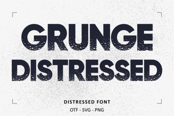
Distressed Font offers an uncompromisingly raw aesthetic that perfectly captures the essence of street culture and industrial grit. Its heavily textured outlines and irregular strokes create a sense of movement and authentic wear-and-tear that clean typefaces simply cannot replicate. It excels in environments where a sense of history or rebellious energy is needed, making it a standout choice for high-impact visual storytelling and underground branding.
Beyond its rugged exterior, this typeface maintains a high level of legibility even at smaller display sizes. It is particularly effective for branding projects that lean into a vintage punk or weathered aesthetic, such as apparel design, artisanal packaging, or alternative music promotion. By incorporating these distressed elements, designers can infuse their work with a tactile, handmade quality that resonates with audiences looking for authenticity over polished perfection.
My Recommendation: I would reach for this font when working on a craft brewery label or a gritty documentary poster. Its organic imperfections provide an immediate sense of character that makes a brand feel lived-in and genuine rather than mass-produced.
20. Puzo Font
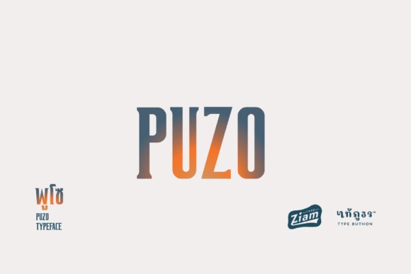
Puzo Font represents a sophisticated take on contemporary type design, balancing bold structural geometry with elegant curves. As a prime example of stylish display fonts, it manages to remain versatile enough for luxury editorial layouts while maintaining a distinct personality that commands attention. The letterforms are meticulously weighted to ensure a harmonious flow across headlines, giving any composition a refined and professional finish that feels modern yet timeless.
The versatility of this typeface allows it to transition seamlessly between high-end fashion branding and modern digital interfaces. Its clean lines and unique character terminals offer a fresh perspective on minimalist typography, ensuring that your message stands out in a crowded visual landscape. Whether used for a minimalist logo or an expansive magazine spread, it provides a polished look that elevates the overall design hierarchy and visual appeal.
My Recommendation: This is my go-to choice for sophisticated tech startups or boutique hotel branding. It has that rare ability to look expensive and curated without being overly ornate, making it perfect for a brand that values modern minimalism and class.
21. Neon Night Font
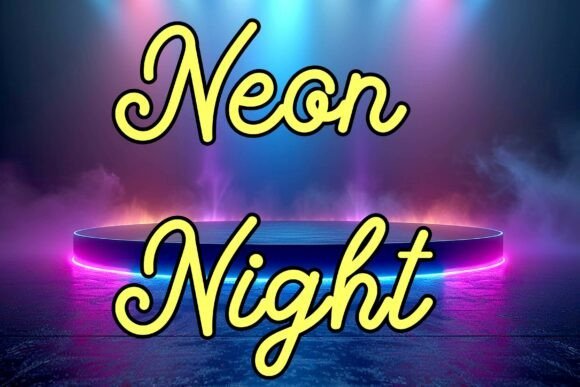
Neon Night Font captures the electrifying energy of a metropolis after dark, drawing heavy inspiration from the luminous glass tubes of retro signage. Each character is crafted with a sense of depth and vibrancy, mimicking the glow and soft falloff of actual neon light. It is a highly expressive typeface that immediately transports the viewer to a world of futuristic cityscapes and late-night adventures, making it ideal for high-contrast digital designs and immersive brand environments.
While it thrives in retro-wave and synth-wave contexts, this font also brings a modern urban edge to streetwear marketing and social media graphics. Its bold, tubular structure works exceptionally well when paired with vibrant color palettes and dark backgrounds, providing a striking visual anchor for YouTube thumbnails or event flyers. This typeface doesn’t just display text; it sets a specific mood of excitement and nocturnal mystery that is hard to ignore.
My Recommendation: I would use this specifically for a podcast cover or a late-night cafe menu where you want to evoke a city-that-never-sleeps vibe. The way the lines flow makes it feel dynamic and perfect for projects that need to pop against dark backgrounds.
22. Shallota Font
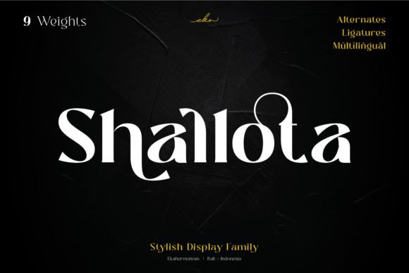
Shallota stands as a masterclass in modern elegance, merging heavy, confident weights with a refined, smooth silhouette. Its aesthetic is deeply rooted in the world of high-end editorial work and boutique fashion, where every curve and terminal must convey a sense of luxury. As one of the most effective stylish display fonts for creators seeking a high-contrast look, it effortlessly draws the eye without overwhelming the surrounding design elements.
Functionally, the font is PUA encoded, which is a significant boon for designers who want to push their creative boundaries. This technical feature ensures that all the intricate swashes and unique glyphs are accessible across various software platforms, allowing for custom ligatures that make a logo or headline feel bespoke. Whether you are crafting a masthead for a lifestyle magazine or a visual identity for a premium skincare line, this typeface provides the necessary gravitas and artistic flair.
My Recommendation: I would choose Shallota for luxury branding or minimalist magazine covers where you need the text to feel like a piece of art. The way the bold strokes transition into delicate lines creates a rhythm that feels very high-fashion and expensive.
23. Theory Display Font
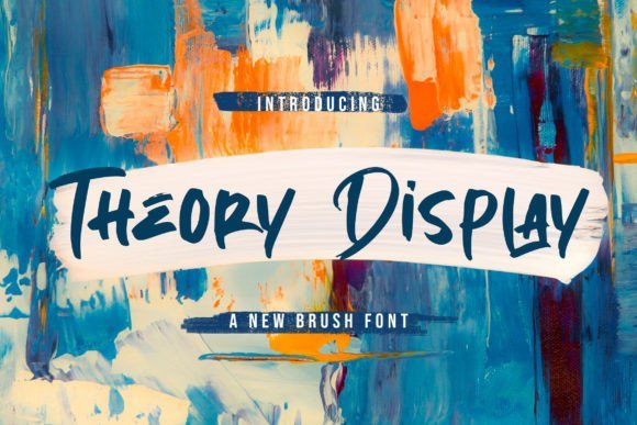
Theory Display breaks away from the polished world of digital vectors to offer an authentic, hand-crafted aesthetic. Created with a brush pen, this typeface retains the gritty, organic textures and flowing motion of wet ink on paper. Its visual language is one of raw energy and spontaneity, making it an ideal candidate for projects that require a human touch or a sense of street-level urgency.
The font’s charm lies in its imperfections, such as the natural dry-brush streaks and variable stroke widths that suggest a designer’s hand at work. This makes it particularly effective for music festival posters, cinematic titles, or urban apparel brands where a sterile typeface would feel out of place. It layers beautifully over photography, lending a visceral and textured quality to headlines that demands immediate attention from the viewer.
My Recommendation: This is my go-to for action-oriented designs or event branding where you want a raw, handmade vibe. Its textured finish means you don’t have to spend extra time adding distressing effects to your typography; it carries that energy right out of the box.
24. Melipe Font
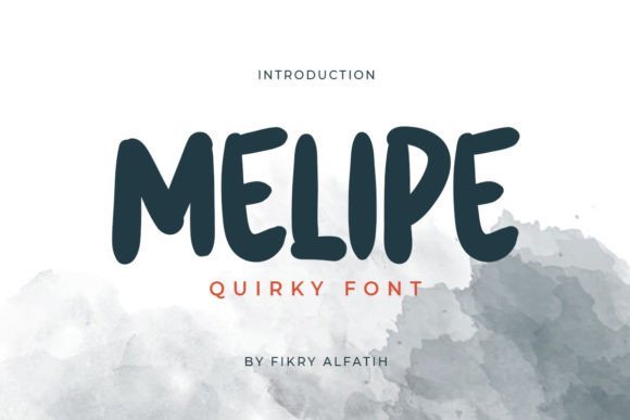
Melipe is a breath of fresh air for designers looking to inject whimsy and playfulness into their visual storytelling. With its bouncy baselines and unconventional character shapes, it manages to be both highly engaging and surprisingly versatile. In a landscape filled with rigid typography, Melipe stands out among stylish display fonts by prioritizing a sense of joy and approachability that is often missing in professional font kits.
The typeface excels in environments where the goal is to build a friendly rapport with the audience, such as children’s educational materials, artisanal product packaging, or vibrant social media campaigns. Its unique letterforms provide a distinctive personality that can anchor an entire brand identity, ensuring that the messaging feels imaginative and full of life. It’s a tool for creators who want to break the mold and offer something that feels warm, personal, and visually captivating.
My Recommendation: Melipe is fantastic for boutique food packaging or creative apps aimed at a younger, more imaginative audience. I love how it balances a quirky personality with great legibility, making it a reliable choice for long headlines that still need to look fun.
25. Charlotte Font
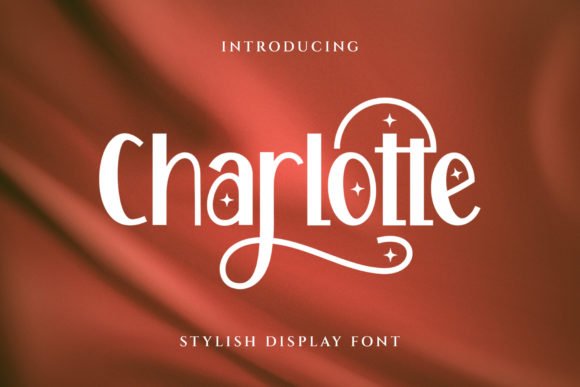
Charlotte is a masterclass in typographic harmony, striking a perfect equilibrium between weight and whitespace. Its design philosophy centers on a balanced structure that avoids the extremes of spindly lines or overwhelming thickness, making it a versatile choice for designers aiming for a refined, upscale aesthetic. The subtle variations in its strokes suggest a handcrafted origin, lending an organic warmth to digital layouts that often feel too sterile.
This typeface excels in environments where beauty and readability must coexist, such as luxury skincare packaging or high-end editorial spreads. Its rhythmic flow guides the eye effortlessly across the page, while the carefully sculpted serifs add a touch of classic sophistication. Whether you are crafting a brand identity for a boutique or designing a curated coffee table book, this font provides the structural integrity needed to anchor your visual narrative.
My Recommendation: I would reach for this font when a project requires a touch of grace without being overly delicate. It is particularly effective for lifestyle branding where you need the typography to feel both approachable and expensive at the same time.
26. Blue Bronx Font
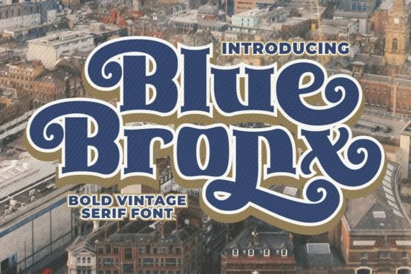
When your design requires a bold, unapologetic presence, Blue Bronx stands out as one of the most compelling stylish display fonts available today. Characterized by its heavy-set letterforms and daring silhouettes, this typeface is engineered for high-impact communication. It discards subtlety in favor of a confident, urban energy that makes every word feel like a definitive statement, making it perfect for catching the eye in a crowded marketplace.
Beyond its visual weight, the font offers a modern edge that suits contemporary branding, product labels, and energetic advertising campaigns. Its thick, sturdy strokes ensure maximum legibility even at large scales, making it an ideal candidate for billboard designs or streetwear merchandise. By integrating this face into your creative toolkit, you gain the ability to infuse projects with a sense of strength and forward-thinking style that is hard to ignore.
My Recommendation: This is my go-to for loud branding projects that need to bridge the gap between street culture and professional design. It works exceptionally well on physical packaging where the texture of the print can play off the font’s bold geometry.
27. Nyla Font
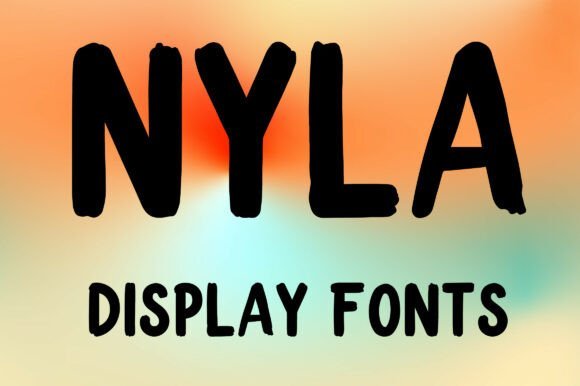
Nyla represents a fascinating intersection of elongated verticality and soft, rounded geometry, creating a chic visual language that feels both modern and whimsical. By blending these contrasting shapes, the typeface achieves a unique ‘tall’ profile that saves horizontal space while maximizing vertical presence. This makes it an excellent choice for experimental layouts where typographic height can be used to create architectural interest on the page.
The font is specifically tailored for creative applications that prioritize expressive character over traditional text blocks, featuring uppercase English letters and numbers that pop with personality. Its playful yet sophisticated construction makes it a standout for event posters, artistic social media assets, and specialized logo marks. Because it avoids standard conventions, it invites designers to push their creative limits and explore unconventional kerning and stacking techniques.
My Recommendation: I recommend this specifically for headline-heavy work where you want to break away from standard proportions. The tall, circular nature of the letters makes it incredibly fun to use in vertical layouts or minimalist poster designs.
28. Stay Lucky Font
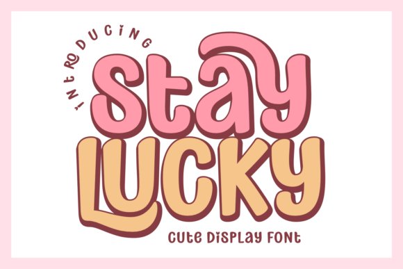
Stay Lucky is a powerhouse of personality that draws heavily from the maximalist aesthetic of the 1970s. This typeface is more than just a set of letters; it is a full-bodied design tool that captures the essence of groovy, high-energy branding. Its thick, wavy strokes and bold presence make it a standout among stylish display fonts, providing a sense of nostalgic warmth that works perfectly for eye-catching t-shirt designs, vibrant product packaging, and bold posters that need to command attention immediately.
Beyond its vintage charm, this font is incredibly versatile for the modern digital landscape. Whether you are building an interface for a casual mobile game or designing assets for digital planners and stickers, Stay Lucky provides a consistent, legible, and fun atmosphere. It includes a comprehensive set of alternates and ligatures, alongside support for Procreate and SVG formats, allowing designers to manipulate the text to fit various artistic contexts from bohemian aesthetics to psychedelic retro themes.
My Recommendation: I would reach for Stay Lucky when a project needs a massive dose of optimism and character. It is particularly effective for merchandise and YouTube branding where you want to project a fun, approachable, and slightly eccentric persona that stands out in a crowded feed.
29. Slowdate Font
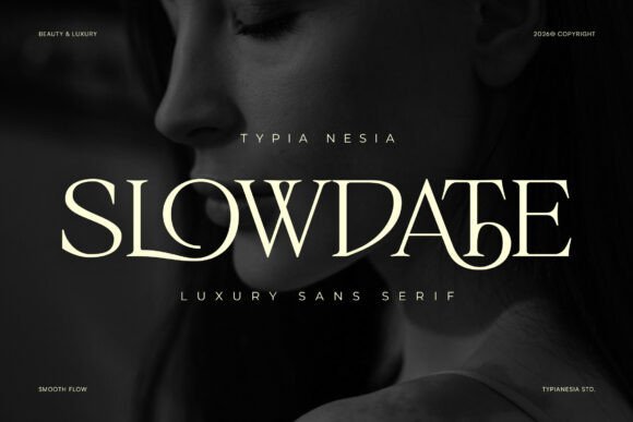
Slowdate represents the pinnacle of modern luxury in the world of serif typography. This typeface is defined by its slender, graceful proportions and a series of meticulously crafted ligatures that transform standard text into a bespoke piece of art. Its feminine and high-end character makes it a natural fit for editorial layouts, boutique branding, and sophisticated wedding invitations where a sense of royal elegance is required. The balance between its sharp serifs and soft, fluid curves creates a rhythmic flow that feels both timeless and contemporary.
In professional branding contexts, Slowdate excels in sectors like premium skincare, fine jewelry, and fashion-forward cosmetic labels. The font’s architecture is designed to look expensive and exclusive, providing an instant upgrade to minimalist logo designs. Because it prioritizes refinement and clarity, it functions beautifully as a primary header font that communicates a brand’s commitment to quality and aesthetic excellence without overwhelming the viewer with unnecessary complexity.
My Recommendation: This is my go-to choice for luxury branding projects that require a ‘quiet wealth’ vibe. The ligatures are so well-designed that they do most of the heavy lifting for you, making any simple wordmark look like it was custom-lettered by a high-end agency.
30. Smiles Honey Font
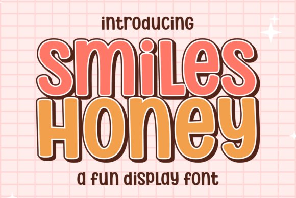
Smiles Honey is a vibrant celebration of the bubble-letter trend, reimagined for contemporary designers who want to inject a sense of playfulness into their work. Taking inspiration from 70s candy store signage and classic children’s books, this font utilizes thick, rounded lines to create a soft yet impactful visual weight. It is a prime example of how stylish display fonts can bridge the gap between retro nostalgia and modern digital design, making it an excellent candidate for digital sticker packs, playful social media graphics, and adventurous branding projects.
What sets Smiles Honey apart is its sheer adaptability across different creative mediums. While its heart lies in the groovy, maximalist world, its clean edges and high readability ensure it performs well in casual game interfaces and children’s product packaging. The font also supports multilingual inputs and is compatible with Procreate, providing a tactile, hand-drawn feel that works wonderfully for t-shirt graphics and boho-inspired logo sets that need a friendly, approachable touch.
My Recommendation: Smiles Honey is the font I recommend when you want to make your audience smile. It has a fantastic ‘bounce’ to it that is perfect for youthful, high-energy brands or any project that doesn’t take itself too seriously but still needs professional-grade typography.
31. Simple Lines Font
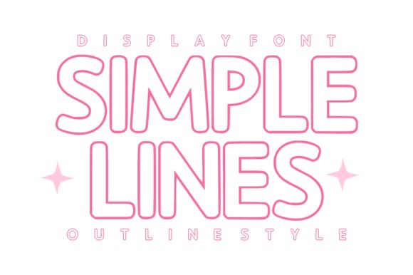
Simple Lines reimagines the concept of negative space through its meticulously balanced rounded outline aesthetic. Unlike heavier typefaces that dominate a layout, this selection offers a delicate, airy presence that works harmoniously with high-resolution photography and complex backgrounds. Its clean, hollow architecture is specifically designed for legibility even when layered, making it a sophisticated choice for designers looking to achieve a modern, minimalist look without sacrificing character or warmth.
Beyond its visual appeal, the technical precision of the paths makes it exceptionally reliable for physical production. Whether you are prepping files for vinyl cutting machines like Cricut or Silhouette, or designing high-end packaging for a boutique apothecary, the smooth curves ensure a professional finish every time. It excels in environments where a gentle touch is required, such as editorial headers, bespoke stationery, or interactive social media templates that prioritize a soft, welcoming aesthetic.
My Recommendation: I find this font indispensable for lifestyle branding where you need text to feel integrated with the imagery rather than sitting on top of it. It is particularly effective for eco-friendly product packaging or as a secondary font in a luxury brand’s visual identity because of its understated elegance.
32. Kingdom Retro Font
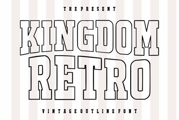
Kingdom Retro captures the raw energy of vintage varsity athletics and classic Americana through a bold, outlined framework. As one of the more versatile and stylish display fonts available for nostalgic branding, it bridges the gap between mid-century western posters and 90s streetwear culture. The strong, blocky structure provides a commanding presence on the page, while the interior transparency allows for creative color fills and gradient experimentation that can transform a simple headline into a focal point.
This typeface is engineered for high-impact communication, making it an ideal candidate for sports-related identities, collegiate-style apparel, and bold editorial layouts. The meticulous attention to letter spacing and geometric consistency ensures that the font maintains its authoritative voice across various media, from large-scale event banners to embroidered patches. It brings an undeniable sense of heritage and rugged professionalism to any project that requires a touch of old-school grit combined with contemporary design standards.
My Recommendation: This is a powerhouse choice for any project involving apparel or fan merchandise. I would specifically use it for a local sports league rebranding or a streetwear capsule collection to give the pieces that authentic, timeless ‘campus’ vibe that never goes out of style.
33. Bestseller Bundle Font
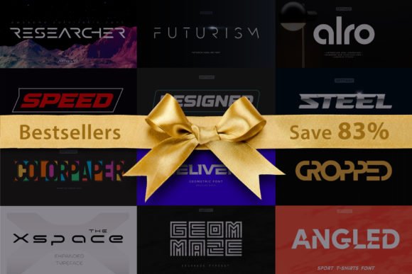
The Bestseller Bundle represents a curated selection of typefaces designed to meet the demands of the digital-first era, particularly in sectors like gaming, technology, and high-performance sports. Each variant within this collection is built with a focus on high-contrast forms and aggressive silhouettes that demand immediate attention. The architectural integrity of these fonts makes them suitable for everything from intricate HUD displays in video games to sleek, futuristic corporate logos that need to convey speed and innovation.
By providing a spectrum of weights and stylistic variations, this bundle allows for a cohesive visual language across an entire product ecosystem. Designers can utilize the sharper, more angular options for tech-focused branding while pivoting to the more balanced, heavy-set versions for physical merchandise like jersey numbers or large-format event signage. Its versatility is its greatest strength, offering a toolkit that adapts to the high-energy requirements of modern commercial design without feeling repetitive or generic.
Download Bestseller Bundle Font
My Recommendation: If you are working on a tech startup or a YouTube gaming channel, this bundle is a literal lifesaver. I love it for its ability to look ‘expensive’ and high-tech while remaining incredibly easy to read at a distance, making it perfect for both digital overlays and physical storefronts.
34. Bevaloire Font
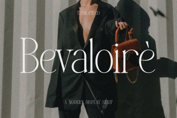
Bevaloire represents a masterclass in modern editorial aesthetics, blending sculptural serif elements with a high-contrast weight distribution that feels both classic and cutting-edge. This typeface is defined by its fluid curves and artistic terminations, making it an exceptional choice for luxury branding, high-end fashion mastheads, and sophisticated packaging designs that require a touch of haute couture.
As one of the more refined and stylish display fonts in a designer’s toolkit, Bevaloire excels when used at large scales where its intricate details can be fully appreciated. Whether you are crafting a visual identity for a boutique hotel or a sleek gallery invitation, this font provides a sense of curated elegance that instantly elevates the surrounding composition.
My Recommendation: I would reach for Bevaloire when working on a project that needs to breathe luxury and quiet confidence, such as a premium skincare line or a high-end lifestyle magazine. The contrast in the strokes creates a rhythm that feels incredibly bespoke and expensive.
35. Brastika Font
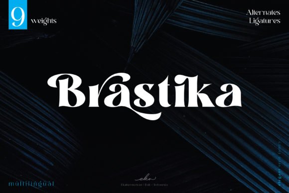
Brastika is a powerhouse of visual weight, offering a thick-lettered approach that anchors any layout with undeniable authority. Each character is expertly crafted to balance heavy proportions with modern silhouettes, resulting in a typeface that feels substantial and grounded. Its bold presence makes it particularly effective for outdoor advertising, social media headers, and impactful title sequences where immediate legibility and strength are paramount.
The construction of this font leans into a contemporary aesthetic that avoids the clutter of traditional serifs, focusing instead on clean lines and a robust footprint. It thrives in environments where the typography needs to act as a primary design element, providing a solid foundation for experimental layouts or stark, minimalist poster work.
My Recommendation: This is a fantastic pick for tech-oriented brands or streetwear labels that want to project a sense of durability and ‘cool’ without trying too hard. It works best in hero sections where you want the message to hit the viewer with immediate, heavy-hitting impact.
36. Emynam Crew Font
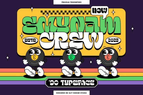
Emynam Crew is a vibrant revival of the grooviest eras, meticulously designed to bring 1970s and 80s nostalgia into the digital age. With a staggering library of 705 glyphs, this typeface offers an unparalleled level of customization, allowing designers to play with diverse ligatures and alternative characters to create truly rhythmic and unique typographic arrangements. It captures a specific sense of ‘funk’ that is perfect for music festival posters, retro-themed branding, and apparel design.
When searching for stylish display fonts that offer character and movement, Emynam Crew stands out for its ability to mimic hand-lettered vintage signage. Its bold, flowing letterforms are not just legible but also incredibly expressive, making every headline feel like a piece of custom artwork rather than just typed text.
My Recommendation: I love the sheer versatility provided by the hundreds of alternate glyphs, which makes it perfect for a craft brewery or a record store identity. It’s my top recommendation for any project that needs to feel soulful, energetic, and slightly rebellious.
37. Dessthia Font
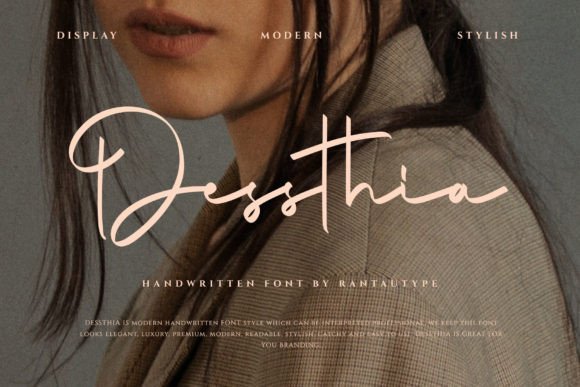
Dessthia emerges as a masterclass in calligraphic refinement, offering a dainty and fluid handwritten aesthetic that feels deeply personal. The font is defined by its sweeping, melodic swashes and a consistent visual rhythm that mimics the hand of a seasoned scribe. Unlike more rigid scripts, this typeface maintains a breezy, light-hearted energy that brings a sense of artisanal craftsmanship to digital projects, making it a premier choice for high-end branding and delicate editorial layouts.
Beyond its initial elegance, the typeface provides a versatile toolkit for designers working on bespoke stationery or feminine-leaning visual identities. Each character is thoughtfully weighted to ensure legibility remains intact even when the decorative flourishes take center stage. It serves as a brilliant typographic anchor for wedding invitations, luxury letterheads, and lifestyle social media graphics that require a touch of human warmth and sophisticated charm.
My Recommendation: I would turn to Dessthia whenever a project calls for an intimate, boutique feel that can’t be achieved with standard sans-serifs. Its organic flow is perfect for signature logos where you want the brand to feel approachable yet unmistakably high-end. The delicate swashes add just enough personality to make a heading pop without overwhelming the rest of the layout.
38. Migaela Font
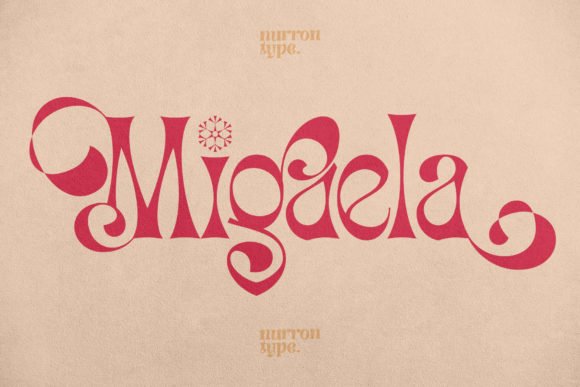
Migaela stands as a testament to contemporary sophistication, positioning itself at the very top of the hierarchy for stylish display fonts. This typeface features sharp, high-contrast strokes and unique geometric terminals that command immediate attention in any editorial context. Its silhouette is both bold and graceful, bridging the gap between mid-century modern aesthetics and the fast-paced demands of current luxury marketing trends.
This font is particularly effective when utilized in large-scale formats, such as magazine mastheads or high-fashion lookbooks, where its intricate details can truly shine. The balance of its negative space allows for tight leading and kerning without sacrificing the structural integrity of the words. When you are searching for stylish display fonts that can carry the weight of a brand’s visual identity on their own, Migaela offers a polished, professional solution that radiates confidence and avant-garde style.
My Recommendation: This is my go-to choice for editorial covers and high-fashion branding because it has that ‘Vogue’ level of poise. Its high contrast creates a stunning visual tension that works beautifully against minimalist photography. It’s the kind of typeface that makes even a single word look like a finished piece of art.
39. Cinquecento Font
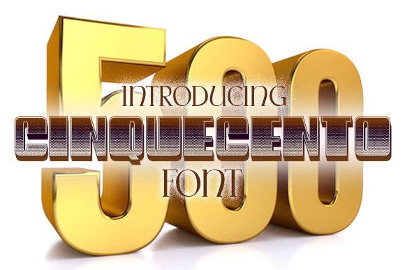
Cinquecento is a robust and architectural font family designed for those who need a diverse range of weights to tackle complex design systems. With a strong foundation rooted in classic display proportions, it offers a sense of stability and permanence that is hard to find in more decorative options. The family expands from lighter, airy iterations to thick, impactful heavyweights, ensuring that designers have the exact level of gravitas needed for everything from small-scale flyers to massive outdoor banners.
The versatility of this typeface makes it an industrial powerhouse for merchandise and apparel design, specifically within the streetwear and lifestyle sectors. Its clean lines and confident posture allow it to be layered over busy textures or placed against vibrant color palettes without losing its punch. Whether you are building an identity for a modern tech startup or designing heavy-duty packaging, the varied weights of this family provide the structural flexibility required for a cohesive and modern visual language.
My Recommendation: I highly recommend Cinquecento for anyone building a comprehensive brand identity from scratch, as the font family’s range allows for great hierarchy. The heavier weights are exceptionally punchy on t-shirts and hoodies, giving off a crisp, urban vibe that feels very current. It’s a workhorse that manages to look incredibly sleek in almost any application.
Choosing the right typeface is one of the most important decisions a designer can make. With these 39 stylish display fonts at your disposal, you’re well-equipped to create memorable visuals that resonate with your audience throughout 2026. I hope this list helps you find that perfect match for your next creative endeavor, whether it’s a bold poster or a subtle social media graphic. Happy designing!