26 Trendy Geometric Logo Fonts for Bold Branding in 2026
Geometric Logo Fonts bring clean, grid-based letterforms and modern simplicity to brand marks, making them ideal for startups, tech companies, and creative studios.
This curated set of 26 typefaces spans modular sans-serifs, monoline glyphs, and geometric display styles, offering logo typography, monograms, and emblem-ready options. Use these geometric typefaces to achieve crisp legibility, strong wordmarks, and contemporary identity systems.
1. Gnora Font
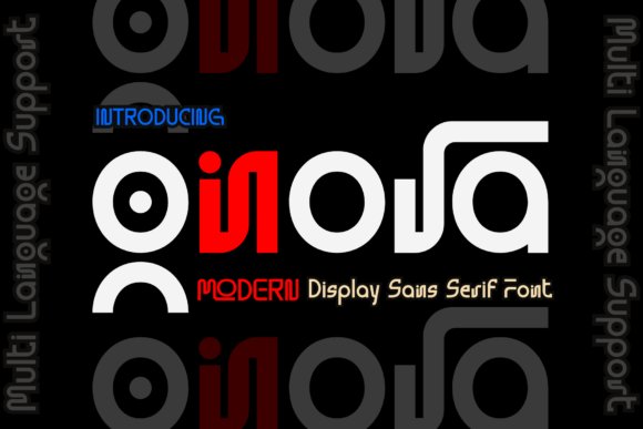
Gnora lands as a crisp geometric sans that balances cheerful personality with disciplined construction. Its closed counters, circular bowls, and even stroke widths give it a bright, approachable presence while retaining the precision designers want for professional identity work. Geometric Logo Fonts like Gnora excel at creating marks that feel modern without being cold – this one leans warm, making brands feel authentic and inviting.
On a closer read, Gnora’s letterspacing and subtle terminal cuts are tuned for tight wordmarks: letters lock together cleanly without losing individual clarity. The typeface reads equally well on stationery and large-scale signage because its shapes scale predictably; small caps remain legible and capitals hold their shape in simplified applications. Designers will appreciate how it performs in single-line logos and compact badge layouts.
Pairing wise, Gnora thrives when contrasted with a light humanist body font or a textured script for editorial accents; it also works solo for stripped-back identities. Its geometric rhythm lends itself to product packaging, social headlines, UI headers, and boutique branding where a friendly but structured voice is needed. Overall, Gnora is a versatile tool for anyone aiming for polished, contemporary marks that feel both playful and assured.
My Recommendation: I’d reach for Gnora when creating a brand that needs to feel modern yet personable-think artisan shops, lifestyle blogs, or boutique product lines. Its tidy geometric shapes make logo construction straightforward and reliable across print and digital. Use it when you want a logo that reads cleanly at small sizes but still carries character at large scales.
2. Oqygen Font
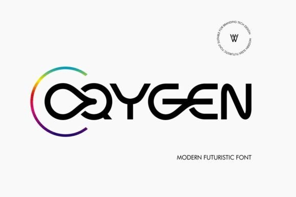
Oqygen announces itself with assertive geometry and a condensed profile that feels engineered for impact. The letterforms are deliberately compact, with tight counters and precise stroke terminals that create a bold silhouette in headlines and emblems. Its futuristic undertone-hinting at Y2K revival-gives identities a forward-leaning, tech-conscious attitude without leaning into gimmickry.
Technically, Oqygen behaves like a display-first sans: tracking should be adjusted for long runs, but its tight proportions are perfect for single-line logos, app icons, and title treatments. The consistent stroke weight preserves legibility even when scaled down for digital interfaces, while larger sizes let the geometric geometry breathe and show off its engineered detail. Use it where space is limited but presence is required.
Oqygen pairs best with neutral, open-source body fonts or humanist serifs to soften its clinical edge and create contrast. It’s ideal for technology brands, AI startups, and product launches that want a sleek, contemporary wordmark. If you need a condensed display face that reads as confident and futuristic, this one delivers with clarity.
My Recommendation: I recommend Oqygen for tech-forward branding and interface headers where a strong, compact presence is needed. Its condensed geometry makes it ideal for logos on limited-width platforms like app headers or narrow signage. Use it when you want a modern, assertive type that suggests innovation and efficiency.
3. Grivor Racer Font
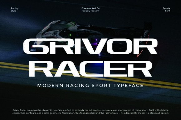
Grivor Racer channels velocity with angular cuts and aerodynamic terminals that mimic the motion of motorsport visuals. The geometric backbone is aggressively stylized: characters push forward with forward-leaning cues and sharp diagonals, making this a quintessential display face for high-energy identities. The effect is immediate-logos, numbers, and badges gain intensity and motion simply through the type choice.
Functionally, Grivor Racer is built for bold settings where a dominant headline or emblem must grab attention at a glance. It favors all-caps treatments and performs best when used sparingly-team insignias, vehicle decals, posters, and merchandise where legibility at distance matters. Tight kerning emphasizes the compact, performance-driven aesthetic, while thicker weights hold up well in print and vinyl applications.
To balance its aggressive voice, pair Grivor Racer with neutral sans or condensed supporting text that won’t compete for attention. It’s perfect for motorsport brands, performance product packaging, event posters, and any project that needs the visual language of speed without sacrificing geometric control. The type conveys energy and precision in equal measure.
My Recommendation: I’d choose Grivor Racer when a project demands kinetic energy-think race teams, athletic apparel, or extreme-sports branding. Its sharp geometry creates instant momentum in logos and large-format graphics. Use it when you want typography that reads fast and feels engineered for performance.
4. Bapeg Font
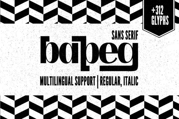
Bapeg is a finely balanced geometric sans-serif that pairs delicate stroke contrast with crisp, mechanical construction. Its high-contrast terminals give letterforms an elegant, upscale voice, making it a natural fit for premium identity work where legibility and refinement must coexist. Designers will notice how the narrow counters and subtle modulation in strokes create a sense of luxury without becoming ornate.
Where Bapeg truly shines is in logo and packaging environments: the typeface scales cleanly from tiny labels to large-format posters while preserving its distinctive silhouette. Precise spacing and consistent geometric proportions help it read confidently in wordmarks and stacked marks alike. Because of its poised personality, Bapeg integrates smoothly with minimalist art direction, photographic layouts, and glossy cosmetics branding.
Bapeg also earns points for versatility: it transitions from restrained editorial headlines to expressive brand headlines with ease, supporting cohesive visual systems across print and digital. If you want a typeface that feels contemporary but carries a couture edge, Bapeg comfortably ranks among Geometric Logo Fonts for premium, tactile brands. Its measured contrast and thoughtful construction give designers a stylish tool for elevating brand language.
My Recommendation: I’d reach for Bapeg when crafting identities for luxury beauty, boutique packaging, or boutique lifestyle brands. Its delicate high-contrast shapes read beautifully at logotype scale and on product labels, giving a refined, memorable mark. Use it when you want modern geometry with an elegant, editorial feel rather than abrupt or industrial geometry.
5. Just Logo Font
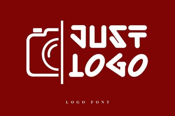
Just Logo presents a futuristic, geometric aesthetic built from bold strokes and smooth, engineered curves. Each character feels deliberately constructed-wide terminals, tight counters, and angled joins create a visual vocabulary that reads as both minimalist and forward-thinking. The typeface’s visual rhythm gives quick recognition, which is essential for tight logo lockups and tech identity systems.
Its hard-edged geometry and distinctive character shapes make Just Logo ideal for brands wanting a modern, sci-fi-infused persona. Use it for digital-first projects, product branding, and interfaces where a confident, tech-driven tone is desired. The font’s strong silhouette also adapts well to motion and interactive treatments, where simple shapes animate clearly.
Because of its bold geometry, Just Logo works best when given breathing room: paired with neutral sans bodies or understated imagery, it becomes a memorable headline voice rather than a busy display. For designers creating names, app icons, or signage with a contemporary technological feel, this family provides a sharp, highly legible option that emphasizes innovation and clarity.
My Recommendation: I recommend Just Logo for startups, gaming studios, and tech products that need an assertive, futuristic mark. It cuts through noisy visual environments and scales well for app icons and signage. If your brief calls for a minimalist but daring personality, this font will give your logo a distinctive, future-facing edge.
6. Montreal Font
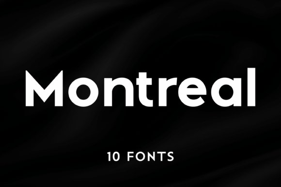
Montreal is a robust geometric sans-serif family offered in ten distinct styles, giving designers a broad palette from light, airy weights to commanding blacks. The family’s consistent geometric rhythm-circular bowls, even stroke distribution, and balanced proportions-provides a dependable foundation for both display and body uses. Across weights, Montreal preserves clarity and readability, which makes it a strong contender for systems that require typographic cohesion.
What sets Montreal apart is its adaptability: lighter weights lend a refined minimalism for editorial layouts, while heavier variants deliver impactful headlines and logos with impressive presence. The typeface responds well to tight tracking for compact wordmarks and more generous spacing for modern editorial spreads. Its neutral yet contemporary voice helps it function as a brand workhorse across print, web, and environmental graphics.
Montreal’s extensive style range also supports typographic hierarchy without introducing mismatched personalities, which simplifies identity development and campaign work. For designers building scalable brand systems, Montreal supplies both subtlety and punch in one family. If you need a geometric sans that can do everything from corporate signage to expressive advertising, Montreal is a practical, versatile choice.
My Recommendation: I turn to Montreal when a project requires typographic flexibility across many touchpoints-corporate identity, websites, and large-format displays. Its ten-style range makes designing hierarchies and pairings straightforward, and its geometric neutrality keeps the focus on the brand rather than the type. Choose Montreal when you want a modern, reliable sans-serif that adapts to both minimal and assertive visual directions.
7. Zanela Font
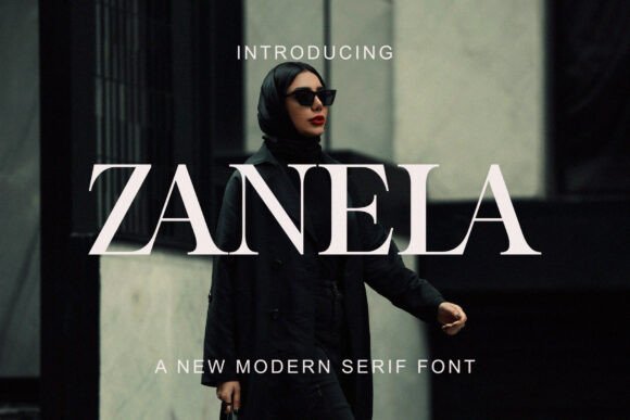
Zanela is a modern high-contrast serif that reads like couture in type form: sharp, refined terminations meet generous counters to create an unmistakable editorial voice. Its needle-like serifs and geometric apertures give letterforms a sculpted, almost architectural presence that commands attention at headline scale without feeling decorative.
With a tall x-height and upright posture, Zanela performs superbly in tight logo lockups and luxury packaging where legibility and attitude must coexist. It sits confidently in the sweet spot between classic serif elegance and contemporary geometric precision, making it a strong member of any Geometric Logo Fonts toolkit when you want a premium, structured look.
Use Zanela for couture branding, magazine mastheads, or minimalist product labels to inject a sense of artisanal authority; subtle letterspacing and weight choice dramatically change its tone from austere to sensual. The typeface rewards careful pairing – combine it with a low-contrast grotesque for body text or let it stand alone as the cornerstone of an identity system.
My Recommendation: I’d reach for Zanela when building a luxury or fashion identity that needs both elegance and modern edge. Its sculptural serifs and strong vertical rhythm make logos feel intentional and timeless. Use it for high-end beauty, editorial covers, or boutique packaging where every letter needs to feel curated.
8. Northen Glitch Font
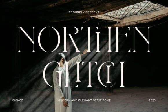
Northen Glitch presents a bold serif voice with an architectural bent: high-contrast strokes are balanced by slender, razor-sharp serifs and elongated terminals that create a dramatic verticality. The typeface carves out an avant-garde silhouette that reads equally well on a cinematic poster or a glossy editorial spread.
Its elongated ascenders and carefully trimmed apertures produce striking negative space, which designers can exploit for tension in headlines and logo marks. The result is a refined yet slightly disruptive energy-perfect for brands that want to feel experimental without abandoning sophistication.
Practical use benefits from generous tracking and considered kerning at large sizes to preserve the typeface’s intricate shapes; pair it with a plain geometric sans if you need readable supporting copy. Northen Glitch excels where theatrical presence and high-fashion posture are required, delivering a memorable identity without gimmickry.
My Recommendation: I recommend Northen Glitch for editorial projects and fashion-forward brands seeking a dramatic, runway-ready aesthetic. It’s particularly effective in titles, posters, and identity marks where elongated proportions can be shown off. For balanced systems, pair it with a neutral sans to keep longer reading comfortable.
9. Comet Font
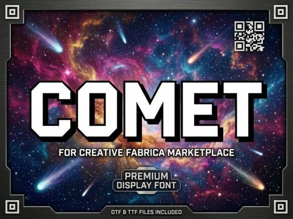
Comet is a heavyweight display face built around geometric fundamentals: broad letterforms, chamfered corners, and bold stems give it a sense of engineered power and forward motion. The clean, angular cuts create a futuristic texture that reads as both industrial and cinematic.
Because of its monumental proportions and punchy presence, Comet is ideal for logos, title sequences, and sports or tech branding where instant impact is required. Its chamfered geometry maintains clarity in badge-style lockups and scales well on both print signage and digital hero banners.
When using Comet, mind the spacing at large sizes to avoid overly dense black shapes; slight negative tracking often helps the forms breathe. Consider pairing it with a thin humanist or condensed sans for secondary type work to preserve hierarchy while amplifying the font’s modern, kinetic character.
My Recommendation: I’d pick Comet for projects that demand bold, futuristic identity-game titles, aerospace brands, or high-energy sports campaigns benefit most. Its architectural weight makes logos feel engineered and purposeful. Use it when you need a headline to read like a statement rather than a sentence.
10. Bardens Font
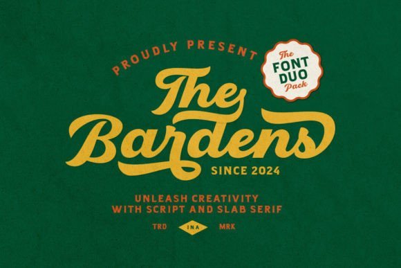
Bardens is a thoughtful retro font duo that pairs a flowing script with a bold slab serif to create a nostalgic, vintage voice. The script shows lively strokes, swashes, and elegant terminals that read like hand-lettering, while the slab brings blocky, geometric letterforms and even stroke widths for a stable counterpoint. Together they form a visual rhythm that feels handcrafted yet composed, ideal for identities that want personality without losing structure.
What makes Bardens stand out is how the slab’s strong, geometric skeleton anchors the script’s motion-this balance echoes the best of modern Geometric Logo Fonts trends by marrying ornament with order. That stability makes Bardens particularly effective for sports crests, retro café signage, craft packaging, and any logo that needs both flair and legibility at small scales. The duo’s contrasts also create excellent layered lockups: script headlines over slab submarks or opposite-color treatments for instant vintage impact.
Technically, Bardens includes alternates, ligatures and expanded punctuation to support polished branding workflows, plus multilingual glyphs for broader markets. It responds well to distressed textures, warm duotones, and stamped effects but also holds up crisply in clean vector layouts, so you can shift from rustic posters to glossy product labels without losing character. Pay attention to optical kerning when pairing the script with the slab at display sizes to preserve rhythm and readability.
My Recommendation: I’d reach for Bardens when a project needs a handcrafted, nostalgic persona with a reliable geometric backbone-think craft breweries, retro sports teams, and boutique packaging. Its script brings warmth and personality while the slab supplies structure for clear logotypes and submarks. Use it when you want vintage charisma without sacrificing modern logo adaptability.
11. Extra Bold Font
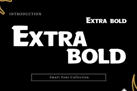
Extra Bold is a heavyweight display typeface engineered to dominate visual hierarchies. Its oversized strokes and blocky silhouettes make each character read like a visual statement, ideal for headlines, billboards, and identity marks that must be legible from a distance. The face leans into industrial strength through tight counters and occasional geometric cutouts that create a contemporary, assertive profile.
Built for high-impact contexts, this typeface loves high-contrast layouts: pairing it with neon accents, cinematic photography, or gritty textures intensifies its aggressive energy. Use it for sports branding, gaming logos, or tech hardware labels where power and modernity are the message. Because of its mass, spacing plays a critical role-generous tracking and optical kerning often calm the density and improve legibility.
Extra Bold also performs well when layered with secondary lighter weights or paired against minimalist sans serifs for contrast; it can act as the hero while simpler faces handle body copy. When crafting packaging or posters, try negative-space treatments or geometric masks to reveal portions of the characters for a contemporary, editorial feel. Overall, its confident silhouette provides immediate recognition and a strong foundation for bold brand systems.
My Recommendation: I recommend Extra Bold when your design brief demands presence above all else-big posters, stadium signage, or bold label systems. Its sheer mass ensures messages are noticed, and with careful spacing it becomes surprisingly versatile across print and digital. Use it to communicate strength, urgency, or high-octane energy where readability at scale is essential.
12. Duoline Modern Font
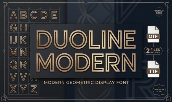
Duoline Modern is a sleek, geometric display face defined by its striking double-line inline construction. The parallel strokes create a crisp, technical rhythm that feels simultaneously futuristic and athletic, giving headlines and logotypes a refined, engineered finish. Because the strokes are evenly spaced, the result is a minimal yet decorative appearance that reads clearly in medium-to-large sizes.
This font excels at contemporary branding tasks: tech identities, modern monograms, streetwear labels, and architecture-focused projects that benefit from a clean, modular aesthetic. Its inline detail adds visual intrigue without overwhelming negative space, making it suitable for monograms and badges where geometric precision matters. For best results, pair Duoline Modern with a solid geometric sans or a thin serif to balance its decorative nature in multi-tier layouts.
On the technical side, Duoline scales beautifully and holds its parallel lines at high resolutions, but requires careful color contrast to preserve the line detail at smaller sizes. Consider bold color blocks, metallic inks, or embossed printing to emphasize the inline effect in physical applications. The typeface’s modern cadence makes it a smart choice when you need a logo or headline that reads as both contemporary and unmistakably crafted.
My Recommendation: I’d choose Duoline Modern for brands seeking a contemporary, architectural look-think design studios, tech startups, and premium streetwear labels. Its parallel-line motif gives logos a signature detail that’s distinct without being ornate. Use it when you want a sleek, engineered identity that scales well from product tags to storefront signage.
13. Bilgist Font
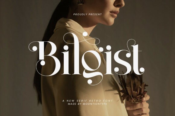
Bilgist arrives with the poise of high-fashion typography and a mid-century sensibility that immediately commands attention. Its high-contrast strokes, graceful ball terminals, and flourished swashes create a refined retro voice that reads as both handcrafted and editorial. At display sizes the type’s sculpted shapes reveal unique details-especially the curled “g” and the distinctive “t”-that lift a brand identity above generic serif choices.
Technically, Bilgist balances ornament with clarity: letterforms are wide enough to preserve the swashes without sacrificing legibility, and its contrast makes it ideal for headlines and premium packaging where texture matters. The face performs best in large compositions where its decorative endings and dramatic counters can breathe; in smaller sizes, the contrast requires careful tracking to avoid visual crowding. Designers will appreciate that the font keeps decorum without tipping into caricature, making it suitable for editorial mastheads and boutique collateral.
For branding systems, Bilgist is an excellent partner for pared-back companions because it wants space to shine. Used alongside a minimal geometric sans or a restrained monoline script the serif’s ornamentation becomes an accent rather than the whole story. It also pairs surprisingly well with Geometric Logo Fonts when you need a serif to bring warmth and handcrafted nuance to a crisp, geometric wordmark.
Practical workflow perks include PUA-encoded decorative glyphs and alternate swashes that are easy to access in most design apps; that reduces fiddly OpenType lookups when crafting layered headlines or stylized logotypes. Ideal applications include luxury packaging, boutique hotel stationery, fashion editorials, and wedding invitations-anywhere you want curated elegance and a sense of quiet, timeless luxury.
My Recommendation: I’d reach for Bilgist when I want a serif that feels editorial and luxurious without being overly ornate. Its dramatic contrasts and swashes give a premium, tactile quality that’s perfect for high-end packaging and fashion identities. Use it when you need a headline voice that reads as both classic and unexpectedly modern.
14. Mega Size Font – Geometric Logo Fonts
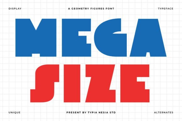
Mega Size is a display-first sans that emphasizes bold geometry and solid, rounded shapes to create an immediate visual impact. Each character is built to be sturdy and legible at large scales, with uniform stroke weights and closed counters that hold up under bright colors and strong contrast. The overall effect is playful yet disciplined-ideal for visual systems that demand personality without complexity.
Where this typeface particularly shines is in applications that need an assertive, minimalist presence: headlines, posters, apparel, and package fronts benefit from its chunky proportions and clean terminals. Kerning is optimized for all-caps logotypes, and the generous x-height keeps lowercase combinations readable when words are stacked or condensed. Its simplicity makes it a reliable choice for fast-paced production where clarity and scale matter most.
Designers will appreciate how Mega Size occupies space and creates memorable negative-space shapes inside counters and between letters, which often becomes a core element of a brand’s visual identity. The font’s friendly geometric feel pairs well with photographic layouts and bold color blocks, and it can be offset by a thin serif or a subtle script when a softer touch is needed. Because of its strong silhouette, it’s also well-suited for vinyl, signage, and merchandise where silhouette recognition is key.
Download Mega Size Font – Geometric Logo Fonts
My Recommendation: I’d use Mega Size when a brand needs to shout-think retail window graphics, event posters, or snack packaging that must read from a distance. Its bold geometry creates instant recognition and pairs well with minimal layouts and vibrant palettes. It’s my go-to when scale, simplicity, and a playful modern tone are the brief.
15. Maode Family Font
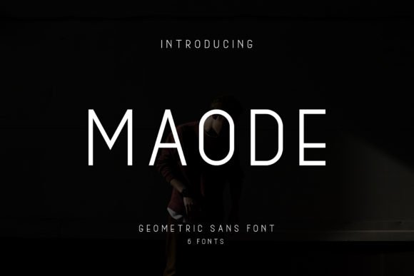
Maode Family is a thoughtfully restrained geometric sans-serif collection built around clarity and modular harmony. The family’s consistent stroke widths and geometric construction give it a contemporary, balanced voice that reads cleanly across both print and digital contexts. Because the styles in the family were designed to work together, you can quickly create typographic hierarchies without introducing visual dissonance.
In practice, Maode excels at identity work where simplicity and cohesion are priorities: wordmarks, business cards, album covers, and quote graphics all benefit from its even rhythms and neutral tone. Its geometric letterforms lend themselves to minimalist compositions and negative-space logo treatments, while slightly condensed weights allow compact layouts to stay legible. The family’s versatility shines in systems that require flexible scale and consistent character across different touchpoints.
Pairing options are straightforward: use heavier weights for emphatic headlines and lighter weights for supporting captions to maintain contrast without resorting to decorative accents. Designers will find the family useful for modular grid systems and UI components because the predictable geometry simplifies spacing decisions. Overall, Maode is a quiet workhorse that supports a broad range of modern branding needs.
My Recommendation: I recommend Maode Family when you need a dependable geometric family that harmonizes across mediums-perfect for startups, tech brands, or editorial projects focused on minimalism. Its multiple weights let you build hierarchy quickly while preserving a cohesive aesthetic. I’d choose it for any project that values clean geometry and straightforward, timeless typography.
16. Befote Font
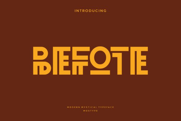
Befote blends a mystical aura with crisp, contemporary geometry, forming letterforms that feel both ancient and engineered. Its glyphs combine sharp angles and rounded counters to create a visual tension that reads well at logo sizes and as striking display text. The overall effect makes Befote ideal for brands that want to convey ritual, mystery, or artisanal craft without sacrificing modern polish.
As one of the more expressive Geometric Logo Fonts, Befote thrives in contexts where symbolism matters: boutique packaging, film titles, tarot-leaning social graphics, and identity marks that lean tribal or fantasy. The type’s distinctive terminals and contained shapes create memorable monograms and wordmarks, while remaining legible across web and print. Pair it with simple sans or neutral serif supports to let its ornamental geometry lead the composition.
Technically, Befote performs well at headline and logo scales thanks to generous stroke contrast and purposeful spacing; the unique shapes reward tight tracking for compact marks and looser breathing for larger posters. Designers will appreciate how its modular forms lend themselves to custom ligatures and brand-specific tweaks, making it a flexible starting point for concept-driven identities. Consider using subtle texture or metallic inks to amplify the font’s mystical character in physical collateral.
My Recommendation: I’d reach for Befote when creating identities that need a ritualistic or fantasy edge without feeling dated. Its sculpted geometric letterforms make logos and titles stand out, and it pairs well with pared-back supporting type. Use it on boutique packaging, film posters, or lifestyle brands that benefit from a mystic, artisanal personality.
17. Slogfe Font
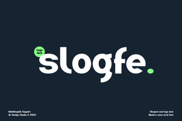
Slogfe is a clean, contemporary sans serif with a soft geometric skeleton and subtly rounded terminals, offering a neutral yet distinctive voice for modern brands. The balanced curves and measured proportions deliver clarity at both small sizes and in bold display treatments, giving it broad usability across touchpoints. Its restrained personality makes Slogfe an excellent backbone for systems that demand consistency without looking generic.
Optimized for branding and logo work, Slogfe supports tech startups, fashion labels, and minimalist packaging with equal confidence; the gentle geometry reads as approachable but professional. In logotype work its letterforms form tidy, memorable wordmarks while remaining legible across digital interfaces and print. Designers can use heavier weights for impactful headlines and lighter styles for UI or editorial body text to maintain a cohesive voice.
Stylistically versatile, Slogfe pairs well with condensed display faces or a modest humanist serif for contrast, and its neutral rhythm simplifies layout decisions. Its clarity and modernism make it a reliable choice for scalable identity systems where readability and a contemporary aesthetic are priorities. For tight user interfaces, slightly increased tracking helps preserve legibility without losing character.
My Recommendation: I recommend Slogfe when you need a dependable, modern sans that won’t overpower your brand visuals. It’s especially useful for tech or lifestyle projects that require clean logotypes and flexible UI typography. Use it when you want a polished, approachable look that scales from app interfaces to storefront signage.
18. Carteny – Geometric Sans Family Font
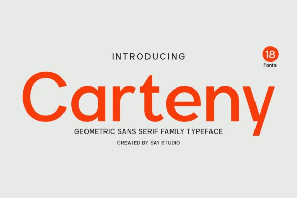
Carteny is a purposeful geometric sans family built around clarity, proportion, and typographic harmony, offering a refined toolkit for comprehensive brand systems. Across its range of weights, the type preserves consistent character widths and carefully considered counters, producing smooth typographic rhythms whether used for headlines or supporting copy. The family’s precision makes it feel engineered yet warm, bridging corporate formality and modern design sensibility.
With its 18 styles, Carteny adapts to diverse tasks from bold logo marks to subtle UI text, allowing designers to establish layered hierarchies without introducing new typefaces. Its geometric construction supports clean logotypes and monogram work while the lighter weights are elegant choices for editorial and interface typography. Thoughtful spacing and optical balance reduce the need for heavy manual kerning in most branding applications.
Carteny excels in systems thinking: it’s ideal for design teams building responsive sites, product interfaces, or multi-channel campaigns where type needs to remain consistent across screens and print. The family’s broad weight palette enables disciplined typographic scale and nuanced emphasis without visual clutter. For polished corporate or startup identities that require endurance and visual clarity, Carteny is a practical, design-forward option.
Download Carteny – Geometric Sans Family Font
My Recommendation: I would choose Carteny when creating a full identity system that must stay cohesive across digital and print. Its wide weight range and geometric neutrality make it excellent for logos, UI, and editorial layouts alike. Use Carteny when you need a timeless, professional type family that supports scalable, well-structured brand communications.
19. Tanod Font
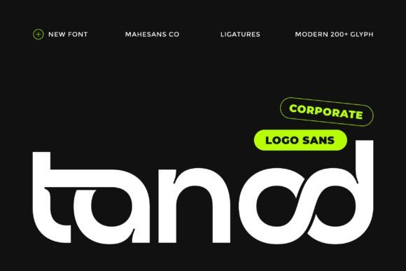
Tanod is a modern sans designed to read like high-end typography at first glance. Positioned among top-tier Geometric Logo Fonts, it intentionally pairs a crisp geometric skeleton with tasteful quirks so marks feel premium without resorting to ornament. The result is a refined logotype voice that reads luxe and deliberate.
Structurally, Tanod relies on sharp terminals and controlled stroke widths that preserve clarity at large display sizes while remaining legible in compact applications. Small idiosyncrasies in counters and joins give each letter a subtle personality, preventing the type from flattening into a generic corporate tone. It feels confident on signage, packaging, and hero headlines.
Because it was engineered for identity work, Tanod behaves predictably in wordmarks and stacked lockups alike. Tight tracking, generous apertures, and balanced proportions make it straightforward to pair with secondary text families or iconography. For teams building brand systems, Tanod offers the visual authority of a luxury typeface with practical versatility for digital and print environments.
My Recommendation: I’d reach for Tanod when a brand needs to read like an upscale product or service without fuss. Its refined geometric construction gives logos immediate prestige, while the thoughtful letter quirks keep identities memorable. Use it for premium retail, tech start-ups that want to appear established, or corporate marks that need both clarity and character.
20. Mansfield Font
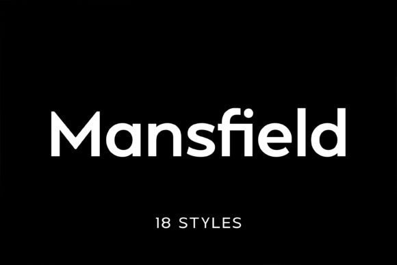
Mansfield channels mid-century modern type principles into a clean, contemporary sans-serif suited to broad creative needs. Its geometric letterforms and minimal stroke contrast reference classics like Futura while updating proportions for today’s screens and print. The result is a neutral but distinct voice that complements rather than competes with imagery and layout.
The family ships with a deep weight range and companion italics, giving designers precise control over hierarchy from bold headlines to body copy. Tall x-heights and measured counters improve legibility across sizes, and the crisp edges maintain impact at display scale. This flexibility makes Mansfield equally comfortable in magazines, banners, or product packaging.
For identity work, Mansfield’s restrained geometry creates clean wordmarks that scale reliably and pair well with expressive logo marks. Its neutral temperament also makes it a strong choice for corporate branding systems or editorial design where typographic consistency is critical. Overall, it’s a dependable geometric sans with plenty of practical options for real-world projects.
My Recommendation: I recommend Mansfield when you need a timeless, versatile sans that won’t distract from content. Its broad weight spectrum and polished geometry make it excellent for editorial systems, brand refreshes, and UI projects that require a cohesive typographic palette. Use it when clarity and flexibility are top priorities.
21. Bogea Font
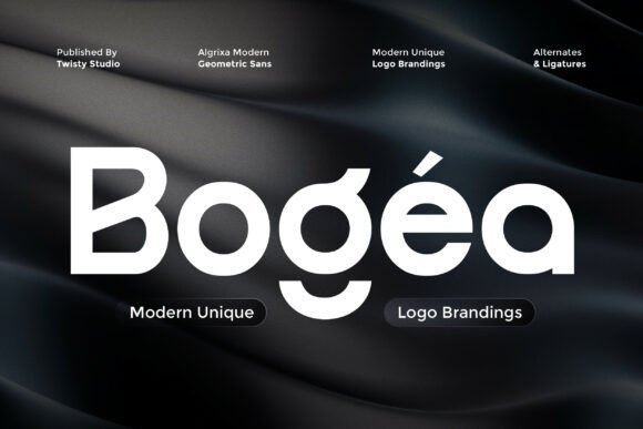
Bogea is a precise geometric sans that emphasizes balance and sculpted curves for polished branding. The typeface reads as contemporary and purposeful, with even strokes and rounded counters that create a calm, approachable aesthetic. Its engineered regularity makes it an excellent base for logotypes that require a restrained yet memorable presence.
The standout feature is a suite of alternate characters that let designers customize common shapes without heavy manipulation. Alternates open up possibilities for unique ligatures, bespoke initials, and compact wordmarks-so a simple change of a single letter can shift a brand’s tone from minimal to bespoke. These options are especially helpful when crafting monograms or tight-seal logos.
Bogea performs well across applications: from minimalist packaging to bold storefront signage or sleek web headers. Its geometry supports tight tracking and robust kerning, which keeps long names readable while allowing for tighter, more modern wordmarks. In short, Bogea is a restrained but adaptable choice for designers seeking subtle originality in their identity work.
My Recommendation: I’d pick Bogea for projects that need a clean, contemporary look with room for typographic customization. The alternates let you create distinctive marks without custom lettering, making it great for boutique brands, product labels, and modern corporate identities. Its balanced shapes also make it reliable for both print and digital touchpoints.
22. Quark Font
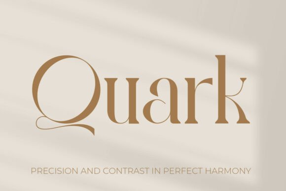
Quark is a luxury stencil serif that juxtaposes classical serif rhythm with modern geometric cutouts, yielding a very distinct display voice. The high‑contrast strokes feel editorial and premium, while the stencil apertures create bold negative space that reads like a logo system; this makes Quark particularly effective among Geometric Logo Fonts for brands that want sculpted elegance rather than soft minimalism.
On close inspection the letterforms reveal careful modulation: terminal shapes and sharp serifs harmonize with rounded counters to maintain legibility at large sizes. Quark performs best as a headline or monogram typeface where the stencil details can breathe-think jewelry marques, couture labels, and luxury packaging that need a strong signature mark.
Pair Quark with a neutral sans or a fine‑lined script to balance its theatrical presence; its stencil gaps also translate well into cut vinyl, embossing, and laser‑cut signage. I found the kerning and contrast especially well tuned for tight logo lockups, and its geometric undertones give designers a refined toolkit for upscale identities.
My Recommendation: I’d reach for Quark when crafting high‑end brand identities that demand both tradition and a contemporary twist. Its stencil geometry cuts through visually, making it ideal for jewelry, luxury hospitality, or wedding suites where a distinctive mark is essential. Use it at large sizes and combine it with simpler typefaces to keep the overall system elegant and readable.
23. Dilabo Font
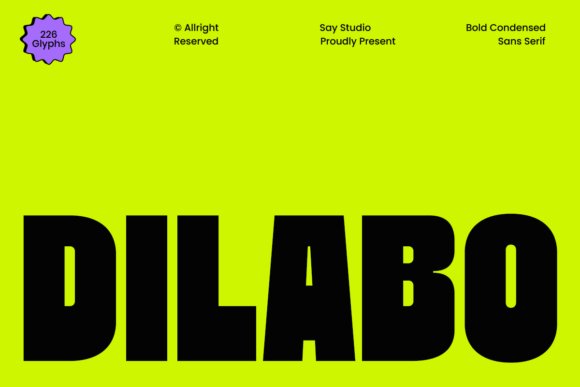
Dilabo is a bold, condensed sans serif engineered for maximum visual impact in display settings. Its tall x‑height and compact width create a commanding silhouette that grabs attention on posters, signage, and thumbnails-perfect when space is tight but presence is non‑negotiable. The geometric construction gives Dilabo a modern, urban attitude without relying on ornamentation.
The font’s heavy stroke and geometric terminals produce excellent legibility at headline sizes while also delivering strong logo potential for sports, streetwear, and industrial brands. Condensed letterspacing allows designers to build dense typographic blocks or tight lockups for logotypes, while generous counters prevent the forms from feeling claustrophobic.
For branding systems, Dilabo pairs well with light sans or slab serifs to create hierarchical contrast; its assertive weight makes it a natural choice for call‑to‑action copy and packaging front panels. Given its condensed nature, it’s best used as a display face rather than for long passages of text, and careful tracking adjustments will keep word shapes readable at smaller sizes.
My Recommendation: I’d use Dilabo when a project needs bold presence in a compact footprint-think sports identities, event posters, streetwear labels, or product packaging. Its condensed geometry helps maximize impact without sacrificing legibility, making it ideal for tight layouts and bold headlines. Pair it with lighter supporting faces to create balance in identity systems.
24. Rosorup Font
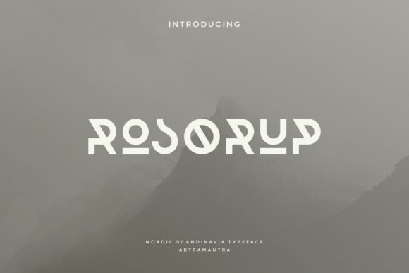
Rosorup channels a tribal, rune‑inspired aesthetic through a geometric all‑caps design that reads both historic and contemporary. The glyphs are angular and dynamic, borrowing the visual language of Nordic runes while remaining faithful to modern typographic construction-this creates a striking emblematic quality for posters, festival identity, and craft labels.
Because Rosorup leans heavily on uppercase character shapes and decorative motifs, it’s especially powerful for short headlines, logos, and wordmarks where atmospheric tone matters more than extended copy. The font’s geometric strokes and pointed terminals convey rugged authenticity, which works well for outdoor brands, craft beverages, and themed editorial spreads seeking a raw, hand‑forged vibe.
Use Rosorup sparingly and give it ample breathing room; the strong forms can dominate a layout, so counterbalance with neutral body type and restrained color palettes. When used thoughtfully, its tribal motifs can elevate packaging, posters, and event branding with a memorable, heritage‑driven visual signature.
My Recommendation: I’d pick Rosorup for projects that want a bold, cultural edge-like craft beers, outdoor gear, music festivals, or vintage‑inspired packaging. Its rune‑like geometry creates instant mood and is ideal for short headlines or logo marks rather than body text. Combine it with simple sans serifs and natural textures to amplify its authentic, hand‑crafted character.
25. Lune Night Font
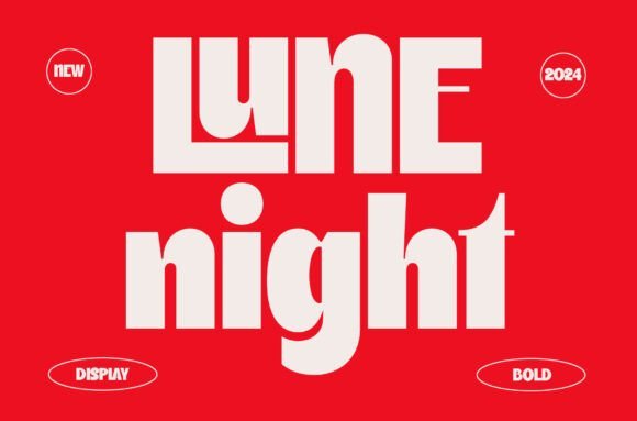
Lune Night is a high-impact modern display typeface with an extra-bold presence and sculpted geometric motifs. Its chunky strokes feel authoritative without becoming clumsy, balancing heavy weight with carefully trimmed counters and clean terminals to maintain legibility at large sizes. The result is a contemporary attitude that reads as both confident and refined.
What makes this design memorable are the built-in stylistic ligatures and interlocking letterforms that suggest custom lettering rather than an off-the-shelf font. Details like the nested U inside the L and tight, purposeful joins let brand marks and headlines feel bespoke – a practical reason to include it among Geometric Logo Fonts when you need distinctive, architecture-driven letterforms. These ornaments are subtle enough to remain readable while providing visual signature points.
Technically versatile, Lune Night ships in OTF, TTF and WOFF with multilingual support and thoughtfully spaced numerals for typographic hierarchy. It performs exceptionally in poster art, bold logos, magazine covers and photography overlays where impact matters most; pairing it with a restrained sans for body copy keeps compositions clean. Designers will appreciate its strong baseline rhythm and the way it commands attention without sacrificing balance.
My Recommendation: I recommend Lune Night when you need a logo or headline that reads like a custom-crafted mark-its interlocking forms give instant character while the heavy weight ensures visibility. Use it for bold branding, editorial covers, and posters where geometric precision and visual signature are priorities. Pair with neutral body type to let the display face remain the focal point.
26. Archides Font
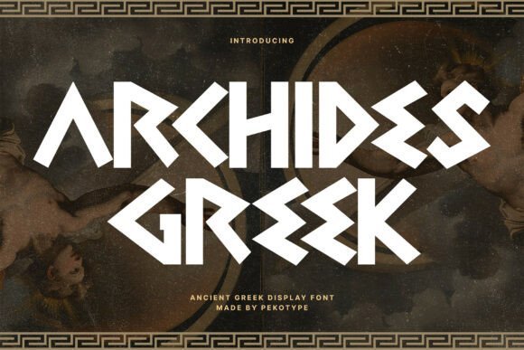
Archides channels classical Greek letterforms into a contemporary display face that feels both monumental and stylized. Each glyph embraces angular geometry and deliberate stroke contrasts, evoking stone-carved inscriptions while remaining fresh for modern layouts. The font’s presence is theatrical, making it an effective choice where gravitas and cultural resonance are required.
At display sizes, Archides reveals distinctive terminals and sharp serifs that frame counters like architectural details, lending titles a sculptural rhythm. This character makes the typeface particularly suitable for game branding, epic film posters, and heritage-driven identity work that needs an instantly recognizable voice. Designers can exploit its dramatic capitals for wordmarks and logotypes that must feel historic yet bold.
Available in standard desktop and web formats, Archides supports extended Latin sets and includes carefully tuned spacing for headline use. It thrives in condensed layouts and on merchandise where its carved aesthetic reads clearly from a distance. For projects that want to borrow the authority of antiquity without literal ornamentation, this font is a strong, versatile choice.
My Recommendation: I would reach for Archides when creating titles or logos that need a sense of epic history or cultural weight, such as fantasy games, period films, or museum identity. Its carved geometry gives immediate personality while remaining adaptable to modern design systems. Combine it with minimal textures and muted color palettes to maximize its dramatic impact.
Whether you need a minimalist monoline or a bold modular display, these 26 selections make it easy to find a geometric typeface that strengthens your brand voice and scales across touchpoints.
Browse the collection, test pairings, and use structured letterforms, negative space, and contrasting weights to craft a memorable logo that communicates clarity and confidence.