21 Punchy Bold Display Fonts for Posters (2026)
Bold display fonts for posters have to win a room. A poster is read from across a street or a hall, so the type needs weight, contrast and a shape that stays clear when it fills a wall. The best bold display fonts for posters are built for one or two huge words, not paragraphs, and they make those words impossible to ignore.
This guide sorts 21 fonts by style, bold display serifs, athletic faces, high-energy display, condensed and decorative options, so you can match the font to the event.
For headline serifs, the display serif fonts guide helps, and the vintage display fonts guide adds retro options.
- How to use bold display fonts for posters
- Bold display serifs for poster headlines
- Athletic and collegiate poster fonts
- High-energy and experimental display fonts
- Condensed bold display for tight posters
- Decorative and blackletter poster fonts
- Fonts FAQ
How to use bold display fonts for posters
A poster is a distance medium. A few rules keep bold display fonts for posters working from across a room.
- One or two words: let the display face carry the hook, not the body.
- Contrast with calm: pair the bold face with a plain sans for details.
- Fill the space: display type wants to be huge, so push it to the edges.
- Test at distance: print a draft and step back to check it reads.
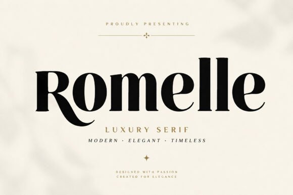
Bold display serifs for poster headlines
Start here. These bold display fonts for posters lead a headline with high-contrast serif drama and real presence.
Fashion Wacks
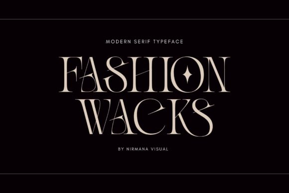
Fashion Wacks is a bold, elegant serif with character. Among bold display fonts for posters it brings a fashion-led weight to a headline, confident without losing class. Use it large for the hook and a clean sans for the rest. The bold serif forms read clearly at distance. For a fashion or lifestyle poster that wants a strong, elegant headline, Fashion Wacks is a characterful display serif worth trying.
Fashion Pressed
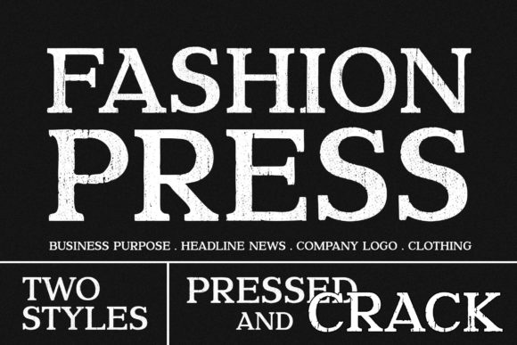
Fashion Pressed is a cool, bold, assertive serif. Among bold display fonts for posters it has a pressed, letterpress-style confidence, good for an editorial or event headline. Use it huge for one line and pair it with a plain sans for detail. The assertive forms read strong at distance. For a poster that wants a bold, confident serif statement, Fashion Pressed is a punchy display serif worth a look.
Rich Bold
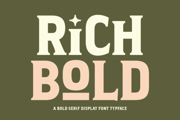
Rich Bold is a striking serif display font built to make an impact. Among bold display fonts for posters it is a flexible headline face, bold enough for a wall yet refined enough for a premium event. Use it large for the hook with a clean sans for support. The strong forms read at distance. For a poster that wants a bold, rich serif headline, Rich Bold is a dependable display serif worth trying.
Segara
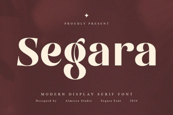
Segara is a commanding high-fashion display serif with unmistakable presence. Among bold display fonts for posters it leads a fashion or beauty headline with sculpted contrast and confidence. Use it huge for one or two words and let a plain sans handle details. The dramatic forms read across a room. For a poster that wants pure high-fashion drama, Segara is a striking display serif worth a close look.
Bolde Luxe

Bolde Luxe is a sophisticated, opulent serif. Among bold display fonts for posters it brings luxury weight to a headline, suiting a premium launch or gala poster. Use it huge for one or two words and keep the rest plain. The refined bold forms read expensive at distance. For a high-end poster that wants a bold, luxurious serif headline, Bolde Luxe is a graceful display serif worth a look.
Charnoir
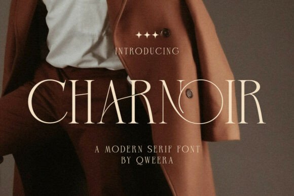
Charnoir is a high-class serif that blends dramatic curves with bold weight. Among bold display fonts for posters it brings theatrical drama to a headline, good for fashion, film and event work. Use it large for the hook where the curves can show, with a plain sans for detail. The dramatic forms read striking at distance. For a poster that wants a bold, dramatic serif statement, Charnoir is a distinctive display serif worth trying.
Alurane
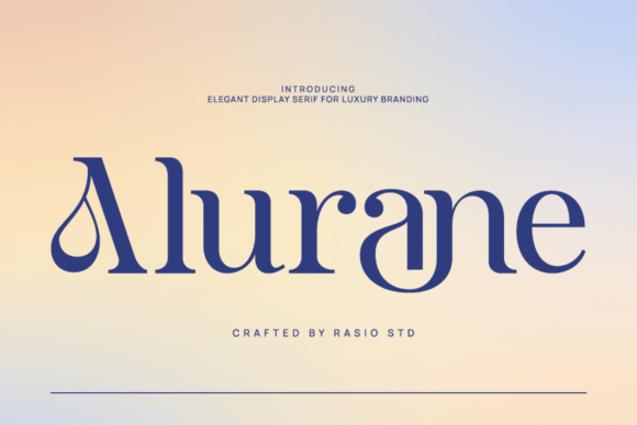
Alurane is a high-end editorial display serif with refined character. Among bold display fonts for posters it brings a magazine-cover sophistication to a headline, suiting fashion and culture posters. Use it large for one line and a clean sans for the rest. The editorial forms read polished at size. For a poster that wants an editorial, high-end serif headline, Alurane is a graceful display serif worth a look.
Athletic and collegiate poster fonts
For sport, events and varsity themes, these athletic faces bring a bold, team-jersey energy to a poster.
Athletic College
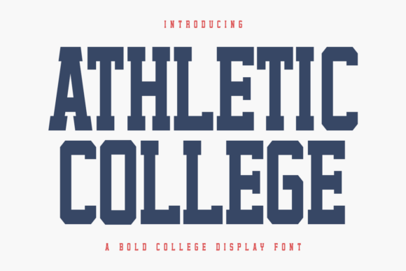
Athletic College is a bold, powerful collegiate display font with varsity energy. Among bold display fonts for posters it is the team-jersey choice, ideal for sports, events and school-spirit work. Use it huge for the headline and numbers, with a plain sans for detail. The strong forms read from the back of a hall. For a sports or event poster that wants athletic energy, Athletic College is a powerful display font worth trying.
Athletic College Outline
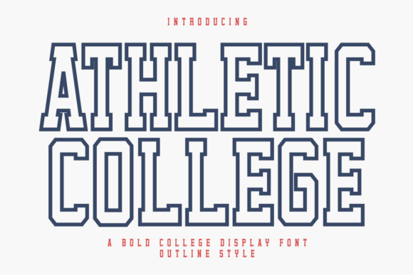
Athletic College Outline is the outline cut of the collegiate display family. Among bold display fonts for posters it layers beautifully over the solid version for a two-tone, jersey-style headline. Use the outline for depth behind the solid, or alone for a lighter touch. The outline forms read bold at distance. For a sports or event poster that wants a layered varsity headline, Athletic College Outline is a useful display cut worth a look.
Rock Away
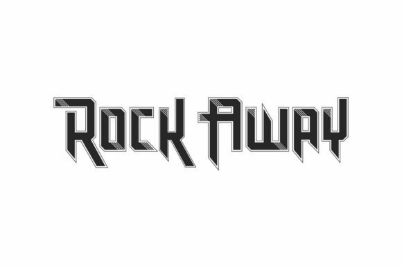
Rock Away is an exclusive display font with a racing and music theme. Among bold display fonts for posters it brings high-octane, gig-poster energy, ideal for music, motorsport and youth events. Use it huge for the headline and a plain sans for detail. The energetic forms read loud at distance. For a poster that wants speed and rock-show attitude, Rock Away is an energetic display font worth trying.
High-energy and experimental display fonts
For music, festivals and youth brands, these high-energy and experimental bold display fonts for posters bring movement and edge.
Kouti
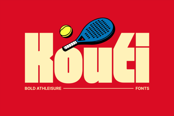
Kouti injects a burst of energy into a design. Among bold display fonts for posters it is the high-energy option, with lively forms that suit festivals, sales and youth brands. Use it large for the hook and keep support plain so it stays the star. The energetic shapes read fun at distance. For a poster that wants an upbeat, high-energy headline, Kouti is a punchy display font worth a look.
Ut Milliffigh
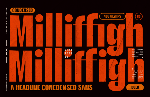
Ut Milliffigh is a typeface made for impact, with a modern, decisive build. Among bold display fonts for posters it is a clean heavyweight, carrying a headline with weight and a contemporary edge. Use it huge for one or two words and a plain sans for detail. The strong forms read clearly at distance. For a modern poster that wants pure impact, Ut Milliffigh is a powerful display font worth trying.
Rolyzim
Rolyzim is an abstract, experimental display face inspired by futuristic systems. Among bold display fonts for posters it is the avant-garde choice, ideal for an art show, a club night or a design-led brand. Use it huge for a short hook where the unusual forms can be read, with a plain sans for clarity. The experimental shapes read striking. For a poster that wants a futuristic, arty headline, Rolyzim is a distinctive display font worth a careful look.
Boho Tattoo
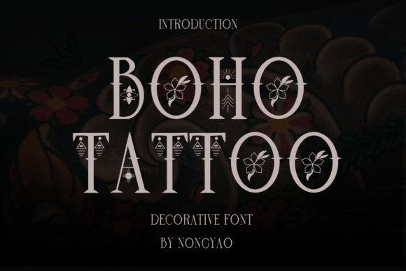
Boho Tattoo blends spiritual geometry, botanical art and a free-spirited line. Among bold display fonts for posters it suits festivals, wellness events and bohemian brands wanting a hand-inked, mystical feel. Use it large for the headline and decorative flourishes, with a clean sans for detail. The artistic forms read characterful at size. For a poster that wants a boho, tattoo-style headline, Boho Tattoo is an expressive display font worth a look.
Condensed bold display for tight posters
For long headlines or narrow formats, these condensed bold faces stack a message tall and loud.
Vion
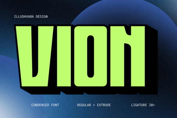
Vion is a modern condensed bold logo font built to deliver a strong message. Among condensed bold display fonts for posters it stacks a long headline tall and tight while staying punchy. Use it large for the hook and a plain sans for detail. The condensed forms read bold in a narrow space. For a poster with a long headline or a tall format, Vion is a strong condensed display font worth trying.
Cinematic
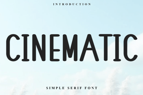
Cinematic is a tall, condensed serif with a refined, modern take on film-title type. Among bold display fonts for posters it brings a movie-poster gravity to a headline, stacking words tall with elegant contrast. Use it large for the title and a plain sans for credits. The condensed forms read dramatic. For a film, event or fashion poster that wants a cinematic headline, Cinematic is a striking condensed display serif worth a look.
Fashion Victim
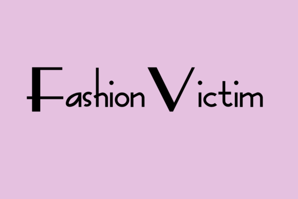
Fashion Victim is an elegant, modern sans with a neat, confident character. Among bold display fonts for posters it is the clean condensed-feeling option, good for a fashion or minimalist poster that wants impact without serifs. Use it large for the hook and the same family for detail. The clean forms read sharp at distance. For a modern poster that wants a bold sans headline, Fashion Victim is a sharp display sans worth trying.
Decorative and blackletter poster fonts
For character and grit, these decorative and blackletter faces give a poster a hand-made, distinctive edge.
Black Male
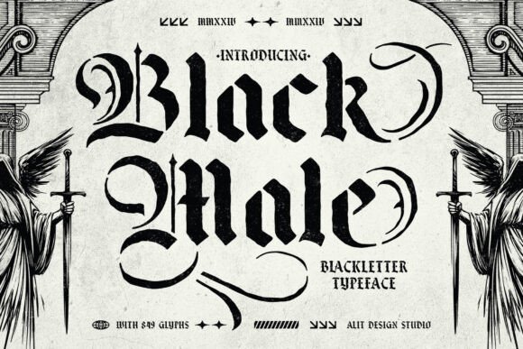
Black Male is a blackletter stencil face with a crafted, urban edge. Among decorative bold display fonts for posters it brings gothic grit and streetwear attitude, suiting music and bold drops. Blackletter is hard to read in bulk, so keep it to one or two words and pair it with a clean sans. The heavy forms read strong at distance. For a poster that wants a bold, gothic headline, Black Male is a striking decorative font worth a careful look.
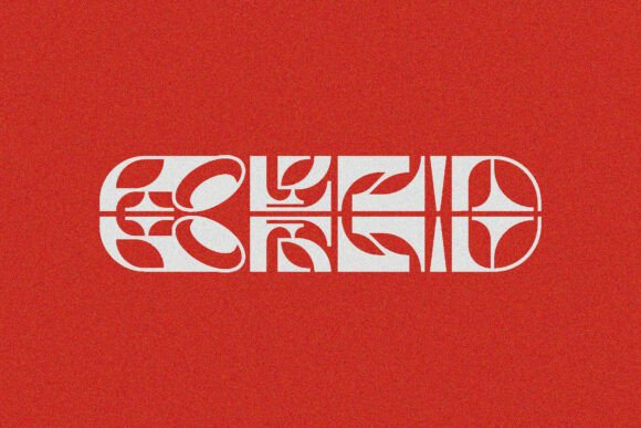
Cekona
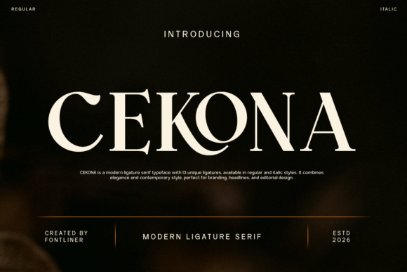
Cekona is a modern ligature serif that brings refined elegance through joined letterforms. Among bold display fonts for posters it is the dressier decorative option, lending a headline a custom, designed feel. Use the ligatures where the words allow and keep it large for one line. The refined forms read elegant at size. For a poster that wants a decorative, ligature-rich serif headline, Cekona is a graceful display font worth a look.
Hibrida
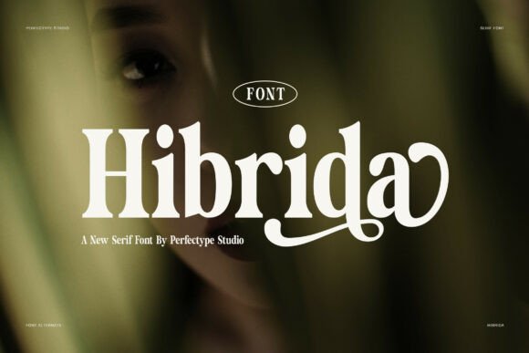
Hibrida is a contemporary serif with a strong storytelling character. Among bold display fonts for posters it brings a modern editorial weight to a headline, balancing drama and readability. Use it large for the hook and a plain sans for detail. The contemporary forms read confident at distance. For a poster that wants a modern, story-led serif headline, Hibrida is a characterful display font worth trying.
Vonca
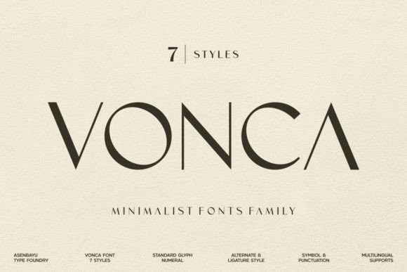
Vonca is a modern minimalist family built around simplicity and elegance. Among bold display fonts for posters it is the clean counterpoint, useful when a poster wants impact through scale rather than ornament. Use a heavy weight huge for the headline and a light one for detail. The minimal forms read calm and confident. For a poster that wants a clean, scaled-up minimalist headline, Vonca is a tidy family worth a look.
Fonts FAQ
What are the best bold display fonts for posters in 2026?
The best bold display fonts for posters combine weight with a clear shape that reads at distance. From this roundup, Segara and Charnoir lead with dramatic serifs, Athletic College brings varsity energy, Rock Away suits music, and Vion handles tight formats. Pick one display face for the headline and keep details in a plain sans.
Can display fonts be used for body text on a poster?
No, display fonts are built for one or two large words, not reading. Their weight and character make a headline unforgettable but tire the eye in paragraphs. On a poster, use the display face for the hook and a clean sans for dates, prices and the small print so the whole thing stays legible at distance.
How big should poster type be?
Big enough to read from where your audience will stand, which usually means the headline fills a large share of the poster. The exact size depends on the venue and viewing distance, so print a draft, step back to that distance, and confirm the headline reads instantly before you finalise the design.
Choosing the right bold display font for your poster
Choosing bold display fonts for posters is about distance and impact: pick one face with the weight and shape to read across a room, give it one or two huge words, and let a plain sans carry the details. Match the style to the event, print a draft, and step back before you commit.
From here, the display serif fonts guide helps with headline serifs, and the vintage display fonts guide adds retro options. For background, this display typeface overview is a useful reference. Print a draft and read it from across the room before you commit.
Affiliate disclosure: some links on this page are affiliate links. If you buy a font through one of them, fontfinds.com may earn a small commission at no extra cost to you. We only feature fonts we think are worth your time.