15 Bold Display Serif Fonts for Headlines (2026)
Display serif fonts for headlines have one job: to be read big and remembered. A headline is seen at a glance, so the type needs contrast, character and a clear shape that survives being blown up to a poster or a full-width title. The best display serif fonts for headlines are built for size, not body text.
If you are new to choosing display type, the primer below explains what works at scale. After that, the picks are grouped by style, high-contrast, bold, stencil and minimal.
For wider serif use, the serif fonts for fashion magazines guide helps with covers, and the bold display fonts guide goes beyond serifs.
- What makes display serif fonts for headlines work
- High-contrast display serifs for elegant headlines
- Bold display serifs for impact
- Stencil and decorative display serifs
- Minimal and condensed display serifs
- Fonts FAQ
What makes display serif fonts for headlines work
Before the picks, a quick primer. The display serif fonts for headlines that hold up tend to share a few traits.
- Contrast or weight: a clear thick-to-thin stroke or a heavy build reads at a distance.
- Size, not length: a display serif only needs to look great large and short.
- One star: pick a single display serif for the headline and a plain sans for body.
- Test big: set it at true headline size and step back before you commit.
High-contrast display serifs for elegant headlines
For elegant titles, these high-contrast display serif fonts for headlines bring drama through sharp thick-to-thin strokes.
Dihot
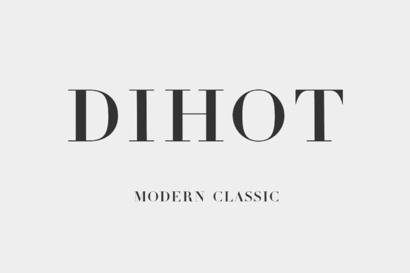
Dihot is a modern classic serif inspired by the famous Didot tradition, all crisp contrast and poise. Among high-contrast display serif fonts for headlines it reads as premium fashion the moment it appears. Use it large where the hairline strokes can show, with a plain sans below. Keep the print clean so the contrast holds. For an elegant, fashion-led headline, Dihot is a polished display serif worth trying.
Brown
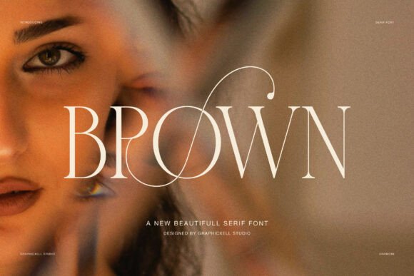
Brown is an elegant serif display face built to express luxury and confidence, inspired by fashion editorials. Among display serif fonts for headlines it is a graceful lead, with the contrast and character a title needs at size. Use it large for the headline and a clean sans for body. The refined forms read expensive. For a fashion or beauty headline that wants editorial elegance, Brown is a strong display serif worth a close look.
Cornella
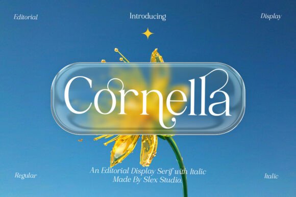
Cornella is an elegant editorial display serif built for sophistication. Among these display serifs it brings a magazine-cover refinement to a title, with graceful, considered forms. Use it for the headline and openers at size, paired with a clean sans for text. The editorial detailing reads polished. For a publication or brand that wants an elegant editorial headline serif, Cornella is a graceful font worth a closer look.
Milky Noire
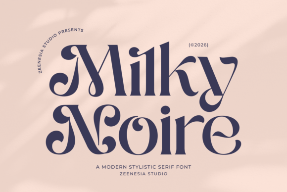
Milky Noire is a refined modern typeface that blends stylistic elegance with bold detailing. Among high-contrast display serifs it balances drama and polish, suiting a fashion or beauty title. Use it large for the headline with a minimal sans for body. The refined contrast reads upscale at size. For a modern, elegant headline with a touch of boldness, Milky Noire is a striking display serif worth a look.
Rekogil
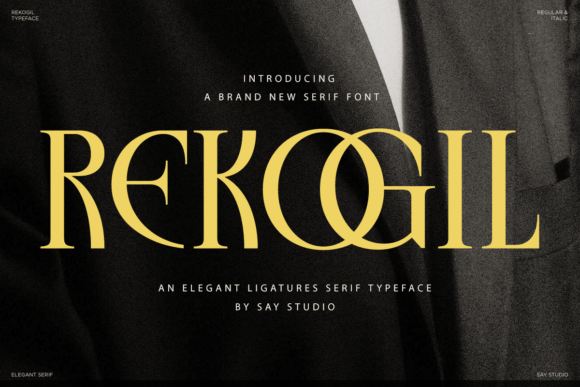
Rekogil is a luxurious serif built to capture timeless elegance. Among display serif fonts for headlines it gives a title a premium, considered presence, suiting luxury and heritage brands. Use it large for the headline and a plain sans for the rest. The refined forms read expensive at size. For a luxury brand that wants an elegant, timeless headline serif, Rekogil is a graceful font worth trying.
Bold display serifs for impact
For pure impact, these bold display serifs carry a headline or poster with weight and presence.
Focsio
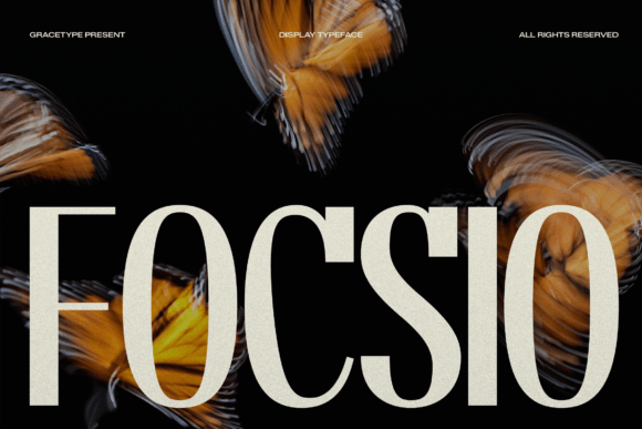
Focsio is a bold display face blending high-fashion elegance with strong impact. Among bold display serif fonts for headlines it is built to be a centrepiece, carrying a short headline with confidence and a designer edge. Use it large for a few words and let it own the layout, with a plain sans for body. The bold forms read at a distance. For a fashion-forward headline that needs impact, Focsio is a strong display serif worth a look.
Homeroth
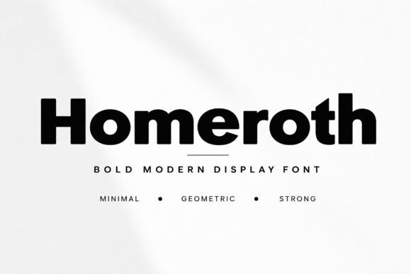
Homeroth is a bold modern display face with strong geometric shapes and clean lines. Among bold display serif fonts for headlines it brings a confident, architectural weight, good for a modern title or poster. Use it large for the headline and a clean sans for detail. The geometric build keeps it crisp at size. For a modern brand that wants a bold, structural headline, Homeroth is a powerful display face worth trying.
Magora
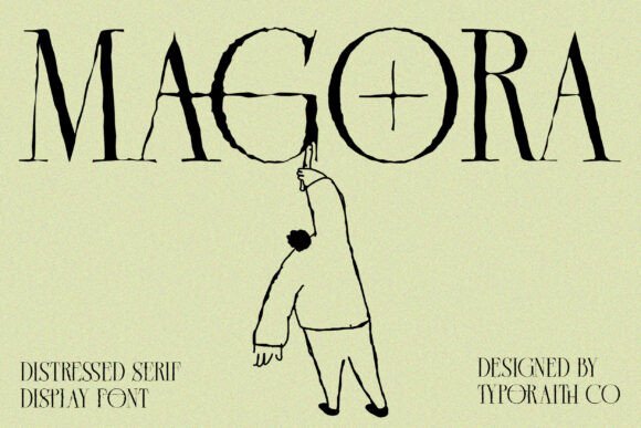
Magora is a display serif that blends modern elegance with raw, distressed detailing. Among bold display serif fonts for headlines it brings grit and a hand-printed, gig-flyer feel, ideal for music, streetwear and indie titles. Use it large so the distress reads as texture, with a clean sans for the rest. The worn forms read characterful. For a headline that wants attitude and a rough edge, Magora is a distinctive display serif worth a look.
Melnora
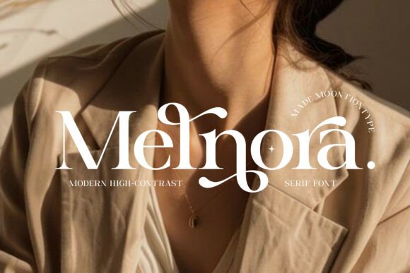
Melnora is a modern face that brings elegance and sophistication to creative work. Among bold display serif fonts for headlines it balances weight with refinement, suiting a premium title that wants presence without harshness. Use it large for the headline and a minimal sans for body. The forms read confident at size. For a brand that wants a bold yet elegant headline serif, Melnora is a graceful display face worth trying.
Stencil and decorative display serifs
For a structural or characterful headline, these stencil and decorative display serif fonts for headlines add an architectural edge.
Regal Stencil
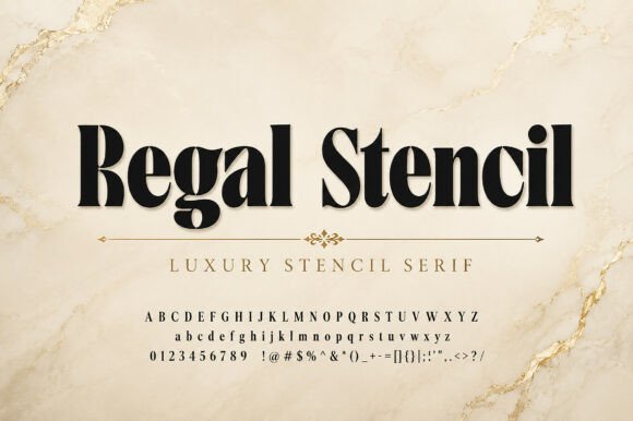
Regal Stencil is a luxury stencil serif for bold, elegant identities. Among stencil display serif fonts for headlines it gives a title an architectural, design-led look while the serif keeps it classy. Use it large for the headline and let the stencil breaks be the feature, with a plain sans for detail. The structural forms read distinctive. For a brand or poster that wants a striking stencil headline, Regal Stencil is a characterful display serif worth a look.
Agenova
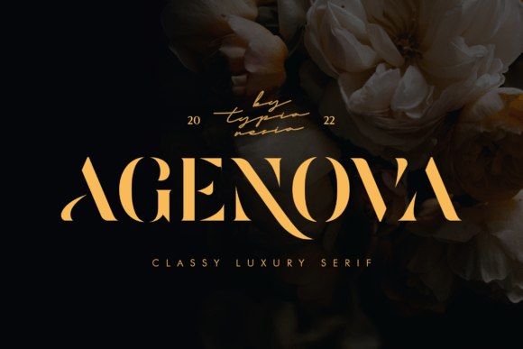
Agenova is a modern luxury bold stencil serif with classy glamour. Among display serif fonts for headlines it brings a stencil-meets-luxury character, ideal for a premium brand logo or a glamorous title. Use it large for the headline and a clean sans for the rest, letting the stencil detail be the signature. The bold forms read confident. For a glamorous brand that wants a stencil display headline, Agenova is a striking font worth trying.
Monster of Fantasy
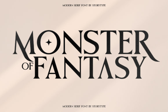
Monster of Fantasy is a modern classic serif with its own unique stylistic character. Among decorative display serifs it brings a distinctive, slightly theatrical personality to a title. Use it large for the headline where the character shows, with a plain sans for body. The unusual forms read memorable. For a brand or project that wants a characterful, one-of-a-kind headline serif, Monster of Fantasy is a distinctive font worth a closer look.
Minimal and condensed display serifs
For cleaner or tighter titles, these minimal and condensed display serifs keep a headline modern and space-efficient.
Evorine Serif
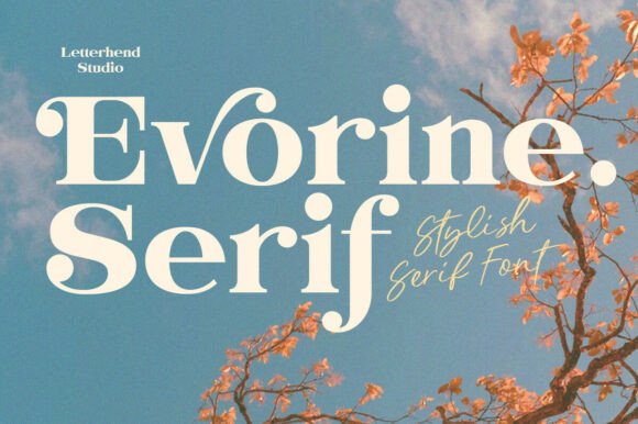
Evorine Serif is a dreamy statement font with soft curves and bold elegance. Among minimal display serif fonts for headlines it gives a title a gentle, golden-hour warmth rather than hard drama. Use it large for the headline and a clean sans for body. The soft forms read pretty at size. For a beauty or lifestyle brand that wants a soft, statement headline serif, Evorine Serif is a lovely display face worth a look.
Marlyn Tomorrow
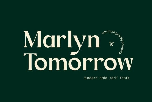
Marlyn Tomorrow is a luxury minimal serif for refined branding. Among minimal display serif fonts for headlines it keeps a title clean and modern while still reading premium. Use it large for the headline and the same family for detail. The pared-back forms read calm and current. For a modern luxury brand that wants a minimal, refined headline serif, Marlyn Tomorrow is a sharp font worth trying.
Horizon
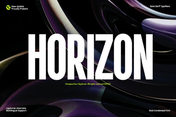
Horizon is a condensed sans that mixes modern boldness with an edgy feel and high contrast. Among display serif fonts for headlines it is the condensed companion, fitting long titles into a tight column while staying punchy. Use it for secondary headlines and stacked titles, paired with a display serif for the main line. The narrow build saves space. For a layout that needs a tight, edgy headline, Horizon is a useful condensed face worth a look.
Fonts FAQ
What are the best display serif fonts for headlines in 2026?
The best display serif fonts for headlines combine contrast or weight with a clear shape that reads big. From this roundup, Dihot and Brown bring elegant high contrast, Focsio and Homeroth deliver bold impact, and Regal Stencil adds a structural edge. Pick one display serif for the headline and keep body text in a clean sans.
Can a display serif be used for body text?
No, display serifs are built for size, not reading. Their contrast, character and detailing look great in a short headline but tire the eye and lose legibility in paragraphs. Use a display serif for titles and openers, and pair it with a plain text serif or sans for body, captions and the practical content.
What size should a headline serif be?
A display serif headline should be large enough to read at a glance and from a distance, which usually means it fills a big share of the layout. The exact size depends on the format, so set it at true headline size, step back, and confirm it still reads clearly before you commit.
Choosing the right display serif for your headlines
Good display serif fonts for headlines come down to contrast, weight and shape: pick one face built for size, make sure it reads big, and let a plain sans handle the body. The primer and groups above make the shortlist quick to narrow.
From here, the serif fonts for fashion magazines guide helps with covers, and the bold display fonts guide goes beyond serifs. For background, this display typeface overview is a useful reference. Set your headline at true size and step back before you commit.
Affiliate disclosure: some links on this page are affiliate links. If you buy a font through one of them, fontfinds.com may earn a small commission at no extra cost to you. We only feature fonts we think are worth your time.