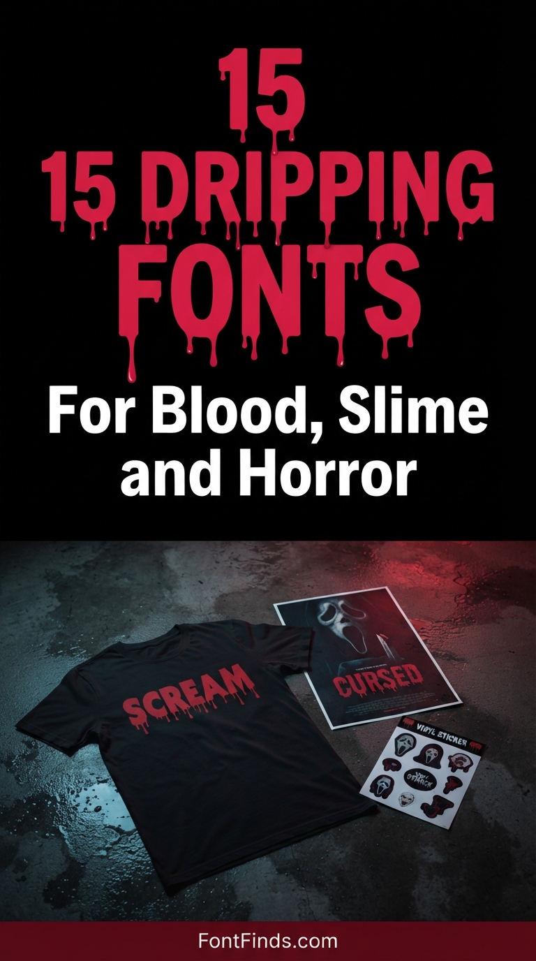
Dripping fonts look like the easiest thing in the world to get right and they are not. The difference between a drip effect that reads as liquid and one that reads as decoration comes down to where the drips start, how much their lengths vary, and whether the letter underneath survives being covered. This collection covers fifteen dripping fonts and adjacent horror faces, with attention to which ones stay legible once the effect is applied.
What Separates Good Dripping Fonts From Bad Ones
Origin points. Liquid pools at the lowest point of a shape before it falls. In a well-drawn dripping font the drips emerge from the actual bottom of each letter, which means their positions vary across a word. In a poor one they sit at even intervals, producing a repeating rhythm that reads as pattern rather than as liquid.
Length variation. Real drips run different distances. Uniform lengths look printed. The best fonts in this category vary drip length substantially, with some barely forming and others running far below the baseline.
Letter survival. The letterform underneath has to remain readable. A drip that starts halfway up a letter and covers its counter destroys the character. Check the sample for a lowercase e or a, which are the first casualties.
Baseline discipline. Drips extend below the baseline, which means your line spacing needs to account for them or the drips will collide with the line below. Most dripping fonts do not build this into their metrics, so expect manual adjustment.
Blood versus slime is a content decision, not a style one. The same technical effect reads as violent when red and angular, and as playful when green and rounded. If your audience includes children, the rounded slime variants get you the same visual energy without the content problem.
15 Dripping and Horror Fonts
Classic Drip
1. Blood Drip
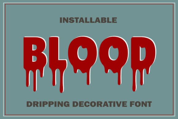
Blood Drip is the archetype of the category: bold letterforms with liquid running down from the baseline. What separates a good drip font from a poor one is where the drips originate. Convincing versions have drips falling from the natural low points of each letter, following gravity from wherever the ink would actually pool.
Poor versions attach drips at regular intervals regardless of letterform, which produces a repeating pattern the eye picks up immediately and reads as decoration rather than as liquid. Check the sample image for a word rather than an alphabet to see which you are getting.
My take: Look at where the drips start before buying any drip font. Regular spacing is the giveaway of a lazy execution.
View This Font →
Movie Horror
2. Blood Scream
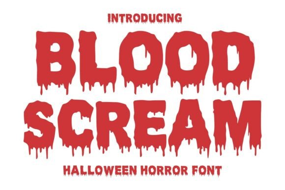
Blood Scream draws directly on classic Halloween movie typography, which is a specific and well-defined visual tradition. Horror film titling from the seventies and eighties established conventions still in use: heavy weight, irregular edges, and drips that vary in length rather than matching.
Length variation is the detail that sells it. Real liquid runs different distances depending on volume and surface, so uniform drips look printed while varied drips look wet. This one gets that right.
My take: The closest thing here to authentic horror movie titling. Worth it if you are working in that specific visual language.
View This Font →
Halloween Display
3. Dripping Season
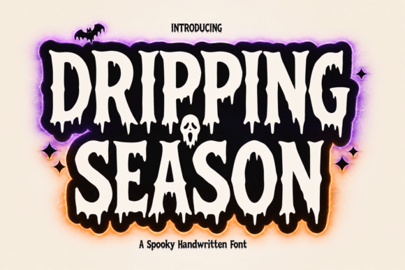
Dripping Season is built for Halloween projects specifically, which shows in the balance it strikes. The drips are present but restrained, so the letters underneath stay fully legible.
That restraint is a commercial decision rather than an aesthetic weakness. Party invitations, shop signage and product labels all need to be read, and a font where the drips obscure the letterforms fails at the actual job. Save the extreme versions for poster art where atmosphere beats information.
My take: The sensible choice for anything that has to communicate rather than just look scary. Restrained drips read better.
View This Font →
Thick Rounded
4. Slime Drip
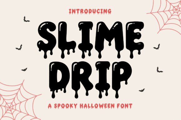
Slime Drip uses thick rounded letters with melting drips, which produces a very different feeling from blood. Rounded forms read as gooey and cartoonish where angular forms read as violent.
That distinction lets you target audience age directly. Slime works for children’s Halloween events, family parties and school activities where blood imagery would be inappropriate. It is the same technical effect deployed with a completely different tone.
My take: My pick for anything family-facing. Slime gets you the horror aesthetic without the content problem blood creates.
View This Font →
Melting Display
5. Meltora
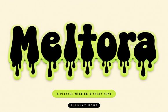
Meltora is a melting font rather than a dripping one, and the distinction is real. Melting distorts the letterform itself, softening and sagging the whole shape. Dripping leaves the letter intact and adds liquid below it.
Melting is more visually dramatic and considerably harder to read, because the letter skeleton is compromised. Use melting when the word is short and familiar, and dripping when the reader needs to decode something unfamiliar.
My take: Melting distorts the letters themselves, so keep the words short and predictable. Nobody can decode an unfamiliar name in a melted face.
View This Font →
Rough Edge
6. Wild Crimson
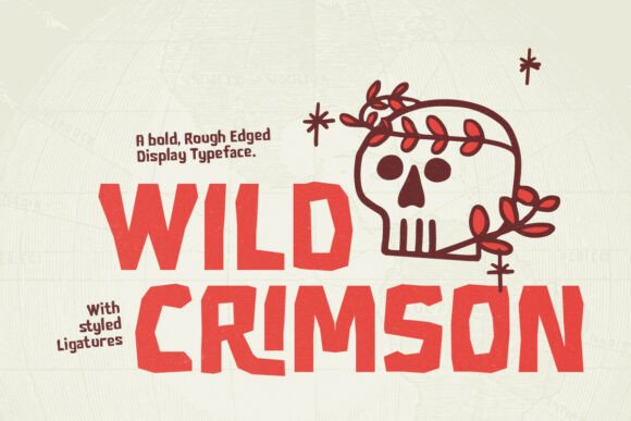
Wild Crimson is a bold rough-edge display face with ligatures rather than a strict drip font. Rough edges achieve some of the same visceral effect through a different mechanism, suggesting damage and decay rather than liquid.
Ligatures matter more in rough-edge fonts than in clean ones. Where two rough letters meet, the irregular edges can collide awkwardly, and a well-drawn ligature solves the specific pairs where that happens.
My take: A good alternative if drips feel too literal. Rough edges suggest horror without spelling it out.
View This Font →
Horror Display
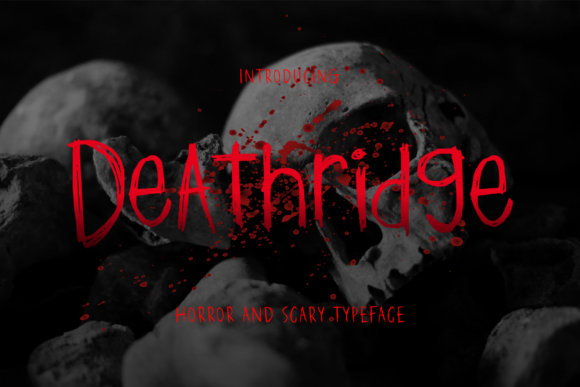
7. Deathridge
Deathridge is built explicitly for horror products and Halloween season work. Fonts positioned this way tend to have their peak commercial value in a narrow window, which is worth planning around.
If you sell seasonal products, buying horror type in August means you are competing with everyone else who had the same idea. The designers know this too, which is why bundles and sales cluster in late summer. Buy early or buy at the January sales instead.
My take: Worth buying out of season. Horror font pricing follows demand and demand peaks in September.
View This Font → Free.
Scary Display
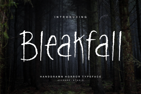
8. Bleakfall
Bleakfall aims for a spooky appearance through overall form rather than through added effects. Fonts that achieve horror structurally rather than decoratively tend to be more versatile.
The reason is scale. A decorative effect like a drip has a fixed size relative to the letter, so it either dominates at small sizes or disappears at large ones. Structural horror scales cleanly because the whole letterform carries the mood.
My take: More versatile than effect-based horror fonts. Structural creepiness scales where added drips do not.
View This Font → Free.
Dark Brush
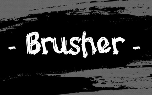
9. Brusher
Brusher is a creepy dark display font built on brush strokes, which introduces an interesting tension. Brush lettering normally reads as energetic and human, and darkening it produces something that feels hand-made and wrong at the same time.
That combination suits found-footage horror, cult imagery and anything meant to look like it was made by an unstable person rather than by a designer. It is a specific effect and a strong one when the concept calls for it.
My take: Use it when the concept involves something handmade and disturbing. The brush origin does work that clean horror type cannot.
View This Font → Free.
Creepy Display
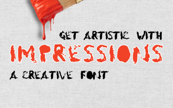
10. Impressions
Impressions works through a dark, heavy presence rather than through explicit horror signalling. Understated horror type is genuinely rare because the category rewards obviousness.
Understatement pays off in commercial contexts. A restaurant doing a Halloween menu, a brand running an October campaign, a bar with a themed night: all of these need to signal the season without committing to gore. Subtle horror faces serve that middle ground.
My take: The choice for brands that want seasonal atmosphere without going full horror. That middle ground is badly underserved.
View This Font → Free.
Uneven Heavy
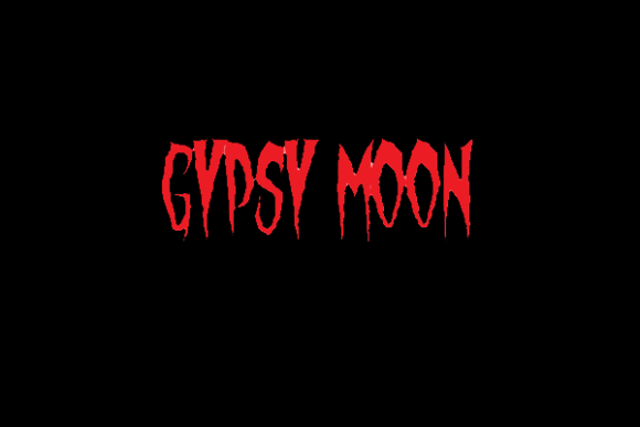
11. Gypsy Moon
Gypsy Moon is a heavy display face where characters deliberately vary in size and carry pointed edges. Size variation between characters is an unusual technique and it produces a specific effect: the word looks assembled rather than typed.
That works well for ransom-note and found-object aesthetics, and badly for anything that needs to look professional. It also means letter spacing needs manual attention, since automatic spacing assumes consistent character heights.
My take: Expect to adjust spacing by hand. Fonts with varying character sizes never space correctly on their own.
View This Font → Free.
Thick Spooky
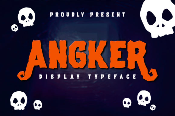
12. Angker
Angker is thick-lettered and built for Halloween projects, sitting in the reliable middle of the horror display range. Thick letters with spooky detailing is the most commercially useful configuration in this category.
The reason is reproduction. Halloween work ends up on cheap printed flyers, vinyl banners, screen-printed shirts and laser-cut signage, and thick letters survive all of it. The more refined horror faces look better in a mockup and worse in the real world.
My take: The workhorse option. Not the most exciting font here but the one most likely to survive whatever you print it on.
View This Font → Free.
Horror Handwritten
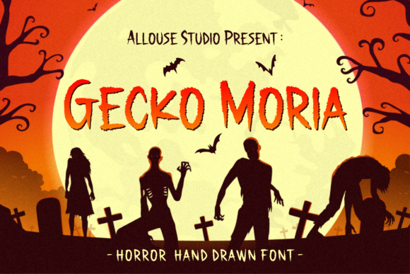
13. Gecko Moria
Gecko Moria is a horror handwritten font, which is a less common combination than horror display. Handwriting suggests a person, and horror handwriting suggests a person you would not want to meet.
That personal quality makes it effective for narrative horror: diary entries, warning notes, found documents. It is much less effective for branding, where the implied individual conflicts with the idea of a company.
My take: Narrative work rather than branding. Horror handwriting implies a character, which is exactly wrong for a business.
View This Font → Free.
Distressed Stamp
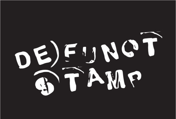
14. Defunct Stamp
Defunct Stamp works through a stamped, worn aesthetic rather than through horror imagery. Stamp effects carry associations with bureaucracy, expiry and abandonment, which is a distinctly different kind of unease.
This is institutional horror rather than monster horror, and it suits everything from dystopian design to escape room props to vintage-styled Halloween invitations. The mood is closer to dread than to fright.
My take: A different flavour of unsettling. Bureaucratic decay is more sophisticated than blood and there is far less of it available.
View This Font → Free.
Halloween Serif
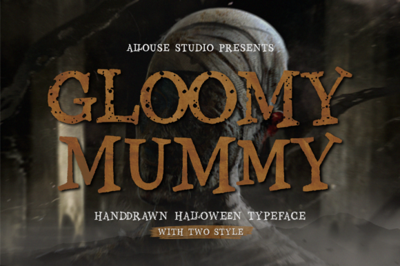
15. Gloomy Mummy
Gloomy Mummy is a Halloween-inspired serif, which is a rarer proposition than a Halloween display face. Serifs carry authority and tradition, and applying horror styling to that structure produces something that feels old rather than merely scary.
Old is a useful register for Halloween. Haunted houses, gothic literature, Victorian ghost stories and vintage carnival aesthetics all want type that reads as aged rather than as aggressive. A horror serif serves that better than any display face.
My take: The pick for vintage and Victorian Halloween themes. Horror serifs are scarce and this fills a real gap.
View This Font → Free.
Printing Dripping Fonts Without Losing the Drips
Drip tips are the thinnest part of the design
Every drip tapers to a point, and that point is where reproduction fails first. In screen printing, embroidery or vinyl cutting the tips break off, leaving stubby drips that look like a mistake.
Thicken before you cut
If the design is going to vinyl or embroidery, apply a small outward offset to the whole shape. This thickens the drip tips enough to survive without visibly changing the letterforms.
Watch your line spacing
Drips extend well below the baseline. Two lines of dripping type at default leading will overlap. Increase line height until the drips clear the cap height of the line beneath.
Dark backgrounds need an underbase
Printing light drips on a black shirt requires a white underbase layer, which adds a screen and a cost. Factor it into quotes before promising a price.
Questions People Ask
What are dripping fonts used for?
Halloween graphics, horror posters, band merchandise, streetwear, energy drink branding and graffiti-influenced design. The effect signals danger or messiness, which suits anything positioned as edgy.
Do dripping fonts work at small sizes?
Poorly. The drip tips are the first detail lost, and once they go the font reads as a slightly odd bold face rather than as a drip effect. Use them large or not at all.
Can I use dripping fonts on a Cricut?
Yes, but expect the finest drip tips to be difficult to weed and prone to tearing. A small outward offset applied before cutting solves most of it.
What is the difference between dripping and melting fonts?
Dripping leaves the letter intact and adds liquid below it. Melting distorts the letterform itself so the whole character sags. Melting is more dramatic and considerably harder to read.
Which dripping fonts are safe for children’s events?
The rounded slime variants. Same technical effect, different colour and letterform, with none of the content concerns that blood imagery raises for a family audience.
Are dripping fonts only for Halloween?
No. They appear year-round in horror publishing, metal and punk merchandise, skate branding, graffiti-influenced design and energy drink packaging. Halloween is the peak season, not the only use.
Related: spooky Halloween fonts, bold display fonts for posters, or browse Creative Fabrica →