Mystical fonts have moved a long way from their occult origins. The visual language of moons, stars, tarot and astrology now sells wellness products, yoga studios, skincare lines and lifestyle brands far more often than it sells anything genuinely esoteric. That shift changes what the type needs to do: calm and premium rather than dark and threatening. These twenty mystical fonts cover both registers, with notes on which is which.
The Three Registers of Mystical Design
Celestial and wellness. Moons, stars, sun and moon pairings, soft colour. This is where the money is: wellness brands, skincare, yoga, journalling products and lifestyle retail. The type needs to feel premium and calm. Anything that reads as occult or threatening actively damages the positioning.
Witchy and folk. Brooms, cauldrons, herbs, cottagecore. Warmer and more playful, overlapping with Halloween in October and with cottagecore year-round. This register tolerates more decoration than the wellness end and takes itself less seriously.
Occult and gothic. Tarot, sigils, dark romance, seances. The narrowest and most polarising. It performs well in publishing, tattoo and subculture work, and it makes some audiences genuinely uncomfortable, particularly in more religious markets. Worth choosing deliberately rather than by accident.
Most mystical fonts sit clearly in one of the three, and mixing registers within a single project is the most common reason mystical design looks confused.
A note on symbols. Celestial and occult symbols carry real meaning to people who use them. Pentagrams, sigils and specific tarot imagery are not neutral decoration to a practising audience, and using them incorrectly is noticeable to that audience even when it is invisible to everyone else. If you are designing for that market, it is worth checking what the symbols you are using actually mean.
20 Mystical Fonts
Celestial Accents
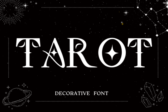
1. Tarot
Tarot builds stars and half-moons directly into the letterforms as decorative accents. Integrated celestial symbols are the defining feature of this whole category, and the execution varies enormously between fonts.
The question to ask is whether the symbols replace parts of letters or sit alongside them. Replacement is riskier: a star standing in for a dot on an i works, but a moon replacing a letter entirely can break legibility. Alongside placement is safer and easier to control.
My take: Check whether symbols replace letters or accompany them. Replacement looks clever in a specimen and causes problems in real words.
View This Font →
Moon and Astrology
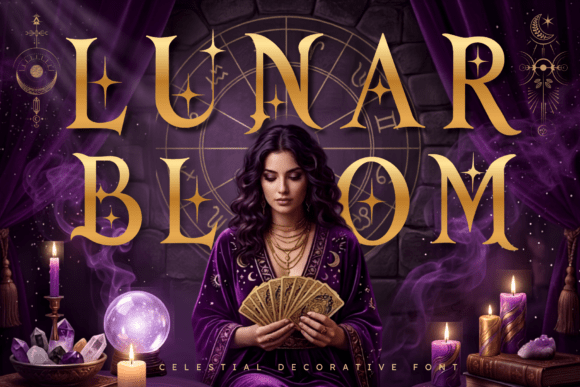
2. Lunar Bloom
Lunar Bloom draws on moon phases, celestial symbols, tarot and astrology, which is the full contemporary mystical vocabulary. That vocabulary has become genuinely commercial over the last decade, moving from niche interest into mainstream wellness and lifestyle branding.
The commercial shift matters for design decisions. Serving a wellness audience means the type needs to feel calm and premium rather than occult and threatening, which is a very different brief from Halloween work.
My take: The wellness market wants mystical without menace. That is a different design brief from Halloween and pays considerably better.
View This Font →
Cosmic Duality
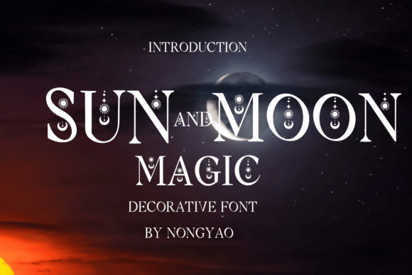
3. Sun and Moon Magic
Sun and Moon Magic is built around cosmic duality, pairing opposing celestial symbols. Duality is a strong organising concept for a typeface because it gives you two contrasting registers within one purchase.
In practice that means you can use the solar characters for headlines and lunar ones for accents, or split a design between the two moods without introducing a second font. It is more design flexibility than most decorative faces offer.
My take: Two moods in one font is unusual value. Most decorative faces give you a single register and force a second purchase.
View This Font →
Everyday Decorative
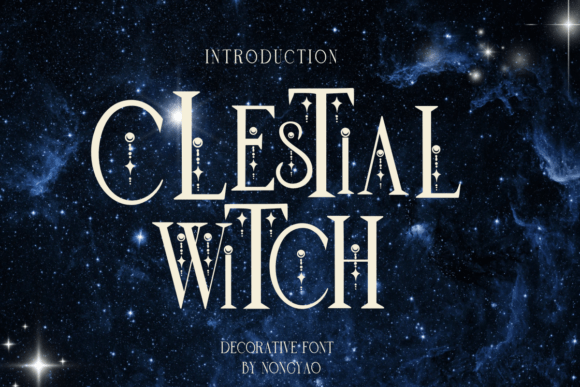
4. Celestial Witch
Celestial Witch is positioned for notes, diaries and greeting cards rather than for branding, which is a refreshingly honest framing. Not every decorative font needs to claim it works for logos.
Personal-use decorative fonts have different requirements. They need a complete character set including punctuation, they need to work at body-text size, and they need to stay readable across a full sentence. Many display-focused mystical fonts fail all three.
My take: Honest positioning. If you need a mystical font for actual writing rather than headlines, this category is much smaller than it appears.
View This Font →
Journal Decorative
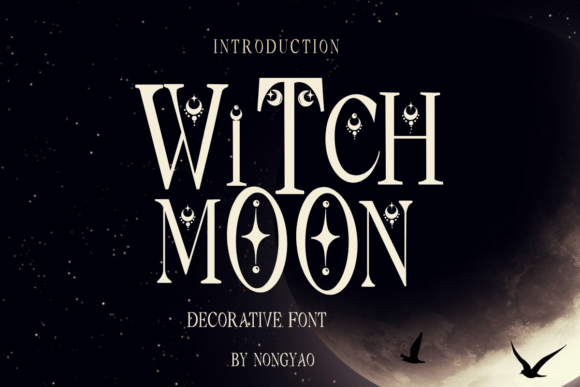
5. Witch Moon
Witch Moon sits in the same personal-use territory, aimed at journalling and card making. The journalling market is substantially larger than most designers realise, driven by bullet journalling, grimoire keeping and planner communities.
Those users buy fonts differently. They want something readable at small sizes across many lines, and they care far more about the lowercase than about decorative capitals, which is the reverse of what branding buyers want.
My take: Journalling buyers judge the lowercase, not the capitals. That reverses the usual priority for decorative type.
View This Font →
Mystical Dingbats
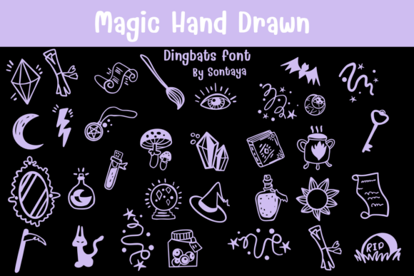
6. Magic Hand Drawn
Magic Hand Drawn is a dingbats set of mystically themed symbols rather than an alphabet. Symbol sets solve a specific problem in this category: mystical design leans heavily on iconography, and sourcing symbols that share one visual style is genuinely difficult.
Buying a matched set eliminates the mismatch that makes amateur mystical design recognisable. Mixed-source symbols in different line weights and styles are the single most common tell.
My take: Mismatched symbol styles are the giveaway in amateur mystical design. One matched set fixes it.
View This Font →
Tall Whimsical
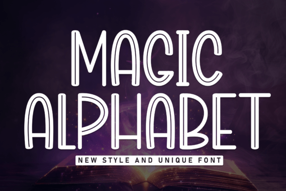
7. Magic Alphabet
Magic Alphabet uses tall elegant proportions with whimsical detail, and the height is doing real work. Extended vertical proportions read as ethereal and otherworldly in a way that wide letterforms simply do not.
The trade-off is line spacing. Tall letters need more vertical room, and cramming them into standard leading destroys the elegance that made you choose them. Budget the space before committing to a layout.
My take: Tall proportions need generous line spacing. Squeeze them and you lose exactly the quality you bought them for.
View This Font →
Fantasy Display
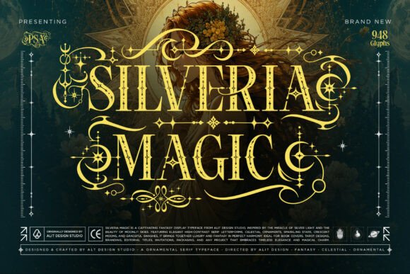
8. Silveria Magic
Silveria Magic is a fantasy display face built around spellbinding and celestial enchantment. Fantasy differs from occult in an important way: fantasy is fictional and safe, where occult carries real-world spiritual associations.
That distinction matters for audience. Fantasy styling works for games, books and entertainment without controversy. Occult styling can be genuinely off-putting to some audiences, particularly in more religious markets.
My take: Fantasy is the safer commercial register. Occult styling narrows your audience in ways worth thinking about first.
View This Font →
Whimsical Magical
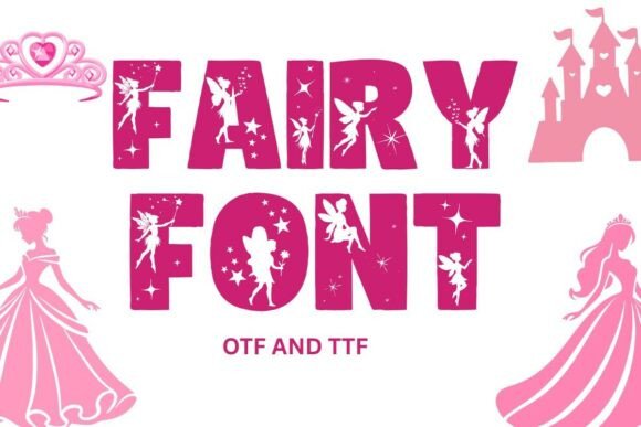
9. Fairy
Fairy is a whimsical magical typeface aimed at charm and fantasy. Fairy styling is the gentlest end of the mystical range, overlapping heavily with children’s design.
That overlap is useful. A fairy-styled font can serve both a children’s book and an adult cottagecore brand, which is a wider commercial range than most decorative faces manage. Few mystical fonts work for both audiences.
My take: One of the few mystical faces that works for both children’s and adult markets. That range is worth paying for.
View This Font →
Curly Halloween
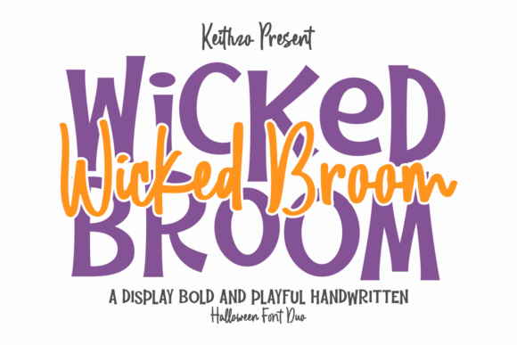
10. Wicked Broom
Wicked Broom is a handcrafted curly Halloween face with ligature detail on each character. Curly letterforms sit between witchy and playful, which makes them versatile across the October season.
Ligatures in decorative fonts serve a different purpose than in text fonts. Rather than fixing collisions, they usually add decorative connections between specific letter pairs, so the same word can look noticeably better or worse depending on its letters.
My take: Type your actual word to check the ligatures. Decorative ligatures only trigger on specific pairs and yours may not have any.
View This Font →
Playful Halloween
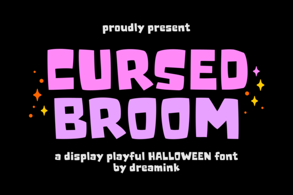
11. Cursed Broom
Cursed Broom brings spooky magic through a playful display treatment. Broom imagery is one of the most reliable witch signifiers because it works in silhouette, which matters enormously for small-scale reproduction.
Silhouette legibility is an underrated test for themed fonts. If a decorative element only reads when you can see its internal detail, it will fail on a small label, an embroidered patch or a phone screen.
My take: Test themed decorative elements in silhouette. If they only read with internal detail visible, they will fail when small.
View This Font →
Serif Style
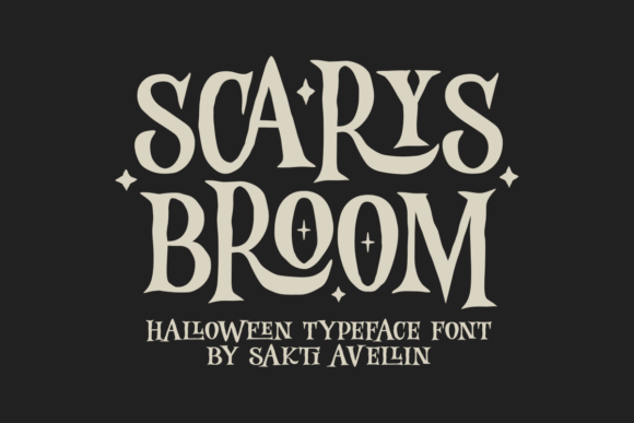
12. Scarys Broom
Scary’s Broom blends classic serif structure with Halloween styling, which is a less common approach than display treatment. Serif underneath means the letterforms have real typographic bones rather than being purely decorative shapes.
Structural quality shows up in longer text. Decorative faces built on a solid serif skeleton stay readable across a full line where purely ornamental ones become tiring after a few words.
My take: Better structure than most themed fonts. The serif skeleton means it survives longer text than pure display faces.
View This Font →
Elegant Serif
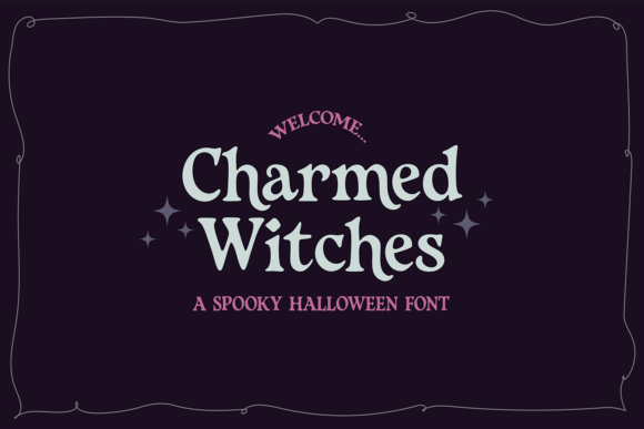
13. Charmed Witches
Charmed Witches is a sophisticated spooky serif with restrained seasonal styling. Restraint is what separates a font usable by a real brand from one that only works on a party invitation.
A restaurant, a bar or a boutique running an October promotion needs type that signals the season without abandoning its own identity for three weeks. Elegant seasonal serifs serve that, and there are very few of them.
My take: The pick for established brands doing seasonal work. Loud Halloween type forces a business to abandon its own look.
View This Font →
Bold Casual
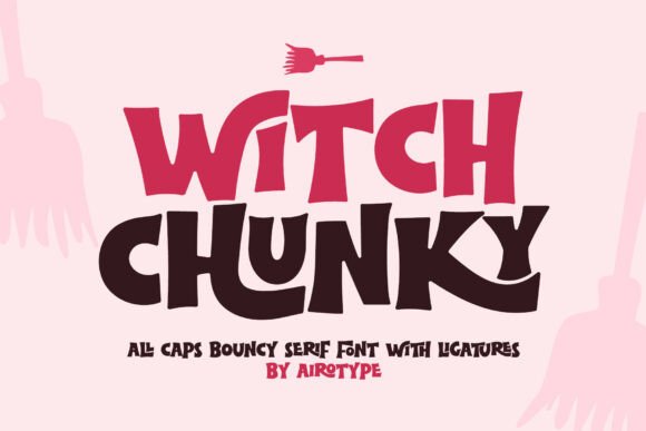
14. Witch Chunky
Witch Chunky is an all-caps serif with thick characters and a bouncy rhythm. All-caps design is a significant limitation and a significant simplification at the same time.
You lose the ability to set sentences properly, but you gain consistency: without lowercase, there is no risk of mismatched proportions between cases, and spacing becomes much more predictable. For signage and short headlines that trade is usually worth it.
My take: All-caps limits you to short phrases but removes a whole category of spacing problems. Fine for signage, wrong for anything longer.
View This Font →
Dark Romance
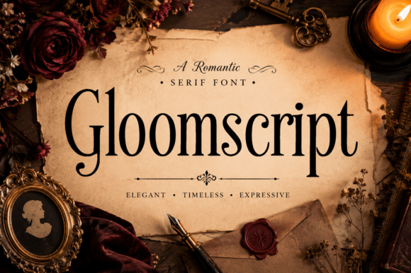
15. Gloomscript
Gloomscript is an elegant serif built around dark romance rather than horror. Dark romance is a distinct and growing publishing category with its own visual conventions, quite separate from horror.
The conventions lean gothic-literary: high contrast serifs, deep colour, botanical ornament and restrained layouts. Getting the register right matters because dark romance readers are a specific audience who recognise when a cover is signalling the wrong genre.
My take: A genre-specific tool. Dark romance publishing has its own visual language and this speaks it correctly.
View This Font →
Literary Mystery
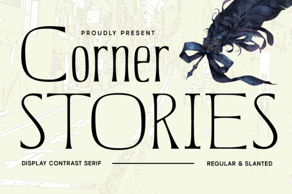
16. Corner Stories
Corner Stories weaves mystery and literary allure into a display contrast face. Literary mystery is another well-defined publishing category, distinct again from both horror and dark romance.
High contrast between thick and thin strokes is the technical marker here. That contrast reads as sophisticated and slightly old-fashioned, which is exactly what mystery cover design has used for decades.
My take: High contrast is the mystery genre marker. It reads as sophisticated and dated in the way the category wants.
View This Font →
Modern Calligraphy
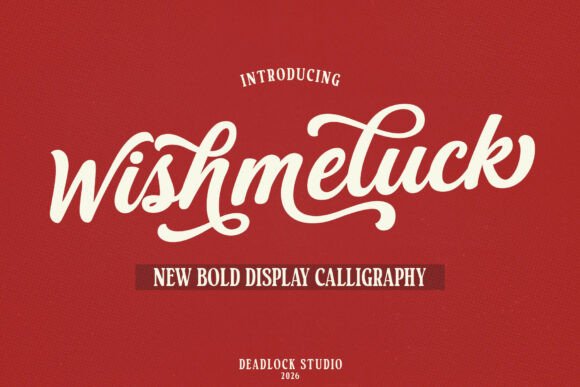
17. Wishmeluck
Wishmeluck is a bold modern calligraphy face blending contemporary brush work with something more elaborate. Bold calligraphy is rarer than delicate calligraphy and considerably more useful.
The reason is reproduction. Delicate calligraphic hairlines fail in embroidery, vinyl and small print, while bold calligraphy survives all three. If your mystical design is going onto a product rather than a screen, weight is the deciding factor.
My take: Bold calligraphy survives production where delicate calligraphy does not. Choose on weight if the design becomes a physical product.
View This Font →
Ornate Flourishes
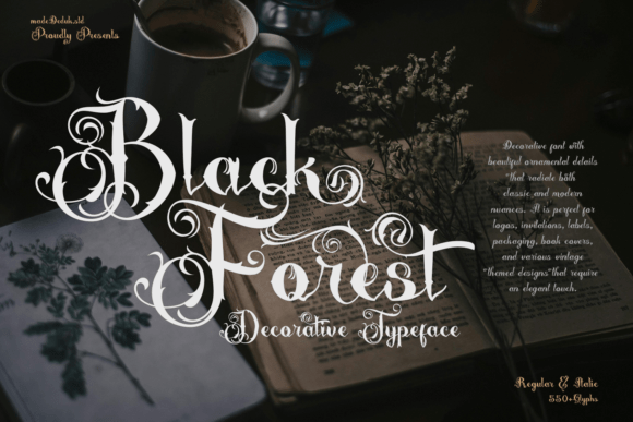
18. Black Forrest
Black Forrest is a lavish decorative face with exquisite flourishes and a very large glyph count. Large glyph sets in decorative fonts usually mean extensive alternates and swashes rather than broad language support.
Alternates are what let you customise a wordmark. Being able to swap the first and last characters for flourished versions is often the difference between a logo that looks typed and one that looks designed, and it takes seconds.
My take: Use the alternates. A decorative font with 550 glyphs is wasted if you only ever type the default characters.
View This Font →
Victorian Vintage
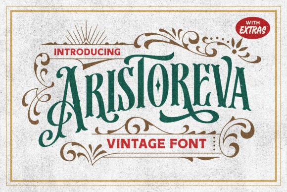
19. Aristoreva
Aristoreva draws on Victorian typography, which is a specific historical period with recognisable conventions: ornate capitals, condensed proportions and heavy decorative detail.
Victorian styling has strong mystical associations because the period coincided with the spiritualist movement, seances and occult revival. That historical link is why Victorian type reads as mystical even without any celestial symbols added.
My take: Victorian type carries mystical weight through history alone. You often do not need to add moons and stars on top.
View This Font →
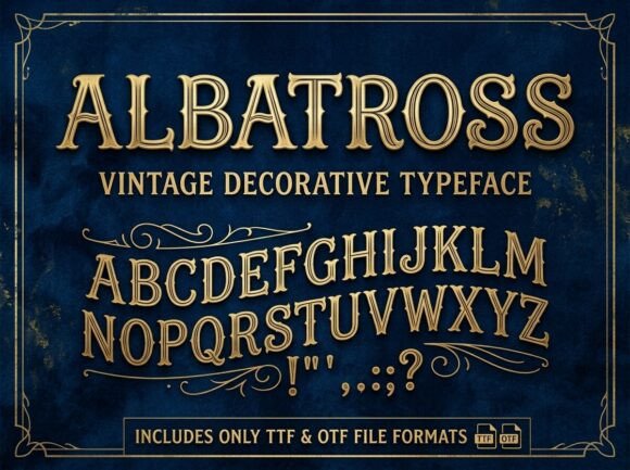
Vintage Decorative
20. Albatross
Albatross is a vintage decorative face capturing timeless design. Vintage decorative sits adjacent to the mystical category without being explicitly part of it, which is often an advantage.
Explicitly themed fonts date and limit. A well-drawn vintage decorative face serves a mystical brand today and a completely different brand in three years, which makes it a better library investment than something covered in pentagrams.
My take: The better long-term buy. Explicitly themed fonts have a shorter useful life than well-drawn vintage ones.
View This Font →
Using Mystical Fonts Well
Symbols alongside, not instead of, letters
A star replacing the dot on an i is charming. A moon replacing a whole letter is a legibility problem. Check what your specific word does before committing.
Give tall faces room
Extended vertical proportions are what make celestial type feel ethereal, and cramped line spacing destroys the effect completely. Increase leading beyond the default.
Match the register to the market
Wellness wants calm and premium. Witchy wants warm and playful. Occult wants dark and specific. Choosing the wrong one is more damaging than choosing a mediocre font within the right one.
Buy matched symbol sets
Mystical design is symbol-heavy, and mixed-source icons in different line weights are the clearest sign of amateur work. One matched dingbats set solves it.
Questions People Ask
What are mystical fonts used for?
Wellness and skincare branding, yoga and meditation studios, tarot and oracle deck design, journalling products, fantasy publishing, and cottagecore lifestyle brands. The commercial market is far larger than the occult one.
What is the difference between mystical and gothic fonts?
Mystical fonts lean on celestial and natural symbolism with generally lighter weights. Gothic fonts descend from medieval blackletter and read as heavy and architectural. They occasionally overlap but the associations are quite different.
Are mystical fonts readable enough for body text?
A few of the simpler decorative ones are, particularly those positioned for journalling. Most are display faces and become tiring across more than a line or two.
Which mystical fonts work for tarot deck design?
The elegant serif options, since card design needs type that holds up small and prints cleanly on card stock. Heavily ornamental display faces lose their detail at card scale.
Where do most mystical fonts go wrong?
Register mixing. A celestial wellness face beside an occult gothic one reads as confused rather than layered. Pick one of the three registers above and stay inside it.
Can I use celestial symbols commercially?
The fonts themselves are licensed like any other, though terms vary. The symbols are generally in the public domain as concepts, but check the individual font licence for merchandise and resale rights.
Related: witchy fonts and bundles, elegant script fonts for branding, or browse Creative Fabrica →