Most Halloween typography aims at horror, which is odd given that the majority of Halloween spending goes on children’s parties, school events and family decoration rather than on anything genuinely frightening. Ghost fonts occupy the useful middle: recognisably seasonal, clearly supernatural, and safe to put in front of a seven-year-old. These eighteen cover that territory, along with the practical details that decide whether they survive a home printer or a cutting machine.
Why the Friendly End of Halloween Is the Bigger Market
Think about who actually buys Halloween design. Teachers making classroom displays. Parents printing party invitations. Small shops decorating a window. Craft sellers listing seasonal products. Community centres advertising a trunk-or-treat event.
None of those buyers want blood. All of them need the season to be unmistakable. That gap is what ghost fonts fill, and it explains why the cute-but-creepy register is both harder to design and more commercially valuable than outright horror.
It also changes what matters technically. Horror posters are printed professionally at large sizes. Family Halloween materials are printed at home on inkjets, cut on a Cricut, or displayed on a phone screen. Those conditions punish fine detail, so the practical notes in each entry below matter more here than they would in a horror roundup.
Ghosts and monsters are not the same tonal register. Ghost imagery carries an implicit connection to death, which some parents of very young children would rather avoid. Monster imagery reads purely as creatures and characters. For nursery and toddler work, monsters are the safer theme even though the visual style is similar.
18 Ghost Fonts, Reviewed
Hand Drawn
1. Ghost Doodle
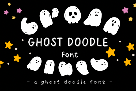
Ghost Doodle brings whimsical charm to Halloween work through hand-drawn ghost shapes rather than through typography alone. Doodle-style fonts occupy a specific niche: they look like something a person sketched, which makes them feel personal in a way that polished display type does not.
That hand-drawn quality is why doodle fonts dominate on classroom materials, planner spreads and small-batch craft products. The imperfection is the selling point, and cleaning it up would remove the appeal entirely.
My take: The default choice for classroom and planner work. Hand-drawn imperfection is what that audience actually wants.
View This Font → Free.
Playful Display
2. Boonie Ghost
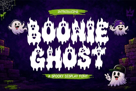
Boonie Ghost adds spooky fun and playful haunting to graphics without tipping into horror. The balance point matters commercially, because most Halloween buying is done by parents and event organisers rather than by horror fans.
Fonts in this register serve the larger market. School events, family parties, community fairs and retail displays all need Halloween signalling that will not frighten a five-year-old, and there are fewer good options in that space than in outright horror.
My take: The bigger commercial market is family Halloween, not horror. Fonts like this serve it and there is less competition.
View This Font →
Two Styles
3. Poultrygeist
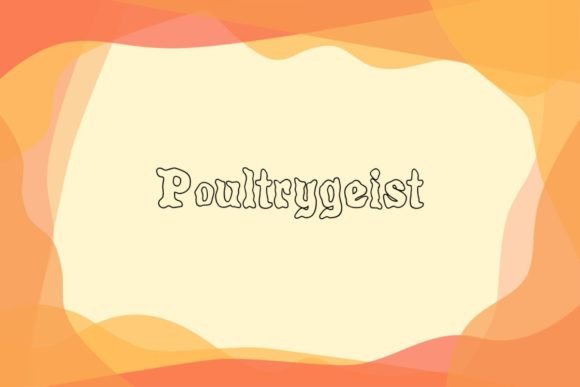
Poultrygeist ships with two styles, which is more useful than it sounds for seasonal work. A second style means you can create hierarchy within a single typeface, using one for the headline and the other for supporting text.
That matters because Halloween designs are usually made quickly by non-designers, and mixing two unrelated fonts is where amateur layouts go wrong. A matched pair removes the decision and the risk.
My take: Buy duos over singles when the design will be made by someone without training. Matched pairs prevent the most common layout mistake.
View This Font → Free.
Cute But Creepy
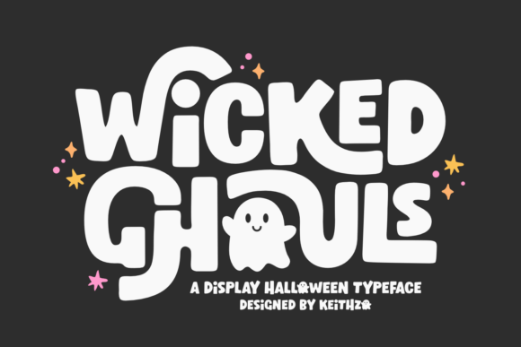
4. Wicked Ghouls
Wicked Ghouls describes itself as cute but creepy, which is the exact tonal target most Halloween design is aiming at and frequently misses. Achieving it requires rounded letterforms carrying slightly unsettling detail.
Get the ratio wrong in either direction and it fails: too cute and the Halloween reference disappears, too creepy and the family audience is lost. This one sits closer to the cute end, which is the safer error to make commercially.
My take: Cute-but-creepy is the hardest register to hit and the most commercially valuable. Erring toward cute is the safer mistake.
View This Font →
Script and Display
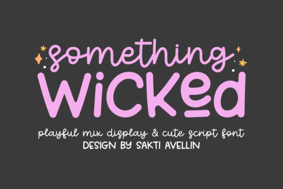
5. Something Wicked
Something Wicked combines a cute script with a playful display face, giving you two contrasting styles designed to work together. Script plus display is the most useful pairing structure for seasonal design.
The script handles names and personal touches while the display carries headlines and signage. Because both come from one designer with one aesthetic, they share proportions and weight in a way that separately chosen fonts rarely do.
My take: A complete seasonal toolkit in one purchase. Script plus display covers almost every Halloween layout you will need.
View This Font →
Flared Serif
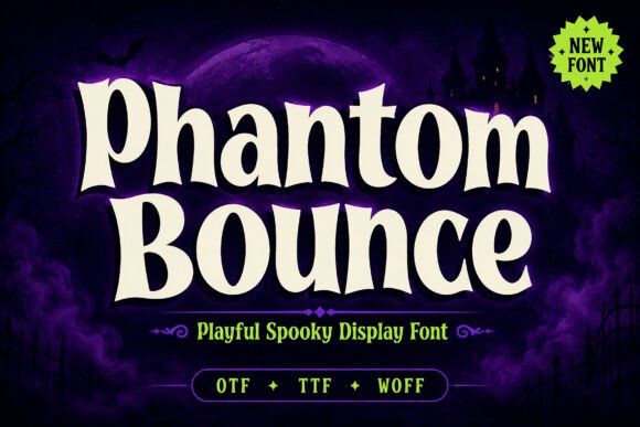
6. Phantom Bounce
Phantom Bounce uses flared serifs with a bouncing baseline, which produces movement without resorting to distortion. Bouncing baselines are the gentlest way to make type feel animated.
Movement matters in Halloween design because the season is associated with things that lurk and shift. Static type reads as institutional. A slight bounce gets you a sense of life at almost no legibility cost, which is a better trade than melting or dripping effects.
My take: Bouncing beats melting when you need movement but cannot afford to lose readability.
View This Font →
Friendly Casual
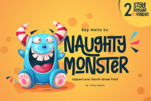
7. Naughty Monster
Naughty Monster is a casual display face with a friendly feel, positioned toward monsters rather than ghosts. Monster imagery skews younger than ghost imagery, which is a useful distinction when choosing.
Ghosts carry a hint of death and the supernatural, while monsters read as creatures and characters. For nursery, toddler and early primary work, monsters are the safer theme.
My take: Monsters over ghosts for the youngest audiences. The associations are meaningfully different even if the aesthetic is similar.
View This Font →
Display and Dingbats
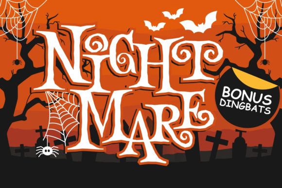
8. Night Mare
Night Mare is a duo pairing a display face with a matching dingbats set, which solves the illustration problem for anyone who cannot draw. Themed icons matched to the typeface remove the need to source separate graphics.
Matched icon sets are consistently undervalued. Sourcing clip art that shares a visual style with your chosen font is genuinely difficult, and buying them together eliminates the mismatch that gives away amateur design.
My take: Font plus matching icons is the best value structure in seasonal type. Style-matched clip art is hard to find separately.
View This Font →
Installable Halloween
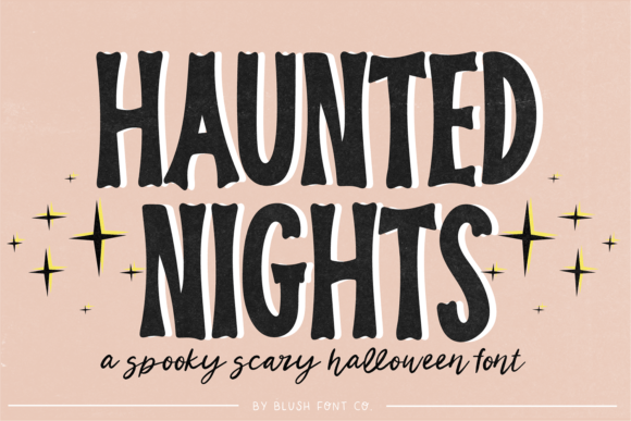
9. Haunted Nights
Haunted Nights is a straightforward installable Halloween face without an unusual gimmick, which is more useful than it sounds. Not every project needs a font with a distinguishing feature.
Most seasonal work needs type that reads clearly, signals the theme, and gets out of the way while photography or illustration carries the design. A competent unremarkable Halloween font does that job better than a more characterful one.
My take: Plain is underrated. When the design has strong imagery, the type should support rather than compete.
View This Font →
Dramatic October
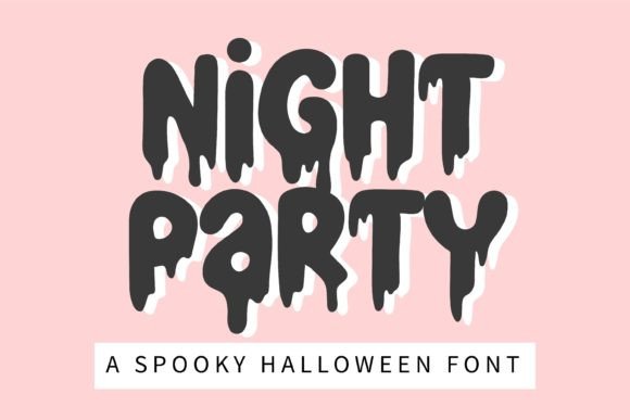
10. Night Party
Night Party is built for October projects needing drama, sitting a step bolder than the gentler faces here. The bolder end of playful Halloween is where event signage lives.
Signage has different requirements from print. It gets read at distance, often in low light, sometimes at an angle. Weight and simplicity beat detail and charm in those conditions, which is why the delicate options above would fail on a banner.
My take: The pick for event signage rather than print. Low light and distance both demand weight.
View This Font →
Party Graphics
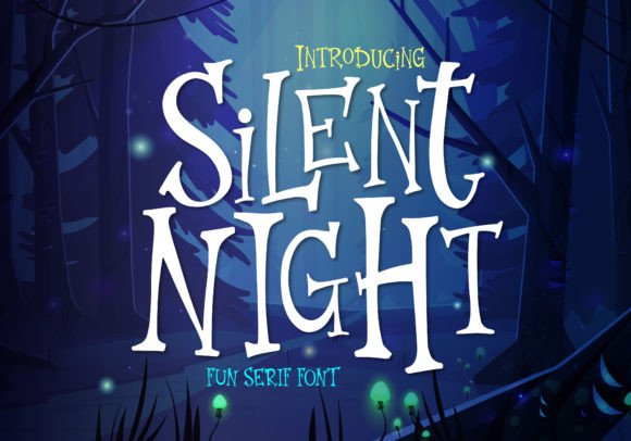
11. Silent Night
Silent Night is aimed squarely at Halloween party materials, which is the highest-volume use case for seasonal type. Party graphics have a specific constraint most designers overlook: they are usually printed at home.
Home printers handle solid shapes well and fine detail poorly. A font intended for party printables should have generous stroke weights and no hairlines, because the output will be inkjet on standard paper rather than professional press work.
My take: Consider the printer, not just the screen. Party printables end up on home inkjets and detail does not survive that.
View This Font →
Bold Decorative
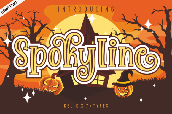
12. Spokyline Demo
Spokyline Demo is a bold decorative display face capturing Halloween mystery. The demo designation is important: demo versions typically limit the character set, often to uppercase only or without punctuation.
That limitation is fine for a short headline and fatal for anything with dates, times or addresses. Check exactly what is included before building a layout, because discovering the missing characters at the end is a real time cost.
My take: Check the character set before designing. Demo versions frequently drop numbers and punctuation, which party graphics need.
View This Font → Free.
Sans and Script Duo
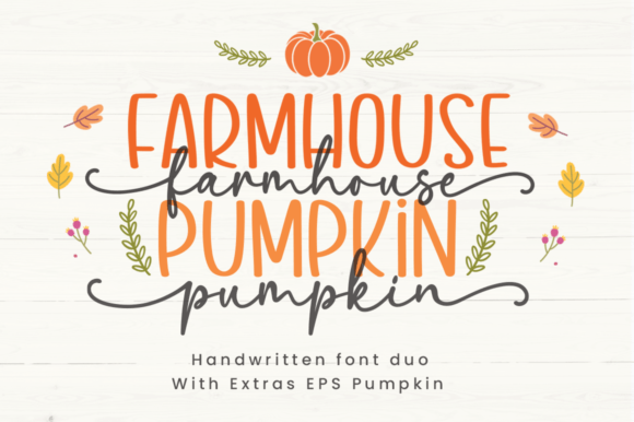
13. Farmhouse Pumpkin
Farmhouse Pumpkin pairs a sans serif with a script in a farmhouse aesthetic, which places it in the autumn rather than the horror side of the season. Farmhouse styling has been commercially dominant in home decor for years and shows no sign of fading.
The autumn market runs longer than the Halloween market. Farmhouse pumpkin imagery sells from late August through November, where horror imagery has a three-week window. If you produce for sale, that difference is significant.
My take: The autumn market outlasts the Halloween market by two months. Worth considering if you sell seasonal products.
View This Font →
Autumn Dingbats
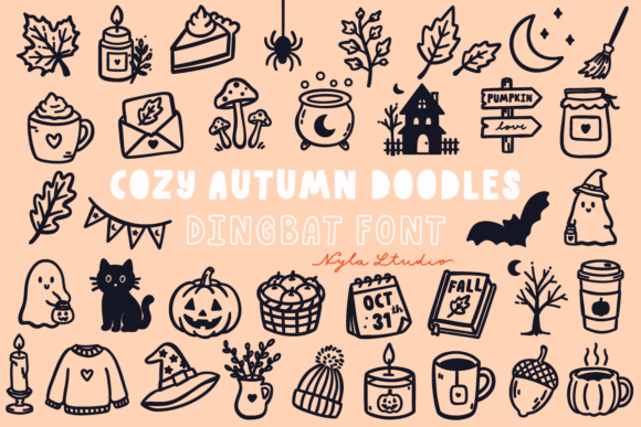
14. Cozy Autumn Doodles
Cozy Autumn Doodles is a dingbats set covering both autumn and Halloween icons, which extends its useful season considerably. Dual-purpose seasonal assets are worth more per pound than single-theme ones.
Practically, this means one purchase covers September harvest content, October Halloween content and November thanksgiving-adjacent content. For anyone producing regular seasonal social media or product listings, that range matters more than icon count.
My take: Dual-season assets earn their keep. Halloween-only icon sets sit unused for eleven months.
View This Font →
Playful Handwritten
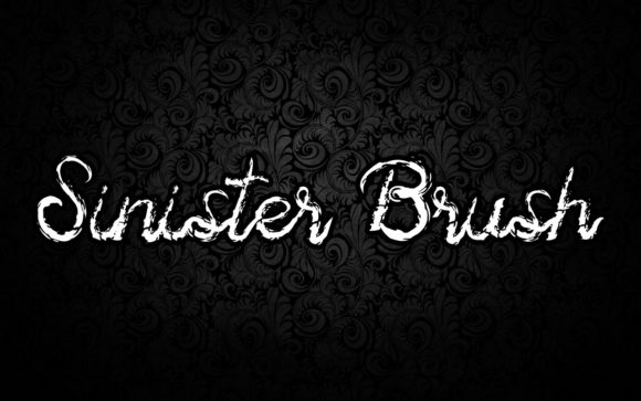
15. Sinister Brush
Sinister Brush is a handwritten face with balanced characters and a name that oversells its menace. It reads as playful rather than sinister, which is worth knowing before you buy on the name alone.
This is a general caution about seasonal type. Font names are marketing, and many Halloween-named faces are considerably gentler than they sound. Always judge from the sample image rather than from the title.
My take: Judge from the sample, not the name. Halloween font naming routinely oversells how frightening the design actually is.
View This Font → Free.
Modern Eerie
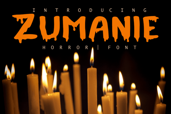
16. Zumanie
Zumanie is a modern eerie decorative face, described as suited to crafters and compatible with the usual cutting machine software. Explicit craft compatibility signals clean vector outlines without overlapping paths.
Overlapping paths are the hidden problem in decorative fonts. They look fine on screen and produce double-cut lines or unexpected holes when sent to a cutting machine, and fixing them manually is tedious. Fonts flagged as craft-ready have usually had this cleaned up.
My take: Craft-compatible labelling usually means clean vector paths, which saves real time in Design Space.
View This Font → Free.
Spooky Decorative
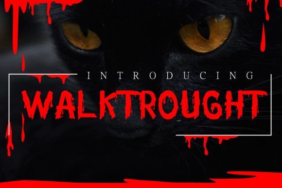
17. Walktrought
Walktrought is a modern spooky decorative face aimed at the same craft audience. Sitting alongside Zumanie, the two make a reasonable pairing for anyone building a small seasonal font library.
Two fonts in the same register from different designers give you variation without tonal clash, which is usually a safer approach than buying one font and one wildly different one. Consistency of mood beats variety of style in seasonal work.
My take: Pairs naturally with Zumanie. Two fonts in the same mood are more useful than two in different ones.
View This Font → Free.
Colour 3D
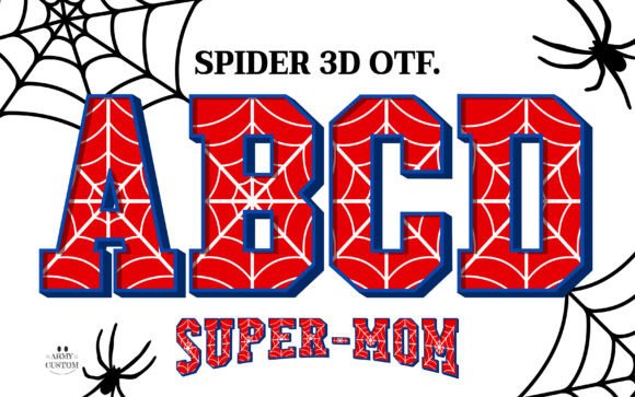
18. Spider 3d
Spider 3d is a colour font with three-dimensional treatment, which is a specific technical category with specific constraints. Colour fonts render their built-in colour only in supporting software: Photoshop, Illustrator, Canva Pro and Silhouette Studio among them.
Outside those, the font falls back to flat black. That means a colour font is unusable for web display, unreliable in Word or Google Docs, and impossible to blade-cut on a Cricut without a separate plain version.
My take: Check your software before buying any colour font. The 3D effect exists only in programs that support OpenType-SVG.
View This Font →
Printing and Cutting Ghost Fonts
Home printers lose fine detail
Party printables get printed on inkjets onto standard paper, where thin strokes bleed and small gaps fill in. Choose fonts with generous weight and avoid anything with hairlines if the output is going home with guests.
Doodle fonts weed easily
Hand-drawn styles usually have thick, simple strokes, which makes them among the easiest fonts to cut and weed in vinyl. Detailed horror faces are considerably harder.
Colour fonts need supporting software
OpenType-SVG fonts show their colour only in Photoshop, Illustrator, Canva Pro and Silhouette Studio. Everywhere else they fall back to flat black, and Cricut cannot blade-cut them at all without a plain version.
Demo versions have gaps
Fonts labelled demo often omit numbers and punctuation. Party graphics need dates and times, so check the character map before you build a layout around one.
Questions People Ask
What makes a ghost font different from a horror font?
Rounded letterforms, bouncing baselines and lighter weights. Horror fonts use sharp terminals, heavy weight and distortion effects. The same subject matter can go either way depending on how the letters are drawn.
Are ghost fonts suitable for classroom materials?
The doodle and playful options here are, though check letterform clarity for young readers. A lowercase a that could be mistaken for an o causes real problems in early reading material.
Which ghost fonts work best on a Cricut?
The doodle and hand-drawn styles, because thick simple strokes weed easily. Anything with fine detail or built-in colour will be difficult or impossible.
Can I sell products made with these fonts?
Check the licence on each product page. Most permit commercial use but merchandise and print on demand are sometimes handled as separate rights.
How many ghost fonts does a seasonal project need?
Two. One display face for headlines and one script or dingbats set for accents. Buying a matched duo solves this in a single purchase and avoids the mismatch that gives away amateur layouts.
Do ghost fonts work outside October?
The autumn and farmhouse-styled options do, running from late August through November. Purely Halloween-themed faces have roughly a three-week commercial window.
Related: cute Halloween fonts, Halloween monogram and dingbat fonts, or browse Creative Fabrica →




One Comment