Medieval fonts are among the most misused typefaces in design, mostly because people choose them on atmosphere and then discover the practical problems afterwards. Blackletter capitals are frequently unreadable to modern eyes. The letterforms are dense enough that spacing errors merge whole words. Fine manuscript detail vanishes the moment you print small. This collection covers twenty medieval fonts with those problems addressed rather than ignored.
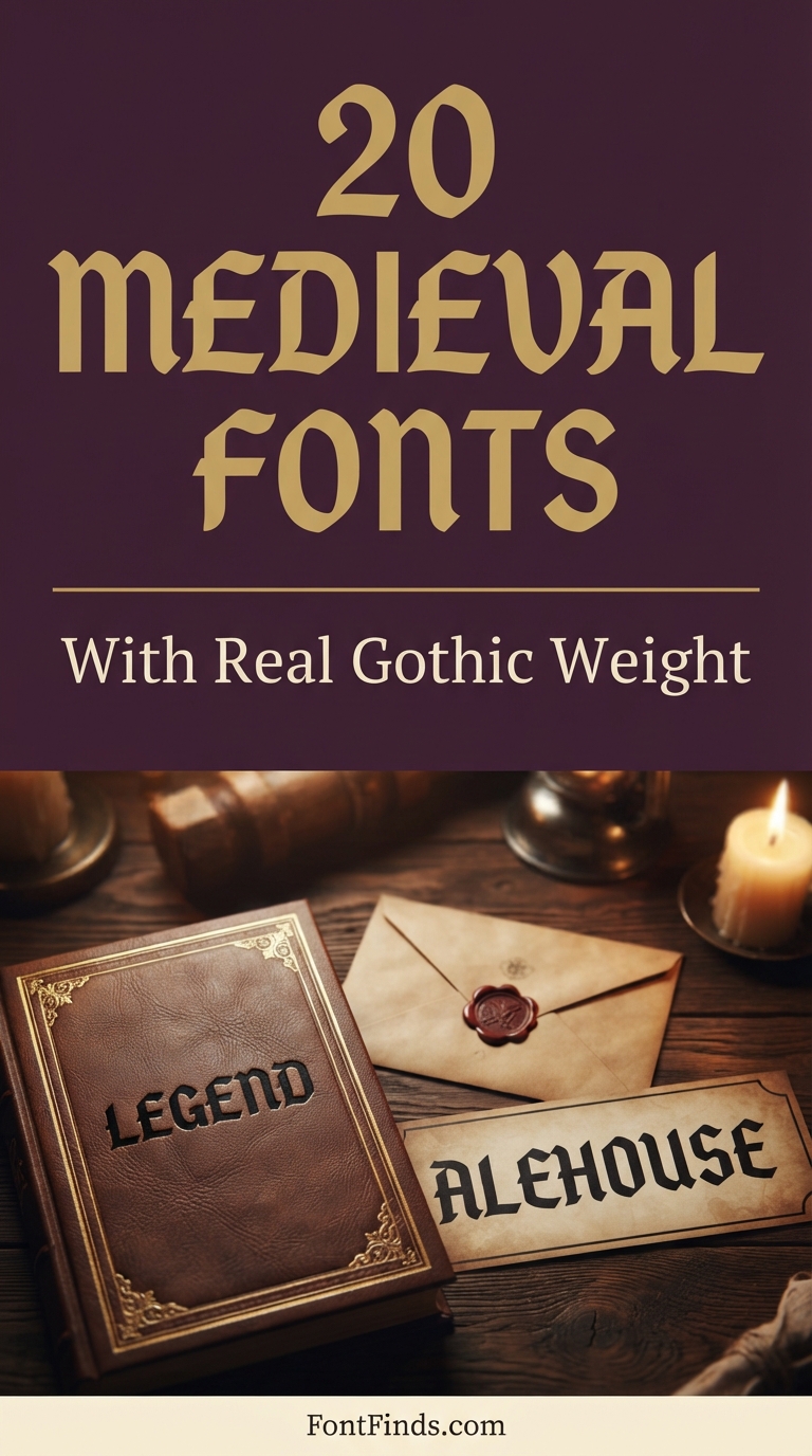
Why Medieval Fonts Are Harder to Use Than They Look
Blackletter developed as a handwriting system, written with a broad-nib pen held at a fixed angle. Every characteristic of the style follows from that tool: the thick vertical stems, the thin diagonal connectors, the angular terminals where the nib lifted. Understanding that origin explains most of the practical problems.
The first is density. Blackletter was designed to fit more text on expensive parchment, which means the letters are narrow and the gaps between them are deliberately small. Set it with default spacing at a large size and words visually merge into a solid block.
The second is capital legibility. Gothic majuscules were decorative initials, not everyday letters, and many are unrecognisable to anyone who has not studied the tradition. A capital that reads clearly to you may read as a completely different letter to your audience.
The third is reproduction. Authentic revivals carry the fine hairlines a pen produced. Those hairlines survive screen display and high-quality printing, and disappear in embroidery, vinyl cutting and small-scale print. Heavier modern reinterpretations solve this, which is why so many entries below are described as bold rather than authentic.
On historical associations. Blackletter carries specific cultural baggage in some regions, particularly in Germany where the style was heavily used in twentieth century political propaganda and remains loaded as a result. If your work will be seen in a European market, it is worth being aware that the same typeface reads differently there than it does elsewhere.
20 Medieval Fonts
Bold Blackletter
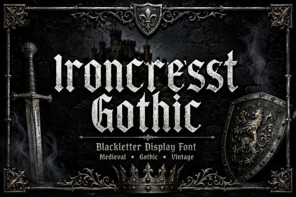
1. Ironcrest Gothic
Ironcrest Gothic is a commanding blackletter display face, and commanding is the right word for where it sits in the range. This is not the delicate manuscript end of the tradition, it is the heavy architectural end where letters read as carved rather than written.
Weight is what makes blackletter usable in modern design. The original manuscript hands were written with a broad nib at reading size, which produced fine detail that disappears at logo scale. Heavier reinterpretations like this survive being shrunk, printed on fabric, and reproduced in a single colour, which is where most authentic revivals fail.
My take: My first pick for anything that has to work on merchandise. Heavy blackletter is one of the few historical styles that screen prints cleanly.
View This Font →
Old World
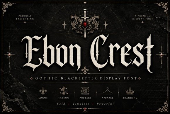
2. Ebon Crest
Ebon Crest leans on old-world grandeur, with the elaborate capitals that define traditional gothic type. Those capitals are the most decorative part of any blackletter alphabet and the part that carries most of the historical signal.
They are also where legibility problems begin. Blackletter capitals vary enormously between designers and some are genuinely hard to read for anyone not familiar with the tradition. Before committing, type the actual first letter of your brand or title and show it to someone cold. If they misread it, no amount of atmosphere compensates.
My take: Test your specific initial before falling in love with the alphabet. Gothic capitals are where this style most often defeats its own purpose.
View This Font →
Medieval Display
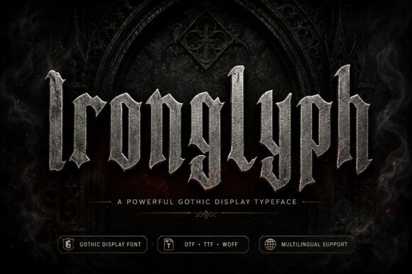
3. Ironglyph
Ironglyph is described as striking medieval allure, positioning it in the historical rather than the modern reinterpretation camp. Fonts in this territory work best when the surrounding design agrees with them.
That means texture, muted colour and generous margins. Blackletter dropped onto a clean white modern layout looks like a costume, whereas the same face on aged paper stock with a restrained palette reads as intentional. The typeface can only do half the job.
My take: Pair it with texture. Medieval fonts on flat white backgrounds always look borrowed rather than designed.
View This Font →
Architectural
4. Dreadmoor
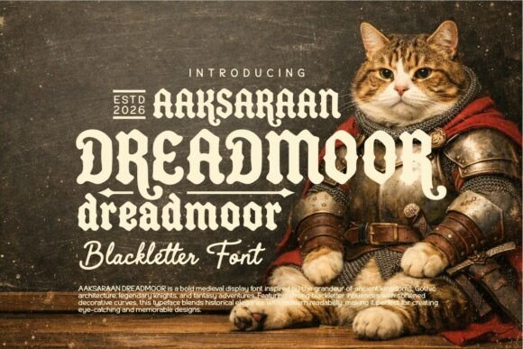
Dreadmoor draws on gothic architecture and ancient kingdoms, which shows up in the vertical emphasis of the letterforms. Architectural blackletter tends to be taller and narrower than manuscript blackletter, with strong upright stems and minimal curve.
Narrow proportions have a practical benefit: more characters fit on a line, which matters because blackletter set wide becomes unreadable quickly. If your title runs long, a condensed medieval face is a far better choice than trying to shrink a wide one.
My take: The better choice when the words are long. Most medieval fonts assume a short title and fall apart past about ten characters.
View This Font →
Dark Grandeur
5. Obsidian Black
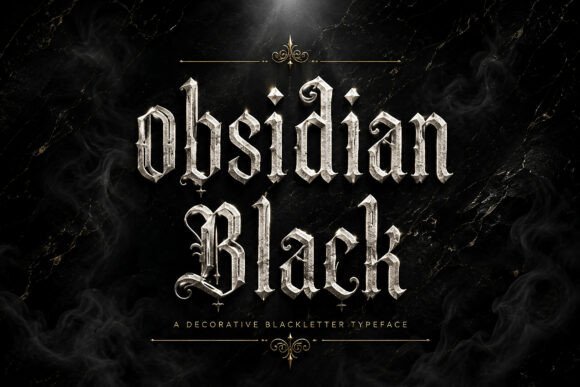
Obsidian Black channels dark majesty and gothic grandeur, sitting at the heavy decorative end where ornament is built into the letterforms rather than added around them.
Built-in ornament is a genuine advantage for anyone without illustration skills, since the flourishes come pre-matched to the type. It is a disadvantage when you need the type to sit alongside your own graphics, because two competing decorative systems rarely resolve. Decide which is doing the decorating before you choose.
My take: Good if the type is carrying the whole design. Less good if you already have illustration in the layout.
View This Font →
Elegant Gothic
6. Underdove
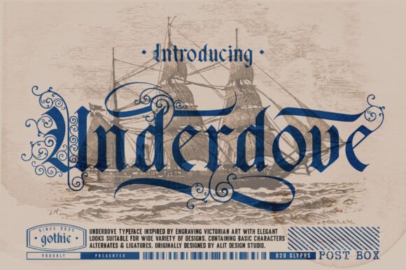
Underdove takes a more restrained approach, described as a tribute to elegance and authority rather than to menace. That distinction matters more than it might seem.
Blackletter carries two very different associations depending on execution. Heavy and rough reads as metal, motorcycle culture and horror. Refined and controlled reads as academic, ceremonial and traditional, which is why universities and newspapers still use it. Underdove is firmly in the second camp, which makes it usable in contexts where the rougher faces would be inappropriate.
My take: The one to use for certificates, mastheads and anything ceremonial. Most medieval fonts are too aggressive for those jobs and this one is not.
View This Font →
Modern Old English
7. Crownspire
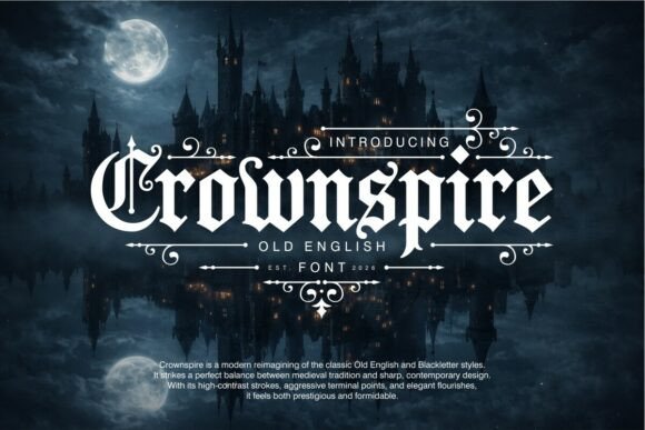
Crownspire is explicitly a modern reimagining of Old English and blackletter, striking a balance between historical reference and contemporary usability. Modernised blackletter simplifies the most decorative details while keeping the recognisable structure.
The result is a face that reads faster than authentic revivals. Whether that is good depends on your goal. For a tattoo, a band logo or a streetwear drop where the audience knows the tradition, authenticity wins. For a general audience who just need to read the word, modernisation wins.
My take: Choose this over a strict revival when your audience is general rather than subcultural. Legibility beats authenticity outside the niche.
View This Font →
Knotwork
8. Dawns
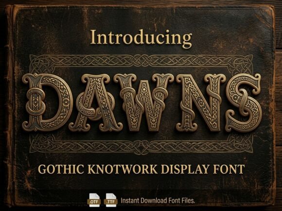
Dawns uses gothic knotwork, an interlaced decorative style with roots in insular manuscript illumination rather than in continental blackletter. The two traditions are often blended in modern fonts but they come from different places.
Knotwork adds visual density, which means it needs size. At small scale the interlacing collapses into noise, so this is a title face and a poster face rather than a body face. Set it large, keep the word count low, and give it space.
My take: Large sizes only. Knotwork detail is the first thing lost when a design gets scaled down.
View This Font →
Dark Gothic
9. Bathory
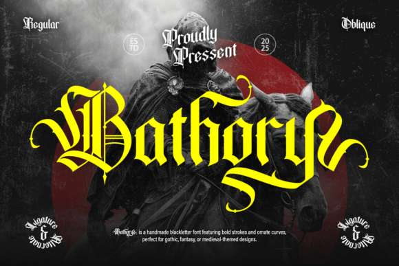
Bathory brings a bold sense of darkness and mystery, sitting toward the horror-adjacent end of the blackletter range. The naming is doing deliberate work here, referencing a figure from European folklore associated with the genre.
Fonts with strong thematic naming tend to have letterforms that match, which is useful when browsing but limiting when applying. This will always carry a dark association, so it suits horror, metal and gothic subculture work rather than anything neutral.
My take: Genre-specific rather than general purpose. Excellent within horror and metal, awkward outside them.
View This Font →
Evocative Gothic
10. Black Raven
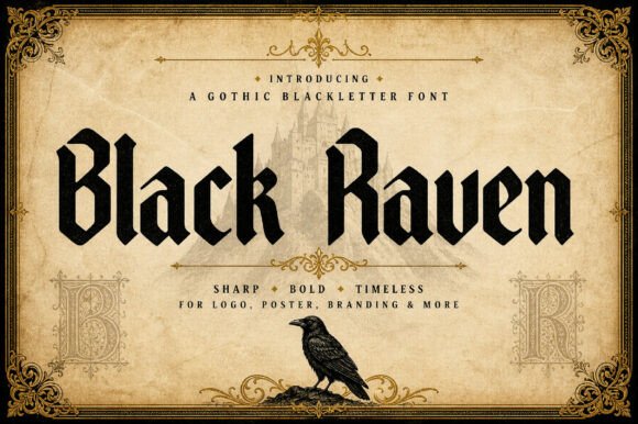
Black Raven is a gothic blackletter display face built around atmosphere rather than authenticity. The raven association places it in the literary gothic tradition, closer to nineteenth century romanticism than to medieval manuscript.
That is a distinct visual register worth knowing. Literary gothic tends toward elegance and melancholy, where medieval gothic tends toward weight and authority. If your project is about mood rather than history, the literary end is usually the better fit.
My take: The right choice for book covers and anything literary. Medieval authority is a different feeling to gothic melancholy.
View This Font →
Brutal
11. Bloodforge Gothic
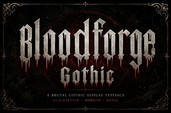
Bloodforge Gothic is described as brutal, merging sharp angular forms with gothic structure. This is the most aggressive end of the range and it behaves accordingly.
Sharp angular blackletter has one enormous practical advantage: the letterforms survive distressing. If your design involves grunge textures, halftones or heavy overlays, delicate faces get destroyed and brutal ones just look more brutal. Match the font’s robustness to how much processing the artwork will take.
My take: Use this when the artwork is getting distressed. Fine gothic detail disappears under texture and this will not.
View This Font →
Ornate Gothic
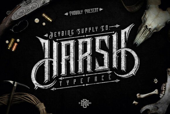
12. Harsh
Harsh combines ornate decoration with dramatic sharp strokes, which is an unusual pairing. Most blackletter picks one or the other, since ornament tends to soften and sharpness tends to strip detail.
Getting both means the font carries a lot of information per letter. That is powerful in a single-word logo and exhausting across a headline. Treat it as a mark rather than as type, and let something plain carry the actual message.
My take: One word maximum. There is too much happening per letter for anything longer to stay comfortable.
View This Font →
Arcane Ornamental
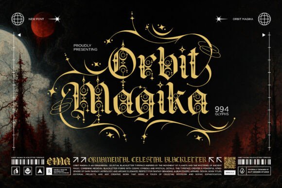
13. Orbit Magika
Orbit Magika sits at the intersection of blackletter and occult ornamental design, an increasingly common blend in contemporary display type. The arcane framing shifts it away from historical reference toward fantasy.
That shift widens its use. Historical blackletter is limited to contexts where medieval reference makes sense, whereas arcane blackletter works across fantasy publishing, tarot design, game branding and mystical product packaging, all of which are growing categories.
My take: More commercially flexible than strict medieval faces. Fantasy and occult markets are larger than genuinely historical ones.
View This Font →
Blended Blackletter
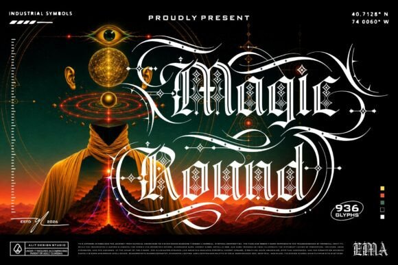
14. Magic Round
Magic Round blends classic blackletter with rounder, softer construction. Rounding is the single most effective way to make gothic type approachable, because sharp terminals are what create the sense of threat.
Softened blackletter opens up applications that hard gothic cannot reach: children’s fantasy, board games, craft brewing, anything that wants historical flavour without menace. It is a small technical change with a large tonal consequence.
My take: The medieval font for projects that need charm rather than intimidation. Rounding changes the entire emotional register.
View This Font →
Mystical Gothic
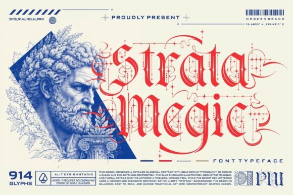
15. Strata Magic
Strata Magic is a premium gothic display face positioned around mystical elegance. Premium in this context usually means a larger glyph set and better spacing than budget alternatives, both of which show up in real use.
Spacing is the quiet difference between good and bad blackletter. Gothic letterforms are dense and the gaps between them are narrow by design, which means poor spacing produces words that visually merge. Well-spaced blackletter reads noticeably faster.
My take: Worth paying for if blackletter is central to your project. Spacing quality is invisible in a preview and obvious in a headline.
View This Font →
Baroque
16. Mozathia
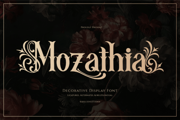
Mozathia moves past medieval into baroque territory, with dark romance and ornamental opulence. Baroque decorative type is a different historical period entirely, roughly the seventeenth and eighteenth centuries rather than the twelfth to fifteenth.
Period accuracy matters if your project references a specific era, and it matters not at all if you simply want atmosphere. Most audiences read all ornamental historical type as vaguely old, so unless you are working for a museum, choose on appearance rather than on date.
My take: Do not worry about the period unless accuracy is part of the brief. Audiences read all of this as old and that is usually enough.
View This Font →
Spooky Blackletter
17. Black Metal
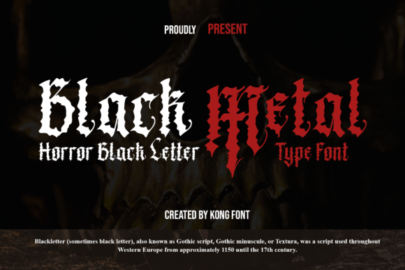
Black Metal is a modern spooky blackletter, and the name points directly at its native context. Blackletter’s association with extreme metal is one of the strongest genre-typography links in existence, dating back decades and still going.
What makes metal blackletter distinct is illegibility tolerance. Within the genre, a logo that outsiders cannot read is a feature rather than a bug, which frees the letterforms to become extremely decorative. Outside the genre that same freedom becomes a problem.
My take: Perfect for band artwork, risky anywhere the audience actually needs to read the word.
View This Font → Free.
Vintage Horror
18. Drachenveil
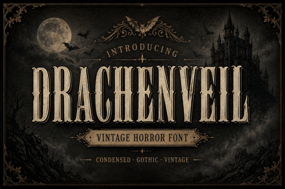
Drachenveil is a condensed vintage horror face built to evoke classic gothic tales. Condensed is the operative technical detail: narrower letterforms mean more characters per line without reducing height.
For horror titling that matters because titles are often long. A condensed gothic face lets a four-word title stay large enough to read on a poster thumbnail, where a wide face would force you to shrink it to fit.
My take: The practical horror titling choice. Condensed proportions solve the problem most gothic display faces create.
View This Font →
Bold Fun
19. Strong Witches
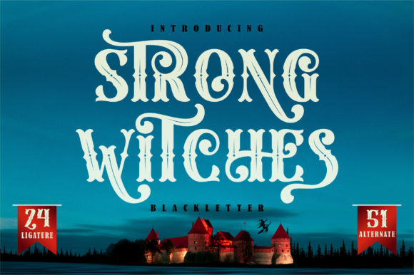
Strong Witches is a bold blackletter with a deliberately fun rather than menacing character, which is unusual in this category. Most gothic faces treat the tradition seriously.
Playful gothic has a small but real market: Halloween party graphics, themed events, craft products and anything that wants the visual shorthand of the occult without the tone. It is a narrow niche and there is correspondingly little competition in it.
My take: A useful oddity. If you need gothic that is not intimidating, there are very few alternatives to choose from.
View This Font →
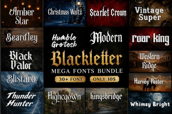
Bundle
20. Modern Blackletter Mega Bundle
A bundle of modern blackletter faces rather than a single typeface, which changes the value calculation entirely. Bundles make sense when you work in this style regularly and want range without repeated purchases.
They make less sense for a one-off project, where a single well-chosen face beats twenty adequate ones. Buy a bundle if blackletter is part of your ongoing work, not if you have one poster to design.
My take: Only worth it if you use gothic type regularly. For a single project, choose one font properly instead.
View This Font →
Four Rules for Using Gothic Type
1. Open the letter spacing
Whatever the default is, add to it. Blackletter was drawn tight for parchment economy and modern layouts have no such constraint. Extra spacing dramatically improves readability at almost no aesthetic cost.
2. Never set it in lowercase only
Gothic lowercase is a repeating pattern of vertical strokes. Without capitals to break the rhythm, a word becomes a picket fence that the eye cannot decode. Mixed case or all caps, never lowercase alone.
3. Keep it to short phrases
Two or three words maximum. Blackletter reads roughly half as fast as a modern sans serif, which is fine for a title and intolerable for a paragraph.
4. Pair it with something plain
A clean sans serif for all supporting text. Two decorative faces in one layout produce visual noise, and gothic type needs a quiet partner more than most.
Questions People Ask
What is the difference between medieval fonts and blackletter?
Blackletter is the specific script family, covering Textura, Fraktur, Schwabacher and Rotunda. Medieval fonts is a broader marketing term that also includes knotwork, uncial and various fantasy-inspired styles that were never historical scripts at all.
Are medieval fonts readable?
At headline size with generous spacing, yes. In long text or at small sizes, no. Blackletter reads considerably slower than modern type even for people familiar with it, which is why it survives as display type and not as body type.
Which medieval font works best for a tattoo?
A heavy one with simple capitals. Fine gothic detail blurs as tattoo ink spreads over the years, so the ornate options here will not age well on skin. Bold, structural faces hold their shape.
Can I use medieval fonts commercially?
Check each licence individually. Most Creative Fabrica fonts permit commercial use, though merchandise and trademark registration are sometimes handled separately from general commercial rights.
Why does my blackletter text look like a solid block?
Letter spacing is too tight, which is the default state for most gothic fonts. Increase tracking until the vertical strokes visibly separate, then increase it a little more.
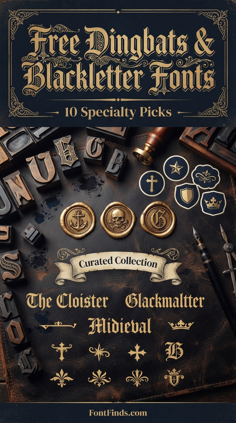
Related: free blackletter and specialty fonts, streetwear logo design ideas, or browse Creative Fabrica →



2 Comments