Serif fonts sell luxury more reliably than any other typographic decision, which is why the category is crowded with releases that describe themselves in identical language. Elegant, refined, sophisticated, editorial. These sixteen recent serif fonts are covered with attention to the one thing the marketing copy never mentions: stroke contrast, and whether the font survives leaving a screen.
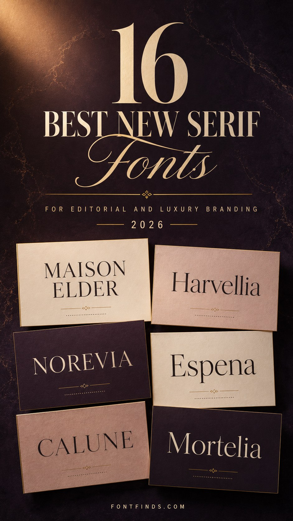
Stroke Contrast Decides Everything
Every practical question about a serif comes back to how much thinner the thin strokes are than the thick ones. That single measurement predicts where the font works and where it fails.
Low contrast. Thin and thick strokes are close in weight. Survives body text, small sizes, embroidery, uncoated paper and single-colour reproduction. Reads as sturdy and readable rather than luxurious.
Moderate contrast. Visible difference without extremes. The most useful range for brand work, since it reads as refined while still functioning at caption size and in most print conditions.
High contrast. Dramatic difference, approaching hairlines. Reads as expensive and fails in every physical production method. Screen and coated print only, and only at size.
Hairline. The thin strokes are barely present. Nothing looks more premium and nothing is more fragile. Large format and high-quality print exclusively.
Before comparing any two serifs, decide which band your project needs. That question eliminates most of the category and makes the remaining choice straightforward.
On identical marketing copy. Several fonts below describe themselves as elegant, refined and editorial in nearly the same words. That is not laziness, it is that the category sells on those associations. Judge from the letterforms in the specimen image, because the descriptions genuinely will not differentiate them.
16 New Serif Fonts
High Fashion Drama
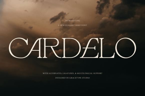
1. Cardelo
Cardelo is built for high-fashion drama and editorial luxury. Fashion serifs share a specific technical signature: extreme stroke contrast, meaning the thin parts are dramatically thinner than the thick parts.
That contrast is the fastest route to perceived expense, and it is also the fastest route to a font that fails in production. Hairlines disappear in embroidery, break in foil stamping and vanish on uncoated paper. This is a screen and coated-print typeface.
My take: Extreme contrast is why it reads expensive and why it will not survive a woven label. Plan accordingly.
View This Font →
Contemporary Elegance
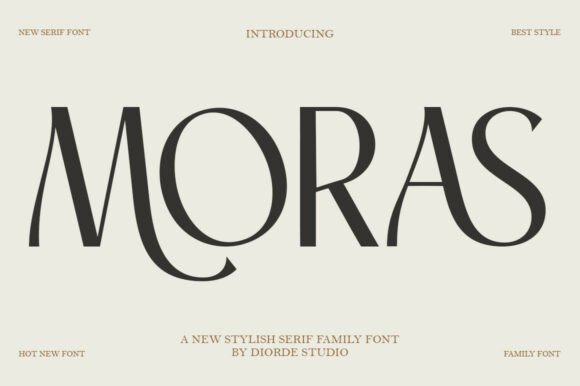
2. Moras
Moras blends fluid motion with structured sophistication. Fluid in a serif usually means slightly curved stems or asymmetric terminals, borrowed from calligraphy rather than from metal type.
Those calligraphic touches read as contemporary because historical serifs were geometrically rigid. The caution is that fluid details are the first thing lost when a font is scaled down, so check at small sizes before assuming the character carries through.
My take: Calligraphic details are what make it feel current and the first thing to vanish when scaled down.
View This Font →
Editorial Grace
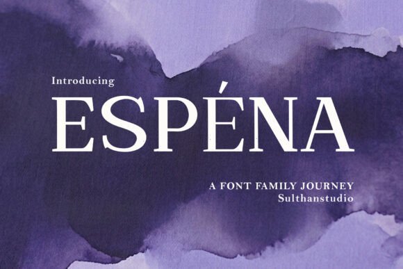
3. Espena
Espena aims at refined artistic poise and high-fashion luxury. This is the third font in this batch describing itself in nearly identical terms, which says something useful about the market.
Luxury serif is a crowded category because it sells. That means competent releases are plentiful and genuinely distinctive ones are rare. If differentiation matters for your brief, look at the specific letterforms rather than the marketing language, because the copy will be the same everywhere.
My take: Luxury serif is crowded because it sells. Judge on letterforms, since every listing uses identical language.
View This Font →
High Contrast
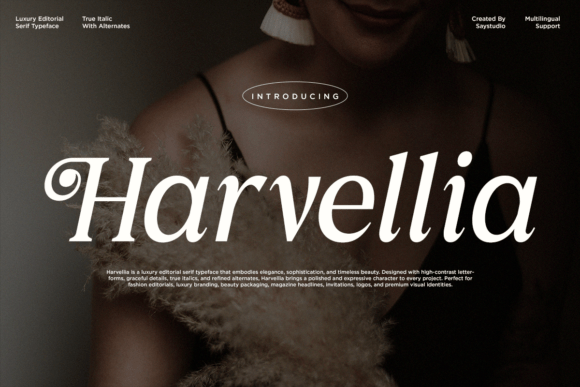
4. Harvellia
Harvellia is an elegant high-contrast serif for sophisticated contemporary work. High contrast is worth understanding as a spectrum rather than a binary.
Moderate contrast survives body text and small sizes. Extreme contrast, the Didone end, only works large. Before choosing, decide whether the font needs to carry captions and product details or only headlines, because that single question eliminates most of the category.
My take: Decide whether it needs to carry captions. That one question eliminates most high-contrast serifs immediately.
View This Font →
Refined Curves
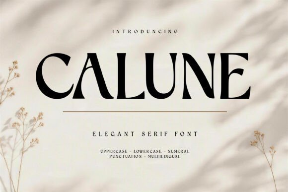
5. Calune
Calune is crafted with graceful curves and refined contrast. Curve quality in a serif is genuinely difficult to assess from a specimen image and easy to assess in use.
Type a lowercase o, s and g at large size. Well-drawn curves have smooth continuous transitions with no flat spots or sudden changes in direction. Poorly drawn ones show visible corners where the curve segments meet, which is invisible small and obvious large.
My take: Set a large lowercase o and s. Flat spots in the curves are invisible small and impossible to unsee large.
View This Font →
Sculptural Display
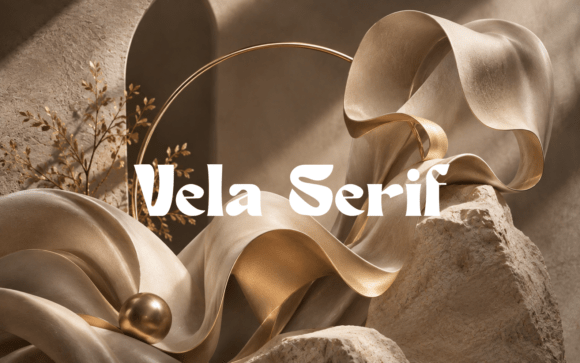
6. Vela
Vela is a modern elegant display serif built around sculptural luxury and high-fashion fluidity. Display serif is a specific sub-category with a narrow useful range.
It carries serif detail that fails at small sizes and display weight that becomes tiring in text. That leaves headlines, logos and short pull quotes, and nothing longer. Buying one expecting a full text family is a common and expensive mistake.
My take: Display serifs have a narrow range. Headlines and logos, never body copy, regardless of what the listing implies.
View This Font →
Hairline Serif
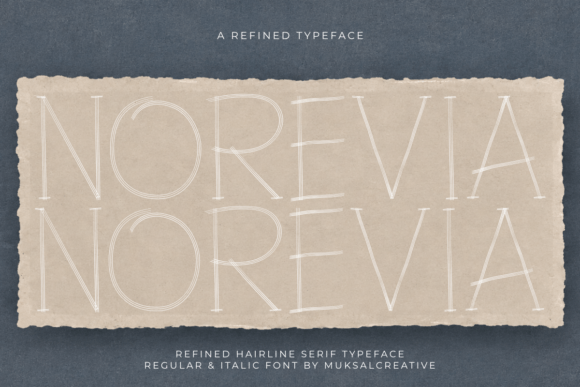
7. Norevia
Norevia is an elegant hairline serif display face for refined sophisticated work. Hairline is the most extreme end of the contrast spectrum and it comes with the strictest constraints.
These faces need large size, high-quality reproduction and generous surrounding space. They fail in every physical production method and in most small digital contexts. When they work, nothing looks more expensive, and the conditions where they work are narrow.
My take: Nothing looks more expensive when it works, and the conditions where it works are very narrow.
View This Font →
Royal Luxury
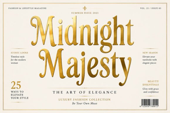
8. Midnight Majesty
Midnight Majesty defines royal sophistication with classic luxury styling. Classical serif references carry associations that geometric or modern serifs do not.
The association is institutional permanence, which is why heritage brands, universities and formal institutions keep using classical serifs decades after the style stopped being fashionable. If your positioning depends on implying history, that association is doing work no modern face can replicate.
My take: Classical serifs imply institutional permanence. Modern serifs cannot fake that association no matter how well drawn.
View This Font →
Sculptural Glamour
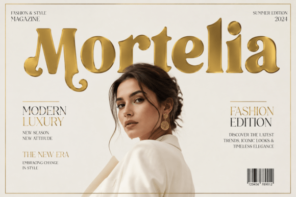
9. Mortelia
Mortelia exudes high-fashion glamour with sculptural luxury. Sculptural in type marketing usually means unusual weight distribution or exaggerated proportions rather than conventional serif structure.
Those exaggerations are what make a display serif memorable and what make it date. Distinctive proportions tie a face to the moment it was designed, which is fine for a campaign and risky for an identity meant to last.
My take: Exaggerated proportions are memorable and they date. Campaign yes, decade-long logo no.
View This Font →
Avant-Garde Editorial
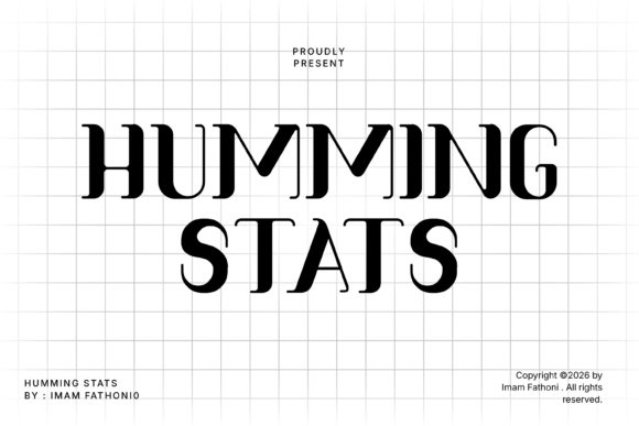
10. Humming Stat
Humming Stats establishes avant-garde editorial authority. Avant-garde is a warning label as much as a description.
Experimental letterforms slow readers down in ways they cannot articulate, which is fine in a fashion editorial where the reader is browsing and wrong in anything where information needs to transfer efficiently. Match the experimentation to how carefully the text will actually be read.
My take: Experimental serifs suit browsing and fail at reading. Match the risk to how the text will be consumed.
View This Font →
Liquid Serif
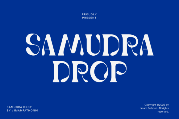
11. Samudara Drop
Samudra Drop infuses fluid grace into a serif structure, producing a liquid display treatment. Liquid distortion compromises the letter skeleton rather than merely decorating it.
That is the practical difference from a merely fluid serif. Distorted skeletons need familiar words and large sizes, because readers decode unfamiliar text by letter shape and distortion removes the shapes they rely on.
My take: Distortion removes the shapes readers use to decode unfamiliar words. Keep it to words they already know.
View This Font →
Vintage Display
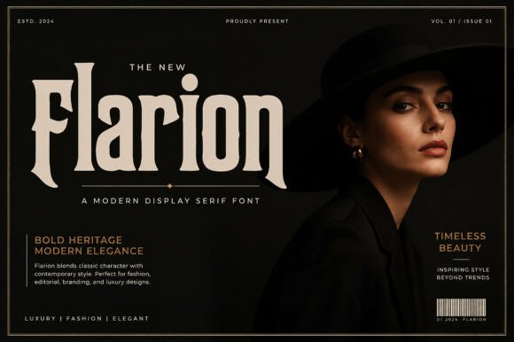
12. Flarion
Flarion is a vintage display serif with historical reference. Vintage serifs carry a specific commercial advantage worth naming plainly.
They imply the business has existed longer than it has. A customer comparing two similar products reads heritage-styled type as more established, and that perception is available to a company founded last month. It is the cheapest positioning tool in packaging design.
My take: The cheapest positioning tool in packaging. Heritage type implies a history you do not need to actually have.
View This Font →
Refined Vintage
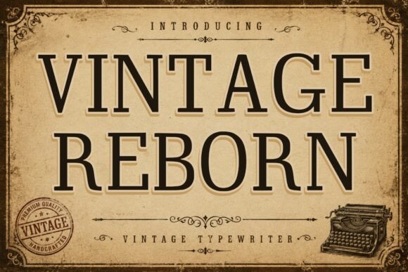
13. Vintage Reborn
Vintage Reborn is a refined vintage serif display face for timeless design work. Refined vintage sits at a different price point from rustic vintage, and the distinction matters commercially.
Rustic vintage signals handmade and affordable. Refined vintage signals established and expensive. Both are historically accurate, and choosing the wrong one places your product in the wrong mental price bracket before the customer reads a number.
My take: Rustic and refined vintage sit at opposite price points. Match it to what you actually charge.
View This Font →
Retro Modern Serif
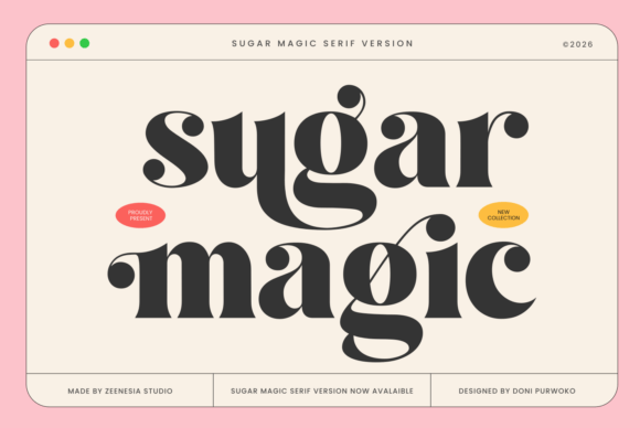
14. Sugar Magic
Sugar Magic combines vintage seventies flair with modern display serif construction. Seventies serif is distinct from seventies groovy display in a way worth knowing.
Groovy is bubbly and rounded. Seventies serif keeps serif structure while widening the proportions and softening the terminals. It reads as period-accurate without the cartoon quality, which suits food, drink and lifestyle brands that want retro warmth with credibility.
My take: Retro warmth with credibility. Groovy display gets the era but loses the seriousness.
View This Font →
Classic Vintage Slab
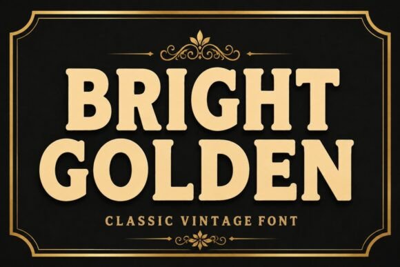
15. Bright Golden
Bright Golden is a bold elegant classic vintage face designed to stand out. Slab construction gives it a durability advantage the finer serifs here do not have.
Slab serifs are thick enough to survive embroidery, vinyl cutting, engraving and small-scale printing. If your vintage serif needs to end up on a physical product rather than a screen, slab is the pragmatic choice over anything high-contrast.
My take: The production-proof vintage option. Slabs survive manufacturing where high-contrast serifs cannot.
View This Font →
Playful Retro
16. Relvato
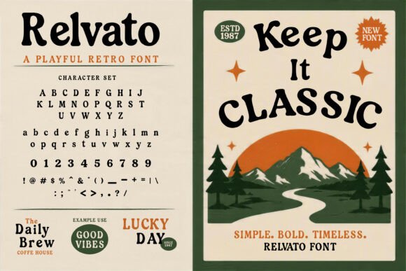
Relvato is a playful retro display serif with bold nostalgic personality. Playful retro serif is a narrower category than either playful display or retro serif alone.
That narrowness is an opportunity. Most retro serif releases aim at heritage credibility, which leaves the lighter end underserved. For ice cream, casual dining, kids’ products and anything that wants nostalgia without gravity, there is genuinely less competition.
My take: Underserved corner of a crowded category. Most retro serifs chase gravity and leave this space open.
View This Font →
How to Compare Similar Serifs
Set a large lowercase o, s and g
Curve quality is where drawing skill shows. Well-made curves transition smoothly with no flat spots or visible corners where segments meet. This is invisible at small size and unmistakable at large.
Check the terminals
How the strokes end tells you the era being referenced. Bracketed serifs read classical, flat unbracketed ones read modern, and flared ones read contemporary. This is where most of a serif’s personality lives.
Look at the numerals
Serif figures are frequently an afterthought. Prices and dates appear on almost every commercial project, and badly drawn numbers undermine otherwise good typography.
Print it before deciding
Screen rendering flatters thin strokes. Print at final size on your actual stock and the contrast will look different, usually heavier on uncoated paper and thinner on coated.
Questions People Ask
What are the best serif fonts for luxury branding?
High-contrast serifs read as most expensive, but they only work on screen and in quality print. If the brand needs embroidery, packaging or small-scale reproduction, moderate contrast is the practical choice.
Why do my serif fonts look broken at small sizes?
Stroke contrast. The thin strokes disappear as size decreases, leaving a fragmented letterform. Choose a lower-contrast serif for anything that has to work small.
What is the difference between a display serif and a text serif?
Display serifs are drawn for size and impact, with tight spacing and often extreme contrast. Text serifs are spaced for reading with moderate contrast. Very few families do both, and buying one expecting the other is a common mistake.
Are vintage serifs still current?
Yes, and they carry a specific commercial advantage: implied longevity. A heritage-styled serif makes a new business read as established, which is why craft food, drink and cosmetics packaging uses them so consistently.
How do I pair a serif with a sans serif?
Match the x-heights so the two look consistent at the same point size, and give one font the personality while the other stays quiet. Two expressive faces in one system means neither is doing its job.
Related: modern serif fonts for branding, vintage serif fonts for logos, or browse Creative Fabrica →



2 Comments