18 Birthday Party Sign Fonts That Set the Mood

This article contains affiliate links. If you buy through them, I may earn a commission at no extra cost to you.
The welcome sign is often the first piece of party styling a guest reads. I want it to feel like the celebration before they reach the table. For these birthday party sign fonts, I am looking at playful shapes, the space a name needs and the difference between a cheerful headline and a readable message.
This is not a list of eighteen interchangeable bubble alphabets. I would use some for a big welcome, others for a dessert-table label and a few for a softer personal greeting. Start with the birthday name and age, then see which visual direction makes those words feel natural.
Which party mood are you building?
- Soft and sweet: Honey Chunky — A substantial rounded name for a cheerful board.
- Personal and gentle: Darling Birthday — A script greeting with room for the birthday name.
- Lively and playful: Wobblish — Uneven bold forms for a deliberately energetic welcome.
I would build the sign around the name
The name should remain the star even when the font is playful. I would make a quick layout with the real name, the age and one short supporting line, then remove decoration until the reading order is obvious. A long name may need a different typeface from the one that looks best in a short sample.
For a coordinated party, I would repeat the main lettering on the welcome board and use a simpler companion on smaller labels. That gives the event a recognizable look without making guests work to read every cake flavor or seating detail.
1. Cute Babe: For a big friendly welcome
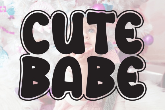
Cute Babe has thick, rounded forms with an outline detail. I would use it for a short birthday name or a bold welcome that needs to feel instantly cheerful.
I would keep the age in a clear companion if the matching numeral becomes too decorative. The name should remain the first thing guests notice.
Explore This Party Font →Preview & download options
2. Baby Candy: For a light candy-themed heading

Baby Candy uses slender outline forms with striped interior sections. I would consider it for a large candy-table sign where those details have room to show.
I would avoid using it for tiny flavor labels. A plain background and a real-size print test would tell me whether the stripes stay distinct.
Explore This Party Font →Preview & download options
3. Honey Chunky: For a soft, substantial party name

Honey Chunky has plump, friendly lettering with a strong silhouette. I would try it for a sweet-themed birthday board or a compact two-line name treatment.
I would start in one color and keep the surrounding illustrations simple. The rounded letters can carry the cheerful mood without recreating the entire candy mockup.
Explore This Party Font →Preview & download options
4. Cookie Dough: For a wide graphic headline
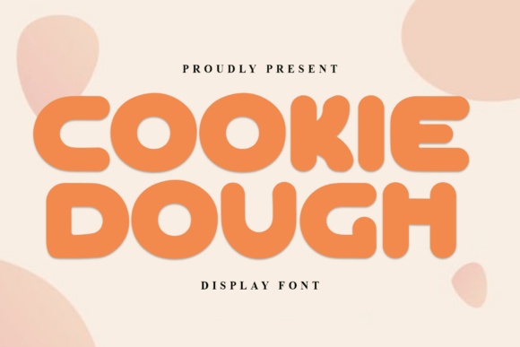
Cookie Dough has low, rounded display forms that create a broad block. I would choose it for a short name with generous horizontal space.
I would not squeeze a long name into the same arrangement. A deliberate second line is more likely to preserve the friendly proportions.
Explore This Party Font →Preview & download options
5. Darling Birthday: For a softer personal greeting

Darling Birthday offers flowing handwriting with tall capitals and gentle curves. I would use it when the sign should feel personal rather than loudly themed.
I would keep the greeting short and give the descending strokes room. Smaller event details belong in a calmer printed companion.
Explore This Party Font →Preview & download options
6. Children Comic: For a comic-style welcome board
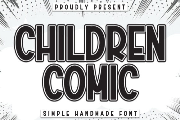
Children Comic has tall outlined letters with a substantial display character. I would consider it for a graphic party theme with a short headline.
I would place it over a flat area instead of patterned artwork. The outline should remain clear when the sign is viewed from the entrance.
Explore This Party Font →Preview & download options
7. Melon Pop: For a lively retro party

Melon Pop has narrow, rounded forms with an energetic handmade rhythm. I would try it for a music-themed birthday or a bright summer gathering.
I would keep the name in a simple shape and let one illustration establish the theme. The busy preview scene is not necessary for the lettering to feel lively.
Explore This Party Font →Preview & download options
8. Smooth Boom: For a clear playful name
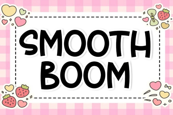
Smooth Boom has broad, clean-looking capitals with small irregularities. I would shortlist it when I want a birthday name to be friendly and easy to find.
I would compare a single line with a compact stack. The best arrangement is the one that keeps the actual name comfortable, not the one that fills every inch.
Explore This Party Font →Preview & download options
9. Pinky Slinky: For a bouncy outlined statement
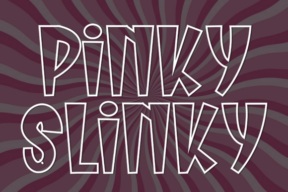
Pinky Slinky has tall, uneven outline forms with a lively silhouette. I would use it for a large short phrase on a playful welcome board.
I would keep the background quiet and avoid another heavy outline around the whole phrase. The letter contours already provide plenty of movement.
Explore This Party Font →Preview & download options
10. Carrot Rabbit: For a gentle storybook party
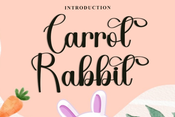
Carrot Rabbit has connected script forms and generous loops. I would consider it for a soft illustrated birthday theme or a more personal greeting.
I would keep the rabbit imagery optional and test the actual name first. The lettering can work beyond the specific seasonal theme shown in the preview.
Explore This Party Font →Preview & download options
11. Bubble Cream: For a rounded, modern celebration

Bubble Cream has soft, irregular forms with a relaxed rhythm. I would try it for a short name on a clean board with a few large decorative shapes.
I would use a limited palette rather than color every letter differently. That lets the unusual forms stay coherent while keeping the party mood.
Explore This Party Font →Preview & download options
12. Wobblish: For a deliberately lively sign
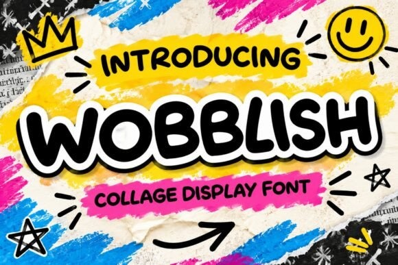
Wobblish has bold, uneven lettering that feels expressive and informal. I would use it for a playful welcome or an activity station with a short title.
I would keep the rest of the layout aligned. When the letters already wobble, a stable composition helps guests read the message quickly.
Explore This Party Font →Preview & download options
13. Melon Squishy: For a soft dessert-table label

Melon Squishy has rounded, substantial forms with a gentle irregularity. I would try it for a sweet-table heading or a friendly birthday name.
I would keep the supporting labels simpler and smaller. That gives the main lettering a clear role instead of making the entire table equally loud.
Explore This Party Font →Preview & download options
14. Grape Squishy: For a lighter playful alternative
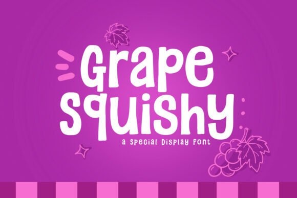
Grape Squishy has slimmer rounded forms than some of the heavier options here. I would consider it when the sign needs warmth without a dense block of lettering.
I would use a dark color on a pale background and test the longest word. The lighter structure needs enough contrast to stay clear.
Explore This Party Font →Preview & download options
15. Bread Squishy: For a warm handmade party mood
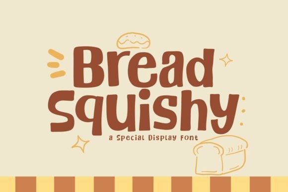
Bread Squishy has fuller, soft-edged forms that suggest an approachable handmade style. I would use it for a cozy family celebration or a simple dessert board.
I would avoid excessive shadows and let the natural weight lead. A small illustration can support the mood without taking over the name.
Explore This Party Font →Preview & download options
16. Onigiri Squishy: For a compact cheerful heading

Onigiri Squishy combines rounded letters with a slightly uneven baseline. I would try it for a short station label or a compact birthday headline.
I would separate the actual wording from the food imagery in the preview. The type can support a wider party theme when the surrounding design changes.
Explore This Party Font →Preview & download options
17. Chubby Bubble: For bold bubble lettering
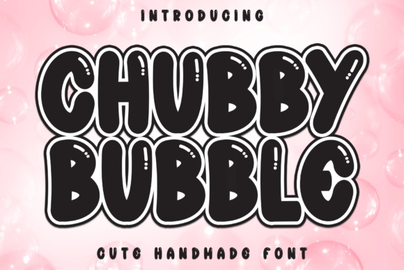
Chubby Bubble has thick, rounded forms with a light outline detail. I would shortlist it for a short birthday name that needs a strong presence.
I would check the interior spaces at the intended size. Heavy letters can lose their shape if they are packed too tightly or given an oversized border.
Explore This Party Font →Preview & download options
18. Birthday: For a straightforward celebratory title
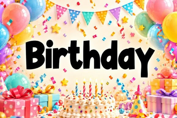
Birthday has substantial, lively printed forms with an informal rhythm. I would consider it for a welcome board where the words should do most of the work.
I would use one clear headline and keep the age separate enough to read immediately. The surrounding balloons in the preview are optional styling.
Explore This Party Font →Preview & download options
The choice I would make before adding balloons
I would decide whether the party should feel soft, silly or bold. Then I would open just two or three matching font pages and compare the actual name. A clear name in a lively font will usually do more for the sign than another layer of decoration.
My recommendations are based on a visual review of the supplied product previews, not installation or production tests. The cover is an illustrative lettering montage. Open the linked listing to check the full character set, supplied files and current license before downloading.
More font ideas
Frequently asked questions
Can I use the same font on all party signs?
Use it for the main headings, then add a simpler companion for small labels and practical information. That keeps the set coordinated without making every element equally loud.
Should the age be in the same style as the name?
Only if the numerals work well. I would preview the actual age separately and use a clear companion if the decorative numbers are difficult to recognize.
How do I judge a large welcome sign on screen?
View the complete layout at a reduced size to check hierarchy, then inspect an actual-size print sample for details. The name should be recognizable before the small supporting words.