Calligraphy and signature scripts get used interchangeably and they should not be. A signature font imitates someone writing quickly. Calligraphy imitates someone writing carefully with a broad or pointed nib, which produces controlled thick-to-thin contrast rather than speed. That difference decides which projects each one suits, and it also decides which ones survive being printed. These sixteen free calligraphy fonts are covered with both questions in mind.
Calligraphy Versus Signature Scripts
Look at the stroke weight. If it varies smoothly from thick to thin depending on the direction of the stroke, you are looking at calligraphy, because that variation comes from a nib changing angle against the paper. If the weight stays roughly constant and the letters lean forward with ragged endings, you are looking at a signature script imitating speed.
Neither is better. Calligraphy suits formality, ceremony and luxury positioning. Signature scripts suit personal brands, artists and anything that should feel like an individual rather than an institution. Choosing the wrong category is a more damaging mistake than choosing a mediocre font within the right one.
The one warning that applies to this entire list. Free calligraphy fonts almost always have thin strokes, and thin strokes are the first thing lost in production. Before committing to one, find out how the piece will be reproduced. Foil stamping, embroidery, vinyl cutting and printing on uncoated stock all destroy hairlines.
16 Free Calligraphy Fonts, Reviewed
Each entry below covers the letterform behaviour and the production limits, since free calligraphy fonts fail more often in printing than in design.
Delicate
1. Angista Script
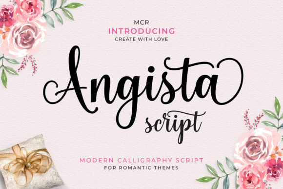
Angista opens this list because it demonstrates the defining feature of calligraphic type: characters that sit unevenly along the baseline. Where a signature font imitates fast writing, calligraphy imitates the deliberate pressure of a broad-nib pen, and that shows up as controlled thick-to-thin variation rather than ragged speed.
On an invitation this pays off at the top of the card, on the couple’s names or the event title. It does not pay off in the details block, where the same delicacy that reads as luxury at 40pt becomes illegible at 9pt. Plan two fonts from the start rather than trying to make one carry the whole card.
My take: Set the names in Angista and hand the date, venue and RSVP to a plain serif. That split is the standard structure for a reason.
Download This Font → Free download.
Classical
2. Elizabeth
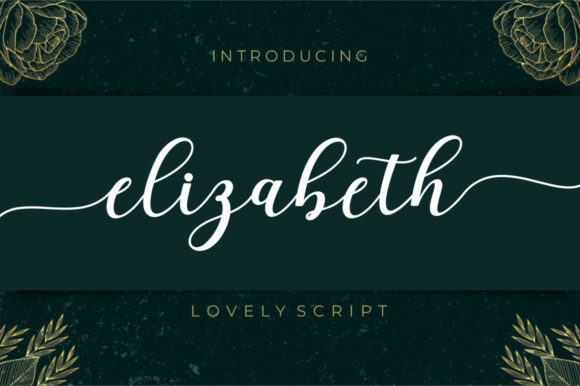
Elizabeth is the most classically formal option here, with consistent letterforms and clean connections that feel taught rather than improvised. PUA encoding puts the alternate characters within reach, which matters when you want the first letter of a name to carry a flourish that the rest of the word does not.
Formality is a positioning choice. This suits black-tie events, formal wedding stationery and luxury product labels where the customer should feel tradition. It reads as stiff on anything casual, which is worth checking against the actual event before committing.
My take: The safest formal choice in this collection. If the brief says elegant and gives no other direction, start here.
Download This Font → Free download.
Flowing
3. Mama
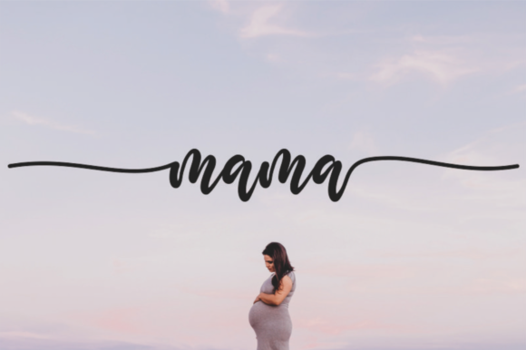
Mama has longer, more continuous strokes than most free calligraphy faces, which gives it a sweeping quality closer to modern brush calligraphy than to traditional pointed pen. The CF description points it at wedding invitations and that is exactly right.
The practical issue with high-flow scripts is horizontal space. Long entry and exit strokes mean a two-word name occupies more width than the same name in a tighter script, and on a portrait-format invitation that can force an awkward line break. Lay it out before you commit to a card size.
My take: Beautiful but space-hungry. Test it at actual card dimensions early rather than discovering the problem at proof stage.
Download This Font → Free download.
Romantic
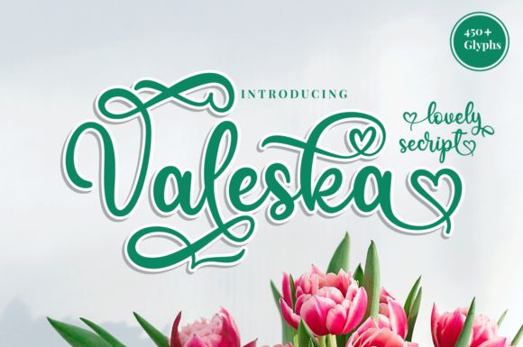
4. Valeska
Valeska pushes the dancing baseline further than most, which produces genuine warmth at the cost of predictability. Letters rise and fall enough that the same word set twice at different sizes can look noticeably different in rhythm.
That variation is the whole appeal on a hand-finished invitation or a small-batch product label, where the point is to look made rather than manufactured. It is a liability on anything that needs to be reproduced consistently across many sizes, such as a logo.
My take: Use it for one-off pieces. For anything that has to scale across a brand system, choose something more disciplined.
Download This Font → Free download.
Warm
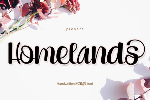
5. Homelands
Homelands is romantic calligraphy with a slightly tighter, more controlled hand than Valeska. The difference is small on screen but noticeable in application: tighter scripts hold their line better across longer words and take letter spacing adjustments more gracefully.
Tonally it sits warmer and less formal than Elizabeth, which makes it a better fit for a small independent business than for a luxury house. Farm shops, bakeries, florists and craft brands all suit this register better than jewellery or couture does.
My take: Good for independent brands with a personal story. It reads as made by a person, which is exactly what small businesses are selling.
Download This Font → Free download.
Restrained
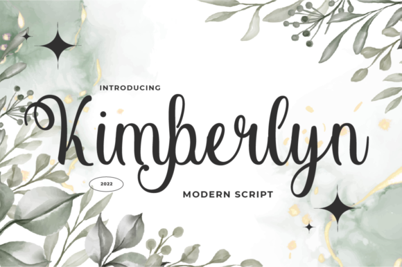
6. Kimberlyn
Kimberlyn takes a quieter approach than most calligraphy faces, with delicate strokes and few dramatic flourishes. In a category where fonts compete on swash length, restraint is genuinely rare and genuinely useful.
A subtle calligraphic face sits alongside photography without fighting it, which matters on invitations that include a photograph and on packaging where the product image carries the weight. Loud scripts and strong images cancel each other out.
My take: My pick when there is a photograph in the layout. Most calligraphy competes with imagery and this one cooperates with it.
Download This Font → Free download.
Balanced
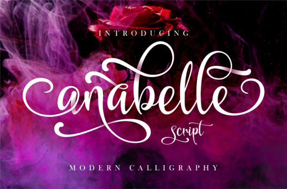
7. Anabelle Script
Anabelle uses baseline variation with a light touch, moving letters vertically without changing their size much. The result keeps the overall line looking even while still feeling hand-placed, which is harder to achieve than either extreme.
That balance means it handles longer words better than the bouncier options here. If the name on the invitation runs to several syllables, or the product name is more than one word, this holds together where more dramatic scripts start to look disorganised.
My take: The one to try when a longer name has broken every other script you have tested.
Download This Font → Free download.
Ornamented
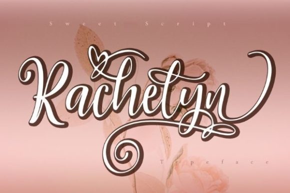
8. Rachelyn
Rachelyn ships with heart ornaments built into the character set, which is a specific decision that narrows its use considerably. Decorative extras are useful when they match the occasion and awkward when they do not.
For wedding and engagement stationery, Valentine’s campaigns and anything romantic, having ornaments already matched to the typeface saves sourcing separate graphics that never quite fit. For a general-purpose brand, the same feature is dead weight you will never use.
My take: Buy into this one only if the hearts suit the project. Matched ornaments are a real time-saver when they fit and an irrelevance when they do not.
Download This Font → Free download.
Dramatic
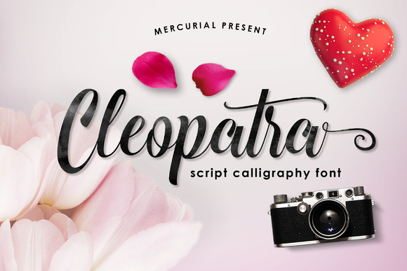
9. Cleopatra
Cleopatra is positioned as a statement face rather than a supporting one, with letterforms that carry more visual weight than the delicate scripts around it. Heavier calligraphy behaves differently from fine calligraphy in one important way: it survives.
Thin calligraphic hairlines disappear when printed on textured paper, foil stamped, or reproduced small. A heavier hand keeps its shape through all three. If your invitation is going on cotton stock or being foiled, weight is not a style preference, it is a production requirement.
My take: Choose this over the finer options if the piece is being foil stamped or printed on textured stock. Hairlines do not survive either process.
Download This Font → Free download.
Crafted
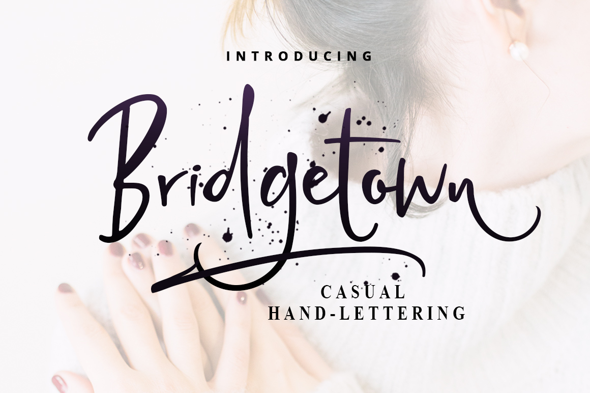
10. Bridgetown Font
Bridgetown is described as crafted for giving designs a handmade quality, which places it between formal calligraphy and casual lettering. The strokes have visible variation without the strict pen logic of traditional calligraphic type.
That in-between position makes it flexible. It is dressy enough for an invitation and relaxed enough for a product label, which means one download covers two jobs. Flexibility is undervalued when you are building a font library on a budget.
My take: Good value for a small brand that needs one script to cover both stationery and packaging.
Download This Font → Free download.
Magical
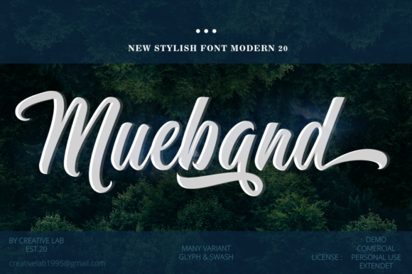
11. Mueband
Mueband leans decorative, with a touch of elegance layered over a handwritten base. Fonts described this way tend to have more personality per letter than classical calligraphy, which is either the point or the problem depending on the project.
High personality works on a single focal word. It becomes tiring across a full line and unreadable across a paragraph. Treat this as a display face that happens to be calligraphic rather than as a working script.
My take: One word only. It has too much character to carry a phrase without becoming exhausting to read.
Download This Font → Free download.
Timeless
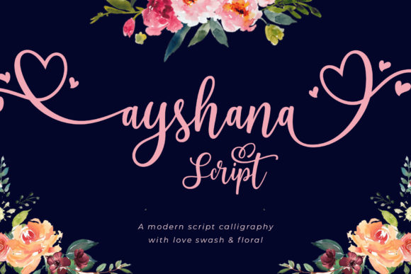
12. Ayshana Script
Ayshana is a lovely and timeless handwritten face, which in practice means it avoids the details that date a script. No extreme swashes, no trend-driven quirks, no unusual letterform decisions that will look odd in five years.
Timelessness matters far more for a brand identity than for a single invitation. If this script is going on a logo you intend to keep, the absence of fashionable details is the feature you are paying for, even when the font costs nothing.
My take: The choice for a logo rather than a campaign. Boring is an asset when the design has to last.
Download This Font → Free download.
Whimsical
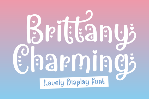
13. Brittany Charming
Brittany Charming sits at the playful end, chic and whimsical rather than formal. Its characters carry a lightness that suits celebration over ceremony.
The distinction matters when choosing invitation type. A formal wedding wants Elizabeth. A garden party, a baby shower or a milestone birthday wants something like this, where the type signals that the event will be relaxed. Getting that register wrong is a more common mistake than choosing a technically poor font.
My take: Match the font register to the event register. This one says come and enjoy yourself, not black tie.
Download This Font → Free download.
Seasonal
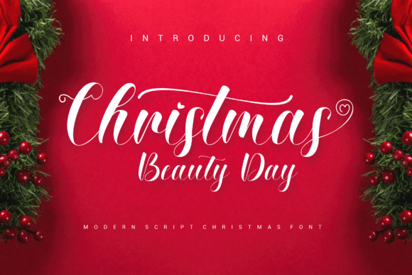
14. Christmas Beauty Day
A delicate elegant handwritten face with a seasonal name but no seasonal restriction in the letterforms themselves. Nothing about the alphabet is specific to Christmas, which means the naming is doing marketing work rather than describing the design.
That is worth knowing because seasonally named fonts are often overlooked in January. If the letterforms are neutral, the font is usable year round and faces less competition from other designers who filtered it out as a holiday face.
My take: Ignore the name. It is a general-purpose elegant script that most people only look at in December.
Download This Font → Free download.
Limited
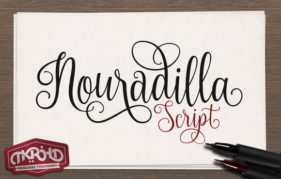
15. Nouradilla Script Free Version
This is a free cut of a paid family, which means the alphabet is complete but the alternate and swash characters shown in some previews may not be included. That gap causes real problems if you design around a flourished capital and then discover it is not in the file.
Check what you actually have before finalising a layout. For a personal project or a prototype the free version is fine. For a client identity, either budget for the full family or design only with the characters you can confirm are present.
My take: Prototype with it, then upgrade if the design gets approved. Do not build a client logo on a partial character set.
Download This Font → Free download.
Modern
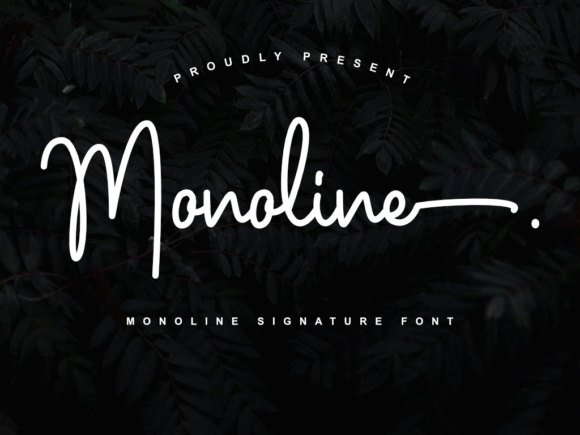
16. Monoline
Monoline is the exception in this collection: a script with one consistent stroke weight and no thick-to-thin contrast at all. Strictly speaking that makes it modern lettering rather than calligraphy, but it solves the problem that plagues every other font on this list.
Calligraphic hairlines fail in production. They vanish in embroidery, break in vinyl cutting, disappear in foil, and thin out on absorbent paper. A monoline script survives all of it. If the design is heading onto a physical product rather than a printed card, this is the pragmatic choice.
My take: The only font here I would confidently send to an embroiderer. Everything else needs redrawing first.
Download This Font → Free download.
Which Free Calligraphy Fonts Survive Printing
Digital printing on coated stock
The most forgiving option. Fine hairlines reproduce well, so almost anything on this list works. This is where delicate calligraphy looks its best.
Uncoated and textured stock
Ink spreads into the fibres, thickening strokes and closing small gaps. Go a weight heavier than looks right on screen, or choose one of the sturdier faces above.
Foil stamping and letterpress
Both need a minimum stroke width to hold. Hairlines either fail to transfer or break up unevenly. Ask your printer for their minimum before designing rather than after.
Embroidery and vinyl
The least forgiving. Thin calligraphic strokes cannot be stitched or cut reliably. Use a monoline script instead, or have the artwork redrawn with thickened strokes.
Questions People Ask
Are free calligraphy fonts good enough for wedding invitations?
Several here are, provided you match the font to the printing method. The common failure is not font quality but choosing a delicate script for a process that cannot reproduce fine strokes.
What is PUA encoding and why does it matter?
It places alternate letterforms and swashes on accessible character slots, so you can use them without professional design software. Without it, the decorative variants shown in previews may be unreachable.
Can I use free calligraphy fonts commercially?
Usually, though licences vary by designer and some free releases are reduced versions of paid families. Check the individual product page, especially before trademarking a logo built on one.
Why does my calligraphy font look broken between letters?
Letter spacing has been increased somewhere. Calligraphic scripts depend on letters touching. Set tracking back to zero and the connections return.
How do I choose between free calligraphy fonts?
Work backwards from the production method. Decide how the piece is being printed first, then eliminate every font whose hairlines will not survive it. That usually leaves three or four real candidates instead of sixteen.
Which free calligraphy font works best for a logo?
Ayshana or Monoline, for opposite reasons. Ayshana avoids trend details that date, and Monoline survives every reproduction method a growing brand will eventually need.
Also worth a look: elegant script fonts for branding, wedding signature fonts, or browse the full Creative Fabrica library →



2 Comments