Luxury Serif Fonts That Make a Brand Look Expensive: 18 Picks for 2026
Buying a serif for a high-end brand is less about taste and more about a few practical decisions. So rather than a flat list, here are 18 luxury serif fonts arranged around the questions I ask before choosing one, with picks under each. If you want the textbook version, here is what actually defines a serif.
- Luxury serif fonts and stroke contrast
- Decide how romantic you want it
- Check the extras: alternates and ligatures
- Match it to the use
- Quick answers
Luxury serif fonts and stroke contrast
Question one: how dramatic do you want the thick-to-thin? Steep contrast reads expensive and editorial but needs large sizes; gentler contrast is more flexible. These lean high-contrast.
Refined
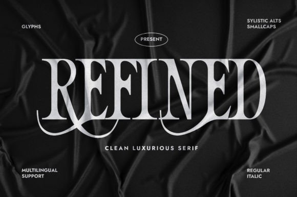
Refined is a classy serif with a clear thick-to-thin contrast that keeps the structure crisp. It reads as chic and grown-up, the sort of face you’d put on a fashion logo or a luxury product label. The proportions are balanced and slightly tall, which gives headlines a poised, magazine-cover look. Because the thin strokes are fine, it rewards larger sizes and clean printing. Pair it with a neutral sans for body copy and let the brand name sit in Refined. In a single deep tone, it looks expensive with very little effort.
Orgecta
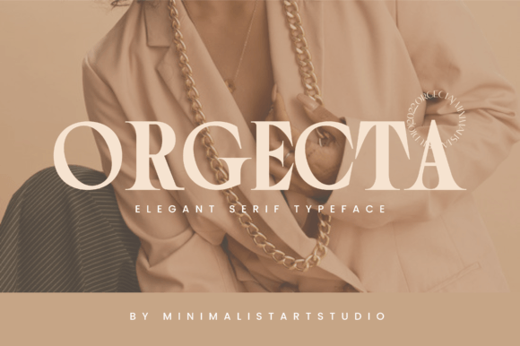
Orgecta is a luxury serif with crisp, sharp outer edges and softer curves inside the letters, a combination that gives it a distinctive, faceted look. That edge makes it feel modern and a touch dramatic, good for fashion, jewelry, or a high-end editorial header. Set it large and the contrast between sharp and smooth reads clearly, which is where the personality lives. Pair it with a minimal sans for the supporting text and keep Orgecta as the headline. A single tone and open tracking let its detailing stand out without crowding.
El Romantica
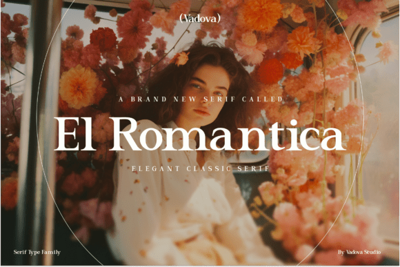
El Romantica is a classic serif built for understated beauty, with graceful curves, high stroke contrast, and a few artistic touches. It reads as heritage-minded and refined, a good fit for a wine label, a fashion house, or an editorial cover. The high contrast gives headlines a polished snap, though the fine strokes prefer larger sizes and clean printing. Pair it with a neutral sans for body copy and keep El Romantica as the headline. In a single deep tone, it looks established and expensive with little extra styling.
Riches
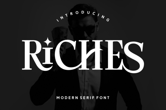
Riches is a serif that trades on class and a sense of luxury, with graceful proportions and a clear stroke contrast. It reads as confident and upscale, suited to premium packaging, fashion logos, and editorial headers. The shapes carry enough character to stand alone, so reserve it for headlines and brand names rather than dense text. Keep it at larger sizes where the fine strokes hold, and pair it with a neutral sans for the details. In a single deep tone, Riches gives a brand a polished, expensive-looking finish.
Decide how romantic you want it
Question two: warm and feminine, or cool and architectural? This group sits on the softer, more romantic side, good for beauty and lifestyle.
Quekida
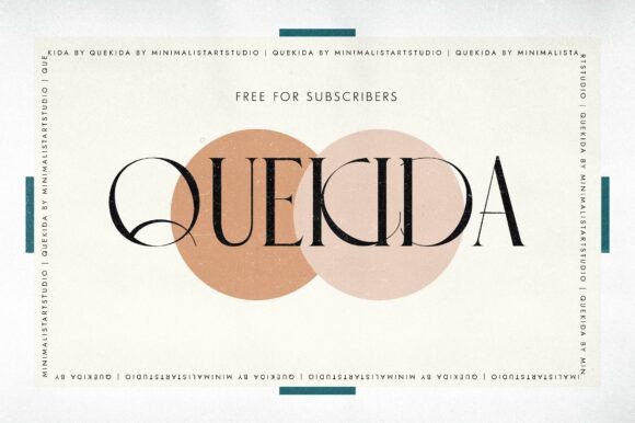
Quekida leans romantic where some of its siblings lean severe, with graceful curves and a refined contrast between thick and thin. It suits beauty branding, wedding monograms, and editorial spreads that want warmth alongside polish. The shapes are graceful enough to carry a couple’s initials or a boutique name with poise. Keep it at display sizes so the fine strokes hold, and pair it with a soft serif or sans for the details. In a muted palette it reads as gentle and upscale, a flexible anchor for a romantic identity.
Keith Pro
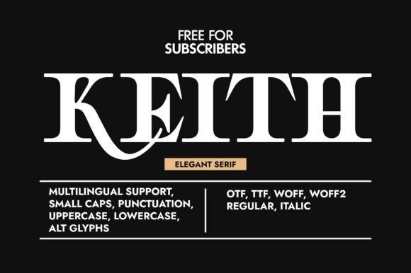
Keith Pro is a romantic serif with graceful proportions and a smooth, refined contrast between its strokes. It reads as warm and upscale, a good fit for fragrance, fashion, or a boutique hotel identity. The shapes carry a quiet confidence that suits both a logo and an editorial headline. Keep it at larger sizes where the fine strokes stay crisp, and pair it with a neutral sans for the functional text. In a muted palette with open tracking, it gives a brand name a poised, grown-up finish.
Berry
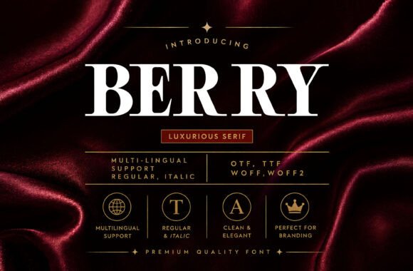
Berry is a soft serif with a romantic streak and a clear thick-to-thin rhythm. It sits comfortably on beauty packaging, stationery, and fashion headers, where its gentle character reads as considered. The letterforms are graceful without heavy ornamentation, so they pair easily with a clean sans or a flowing script. Set it large enough for the fine strokes to hold and keep it for headlines and names. In a single warm tone, Berry gives a layout a refined, slightly tender quality that suits a softer brand.
Grache Hustle
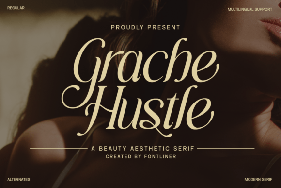
Grache Hustle is a soft, feminine serif that pairs graceful curves with refined detailing and a polished finish. It reads as gentle and upscale, a good fit for beauty, fashion, and boutique branding. The shapes are refined without heavy ornamentation, so they pair easily with a clean sans or a flowing script. Keep it at headline sizes where the detailing holds and set body copy in something plainer. In a muted palette with open tracking, Grache Hustle gives a brand name a considered look that suits a softer audience.
Lowesa Romance
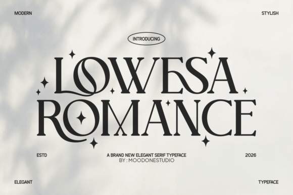
Lowesa Romance is a modern serif that aims for beauty and grown-up polish, with classic proportions and a warm, romantic edge. It carries a quiet refinement that suits fashion headers, stationery, and brand names. The shapes are graceful without being fragile, so they hold up across a reasonable size range. Pair it with a minimal sans for body copy and keep Lowesa Romance as the headline voice. In a soft, muted palette, it gives a layout a slightly tender quality, a comfortable anchor for a romantic identity.
Check the extras: alternates and ligatures
Question three: do you need to fine-tune a wordmark? These ship with alternates or swashes that let you tailor a name without hunting for another face.
Shagaina
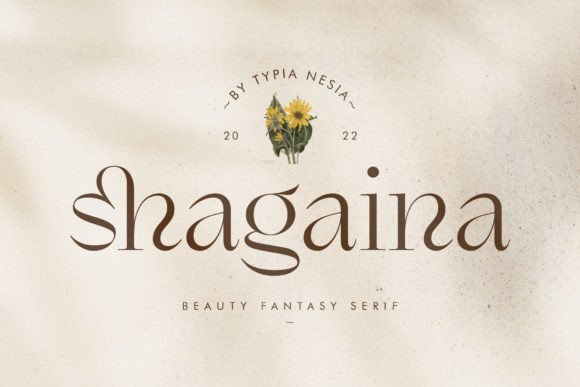
Shagaina is an expressive, feminine serif that comes with alternates and ligatures you can mix and match to fine-tune a layout. Those extras give a name a custom feel, since you can swap in a more decorative letter where it fits. It suits beauty, fashion, and romantic branding that wants a hand-tuned headline. Keep it at display sizes so the detailing reads, and pair it with a minimal sans for the supporting copy. In a soft palette, it reads as graceful and a little lovely without much else on the page.
Lovely Paradise
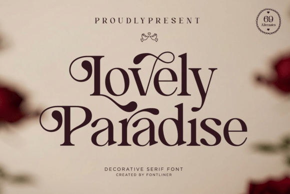
Lovely Paradise is a decorative serif built for romance and feminine grace, with sweeping curves, delicate swashes, and refined detailing. The swashes give names a soft, ornamental finish, suited to beauty, floral, and wedding branding. Those decorative touches need room, so reserve them for headlines and give the letters space to open up. Pair it with a minimal sans for body copy and keep the serif as the accent. In a soft palette, it reads as gentle and pretty, a good fit for a brand with a tender personality.
The Rokvella
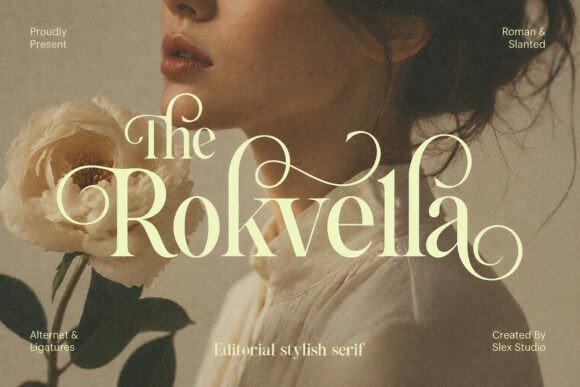
The Rokvella is an editorial serif that blends classic structure with a feminine, artistic feel. The delicate detailing gives it a refined, fashion-magazine quality, suited to brand identities, mastheads, and lookbook spreads. It reads as graceful and grown-up, comfortable carrying a boutique name or a feature headline. Because the strokes are fine, set it large and print it cleanly so the detailing holds. Pair it with a minimal sans for the functional text and keep Rokvella as the lead. In a muted palette, it gives a layout a poised, editorial finish.
Match it to the use
Question four: where will it live? These are the flexible all-rounders that move between logo, header and packaging without fuss.
Rovek
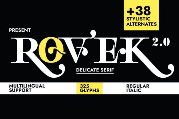
Rovek is a chic serif with a confident, slightly bold presence and a clean stroke contrast. It feels assured rather than delicate, which makes it a strong choice for a brand name that needs to hold its ground on packaging or signage. The structure stays clear at a range of sizes, so it’s more flexible than the most fragile faces here. Pair it with a minimal sans for body copy and keep Rovek as the headline voice. In a single deep tone, it reads as polished and self-assured without much else on the page.
Silent Dream
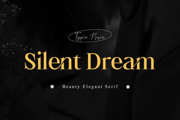
Silent Dream is a stylish serif with a feminine, chic character and a clean, refined structure. It works well for beauty branding, fashion headers, and stationery that wants a soft, grown-up tone. The shapes are polished without being fussy, so they sit comfortably alongside a flowing script or a minimal sans. Keep it at headline sizes where the fine detailing holds, and pair it with a calmer face for body copy. In a muted palette, it gives a brand a quiet, considered look rather than a loud one.
Ethereal Glamor
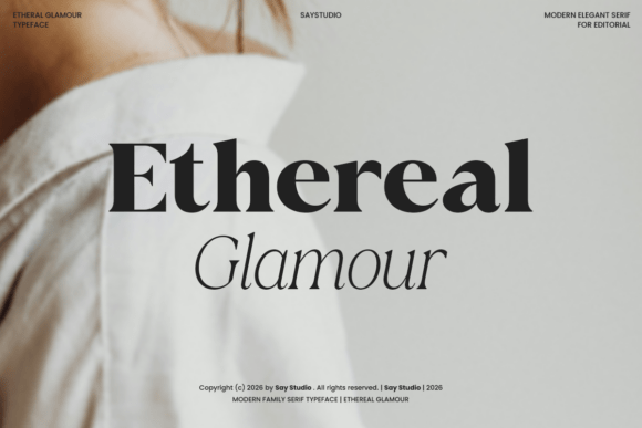
Ethereal Glamour is a refined serif that aims for softness and lasting beauty, drawing on high-fashion editorial cues. The shapes are gentle and graceful, which makes it a natural for beauty branding, fashion headers, and polished stationery. It reads as light and upscale rather than heavy, so it pairs well with plenty of white space. Keep it at display sizes where the fine detailing stays crisp, and set body copy in a clean sans. In a pale palette with open tracking, it gives a brand a delicate, magazine-cover finish.
Meillona
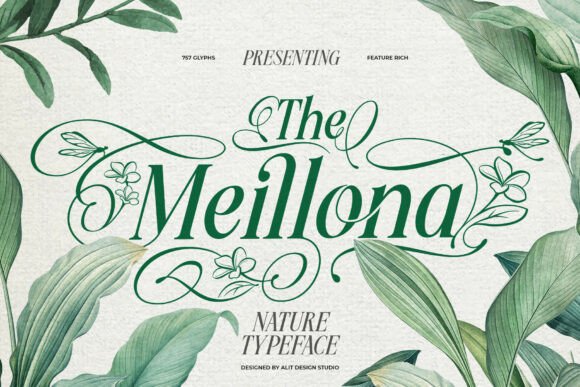
Meillona is a graceful slanted serif inspired by the soft shapes of nature, designed with both polish and an organic feel. The gentle slant gives it movement, a bit like italic without losing the structure of a roman serif. It suits organic skincare, floral branding, and editorial work that wants warmth. The shapes hold detail down to mid sizes, which is more forgiving than the steep-contrast faces here. Pair it with a clean sans for captions and keep Meillona for headers, where its slant adds a quiet sense of motion.
Qurellia Salesta
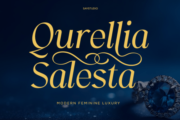
Qurellia Salesta is a modern, feminine luxury serif built around graceful curves and flowing strokes. It reads as refined and a little soft, which suits beauty branding, fashion headers, and upscale stationery. The shapes are graceful without heavy ornamentation, so they pair cleanly with a minimal sans or a flowing script. Keep it at display sizes where the detailing stays crisp and set body copy in something plainer. In a muted palette with open tracking, Qurellia Salesta gives a brand name a grown-up finish that suits a softer identity.
Beautiful Kindness
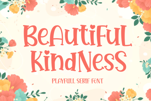
Beautiful Kindness is a serif made for branding and logo work, with a warm, romantic touch to its shapes. It reads as friendly but still upscale, a good fit for beauty, lifestyle, and stationery projects. The letterforms are refined without heavy ornamentation, so they sit comfortably alongside a clean sans or a flowing script. Keep it at headline sizes where the detailing holds and set the small print in a plainer face. In a soft palette, Beautiful Kindness gives a brand name an approachable quality that suits a gentle identity.
A quick decision checklist
- Will it appear small? Favor gentler contrast and avoid the finest hairlines
- Is the brand warm or cool? Pick from the romantic group or the architectural one accordingly
- Do you need a custom wordmark? Choose a face with alternates
- What carries the body text? Line up a neutral sans before you commit
If you want a shortcut past all four questions, Refined and Kalorama-style faces are hard to get wrong for most brands, and a plain sans underneath does the rest. For the older, more characterful end of serifs, see vintage serif fonts, and for the pared-back modern side, modern minimalist fonts.
Quick answers
What makes a serif font look luxurious?
Usually a clear contrast between thick and thin strokes, refined proportions, and restraint in the layout, which together read as expensive without much ornament.
Are high-contrast serifs hard to print?
The fine hairlines can drop out at small sizes or on rough stock, so keep them at headline sizes and test a proof before a large run.
What should I pair with a luxury serif?
A neutral sans for body copy is the safest partner, since it keeps the serif as the star while handling the functional text cleanly.
Disclosure: some links on this page are affiliate links. If you buy through them I may earn a small commission, at no extra cost to you. I only feature fonts I would be happy to use in my own work.