18 Romantic Calligraphy Fonts for Dreamy, Heartfelt Designs (2026)
What mood are you actually going for? That is the question that should pick a script for you, not whichever one looks busiest on the screen. These 18 romantic calligraphy fonts are sorted into four moods so you can jump to the feeling you want, whether that is sweet and gentle or all sweeping flourish. If the craft itself interests you, the long history of calligraphy is a lovely rabbit hole.
A reminder that runs through all of these: scripts are for short lines. Set them large, keep the spacing open, and pair each with a calm face for anything you actually need people to read in bulk. For the cleaner, more modern end of handwriting, see modern script fonts, and for the big day specifically, elegant wedding fonts.
- Romantic calligraphy fonts for soft, sweet designs
- If you love dramatic flourishes
- If you want a vintage, hand-inked feel
- If it is for Valentine’s and love notes
Romantic calligraphy fonts for soft, sweet designs
Gentle bounce, rounded curves, nothing intimidating. These suit cards, soft branding and anything aimed at a tender audience.
Ho Hello
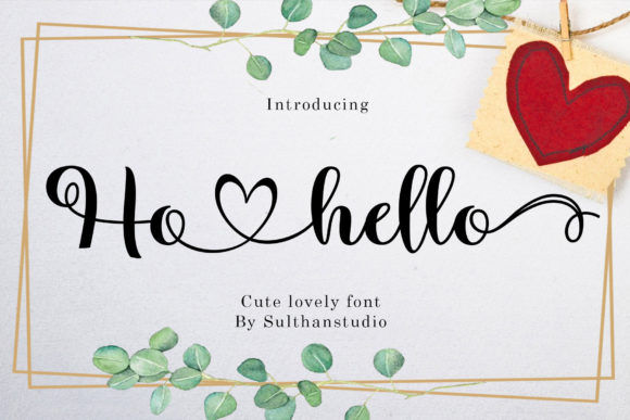
Ho Hello is a sweet, romantic calligraphy face with letters that dance along the baseline and a soft, casual charm. It reads as cute rather than formal, which makes it a comfortable choice for cards, children’s stationery, and playful branding. The bouncing baseline gives it personality, so short, expressive lines suit it better than blocks of text. Pair it with a rounded sans to match its friendly tone, or a light serif if you want a touch more polish. Keep line spacing open so the ascenders and descenders don’t tangle.
Star Bright
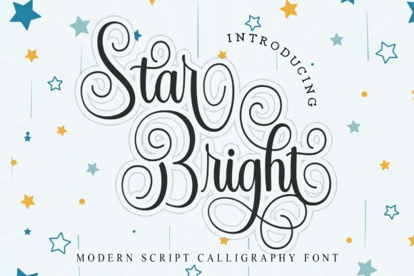
Star Bright is a romantic calligraphy script with the same dancing-baseline charm but a slightly more refined hand. The curves are smooth and the connectors gentle, giving short phrases a warm, hand-written grace. It suits wedding accents, candle and soap labels, and quote art where the lettering itself is part of the decoration. As with most of these scripts, reserve it for names and headlines and let a plain face carry the details. A soft, single-color palette keeps it feeling delicate rather than busy.
Keiyosa
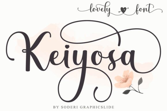
Keiyosa is a sweet calligraphy face with letters that dance along the baseline and a casual yet polished touch. The bounce gives it a friendly, hand-lettered personality that suits cards, soft branding, and quote art. It sits on the playful side of romantic, so short, cheerful lines work better than formal wording. Pair it with a rounded sans to match its warmth, or a light serif for a little more refinement. Keep the line spacing open so the lively ascenders and descenders have room to move.
Filamonte
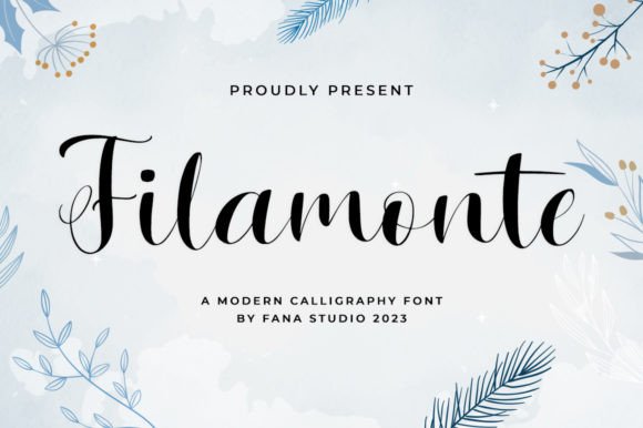
Filamonte is a romantic, sweet calligraphy script with the familiar dancing baseline and a soft, affectionate feel. The connected letters give short phrases a gentle, handwritten grace, good for wedding accents, candle labels, and love notes. It reads as delicate, so I’d keep it for headlines and names and let a plain face carry the rest. Pair it with a quiet serif and a muted palette for a tender, cohesive look. A single warm color and a bit of breathing room let its curves stay legible and pretty.
Zalendia
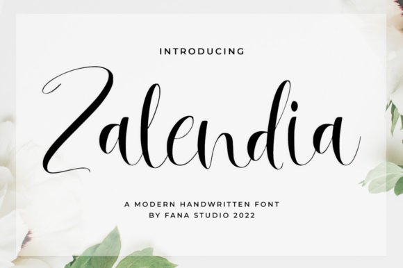
Zalendia rounds out the romantic scripts with the same baseline bounce and a smooth, sweet character. The curves are gentle and the connectors light, giving short lines a warm, hand-drawn charm. It suits greeting cards, soft packaging, and quote prints where the lettering is part of the decoration. As with its siblings here, reserve it for names and headings rather than paragraphs, and pair it with a clean companion face. In a soft palette with open spacing, it reads as delicate and inviting without feeling fussy.
Sefillia Script
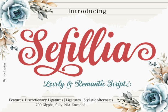
Sefillia is a calligraphy script that balances polish with a bit of playfulness, thanks to its fluid, bouncing curves. Letters rise and dip along the baseline, giving short phrases a lively, hand-lettered energy. That makes it a friendly pick for greeting cards, packaging, and quote prints rather than formal documents. The rhythm is the appeal, so resist tight tracking and let the curves breathe. Pair it with a simple sans for contrast, and use any alternate letterforms to keep repeated characters from looking identical.
If you love dramatic flourishes
Long extenders and confident swashes that want a whole line to themselves. Give them space and they carry a layout alone.
Braveheart
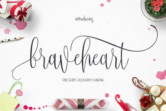
Braveheart is a lively script defined by very thin strokes and long flourishes that sweep dramatically off the letters. Those extenders are the whole personality, so it needs open space to stretch out, both above and below the line. It suits romantic quote prints, fashion editorials, and feature headlines where one phrase can spread across the page. Because the hairlines are delicate, set it large and print it cleanly so they don’t drop out. Pair it with a sturdy serif or a plain sans to balance all that movement.
Relyna
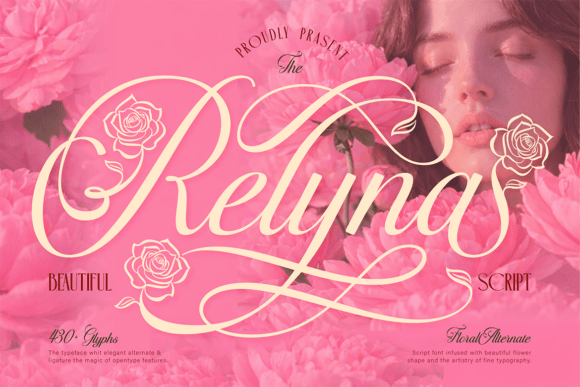
Relyna takes its cues from blooming flowers and romantic moments, with graceful swashes, soft curves, and floral alternates worked into the set. Those botanical extras make it a natural for garden weddings, florist branding, and spring packaging. The swashes want room, so plan generous spacing and avoid crowding the decorative letters. Pair it with a quiet serif for body copy and let the florals act as small accents rather than filling every line. In a soft green or blush palette, it reads as fresh and gentle.
Alignment
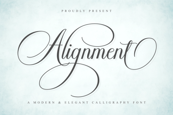
Alignment is a modern calligraphy script with elegant swashes and smooth, feminine strokes, built to feel stylish and a little luxurious. The swash capitals give names a graceful finish, while the lowercase stays clean enough to read at a glance. It suits beauty brands, boutique logos, and invitation headlines. Use the swashes where there’s space to open them up rather than crowding a tight lockup. Pair it with a minimal sans for contrast and a soft palette, and it carries a short, polished statement with ease.
Francy Tiguan
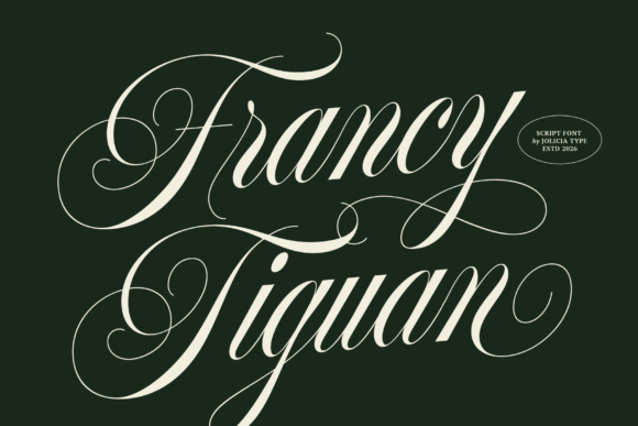
Francy Tiguan blends calligraphy with a modern luxury attitude, pairing flowing swashes with graceful, refined curves. It reads as classy and current rather than old-fashioned, which suits fashion labels, perfume packaging, and upscale stationery. The decorative swashes are the highlight, so give names room to breathe and reserve the plain alternates for tighter spots. Pair it with a clean serif or sans for body copy, keeping the script as the headline voice. In a single deep tone it looks expensive without much else on the page.
Romantic (Modern Calligraphy)
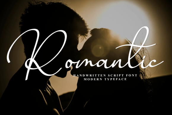
Romantic, in this modern calligraphy cut, is a fluid script with noticeable contrast between thick downstrokes and fine connectors. That contrast gives it a sophisticated, almost editorial feel while keeping the warmth of handwriting. It suits beauty branding, romantic quote art, and invitation headlines. The fine strokes prefer larger sizes and clean printing, so I’d avoid the smallest details. Pair it with a simple serif or sans, set it in a single warm tone, and let its rhythm carry a short, important line.
If you want a vintage, hand-inked feel
A little worn, a little nostalgic, like signage from another decade. These pair beautifully with a classic serif.
Violetta
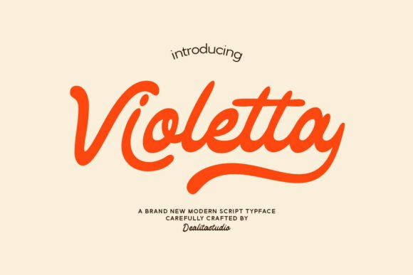
Violetta is a retro script that brings a vintage flavor most of these faces don’t. The flowing curves and authentic, slightly worn character make it feel like signage from another era. That nostalgic quality suits artisan packaging, a cafe logo, or anything that wants a bit of old-world romance. It pairs well with a classic serif to lean into the period feel, or a clean sans for contrast. Keep it at display sizes so the texture and detailing stay visible, and use it for short, memorable lines.
Apple
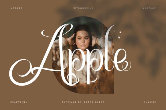
Apple is a romantic, retro script full of looping swirls that give it an exclusive, slightly vintage feel. The decorative loops make it a fun choice for artisan packaging, a boutique logo, or a nostalgic poster. Those swirls need space, so keep it large and let the extenders open up rather than packing lines together. Pair it with a classic serif to play up the period mood, or a plain sans for a more modern contrast. Reserve it for short lines where the character of the lettering can do the work.
Chocolate
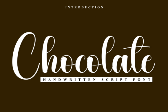
Chocolate is a handwritten script with the smooth, flowing rhythm of high-end calligraphy and a rich, indulgent feel to match its name. The strokes are confident and connected, giving short phrases a luxurious, hand-lettered look. It works for dessert and confectionery branding, romantic cards, and warm editorial accents. Keep it for headings and names where the flow is visible, and pair it with a clean serif for the supporting text. In a deep brown or warm neutral it reads exactly as cozy as it sounds.
Sattila
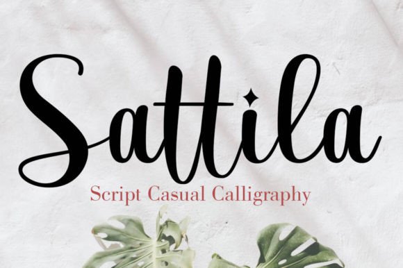
Sattila is a calligraphy face with a creative, hand-drawn mood and well-balanced, varied letterforms, made with luxury work in mind. The strokes have a confident thick-and-thin rhythm that gives short phrases a polished, expressive look. It suits boutique branding, romantic quote prints, and packaging that wants a hand-lettered headline. Reserve it for names and short lines where the rhythm shows, and pair it with a clean serif or sans for the details. Set in one warm tone with open spacing, it feels both artistic and refined.
If it is for Valentine’s and love notes
Warm, affectionate and unmistakably romantic, made for the cards and notes you actually hand to someone.
Valentine Coolday
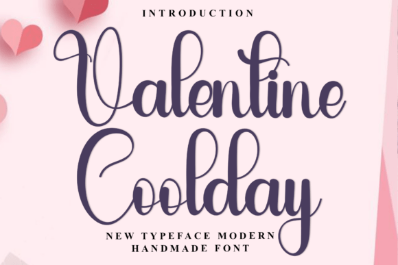
Valentine Coolday is a handmade calligraphy face with a natural, rhythmic flow, the kind of lettering that looks dashed off by a steady hand. It carries a romantic warmth that suits love notes, Valentine’s cards, and soft branding. The strokes vary in weight the way a real brush would, so it feels organic rather than digital. Keep it to short phrases where that hand-drawn quality can be seen, and pair it with a plain serif for any longer text. A warm red or blush ink plays up its affectionate mood.
Giftaway Valentine
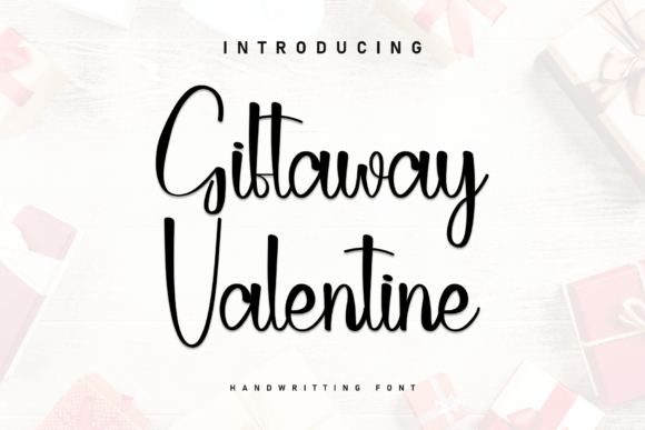
Giftaway Valentine captures the fluid, cursive movement of a love letter written by hand, with soft connectors and a warm, romantic rhythm. It’s made for the obvious occasions, Valentine’s cards, gift tags, and heartfelt notes, but it also suits gentle branding. The handwritten feel is the point, so keep it to short phrases and let a plain face handle anything longer. Pair it with a simple serif and a warm palette, and the whole piece reads as personal. A little extra line spacing keeps the loops from overlapping.
Blooming Valerian
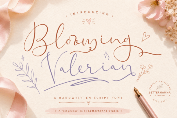
Blooming Valerian is a thin calligraphy face with beautiful curves and slightly wide spacing that makes it read as airy and refined. The extra room between letters is unusual for a script and gives it a calm, modern grace. It suits minimalist wedding stationery, delicate logos, and quote prints where lightness is the goal. Because the strokes are fine and the spacing open, it’s most effective at larger sizes. Pair it with a clean sans and a pale palette, and resist tightening the tracking, which is part of what makes it work.
Three pairings I like
- Braveheart over a clean serif: dramatic script, steady base
- Ho Hello with a rounded sans: sweet and friendly
- Violetta with a classic serif: full vintage mood
If you can only keep one, I would take Braveheart, simply because those long flourishes make even a single word feel considered. That said, it is the fussiest to set, so if you want something easier to live with day to day, the soft-and-sweet group is more forgiving. The broader picture lives in the elegant fonts guide.
Disclosure: some links on this page are affiliate links. If you buy through them I may earn a small commission, at no extra cost to you. I only feature fonts I would be happy to use in my own work.