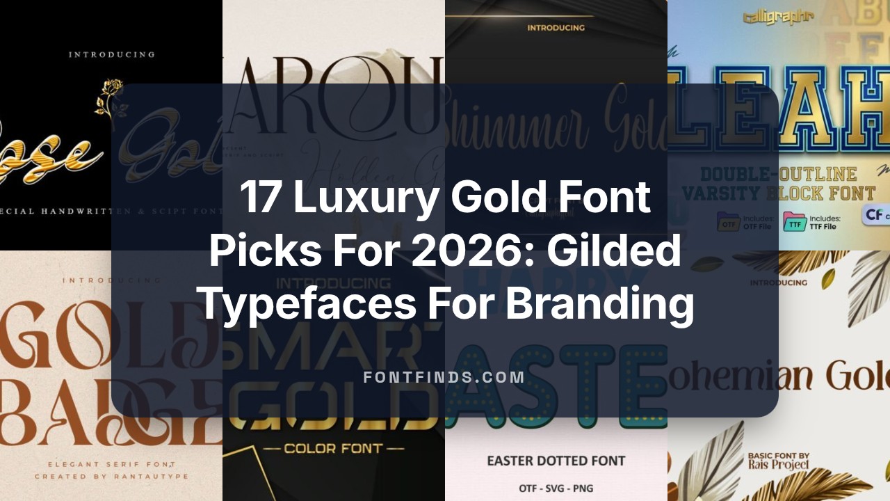
17 Luxury Gold Font Picks For 2026: Gilded Typefaces For Branding
Looking for the right Gold Font to give your project a luxe, metallic edge? This handpicked collection of 17 gilded typefaces-ranging from shimmering script and golden lettering to bold metallic sans-offers foil-style typography and luxury typefaces suited for logos, packaging, invitations, and premium web headers. Updated for 2026, each entry includes style notes and best-use tips to help you match the perfect gilded look to your brand voice.
1. Shimmer Gold Font
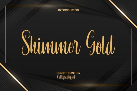
Shimmer Gold is a refined calligraphic script that brings an artisanal, high-end feel to any visual project. Its flowing strokes and elegant terminals evoke traditional hand-lettering while remaining polished enough for contemporary design work. The glyph shapes are deliberately varied-long ascenders, graceful swashes and carefully balanced descenders-that give designers plenty of expressive options when composing headlines, monograms, and invitations. Because the letterforms are sculpted with detail, Shimmer Gold reads beautifully at display sizes and makes a luxurious statement on packaging, magazine mastheads, and premium labels.
Technically, this face is a joy to work with: it includes an array of ligatures and stylistic alternates that make repeated letter combinations look natural and custom-drawn. The PUA encoding unlocks these extras easily in most desktop apps, so you can add extra flourish without complex OpenType workflows. When you want a metallic or gilded look, Shimmer Gold pairs exceptionally well with foil stamping, layered gradients, or subtle texture overlays-its strokes hold highlights and shadowing in a believable way. For a modern editorial layout, try combining it with a minimal sans for body text; for wedding stationery or boutique identities, use it solo at larger sizes so its nuance can shine.
My Recommendation: I’d reach for Shimmer Gold when I want handwritten elegance without sacrificing legibility-think boutique branding, luxury invitations, and product labels. Its built-in alternates and ligatures save time and give the impression of bespoke lettering. Use it for projects where a tactile, classical appearance is required, especially if you plan to add metallic finishes or foil effects.
2. Smart Gold Font
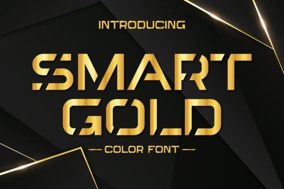
Smart Gold is a purpose-built color typeface that recreates the gleam and depth of metal in a single OpenType-SVG package, making it one of the most straightforward solutions for achieving a luxe metallic headline without complex layer builds. This Gold Font is engineered to display multi-tonal gradients, highlights and subtle shadowing right out of the box, so titles, posters and logo lockups can instantly read as gilt when viewed in compatible apps. Designers will appreciate how the colored glyphs preserve crisp edges and maintain consistent color across large display sizes, which is particularly useful for film posters, theatrical promos and premium packaging mockups.
Compatibility is a key strength and a limitation at once: Smart Gold’s color features work seamlessly in modern versions of Photoshop, Illustrator and Inkscape, and are supported by Silhouette for craft workflows. However, the included OTF and TTF files do not carry the color data in environments like Cricut, so plan for fallbacks or pre-rendered assets when working across multiple platforms. For maximum flexibility, use the SVG-OTF in your primary layout app and export flattened outlines or rasterized assets for production use where color fonts aren’t supported. The overall impression is luxuriously modern-if you need metallic lettering that looks polished with minimal setup, Smart Gold delivers a highly convincing and time-saving result.
My Recommendation: I recommend Smart Gold when you need an instant metallic headline without building textures or layer effects by hand. It’s perfect for bold posters, logos and hero graphics where you want a luxe, attention-grabbing finish quickly. Just be mindful of app compatibility-use the OpenType-SVG files in supported software and export flattened versions when delivering files to printers or hobby machines that don’t handle color fonts.
3. Ink Gold Font
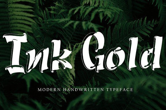
Ink Gold captures the spontaneity of a hand-brushed script with lively, slightly irregular strokes that feel candid and modern. Each character carries the personality of ink on paper-short, confident upstrokes and richer downstrokes-making this face especially effective for projects that want a human touch rather than a polished, mechanized look. Because of its warm, organic rhythm, Ink Gold excels on social media headers, inspirational quote graphics, boutique shop signage and editorial pull-quotes where a handcrafted voice adds trust and charm.
From a practical standpoint, the font balances artistic flair with functional clarity: it remains readable at mid to large sizes while retaining enough character to stand out in logo work or labels. The design responds well to textured or metallic treatments-layering a soft gold gradient, foil effect or subtle embossing over the letterforms will enhance the tactile feel without obscuring the brush details. For pairing, combine Ink Gold with a simple geometric sans to keep layouts grounded, or use it as the focal point in minimalist packaging to convey authenticity and artisanal quality.
My Recommendation: I’d choose Ink Gold for projects that need a warm, handcrafted aesthetic-think boutique product labels, blog headers, and bespoke stationery. It brings personality and a casual elegance that reads as genuine rather than manufactured. Pair it with clean, neutral typography to let the brushwork be the star, and consider subtle metallic treatments when you want to up the perceived value without losing its natural feel.
4. Smart Steel Gold Font
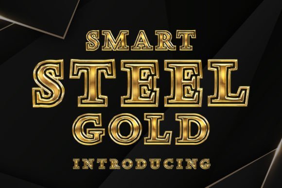
Smart Steel Gold is a bold metallic display that combines industrial strength with a polished, upscale sheen. This typeface reads like a confident headline: letterforms are compact and structured, which lets the reflective gold texture sit cleanly on top without losing legibility. When used at large sizes on posters or product packaging, the type produces a convincing faux-metal effect that reads as luxury trim rather than a gimmick; on smaller collateral such as business cards and labels the high-contrast strokes retain clarity and reproduce well in foil or spot-UV processes. Because this is designed with a metallic treatment in mind, it pairs exceptionally well with dark, matte backgrounds where the shine can pop, or with textured paper stocks that accentuate the imagined depth of the plating.
Beyond its aesthetics, Smart Steel Gold adapts to many practical workflows: it photographs beautifully for e-commerce hero shots, scales cleanly for vinyl heat-press tees, and provides a strong brand anchor for logo marks that need to convey durability and premium quality. Designers will appreciate the font’s capacity to take on simulated embossing or layer masks in Photoshop and Illustrator for even richer gold foil mockups. Try combining it with a minimal sans for body copy or a delicate script for event invitations to create contrast between metallic authority and softer supporting elements. In short, this typeface behaves like a high-end metal finish translated into type-a ready-made choice whenever you need typography that reads as both modern and opulent.
Download Smart Steel Gold Font
My Recommendation: I’d reach for Smart Steel Gold whenever a project demands instant premium appeal-luxury product labels, high-impact logos, and event branding where metallic accents are central. Its dense, structured letterforms make it especially reliable for print finishes like foil stamping and spot varnish. Use it as the headline element and let a simple secondary font carry the copy to preserve the metallic treatment’s visual impact.
5. Saint Patrick Day Dingbats Font
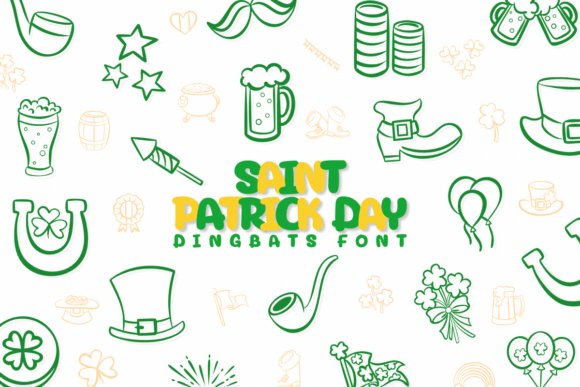
Saint Patrick Day Dingbats Font is a curated set of playful icons and themed ornaments designed for seasonal projects and festive layouts. Rather than being a traditional alphabet, this dingbat collection gives you shamrocks, leprechaun hats, beer mugs, rainbows, and treasure-filled pots – each glyph crafted to be immediately recognizable at a glance. The symbols are drawn with friendly proportions and consistent stroke weight so they align well when used in repeating patterns, borders, or decorative bullet points. Because the shapes are simplified without losing character, they reproduce cleanly on both small-format print items like stickers and large-format applications like banners or parade signage.
What makes this set especially useful is its flexibility: combine individual icons to create bespoke emblems for invitations, or string several together to form a thematic separator in social media graphics. The dingbats are ideal for vector-based workflows and pair especially well with rounded script fonts when you want a whimsical, handcrafted vibe. For crafters and small-business designers, these glyphs work neatly with cutting machines and print-on-demand platforms – as long as you convert to outlines or SVGs if your toolchain requires it – and they make quick work of assembling thematic packaging, table decor, or classroom activities that celebrate Irish culture in a lighthearted way.
Download Saint Patrick Day Dingbats Font
My Recommendation: I recommend this dingbat set for anyone creating seasonal content – from party invitations to promo graphics for a bar or café. Its icons are friendly and versatile, making them perfect for both print and digital use. If you’re building themed merchandise or event collateral, these glyphs will save time and keep a cohesive look across all pieces.
6. Easter Dotted Font
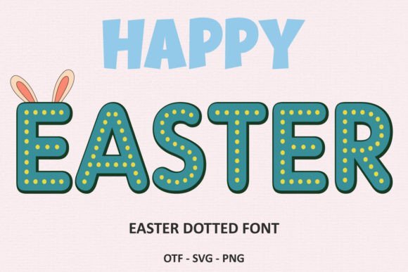
Easter Dotted is a color-centric display that blends a springtime green base with playful gold-dotted accents to give each letter a festive, jewel-like presence. As a color font, its most striking feature is the dotted metallic ornamentation that suggests tiny flecks of foil or confetti across the letterforms – it reads as cheerful and premium at once. Because the gold speckles are integrated into the glyphs, the type retains its decorative richness without additional layer work, making it an efficient choice for designers who want an instant holiday motif. The lively contrast between the verdant green and warm gold highlights helps the text feel celebratory yet refined, ideal for seasonal cards, product labels, and limited-edition packaging.
It’s important to note the workflow considerations: the black (monochrome) version of this family works with cutting machines like Cricut Design Space, while the full-color version relies on design software that supports color OpenType fonts (such as Photoshop, Illustrator, Silhouette Studio, and Inkscape). If your production path is print or digital mockups, the color glyphs export beautifully in layered formats for easy compositing; if you’re preparing files for vinyl cutting or embroidery, switch to the monochrome outline to avoid color incompatibilities. For creative combinations, layer the color font over subtle textures or use as a headline punctuated by clean sans-serif body copy – the dotted gold highlights do the heavy lifting of creating a seasonal focal point without overwhelming the layout.
My Recommendation: I’d choose Easter Dotted when I need a quick, joyful accent that feels handcrafted but polished-holiday greeting cards, seasonal product lines, and promotional social posts are perfect fits. Be mindful of the software compatibility: use the color version in advanced design apps, and the black/outline version when working with cutting machines. Its distinctive dotted gold effect makes it a go-to for projects that want charm and a hint of luxury in equal measure.
7. Gold Easter Eggs Font
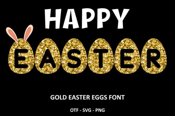
Gold Easter Eggs is a decorative, egg-shaped typeface crafted specifically for springtime and holiday-themed design work. Each glyph resembles a delicately patterned egg, with ornamental interiors that read clearly at larger display sizes and deliver an artisanal, hand-decorated aesthetic. The font comes in two distinct treatments: a solid black cut-ready version that works smoothly with Cricut Design Space and other vinyl/cutting machines, and a color-rich variant that reproduces intricate metallic textures and multicolor fills in design programs that support color fonts.
The color edition reproduces foil-like highlights and layered ornamentation in apps such as Adobe Photoshop, Illustrator, Silhouette Studio, and Inkscape, where OpenType-SVG or COLR/CPAL color font support is available. Because the OTF/TTF color files are not compatible with Cricut’s single-color cutting workflow, I recommend exporting flattened artwork (PNG/SVG) from your design app before sending to cutters if you want to preserve the painted/metallic look. Practically speaking, this font shines on Easter invitations, bakery packaging, seasonal social posts, window decals, and children’s party collateral-especially when paired with soft pastels, linen textures, or subtle drop shadows to emphasize the embossed details.
Download Gold Easter Eggs Font
My Recommendation: I’d reach for Gold Easter Eggs when designing anything tied to spring celebrations or family-friendly events. Its whimsical ornamentation instantly communicates festivity while the black, cutter-compatible version makes production straightforward for crafts and vinyl projects. For high-end print items like gift boxes or limited-run cards, use the color version inside Photoshop or Illustrator to get the luxe metallic look before exporting.
8. Leah Font
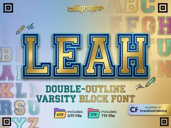
Leah is a bold varsity display typeface that fuses classic collegiate block letterforms with contemporary finishing touches. It features a robust double-outline structure that creates strong visual depth, and a built-in premium gold-metallic gradient that gives headlines a trophy-like shine. The combination of thick strokes and the layered outline makes Leah perfect for emblems, crest work, and any design that needs to project authority and celebration-think championship posters, varsity jackets, and high-impact event branding.
Beyond its athletic roots, Leah can function as a luxe, retro-modern display option for premium packaging and high-end merchandise because its metallic treatment reads like gilded stamping in photographic reproduction. If you plan to use Leah on the web, treat the embedded gradient as an ornamental layer: export high-resolution assets for raster-based sites or recreate the effect with CSS gradients and SVG masks to maintain crisp outlines. For print and apparel, Leah’s strong counters and shallow internal spaces translate well to embroidery and puff-print techniques when the design is adapted to single-color production. As a focused Gold Font with pronounced outline detail, Leah balances nostalgia and glamour in a way few sports fonts do.
My Recommendation: I would choose Leah when a project requires that classic varsity energy but with a premium sheen-such as team championship posters, limited-edition spirit wear, or boutique athletic goods. Its double-outline and metallic feel make it stand out in both print and apparel contexts, and it’s especially effective when used large as a focal headline. For best results, prepare a vector or high-res raster export if you need to reproduce the gold gradient reliably across different production methods.
9. Gold Rush Font
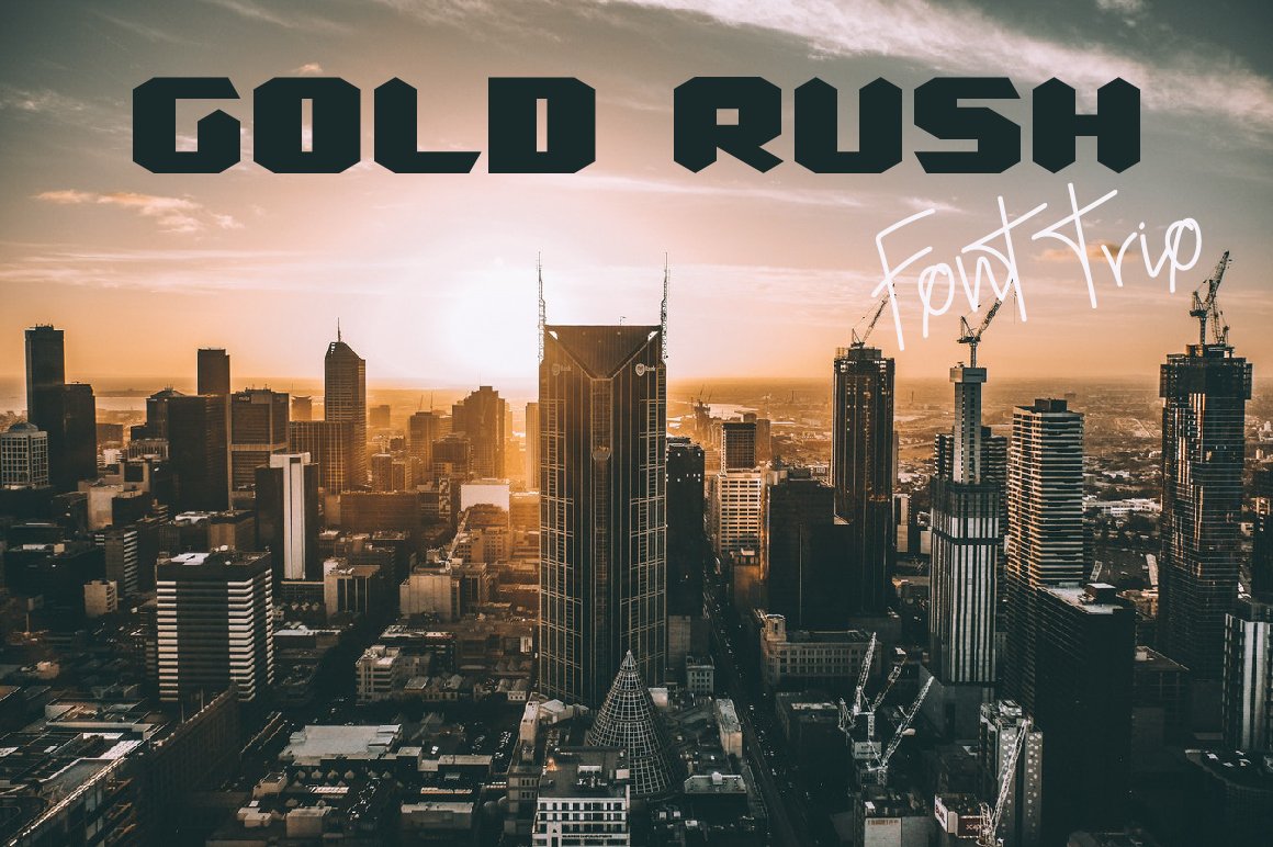
Gold Rush is a versatile display family made up of two bold display styles (regular and italic) and a complementary handwriting script that brings an organic, human touch. The primary display faces blend futuristic geometry with vintage signage cues-sharp terminals meet generous counters-resulting in a retro-futuristic voice useful for posters, storefront logos, and editorial headers. The italic variant injects motion and attitude, while the handwriting companion offsets the display faces with readable, messy strokes that feel like a designer’s quick note added by hand.
What distinguishes this family is its origin story: a letterform inspired by Melbourne’s architectural character and the designer’s own coffee-shop sketches, which gives the set an urban, artisanal personality. Use the display styles for impactful logotypes or hero headlines and apply the handwriting face as a secondary accent on menus, loyalty cards, or social-media overlays to evoke authenticity. From a technical perspective, the family is best deployed at medium to large sizes where the peculiarities of the glyphs and any alternates are clearly visible; avoid reducing it too small for body text. Overall, Gold Rush works beautifully for café brands, indie apparel labels, and event posters that want to marry city grit with a nostalgic sheen.
My Recommendation: I recommend Gold Rush when you want a type family that can carry both bold, eye-catching titles and intimate, hand-crafted accents within the same visual system. It’s ideal for coffee shops, boutique retailers, and posters where a local, lived-in vibe is important. Pair the display faces with the handwriting style to create hierarchy and personality without switching to a wholly different type palette.
10. Gold Fish Dingbats Font
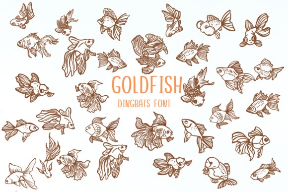
Gold Fish arrives as a charming dingbats font that reads like a pocket sketchbook full of tiny ornaments, hand-drawn icons, and playful flourishes. The set leans into a sketched theme with textured strokes that feel organic rather than perfectly vectorized, making it ideal for projects that want a human touch – think homemade wedding invitations, scrapbook headers, craft fair signage, or boutique product tags. Because the glyphs are pictorial rather than alphabetical, you can use Gold Fish to build borders, separators, and spot-graphics that mimic foil-stamped accents without the production cost. Designers looking to create a luxe vibe can combine these sketched motifs with a metallic treatment: drop a subtle gold foil overlay on the icons or place them alongside a bold metallic Gold Font to produce a cohesive, premium layout.
Technically, Gold Fish is straightforward to implement in most design apps since each symbol occupies a single keyboard slot, which speeds up layout iterations. The irregular line weights and slight wobble in the strokes mean these dingbats will read as hand-rendered even at modest sizes, but they also hold up when enlarged for posters or signage thanks to their strong, readable silhouettes. For DIY enthusiasts and small studios that want to mix typography and ornamentation without commissioning custom illustration, Gold Fish provides a versatile visual library – from tiny confetti marks to decorative corners. If you pair it with textured paper or a simulated foil effect, the end result feels artisanal and luxurious without demanding complex file prep.
Download Gold Fish Dingbats Font
My Recommendation: I recommend Gold Fish when you need whimsical, handcrafted icons that act like decorative punctuation for a design. Its sketchy aesthetic complements rustic and boutique brands, and it’s exceptionally useful for wedding stationery, craft packaging, and social media overlays where you want personality without clutter. Use it alongside a refined serif or a dramatic script to balance playfulness with elegance.
11. Gold Badge Serif Font
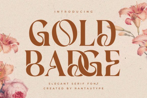
Gold Badge is a contemporary serif that distinguishes itself through bold curvature and a refined set of alternates and ligatures, giving designers many on-the-fly styling options. Its letterforms balance solidity with elegance: stems and serifs are assertive enough to command attention in headlines, while the nuanced curves lend a modern lifestyle sensibility suited for editorial covers, boutique branding, and product packaging. Because the family includes alternate characters, you can experiment with different moods – swap in a softer loop for a more feminine look, or choose compact glyphs for a robust corporate feel. The richness of the character set makes Gold Badge particularly effective when used as a display face where each letter needs to contribute to an overall identity rather than disappear into body text.
In practical use, Gold Badge performs well across print and digital contexts. It scales cleanly for large titles and embossed logos, and the carefully considered counters and apertures preserve legibility at smaller sizes when used in subheadings or pull quotes. Designers who like to craft layered typographic treatments will appreciate how these serifs pair with clean sans-serifs for body copy, or with script accents for high-end invitations. Because of its built-in alternates and ligature support, Gold Badge can be pushed into creative territory – think monogram lockups, badge marks, and magazine mastheads where subtle typographic flair makes a big difference.
Download Gold Badge Serif Font
My Recommendation: I’d choose Gold Badge for projects that require a modern, upscale serif with personality – especially brand identities, magazine covers, or premium packaging where typographic detail matters. Its alternates make it flexible for bespoke logotype work, and its strong presence helps anchor layouts that need a confident headline. Use it when you want a serif that feels both contemporary and crafted.
12. Stay Gold Script Font
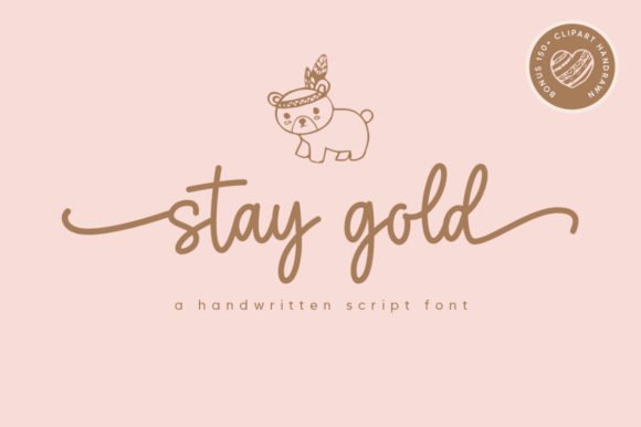
Stay Gold is a delicate handwritten script that blends classic calligraphic sensibilities with a breezy, contemporary hand. The letterforms are slender and slightly gestural, giving the font a refined air that still reads as approachable; every curve and connective stroke was designed to feel intentional rather than ornamental. Because Stay Gold is PUA-encoded, you have direct access to a wide array of alternate glyphs, swashes, and end-forms without needing advanced OpenType features – a huge convenience for wedding designers and small studios. When styled with a metallic sheen or foil effect, Stay Gold excels at evoking luxury: pairing its fluid ligatures with a complementary Gold Font or a faux-metallic texture results in invitations, labels, and packaging that look professionally finished and richly tactile.
Beyond its ornamental value, Stay Gold is surprisingly versatile in layout work. It maintains legibility at display sizes while offering enough flourish to serve as a brand’s signature wordmark or as an accent layer over imagery. The built-in swashes can be mixed and matched to craft distinctive headlines and logotypes without the need for manual vector editing, and the overall rhythm of the type makes it straightforward to set longer names or phrases without awkward spacing. For digital use, Stay Gold retains its charm on retina displays and scales nicely for hero headers, social media banners, and product mockups where a handcrafted vibe is desirable.
Download Stay Gold Script Font
My Recommendation: I use Stay Gold when a project calls for a sophisticated, handwritten voice that feels intimate but polished – such as wedding suites, boutique branding, or premium product labels. The PUA encoding saves time and makes it simple to experiment with swashes and alternates, so it’s great for designers who want variety without extra technical steps. Pair it with a clean sans or a sturdy serif to balance the script’s delicacy and you’ll get an elegant, modern result.
13. Rose Gold Font
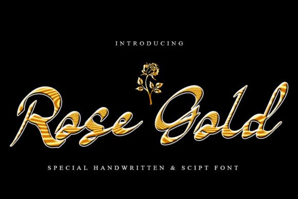
Rose Gold is a whimsical script font that leans into relaxed, hand-drawn charm without ever feeling messy. Its letterforms are fluid and slightly bouncy, with looping terminals and soft joins that give words a conversational, intimate tone. The overall rhythm reads like casual calligraphy-perfect for projects that need a personal touch rather than something rigid or corporate. Because the strokes remain relatively even, the font preserves legibility even at modest sizes, but it truly shines when allowed room to breathe on invitations, greeting cards, and hero headings where the curves can be appreciated.
Beyond the obvious prettiness, Rose Gold carries practical features that make it versatile across both print and digital work. It pairs beautifully with clean sans-serifs for a balanced editorial layout and with textured backgrounds for boutique packaging or lifestyle brand labels. If you want to simulate foil stamping or metallic lettering, the font’s generous counters and open bowls adapt well to overlays, SVG color fonts, or foil mockups. Designers will find it friendly for whitespace, easy to kern, and forgiving in decorative settings-an asset for mood boards, Instagram covers, boutique logos, and wedding suites where a softer, handcrafted aesthetic is desired.
My Recommendation: I’d reach for Rose Gold when I want warmth and handcrafted flair without sacrificing readability. Its relaxed loops make it ideal for wedding invites, boutique branding, and social-media quote graphics where personality matters. Use it with a minimalist sans-serif and soft pastels or with subtle foil textures to elevate the look while keeping the tone intimate and approachable.
14. Narque Holden Gold Font Duo
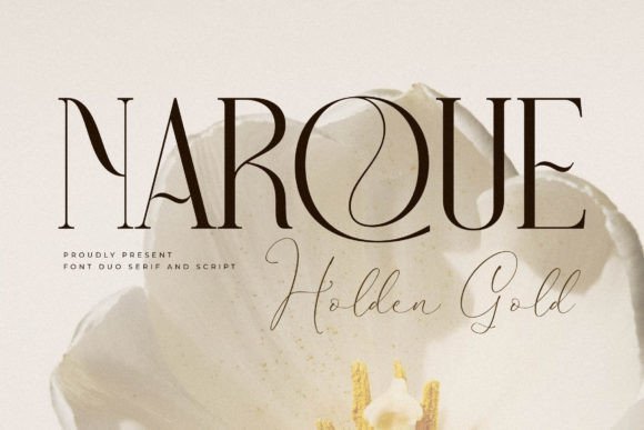
Narque Holden Gold is presented as a thoughtful duo combining a refined serif with a complementary script, crafted to convey modern elegance with a touch of theatrical flair. The serif component offers strong vertical stress and slightly tapered terminals, lending authority and structure-excellent for headlines, editorial mastheads, and title treatments. The paired script brings contrast through flowing strokes and tasteful swashes, designed to nestle beside the serif or overlay it as an accent. Together, the pair creates a high-end typographic palette that reads luxe without resorting to clichés, making it an excellent choice when you need both gravitas and personality in the same identity system.
Technically, this family is built for professional use: expect careful kerning, alternate glyphs, and ligatures that smooth transitions between letters, which is crucial when working at large display sizes. The duo adapts well to specialty finishes such as foil stamping, embossing, and metallic treatments-the kind of work where the phrase Gold Font naturally applies, because the type is designed to take shine and texture without losing detail. Use the serif for blocky, authoritative statements and the script for signatures, taglines, or decorative initials; the combination also translates beautifully to packaging, fashion lookbooks, movie title design, and luxury logos where a polished, cinematic presence is required.
Download Narque Holden Gold Font Duo
My Recommendation: I recommend Narque Holden Gold when you need a cohesive brand voice that balances seriousness with artistry. The serif provides the backbone for editorial or packaging work, while the script injects visual warmth and handcrafted charm. If you’re designing a fashion label, boutique magazine, or a high-impact logo, this duo will give you the flexibility to mix authority with personality and to apply metallic or foil finishes convincingly.
15. Bohemian Gold Font
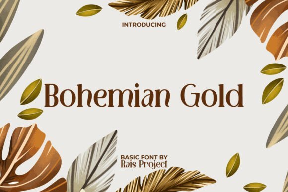
Bohemian Gold is a display-oriented typeface that channels a free-spirited, decorative aesthetic with sinuous, leaf-like strokes and gently irregular terminals. The letter shapes flow with an organic rhythm-each glyph feels hand-guided, as if drawn by a pen swept across a warm breeze. This sculptural quality gives the font strong visual identity at large sizes: it commands attention on posters, signage, and cover art without needing additional ornamentation. Its quirky curvature and open counters produce an artisanal vibe that reads as both contemporary and nostalgic, making it a great choice for brands and projects that want to evoke craft, wanderlust, or boho-luxe sensibilities.
From a practical perspective, Bohemian Gold excels in headline and display roles rather than long passages of text; its decorative features are most effective when given generous spacing and high resolution. Designers can exploit alternate glyphs and swashes to create unique logotypes or patterning for product packaging and textile prints. Color palettes that emphasize natural pigments-terracotta, ochre, deep teal-pair beautifully with the font, as do matte paper stocks and stamped textures that accentuate the font’s artisanal feel. Whether used for invitations, boutique restaurant menus, or lifestyle branding, this face adds an unmistakable handcrafted personality while remaining surprisingly adaptable across print and web mockups.
My Recommendation: I’d pick Bohemian Gold for projects that need bold, characterful display type-think artisanal product labels, festival posters, or boho-chic branding. Its organic strokes are perfect for making a single-word logo or headline memorable, and the alternates let you craft custom letter combinations. Pair it with clean, neutral supporting type and textural materials to maximize the lived-in, handcrafted atmosphere it creates.
16. Gold Glitter Font
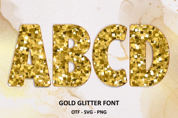
Gold Glitter is a show-stopping script-style display face that lives up to its name: it recreates the tactile richness of glitter-infused lettering while remaining surprisingly practical for a wide range of design contexts. The font is supplied in both a conventional black cut-ready version and a colorized glitter variant; the black version is fully compatible with cutting machines such as Cricut Design Space, making it an excellent choice for vinyl decals, heat transfer vinyl T‑shirts, and layered craft projects. The color version captures fine metallic speckle and twinkle details that translate beautifully to high-resolution print and digital mockups, but note that those rich color OTF/TTF files are only supported in certain design apps (for example, Inkscape and recent versions of professional vector editors) – for web and broader app compatibility you may need to export the glitter layer as an SVG or raster texture. Because this asset simulates foil and shimmer, designers often create a hybrid approach: use the black cut version for physical projects and the color version for web banners, social posts, and packaging comps.
From a typographic perspective Gold Glitter balances ornamentation with legibility: letterforms are sufficiently open to read at headline sizes while retaining sparkling fill detail that catches the eye. For best results on dark backgrounds, increase contrast slightly and consider adding a subtle drop shadow or thin outline to preserve readability against busy imagery. When you need to convey luxury and celebration at once, this Gold Font gives you a fast visual shortcut to glamour without heavy post-processing – it’s ideal for party invites, seasonal promotions, beauty and cosmetics branding, and any creative that benefits from glittering, eye-catching typography. Practical tips: convert the color glitter wordmarks to SVG for crisp scaling on the web, rasterize at 300–600 DPI for print to keep the sparkle intact, and test the Cricut-ready black file in your cutting software at the intended size to confirm welds and joins before production.
My Recommendation: I’d reach for Gold Glitter when I want maximum sparkle with minimal fuss – it’s the quickest way to add a celebratory, high-end look to social posts, packaging proofs, or event stationery. Because it comes with a cut-ready black version, I regularly use it in hybrid projects that combine physical crafting (Cricut/laser) with digital branding assets. It’s particularly effective for holiday campaigns, boutique product labels, and any design that needs instant glamour without custom foil printing.
17. The Gold Bachelor Font
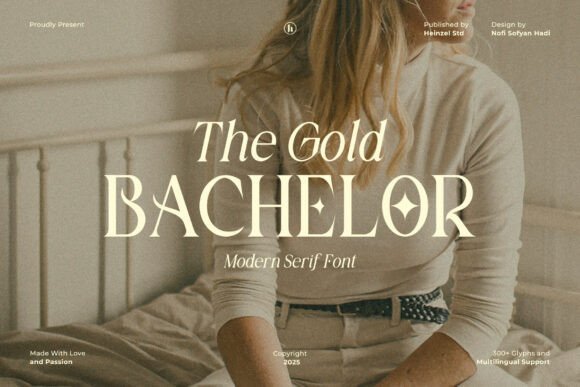
The Gold Bachelor Font is a refined modern serif that channels editorial polish and quiet luxury. Its letterforms feature moderate contrast between thick and thin strokes, slightly tapered terminals, and gently bracketed serifs that together create an elegant silhouette suited to long-form headers and refined brand identities. Designed with clear attention to spacing and optical balance, the typeface holds up well at large display sizes for magazine mastheads, signage, and upscale packaging, while still remaining readable in short blocks such as pull quotes or invitation lines. The restraint in its detailing makes it a perfect pairing partner for minimalist sans fonts when you need a high‑end typographic system with distinct voice and hierarchy.
Beyond aesthetics, The Gold Bachelor includes practical touches that designers appreciate: tight but forgiving kerning pairs, clean numerals, and several stylistic alternates for uppercase characters that give you subtle ways to tune the tone of a headline. It adapts nicely to tactile production techniques – think foil stamping, embossing, and letterpress – where the serif detailing reads with a tangible richness. For branding projects aiming at fashion, hospitality, wedding stationery, or boutique spirits, this serif conveys sophistication without feeling antiquated; pair it with muted palettes, matte stock, and a metallic accent to amplify its luxurious feel. When used at smaller sizes, I recommend slightly increased tracking and optical size-aware rendering if your software supports it, to preserve clarity in body text or dense layouts.
Download The Gold Bachelor Font
My Recommendation: I would use The Gold Bachelor when a project calls for understated elegance – it’s my go-to for fashion editorials, premium packaging, and wedding suites that need a modern yet timeless serif. Its clean forms and tasteful alternates make it flexible: I can lean into classic refinement for formal occasions or dial up minimalism for contemporary brands. If you want a serif that performs equally well in print finishes like foil or embossing and in high-resolution digital layouts, this typeface is an excellent choice.
Whether you need subtle metallic typography or a show-stopping foil-stamped headline, these 17 Gold Font selections deliver versatile, high-end options for branding and creative work. Use the short descriptions and examples to choose a gilded typeface that complements your design and gives it a polished, luxurious finish.