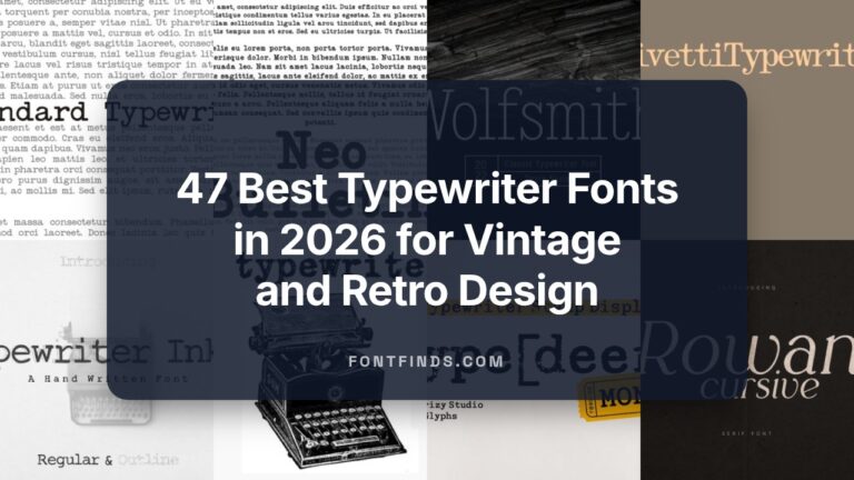
35 Essential Font for T-Shirt to Boost Etsy Boutique Sales in 2026
Choosing the right font for T-shirt can instantly shift a design’s mood-from playful hand-lettering to bold varsity insignias that demand attention.
In this guide we showcase 35 carefully selected typefaces and tee typography options tailored for indie boutiques, band merch, print-on-demand stores, and athletic apparel. Each pick includes pairing suggestions, recommended sizes for printing, and licensing reminders so you can apply them with confidence.
1. Sixties Hippie Font
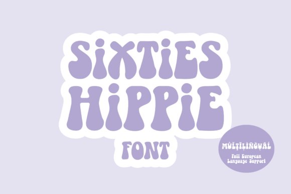
Sixties Hippie resurrects the warm, hand-crafted spirit of 1960s psychedelia with bulbous counters and playful terminals that immediately read vintage and joyous. The heavy display weight looks fantastic on apparel and posters and responds beautifully when you warp words into waves or an arch. This groovy Sixties Hippie feels like a hand-lettered relic of the 60s and is an excellent choice when you need a bold, charismatic font for T-shirt .
Its clean node geometry makes it unusually friendly to vinyl cutting and craft workflows-think Cricut, Silhouette and heat-transfer vinyl-while maintaining clarity for screen printing. Because the letters remain legible at large sizes, it suits everything from children’s apparel to retro adult tees and mugs without losing personality. Use it when you want a joyful, hard-hitting headline that reads as both playful and authentic.
╰┈➤ Download Sixties Hippie Font
My Recommendation: I reach for Sixties Hippie when I want instant vintage energy-its bold shapes command attention on a chest print or poster. The cut-friendly nodes save time when producing vinyl decals or mockups for clients. It’s perfect for retro collections, band merch, festival apparel, and any project that needs optimistic, psychedelic character.
2. Thick Baby Font
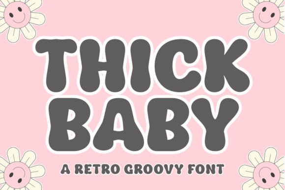
Thick Baby pairs chunky, bouncy letterforms with subtle boho curves to create a modern-retro voice that reads playful without feeling juvenile. Its wavy, handwritten temperament makes it ideal for brand marks, summer event posters, sticker sheets, and casual apparel. When used at large sizes the decorative flourishes add personality while retaining bold readability.
Deliverables in SVG and PNG plus compatibility with Procreate and cutting machines streamline production for makers and small studios. The font’s open counters and generous tracking prevent ink-snagging in screen printing and produce clean vinyl weeding for heat-transfer projects. Apply Thick Baby to packaging, social hero graphics, or merchandise where a friendly, nostalgic mood will support your visual story.
My Recommendation: I’d pick Thick Baby for lifestyle brands and seasonal collections because its warmth translates across both digital and tactile applications. It’s especially useful when you need a cheerful headline that still reads clearly on shirts and stickers. Fast to cut and forgiving in print, it’s a dependable choice for small-batch merch and playful branding.
3. Minimalike Font
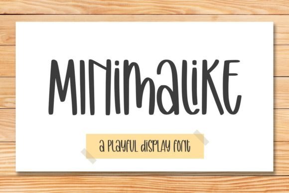
Minimalike is a pared-back display sans that blends geometric simplicity with a touch of whimsy, making designs feel fresh and approachable. Its even stroke width and generous x-height give strong legibility on tags, tote bags, mugs, or social graphics where clarity matters. Because it’s restrained, it plays nicely with script accents and textured backgrounds without competing for attention.
Minimalike scales cleanly for both screen printing and direct-to-garment production, keeping crisp edges and predictable kerning across sizes. Designers will appreciate how easily it pairs with bold display faces for headlines or lightweight scripts for subcopy. It’s an excellent go-to when you want a modern, friendly look that supports content rather than shouting over it.
My Recommendation: I recommend Minimalike when you need a reliable, unobtrusive type that still has personality-great for minimalist apparel lines and everyday merch. Its clarity in production workflows keeps mockups honest and reduces surprises in printing. Use it for brand systems, kids’ products, and retail labels where simplicity and friendliness are priorities.
4. Boteka Font
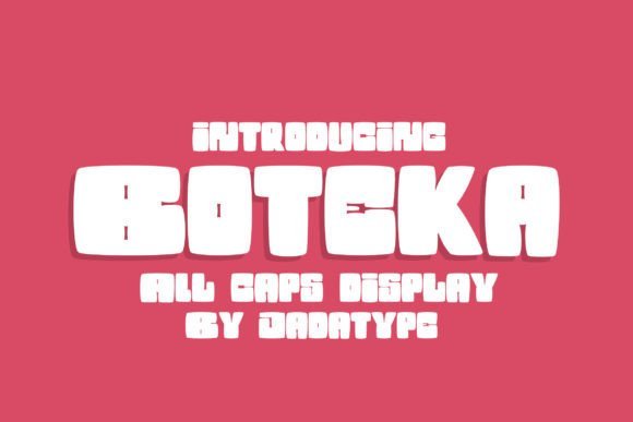
Boteka is a display font defined by oversized, playful letterforms and chunky counters that grab attention from across a room. Its generous x-height, open apertures and lively terminal shapes make it an ideal font for T-shirt slogans and large placements where impact matters. The heavy strokes reproduce cleanly in screen printing and vinyl, so short slogans and large typographic graphics pop without losing character.
Delivered in standard OTF/TTF formats, Boteka installs easily into Adobe apps, Affinity, and Word while retaining crisp vector outlines for vinyl cutting and SVG exports. Balance its exuberance by pairing with a narrow sans or a restrained script, and nudge tracking when setting long lines to avoid crowding. If you plan embroidery or very small print, test a scaled sample first-the bold forms read best when given breathing room.
My Recommendation: I’d reach for Boteka when I need bold, playful impact-kids’ tees, novelty shirts, or bright social-media mockups. Its forgiving shapes simplify printing and cutting, saving time on production. Use it when you want a cheerful, high-contrast headline that reads well at a distance.
5. String Lights Font
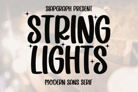
String Lights is a buoyant sans-serif with rounded terminals and a chunky rhythm that channels birthday-invite charm without feeling twee. The type’s even stroke weight and open counters ensure it stays readable on mugs, planners, or small-format prints where decorative fonts often fail. Its retro-cute personality shines at medium sizes and pairs well with playful icons or stamped textures to amplify nostalgia.
Because the letterforms are clean and monoline, the family adapts beautifully to SVG cutting, sublimation, and heat-transfer vinyl-especially when layered with contrasting colors. Use a subtle drop shadow or an outline to mimic literal string-light effects, or keep it flat for sticker and tumbler designs that need crisp edges. Tweak color palettes to take this font from birthday themes to holiday merch quickly without redesigning artwork.
╰┈➤ Download String Lights Font
My Recommendation: I’d pick String Lights for cheerful merchandise like party tees, kids’ birthday kits, and cozy home goods. Its clean outlines simplify cutting and printing for heat transfers and sublimation. The nostalgic feel helps sell seasonal and giftable items while keeping production straightforward.
6. Minekraft Font
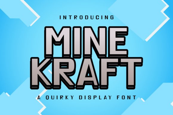
Minekraft channels pixelated gaming aesthetics with blocky, modular glyphs and a chunky outlined variant that reads as playful and retro. Its geometric, low-resolution look makes it a perfect headline solution for gamer apparel, party invites, or any design that benefits from nostalgic arcade energy. Because the forms are bold and self-contained, they hold up well on large chest prints and vinyl cuts where fine details would otherwise disappear.
For production, Minekraft excels in DTG and high-resolution sublimation; outlined versions create strong two-tone effects when layered in vinyl or screen printing. Avoid tiny text or dense copy-this style works best as a display headline or logo rather than body copy-and consider pairing it with a soft rounded sans to soften compositions. Also check licensing for POD marketplaces and export clean vectors for Cricut and laser cutting workflows.
My Recommendation: I’d use Minekraft for gamer-focused merchandise, kids’ party themes, or retro-themed promotions where instant recognition matters. Its modular shapes simplify separations for two-color prints and vinyl. If you need a nostalgic pixel vibe that’s easy to prepare for print and cutting, this font delivers.
7. Black Distressed Font
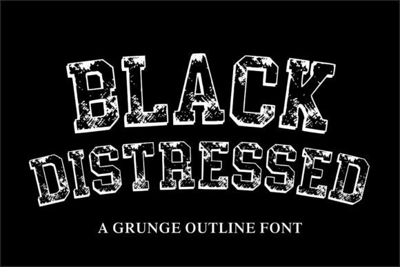
Black Distressed pairs bold collegiate letterforms with a rugged, ink-worn texture that reads like a battle-tested vintage lockup. The rough outline and irregular distressing give a tactile sense of age while preserving strong legibility, making it an excellent font for T-shirt production, especially when you want an authentic retro or sportswear vibe. Its heavy weight and open counters hold up well to screen printing and vinyl transfers, and the outline detail creates a layered look that catches the eye on posters and merchandise.
In practice this typeface excels at large-format headlines, team apparel, and urban streetwear where attitude matters; its distressing masks minor registration shifts that occur in multi-color print runs. For best results, pair it with a simple sans for secondary text, limit overly fine textures at small sizes, and consider color-block fills or halftone overlays to amplify the vintage effect on garments and labels.
╰┈➤ Download Black Distressed Font
My Recommendation: I’d reach for Black Distressed when I want bold attitude on apparel-its worn edges and collegiate structure give instant retro credibility. It’s forgiving for printing methods like screen print and vinyl because the texture hides slight misalignments. Use it for sports tees, vintage-style merch, and any design that needs a gritty, statement-making headline.
8. Avendita Font
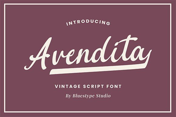
Avendita is a refined handwritten script that balances classic calligraphic strokes with a clean, contemporary finish, giving work a handcrafted but professional look. The flowing connections and tasteful swashes provide personality without sacrificing readability, making it a strong choice for logotypes, boutique branding, and editorial headlines where elegance is key. Its restrained flourish set and carefully tuned letter spacing mean it performs well across digital mockups and print collateral alike.
On apparel it brings a couture touch-think boutique tees, branded lifestyle garments, or limited-run merchandise-where subtlety matters more than loud ornamentation. Use Avendita alongside a neutral sans for body copy, leverage alternates and ligatures for variety, and favor high-contrast printing techniques to preserve delicate strokes on fabric and woven labels.
My Recommendation: I’d choose Avendita when I need an elegant, handcrafted voice-its calligraphic roots give designs warmth and authenticity. It’s ideal for boutique clothing labels, wedding or lifestyle tees, and upscale branding projects. The alternates and ligatures allow for bespoke logotypes that feel personal and polished.
9. Techpixs Font
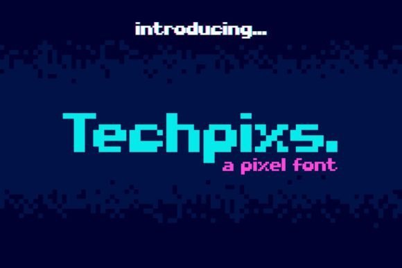
Techpixs is a pixel-inspired decorative display font that channels retro gaming and arcade culture with crisp, blocky forms built on a strict grid. Its modular construction makes it instantly legible at larger sizes and perfect for poster headlines, album covers, and playful apparel where a nostalgic digital aesthetic is desired. Because of its squared pixels and strong geometric rhythm, it reads best in bold weights and benefits from high-contrast color palettes or layered halftones to emphasize the retro motif.
When applied to apparel, Techpixs lends itself to novelty tees, gamer merch, and event promotions where the pixel look communicates playfulness and tech nostalgia. Pay attention to kerning at small sizes, use vector-friendly printing processes like DTG or screen print to retain crisp edges, and consider pairing it with a soft rounded sans to balance the mechanical feel.
My Recommendation: I’d use Techpixs for projects that lean into nostalgia-retro game nights, pixel-art lines, or youth-focused streetwear-because it instantly evokes classic arcade aesthetics. It’s great for bold headlines and thematic merchandise where a distinct, attention-grabbing display face is needed. The font’s blocky geometry makes it a reliable pick for high-impact visuals on both print and digital assets.
10. Gestarla Font
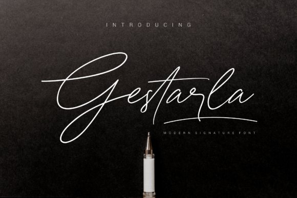
Gestarla is a modern, bold handwritten display font that injects authentic brush energy into identities and merchandise. Its thick downstrokes and varied terminals give logos, esports badges, and posters a confident, handcrafted attitude, while the forms remain balanced and surprisingly readable at larger scales. The typeface carries enough personality to stand alone as a headline solution without needing heavy ornamentation.
As a font for T-shirt printing, Gestarla holds ink well on textured fabrics and reads clearly from a distance, making it a strong choice for merch, team kits, and streetwear statements. The dense strokes tolerate halftone and screen-print processes, and deliberate spacing helps maintain clarity when scaled to chest prints; pair it with a neutral geometric sans for contrast or apply a subtle distress mask to enhance its handmade vibe.
My Recommendation: I use Gestarla when I want a bold, hand-crafted attitude that still prints reliably on apparel and merch. Its heavy strokes and clear letterforms make it perfect for team jerseys, streetwear labels, and standout logos. Because it survives screen printing and DTG well, it’s my go-to when durability and personality must coexist.
11. Penny Handmade Font
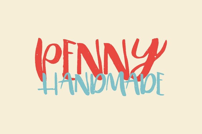
Penny Handmade is a warm, hand-crafted display font that evokes the uneven charm of real pen strokes and casual lettering. The informal letter shapes and subtle texture give designs a personal, approachable voice, making it well suited for boutique branding, posters, and lifestyle packaging. Its slightly irregular baseline and quirky terminals create a lively, artisan feel without looking amateurish.
On apparel and print projects this family shines when used at medium to large sizes, where its texture reads crisply and lends a tactile presence to designs. It ships with alternates and roughened glyphs so you can mimic hand-lettered layouts quickly, which speeds production for print-on-demand and craft cutting. For best results use solid color fills or single-color screen prints, pair with a restrained sans for balance, and consider layering over subtle textures for vintage-style merchandise.
╰┈➤ Download Penny Handmade Font
My Recommendation: I reach for Penny Handmade when a project needs an intimate, handcrafted personality-think indie shop tees, craft-fair signage, or wedding stationery with charm. The alternates let me generate varied compositions without redrawing each word, saving time while keeping an authentic look. It’s especially useful for boutique apparel and packaging where warmth and individuality sell.
12. Comeback Font
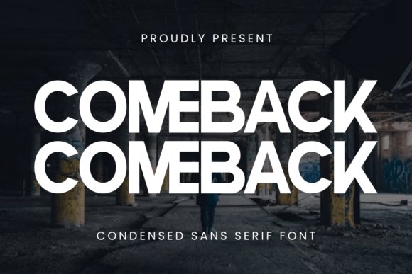
Comeback is a condensed sans serif built to deliver a bold, modern presence while conserving horizontal space. Its geometric construction and crisp terminals lend a no-nonsense, industrial tone that suits headlines, labels, stickers, and apparel branding. The compact letterforms let longer copy sit comfortably on a chest print or sticker without dominating the composition, and the high x-height enhances legibility across sizes.
For T-shirt design and craft workflows like Cricut or Silhouette, Comeback’s narrow profile means more copy fits on a single line while maintaining strong impact, especially in all-caps treatments. It pairs well with softer scripts or slabs for layered branding and is ideal for single-color prints, heat transfers, and embroidered patches. Tweak tracking and favor bold weights to emphasize its architectural, confident character.
My Recommendation: I recommend Comeback when you need a sleek, space-efficient typeface that still reads with authority-great for athletic tees, merchandise lines, and vinyl-cut text. Its clean geometry performs well across printing and cutting processes, giving predictable, crisp results. Use it when your design must feel modern and compact without losing presence.
13. Meowy Kitties Font
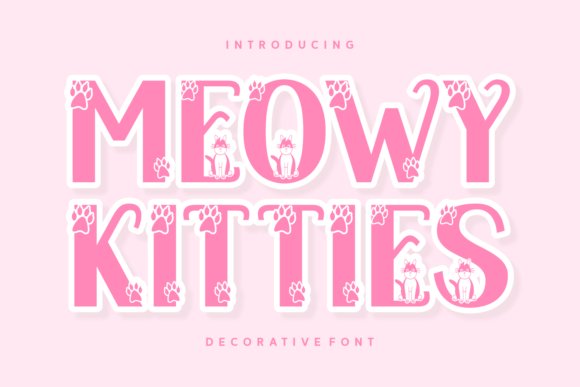
Meowy Kitties is a decorative display font built around rounded letterforms and subtle cat-themed glyphs that read delightfully at headline sizes. Its whimsical ornaments-tiny ears, whisker terminals and paw-shaped counters-lend personality without sacrificing legibility, making it perfect for lively social posts and photographic overlays. It’s also a charming font for T-shirt projects and small-batch apparel runs, where the cute motif can become the central graphic.
The family includes multi-language support and clean vector outlines so it scales crisply for print, packaging, greeting cards and book covers. Pair Meowy Kitties with neutral sans-serifs to balance its exuberance, and favor simplified single-color fills for screenprinting or vinyl cutting to preserve the details. Overall, it gives brands and creatives a unique, friendly voice that reads as both professional and delightfully kitschy.
╰┈➤ Download Meowy Kitties Font
My Recommendation: I’d reach for Meowy Kitties when designing merchandise for pet boutiques, children’s apparel, or playful social campaigns because it instantly communicates warmth and fun. Its decorative glyphs photograph well and translate into single-color prints, making it practical for POD and in-house screenprinting. Use it as a headline or mascot wordmark rather than a body face to keep layouts clean and legible.
14. Wolf Pack Font
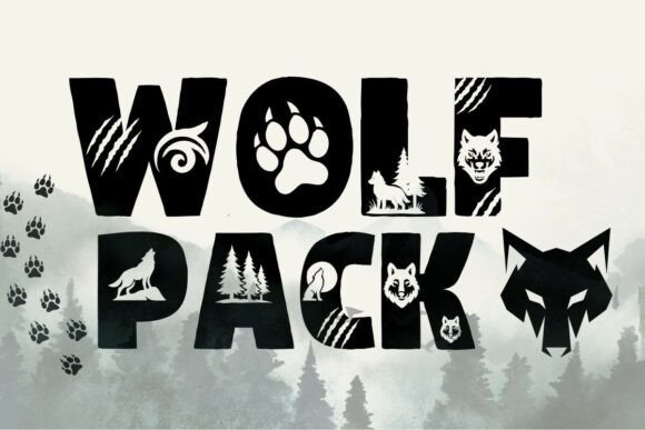
Wolf Pack is a rugged decorative font that weaves silhouette motifs-howling wolves, paw marks and fractured strokes-into each capital letter for a raw, energetic look. The typeface reads bold at large sizes and excels on posters, outdoor gear labels and T-shirt designs where a primal, adventurous tone is desired. Because each glyph carries illustrative elements, it functions as both lettering and ornamentation, letting designers craft instant wordmarks without extra artwork.
Delivered in OTF and TTF with fully vector shapes, Wolf Pack is compatible with Cricut, Silhouette and major design apps; its high-contrast forms reproduce cleanly for laser-cut or vinyl projects. Use tight tracking and solid fills to avoid losing interior details when scaling down, and reserve it for headlines or single-word pieces so the motifs remain legible. It’s an expressive choice that injects immediacy into adventure-branded collateral and youth-focused merchandise.
My Recommendation: I’d pick Wolf Pack for outdoor-event branding, adventure apparel or stickers because its built-in motifs convey character without added graphics. The glyph illustrations speed production-handy for limited runs or craft-cut decals-and it stands out on dark fabrics and rugged surfaces. Use it as a focal headline or logo wordmark to keep designs bold and uncluttered.
15. Varsity Display Font
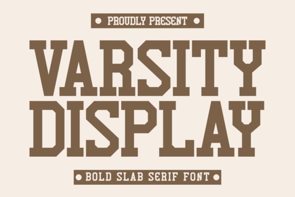
Varsity Display is a condensed slab serif that channels collegiate lettering while staying modern through crisp terminals and tight proportions. Its bold weight and compact width make it ideal for names on jerseys, embroidery mockups and merchandise where space is at a premium. The clean slab anchors sporty layouts and pairs naturally with script accents for team logos or retro-inspired apparel.
With straightforward forms and generous counters, Varsity Display reproduces reliably across POD systems, laser cuts and heat transfers-avoid overly thin strokes for embroidery to reduce snagging. Slight tracking adjustments help longer words breathe, and high-contrast colorways maximize visibility from a distance. This face gives athletic projects an authentic, polished look without feeling dated.
╰┈➤ Download Varsity Display Font
My Recommendation: I use Varsity Display for team kits, collegiate posters and projects that need bold typographic presence in tight spaces. Its condensed slab lets longer names fit comfortably while remaining readable at a distance, and it performs well across print and textile methods. Pair it with a loose script or geometric sans to create a modern vintage vibe that still feels grounded and professional.
16. Cute Couple Font
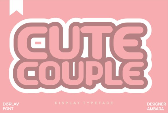
Cute Couple is a hand-lettered display font with flowing connections, rounded terminals, and playful ligatures that read as intimate and approachable. Its moderate contrast and generous counters keep letterforms legible on fabric, reproducing cleanly in screen printing, DTG, or heat-transfer processes, and it’s a versatile font for T-shirt designs and couple-themed merchandise. Built-in alternates and contextual swashes let you create linked names, heart-shaped joins, or custom monograms without drawing extra artwork.
For composition, try pairing Cute Couple with a neutral sans to anchor the layout, or place it atop a soft watercolor wash for a shabby-chic look. The typeface scales well from large chest prints to tiny sleeve tags, and the kerning avoids awkward gaps that can plague script displays. If you want a romantic, handcrafted vibe that still prints reliably, Cute Couple delivers personality without production headaches.
My Recommendation: I love Cute Couple for relationship-themed apparel and bespoke gifts because it feels warm and handcrafted while remaining production-friendly. Its alternates make it effortless to customize names or dates without extra illustration work. Use it on couple shirts, bridal party tees, or any project that needs affectionate charm with reliable print performance.
17. Dusty Font
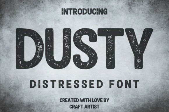
Dusty is a bold, all-caps display font whose heavy, rounded blocks are laced with an integrated distressed texture that reads like years of real wear. The speckled noise is baked into the glyphs for instant authenticity, so you don’t need extra texture layers to achieve a screen-printed or stamped look. Despite the rough treatment, generous counters and subtle rounding preserve legibility even at headline sizes.
Apply Dusty to craft beer labels, outdoor apparel, grunge posters, or any identity that benefits from a handmade, weathered edge. For production, separate the distress into a mask for precise color control or halftone conversion and ensure spot-color separations keep the texture consistent. It’s a practical option when you want convincing grit and an industrial personality without sacrificing readability.
My Recommendation: I reach for Dusty when a project needs authentic wear and handcrafted attitude-especially for breweries, coffee brands, or outdoor labels. The integrated texture saves time in mockups and often prints better than adding a separate distress layer. Use it for bold headlines, logo marks, and apparel that should feel lived-in and rugged.
18. Pixel Bots Font for T-shirt Retro Display
![]()
Pixel Bots is a grid-based display font that captures classic 8-bit charm with crisp square terminals and consistent pixel stems. Each glyph respects integer-grid proportions so it snaps cleanly to low-resolution mockups and scales crisply as vector outlines for large-format prints. The monospace-like rhythm makes it excellent for retro headlines, scoreboard-style slogans, and playful tech-themed graphics.
Layer Pixel Bots with halftone gradients, neon outlines, or bitmap textures to amplify its arcade vibe without losing sharpness. Avoid tiny embroidery where individual squares blur-instead use it for chest prints, stickers, or digital mockups where hard edges remain intact. This typeface brings immediate nostalgia and a clear visual identity to gaming, tech, and vintage-inspired apparel projects.
╰┈➤ Download Pixel Bots Font for T-shirt Retro Display
My Recommendation: I’d choose Pixel Bots for any tee aimed at gamers, retro-lovers, or tech events because it nails the 8-bit aesthetic with pixel-perfect clarity. It’s versatile for large graphics and merchandise mockups, and it pairs well with simple geometric shapes for authentic retro layouts. Use it when you want a clean, nostalgic display that reads instantly as ‘classic game’.
19. January Spirit Font
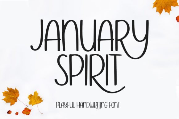
January Spirit is a playful, hand-drawn script with a breezy personality: slightly uneven strokes, soft terminals, and a casual baseline that reads naturally on fabric. The letters retain good clarity at medium sizes, so slogans and short phrases stay legible on apparel while keeping that handcrafted charm; this makes it an excellent font for T-shirt designs, tote prints, and small craft labels without feeling overworked.
Because its gestures mimic real handwriting, January Spirit layers beautifully over textured backgrounds and pairs well with clean geometric sans-serifs for balance. For production, it adapts to screen printing and direct-to-garment printing, and its informal rhythm invites playful color blocking, distressed overlays, or simple single-color prints for a warm, approachable aesthetic.
╰┈➤ Download January Spirit Font
My Recommendation: I’d reach for January Spirit when I want a friendly, handmade look that still reads well on shirts and merch. It’s perfect for indie boutiques, charity tees, and cozy lifestyle brands where warmth and personality matter. Use it for short slogans or names, and pair with a neutral sans to keep designs grounded.
20. Dino Alphabet Font
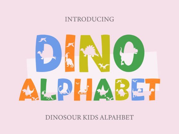
Dino Alphabet transforms each character into an illustrated scene, where chunky letterforms host playful dinosaur silhouettes, making text behave like imagery rather than just type. The heavy, blocky construction gives the font strong presence on kid-focused products and scaled-up signage, so it stands out from a distance while delivering whimsical detail up close.
This display face excels in themed applications-party invites, classroom posters, and novelty tee designs-where letters become part of the story; pair it with a soft rounded sans to avoid visual competition. For production, favor high-resolution prints or vector-output to preserve the internal silhouette details, and use bright, saturated palettes to amplify its prehistoric charm.
╰┈➤ Download Dino Alphabet Font
My Recommendation: I recommend Dino Alphabet when you need typography that’s literally part of the illustration-perfect for children’s apparel, birthday invites, and educational materials. It turns headlines into characters, which is great for attention-grabbing designs and playful branding. Keep supporting text simple so the letter-art remains the focal point.
21. The Boomber Font
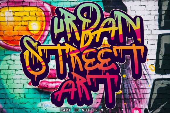
The Boomber channels urban spray-can energy into bold, expressive letterforms with dramatic strokes and angled terminals that mimic street graffiti. Its high-contrast marks and compact counters create a punchy visual rhythm that suits stickers, hoodies, and large-format tees where attitude and movement are key design elements.
Best used as a headline or logo treatment, The Boomber thrives when layered over photo textures, halftone backgrounds, or concrete-inspired motifs to emphasize its streetwise character. Keep copy short and size generous for maximum impact, and consider spot-color printing or plastisol transfers to capture the font’s raw, tactile feel.
My Recommendation: I’d use The Boomber for projects that need grit and personality-streetwear labels, band merchandise, or event posters where boldness sells. It’s excellent for short, loud statements and branding that leans into urban culture. Pair it with minimal supporting type to maintain focus on its energetic letterforms.
22. Super Pixels Font
![]()
Super Pixels Font channels vintage arcade energy with tight, blocky glyphs that read instantly as retro playfulness; its pixel-perfect counters and squared terminals give headlines and logos an unmistakable 8-bit attitude. For apparel designers this typeface is a perfect font for T-shirt designs, delivering the high-contrast, geometric shapes that survive screen printing, vinyl cutting, and DTG reproduction without losing character.
On the technical side, the family’s consistent stroke weight and generous spacing make it simple to scale across chest prints, sleeve tags, and full-bleed posters while preserving legibility. Try layering it with halftone textures or duotone colorways for authentic arcade flair, and pair with a narrow sans for secondary copy to maintain visual hierarchy on merchandise.
╰┈➤ Download Super Pixels Font
My Recommendation: I’d reach for Super Pixels when I need an unmistakable retro look that reads from across a room-great for gaming merch, convention tees, and nostalgia-driven capsule collections. Its bold, square forms print reliably with vinyl or screen methods and handle limited-color runs well. Use it when you want a playful, iconic headline that evokes the 80s arcade era without fuss.
23. Twinkle Rainbow Font
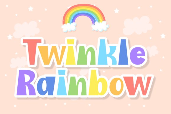
Twinkle Rainbow Font presents plump, friendly letterforms with crisp edge details that feel playful yet polished, making it ideal for children’s clothing lines and fashion-forward casualwear. The rounded terminals and slightly condensed proportions deliver strong readability at mid-sizes, while the charming serifs and whimsical counters lend a handcrafted, youthful personality to logos, birthday cards, and social posts.
Because of its soft shapes and generous x-height, Twinkle Rainbow translates beautifully into heat-transfer vinyl and embroidered patches where clean curves hold up in production. Pair it with muted pastels or metallic foil accents for boutique apparel, or stack it with a thin geometric sans to support multi-line compositions on tote bags and promotional tees.
╰┈➤ Download Twinkle Rainbow Font
My Recommendation: I recommend Twinkle Rainbow for projects that need an inviting, cute aesthetic-think kids’ apparel, boutique branding, and playful event merch. It performs well in both print and embroidery and gives a handmade vibe without sacrificing legibility. Use it to soften modern layouts or to add a whimsical headline to any fashion-forward T-shirt design.
24. Romance Font
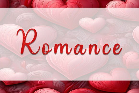
Romance Font is a delicate script with flowing connections and tasteful swashes that evoke intimacy and handcrafted charm-ideal for wedding merchandise, boutique labels, and sticker art. Its variable stroke contrast and open counters create a warm, organic rhythm that translates well to SVG exports and Cricut cut files used in custom apparel and craft-driven tee designs.
Technically versatile, Romance works at both tight logo scales and expanded display sizes thanks to thoughtful kerning and refined terminals; it’s especially effective when converted to vector paths for heat transfer or foil stamping. For best results, pair it with a restrained serif or slab to anchor layouts and preserve readability across social graphics, greeting cards, and personalized shirt projects.
My Recommendation: I’d choose Romance when a project needs emotional warmth-wedding tees, boutique branding, and bespoke gifts benefit most from its hand-lettered elegance. It cuts nicely for vinyl and Cricut workflows and gives a premium feel to small runs or personalized products. Use it to add a human touch where sophistication and sentiment matter most.
25. Spooky Season Font
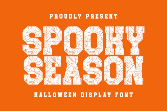
Spooky Season is a Halloween-themed display slab serif that pairs chunky, carved letterforms with delicate spiderweb ornaments for a theatrical, seasonal voice. The heavy stems and open counters make it ideal for screen printing and direct-to-garment processes, while the decorative ligatures retain clarity in laser cuts and vinyl work.
If you need a font for T-shirt that balances spooky flair with legibility, Spooky Season reads well from a distance and holds detail at small sizes. Use bold weights for headline tees and extract the web motifs as subtle accents for labels, stickers, and seasonal packaging to make limited-run merch stand out.
╰┈➤ Download Spooky Season Font
My Recommendation: I recommend Spooky Season when I want Halloween collections to feel playful but polished-its ornamentation gives personality without sacrificing readability. I’d use it for limited-edition party tees, event branding, and boutique seasonal promos where a themed, handcrafted look is needed. It’s especially useful when you want ornamented display type that survives printing and cutting processes.
26. Sunrise Cowboy Font
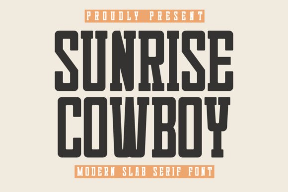
Sunrise Cowboy is a modern slab serif with condensed proportions and subtle flared terminals that evoke western cues in a contemporary package. Its tidy joins and controlled contrast make it an efficient headline face for compact layouts like chest prints, label text, and product badges.
Built for utility as much as style, this typeface performs well in print-on-demand mockups, screen printing, and laser-cut signage thanks to its sturdy stems and reliable counters. Use it to impart rugged sophistication on lifestyle apparel, boutique identity systems, or packaging that needs a confident, pared-back presence.
╰┈➤ Download Sunrise Cowboy Font
My Recommendation: I reach for Sunrise Cowboy when a design needs western character without feeling retro caricatured. Its condensed shapes save space on apparel and packaging while keeping type readable and impactful. It’s my go-to for small-batch clothing lines, craft-brand labels, and any project that wants a rugged, refined aesthetic.
27. Heart Font
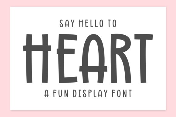
Heart is a warm, fun display type with tall, slightly irregular letterforms that read like friendly hand lettering and deliver instant charm to casual designs. The elongated vertical rhythm helps headlines stand out on posters, children’s products, and social graphics while preserving open counters for clean reproduction across mockups and heat transfers.
This typeface shines when personality is the priority: use it for playful branding, classroom materials, or small-batch merchandise where authenticity matters. Pair Heart with bright palettes or soft pastels and simple illustrations to amplify its approachable energy on tote bags, greeting cards, and lifestyle goods.
My Recommendation: I love Heart for projects that require a direct, affectionate tone-its hand-drawn quality makes messages feel personal and sincere. I’d choose it for kids’ products, community campaigns, and boutique merch where relatability is key. It pairs beautifully with friendly illustrations and vibrant color schemes to create memorable, smile-inducing designs.
28. Attethi Font
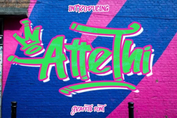
Attethi is a kinetic graffiti display with jagged strokes, spray-can texture and unpredictable ligatures that read like hand-tagged street art. At large sizes its bold counters punch through, making it a perfect font for T-shirt designs and magazine spreads that need attitude. The rough edges simulate aerosol overspray while staying legible and striking at a distance.
OpenType alternates and stylistic sets let you swap characters to avoid repetition on runs, creating organic, tag-like variation across tees and posters. Its silhouettes translate well to DTG, screen-printing and vinyl transfers, and tightened kerning suits short headlines and chest prints for streetwear and editorial uses.
My Recommendation: I reach for Attethi when I want apparel that feels rebellious and alive-its spray-painted texture conveys authenticity without sacrificing readability. It’s excellent for streetwear drops, magazine covers, and event merch where attitude matters. Pair it with minimalist layouts and muted palettes so the typework becomes the focal point.
29. Spooky Friday Font
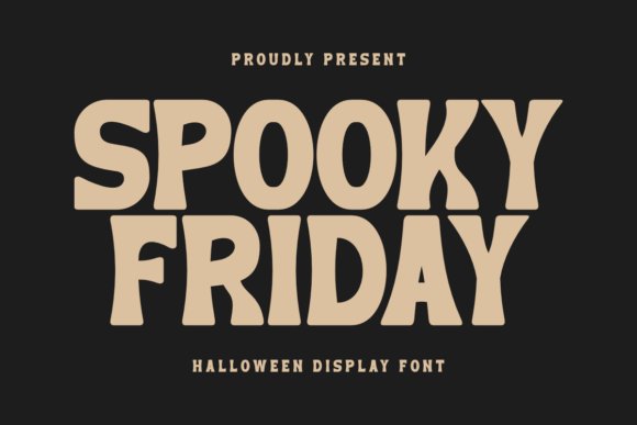
Spooky Friday is a chunky, rounded display font that balances whimsy with a slightly eerie charm, making it ideal for seasonal apparel and playful branding. Its soft terminals and exaggerated bowls make chest prints and badges pop while remaining approachable rather than menacing. The clean shapes read well on fabric and adapt smoothly to POD and laser-cut applications.
Built with generous spacing and bold stems, Spooky Friday handles single-line slogans and stacked phrases without losing clarity on dark garments. Use it for Halloween tees, party invitations, and craft projects-its friendliness avoids cliché horror tropes while still delivering a spooky vibe. It also cuts cleanly for vinyl heat transfers and gift tags.
╰┈➤ Download Spooky Friday Font
My Recommendation: I recommend Spooky Friday when you need a seasonal or novelty look that still feels marketable and family-friendly. It’s perfect for print-on-demand shops, party merch, and DIY crafts because it prints and cuts cleanly. Combine it with playful illustrations and warm autumn tones to maximize charm.
30. Dirty Strong Font
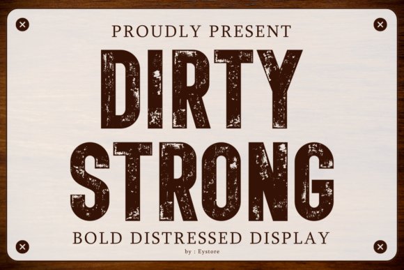
Dirty Strong is a heavy, eroded sans-serif crafted to convey industrial grit and vintage authenticity for bold headline treatment on shirts and posters. The distressed texture reads as natural wear instead of a flat filter, giving logos, packaging and signage a lived-in personality. Thick strokes keep the letterforms readable even with pronounced surface damage.
Its condensed proportions and muscular x-height make it ideal for compact chest prints, patches and label art, and it performs well with letterpress or screen-printing techniques. Layered colours, halftone overlays, or subtle gradients deepen the worn effect without compromising contrast, suiting coffee brands, automotive themes, and rugged workwear aesthetics.
╰┈➤ Download Dirty Strong Font
My Recommendation: I use Dirty Strong whenever a project needs believable, hard-worn character-its erosion reads as genuine age rather than trendy grunge. It’s my go-to for masculine apparel lines, retro industrial posters, and brand marks that need presence. Pair it with textured backgrounds and earthy palettes to emphasize its handcrafted feel.
31. Race Flag Checkered Font
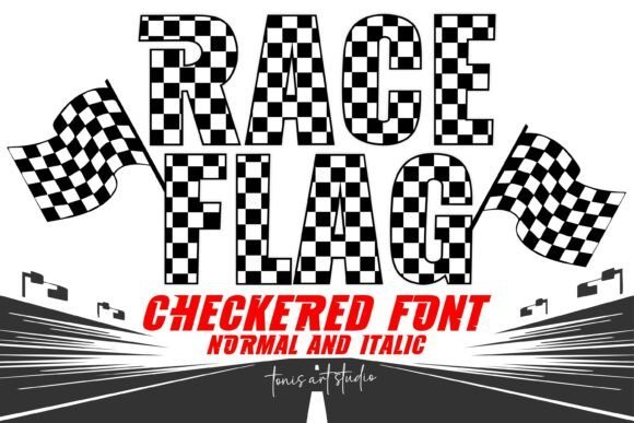
Race Flag Checkered Font channels racetrack energy with a bold checkered fill and a two-style family (Normal and Italic) that reads like motion on the page. As a font for T-shirt , its patterned letterforms pop on chest prints and pit crew shirts, giving designs instant competitive personality without extra artwork. The italic version pushes the sensation of speed, so headlines, team names, and event dates feel like they’re barreling toward the finish line.
On the production side the heavy outlines and textured fills hold up well to screen printing, heat transfer vinyl, and Cricut cuts, but they also reward careful color separation to keep the checkered detail crisp. Use large display sizes to preserve the pattern; for smaller treatments consider using the plain outline or a simplified color block to retain legibility while keeping the racing vibe.
╰┈➤ Download Race Flag Checkered Font
My Recommendation: I’d pick Race Flag Checkered when I need instantaneous motorsport attitude-its checkered texture communicates speed better than any icon. It’s especially great for team apparel, event posters, or merch where bold display lettering is the hero. For small prints I’d simplify the fill, but for banners and tees this typeface steals the show.
32. Pixel Kart Font
![]()
Pixel Kart Font brings crisp 8-bit charm to any composition with perfectly squared terminals and tight pixel grid spacing that evoke classic arcade screens. Its blocky geometry makes headlines, logos, and retro-themed tees feel authentic, while the clean contrast ensures the type still reads at moderate distances on merchandise. Designers can lean into nostalgia by pairing it with neon palettes, bitmap icons, or vintage game sprites for instant period mood.
Technically, Pixel Kart scales nicely when exported as vectors, and its rigid pixel structure converts well to vinyl cutters and direct-to-garment prints if you avoid tiny point sizes. Use it for playful brand marks, children’s apparel, event posters, or packaging where a low-fi digital aesthetic anchors the concept without sacrificing clarity.
My Recommendation: I reach for Pixel Kart when a project needs retro video-game personality that’s immediately legible and fun. It’s ideal for arcade-style tees, gaming event posters, and playful merchandise where a nostalgic, pixelated voice is required. Keep it bold and large for best impact; it sings in short headlines and logos.
33. Stand Together Font
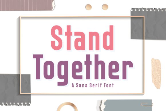
Stand Together Font is a refined sans-serif with generous counters and balanced proportions that favor clarity and a warm, modern tone. Its smooth letterforms and subtle humanist details make labels, stickers, and kid-focused designs feel approachable without sacrificing professionalism, and the type remains highly legible across print and digital applications. This restrained personality translates well to garments and signage where clean communication is the priority.
Multilingual support broadens its utility for global packaging and school projects, and it pairs elegantly with condensed sans or soft scripts when you need contrast. Use Stand Together for product tags, menu boards, classroom prints, or minimalist apparel where readable, friendly typography builds trust and visual consistency across touchpoints.
╰┈➤ Download Stand Together Font
My Recommendation: I recommend Stand Together when you want a versatile, friendly sans that reads beautifully at both small and large sizes. It’s my go-to for labels, children’s apparel, and modern merchandise where clarity and warmth matter. Pair it with a decorative accent for personality or let it stand alone for a clean, contemporary look.
34. Lay Font
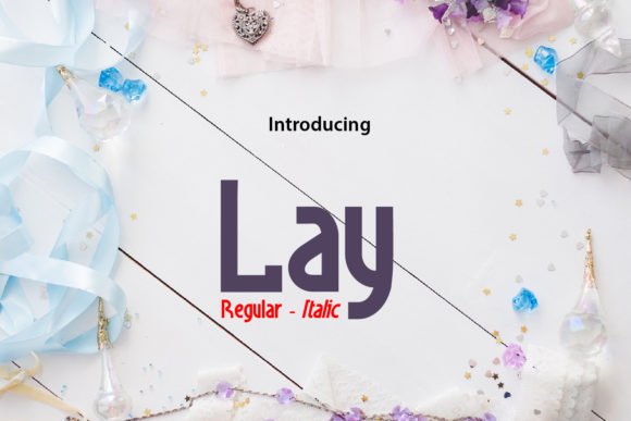
Lay is a crisp, contemporary display font built for clarity and visual impact; its open counters and balanced stroke contrast give headlines and logos a confident, modern voice. The letterforms sit comfortably between geometric precision and humanist warmth, which makes Lay a reliable choice for clean web headers, poster art, and identity work that needs a polished, up-to-date aesthetic.
Because Lay maintains strong legibility at large sizes and on textured surfaces, it also functions exceptionally well as a font for T-shirt layouts and apparel graphics, where print techniques like screen-print or vinyl demand robust shapes. Subtle quirks in the terminals and generous spacing let it pair nicely with condensed sans or soft script accents, so you can use it across e-commerce mockups, minimalist brand systems, and trend-forward merchandise.
My Recommendation: I recommend Lay when you want a modern, no-fuss typographic voice that reads clearly on fabric and digital screens alike. Its clean geometry helps designs feel current without shouting for attention, which is perfect for lifestyle brands and minimalist apparel lines. Use it for headline-driven tees, event merch, or storefront banners where legibility and a fresh look are priorities.
35. Black Vintage Font
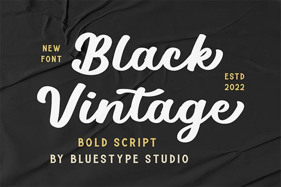
Black Vintage is a bold script calligraphy face with a strong retro personality; its sweeping strokes and pronounced contrast give words a handcrafted, nostalgic feel. The heavy, curving forms are designed to dominate compositions, making this type especially suited to eye-catching logotypes, vintage-inspired packaging, and apparel labels that need a commanding, artisanal presence.
PUA encoding unlocks decorative alternates and swashes without extra software, so designers can quickly experiment with long tail swashes, ligatures, and stylistic sets to create distinctive wordmarks or t-shirt motifs. It performs beautifully over textured backdrops and distressed treatments, and pairs well with sturdy slab serifs or narrow sans styles to balance its exuberant motion for posters, social graphics, and branded merchandise.
╰┈➤ Download Black Vintage Font
My Recommendation: I reach for Black Vintage when a project calls for bold nostalgia-think craft breweries, retro clothing lines, or boutique product labels. The swashes and alternates let you craft unique logotypes quickly, and the weight holds up in print and embroidery. It’s a go-to when you want personality that reads from a distance and ages well with texture treatments.
These 35 choices cover a broad spectrum of voices-vintage serifs, hand-lettered scripts, condensed display faces, and clean sans options-giving you flexible go-to fonts for different T-shirt niches. Use the pairing ideas and print tips to match mood with readability and fabric contrast.
Test a few favorites on mockups and real swatches, check licensing before commercial use, and build a small library of trusted typefaces to speed up your workflow. With the right typeface choices in 2026, your tees will look sharper on the rack and online.