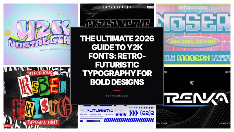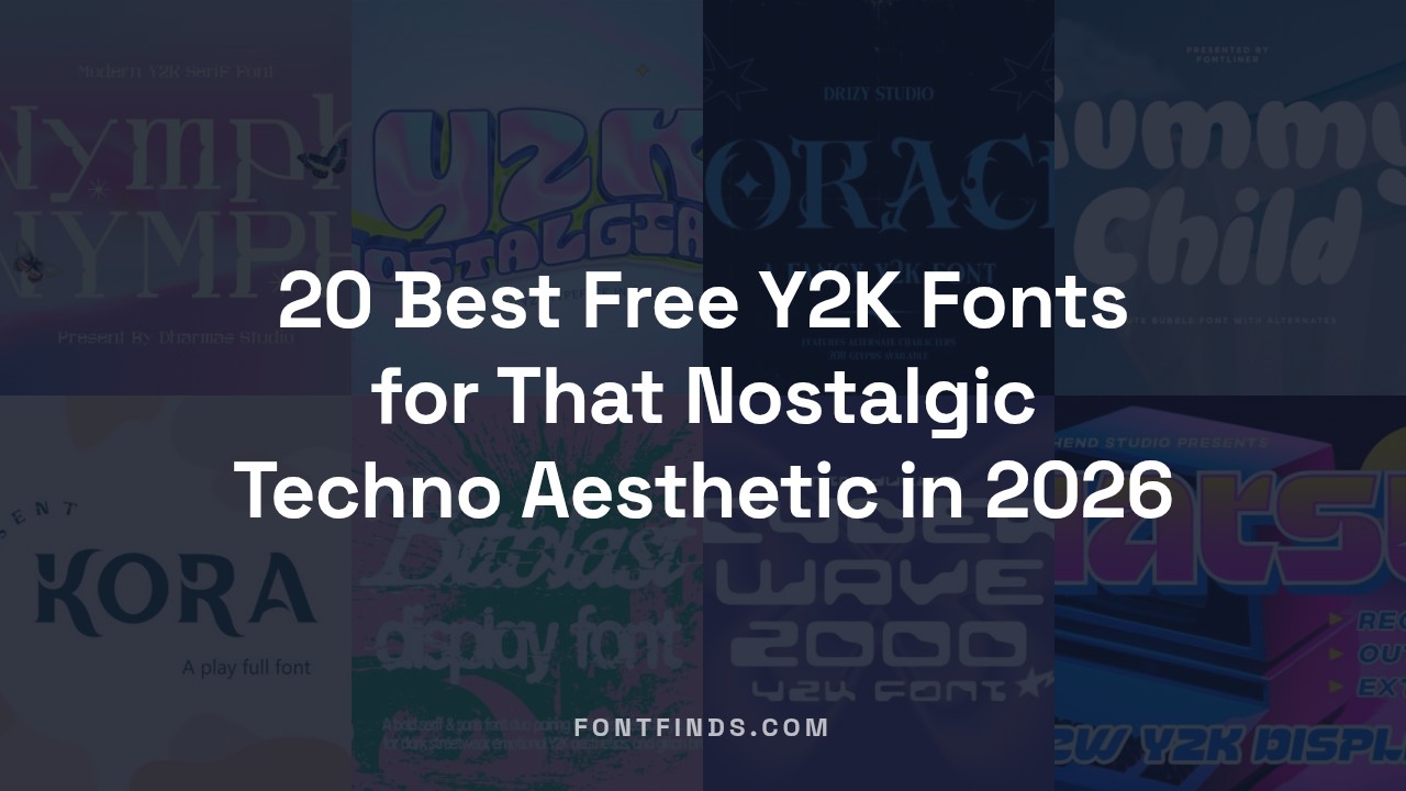
20 Best Free Y2K Fonts for That Nostalgic Techno Aesthetic in 2026
The early internet era is back in a big way, and nothing captures that retro-futuristic energy quite like Y2K typography. Whether you are designing a rave flyer, an album cover, or a streetwear brand lookbook, nailing that techno aesthetic is all about choosing the right typeface. I have spent hours digging through font libraries to bring you the ultimate list of free Y2K style fonts that are dominating design trends in 2026. Get ready to add some serious cyber-nostalgia to your digital toolkit.
1. First Bunny
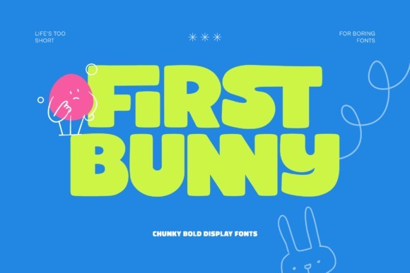
First Bunny captures the absolute essence of late 90s and Y2K nostalgia with its delightfully chunky and unapologetically bold letterforms. As we continue to see a massive resurgence of maximalist design in 2026, this font stands out by delivering a loud, joyful energy that immediately anchors any digital or print layout. The thick, rounded strokes create a bubbly silhouette that feels both retro and remarkably polished, striking the perfect balance between playful aesthetics and modern typographic standards. It is a fantastic choice when you need a display typeface that does not take itself too seriously but still performs flawlessly across different screen sizes.
When it comes to practical application, First Bunny shines brightest in environments that require high visual impact. I highly recommend using it for statement headlines, vibrant event posters, and streetwear apparel graphics where a strong, energetic personality is key. It pairs beautifully with highly saturated color palettes, chrome text effects, and early internet graphic motifs. If you are designing for music festivals, tech startups looking for a disruptive brand voice, or nostalgic lifestyle products, integrating this typeface will instantly elevate the authentic Y2K feel of your project.
2. Groggy
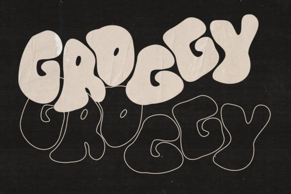
If you are searching for a typeface that embodies the rebel spirit of early 2000s street culture, Groggy is an absolute must-have in your design arsenal. This font perfectly replicates that thick, bubbly graffiti style that dominated underground rave flyers and skate brands during the Y2K era. What makes Groggy particularly valuable for contemporary designers is the inclusion of both regular and outlined versions within the bundle. This dual-style approach allows for effortless layering and dimensional text effects, giving you the creative freedom to experiment with overlapping colors and striking visual depth that defined the techno-pop aesthetic.
In practice, Groggy is my go-to recommendation for projects that demand an edgy yet nostalgic vibe. It works exceptionally well for album cover art, trendy merchandise design, and dynamic social media campaigns. To get the most out of this font, try offsetting the outlined version slightly behind the solid regular weight in a contrasting neon hue to create a quick, customized drop-shadow effect. Whether you are branding a retro gaming channel or launching a 90s-inspired streetwear collection, this typeface provides the perfect blend of playfulness and urban grit.
3. Heart Bubble
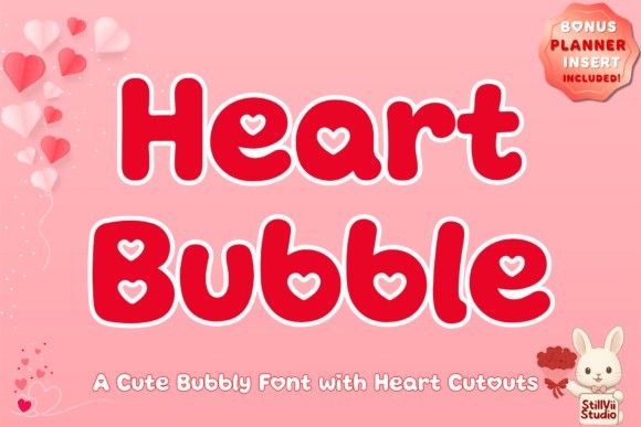
Heart Bubble takes the classic handwritten script and infuses it with an irresistible dose of millennium pop-culture charm. This typeface instantly injects a playful, three-dimensional effect into your typography, mimicking the look of puffy stickers and gel pens that defined the early 2000s stationary craze. As a display font, it carries a unique weight and whimsical flow that commands attention without feeling overly heavy or aggressive. The subtle 3D contours baked into the letterforms make it incredibly easy to achieve a high-effort look with minimal styling, making it a standout choice for designers who want to bring cute, nostalgic branding to life.
The versatility of Heart Bubble extends far beyond basic header text. It is remarkably effective for physical product design, particularly sublimation t-shirts, custom die-cut stickers, and playful packaging for cosmetics or confectioneries. I frequently suggest using this font for youth-oriented brands or whimsical invitations that want to break away from traditional calligraphy. For a truly authentic Y2K finish, try applying a holographic foil texture or a glossy gradient overlay to the text; the natural curves of the font will catch and reflect those digital lighting effects beautifully.
4. Natsu
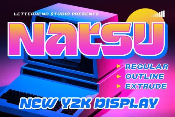
Natsu represents the dynamic, high-energy side of the Y2K design spectrum, drawing heavy inspiration from the bold pop aesthetics and fast-paced techno culture of the 2000s. This eye-catching display font features thick, confident strokes with just enough quirky geometry to make it instantly memorable. It does not just sit quietly on the page; it demands attention, making it a powerhouse for headline typography. In 2026, as brands compete fiercely for fractional seconds of consumer attention, utilizing a font with this level of unapologetic presence is a strategic advantage for any digital campaign or editorial spread.
For designers looking to maximize Natsu’s potential, it is best utilized in short, punchy statements where the unique character shapes can be fully appreciated. It thrives in large-scale formats such as billboard advertisements, video thumbnails, and hero sections on modern brutalist websites. I recommend pairing this robust typeface with a clean, neutral sans-serif for your body copy to ensure the design remains legible and balanced. Adding a subtle drop shadow or a glitch effect to Natsu can further enhance its retro-futuristic techno vibe, making it perfect for electronic music promotions or indie tech magazines.
5. Kora
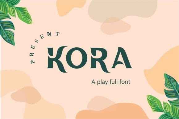
Kora introduces a fascinating twist to the standard Y2K aesthetic by blending tropical design influences with intriguing broken accents. This font proves that you do not need overwhelming complexity to create a memorable display typeface; rather, it highlights how true beauty and character can emerge from simple, thoughtfully disrupted forms. The fragmented details within the letters give it a slightly distressed, almost digital-glitch quality that resonates perfectly with the early days of internet culture and techno-futurism. It is a highly sophisticated take on retro typography that feels both organic and mechanical at the same time.
From a practical standpoint, Kora is exceptionally well-suited for niche branding projects that require a subtle yet distinctive edge. It is an outstanding choice for experimental music labels, avant-garde fashion lookbooks, and cyber-nature hybrid event branding. Because of its broken accents, it is best used at larger point sizes to ensure the intricate details remain crisp and visible. Try layering Kora over abstract, liquid metal backgrounds or pairing it with muted, earthy cyber-palettes to truly emphasize its unique intersection of natural tropical forms and digital techno-nostalgia.
6. Y2k Nostalgia
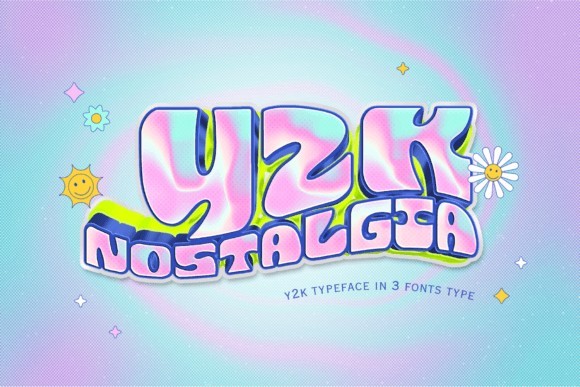
Stepping into 2026, the Y2K Nostalgia typeface proves that the turn-of-the-millennium aesthetic is far from a fleeting trend. This font brilliantly bridges the gap between retro charm and modern versatility, capturing the boundless, slightly chaotic optimism of the early 2000s. Its letterforms feature just the right amount of futuristic curvature and bubbly geometry, making it an instant focal point for any design. As a design professional, I appreciate how it avoids the trap of looking like a cheap parody; instead, it feels like a genuine archival piece updated for contemporary workflows.
When it comes to practical application, this typeface is an absolute powerhouse for display headlines and eye-catching packaging. I highly recommend deploying it in lifestyle branding or youth-centric product launches where a sense of playful nostalgia is required. To maximize its impact, pair Y2K Nostalgia with chrome layer styles, holographic gradients, or stark, contrasting flat colors. It commands attention effortlessly, ensuring your primary messaging never gets lost in the visual noise of a crowded market.
7. Dzruik
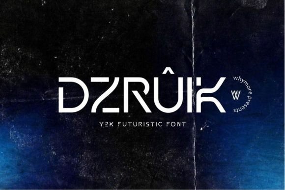
Dzruik is a fascinating departure from the traditionally loud and chaotic Y2K styles, offering a minimalist yet undeniably luxurious take on early 2000s techno aesthetics. In the current design landscape of 2026, where digital brutalism often dominates, Dzruik provides a much-needed breath of sophisticated air. Its structured, clean-cut lines echo the sleek hardware design and corporate tech optimism of the dot-com era. The typeface balances clinical precision with an elegant flow, making it feel both nostalgic and incredibly forward-thinking.
This font truly shines in high-end editorial environments and modern corporate branding. I frequently recommend Dzruik for tech startup identities, architectural brochures, and premium event calendars where clarity must coexist with character. Because of its meticulous kerning and versatile weight distribution, it scales flawlessly from massive billboard headlines down to detailed promotional templates. For the best results, use it over minimalist backgrounds or subtle metallic textures to let its luxurious geometry speak for itself.
8. Kabisat
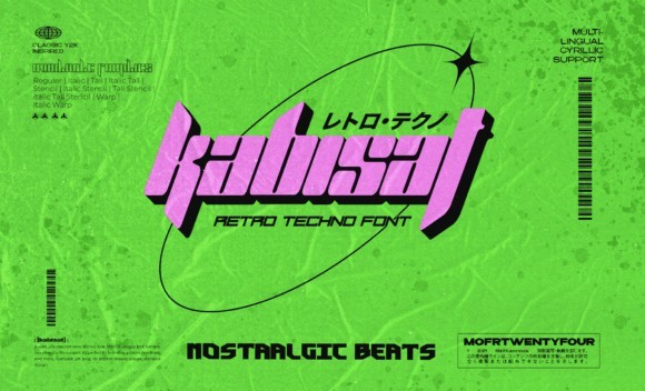
If you are searching for the quintessential heavy-hitting retro techno typeface, Kabisat is an absolute triumph. Bursting with unapologetic boldness and daring character, it instantly transports viewers to underground rave scenes and early 2000s cyber-culture. What makes Kabisat stand out in 2026 is its sheer visual weight and geometric aggression; it does not just sit on the canvas, it dominates it. The letterforms are sharply engineered to forecast a retro-future, blending industrial harshness with a distinct, undeniable Y2K flavor that commands the viewer’s gaze.
Kabisat is tailor-made for projects that need to make a loud, uncompromising statement. It is a top-tier choice for electronic music festival branding, edgy streetwear apparel design, and disruptive social media campaigns. Due to its thick strokes and tight counters, it is best utilized for short, punchy titles rather than body copy. Try applying an extruded 3D effect, liquid metal textures, or high-contrast neon glows to the text; Kabisat handles heavy styling beautifully without losing its inherent legibility and fierce personality.
9. Rebel Frisco
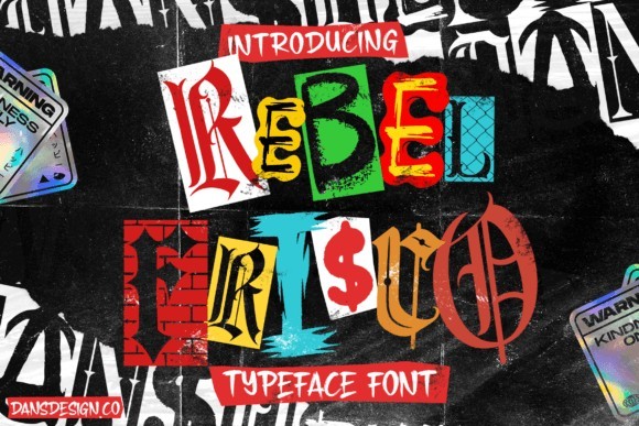
Rebel Frisco is a highly detailed display typeface that masterfully captures the intersection of urban graffiti culture and the Y2K streetwear explosion. Unlike many digitized graffiti fonts that feel stiff or overly synthesized, this typeface retains a remarkable sense of authentic street energy and fluid motion. Reviewing it in 2026, it is clear that the designer poured immense effort into preserving the raw, expressive brush strokes and jagged edges characteristic of turn-of-the-century urban art. It is complex, exquisitely gritty, and packed with rebellious attitude.
This font is an exceptional asset for specialized branding projects, particularly within the fashion and lifestyle sectors. I strongly advise using Rebel Frisco for apparel graphics, skateboard deck designs, and independent record label identities where an underground aesthetic is essential. Because of its high level of detail, it requires plenty of breathing room; avoid crowding it with competing design elements. It works spectacularly well in monochromatic palettes or layered over distressed, halftone backgrounds to amplify its authentic urban roots.
10. Digibits
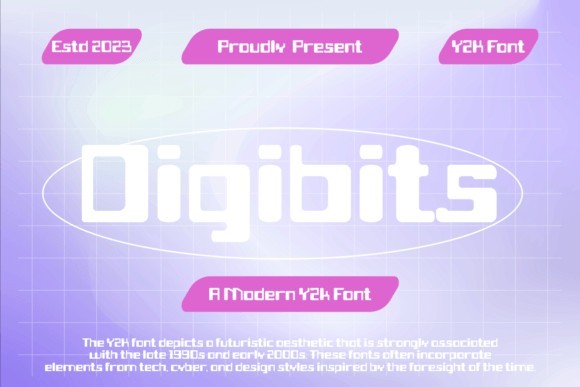
Digibits is a brilliant typographic time capsule that perfectly encapsulates the technological awakening of the late 90s and early 2000s. This font is a meticulous visual representation of vintage digital interfaces, drawing heavy inspiration from pixelated computer monitors, early internet browser aesthetics, and geometric neon structures. In 2026, as the demand for nostalgic UI/UX elements continues to soar, Digibits stands out as a highly authentic tool for creators. It captures the blocky, unrefined charm of early tech developments while remaining remarkably clean and usable in modern software environments.
The ideal use cases for Digibits revolve around projects that celebrate digital culture, gaming, and tech history. It is a fantastic choice for web design hero sections, retro-gaming Twitch overlays, and editorial layouts exploring the evolution of the internet. To truly lean into its aesthetic strengths, pair this typeface with stark black backgrounds, glowing cathode-ray tube (CRT) visual effects, or vibrant, highly saturated web-safe colors. It is a specialized display font, so keep it reserved for impactful headers and navigational elements where its pixel-perfect personality can truly shine.
11. Genniro
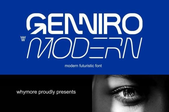
Genniro strikes the perfect balance between unmistakable 2000s techno nostalgia and sharp, forward-thinking modern typography. As we navigate the design landscape of 2026, finding a typeface that captures that elusive Y2K futuristic energy without feeling incredibly dated can be a challenge. Genniro answers the call with its remarkably legible letterforms that still manage to pull the viewer in with an aggressive, eye-catching edge. It feels like it belongs in the high-budget sci-fi interfaces of the early millennium while maintaining the structural sophistication required for today’s high-end branding.
From a practical standpoint, this font is an absolute workhorse for bold applications like oversized headlines, stark logo marks, and experimental editorial lettering. I highly recommend deploying Genniro when you need your visual communication to command attention but still demand strict readability. It pairs wonderfully with neon color palettes, chrome textures, and wireframe 3D assets that dominate contemporary cyber-aesthetic projects. Whether you are laying out a vinyl cover for an electronic artist or establishing a brand identity for a tech startup, Genniro offers a timeless yet distinctively techno-driven presence.
12. Bitblastserif
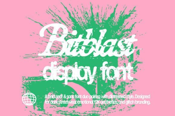
If your project demands high-impact, raw energy, Bitblastserif is the definitive choice for injecting a subversive, distressed aesthetic into your typography. Blending gothic-infused serif elements with a tightly condensed sans structure, this typeface feels wonderfully aggressive and unapologetically retro-futuristic. In 2026, the demand for grunge-meets-digital aesthetics is at an all-time high, and Bitblastserif delivers that specific flavor of chaotic early-web nostalgia perfectly. The raw textures baked into the font give it an almost printed-then-scanned quality that saves designers countless hours in post-processing.
In practice, Bitblastserif excels when pushed to extreme scales in your compositions. It is practically tailor-made for underground music event posters, edgy streetwear apparel design, and brutalist web layouts. To get the most out of this font, try layering it over harsh halftone photography or manipulating it with displacement maps to further exaggerate its distressed nature. It is not designed for body copy; rather, treat it as a display powerhouse that acts as the central visual anchor for projects needing a dark, cyberpunk, or industrial Y2K attitude.
13. Flux
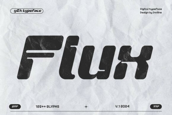
Flux is a masterclass in translating chunky, early-2000s digital aesthetics into a highly usable contemporary display typeface. What makes this font stand out in the heavily saturated 2026 typography market is its distinct combination of rounded, friendly corners with heavy strokes and subtle distressing. This intersection of approachability and technological nostalgia creates a unique visual friction that immediately catches the eye. It is heavily inspired by the optimistic, bulbous tech hardware of the Y2K era, making it an incredibly fun yet impactful tool for designers looking to inject some playful retro-tech energy into their work.
When integrating Flux into your workflow, you will find it shines brightest in application scenarios that lean into cyberpunk branding, futuristic poster art, and retro-tech merchandise. The chunky weight of the characters makes it highly responsive to gradients, glowing layer styles, and heavy drop shadows typical of the era’s web design. Use it for impactful hero section headers or oversized graphic tees where the letterforms can really breathe. Pairing Flux with a highly legible, neutral sans-serif for secondary text will ensure your design remains grounded while allowing this character-rich display font to steal the show.
14. Shoock Crooks
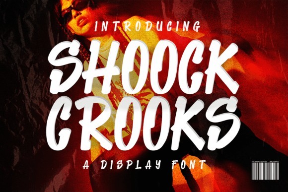
Stepping away from the rigid geometries of early tech interfaces, Shoock Crooks captures the rebellious, tactile side of the Y2K era with its highly detailed marker-style execution. This handwritten font oozes retro-urban attitude, perfectly mimicking the look of quick, aggressive tags found on early 2000s skate decks and hip-hop mixtapes. In 2026, as audiences continue to crave authenticity and human touch in digital spaces, a meticulously crafted organic typeface like Shoock Crooks provides a much-needed break from hyper-polished vector graphics. The intricate detailing in the strokes gives the illusion of actual ink bleed, adding an incredible layer of realism to your digital canvas.
From an application standpoint, Shoock Crooks is a dominant force for streetwear apparel design, energetic logo treatments, and lifestyle brand identities. It brings a dynamic, street-level energy that works remarkably well when juxtaposed against clean, minimalist layouts or rigid grid systems. I recommend experimenting with this font by applying rough paper textures and vibrant, saturated colors to really sell the authentic marker aesthetic. Whether you are designing limited-edition merchandise drops or creating expressive social media campaigns, Shoock Crooks provides an effortlessly cool, underground vibe that resonates strongly with today’s youth culture.
15. Kansei
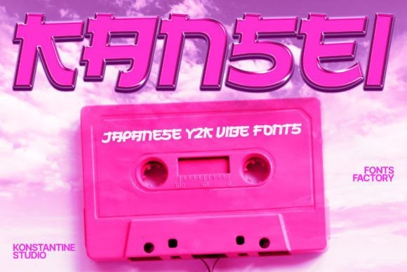
Kansei masterfully blends the sharp, hyper-kinetic energy of Japanese mecha culture with the distinct Y2K design language that continues to dominate the visual landscape in 2026. This all-caps typeface carries an undeniable sense of motion and technological prowess, making it feel like it was directly ripped from the title screen of a legendary late-90s arcade game. The uniform sizing of the uppercase and lowercase letters ensures a solid, blocky typographic rhythm that is incredibly easy to align and format in complex layouts. It is an aggressive, statement-making font that commands respect and immediately sets a high-octane tone for whatever project it graces.
The practical applications for Kansei are practically limitless if you are working within the realms of esports, gaming content, or high-energy streetwear. It is absolutely flawless for constructing striking team logos, Twitch overlay graphics, and aggressive poster typography that needs to be legible at a glance. To maximize its impact, I suggest pairing Kansei with high-contrast color palettes like neon green and stark black, or applying sleek chrome layer styles to amplify its futuristic automotive vibes. It is a highly specialized tool, but when deployed in the right cyberpunk or competitive gaming context, Kansei absolutely obliterates the competition.
16. Sorach
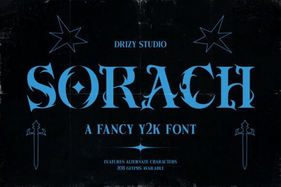
Sorach emerges as a powerhouse in the resurgence of graffiti-inspired Y2K typography, demanding attention with its bold, flashy curves and undeniable urban edge. It expertly bridges the gap between raw street art and the polished, futuristic digital aesthetic that defined the turn of the millennium. As we navigate the design trends of 2026, this typeface stands out by offering a rebellious yet highly legible structure, making it incredibly versatile for creators looking to inject some serious attitude into their visual narratives without sacrificing modern clarity.
From a practical standpoint, Sorach is an absolute dream for statement pieces. I highly recommend deploying it on oversized event posters, underground music album covers, or edgy streetwear branding where you want the text to serve as the primary graphic element. Pair it with high-contrast neon colors or metallic chrome effects to maximize that early 2000s cyber-rebel vibe. Just keep the surrounding design minimal so this loud, expressive font can truly take center stage and guide the viewer’s eye exactly where you want it.
17. Cyberwave 2000
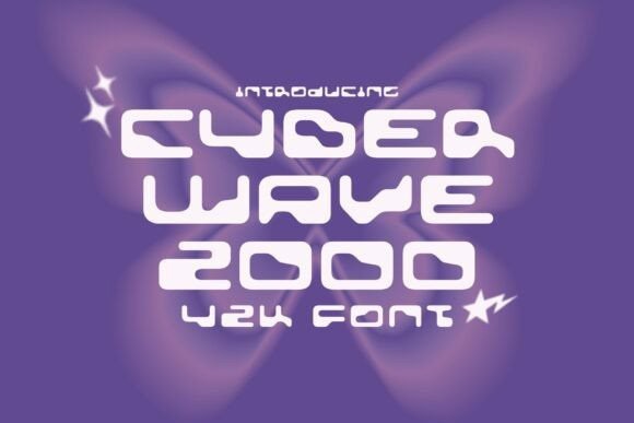
Stepping into the digital frontier of 2026, Cyberwave 2000 delivers an intoxicating dose of glitchcore glamour and chrome-coated aesthetics that instantly transport you to the early days of the internet. This bold typeface perfectly encapsulates the futuristic optimism of the era, balancing sharp, technical angles with the nostalgic charm of early web design. It feels simultaneously retro and forward-looking, making it an essential tool for designers aiming to capture the tech-heavy, utopian spirit of the Y2K movement while maintaining a crisp, contemporary edge.
When integrating Cyberwave 2000 into your workflow, think about projects that require a high-tech, digital-first presence. It excels in UI mockups for retro-futuristic apps, vaporwave festival branding, and high-energy Twitch stream overlays. To get the most out of this font, try applying gradient maps, subtle drop shadows, or synthetic glitch effects to the text. It pairs beautifully with monospaced secondary fonts, ensuring your primary headlines pack a massive visual punch while maintaining flawless typographic hierarchy.
18. Mescio
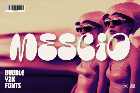
Mescio takes the beloved bubble font trend of the early 2000s and refines it for the modern design landscape of 2026. This vibrant typeface bursts with energy, channeling the era of frosted tips, pop music explosions, and neon-drenched cyber dreams. Its exaggerated, ultra-rounded letterforms manage to feel incredibly nostalgic while retaining a crisp, professional finish that prevents it from looking dated. It is a masterful study in how to make playful, juvenile typography feel sophisticated and highly intentional for contemporary commercial use.
If you are working on lifestyle branding, cosmetic packaging, or playful social media campaigns, Mescio should be at the top of your typographic arsenal. The trick to using this font effectively is to treat it almost like a logo mark, letting it breathe with plenty of negative space. It looks absolutely stunning when rendered in glossy 3D styles or flat, vibrant pastel tones. Contrast its bubbly, expansive nature with a sharp, geometric sans-serif for body copy to keep your overall layout grounded and highly readable.
19. Gummy Child
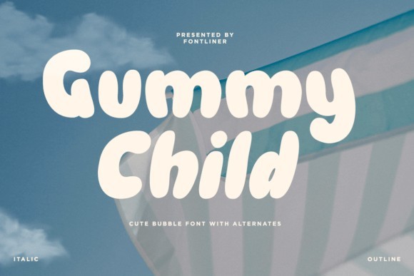
Gummy Child is the ultimate answer to the ongoing demand for soft, groovy Y2K typography that does not sacrifice modern readability. Its rounded, incredibly playful curves inject an immediate sense of joy and nostalgia into any canvas, perfectly balancing the whimsical nature of turn-of-the-century design with the clean execution expected by today’s top agencies in 2026. The font feels like a warm hug from the past, yet its structural integrity ensures it performs flawlessly across high-resolution digital displays and premium print media alike.
I frequently reach for Gummy Child when designing for youth-oriented brands, indie magazine headers, or quirky apparel lines. Because the letters are so visually dense and friendly, they work wonderfully with tight kerning to create solid, stamp-like typographic blocks that immediately draw the eye. For a truly authentic 2000s look, try applying a thick contrasting stroke or a soft inner glow to the letterforms. It is a highly charismatic typeface that does a lot of heavy lifting, allowing you to keep the rest of your layout refreshingly simple.
20. Nymph
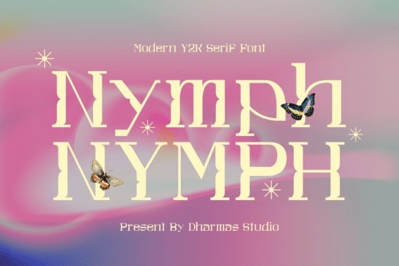
Nymph is a fascinating typographic experiment that brilliantly merges modern sensibilities with unmistakable Y2K nostalgia. By utilizing unique letter shapes that cleverly resemble playful, slightly off-kilter rectangles, it establishes a friendly yet distinctly trendy rhythm across the baseline. In 2026, where designers are constantly searching for ways to break the mold without alienating their audience, Nymph strikes the perfect balance. It leans heavily into the coolness of the late 90s tech boom while maintaining a highly approachable and inviting overall demeanor.
The blocky yet soft nature of Nymph makes it incredibly versatile for both digital platforms and tangible print applications. It shines brightest in editorial layouts, boutique brand identities, and eye-catching product packaging where you need the typography to instantly spark curiosity. I advise using it for short to medium-length headlines rather than dense paragraphs, as its distinct shapes demand undivided attention. Pair it with a stark, minimal background and let the quirky geometry of the letters dictate the visual flow of your composition.
Finding the perfect typography can make or break a design, but this collection of Y2K style fonts should give you everything you need to nail that nostalgic techno vibe. From chunky block letters to liquid cyber shapes, these free options prove you do not need a massive budget to create standout designs in 2026. Grab your favorites, experiment with some chrome text effects, and let that early internet energy shine through your next big project.