43 Best Designer Fonts You Need to Download in 2026
Finding the right typography can make or break a design project. Whether you are working on a sleek brand identity, a modern website, or a vintage-inspired poster, the typeface you choose sets the entire mood. With design trends shifting rapidly, sticking to the same old standard typefaces just will not cut it anymore. That is why I have spent hours scouring the web to put together the ultimate collection of the 43 best designer fonts for 2026. These picks cover everything from elegant serifs to bold, modern sans-serifs, giving you plenty of fresh options to upgrade your typography game.
1. Wild Lines Handwritten font
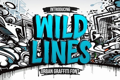
If you are searching for an organic, untamed aesthetic to elevate your next project, the Wild Lines handwritten font is an absolute must-have for your designer toolkit in 2026. This dynamic typeface captures the raw, energetic movement of authentic handwriting, making it incredibly effective for projects that require a personal, bespoke touch. The stroke variations are beautifully crafted, providing a realistic marker-like texture that jumps right off the screen or page.
From a practical standpoint, Wild Lines is exceptionally versatile. I highly recommend using it for statement branding, edgy apparel graphics, or eye-catching social media campaigns where you want to break away from rigid typography. It pairs marvelously with clean, geometric sans-serifs, allowing the expressive loops and fast-paced curves to serve as the ultimate focal point. Whether you are designing album art, adventurous lifestyle blogs, or modern packaging, this font delivers undeniable character.
2. Floxy Sans Serif font
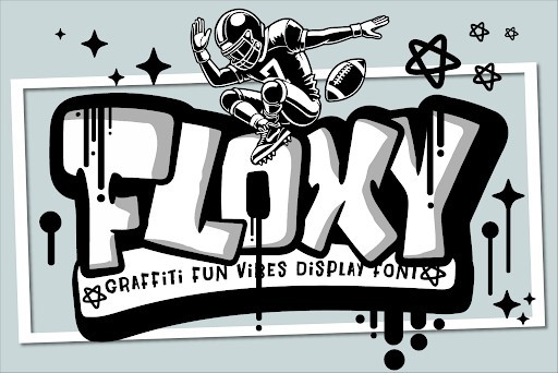
Floxy is a masterclass in contemporary typography, offering a brilliantly balanced sans serif structure that feels both sophisticated and remarkably approachable. In the fast-evolving landscape of 2026 design trends, having a reliable yet distinctive workhorse font is crucial, and Floxy fits the bill perfectly. Its letterforms feature subtle geometric nuances and excellent legibility, ensuring that it performs beautifully across a wide array of screen sizes and print applications without ever losing its modern charm.
When deploying Floxy in your workflow, consider utilizing it for high-end corporate branding, editorial layouts, or sleek UI/UX design projects. Its clean lines make it an exceptional choice for website headers and minimalist packaging. To maximize its impact, try playing with wide tracking for a luxurious, airy feel in your logos, or use its bolder weights to command attention in advertising copy. Floxy proves that simplicity, when executed with precision, is the ultimate form of sophistication.
3. Spilt Stacked Display font
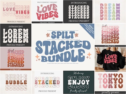
Injecting a dose of pure joy and playful energy into your designs has never been easier than with the Spilt Stacked display font. Created with a distinctively quirky and layered visual approach, this typeface completely redefines how we look at novelty fonts this year. Its chunky, uneven baseline and delightful stacking capabilities allow designers to create dimensional, sticker-like text effects effortlessly. It is a font that refuses to take itself too seriously while maintaining the high-quality vector precision professionals demand.
This font is an absolute powerhouse for crafters, digital illustrators, and anyone operating in the children’s design space. I frequently recommend Spilt Stacked for designing vibrant birthday invitations, custom die-cut stickers, quirky apparel, and engaging educational materials. If you are a fan of using cutting machines like Cricut or Silhouette, you will appreciate how smoothly these thick letterforms cut and weed. Pair it with a simple, highly legible secondary font to ensure your bold, stacked headlines remain the star of the show.
4. Neighbor’s Blanket Handwritten font
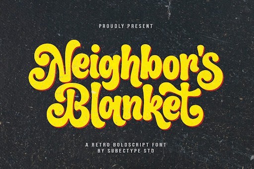
There is a unique magic in typography that can evoke a sense of comfort and nostalgia, and the Neighbor’s Blanket handwritten font captures that feeling effortlessly. This typeface features a beautifully rustic, slightly textured edge that mimics the gentle glide of an ink pen on textured paper. The baseline is delightfully bouncy, giving every word a custom-lettered appearance that feels intimately crafted and warmly inviting. It is the typographical equivalent of a cozy evening indoors, making it a standout choice for designers looking to inject heart into their work.
Practically speaking, Neighbor’s Blanket shines brightest when used in boutique branding, seasonal marketing campaigns, and personalized stationery. It is my go-to recommendation for autumn and winter-themed creations, artisanal food packaging, and heartfelt greeting cards. To get the most out of this charming font, utilize its alternate characters and ligatures if your software supports them, as this will further enhance the authentic, hand-drawn illusion. It pairs wonderfully with classic serif fonts for an elegant yet approachable aesthetic.
5. Chicago Athlete Slab Serif font
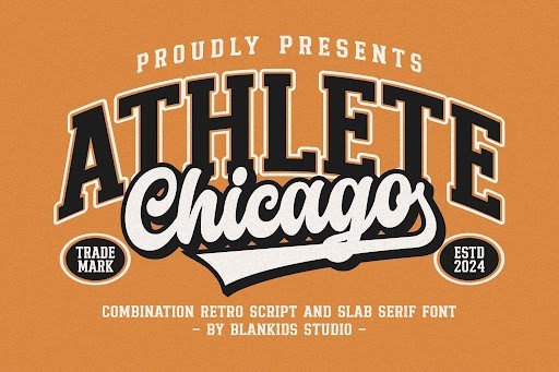
Tapping into the enduring appeal of vintage collegiate and professional sports aesthetics, the Chicago Athlete slab serif font is a bold, uncompromising powerhouse. This typeface features the iconic blocky serifs and rigid, structured geometry that instantly commands respect and attention. What sets Chicago Athlete apart in the crowded landscape of athletic fonts is its pristine execution; the proportions are flawlessly balanced to ensure maximum legibility and impact, even from a distance or when printed on heavily textured fabrics.
This is the ultimate typographic tool for designing team logos, varsity-style apparel, e-sports branding, and high-energy event posters. When working with Chicago Athlete, I recommend applying thick strokes or offset outlines to create that classic mascot-logo depth. It also performs exceptionally well in large, commanding headlines for fitness magazines or nutritional supplement packaging. If you need to communicate strength, tradition, and competitive spirit in your next project, this slab serif is guaranteed to score a home run.
6. Pale Martini Script font
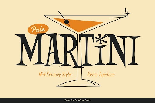
When you are designing for the modern luxury space in 2026, finding a typeface that balances elegance with approachability is no easy task. Pale Martini manages to strike that perfect chord, offering a sophisticated script aesthetic without feeling overly stuffy or dated. Its flowing ligatures and subtle baseline variations give it an organic, bespoke feel that immediately elevates any canvas. As a design professional, I consistently reach for typefaces like this when a client needs their brand to communicate high-end exclusivity while still remaining inviting and warm to a modern audience.
In terms of practical application, Pale Martini shines brightest in boutique branding, high-end hospitality menus, and artisanal packaging. Because delicate script fonts can sometimes suffer from legibility issues at smaller scales, I highly recommend using this strictly for hero text, logos, and short callouts. Pair it with an ultra-clean, minimalist sans-serif to create a striking visual hierarchy. This deliberate contrast allows Pale Martini’s exquisite loops and terminals to take center stage without overwhelming your reader’s eye.
7. River School Display font
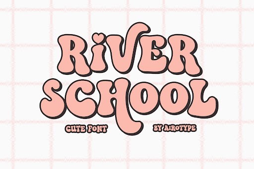
Collegiate and varsity-inspired typography has seen a massive resurgence lately, and River School perfectly captures that nostalgic, structured aesthetic while maintaining crisp, modern vector points. This display typeface brings a heavy, authoritative presence to the table, utilizing thick block lettering and subtle geometric styling that immediately commands attention. Unlike older athletic fonts that can feel clunky or poorly kerned out of the box, River School is meticulously engineered for the demanding standards of 2026, ensuring that your heavy headlines look impeccably balanced with minimal manual adjustment.
This font is an absolute powerhouse for sports apparel, university-themed merchandise, and bold streetwear branding. To get the absolute best out of River School, play generously with your tracking; giving these heavy letters a bit of breathing room can dramatically modernize the vintage aesthetic. I also frequently use it for impactful poster designs and brewery branding, particularly when paired with a rough texture overlay to enhance its inherent retro charm. Just remember to keep it out of your body copy, as its sheer weight demands to be used at large display sizes.
8. Mixed Notes Handwritten font
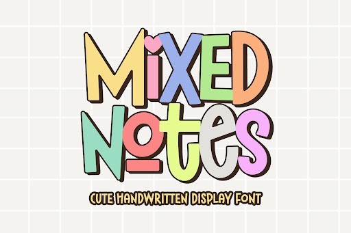
In an era where digital perfection can often feel cold and corporate, Mixed Notes acts as a typographic breath of fresh air. This handwritten font captures the organic, slightly imperfect cadence of genuine penmanship, making digital designs feel highly personal and intimately crafted. The slight irregularities in its x-height and the natural-looking stroke weights make it incredibly convincing as real handwriting. It is an invaluable tool for designers looking to break the monotony of rigid grid systems and inject a dose of human empathy into their digital campaigns.
Mixed Notes is practically built for social media graphics, lifestyle blog headers, and intimate email marketing campaigns where building a personal connection with the audience is key. From a layout perspective, it pairs wonderfully with strict geometric serifs, creating a dynamic tension between the formal and the casual. I strongly advise utilizing the font’s alternate glyphs if your software supports them, as swapping out repeating characters prevents the text from looking like a repetitive digital stamp and preserves that authentic, handwritten illusion.
9. Cowboy Howdy Display font
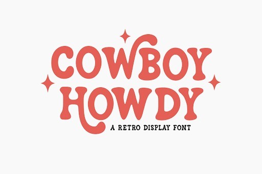
Cowboy Howdy is a masterful typographic homage to the rugged spirit of the Wild West, seamlessly blending rustic charm with contemporary display mechanics. Western fonts can easily veer into cheap novelty territory, but this typeface completely avoids that trap through careful attention to its classic spurs, bold weighting, and refined terminals. It evokes the feeling of vintage wanted posters and classic denim branding, yet it remains sharp and legible enough for modern digital applications in 2026. It is a fantastic example of how to do thematic typography right.
This typeface is highly recommended for outdoor brand identities, artisanal coffee roasters, barbecue restaurants, and event typography. Because of its distinctive character shapes, Cowboy Howdy needs to be the star of the show. I advise pairing it with a very quiet, unassuming secondary font so the two do not compete for attention. Additionally, it works exceptionally well when styled with layered effects, such as a subtle drop shadow or an inline stroke, which helps to further accentuate its strong, architectural letterforms.
10. Sunday Bright Script font
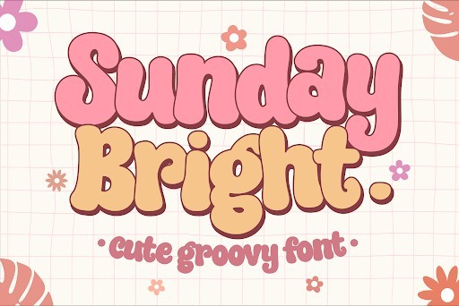
Sunday Bright is the typographic equivalent of a sunny, optimistic weekend morning. It is an incredibly cheerful, bouncing script font that carries an effortless, rhythmic flow across the baseline. What makes this font stand out in 2026 is its exceptional legibility; many playful scripts sacrifice readability for style, but Sunday Bright maintains clear letterforms even at moderate sizes. Its thick, marker-like strokes give it a friendly, robust presence that instantly brightens up any design project without feeling overly juvenile.
This is my go-to recommendation for children’s book covers, organic food packaging, greeting cards, and approachable lifestyle branding. Because of its heavy, continuous strokes, it looks absolutely stunning when used in overlapping multi-color designs or styled with a slight gradient. To truly maximize its potential, take advantage of its ligatures to ensure smooth transitions between tricky letter combinations like ‘th’ and ‘os’. Keeping the text tightly kerned but well-leaded will ensure that Sunday Bright maintains its bubbly, cohesive energy across your entire layout.
11. Super Hero Display font
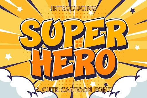
If you are working on a project that demands high-energy visuals and bold character, the Super Hero font by Kido Studio is an absolute powerhouse. As a striking display font, it effortlessly captures the dynamic, action-packed essence of classic comic books and modern cinematic universes. The chunky, weighted letters ensure maximum legibility from a distance, making it an exceptional choice for arresting headlines, YouTube video thumbnails, and promotional posters. What sets this typeface apart in the 2026 design landscape is its meticulously crafted kerning and robust letterforms, which prevent the design from feeling overly cluttered even when applied to longer title sequences.
From a practical standpoint, this font is a versatile asset for designers targeting younger demographics or pop-culture enthusiasts. I frequently recommend it for children’s apparel, energetic event flyers, and gaming channel branding where a sense of momentum is crucial. When deploying the Super Hero font, try pairing it with vibrant, saturated color palettes—think primary reds, blues, and yellows—or adding heavy drop shadows and halftone dot textures to fully embrace that vintage comic book aesthetic. It works best as a primary focal point, so keep your secondary body copy restricted to a clean, understated sans-serif to maintain visual hierarchy.
12. Nice Boho Handwritten font
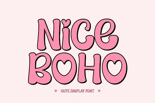
Embracing the organic, free-spirited aesthetic that continues to dominate modern branding, the Nice Boho font by Ade is a breathtaking addition to any designer’s typographic arsenal. This handwritten font masterfully balances casual fluidity with refined elegance, offering a natural monoline stroke that mimics the authentic feel of a premium ink pen. The subtle irregularities in the baseline and letter heights give it a genuinely human touch, which is highly sought after in today’s overly digitized world. It brings a sense of warmth and approachability to your canvas, making it an indispensable tool for lifestyle brands, wellness blogs, and artisanal packaging.
When it comes to real-world applications, Nice Boho shines brightest in the wedding and event industry. It is absolutely perfect for crafting bespoke invitations, place cards, and romantic signage that require a personal, intimate vibe. I also highly advise using it for social media graphics, particularly for Instagram quote posts or Pinterest pins where a chic, bohemian flair can dramatically increase engagement. To maximize its impact, pair this handwritten beauty with a geometric sans-serif or a crisp, classic serif font to create a stunning contrast. Using earthy, muted color palettes like terracotta, sage green, and dusty rose will perfectly complement its rustic yet sophisticated charm.
13. Diamond Cartoon Display font
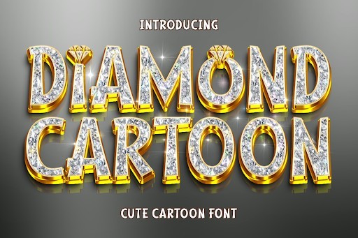
Injecting a dose of pure joy and whimsy into your design projects has never been easier thanks to the Diamond Cartoon font by Eightde. This playful display font is characterized by its bouncy baseline, exaggerated curves, and slightly irregular proportions that instantly evoke the charm of Saturday morning animations. Unlike many novelty fonts that sacrifice readability for style, Diamond Cartoon maintains exceptional clarity, ensuring your message is easily digestible even for younger audiences. The robust, bubbly letterforms are practically begging to be filled with vibrant gradients or outlined with thick, comic-style strokes, making it a highly adaptable choice for digital illustrators and graphic designers alike.
The use cases for this delightful typeface are virtually endless, particularly within the realms of entertainment and merchandise. It is a top-tier selection for toy packaging, mobile game interfaces, children’s book covers, and school-related promotional materials. In my professional practice, I have found that this font pairs wonderfully with energetic, neon-leaning color palettes and playful vector illustrations. For the best typographic results, reserve Diamond Cartoon for your main headings and calls to action, and pair it with a highly legible, rounded sans-serif font for the body text to keep the overall layout balanced, fun, and exceptionally user-friendly.
14. Sunset Retro font
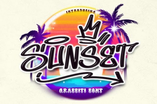
Riding the massive wave of nostalgia that defines much of 2026’s creative direction, the Sunset font by BB Type Studios is a masterful execution of retro typography. This font perfectly encapsulates the warm, laid-back energy of the 1970s and 80s, featuring smooth, sweeping curves and thick, groovy letterforms that demand attention. What makes Sunset truly remarkable is its ability to evoke a specific era without feeling dated or cliché; it possesses a refined, modern polish that makes it incredibly relevant for contemporary branding. The slightly condensed structure of the characters allows for high-impact headlines that do not consume excessive horizontal real estate, providing designers with both style and spatial efficiency.
For designers looking to infuse their work with a vintage California vibe, this retro font is an absolute must-have. It is exceptionally well-suited for surf and skate apparel, summer music festival posters, and boutique brewery labels. To truly unlock its potential, I recommend experimenting with retro-inspired text effects, such as deep extrusions, offset strokes, or classic retro-striped color fills in shades of mustard yellow, burnt orange, and teal. Because Sunset is such a visually dominant typeface, it is best utilized for short, punchy titles or logos. Pair it with a highly simplified, utilitarian sans-serif font to ensure your underlying message remains crisp and perfectly legible.
15. Real Wavy Stacked Display font
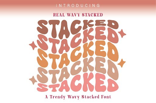
Pushing the boundaries of conventional typography, the Real Wavy Stacked font by SVG Bloom is an incredibly innovative display font designed for the bold and the fearless. As its name suggests, this font features a mesmerizing, undulating wave effect combined with a built-in stacked design, instantly creating a trippy, psychedelic visual experience. This saves designers hours of manual warping and layering in Illustrator, offering a ready-to-use solution for complex typographic art. The seamless flow of the distorted letters captures the essence of the modern retro-futurism trend, making it a standout choice for projects that need to break the mold and command immediate visual authority.
Given its highly stylized nature, Real Wavy Stacked is best deployed in statement pieces where the typography acts as the primary art element. It is phenomenal for streetwear apparel designs, indie band merchandise, rave or club flyers, and edgy social media campaigns. When working with this font, minimalism in the surrounding elements is key; allow the wavy, stacked letters to take center stage. I frequently suggest using high-contrast color combinations—such as acid green on deep black or electric pink on navy—to accentuate the optical illusion of the waves. Keep your supporting text minimal and extremely clean to ground the design and prevent visual overwhelming.
16. Pink Girl Script font
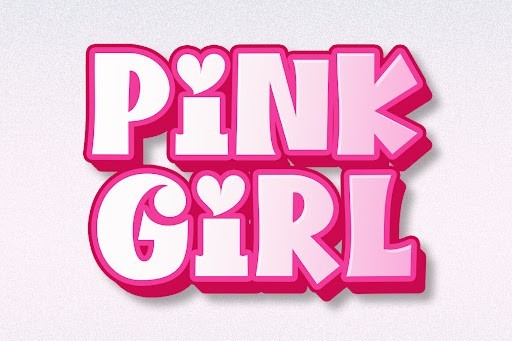
Pink Girl by IM Studio is a delightfully playful script font that perfectly captures the whimsical and feminine design trends dominating 2026. As a professional designer, I appreciate how smoothly the ligatures connect, giving it a genuinely handwritten feel without looking overly manufactured. It brings a bubbly, energetic aesthetic to the table, making it an incredibly versatile asset for modern branding projects that need a touch of approachability and warmth.
Practically speaking, this font shines brightest in lifestyle, beauty, and fashion contexts. I highly recommend using Pink Girl for cosmetics packaging, social media quote graphics, or boutique apparel logos. When applying it to your designs, pair it with a clean, understated sans-serif to keep your typography balanced. Ensure you give it plenty of negative space so the sweeping ascenders and descenders have room to breathe, resulting in a cohesive and eye-catching layout.
17. Rodeo Bundle Display font
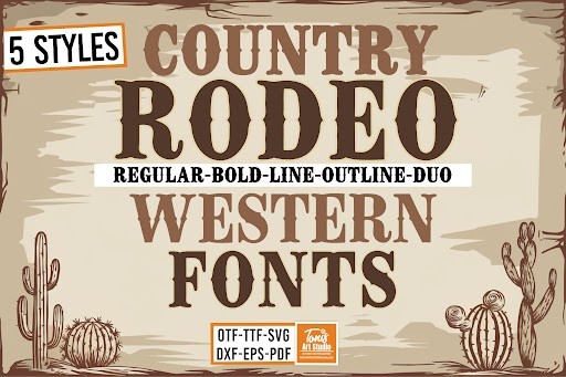
The Rodeo Bundle by TonisArtStudio is an absolute powerhouse for designers looking to inject a rugged, vintage Americana vibe into their work. In 2026, we are seeing a massive resurgence of Western-inspired aesthetics, and this display font bundle hits every necessary mark. It features bold, sturdy letterforms with just the right amount of rustic distressing, giving it an authentic, hand-painted saloon signage appeal that instantly commands attention.
This bundle is my go-to recommendation for outdoor lifestyle brands, craft brewery labels, and event posters for music festivals or rodeo shows. Because display fonts of this nature carry a lot of visual weight, they are best reserved for large headers and striking typographic focal points. Pair it with a highly legible, simple serif or sans-serif for your body copy to prevent the design from becoming overwhelming while maintaining that strong, adventurous frontier spirit.
18. Retro Magic Retro font
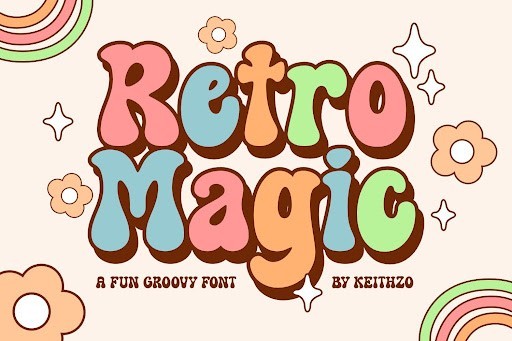
Retro Magic by Keithzo is a brilliant typographic time machine that seamlessly blends nostalgic 1970s groove with the crisp, high-definition standards expected in 2026. What makes this retro font stand out in a crowded market is its impeccably balanced curves and chunky, dynamic swashes. It does not just rely on its vintage gimmick; it is structurally sound, highly legible, and brings an infectious, feel-good energy to any digital or print canvas.
If you are working on podcast covers, vibrant packaging design, or standout merchandise, Retro Magic is a phenomenal choice. I suggest utilizing it with warm, earthy color palettes—think mustard yellows, burnt oranges, and deep browns—to fully amplify its retro aesthetic. For the best results, use it primarily for short, punchy headlines or logotypes, as its heavy weight and stylized letterforms can lose their charm if forced into dense paragraph text.
19. Super Bubble Display font
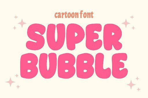
Super Bubble by anamalmusyaffaCreative is a fantastically fun and voluminous display font that taps right into the Y2K and maximalist design revival of 2026. It features incredibly plump, rounded letterforms that look almost 3D, bringing a tactile, balloon-like quality to the screen. As a typography expert, I am impressed by how well the creator maintained legibility despite the extreme weight and inflated proportions of the characters.
This font is an absolute dream for children’s books, vibrant streetwear brands, and playful app interfaces. To make the most out of Super Bubble, I recommend experimenting with bright, contrasting colors, drop shadows, and stroke outlines to enhance its three-dimensional pop. It is purely meant for high-impact headlines and graphic lockups, so be sure to pair it with a very clean, geometric sans-serif to keep your overall composition grounded and accessible.
20. College Duo Slab Serif font
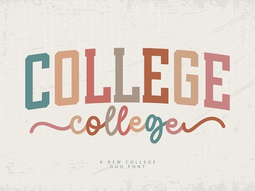
MaxArt has delivered an exceptional collegiate typography experience with the College Duo font. As athletic and varsity-inspired apparel continues to dominate casual fashion in 2026, having a robust slab serif in your design toolkit is non-negotiable. This font provides that iconic, blocky, and authoritative structure you expect from university branding, but it is refined with remarkably clean edges and perfect kerning that make it suitable for premium commercial projects.
The true strength of College Duo lies in its versatility across sports branding, e-sports logos, and university-style merchandise. I love using the solid and outlined versions together to create dynamic, layered text effects without needing complex vector tricks. When designing with this slab serif, use all-caps for maximum impact in your headers, and contrast it with a fluid script or a simple sans-serif to create a dynamic, energetic visual hierarchy.
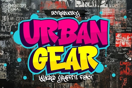
21. Urban Graffiti Display font
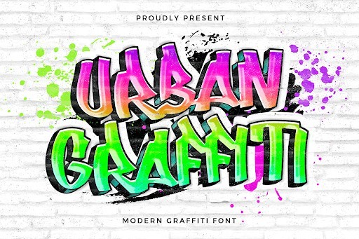
For designers looking to inject authentic streetwear energy into their projects, the Urban Graffiti font by fontkong is an absolute standout in 2026. This dynamic display typeface captures the raw, rebellious spirit of urban street art with its bold strokes, jagged edges, and undeniable swagger. Unlike many graffiti fonts that look overly digitized or repetitive, this particular design maintains a hand-drawn, spontaneous feel that makes each letterform pop. It is exceptionally well-suited for striking apparel designs, skateboard decks, music album covers, and edgy branding campaigns where you need to make a loud, unapologetic statement.
When working with Urban Graffiti, my top recommendation is to pair it with a stark, minimalist sans-serif font to maintain visual balance and prevent your design from feeling cluttered. Because the characters carry so much visual weight and intricate detailing, using it strictly for headlines, logos, or short burst copy yields the best results. Experiment with vibrant neon gradients or textured overlay effects like spray paint drips and grunge brushes to elevate the urban aesthetic. It is a powerful tool in any modern designer’s typography arsenal, guaranteed to bring an authentic, gritty underground vibe to your digital and print canvases.
22. Heavy Grunge Display font
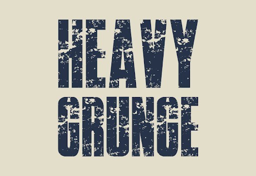
The Heavy Grunge font by GraphicsNinja is a masterclass in distressed typography, offering designers the perfect blend of aggressive texture and structural readability. In the modern design landscape of 2026, where overly polished corporate aesthetics often dominate, this font provides a much-needed dose of raw, tactile authenticity. Every character looks as though it has been stamped, scraped, and weathered by the elements, giving your projects an instant vintage, industrial, or punk-rock edge. It is an excellent choice for posters, vintage merchandise, distressed logo designs, and editorial layouts that demand a rugged, worn-in personality.
To maximize the impact of Heavy Grunge, I highly recommend using it at larger point sizes; scaling it down too much can cause the beautiful distressed details to muddy and lose their impact. It pairs remarkably well with high-contrast, black-and-white photography or monochromatic color palettes punctuated by a single aggressive accent color like blood red or hazard yellow. Additionally, layering this font over textured backgrounds—such as cracked concrete, rusted metal, or vintage paper—will instantly amplify its gritty aesthetic. It is a heavy-hitting display font that effortlessly transforms standard text into a compelling visual centerpiece.
23. Self Dream Script font
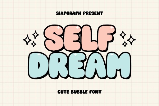
Elegance meets contemporary fluidity in the Self Dream font, a stunning script typeface crafted by SiapGraph that has quickly become a favorite among high-end designers in 2026. This font beautifully mimics the natural flow of modern calligraphy, featuring sweeping ascenders, graceful loops, and a refined baseline that brings a sophisticated yet approachable warmth to any project. Whether you are designing luxury wedding invitations, boutique branding, cosmetic packaging, or an upscale lifestyle blog, Self Dream adds a touch of bespoke craftsmanship. Its organic, handwritten quality ensures that your typography feels personal, intimate, and highly curated.
When incorporating Self Dream into your design workflow, taking advantage of its beautiful ligatures and alternate swashes will elevate your typography from standard to bespoke. Because it is a highly decorative script, it is best utilized for primary branding elements, signatures, or elegant headers, rather than long-form body text. I advise pairing it with a clean, geometric sans-serif to ground the design and provide necessary contrast without competing for attention. Utilizing soft, muted color palettes like blush pink, sage green, or warm gold foil stamping will further enhance its romantic, luxurious appeal, making it an indispensable asset for elegant design projects.
24. Smart Candy Handwritten font
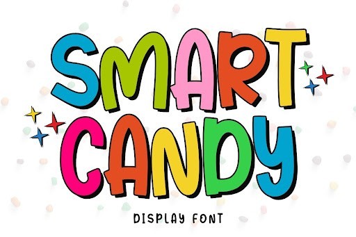
Playful, quirky, and bursting with personality, the Smart Candy font by Minimalist Eyes brings a delightful sense of joy to modern typography in 2026. This charming handwritten typeface is characterized by its bouncy baseline, rounded edges, and thick, juicy letterforms that instantly evoke a sense of fun and approachability. It perfectly hits the sweet spot between casual doodling and professional typographic structure. Smart Candy is the ideal choice for children’s book illustrations, quirky food packaging, upbeat social media graphics, and playful lifestyle branding where a rigid corporate font would feel entirely out of place.
From a practical design standpoint, Smart Candy shines brightest when used in dynamic, colorful applications. Do not be afraid to experiment with vibrant, candy-inspired color palettes—think bubblegum pinks, electric blues, and sunny yellows. Applying subtle 3D effects, drop shadows, or glossy highlights can further enhance its bubbly, pop-art aesthetic. While it excels as a display font for titles and short quotes, make sure to give the letters plenty of breathing room by slightly increasing the tracking if necessary. Pairing it with a highly legible, rounded sans-serif will ensure that your overall layout remains both delightfully whimsical and easily navigable for the reader.
25. Stylish Vintage Serif font
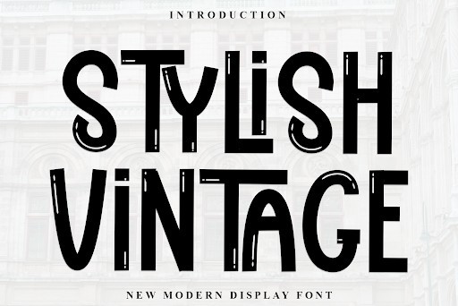
Nostalgia continues to be a dominant force in the 2026 design industry, and the Stylish Vintage font by Inermedia STUDIO captures that timeless retro essence with absolute perfection. This distinguished serif typeface combines classic Victorian architectural influences with subtle modern refinements, resulting in a font that feels both historically grounded and commercially relevant today. Its ornate terminals, varying stroke weights, and elegant curves evoke the craftsmanship of late 19th-century typography. It is an exceptional choice for premium liquor labels, artisanal coffee packaging, vintage-inspired editorial spreads, and heritage branding that needs to convey legacy and premium quality.
To truly unlock the potential of Stylish Vintage, designers should lean into the intricate stylistic alternates and ligatures included in the typeface, allowing for custom, logo-ready lockups right out of the box. The font demands a sophisticated canvas, so pairing it with rich, deep color palettes like forest green, navy blue, or charcoal grey alongside metallic gold or copper accents works exceptionally well. Since its letterforms carry significant intricate detailing, it is best reserved for large headers and prominent branding elements. Pair it with a highly legible, understated sans-serif for body copy to ensure your vintage-inspired design remains beautifully balanced and accessible to modern audiences.
26. Ask Why Handwritten font
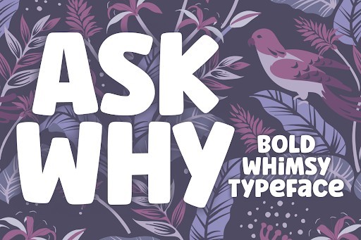
When it comes to injecting a touch of casual authenticity into your design projects, the Ask Why font stands out as a top-tier choice for 2026. This handwritten masterpiece perfectly captures the effortless charm of organic penmanship, making it an indispensable tool for designers looking to break away from rigid, corporate typography. Its fluid strokes and slightly irregular baselines provide a warm, inviting aesthetic that immediately draws the reader’s eye, whether you are crafting an intimate greeting card or designing relatable social media graphics.
From a practical standpoint, Ask Why offers incredible versatility across both digital and print mediums. I highly recommend pairing this expressive handwritten typeface with a clean, understated geometric sans-serif to create a visually striking contrast. It excels in lifestyle branding, boutique logos, and editorial pull quotes where a human touch is paramount. With seamless support across Windows, Mac, and Linux environments, integrating this font into your professional workflow is as effortless as its beautiful, sweeping letterforms.
27. Over Thinking Script font
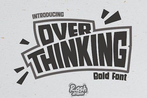
The Over Thinking font is a brilliant exploration of modern script typography, offering a unique blend of energetic styling and refined readability. In today’s design landscape, finding a script font that balances raw emotion with commercial viability can be a challenge, but this typeface delivers on all fronts. Its dynamic ligatures and sweeping swashes give it a spontaneous, energetic vibe that perfectly encapsulates contemporary branding trends. Designers will appreciate how the letters connect with a natural, flowing rhythm, avoiding the artificial uniformity that plagues lesser script options.
For practical applications, Over Thinking is an absolute powerhouse for statement-making designs. It thrives on apparel graphics, striking event posters, and bold packaging designs where the typography needs to serve as the primary visual anchor. When utilizing this font, try giving it plenty of negative space to breathe and let its intricate details shine. It pairs beautifully with minimalist layout structures, ensuring your core message remains legible while delivering a powerful aesthetic punch that clients will absolutely love.
28. Nothing Bad Days Display font
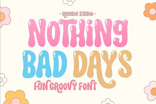
Bursting with optimism and undeniable character, the Nothing Bad Days font is a stellar display typeface that injects pure joy into any creative project. As we navigate the design trends of 2026, there is a massive shift toward typography that evokes happiness and nostalgia, and this font answers that call perfectly. Its chunky, playful letterforms carry a subtle vintage undertone while remaining firmly rooted in modern design principles. The robust weight of the characters ensures maximum visibility, making it an excellent choice for headline text that needs to command attention without feeling overly aggressive.
I frequently recommend Nothing Bad Days for packaging design, youth-oriented branding, and vibrant advertising campaigns. Because of its dominant presence, it works best when utilized as a heroic focal point rather than for dense body copy. To maximize its impact, try applying vibrant color palettes or subtle extrusion effects to elevate its playful geometry. The commercial license ensures you can confidently deploy this charming display font across massive global campaigns, bringing a delightful, positive energy to your brand’s visual identity.
29. Barbie Vintage Retro font
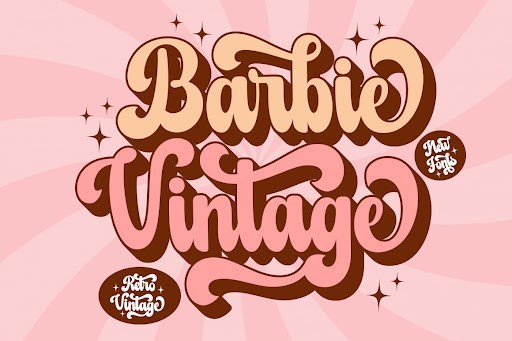
Nostalgia continues to dominate the creative industry, and the Barbie Vintage font is a masterclass in capturing mid-century charm with contemporary precision. This retro typeface transports audiences back to a glamorous era of design, featuring elegant curves, subtle stylistic flourishes, and an undeniably chic silhouette. What makes this font particularly special is its ability to evoke a sense of familiarity while providing the crisp, high-resolution fidelity required for modern digital and print workflows. It is a sophisticated nod to the past that does not compromise on present-day legibility.
In practice, Barbie Vintage is the ultimate secret weapon for boutique branding, high-end cosmetics packaging, and editorial magazine spreads. When working with this retro gem, I suggest pairing it with muted pastel backgrounds or luxurious metallic foil stamps to truly enhance its glamorous aesthetic. It possesses enough personality to stand alone in a minimalist logo design, yet it remains versatile enough to anchor elaborate retro-themed promotional materials. Seamlessly compatible with all major operating systems, it is a must-have asset for designers looking to infuse their work with timeless elegance.
30. The Bolder Shadow Display font
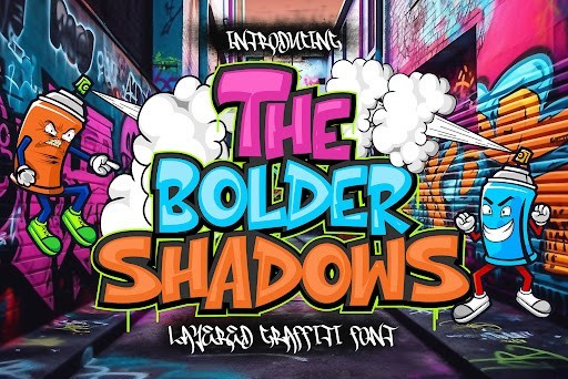
For projects that demand immediate visual authority, The Bolder Shadow font is an absolute game-changer. This robust display typeface comes pre-styled with a striking drop shadow effect, instantly adding three-dimensional depth and striking contrast to your typography. Instead of spending valuable time manually rendering extrusions and shadows in Illustrator or Photoshop, this font provides a plug-and-play solution that looks incredibly polished right out of the box. Its thick, commanding letterforms are structurally sound, making an unforgettable impression on the viewer.
This font is tailor-made for high-impact applications such as streetwear apparel, sports team branding, and eye-catching YouTube thumbnails. The built-in shadow creates a natural pop that separates the text from complex backgrounds, ensuring your message is never lost in the visual noise. I recommend experimenting with tight letter-spacing to create a cohesive, block-like structure that amplifies its heavy-hitting aesthetic. Equipped with a comprehensive commercial license, The Bolder Shadow empowers designers to create bold, assertive graphics with unprecedented speed and efficiency.
31. Varsity Signature Script font
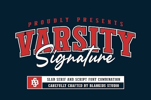
When it comes to infusing a project with an authentic, handcrafted feel, the Varsity Signature Script font stands out as a top-tier choice for designers in 2026. This typeface bridges the gap between classic calligraphy and modern branding, offering elegant, sweeping letterforms that feel remarkably natural. Unlike many digital signatures that can appear stiff or repetitive, Varsity possesses a dynamic flow that mimics the variable pressure of a real ink pen, making it an indispensable asset for creatives looking to add a personalized touch to their work.
From a practical standpoint, this font is an absolute powerhouse for high-end branding, photography watermarks, and luxury product packaging. To get the most out of Varsity Signature, I highly recommend diving into its alternate characters and ligatures, which help avoid that dreaded digital uniformity. Pair this expressive script with a stark, clean geometric sans-serif to create a beautiful typographic tension that instantly elevates your design compositions.
32. Aristoreva Display font
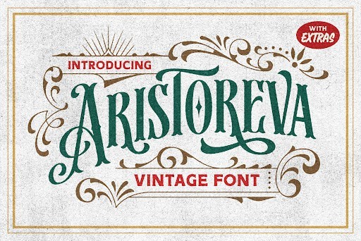
Aristoreva brings a distinct, architectural elegance to the table, securing its spot as a premier Display font for sophisticated design work. What I love about Aristoreva is its masterful balance of sharp, commanding lines and graceful, sweeping curves. This structural duality gives it a highly editorial presence, allowing it to anchor a page without overwhelming the visual hierarchy. It feels incredibly premium, effortlessly communicating luxury and refined taste in an era where minimalist luxury continues to evolve.
This typeface absolutely shines in fashion magazine headers, boutique hotel logos, and high-end cosmetic packaging. When deploying Aristoreva in your layouts, my best advice is to let it breathe. It requires generous surrounding white space to truly make an impact. Use it strictly for display purposes at larger point sizes, and pair it with a subtle, highly legible serif or a muted grotesque for your body copy to maintain a sophisticated editorial balance.
33. College Retro Grunge Retro font
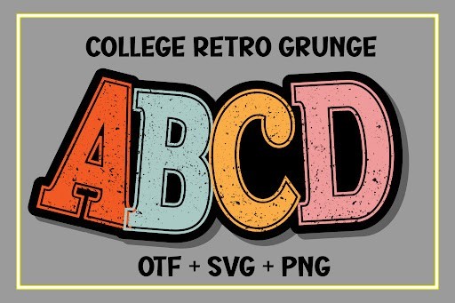
Diving into the nostalgic, distressed aesthetic, the College Retro Grunge Retro font perfectly captures the vintage collegiate vibe that continues to dominate streetwear and sports apparel design. What sets this font apart from typical varsity typefaces is the meticulous attention to its weathering effects. The grunge texture feels organic rather than stamped-on, giving your designs that authentic, worn-in look of a beloved vintage university sweatshirt straight out of a thrift store.
This is your go-to typography for t-shirt graphics, e-sports team branding, and high-energy event posters. To maximize the impact of College Retro Grunge, lean into high-contrast color palettes and overlay your entire canvas with subtle halftone or noise textures to marry the font seamlessly with the background. Because the distressing can impact legibility at smaller sizes, always reserve this heavy-hitter for your primary headlines and oversized graphic focal points.
34. Urban Gear Sans Serif font
Urban Gear is an absolute workhorse of a Sans Serif font, custom-built for industrial, automotive, and tech-focused design ecosystems. Its bold, highly structured letterforms command immediate attention while maintaining stellar legibility across both digital displays and printed media. The typeface exudes a mechanical precision, characterized by squared-off angles and a sturdy baseline that communicates strength, reliability, and forward-thinking engineering.
I highly recommend Urban Gear for fitness app interfaces, heavy-duty product packaging, and modern architectural branding. As a practical tip, utilize the font’s heaviest weights for striking, edge-to-edge headlines to create an imposing visual hierarchy. For smaller subtext or interface elements, step down to its lighter weights, which retain the industrial character but offer the crisp readability required for user interfaces and spec sheets.
35. Welcome January Script font
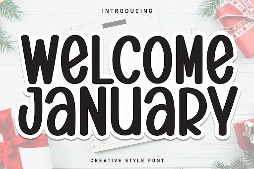
In the increasingly digitized and AI-driven landscape of 2026, the Welcome January Script font provides a much-needed breath of fresh air with its warm, inviting, and organic handwritten feel. This typeface genuinely captures the essence of casual brush lettering, complete with subtle irregularities that give it a relatable, human touch. It manages to be playful and expressive without crossing into the territory of being unreadable, which is a rare feat for heavily stylized script fonts.
Welcome January is a stellar choice for lifestyle blogs, greeting card designs, boutique cafe branding, and organic food packaging. To truly make this font sing, you must take advantage of its built-in OpenType features. By utilizing its contextual alternates and ligatures, you can create a seamless, naturally flowing text block that feels genuinely hand-penned rather than typed on a keyboard. Pair it with a rustic serif to complete that cozy, artisanal aesthetic.
36. Back to Vintage Retro font
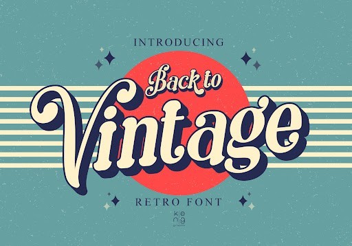
When it comes to channeling the nostalgic charm of bygone eras, the Back to Vintage font stands out as a remarkable typographic achievement in 2026. This typeface masterfully balances authentic distressing with modern legibility, making it an indispensable asset for designers looking to inject historical weight into their projects. The letterforms carry a hand-crafted aesthetic that instantly evokes the golden age of advertising, complete with subtle texturing that holds up beautifully both on digital screens and in high-resolution print.
In practical application, this font truly shines in branding for artisanal products, boutique coffee shops, or craft breweries looking to establish an immediate sense of heritage and quality. I highly recommend pairing Back to Vintage with a clean, understated sans serif to prevent your design from feeling visually cluttered. Whether you are designing rustic packaging, vintage-inspired apparel graphics, or standout editorial headlines, this typeface provides a robust foundation that commands attention without overwhelming the viewer.
37. Lucky Retro Display font
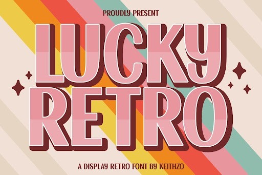
Riding the crest of the ongoing vintage revival trend, the Lucky Retro font captures the groovy, free-spirited essence of the 1970s with unparalleled flair. Its thick, undulating curves and playful baseline create an instant sense of joy and approachability, moving away from rigid geometry in favor of organic, flowing typography. As we see more brands in 2026 embracing maximalist, vibrant visual identities, having a display typeface this charismatic in your typographic arsenal is an absolute game-changer.
From a functional standpoint, Lucky Retro is best deployed in scenarios where you need your messaging to pop with personality. It is a phenomenal choice for lifestyle branding, eye-catching social media graphics, music festival posters, and funky packaging design. To maximize its impact, experiment with tight kerning and vibrant, contrasting color palettes that echo its psychedelic roots. Because of its heavy weight and distinct personality, keep its usage strictly to headers and focal points, allowing more subdued secondary typefaces to handle the body copy.
38. Bold Vibes Sans Serif font
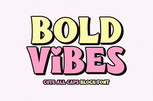
Bold Vibes is exactly what its name promises—a massive, unapologetic typeface designed to dominate the visual hierarchy of any layout. In the current design landscape of 2026, where capturing user attention is more challenging than ever, this heavy-hitting font offers brutalist elegance and structural integrity. The thick, blocky strokes and sharp intersections give it an industrial strength, making it an outstanding choice for modern, high-impact design ecosystems where typography acts as the primary visual element.
I frequently reach for Bold Vibes when working on contemporary streetwear apparel, striking magazine spreads, and aggressive digital marketing campaigns. It commands the canvas so effectively that you rarely need supporting illustrations; the typography itself becomes the art. When using this font, I advise utilizing generous negative space around your text blocks to let the heavy letterforms breathe. It pairs exceptionally well with stark, monochromatic palettes or neon accents, giving your projects a cutting-edge, rebellious aesthetic.
39. Grunge Baseball Display font
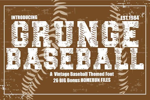
Fusing the classic collegiate aesthetic with a raw, textured edge, the Grunge Baseball font is a masterclass in athletic typography. It takes the familiar slab serif structure traditionally associated with sports branding and introduces a meticulously crafted layer of grit and distress. This gives the font an immediate lived-in, vintage feel, as if it has survived decades of wear and tear on a varsity jacket. The attention to detail in the texturing ensures that the distress patterns look organic and intentional, rather than digitally replicated.
This typeface is an absolute powerhouse for sports-centric branding, e-sports logos, gym apparel, and event posters that need to convey strength, endurance, and heritage. When working with Grunge Baseball, it thrives in large-scale applications where the gritty details can be fully appreciated. I recommend using it for prominent lockups and team wordmarks, perhaps curving the text along an arch to truly mimic that authentic vintage jersey look. Paired with bold, contrasting athletic colors, this font delivers a home run in visual impact.
40. Magic Retro Display font
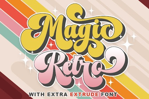
The Magic Retro font is a spellbinding addition to the 2026 design toolkit, offering a whimsical twist on vintage typography. Unlike heavier, funk-inspired retro fonts, Magic Retro leans into a more mystical, elegant aesthetic with sweeping swashes and delicate yet pronounced curves. It bridges the gap between classic retro nostalgia and modern elegance, resulting in a display font that feels both enchanting and highly sophisticated. The letterforms dance along the baseline, providing a dynamic rhythm that elevates any text it spells out.
For designers, Magic Retro is the perfect typographic solution for projects that require a touch of magic and nostalgia. It is incredibly effective for boutique branding, mystical or astrology-themed product lines, artisanal cosmetic packaging, and high-end event invitations. To get the most out of this font, I suggest exploring its alternate characters and ligatures, which allow for a deeply customized, hand-lettered appearance. Pair it with a delicate serif or a clean, minimalist sans serif to ensure your primary message remains the focal point while maintaining an air of vintage luxury.
41. Renila Serif font
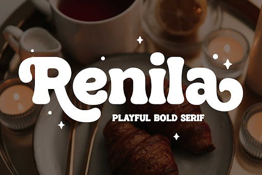
Arterfak Project consistently delivers striking typography, and Renila is an absolute standout for designers looking to elevate their branding in 2026. This beautiful serif balances classic elegance with modern flair, offering a distinct personality that immediately commands attention. The letterforms are meticulously crafted, featuring high-contrast strokes and beautifully refined serifs that look stunning at large scales. I frequently find myself reaching for this typeface when a project demands a premium, sophisticated aesthetic without feeling overly traditional or dated.
When it comes to practical application, Renila truly shines in editorial layouts, high-end packaging, and boutique brand identities. It works flawlessly for bold headlines, magazine covers, and logo designs where you need the text to serve as the primary visual anchor. My top tip when working with Renila is to give it plenty of breathing room—generous kerning and ample white space around your headers will maximize its luxurious impact. It pairs beautifully with a highly legible, minimalist sans-serif for body copy, ensuring your overall design remains perfectly balanced and highly readable.
42. Creative Vintage Script font
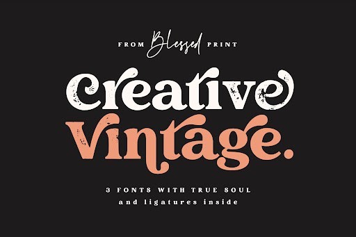
There is a certain undeniable charm to well-executed vintage typography, and the Creative Vintage font by Blessed Print captures that nostalgic magic perfectly. This exquisite script font boasts smooth, sweeping ligatures and a beautifully handcrafted feel that instantly adds character and warmth to any canvas. What sets this typeface apart in 2026 is its remarkable authenticity; it bypasses the cliché retro tropes to offer a genuinely elegant, fluid cursive style that feels both timeless and incredibly bespoke. The varying stroke weights simulate the organic pressure of a real brush pen, giving your digital artwork a convincing analog touch.
I highly recommend Creative Vintage for projects that require a personalized, artisanal touch. It is an exceptional choice for wedding invitations, premium beverage labels, artisan coffee shop branding, and eye-catching social media graphics. To get the most out of this font, I advise taking full advantage of the included alternate characters and swashes. Customizing the beginning and ending letters of your primary words will instantly upgrade your typography from a standard typed appearance to a custom-lettered masterpiece. Pair it with a sturdy, utilitarian serif or block display font to create a visually striking contrast.
43. Thorm Block Display font
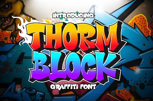
Sometimes a design demands raw power and unyielding presence, which is exactly where the Thorm Block font by Cikareotype comes into play. As a heavyweight display font, Thorm Block is built with robust, architectural letterforms that pack an incredible visual punch. The thick, unyielding strokes and sharp geometric corners give it an industrial and masculine energy that is impossible to ignore. In a design landscape where minimalism often reigns, bringing in a commanding, unapologetic typeface like this can provide the exact disruption your composition needs to stand out.
The use cases for Thorm Block are thrillingly specific but highly impactful. It is the ultimate go-to for sports branding, e-sports logos, athletic apparel, and high-energy promotional posters. Because of its massive weight and tight spacing, you will want to restrict its use exclusively to large, impactful headers and titles—it is not meant for paragraph text. A great trick when designing with Thorm Block is to experiment with tight leading and dramatic color overlays; overlapping these massive letterforms with high-contrast, neon hues against dark backgrounds creates a modern, aggressive aesthetic that perfectly fits the current 2026 design trends.
There you have it, 43 of the best designer fonts available in 2026 to help your projects stand out. Typography is one of the most powerful tools in a designer’s arsenal, and having a diverse, high-quality font library makes your workflow so much easier. Whether you fell in love with a quirky display font or a reliable workhorse sans-serif, I hope you found the perfect typeface for your upcoming designs. Bookmark this page so you can always come back when you need fresh typographic inspiration!