27 Elegant Luxury Sans Serif Fonts to Elevate Editorial Design in 2026
luxury sans serif fonts have become the go-to choice for designers seeking a clean, upscale aesthetic. This collection of 27 handpicked typefaces showcases modern geometric forms, refined proportions, and thoughtful spacing ideal for high-end packaging, editorial layouts, and polished digital products.
In 2026, designers lean into premium sans styles and high-end geometric typefaces to communicate quiet confidence. Use these selections to create clear hierarchy, elegant contrast, and a cohesive typographic voice across brand touchpoints.
1. Lignée Font
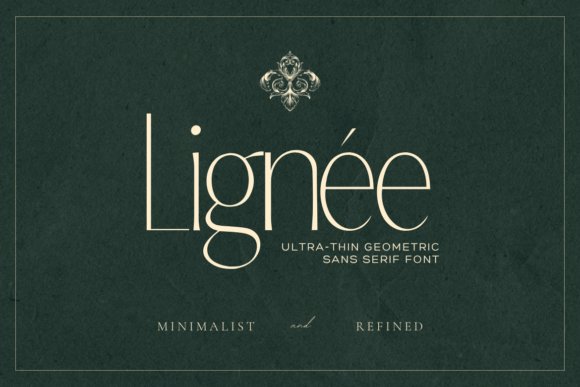
Lignée is an ultra-thin display face that channels editorial restraint and architectural clarity; it sits squarely among luxury sans serif fonts thanks to its hairline strokes and razor-clean terminals. The design balances geometric precision with subtle irregularities that read as hand-tuned details, giving headlines a couture presence without feeling cold or mechanical.
Best used at large sizes and in tightly curated layouts, Lignée demands careful tracking and considered pairing-think scent branding, magazine mastheads, and minimalist packaging. Its refined letterspacing and narrow proportions reward typographic attention and pair beautifully with warmer serif supports or muted color palettes to achieve a premium, editorial result.
My Recommendation: I reach for Lignée when a project needs an ultra-refined, editorial headline with a luxury fashion or fragrance sensibility. Its hairline forms create undeniable elegance, but they require attention to spacing and contrast, so I use it primarily for logos, cover titles, and high-resolution packaging. Pairing it with a humanist serif or soft sans helps maintain readability while preserving its luxe character.
2. Broadway Flower Font
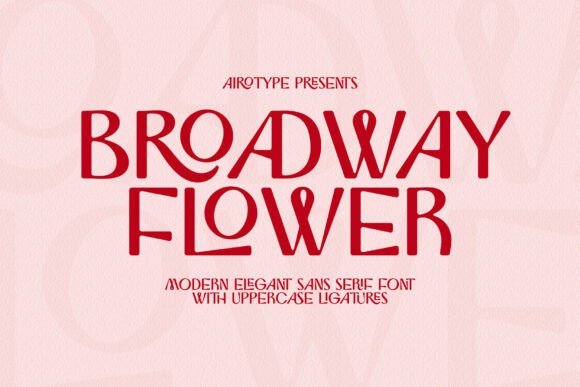
Broadway Flower brings a fresh, modern personality to branding with its bright, minimal letterforms and a smart selection of uppercase ligatures and alternates. Those uppercase options let designers craft distinctive wordmarks and monograms without heavy ornamentation, making the face feel playful yet polished for contemporary identity work.
It shines in display roles – wedding invites, boutique logos, posters, and social graphics – where its clean strokes and open counters read as stylish and approachable. For best results, use Broadway Flower at larger sizes or in generous tracking and combine it with understated sans or delicate scripts to preserve its airy, modern charm.
╰┈➤ Download Broadway Flower Font
My Recommendation: I’d use Broadway Flower for projects that need a stylish, modern flair without over-embellishment, such as brand identities for creatives, wedding suites, and social-first campaigns. The uppercase ligatures are a real time-saver for crafting unique wordmarks, and its simple shapes keep compositions feeling contemporary. It’s my go-to when a design needs personality and clarity in equal measure.
3. Golie Font
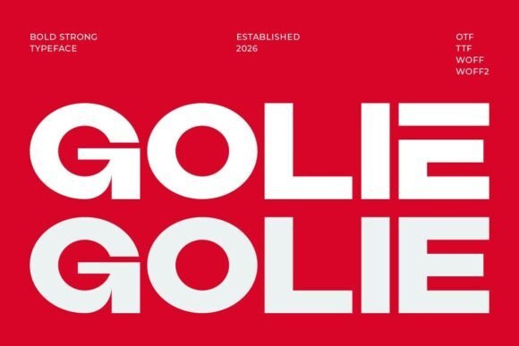
Golie is a refined sans built for elegant, feminine branding-clean strokes, balanced proportions, and gentle contrast produce a composed yet soft voice ideal for boutique and beauty markets. The character shapes favor generous counters and subtle curvature, which lend warmth and legibility across packaging and editorial headers.
Designed to feel both sophisticated and accessible, Golie performs well in identity systems, product labels, and online storefronts where a polished, upscale tone is needed. It pairs effectively with narrow serifs or light scripts to add nuance, and its versatility across print and web makes it a practical choice for lifestyle brands aiming for a modern, premium presence.
My Recommendation: I recommend Golie when a brand needs a modern, feminine typeface that reads luxe without feeling fussy-perfect for cosmetics, boutique shops, and refined editorial projects. Its clarity and warm shapes work well on small labels and larger displays alike, making it flexible across packaging and web. I often pair it with a subtle serif or script to introduce contrast while keeping a cohesive, upscale identity.
4. High Font
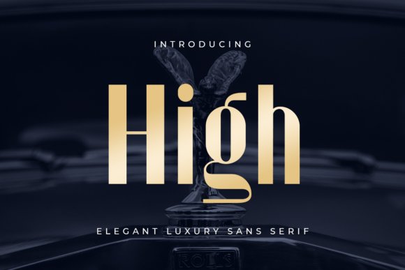
High is a purpose-built elegant sans serif that leans into refinement through a comprehensive set of ligatures and alternates, each crafted with unconventional curves and subtle terminals to elevate premium identities. This family balances neat proportions with discreet flourishes so brands can introduce character without sacrificing legibility; the inclusion of many alternate glyphs makes distinctive wordmarks and monograms effortless and repeatable across collateral. The type’s OpenType features – discretionary ligatures, stylistic sets and contextual alternates – are tuned to give designers instant access to bespoke letterforms that read as handcrafted.
Because High was created for nuanced, high-end applications it shines in packaging, jewelry catalogs, luxury editorial spreads and hospitality wayfinding where typographic nuance matters. Its stylistic variety allows controlled experimentation: swap alternates to produce different moods, tighten or loosen kerning for display text, and mix caps and small-caps for graceful hierarchy. If you want a font that reads like a signature across printed and digital touchpoints, High is a flexible choice among luxury sans serif fonts for creating consistent, elevated branding.
My Recommendation: I’d reach for High when a project needs unmistakable refinement-think boutique labels, premium packaging, and signature logos. The wealth of alternates and ligatures lets me craft a bespoke identity without commissioning custom lettering, saving time while keeping results distinctive. Use it for large display headlines, monogram marks, or anywhere a tactile, handcrafted feeling will lift the perceived value.
5. Marquez Font
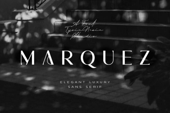
Marquez offers a modern, polished sans serif voice that reads simultaneously fashion-forward and approachable, with soft terminals and slender spine details that flatter editorial layouts and feminine branding. Its letterforms have a gentle contrast and elongated counters which create a poised rhythm on a page, making it especially effective for magazine mastheads, cosmetic packaging, and boutique identity systems. The font’s overall temperament is chic without being fussy, so it supports a wide range of visual directions from minimal luxury to playful couture.
Beyond looks, Marquez is practical: clear numerals, well-tuned kerning, and compatible italic or oblique styles make it robust across print and web. It pairs beautifully with warm serifs or neutral grotesques for multi-level systems, and its refined shapes keep legibility intact even at tight tracking used in logos or business cards. If your brief calls for an elegant, contemporary voice aimed at fashion-conscious audiences, Marquez brings that polished poise with real versatility.
My Recommendation: I recommend Marquez for projects that target style-driven, predominantly female markets-fashion labels, beauty lines, and lifestyle editorials. Its refined strokes give headlines instant personality while remaining readable at small sizes, which makes it useful for both packaging and digital hero text. Pair it with a classic serif for luxury editorials or use it solo for streamlined brand identities.
6. Legowo Font
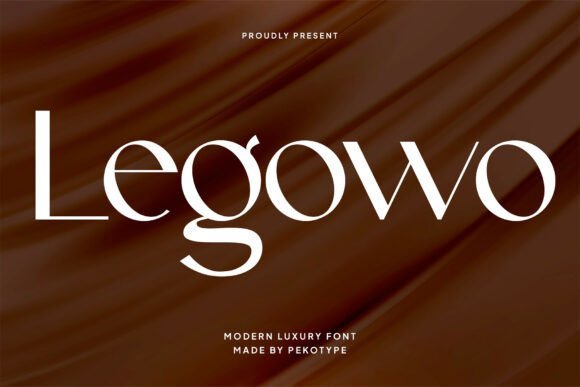
Legowo is a modern sans serif defined by its striking contrast between strong vertical stems and delicate connectors, producing a minimalist yet commanding presence on every line. The type’s geometric backbone and elongated terminals create a contemporary silhouette that reads well in bold display settings and refined identity marks, while its clean counters preserve clarity in smaller captions. Thoughtful spacing and a broad glyph set make Legowo adaptable for both high-visibility signage and intimate editorial typography.
Designed to anchor sophisticated brands, Legowo works particularly well in luxury packaging, premium technology branding, and upscale hospitality materials where a sharp, modern aesthetic is required. Its sharp contrasts bring energy to headlines and logotypes, and the font scales predictably across mediums from large-scale billboards to mobile screens. Use Legowo when you want a minimalist, assertive identity that signals modern luxury without ornamentation.
My Recommendation: I’d choose Legowo when a project needs strong visual impact with minimal fuss-think contemporary watch brands, tech-luxury startups, or architect-led studios. Its high-contrast forms give headlines authority but remain clean enough for extended reading in editorial contexts. It pairs well with muted palettes and textured papers to balance its modern edge with tactile warmth.
7. Le Quarte Font
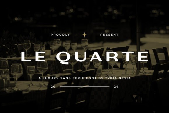
Le Quarte is a refined sans serif whose expanded letterforms and subtle geometric quirks combine modern minimalism with a classical monumentality. As one of the standout luxury sans serif fonts in contemporary type libraries, it projects authoritative elegance without feeling fussy, making headlines read like couture. Sturdy stems and generous counters give it presence at large sizes and clarity in compact wordmarks.
Its roomy widths and open apertures simplify tracking and typesetting across packaging, editorial mastheads, and upscale web headers; slight terminal contrast adds a bespoke, tactile quality. Multiple weights and carefully tuned kerning allow Le Quarte to shift from bold display to restrained supporting copy in premium systems. Pair it with a delicate serif or metallic finishes to layer modern restraint with tactile luxury.
My Recommendation: I choose Le Quarte when a brief calls for bold refinement-luxury boutiques, premium packaging, or hotel branding-because it reads expensive without ornament. Its generous proportions make layout predictable and elegant, which speeds design iterations. Use it for primary logotypes and flagship headlines where presence and clarity are essential.
8. Jenura Font
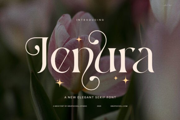
Jenura is a contemporary serif shaped for high-fashion contexts, where elongated serifs and controlled contrast produce glamorous character without sacrificing readability. Its carefully drawn ligatures and stylistic alternates let designers introduce subtle, signature flourishes that feel bespoke. The letterforms balance density and airiness so they perform in both tight logotypes and open editorial spreads.
This typeface excels in brand identities, premium packaging, and magazine headlines that require a poised, couture voice. When scaled, its refined terminals retain nuance, and on-screen hinting keeps texture consistent across devices. For modern editorial work, pair Jenura with a clean geometric sans to maintain a current, layered aesthetic.
My Recommendation: I reach for Jenura for projects that need elevated personality-luxury labels, boutique identities, and fashion editorials-because its alternates let me craft distinctive wordmarks. The contrast and ligatures allow subtle typographic storytelling that feels custom. I recommend using it alongside a neutral sans to keep compositions contemporary and legible.
9. Black Letter Font
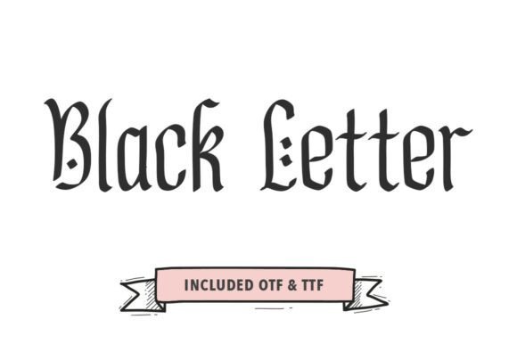
Black Letter recasts gothic energy through hand-drawn brushwork, yielding a display face that retains historic attitude while improving legibility. The characters emphasize vertical rhythm and sharp terminals, yet a moderated density gives clearer silhouettes than traditional blackletter scripts. Textured strokes and artisan imperfections create a tactile, handmade presence that’s compelling at large scales.
This font is best deployed as a focal headline or logo element for craft labels, album art, and bold streetwear identities where expression trumps extended text. Use wide tracking, high-contrast backgrounds, or metallic inks to amplify its dramatic strokes without overcrowding. Treat Black Letter as a marquee asset-its personality works when each glyph is allowed room to breathe.
╰┈➤ Download Black Letter Font
My Recommendation: I use Black Letter when a brief asks for bold heritage or underground edge-think craft beer, tattoo studios, or statement apparel. Its hand-made texture instantly communicates authenticity that standard display faces can’t match. I reserve it for headlines and logotypes, pairing it with understated sans serifs to avoid visual competition.
10. Agathe Signature Font
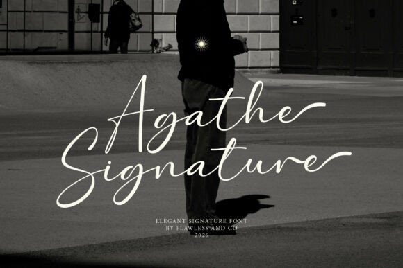
Agathe Signature channels a poised, hand-drawn elegance that reads like a fashion editor’s quick, confident flourish. Its rapid-stroke letterforms are fluid without being fussy-each curve and connector retains legibility at small sizes while the PUA-encoded swashes and alternate glyphs make sophisticated typographic flourishes easy to access in most design apps.
Use Agathe as a personal seal for photography watermarks, couture logos, and minimal lifestyle editorials where a human, artisanal voice is crucial; when paired with luxury sans serif fonts the contrast amplifies exclusivity and creates a clear visual hierarchy. It’s especially effective on tactile materials-embossed cards or matte packaging-where the script’s rhythm reads as intentional and handcrafted.
╰┈➤ Download Agathe Signature Font
My Recommendation: I love Agathe Signature for projects that need an intimate, handwritten touch without sacrificing polish. I’d reach for it on brand marks, premium social content, or bespoke stationery where an artisanal feel elevates perceived value. Pair it with a restrained sans or a bold display to keep compositions modern and readable.
11. Imperium Monogram Font
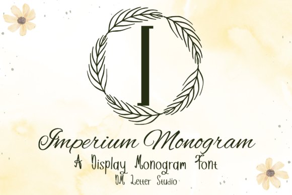
Imperium Monogram presents a disciplined, sculptural take on classical Roman forms, refined into a compact serif system ideal for initials and mark-making. The uppercase-only set emphasizes vertical proportion, subtle contrast, and purposeful terminals that hold up when embossed, engraved, or debossed-delivering an unmistakable sense of authority and refinement.
This font excels where heritage and ceremony matter: luxury packaging, wedding monograms, boutique signage, and engraved products that require dignity and clarity at very small sizes. It pairs beautifully with minimal sans-serifs or delicate scripts to create layered identities that feel both established and contemporary.
╰┈➤ Download Imperium Monogram Font
My Recommendation: I turn to Imperium Monogram when a project needs instant gravitas-think artisan leather goods, formal invitations, or monogrammed gifts. Its tight, elegant capitals read clearly in metal or foil and create memorable stamps of quality. Use it as the focal mark, then support it with cleaner text faces for a balanced, upscale identity.
12. Geometrica Font
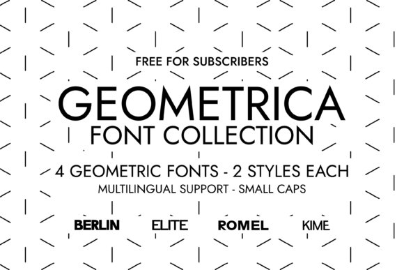
Geometrica is a cohesive quartet of geometric, minimalist sans serif faces-KIME, ROMEL, BERLIN, and ELITE-each engineered for visual harmony and modern clarity. Inspired by Swiss typographic discipline, the collection offers regular and italic styles that deliver grotesque legibility, measured spacing, and crisp terminals suited to high-resolution print and UI environments.
These typefaces thrive in brand systems, luxury packaging, editorial layouts, and product identity work where a clean, confident voice is required; their geometric construction gives logos and headlines a contemporary, trustworthy tone. Use Geometrica to convey precision and calm on cosmetics, tech, and premium lifestyle projects when you need a restrained, high-end sans serif presence.
My Recommendation: I recommend Geometrica for brands that want a modern, unemotional backbone-think upscale skincare, boutique tech, or editorial mastheads. Its restrained geometry reads well across scales and devices, making it a solid choice for identity, web, and packaging. I often mix one heavier Geometrica style for headlines with a lighter companion for body copy to maintain clarity and refinement.
13. Pavesky Font
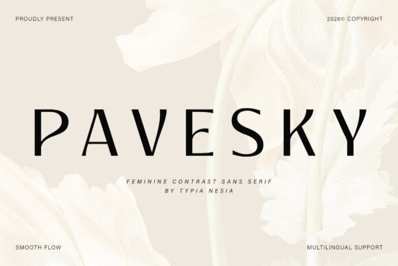
Pavesky Font is a refined, contemporary sans serif that balances delicate curves with crisp, minimal strokes to create a distinctly upscale voice. Pavesky sits comfortably among luxury sans serif fonts, offering a soft femininity without sacrificing geometric clarity. Its measured proportions and slender terminals give logos and editorial headlines a poised, magazine-like presence.
Apply it to wedding suites, cosmetic labels, fashion logos and high-end posters where subtlety matters; it retains readability at display sizes and in smaller text. Thoughtful kerning and open counters make Pavesky practical for both print packaging and responsive web layouts, while restrained contrast allows elegant pairings with warm serifs or condensed grotesques.
My Recommendation: I reach for Pavesky when a brand needs a refined, feminine luxury tone-perfect for boutique skincare, bridal suites, or designer labels. Its quiet elegance communicates premium quality without being showy, and it scales cleanly from packaging to web. Pair it with a neutral serif for warmth or a compact sans for contrast to create a balanced, upscale identity.
14. Spadore Serif Font – luxury sans serif fonts
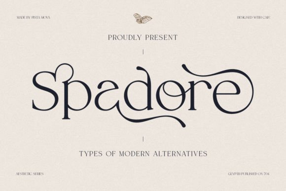
Spadore Serif Font marries retro temperament with contemporary clarity, producing letterforms that carry personality without overpowering a layout. The type shows slightly condensed proportions and distinctive terminals that give headlines and monograms a handcrafted, editorial feel. Its stylistic alternates provide subtle variations that help preserve originality across repeated uses.
Because the family is PUA-encoded, accessing alternates and ligatures is simple in common design tools, speeding logo exploration and headline refinement. It’s an excellent choice for boutique hospitality, artisanal packaging, and editorial mastheads that want warmth and character. For long reads, combine Spadore with a neutral sans to maintain readability while letting the serif act as the brand’s signature voice.
╰┈➤ Download Spadore Serif Font – luxury sans serif fonts
My Recommendation: I’d choose Spadore when a project benefits from personality and heritage-think boutique hotels, craft food labels or cultural publications. The built-in alternates let me experiment with unique wordmarks without custom lettering. It’s especially useful when you want a recognizable, artisanal signature that still reads well at a distance.
15. Caveline Font
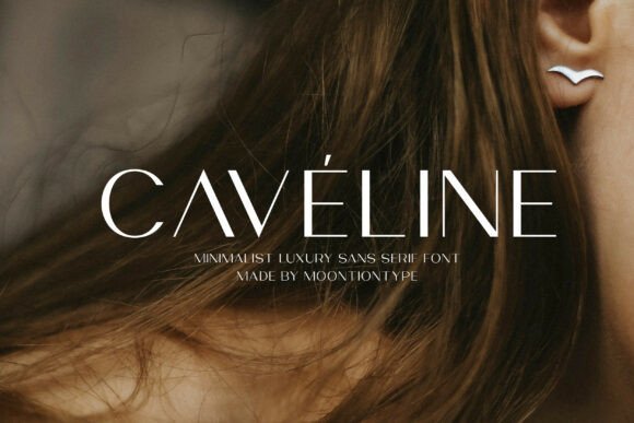
Caveline Font is a minimalist sans that communicates modern luxury through calm, geometric forms and generous spacing. Its even stroke weight and open counters create a crisp silhouette that works beautifully for high-impact editorial headlines and refined UI elements. The overall restraint gives brands a timeless, polished presence without decorative distraction.
Ideal for fashion branding, skincare packaging, wedding invitations and clean digital experiences, Caveline keeps layouts airy while maintaining strong legibility. The OTF and TTF files include a full character set for multilingual work, and the type pairs elegantly with delicate scripts or subtle serifs to introduce contrast. Use it to anchor a premium system with effortless sophistication.
My Recommendation: I often pick Caveline when the brief calls for sleek, modern elegance-perfect for capsule collections, boutique e-commerce or minimalist print campaigns. Its economy of form lends instant sophistication and plays well with textured materials or matte finishes. It’s my go-to when photography and layout need breathing room while the type quietly defines the brand.
16. Vetto Font
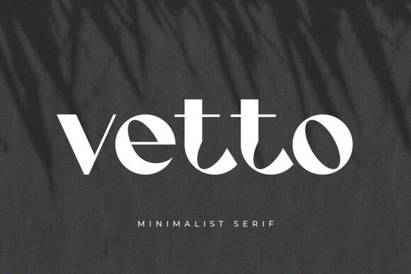
Vetto is a polished, premium typeface that marries minimal geometry with soft, feminine details to create an elegant brand voice. Its clean strokes, harmonious proportions, and restrained terminals give headlines and labels a poised presence while maintaining legibility at small sizes – a characteristic prized among luxury sans serif fonts in upscale identity work. Those subtle curves and slightly tapered strokes lend a contemporary warmth that reads as both refined and approachable across boutique product lines.
Built to perform across packaging, web headers, and printed collateral, Vetto benefits from thoughtful letterspacing and selective weight contrast to build hierarchy without ornament. Designers will appreciate how light-to-bold transitions hold up in embossed or foil applications, and pairing it with a neutral serif for longer copy preserves clarity. Use soft color palettes and tactile finishes to amplify its feminine, high-end character in fashion, beauty, and lifestyle projects.
My Recommendation: I’d choose Vetto when a brand needs a feminine, high-end tone that stays readable across media. Its balanced strokes and adaptable weights make it ideal for boutique fashion labels, beauty packaging, and elegant web hero areas. Use it when you want modern sophistication without ornamental scripts-especially for logos, business cards, and product tags.
17. Mofulina Font
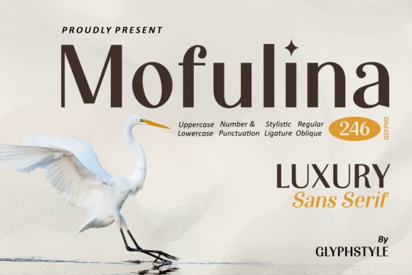
Mofulina reads like a regal display sans designed to turn short phrases into statements of prestige. With tall proportions, pronounced vertical rhythm, and crafted alternates, it’s tailor-made for logotypes and large-format headlines where personality matters most. Its stylistic sets and ligature options let you sculpt a unique wordmark that feels handcrafted yet contemporary.
Best deployed sparingly on packaging seals, invitations, and premium labels, Mofulina creates instant visual impact without relying on ornament. Pair it with a muted text face for body copy, play with tight kerning for mark-making, and consider metallic inks or embossing to heighten the premium feel. It’s an excellent choice when you need a strong focal typeface for boutique, wedding, or luxury hospitality projects.
My Recommendation: I recommend Mofulina whenever a project needs bold, regal personality that commands attention. It’s perfect for couture-style logos, upscale invitations, and signature product packaging that require a distinctive typographic centerpiece. When used thoughtfully with neutral support faces and tactile finishes, it instantly elevates a brand’s perceived value.
18. Elvera Font
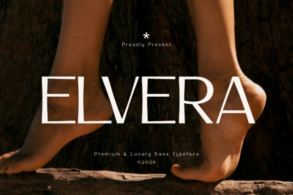
Elvera is a composed, premium sans that blends geometric structure with softened terminals to achieve a modern editorial presence. Its generous x-height and measured counters promote legibility while the subtly sculpted letterforms communicate an understated confidence inspired by contemporary architecture. The aesthetic skews high-fashion without sacrificing functionality, making it suitable for both print mastheads and responsive web headers.
Elvera works beautifully within complete identity systems-use slender cuts for refined logotypes and heavier weights for arresting poster copy. For extended reading, balance it against a humanist serif; for display use, allow wider tracking to emphasize its elegance. It’s especially effective for fashion lookbooks, cosmetics branding, and magazine design where clarity and sophistication must coexist.
My Recommendation: I often reach for Elvera when a client wants quiet luxury rather than overt flash. Its geometry reads consistently across screens and print, so it’s ideal for fashion editorials and premium brand systems. Choose Elvera when you need a contemporary sans that carries an entire visual identity with poise and clarity.
19. Black Font
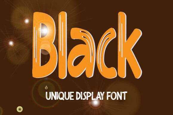
Black is a distinctive display font that blends heavy, rounded forms with refined counters to create a voice that feels both playful and upscale. Its bold weight, crisp spacing, and robust silhouettes give it strong presence in headlines and packaging, making it one of the more versatile luxury sans serif fonts for attention-grabbing applications without losing legibility. The design balances comic energy and measured refinement, so it reads as a premium choice for brands that want personality with polish.
Ideal for logos, wedding stationery, and product labels, Black supplies a memorable character at large sizes while holding clarity in smaller text elements; alternates and open counters let you craft unique lockups. The font pairs well with thin modern serifs or neutral grotesques to create a layered system that feels contemporary and intentional. Use its generous x-height and confident letterforms for social posts, watermarks, and bold editorial headers that need instant recognition.
My Recommendation: I’d reach for Black when a project needs bold charisma without sacrificing an upscale finish – it’s perfect for boutique packaging, playful luxury brands, and standout social media campaigns. Its comic undertones give warmth while the refined detailing keeps things elegant, making it useful across both kids’ and lifestyle projects. For logos and hero headlines I favor heavy weights and tight tracking to produce distinctive, memorable marks.
20. Bosky Evanish Font
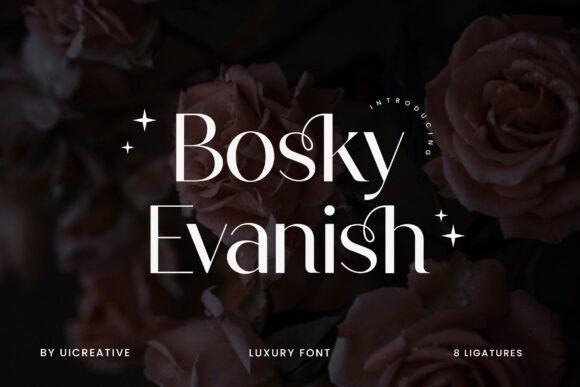
Bosky Evanish is a modern sans-serif display face with a poised, slightly condensed construction that reads as sophisticated yet inviting. Smooth terminals and subtle contrast lend an editorial temperament, positioning it well for high-impact headlines and refined branding. The type carries a whisper of handwriting in its soft curves, which gives it signature-style appeal without sacrificing typographic control.
This font thrives in fashion identities, magazine covers, and wedding collateral where an elegant, stylish tone is desired; its masculine structure and feminine nuances create versatile visual tension. Pair Bosky Evanish with lightweight serifs or airy geometric sans faces to build polished hierarchies for print and web. Thoughtful kerning and its graceful italic make it ideal for luxury logotypes and refined typographic compositions.
╰┈➤ Download Bosky Evanish Font
My Recommendation: I recommend Bosky Evanish for clients seeking an elegant headline face that can wear both editorial and fashion briefs – it’s especially effective for boutique branding and stylish stationery. Its balanced personality makes it adaptable across print covers and premium web headers. I usually combine it with a neutral body type so its display qualities remain the focal point.
21. Cauloid Font
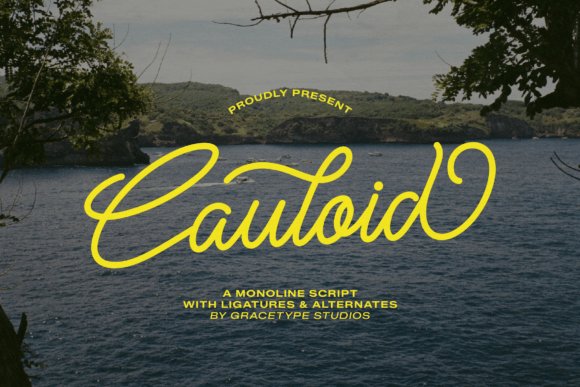
Cauloid is a monoline script that captures a sense of breezy motion through consistent strokes and carefully shaped loops, delivering a modern handwritten aesthetic with boutique sensibility. Its clean, rhythmic ligatures and balanced forms create readable wordmarks and short headlines without descending into overly decorative territory. The font’s controlled personality makes it suitable for projects that need authentic warmth paired with a premium finish.
Perfect for artisanal packaging, wedding suites, and lifestyle branding, Cauloid brings a handcrafted flair that complements clean grotesque sans faces to form clear, elegant systems. Use reserved ligatures for accents and keep spacing open on longer lines to preserve legibility. It works especially well on digital headers and social graphics where a human touch elevates perceived quality.
My Recommendation: I pick Cauloid when a client wants the intimacy of handwriting but with deliberate polish – it’s ideal for boutique skincare, cafés, and invitation suites. Its monoline consistency reads well at multiple sizes, so it’s reliable across packaging and online headers. My go-to approach is to pair it with a neutral sans to let the script’s personality breathe without cluttering the layout.
22. Belaria Font
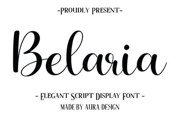
Belaria Font is a masterclass in modern calligraphy, marrying hand-lettered warmth with refined proportions that read as both intimate and upscale. While inherently script, Belaria excels as a companion to luxury sans serif fonts, creating contrast that elevates logos and editorial spreads. Its smooth, sweeping strokes and variable weights produce a lively rhythm that mimics ink on paper without sacrificing clarity.
Use Belaria for wedding suites, boutique identity, and premium product packaging where expressive headers need to communicate handcrafted quality. At display sizes its dramatic swashes become focal points for foil stamping or embossing, while tighter settings preserve legibility for subheadings and pull quotes. Pair this typeface with narrow geometric sans styles for contemporary luxury or with muted palettes and metallic textures to emphasize artisan craftsmanship.
My Recommendation: I reach for Belaria when a project needs warmth and artisanal polish; it’s especially effective on wedding suites, boutique logos, and luxury packaging. Its expressive flourishes create memorable focal points while pairing cleanly with neutral sans-serifs for modern luxury identities. Use it for foil-stamped stationery or hero headlines where handcrafted elegance must read at a glance.
23. Painting Font
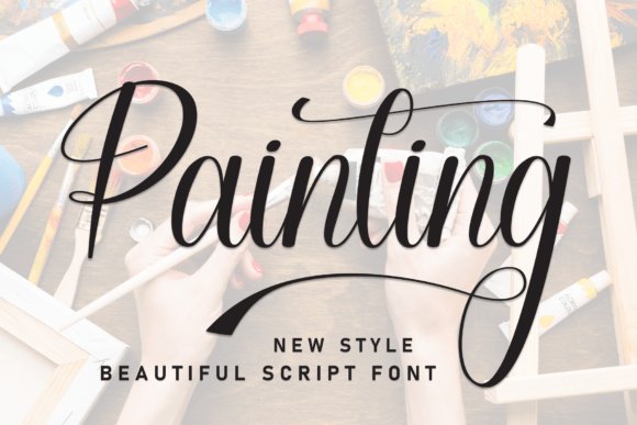
Painting Font channels brush-like motion with crisply rendered stems and theatrical swashes that feel simultaneously spontaneous and controlled. High-contrast strokes and a sculpted rhythm give words a sculptural presence suitable for gallery branding and upscale editorial mastheads. Open counters and carefully tapered terminals keep the characters legible despite ornate flourishes.
Because many decorative alternates are packed into the set (PUA-encoded), designers can toggle between restrained and exuberant styles without extra software. This makes Painting ideal for boutique wine labels, luxury spa identities, and wedding invitations where a hand-painted look signals premium positioning. It harmonizes best with minimalist sans-serifs or condensed grotesques, allowing the script to remain the visual hero.
My Recommendation: I’d choose Painting for projects that need dramatic, hand-painted flair-think gallery invites, signature wine labels, or editorial coverlines. The PUA alternates let me switch moods quickly without extra tooling, saving time in layout iterations. Pair it with a restrained sans for contrast so the script remains readable and unmistakably premium.
24. Bloomcrest Monogram Font
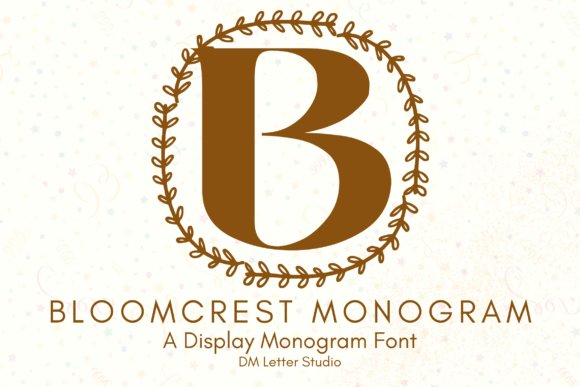
Bloomcrest Monogram Font refines classical serif structure with botanical-inflected terminals, producing initials that feel bespoke and emblematic. Each uppercase is drawn with careful weight distribution so monograms maintain balance whether laser-engraved, embroidered, or letterpressed. The floral motifs are subtle enough to read as ornamentation rather than overpowering decoration, which is essential for legibility at small sizes.
Its disciplined letterforms make Bloomcrest a strong choice for premium packaging, wedding monograms, and boutique signage where a quiet, heritage mood is desired. The set’s completeness-numerals, punctuation, and multilingual support-means it adapts to global branding projects without technical friction. Combine it with a neutral sans or a thin geometric type to modernize compositions while keeping the monogram center-stage.
╰┈➤ Download Bloomcrest Monogram Font
My Recommendation: Bloomcrest Monogram is my go-to when a brand requires heritage polish with boutique sensibility, such as jewelry packaging or bespoke stationery. Its uppercase focus and clean botanical accents reproduce beautifully across print techniques from embossing to embroidery. I pair it with a neutral sans for contemporary brands, or let it stand alone as a refined emblem for classic identities.
25. Figken Font
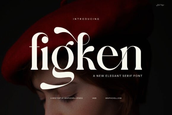
Figken is a refined contemporary serif that balances smooth curves with crisp, expressive serifs to create an instantly sophisticated voice. Its handcrafted letterforms showcase elegant ligatures and distinctive alternates that inject personality into headlines and logotypes. For a modern high-end identity it pairs wonderfully with luxury sans serif fonts to create contrast between classic ornament and clean minimalism.
The typeface’s measured contrast and generous proportions maintain legibility at small sizes while still commanding attention in large display use. Designers will appreciate how Figken moves from upscale packaging to editorial spreads without losing warmth or refinement. Use its alternates sparingly to add bespoke touches-monograms, endorsements, and premium product names benefit most from this restrained flourish.
My Recommendation: I reach for Figken when I need a serif with artisanal detail that still reads modern – its ligatures and alternates give wordmarks a bespoke feel. It adds instant credibility to luxury labels, editorial mastheads, and boutique branding work. If you want a classic voice that can still feel contemporary and highly crafted, Figken is an easy, elegant choice.
26. Restiany Font
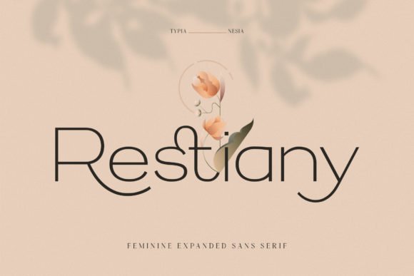
Restiany is a sleek sans serif with a slightly condensed posture and clean terminals that lend an airy, contemporary elegance to any visual system. Subtle stroke modulation and careful spacing make it ideal for logos, photography watermarks, and refined packaging where minimalism meets personality. Its restrained geometry reads equally well on-screen and in print, offering crisp shapes that stay legible at small sizes.
Stylistic alternates and thoughtful kerning options let you customize wordmarks without resorting to flourishes, so your brand stays distinct without losing clarity. The font complements neutral and metallic colorways, bringing a quiet sophistication to event collateral and boutique identity work. Use Restiany when you need understatement with just enough character to feel bespoke.
My Recommendation: I’d use Restiany for boutique product labels, event invitations, and lifestyle branding that require a modern but understated tone. Its compact forms and alternates let me craft unique wordmarks quickly while preserving legibility across touchpoints. It’s a reliable choice when you want polished simplicity rather than loud ornamentation.
27. Luminoir Grotesk Font
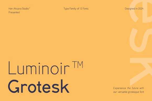
Luminoir Grotesk is a modern variable grotesk that blends neutral readability with a singular design tweak – a subtly tilted stem that animates joined letterforms and adds a quiet forward motion. That kinetic detail gives editorial spreads and corporate identities a tech-informed but sophisticated edge without compromising neutrality. With multiple weights and obliques the family scales from comfortable body text to commanding display headlines.
Engineered for flexible use, Luminoir Grotesk’s open counters and balanced metrics deliver strong performance in responsive interfaces and long-form reading. The oblique styles introduce a premium, slightly futuristic accent that works well for lifestyle tech brands and contemporary magazines. As the family expands, it becomes an excellent tool for designers seeking a modern, characterful grotesk across print and digital systems.
╰┈➤ Download Luminoir Grotesk Font
My Recommendation: I recommend Luminoir Grotesk for projects that need a contemporary, adaptable sans with a signature detail – think tech startups, editorial brands, and premium product systems. The variable weights streamline responsive design workflows, and the obliques add tasteful personality without overt stylization. It’s a practical yet distinct choice when you want clarity and a subtle point of difference.
These 27 selections simplify the hunt for modern, refined sans faces that feel luxurious without being showy. Pair and test each font across scales and media to ensure readability and the right tonal fit.
Keep this list as a reference for upscale projects – the right type can lift perception, usability, and brand value throughout 2026 and beyond.