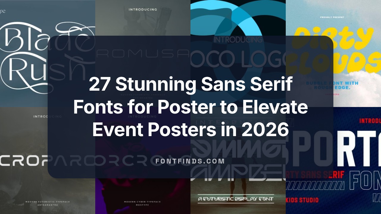
27 Stunning Sans Serif Fonts for Poster to Elevate Event Posters in 2026
Typography makes or breaks a poster’s ability to communicate. Sans serif fonts for poster are indispensable when you need bold legibility, contemporary tone, and clean hierarchy in large-format design.
This guide highlights 27 handpicked typefaces-from geometric and neo-grotesque to humanist and condensed options-so you can choose the best clean typeface for movie promos, exhibition banners, club nights, or minimalist product posters.
1. Melgis Font
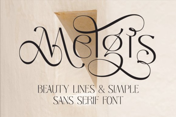
Melgis showcases graceful, flowing strokes and gently curved terminals that give it a refined, editorial presence without sacrificing clarity at large sizes. Its swash glyphs and subtle contrast make headlines feel feminine and premium, while the open counters preserve legibility on posters and magazine covers; Melgis belongs among Sans serif fonts for poster that aim for beauty without ornament overload.
Use Melgis for hero typographic treatments where an elegant voice is needed-think beauty campaigns, product launch posters, and boutique branding-because its letterforms marry decorative accents with robust shapes. Pair it with a neutral geometric sans or a soft serif for body text to maintain hierarchy and let Melgis carry the visual mood as the primary display face.
My Recommendation: I reach for Melgis when I need a display face that reads as both luxurious and readable. Its swash alternates let me craft unique headline treatments without custom lettering, and it holds up well in large-format print like posters and event banners. I’d recommend it for beauty, fashion, and lifestyle campaigns where refined personality is essential.
2. Boltire Font
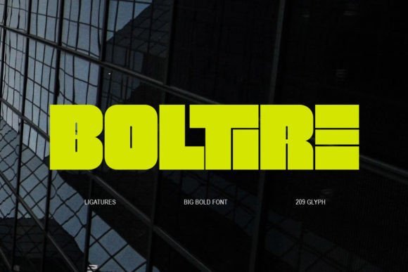
Boltire is a punchy, high-impact display type built for attention: bold, all-caps letterforms with aggressive proportions and built-in ligatures that create compact, expressive headlines. Its dense weight and distinctive terminal shapes make it ideal for posters, billboards, and social graphics where a single word needs to dominate the composition without additional effects.
Beyond sheer strength, Boltire’s ligatures and alternate characters let designers add rhythm and custom letter joins for logotypes and typographic posters, while multilanguage support keeps it versatile across global projects. Use tight tracking and contrasting color blocks to amplify its graphic energy, or combine it with a light sans for supporting copy to keep layouts balanced and legible.
My Recommendation: I use Boltire when a layout demands immediate impact-movie posters, event flyers, and modern editorial covers benefit from its bold attitude. The ligatures help create bespoke headline treatments without manual kerning gymnastics. It’s my go-to for projects that need a loud, confident typographic voice.
3. Bored Trying Font
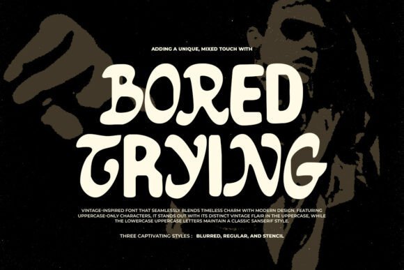
Bored Trying fuses a handcrafted blackletter-inspired uppercase with a smooth sans lowercase to produce a gritty, contemporary hybrid that reads organic and intentionally imperfect. Its rough textures and three stylistic modes-Regular, Blurred, and Stencil-allow designers to select a raw, weathered look or a more structured stencil effect, making it highly adaptable for posters and packaging with an artisanal edge.
The font’s tactile character shines when layered over textured backgrounds, distressed imagery, or screen-printed effects, adding authenticity to branding, music flyers, and indie editorial spreads. Because the set includes multiple styles, you can mix modes for contrast-use the blurred treatment for atmosphere and the stencil for legible calls-to-action-creating depth without extra graphic treatments.
╰┈➤ Download Bored Trying Font
My Recommendation: I pick Bored Trying for projects that benefit from a handmade, slightly rebellious aesthetic-think gig posters, craft labels, and urban streetwear branding. Its three styles give me flexibility to dial up grit or clarity depending on the context, and the mixed typographic voice creates memorable pairings without additional bespoke work. It’s ideal when you want character and texture built into the type itself.
4. Sporta Font
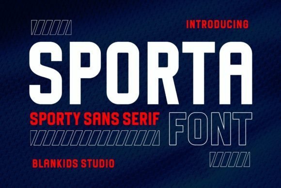
Sporta is a forceful, athletic sans serif whose bold proportions and tight counters make it impossible to ignore in large-format work. Sporta ranks among the best Sans serif fonts for poster because its heavy strokes and condensed architecture read cleanly from a distance, giving headlines instant authority. Its abrupt terminals and minimal contrast carve out a masculine voice that suits sports branding, event banners, and high-impact retail signage.
At display sizes Sporta benefits from slightly increased tracking and careful kerning to avoid visually tight joins, while its sturdy stems survive heavy halftones and textured backdrops. Use it in all-caps for maximum punch or mix with a humanist sans for softer subheads; layered color fills and outlines amplify its presence on posters. Technically, the family supports basic Latin; consider vectorizing treatments for extreme scaling.
My Recommendation: I reach for Sporta when a design must scream strength-sports posters, concert flyers, and action-oriented campaigns. Its bold character is invaluable when legibility at a distance is non-negotiable, and it holds up under heavy effects like halftone or distress. For me it’s a go-to when I need instant, uncompromising impact.
5. Dirty Clouds Font
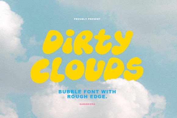
Dirty Clouds is a hand-drawn bubble font characterized by uneven edges and a joyful, homemade texture that immediately humanizes layouts. Its mix of uppercase and lowercase alternates creates playful rhythm, making short statements, stickers, and quote graphics feel handcrafted rather than mechanically typeset. Built-in glyph alternates, underlines, and icons give designers quick access to charming imperfections without manual illustration.
On posters, Dirty Clouds works best as a focal typographic texture-pair it with a neutral sans for supporting copy to keep hierarchy intact. Because of its organic outlines, it thrives on contrasting backgrounds and benefits from generous leading to preserve legibility at medium sizes. Multilingual support and glyph variety make it flexible for campaigns that need personality across different languages.
╰┈➤ Download Dirty Clouds Font
My Recommendation: I use Dirty Clouds when a project needs to feel honest and hand-made-think indie gig posters, playful packaging, or event stickers. Its alternates let me vary words without repeating the exact shapes, which keeps layouts lively. I avoid long paragraphs with it, but for short headlines it injects immediate warmth and charm.
6. Romusa Font
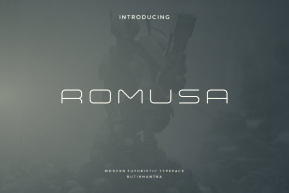
Romusa is a futuristic, all-caps sans serif that reads as both elegant and engineered thanks to its narrow apertures and minimalist strokes. Its geometric precision and subtle angular cuts give a modernist look ideal for tech-forward branding, magazine mastheads, and sleek poster headlines. Because every character is designed for display, Romusa flattens visual noise and brings a refined, forward-facing aesthetic to high-contrast layouts.
Use Romusa with tight tracking and monochrome or neon gradients to emphasize its streamlined silhouette, but reserve it for short copy to preserve clarity. It pairs especially well with warm, humanist body fonts that soften its clinical edges and provide readable supporting text. For logos and signage, its sculpted letterforms reproduce cleanly at large scales and in laser-cut or embossed treatments.
My Recommendation: I turn to Romusa when a project needs a futuristic yet polished tone-product launches, tech conferences, and editorial spreads benefit from its crystalline geometry. It commands attention without ornament, so it’s perfect for minimal posters and brand identities that want to feel next-generation. Pair with a neutral text face to keep longer copy comfortable.
7. Impure Mount Font
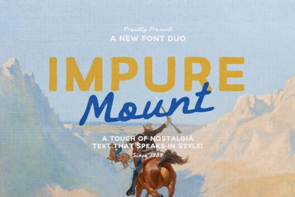
Impure Mount is a nostalgic two-style family that pairs a crisp, practical sans with a loose, hand-lettered script that feels weathered and authentic. The tension between the structured sans and the expressive script produces energetic headlines and layered compositions well suited to outdoor branding, travel posters, and book covers. Its clean sans partner makes it ideal among Sans serif fonts for poster , delivering readable display text that still carries rustic personality.
The handmade script works as a signature accent or secondary headline while the sans provides stable typographic hierarchy and strong legibility at scale. It supports multiple languages, includes alternates for tighter word shapes, and performs beautifully over textured photography or distressed backgrounds. Use Impure Mount for adventure posters, festival identities, product packaging, and quote art when you want handcrafted warmth without sacrificing clarity.
╰┈➤ Download Impure Mount Font
My Recommendation: I’d reach for Impure Mount when a design needs to feel lived-in and outdoorsy-think national park posters, climbing event promos, or rustic product labels. The duo lets me set bold, legible headlines with the sans and add personality with the script without commissioning custom lettering. Its multilingual support and reliable display readability make it a pragmatic and characterful pick for print and social campaigns.
8. Asember Ligature Font
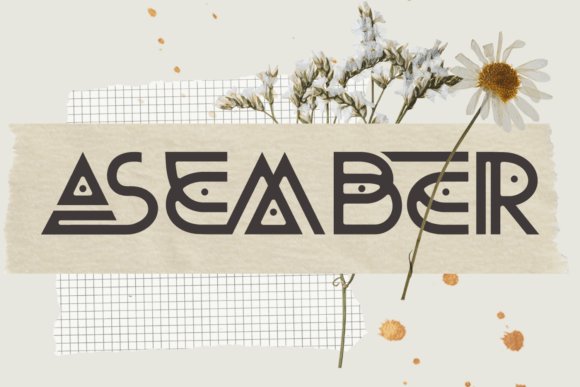
Asember Ligature is a sleek, futuristic sans with precision-crafted ligatures and refined geometry inspired by sci‑fi interfaces and modern gadgets. Its narrow counters and elongated terminals create a streamlined silhouette that reads as both elegant and forward-looking in headline contexts. The built-in ligature system lets designers produce distinct wordmarks quickly while preserving a minimalist, tech-forward aesthetic.
Optimized for display work, Asember holds up on magazine covers, cinematic posters, and product branding where crisp forms and negative space are essential. It pairs well with neutral text faces or understated serifs for body copy to maintain clear typographic hierarchy. Tweak tracking and enable select ligatures to create memorable logotypes and poster headlines that feel custom without redrawing letters.
╰┈➤ Download Asember Ligature Font
My Recommendation: I use Asember Ligature when a project needs a polished, high-tech voice-ideal for sci‑fi film posters, hardware startups, or magazine covers about innovation. Its ligatures speed identity work and give headlines a bespoke look without heavy customization. For best results, apply it in display sizes, experiment with tight tracking, and balance it with a neutral body face.
9. Bletro Font
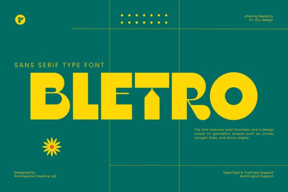
Bletro is a bold display sans that blends mid-century flair with modern geometry, offering dense strokes, crisp angles, and a compact footprint that commands attention. Its sharp terminals and deliberate quirks lend a retro-modern charisma that’s particularly effective for posters, album covers, and high-impact logos. Because it asserts the visual tone immediately, Bletro is excellent for headline-driven layouts where personality must read at a glance.
Designed for display sizes, Bletro thrives when paired with generous negative space, strong color blocks, or simplified photography that allows the letterforms to lead. The typeface supports creative kerning and typographic stacking for experimental poster compositions and social creatives. If you want to soften the overall voice, balance Bletro with a light, humanist text face while keeping it as the focal headline element.
My Recommendation: I recommend Bletro for projects that require instant visual impact-event posters, retro-themed branding, and bold social headers benefit most from its geometry. It’s terrific when paired with minimalist layouts and vibrant color fields to let the type dominate. Use a contrasting, lightweight body face to avoid visual fatigue while keeping Bletro as the central design driver.
10. Maximo Font
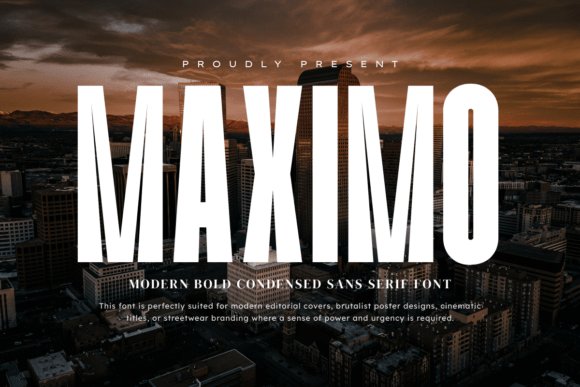
Maximo is built to be among the most commanding Sans serif fonts for poster , its condensed proportions and tall x‑height create a punchy, metropolitan presence that reads at a distance and on small screens alike. The typeface balances geometric precision with stout terminals, giving headlines a refined yet aggressive attitude ideal for brutalist layouts, cinematic title frames, and editorial covers that demand instant attention.
Because of its sturdy strokes and narrow set, Maximo excels where space is limited but legibility cannot be compromised-think streetwear drops, large-format billboards, and compact social media banners. Use tight tracking and heavy weights for maximum impact, or pair with a neutral grotesque for body copy to preserve a clean visual hierarchy and professional edge.
My Recommendation: I’d reach for Maximo when I need a headline that hits hard without becoming crude-its condensed stature lets you pack powerful messaging into tight layouts while maintaining clarity. It’s perfect for urban fashion, film posters, or any branding that wants a polished yet aggressive tone. For maximum effect, combine Maximo with minimal color palettes and large-scale photography.
11. Shark Attack Font
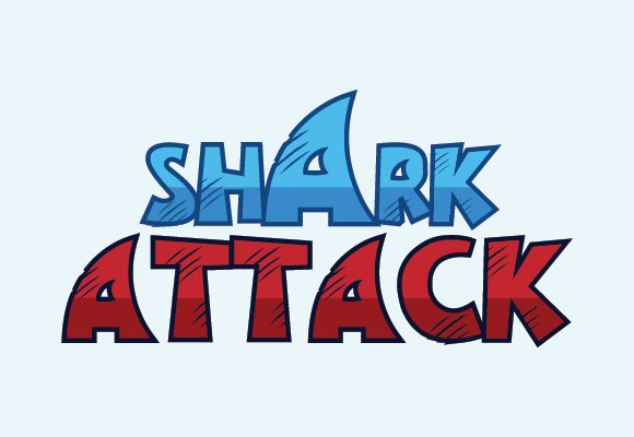
Shark Attack is a modern sans serif with playful, ocean-inspired character shapes that instantly lend personality to casual designs. Its letterforms favor soft curves and slightly exaggerated terminals, creating a friendly, energetic vibe that works beautifully on T‑shirts, promotional banners, and youth-focused poster art.
The font performs best at display sizes where its quirky details sing-try it for merchandise, surf or aquarium event posters, and bold social headers where you want a distinctive but approachable look. Pair Shark Attack with hand‑drawn icons or textured backgrounds to amplify the nautical theme while keeping typography readable and fun.
╰┈➤ Download Shark Attack Font
My Recommendation: I’d use Shark Attack when a project needs charm and motion-think summer events, apparel lines, or aquatic brands where a conventional sans would feel cold. Its whimsical shapes add warmth and memorability without sacrificing legibility. It’s my go‑to for playful branding and casual poster work that benefits from a strong thematic voice.
12. Common Campbell Font
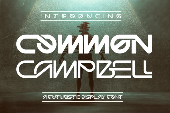
Common Campbell blends retro‑futuristic sensibilities with contemporary technical polish, featuring purposeful ligatures and a mix of sharp edges and soft rounds that recall mid‑century sci‑fi lettering. The design’s modular construction and NASA‑inspired cues make it compelling for movie posters, exhibition type, and any application where a slightly optimistic, high‑tech identity is required.
Beyond headline use, Common Campbell shines when you experiment with uppercase and lowercase mixes to craft bespoke logotypes or title treatments; the included multilingual characters broaden its utility for international campaigns. Use subtle letterspacing and the special ligatures to introduce rhythm into blocky layouts and to ensure a distinct, engineered aesthetic without appearing gimmicky.
╰┈➤ Download Common Campbell Font
My Recommendation: I recommend Common Campbell when you want a typeface that feels both nostalgic and forward‑looking-ideal for science‑fiction posters, tech event branding, or retro product packaging. Its ligatures let you create unique wordmarks quickly, and multilingual support expands its usefulness. I often pair it with minimal, high‑contrast color schemes to emphasize its engineered character.
13. Roto Font
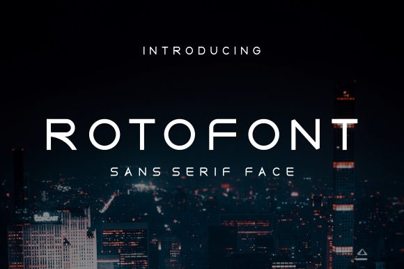
Roto Font is a quietly authoritative neo-grotesque with balanced proportions and a generous x‑height that makes headlines sing and body copy breathe. Among the best Sans serif fonts for poster Roto combines neutral geometry with subtle humanist touches-open counters and soft terminals-that deliver instant clarity at a glance. The family’s variety of weights and italics gives designers the flexibility to build strong typographic hierarchies without extra ornamentation.
On large-format work Roto’s measured spacing and precise kerning preserve legibility from a distance while retaining personality up close, which is invaluable for printed signs, event posters, and retail displays. Condensed weights and sturdy bold cuts excel as display faces on packaging and apparel, and the restrained forms pair effortlessly with a warm serif or minimalist slab to create layered, professional compositions. Choose Roto when you need a timeless sans that reads reliably at scale and adapts across digital and physical media.
My Recommendation: I reach for Roto when a project needs calm authority and absolute readability-think transit posters, retail signage, and brand identities that must work at many sizes. Its balanced shapes and weight range let me build hierarchy without juggling extra type families. For campaigns that require clarity at a distance or a polished, neutral tone, Roto is a dependable workhorse.
14. Blade Rush Font – Sans serif fonts for poster
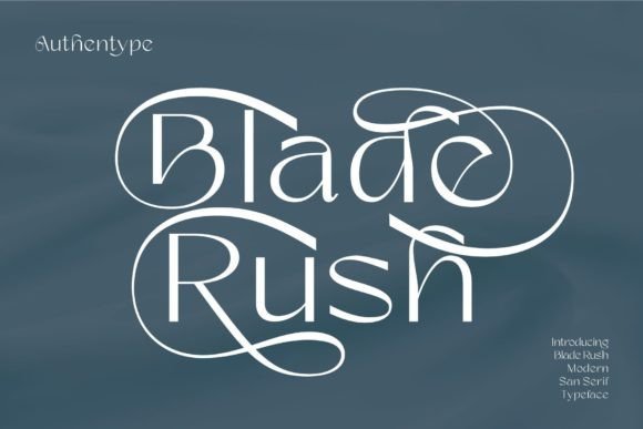
Blade Rush Font is a refined, contemporary sans built around elegant proportions and an ornamental swash set that lifts headlines into the realm of fashion and luxury. The face includes comprehensive glyph coverage-upper and lowercase, numerals, punctuation and stylistic alternates-so designers can craft polished magazine spreads and brand collateral without glyph gaps. Its clean base forms keep the overall look modern while the decorative options add personality where needed.
For poster work Blade Rush’s swashes and ligatures shine when used sparingly on hero lines, creating a couture, editorial feel without sacrificing legibility at typical reading distances. Combine the font’s regular cuts for supporting copy and reserve the swashed alternates for logos, callouts, or product names to maintain hierarchy. I recommend optical tracking and careful kerning when using extended swashes to avoid collisions in tight layouts.
╰┈➤ Download Blade Rush Font – Sans serif fonts for poster
My Recommendation: I’d pick Blade Rush for beauty brands, upscale event posters, and editorial covers where a touch of flourish is desired. Its stylistic alternates let you create bespoke looking wordmarks without custom lettering. Use it when you want sophistication and character in headlines while keeping supporting text clean and readable.
15. Arcades Rivalries Font
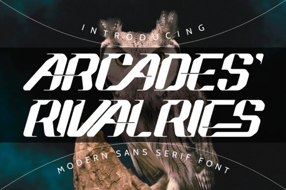
Arcades Rivalries Font channels a hi‑tech, sci‑fi aesthetic through sharp angles, dramatic cuts, and modular letterforms designed for impact. The type’s futuristic skeleton and purposeful negative space make it distinctive for gaming identities, movie titles, and speed‑oriented brands where aggressive personality is required. Built‑in ligatures and display alternates extend logo possibilities and let designers craft custom wordmarks without extra vector work.
Because Arcades Rivalries emphasizes form over softness, it performs best as a display face – think event posters, hero banners, and esports branding rather than long passages of text. Apply wide tracking for large signage or tight tracking with optical adjustments for compact logos to preserve the intended feel. Pair it with very simple neutral bodies or subtle gradients and motion effects to keep the composition readable while amplifying its futuristic vibe.
╰┈➤ Download Arcades Rivalries Font
My Recommendation: I use Arcades Rivalries when a design needs high-octane character – game launches, science‑fiction posters, and automotive promotions are perfect fits. It creates instant attitude and reduces the need for heavy graphical embellishments. Just remember it’s a headline tool: limit use to display sizes and complement it with restrained supporting typography.
16. Goodpast Font
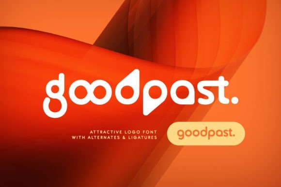
Goodpast is a minimalist, futuristic rounded sans serif that balances clean geometry with playful bends; its twisted alternates give logo marks and headlines an immediately modern edge. The family’s compact proportions and deliberate negative space make it perform well in bold wordmarks and tight layouts, while creative ligatures introduce bespoke-feeling connections without custom lettering.
Goodpast stands out among Sans serif fonts for poster as a go-to when you want a sci‑fi flavor without sacrificing legibility; its multilingual support keeps global campaigns consistent. Use isolated alternates to create memorable monograms or tighten tracking for punchy display lines-this font works especially well for tech branding, film posters, and forward-looking identity projects.
My Recommendation: I recommend Goodpast when you need a contemporary, slightly futuristic voice that still reads cleanly at a glance. The alternates let me craft bespoke-looking marks quickly, and the ligatures add subtle custom feel without extra production. I’d use it for tech event posters, entertainment campaigns, or any brand that wants a modern, polished personality.
17. Rounder Font
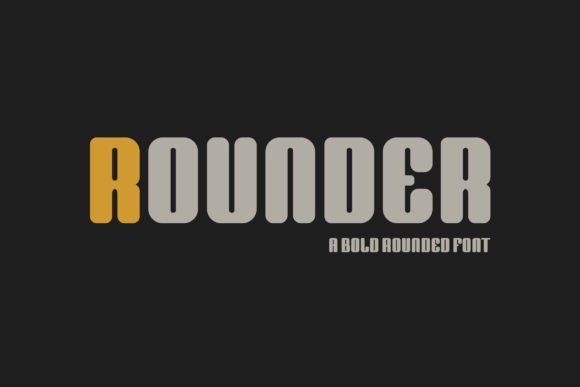
Rounder is a chunky, soft-edged sans serif designed to bring instant warmth and approachability to display work; its generous counters and rounded terminals make headlines feel friendly and alive. The letterforms are broad with a slightly compact footprint, so typographic blocks retain presence while remaining highly legible from a distance.
Built for impact, Rounder shines on posters, packaging, and wayfinding where an upbeat tone matters; its steady stroke weight reproduces reliably on print and screen. Pair it with a narrow grotesque or a light serif for contrast, and use its weight to anchor colorful, playful layouts aimed at families, retail, or children’s events.
My Recommendation: I reach for Rounder when a design needs cheerful personality and immediate visibility-its chunky shapes read well across posters and signage. It’s perfect for kids’ events, playful retail branding, and sticker-style graphics. In practice I pair it with bright color blocks and simple iconography to maximize its friendly impact.
18. Butter Toast Font
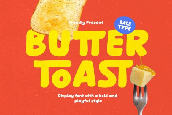
Butter Toast is a bold hand-lettered sans with soft, tactile strokes that evoke warmth and comfort; its rounded terminals and lively rhythm read like handcrafted signage. Built-in ligatures and alternates let you vary wordmarks and headlines without resorting to custom lettering, so short messages feel organic and expressive.
This typeface excels on posters and social art that need an intimate, cozy voice-think cafés, bakeries, and lifestyle promotions-thanks to confident stroke contrast and careful spacing. With multilingual glyphs and thoughtful kerning, Butter Toast keeps personality intact across languages while preserving strong visual hierarchy in display use.
╰┈➤ Download Butter Toast Font
My Recommendation: I use Butter Toast when a project should feel handmade and inviting-its friendly strokes add instant charm without looking amateurish. It’s ideal for food packaging, café posters, and warm lifestyle campaigns where tone matters as much as legibility. For best results set it large for headlines and let the alternates create natural, engaging rhythm.
19. Stovia Font
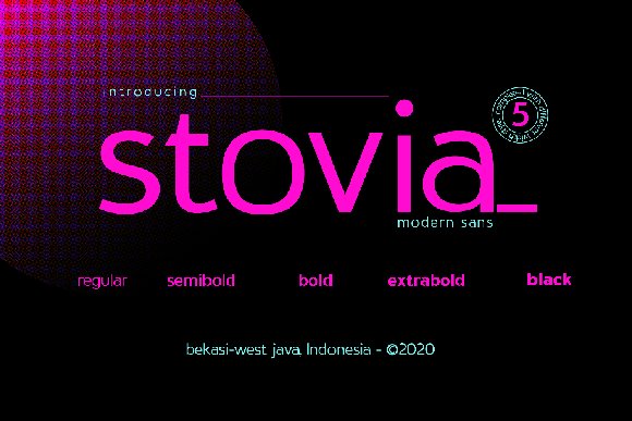
Stovia offers a contemporary, no-nonsense sans design with a generous x-height and open counters that aid legibility at both body and display sizes. When choosing Sans serif fonts for poster I find Stovia’s even stroke contrast and steady rhythm deliver clarity for headlines, logotypes, stationery and long blocks of text without feeling bland.
The family’s moderate weight range and sensible kerning make it versatile for a range of print and digital projects, and its neutral voice supports bold color and layered treatments in poster layouts. Use Stovia for clean, modern compositions where reliable readability and understated character are priorities.
My Recommendation: I would reach for Stovia when I need a dependable, modern sans that reads well across sizes and media. Its balanced shapes are excellent for posters where you want clarity without a loud personality. It’s especially useful for corporate branding, exhibition posters, and editorial spreads that need a neutral but confident type voice.
20. Orcroso Font
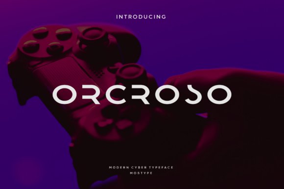
Orcroso blends minimalist geometry with subtle decorative terminals that give it an elegant, slightly cinematic feel; those little curves at the letter ends inject personality without compromising simplicity. The typeface shines in logo work, movie titles and poster headlines because its forms are distinct enough to register at a glance yet refined enough to carry a premium look.
As a secondary text face it retains readability, making it useful for book titles and captioned layouts where a touch of flourish is desirable. For designers, Orcroso works well paired with a neutral grotesque for body copy or used alone in uppercase-led branding to emphasize its sculpted terminals and refined spacing.
My Recommendation: I’d choose Orcroso when a project needs understated sophistication-think boutique film posters, fashion lookbooks, or luxury branding. Its ornamented ends add character without becoming fussy, so it elevates headlines while remaining highly usable. Use it when you want a minimalist palette with a signature typographic flourish.
21. Argolubang Font
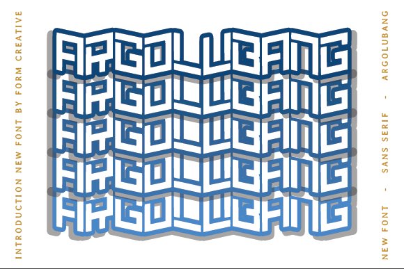
Argolubang is unapologetically bold, with muscular strokes and compact counters that create instant visual weight on posters and billboards. Its assertive letterforms are ideal for attention-grabbing headlines, quotes and branding marks where a sense of power and immediacy is required.
The font’s tight proportions and strong verticals reward bold color and high-contrast layouts, and it performs especially well in short, punchy copy rather than long paragraphs. Pair Argolubang with a softer sans or a light serif to provide contrast and avoid visual fatigue in dense designs.
My Recommendation: I use Argolubang when I need maximum impact-concert posters, sports branding, and statement headlines are its natural home. Its heavy forms cut through busy imagery and printing textures, so it’s great for high-energy creative work. If you want dramatic presence without gimmicks, this font delivers.
22. Grebavi | Modern Logo Typeface Font
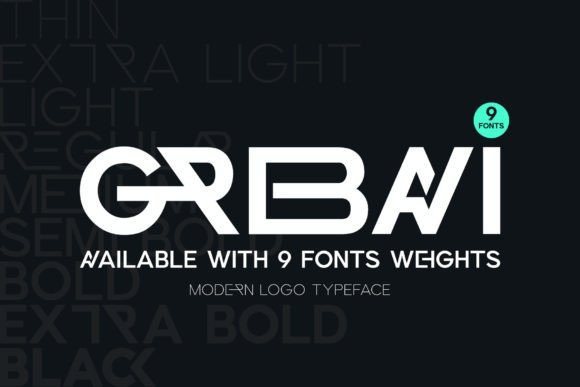
Grebavi is a modern, well-balanced sans serif that blends minimalist geometry with iconic letterforms, giving headlines a confident but refined voice. Its clean counters and subtle terminals form shapes that scale smoothly from small labels to oversized signage. A versatile set of ligatures and alternate glyphs lets designers prototype logo variations and distinctive wordmarks without custom drawing.
Because of that adaptability Grebavi works especially well across brand identity, packaging, social posts and poster layouts while preserving legibility at every viewing distance. Its proportions and ligature set make it a go-to within Sans serif fonts for poster where designers need fast, consistent headline variations and tailored shapes. Choose Grebavi when you want a contemporary, high-impact look that reads clearly in both print and digital environments.
╰┈➤ Download Grebavi | Modern Logo Typeface Font
My Recommendation: I reach for Grebavi when a project needs a modern mark that feels both minimal and memorable; its ligatures let me iterate logo shapes quickly. It’s especially strong for brand systems and bold poster campaigns where legibility and typographic variety matter. Pair it with a plain text face to keep headlines dominant while preserving a clean overall aesthetic.
23. Masone Font
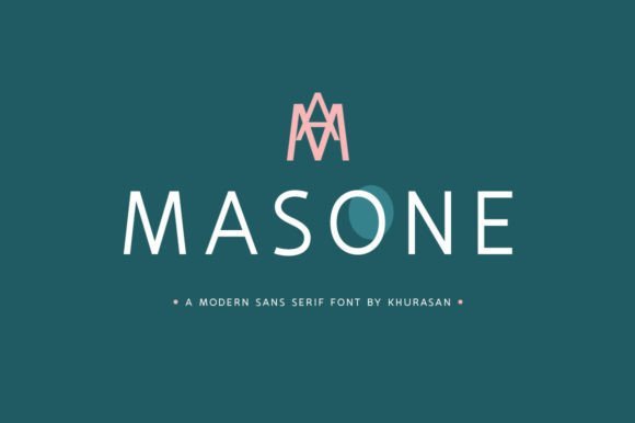
Masone is an elegant sans serif with refined proportions and soft humanist touches that lend warmth to contemporary layouts. Thin-to-medium strokes and gently tapered terminals give text an upscale, crafted appearance without sacrificing readability. The subtle rhythm of its letterforms makes it equally suitable for refined logos and extended display lines.
Its poised character elevates greeting cards, boutique branding and posters where a delicate, tactile tone is desired, and it holds up well in both digital and print contexts. Masone performs beautifully at large sizes for headlines while maintaining composure in short captions or pull quotes. For a cohesive look, combine it with textured materials or muted palettes to emphasize its understated luxury.
My Recommendation: I use Masone for projects that need understated sophistication-artisan labels, wedding stationery, and boutique posters all benefit from its warmth. Its elegance at display sizes creates a refined atmosphere without feeling fussy. It’s my go-to when a design needs clarity with a personable, handcrafted edge.
24. Croparo Font
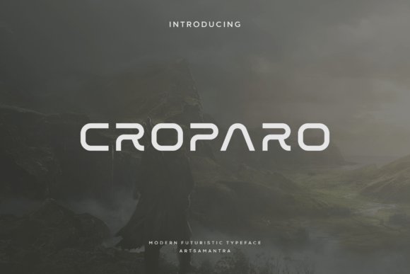
Croparo projects a futuristic, geometric voice with sharp angles and bold strokes that command attention on first glance. Built as an all-caps display, its letterforms read like architecture-tight, assertive and engineered for maximum visual impact. Numerals and symbols are harmonized to keep a strict, mechanical rhythm across headlines and logos.
This typeface thrives on high-contrast placements such as poster headlines, magazine covers and tech-brand identities where a forward-looking aesthetic is essential. Because Croparo is so forceful, generous tracking or pairing with a neutral body face helps avoid visual fatigue. Use it when you need a hard-edged, modern statement that immediately signals cutting-edge intent.
My Recommendation: I choose Croparo when a project demands pure display power-product launches, futuristic posters and esports branding benefit from its angular attitude. It’s excellent for single-line headlines and iconic wordmarks that must dominate the page. Avoid long passages of text; Croparo shines as a bold, succinct voice rather than a body face.
25. Bootsq Font
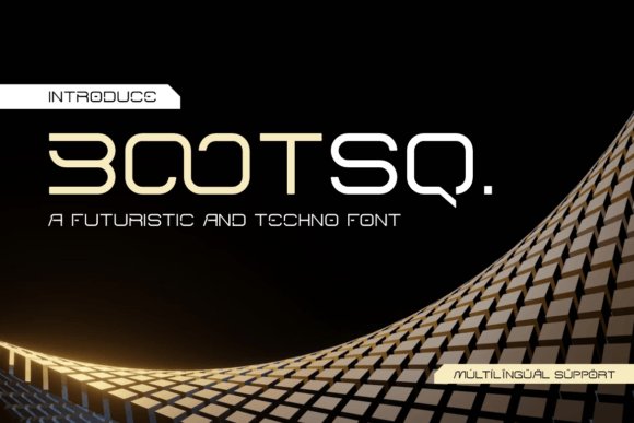
Bootsq presents a pared-back, geometric sans with compact letterforms and squared terminals that make headlines feel deliberate and modern. As one of the Sans serif fonts for poster it projects clarity at scale-its open counters and consistent stroke widths keep large-type compositions feeling crisp without fuss. The minimal aesthetic reads as both contemporary and authoritative, great for identity systems that need a no-nonsense display face.
Technically, Bootsq performs well in tight tracking and layered color treatments where its shapes remain legible from a distance, and its limited contrast avoids visual noise in bold weights. Pair it with a light humanist serif for contrast or use it alone for stark, high-impact layouts across posters, retail signage, and sports branding. Designers will appreciate how easily Bootsq adapts from printed billboards to digital hero panels.
My Recommendation: I reach for Bootsq when a project needs a confident, minimal headline that reads instantly-especially for large-format work. Its geometric restraint gives posters and branding a contemporary edge while remaining highly usable in tight layouts. Use Bootsq when clarity and modernism are the priority, such as retail campaigns, event posters, and athletic identity.
26. Delman Font
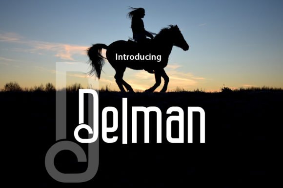
Delman is an exploratory sans with unexpected angles and alternate characters designed to inject personality into display applications. Its quirky terminals and variable proportions let designers craft expressive digital lettering and eye-catching print headlines that feel bespoke rather than generic. When used in posters or apparel graphics the font can shift from playful to refined depending on weight and spacing choices.
On a technical level, Delman offers a range of stylistic alternates and ligatures that reward close typographic work, enabling layered treatments and dynamic wordmarks. It pairs well with subdued neutral typefaces to let its idiosyncrasies speak, making it useful for packaging, poster campaigns, and T-shirt graphics where a distinctive voice is essential. The font thrives in projects that welcome experimental display typography and crafted letterforms.
My Recommendation: I recommend Delman for projects that need a memorable, offbeat display face-especially when you want text to feel hand-tuned or editorial. Its alternates and ligatures make it fun to experiment with in posters and merchandise. Choose Delman when you want to stand out visually without resorting to ornamentation.
27. Poco Logo Font
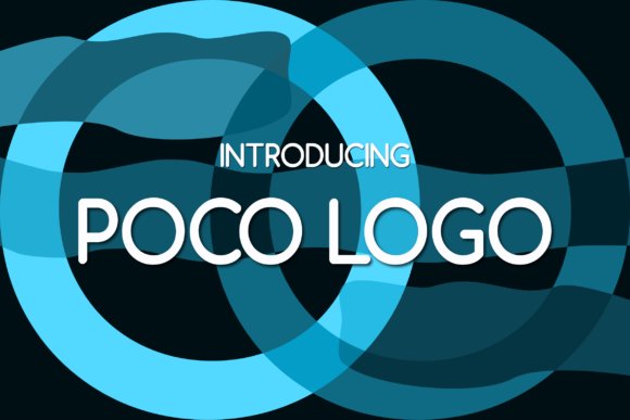
Poco Logo blends classical proportion with contemporary sans simplicity: uppercase forms nod to Roman inscriptional capitals while lowercase shapes borrow the warmth of old-style serif rhythm. The result is a refined, low-contrast sans that feels trustworthy and subtly elegant when used at headline scale. This balance gives designs a heritage quality without feeling dated, ideal for brands that want a timeless voice.
In practice, Poco Logo excels in applications where legibility and sophistication must coexist, such as packaging, museum posters, and premium web headers; its measured spacing maintains clarity in long words and stacked lockups. It pairs beautifully with narrow serifs or delicate geometric icons to amplify a premium aesthetic, and its considered proportions make it a reliable choice across print and digital touchpoints. Use Poco Logo when the goal is understated refinement with strong typographic roots.
My Recommendation: I use Poco Logo when a project needs a polished, historically informed sans that still reads cleanly at display sizes. Its subtle contrast and stately uppercase give posters and packaging a premium feel without fuss. It’s a go-to for boutique brands, editorial covers, and signage where craftsmanship matters.
These 27 selections give you a focused toolkit of sans serif faces that excel at impact, readability, and visual tone for poster work. Try mixing a heavy display weight for headlines with a neutral regular for supporting copy to maintain clarity at scale.
Test a few on real mockups, check legibility at typical viewing distances, and iterate with weight and spacing tweaks. Pick one of the curated fonts above and see how it transforms your posters in 2026.