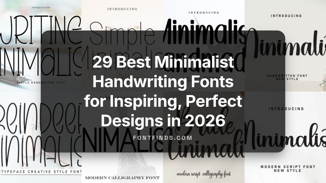
29 Best Minimalist Handwriting Fonts for Inspiring, Perfect Designs in 2026
Minimalist Handwriting fonts are ideal when you want typography that feels personal yet refined. This collection of 29 selections highlights clean, legible handwritten and signature styles that work across branding, editorial, and digital projects.
Each font focuses on simplicity and subtle character, blending modern minimalism with organic hand-drawn charm. Read on for usage tips, pairing ideas, and quick notes to help you choose the perfect minimal handwriting style for your next design.
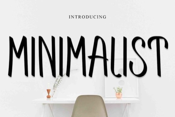
1. Writing Minimalist Font
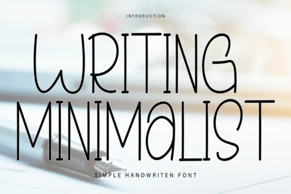
Writing Minimalist arrives as an inviting, low-contrast hand script with a casual rhythm that reads like friendly handwriting. As one of the gentlest choices in Minimalist Handwriting fonts , it balances rounded terminals and airy counters to create a relaxed but intentional presence on the page.
Letters flow with a steady baseline and moderate spacing, which makes this face particularly comfortable for short blocks of text-think invitations, handwritten notes, or card fronts. Subtle irregularities in stroke width preserve a human touch without looking messy or uncontrolled.
For best results, pair Writing Minimalist with a crisp geometric sans for contrast or use it solo on textured stationery to amplify warmth. It performs well in print and large-format web headers but avoid using it as a body text face where extended readability is required.
Download Writing Minimalist Font
My Recommendation: I reach for Writing Minimalist when I want design work to feel personal and approachable-perfect for wedding stationery, boutique packaging, and heartfelt social posts. Its softness gives projects an immediate emotional connection while remaining tidy and professional. Use it when the goal is intimacy without losing clarity.
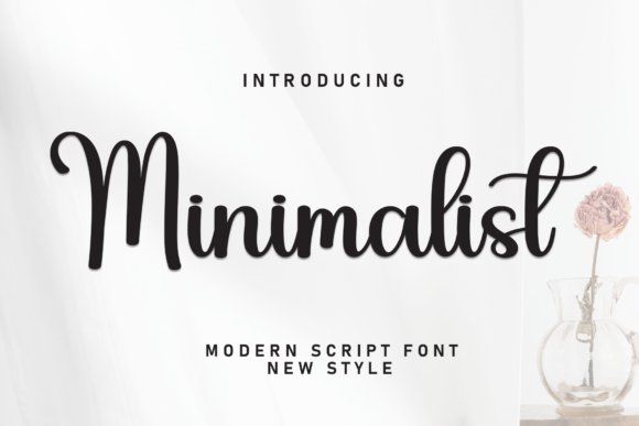
2. Minimalist Love Font
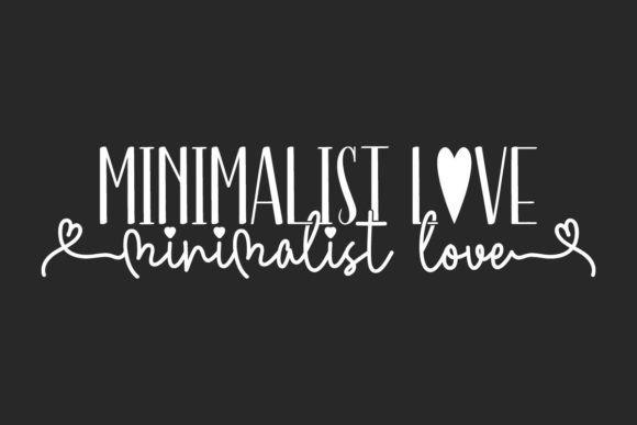
Minimalist Love is a versatile font duo built around contrast: a tall, airy sans display paired with a charming handwriting script that feels naturally affectionate. The sans brings modern structure with narrow proportions, while the script supplies lively strokes and organic rhythm, making the pair useful across many visual moods.
This combination excels in identity work where romance meets restraint-think fashion lookbooks, florist branding, and boutique product labels. The script’s playful swashes and the display’s clean verticals create a compelling hierarchy that guides the eye and anchors layouts for posters, covers, and packaging.
Because the duo covers both headline weight and personal flourish, it translates well between print and pixel. Use the sans for strong typographic statements and reserve the script for accents, signatures, and decorative touches to keep compositions readable and refined.
My Recommendation: I would use Minimalist Love when a project needs both modern elegance and a human touch-such as a bridal suite, editorial spread, or artisanal label. The duo simplifies layout decisions because it already contains complementary styles that work together. It’s ideal when you want sophistication that still feels handmade.
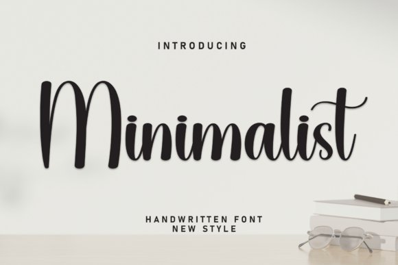
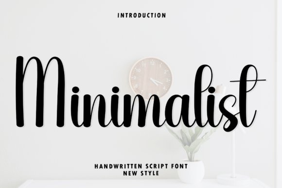
3. Minimalist Handwriting Font
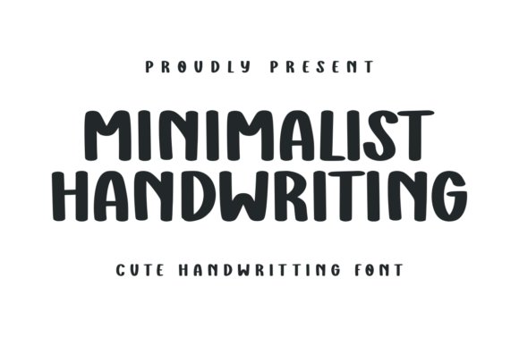
Minimalist Handwriting captures a clean, whimsical personality through smooth curves and restrained loops that read as both contemporary and intimate. Its hand-drawn sensibility avoids frills, favoring streamlined letterforms that retain warmth without becoming ornate.
This style is particularly well suited to romantic projects-wedding invitations, boutique branding, and social media templates-where the voice should feel personal yet polished. The type’s open counters and moderate x-height improve legibility in headers and short captions, while subtle play in the strokes keeps compositions approachable.
For design systems, pair it with a neutral sans or light serif to maintain balance: let Minimalist Handwriting serve as accent and personality rather than a workhorse body face. It’s a great choice when you want a signature-like tone without sacrificing modern clarity.
Download Minimalist Handwriting Font
My Recommendation: I’d choose Minimalist Handwriting for projects that require a handwritten aesthetic without unnecessary ornament-think boutique identities, heartfelt marketing, and curated social content. It lends an authentic, human voice while staying clean enough for editorial use. Use it as a focal accent to add personality without overwhelming the overall design.
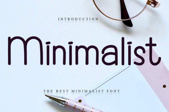
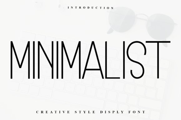
4. Minimalist Font
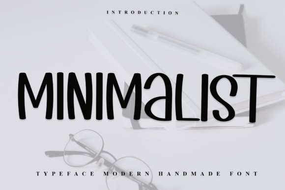
Minimalist radiates a quiet, disciplined charm: restrained strokes, steady spacing, and an uncluttered baseline that make each character immediately legible. Minimalist is an excellent example among Minimalist Handwriting fonts that favors clarity over flourish, choosing precision and negative space to convey a handwritten look without the visual noise of heavy swashes or decorative alternates.
On closer inspection the letterforms reveal subtle human quirks – slightly rounded terminals and modest angled joins – which keep the face from feeling mechanical. These small imperfections make it feel personal while remaining highly readable across sizes; it holds up well in UI labels, captions, and product tags where clarity matters as much as warmth.
Technically it behaves like a modern monoline script: consistent stroke width, comfortable x-height, and forgiving kerning that rarely requires heavy manual adjustment. Use it to inject a handcrafted feeling into minimalist branding, packaging, or editorial layouts where a clean handwritten voice is needed without ornate embellishment.
My Recommendation: I reach for Minimalist when a project needs a human touch without distraction-think clean product labels, subtle social posts, or modern stationery. Its neutrality makes it simple to pair with geometric sans-serifs and restrained serif headlines. I appreciate how it reads well at small sizes while still feeling personal, so it’s my go-to for understated, handcrafted aesthetics.
5. Wedding Minimalist Font
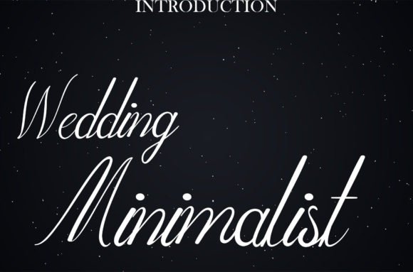
Wedding Minimalist presents an elegant, flowing script with narrow, graceful strokes that whisper rather than shout. The letter connections are smooth and organic, producing an airy calligraphic effect that reads as refined and deliberate-perfect for projects that want romance without baroque decoration.
Unlike heavier ornamental scripts, this design keeps contrast subtle and avoids excessive flourish, which makes it a good choice for modern wedding suites, save-the-dates, and clean ceremony signage. Ligatures are tasteful and restrained; when used sparingly they enhance rhythm without overwhelming the layout.
Functionally, it performs best at display sizes where the delicate joins can breathe; for long blocks of text opt for a companion sans or serif to preserve readability. For print, consider converting text to outlines for complex production, and for web use pair it with a neutral body font to maintain a polished, contemporary wedding identity.
Download Wedding Minimalist Font
My Recommendation: I love Wedding Minimalist for contemporary wedding branding because it communicates intimacy with minimal fuss. It’s ideal for invitations, menu cards, and elegant logos where a delicate, hand-drawn feel is desired. I often pair it with a clean serif to balance the romantic script and to keep longer copy legible.
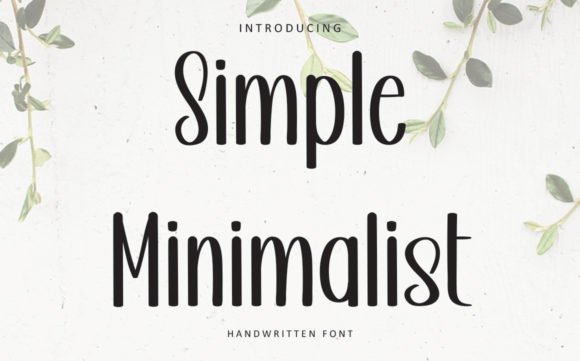
6. Simple Minimalist Font
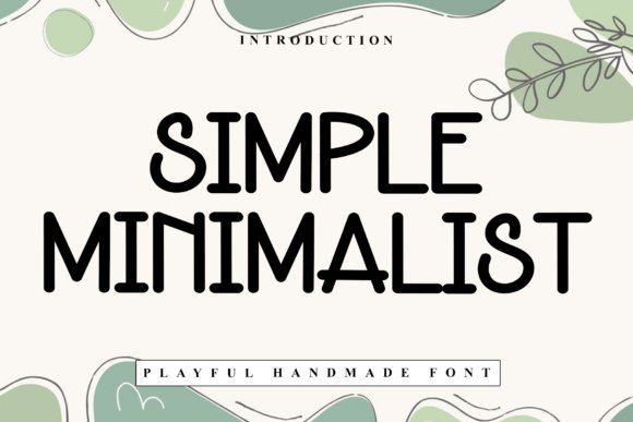
Simple Minimalist is tall, cheerful, and slightly off-kilter – a monoline script that feels deliberately handmade while staying tidy. Its slightly condensed vertical rhythm gives words a compact, energetic presence that reads friendly and upfront, making the font instantly approachable for audiences of all ages.
The even stroke width makes it ideal for consistent reproduction across both digital screens and offset printing; ink traps are minimal and the characters retain personality without fragile hairlines. Playful irregularities in baseline alignment and terminal shapes add warmth, so the typeface feels handcrafted instead of purely geometric.
Where it shines is in bold, short messaging: children’s book covers, custom stationery, uplifting social-media quotes, and brands that want to appear candid and upbeat. For run-length or dense text, pair it with a neutral sans or a crisp serif to preserve legibility while keeping the headline voice distinctly cheerful.
Download Simple Minimalist Font
My Recommendation: I’d pick Simple Minimalist when I need a bright, friendly headline that won’t look stiff-perfect for kid-focused projects, casual product packaging, or feel-good social graphics. Its compact tall forms make it great for tight layouts and stacked logo marks. I often combine it with a restrained body font to keep longer passages easy to read while letting Simple Minimalist carry the personality.
7. Spooky Minimalist Font
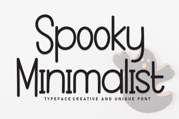
Spooky Minimalist arrives as a tidy, low-contrast display script that balances casual warmth with refined restraint. The rounded terminals and evenly spaced strokes create a calm, approachable rhythm that makes it read like an elegant, unhurried note – a quality that aligns well with Minimalist Handwriting fonts
Under the hood the typeface favors clarity: open counters, consistent stroke width and neutral joins that keep legibility high at headline sizes. Subtle quirks in a few letterforms give it personality without disrupting a pared-back aesthetic, making it easy to pair with geometric sans-serifs or clean serif faces.
Use Spooky Minimalist for branding that needs a friendly but polished voice – think boutique packaging, editorial mastheads, and social headers. It scales beautifully for product labels and web hero text, and its calm demeanor makes it a strong choice when you want handwritten charm without ornamentation.
Download Spooky Minimalist Font
My Recommendation: I’d reach for Spooky Minimalist when a project needs a human touch that stays tidy – such as artisan packaging, lifestyle blogs, or warm but professional brand identities. Its balanced letterforms give instant personality while remaining readable in short headlines and labels. For me, it’s ideal when you want approachable handwriting that still looks designed and deliberate.
8. Simple Minimalist Font
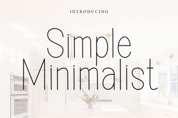
Simple Minimalist is a gentle cursive script built around soft, flowing strokes that suggest hand-drawn intimacy. Its restrained loops and modest slant keep the look sweet without becoming fussy, delivering an understated romanticism suitable for delicate design work.
Technically it leans toward lighter weight forms with generous spacing, which enhances readability at small and medium sizes. The font’s minimal ornamentation means ligatures and alternates are used sparingly, so you get a consistent, honest handwriting texture that doesn’t distract from messaging.
Pair Simple Minimalist with muted palettes, textured paper stocks, or light photography to amplify its intimate mood. It’s particularly effective for wedding invitations, boutique product labels, and social media quotes where a soft, joyful voice is desired.
Download Simple Minimalist Font
My Recommendation: I recommend Simple Minimalist for projects that require a tender, human touch – like wedding suites, artisanal brand collateral, and heartfelt stationery. Its cursive warmth adds emotion without overpowering layouts. I often use it when the brief calls for delicate charm paired with clean, modern layouts.
9. Minimalist Art Deco Font
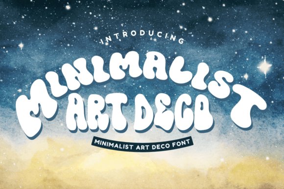
Minimalist Art Deco distills 1920s glamour into a streamlined script that emphasizes geometry and rhythm over flourish. The letterforms blend tall x-heights and elongated verticals with simplified curves, producing a refined, modern-deco voice that feels both retro and contemporary.
Designed for display use, the typeface relies on crisp terminals and consistent stroke modulation to maintain clarity in headlines and mastheads. Its pared-back ornamentation gives it strong logo potential and makes it easy to layer over photography or bold color blocks without visual conflict.
This font shines in editorial headlines, luxury branding, packaging for upscale goods, and signage where a nod to Art Deco elegance is desired without excess decoration. Combine it with minimalist layouts and high-contrast color palettes to emphasize its architectural character.
Download Minimalist Art Deco Font
My Recommendation: I’d choose Minimalist Art Deco when a design needs streamlined glamour – such as boutique identity systems, editorial spreads, or premium product packaging. It brings deco-inspired structure without the visual clutter of classic ornamentation, making it a go-to for modern luxury projects. Use it where bold, elegant headlines must carry the brand voice on their own.
10. Minimalist Font
Minimalist is a pared-back script that leans into relaxed rhythm and airy strokes, making it readable at display sizes and surprisingly clear in tighter settings. Its restrained loops and modest slant deliver a handcrafted sensibility without decorative clutter, which helps maintain professional polish across projects. That quiet personality is perfect when you want warmth without overt ornamentation.
Among designers who favor airy letterforms, this face ranks among the most adaptable Minimalist Handwriting fonts for personal branding, packaging labels, and editorial pull-quotes. Because it avoids heavy swashes and exaggerated contrast, it integrates smoothly with clean sans-serif systems and contemporary grid layouts. The open counters and predictable spacing also translate well between print and responsive web use.
On a technical level the family provides a small but thoughtful set of alternates and carefully tuned kerning so you rarely need manual fixes, preserving the organic feel while keeping production efficient. Its neutral x-height pairs well with condensed headlines or minimalist UI elements, and the light stroke weight works with subtle color palettes. If you need an understated script that elevates messaging without stealing focus, this one delivers.
My Recommendation: I use this design when a project needs human warmth but must remain refined-think boutique packaging, clean editorial pieces, or personal logos. Its subtlety means you get a handwritten voice without disrupting hierarchy, and the tidy spacing saves time in production. For clients who want personality with restraint, this font is a dependable go-to.
11. Minimalist Font
This incarnation of Minimalist is a friendly handwritten display face built to feel warm and inviting; its curves carry a playful elegance that reads as approachable rather than rustic. The charm sits in its irregular strokes and slightly bouncing baseline, which give headlines and short lines a human, joyful cadence. It’s the kind of type that immediately softens a layout.
Because it reads like a personal note, this style shines on wedding invitations, greeting cards, and artisan packaging where emotional resonance matters more than formality. Use it large for hero text or decorative bursts where the hand-drawn quirks can be appreciated; for longer passages, pair it with a simple serif or neutral sans to preserve readability. It’s particularly effective with soft color palettes and textured backgrounds that enhance its friendly personality.
From a workflow perspective, the font offers expressive alternates and ligatures that add variety when you repeat names or phrases, avoiding a monotonous look. Its display-focused proportions favor larger sizes, so be mindful of tracking when applying it at tiny scales. If you want a typeface that feels like a warm handshake, this design delivers the kind of approachable, artful voice that resonates in personal projects.
My Recommendation: I pick this font when a project needs cheerfulness and a handcrafted touch-wedding suites, seasonal campaigns, or boutique product labels come to mind. Its playful irregularities make layouts feel alive, while alternates prevent repetition in repeated words or names. Use it as a headline or accent paired with a restrained body face for balanced compositions.
12. Minimalist Font
Minimalist presents itself as a sweet, friendly handwritten face with a naturally flowing rhythm that reads as sincere and approachable. The letterforms carry subtle personality-small tails, gentle loops, and compact counters-that make the font feel custom without being ornate. Designers will notice how its simplicity supports rather than competes with imagery.
Its neutral warmth makes it a flexible choice across brand identities, social graphics, and product labels where you want to suggest handcrafted quality without leaning on rustic clichés. The moderate stroke contrast helps maintain legibility in UI microcopy or short-form text, while still conveying a distinct voice for badges and stickers. Because it’s unobtrusive, it pairs well with modern geometric sans-serifs for a balanced aesthetic.
On the technical side, the family includes basic alternates and decent kerning, keeping workflow smooth while preserving a human touch. It also adapts well to color and background variations, making it reliable for multi-platform use. If you need an everyday handwriting face that feels genuine and versatile, this one is a strong contender.
My Recommendation: I reach for this font when a project requires warmth without theatrics-think brand badges, social posts, or product tags where authenticity matters. Its friendly rhythm reads well at small sizes and complements clean, modern layouts. It’s a practical choice for designers who want approachable handwriting that won’t overpower their compositions.
13. Classy Minimalist Font
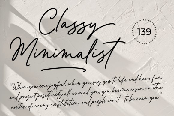
Classy Minimalist is a refined handwritten typeface built around fluid, elegant letterforms and an unusually rich set of 139 ligatures that create authentic, flowing connections. As part of the Minimalist Handwriting fonts tradition, it combines delicate strokes with subtle contrast so letters look like they were penned by a practiced hand rather than mechanically generated. The PUA-encoded glyphs and swashes are easy to access in most design apps, letting you swap alternates and lift text with one click.
Its multilingual support broadens its practical reach-perfect for wedding suites, valentines, editorial quotes, and luxury branding where a restrained but expressive script is needed. Because the shapes are airy and legible, it reads beautifully at display sizes and keeps a minimalist aesthetic without feeling cold. The built-in alternates prevent repetition in long headlines and add a bespoke signature quality.
Technically, Classy Minimalist plays well when paired with a clean sans or a light serif, offering contrast for logos, packaging, and social media assets. Use the ligatures and swashes sparingly to maintain a modern, uncluttered look while benefiting from a handcrafted personality. Overall it’s a versatile script that bridges contemporary minimalism and traditional calligraphic warmth.
Download Classy Minimalist Font
My Recommendation: I reach for Classy Minimalist when a project needs a graceful, human touch without excess ornamentation. Its wealth of ligatures and easy-access swashes make branding and wedding materials feel bespoke, while the clean letterforms keep designs modern. Use it for invitations, premium packaging, and signature-style logos where elegance and legibility matter.
14. Minimalist Farmhouse Font
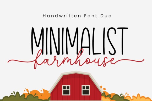
Minimalist Farmhouse is a charming duo consisting of a casual handwritten script and a complementary sans-serif, designed to give projects a warm yet contemporary personality. The handwritten partner carries a relaxed, hand-drawn texture that suggests craft and authenticity, while the sans provides crisp readability for body copy and captions. That pairing makes it straightforward to establish typographic hierarchy without hunting for matching faces.
PUA encoding means the alternates, ligatures, and decorative swashes are accessible in most editors, so you can create subtle variations and rustic accents quickly. The overall aesthetic leans toward approachable minimalism-clean layouts with a hint of handmade charm-making it ideal where understated friendliness is desired. Its light, breezy strokes work well at both small and medium display sizes.
Use Minimalist Farmhouse on labels, boutique branding, editorial headers, or social posts where an intimate, homey tone helps convey trust and personality. The sans companion is especially useful for packaging copy or website UI that needs clarity without undermining the handcrafted vibe. It’s a versatile toolkit for makers, small businesses, and lifestyle brands aiming for an effortless rustic-modern look.
Download Minimalist Farmhouse Font
My Recommendation: I like Minimalist Farmhouse for projects that need a handcrafted feel but also require clean, functional typography. The duo format saves time and keeps designs cohesive, from product labels to social templates. Choose it when you want warmth and simplicity-think boutique packaging, cafe menus, and cozy brand identities.
15. Balpoint Minimalist Font – Minimalist Handwriting fonts
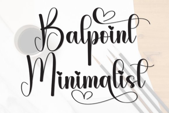
Balpoint Minimalist is a handcrafted display font that radiates playful warmth through rounded terminals and slightly irregular strokes that read as intentionally hand-drawn. Its personality is winsome and joyful rather than formal, making it excellent for friendly, emotive applications like greeting cards, children’s packaging, and candid social graphics. The typeface emphasizes charm over strict uniformity, so each word feels personal and approachable.
Visually, Balpoint favors compact letterforms with soft joins that maintain legibility while conveying a tactile, illustrated quality. It excels in short headlines and names where character is the priority, rather than long paragraphs where the idiosyncrasies might become fatiguing. Pairing it with a neutral sans or a minimal serif helps it sit comfortably within more restrained layouts.
Because of its distinctive voice, Balpoint Minimalist is best treated as a focal decorative element-use it for logos, invitation titles, and product hero text to inject warmth without looking twee. It transforms simple copy into affectionate narratives and performs beautifully in print and pixel formats that benefit from a human touch.
Download Balpoint Minimalist Font – Minimalist Handwriting fonts
My Recommendation: I’d use Balpoint Minimalist when a project needs to feel cheerful and intimate-perfect for kids’ brands, party invites, or artisanal packaging. Its handcrafted quirks give headlines personality while staying readable, and it pairs naturally with clean partners to avoid visual clutter. Reach for it when you want typography that feels like a friendly note from a real person.
16. Minimalist Christmas Font
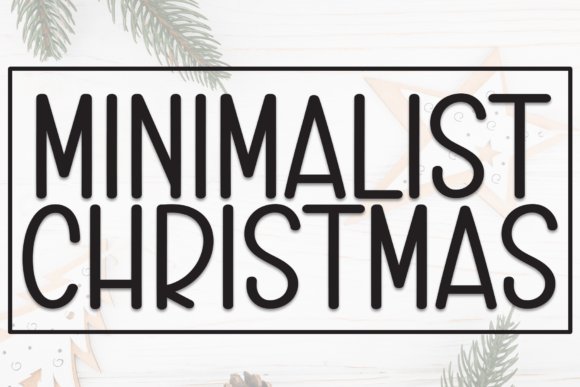
Minimalist Christmas Font is a restrained, hand-drawn script that blends seasonal charm with clean, contemporary strokes. The letterforms maintain a narrow rhythm and generous spacing, giving each character clarity while preserving the warmth of hand lettering; this balance is why designers often include Minimalist Handwriting fonts in holiday identity work. Subtle alternates and gentle terminal strokes make the face feel handcrafted without becoming ornate, so it reads well at display sizes and on packaging.
Technically, the font sports carefully tuned kerning and a set of stylistic alternates that let you craft bespoke logotypes and headers quickly. Its low-contrast strokes and open counters keep legibility high on photo overlays and short lines of copy, while ligatures provide a polished, connected look for signature-style words. The font’s economy of form means it pairs effortlessly with geometric sans-serifs or thin slab faces for cards, tags, and labels.
For seasonal campaigns, the Minimalist Christmas Font performs best when used sparingly-think mastheads, hero headlines, and brandmarks rather than body text. It prints beautifully on textured stocks and responds well to foil or letterpress treatments thanks to its clean shapes. If you need a festive script that feels modern and handcrafted without fuss, this face delivers that aesthetic with restraint and clarity.
Download Minimalist Christmas Font
My Recommendation: I recommend this font when you want holiday designs that feel personal but not fussy. Its tidy hand-lettered character works wonderfully for greeting cards, gift tags, and boutique branding where readability and warmth are both priorities. Use it with a neutral sans for supporting copy and reserve alternates for focal words to keep projects feeling curated.
17. Simple Minimalist Font
Simple Minimalist Font is a flowing handwritten script with an emphasis on openness and casual elegance. Each glyph leans into a relaxed baseline and moderate stroke contrast, giving designs a friendly, human tone without heavy ornamentation. This makes it an excellent choice for wall art, social media graphics, and overlays where you want a genuine handwriting feel that remains modern and readable.
The font includes alternate characters and basic ligatures that allow for subtle variation so repeated words look natural, and its light-weight strokes scale nicely across both digital and print formats. It performs well at small sizes for watermarks and labels because the shapes avoid crowded counters and extreme flourishes. Pair it with a neutral sans or a narrow serif to create well-balanced layouts for invitations and product packaging.
Practical for everyday branding, Simple Minimalist adapts to many contexts: from wedding stationery to lifestyle product mockups. I like to use it when a relaxed, personal voice is needed without sacrificing typographic cleanliness. The font’s minimal approach to ornamentation makes it particularly versatile for contemporary design systems and social templates.
Download Simple Minimalist Font
My Recommendation: I’d reach for Simple Minimalist when a project needs a warm, personable hand-lettered look that stays understated. It’s ideal for social posts, wedding invites, and product labels where clear readability and an approachable tone are important. Use it with a restrained sans for hierarchy and reserve its alternates for headline treatment to maintain visual interest.
18. Minimalist Font
Minimalist Font offers a refined, signature-style script that emphasizes elegant rhythm and measured strokes. The letterforms are deliberately simple-long ascenders, modest loops, and minimal contrast-creating a look that reads as intentional and contemporary rather than overly decorative. This controlled handwriting aesthetic works particularly well for upscale stationery and editorial branding where subtlety is key.
From a technical standpoint the font balances expressive terminals with tight internal spacing, which makes it ideal for monograms, sign-offs, and photographic overlays. It includes a handful of alternates for smoother connections and selectively applied ligatures that enhance flow without crowding the type. When used in print, Minimalist holds up for foil stamping and blind emboss due to its clean, well-defined shapes.
For designers, the font excels when paired with a light grotesque or a delicate serif to create contrast and visual hierarchy. It’s best used for headlines, logos, and short lines of text rather than extended reading. If your project calls for a sophisticated, lived-in signature quality that remains modern and subtle, this typeface is an excellent choice.
My Recommendation: I often pick this font for projects that demand understated elegance-think boutique branding, luxe wedding suites, or author signatures in editorial layouts. Its restraint gives designs a bespoke, timeless feeling without appearing fussy. Combine it with minimalist color palettes and clean sans-serifs to emphasize its refined character.
19. Modern Minimalist Font
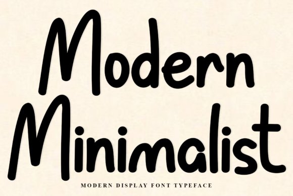
Modern Minimalist feels like a friendly note left on a kitchen table: warm, casual, and instantly approachable. Its rounded terminals and gently varied stroke widths give text a hand-crafted personality without feeling fussy, making headlines and short blocks of copy read as intimate rather than decorative.
As one of the Minimalist Handwriting fonts , this design strikes a careful balance between human warmth and modern restraint – the playful letterforms retain a clean rhythm that keeps layouts feeling contemporary. That balance makes it especially effective for social media banners, personal branding, and invitation suites where readability and charm must coexist.
On the technical side the font ships with PUA-encoded glyphs and broad app compatibility (Photoshop, Illustrator, Canva, etc.), so alternates and special characters slot into most workflows easily. Use slightly increased tracking for longer lines to preserve its airy character, and reserve tighter spacing for short headlines to maximize its friendly impact.
Download Modern Minimalist Font
My Recommendation: I reach for Modern Minimalist when I want designs that feel personal but polished – think boutique socials, hand-lettered logos, and wedding invites. Its rounded strokes add approachability without sacrificing legibility, and the PUA glyphs give creative flexibility. Pair it with a neutral sans for contrast to keep layouts contemporary and uncluttered.
20. Reindeer Minimalist Font
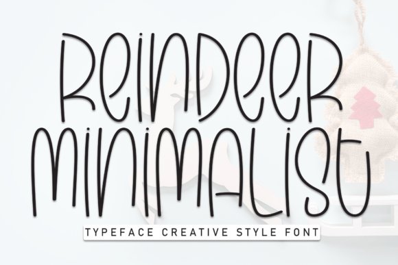
Reindeer Minimalist Font is a sweet, handwritten display face with a naturally playful cadence that never reads gimmicky. The strokes have a slightly uneven baseline and subtle bounce, which injects personality into every word and makes it feel hand-scripted rather than mechanically produced.
Its cheerful attitude is perfect for wedding stationery, greeting cards, seasonal packaging, and youth-oriented branding where a hint of whimsy helps messages land. Because the letterforms are deliberately informal, the font performs best at larger sizes where the quirky details and soft terminals can be appreciated.
For practical use, combine Reindeer with a clean geometric sans to prevent visual competition, and allow generous leading to preserve its airy feel. Keep an eye on kerning pairs in display settings and consider using alternates for repeated characters to maintain a truly handmade look throughout a layout.
Download Reindeer Minimalist Font
My Recommendation: I’d use Reindeer Minimalist Font for projects that benefit from a joyful, handcrafted touch – think boutique holiday packaging or charming wedding invites. Its lively rhythm brings warmth and approachability, but it shines most at display sizes. Pair it with minimal supporting type to let the personality take center stage.
21. Minimalist Font
Minimalist Font delivers a pared-back handwritten voice that’s neither too thin nor overly bold, which makes it a versatile workhorse in a designer’s toolkit. The even stroke weights and restrained curves give it a neat, approachable presence that reads well across different media without drawing undue attention.
Because of its balanced proportions, this font adapts easily from packaging and headlines to subtle editorial accents and web UI labels. Its neutrality preserves readability at smaller sizes while still conveying a handcrafted sensibility when used for short phrases or signatures.
For best results pair Minimalist with a refined serif for editorial projects or with a crisp sans for modern branding – both combinations emphasize its calm, understated charm. Small adjustments to tracking and leading help maintain its clarity in dense layouts, and using it sparingly as a personality accent keeps designs elegant and intentional.
My Recommendation: I recommend Minimalist Font when you need a handwritten feel that won’t overpower the rest of your design – ideal for packaging, subtle branding, and editorial accents. Its balanced weight and clean shapes make it dependable across sizes, and it pairs well with both sans and serif companions. Use it as a tasteful accent to add warmth without sacrificing clarity.
22. Minimalist Font
Minimalist wears a surprising holiday personality: it blends cheerful decorative strokes with controlled letterforms so words feel festive without becoming fussy. Among Minimalist Handwriting fonts , this design stands out for its warm terminals and tiny ornamentals that evoke vintage greeting cards while keeping a contemporary silhouette.
The font is PUA-coded, giving you quick access to an array of swash alternates, contextual ligatures, and decorative glyphs that make rapid layout work painless. Those extras are especially useful for short headlines, gift tags, and social media banners where a handful of charming alternates can create variety without extra design work.
For best results pair it with a clean sans for body copy and leave generous tracking in dense words to preserve legibility at small sizes. It’s also forgiving in print processes-letterpress or foil highlight the playful shapes nicely-so experiment with scale and texture to amplify its nostalgic, celebratory vibe.
My Recommendation: I’d choose this Minimalist when I need a holiday-forward, friendly script that still reads cleanly. The PUA glyphs let me create unique greetings and labels without building custom lettering, and its restrained feel keeps the overall design modern. Use it for seasonal packaging, festive social posts, and limited-run stationery where charm matters but clarity can’t be sacrificed.
23. Minimalist Font
This take on Minimalist trims the exuberance down to a subtler, more versatile handwriting script: think restrained loops, soft stroke contrast, and an airy rhythm between characters. It reads as intentionally simple, making it suitable for identity work where personality is required but loud ornamentation would distract.
PUA coding unlocks stylistic alternates and ligature pairs that let you introduce just a touch of flair without rebuilding words by hand. Those alternates are ideal for logos and hero headlines where a single flourish can become a brand signature across print and digital touchpoints.
In practice, use this version for minimal packaging, business cards, and blog headers-areas that benefit from a human touch but demand legibility. Light tracking, careful kerning, and pairing with geometric sans-serifs will emphasize its modern, understated charm.
My Recommendation: I reach for this Minimalist when I want a handwriting voice that’s quiet but distinctive-perfect for modern brands that trade bravado for refinement. The subtle alternates mean a logo can feel handcrafted without sacrificing consistency, and it scales well from web to print. It’s my go-to for minimalist identity systems, editorial mastheads, and understated product labels.
24. Minimalist Handmade Font
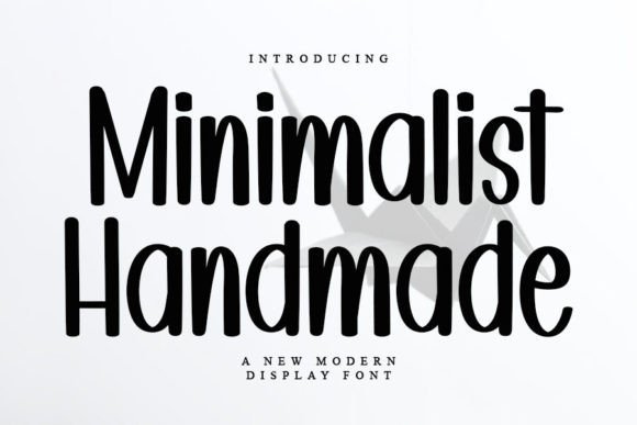
Minimalist Handmade celebrates the imperfections of hand-lettering: uneven strokes, slightly irregular baselines, and tactile terminals that read as authentic and human. The overall rhythm remains compact, so it feels intentional rather than sloppy-great when you want a handcrafted look that still behaves in layouts.
Like the others, this family is PUA-coded, unlocking alternate characters, swashes, and ligature sets to vary repeated words and replicate natural handwriting variance. Those options make it simple to create convincing personal notes, artisan packaging, or wedding suites without building dozens of custom glyphs.
For production, favor textured papers and tactile finishes (emboss, letterpress) to amplify the handmade quality; avoid over-condensing text blocks to preserve the character shapes. This font works beautifully for boutique labels, artisanal menus, and any project that benefits from a warm, human presence.
Download Minimalist Handmade Font
My Recommendation: I’d use Minimalist Handmade when I need a typeface that reads like an actual hand-drawn signature-ideal for small-batch product branding or intimate stationery. Its alternates give the visual variety of real handwriting while keeping output efficient, and it reproduces beautifully in textured print finishes. If your goal is authenticity and charm over slick polish, this is the right choice.
25. Book Minimalist Font
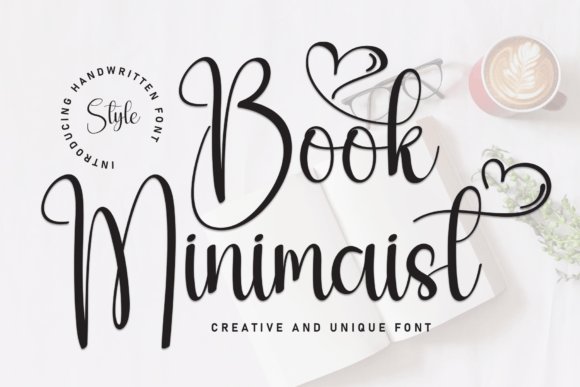
Book Minimalist Font is a gently flowing hand-lettered typeface that balances warmth with restraint. Its organic strokes and soft terminals create an intimate, readable texture that feels like a personal note rather than a formal script, making it perfect for pared-back branding and editorial accents. As part of a curated set of Minimalist Handwriting fonts , it brings the tactile charm of handwriting while keeping compositions airy and uncluttered.
The letterforms prioritize legibility: moderate x-height, even spacing, and consistent stroke width help it read clearly at small sizes or on screens. Subtle irregularities in the curves preserve a handcrafted quality without compromising clean lines, so it pairs exceptionally well with minimalist sans-serifs or refined serifs.
Use Book Minimalist for invitations, book covers, boutique labels, personal stationery, and lifestyle blogs where a sincere, human touch is needed. Its restrained personality means it supports messaging without overwhelming layouts, making it a go-to for designs that need honest charm and modern clarity.
My Recommendation: I recommend Book Minimalist when you want handwriting that reads like a friendly, handwritten note but still feels modern and neat. I often reach for it on boutique packaging, intimate wedding invites, and about pages where authenticity matters. It’s especially useful when you need a human voice in a clean, minimal layout.
26. Winter Minimalist Font
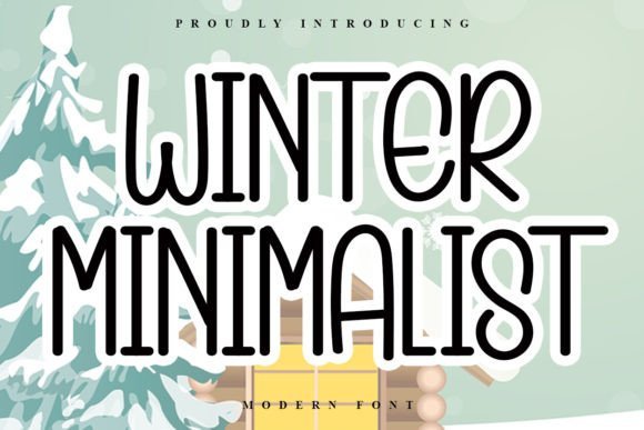
Winter Minimalist Font delivers a sweet, approachable handwritten voice with a light, airy rhythm that evokes casual handwritten letters. The strokes are relaxed and slightly rounded, giving designs a friendly, accessible character without tipping into overly decorative territory. It’s ideal when you want hand-drawn warmth without visual clutter.
Technically, Winter Minimalist emphasizes open counters and generous spacing, which improves readability across print and digital interfaces. The playfulness of certain letterforms-think gentle tails and lifted terminals-adds personality while remaining flexible enough to pair with clean geometric typefaces for contrast.
Apply this font to seasonal graphics, kid-focused packaging, lifestyle blogs, and social templates that benefit from an inviting, human touch. Its versatility makes it suitable for headlines, short quotes, and accent copy where an informal, friendly tone is desired.
Download Winter Minimalist Font
My Recommendation: I’d choose Winter Minimalist when a project needs warmth and whimsy without losing compositional simplicity. It shines on seasonal promotions, children’s products, and casual brand identities that want to feel friendly and modern. The font’s openness also makes it reliable for web use and marketing collateral.
27. Bride Minimalist Font
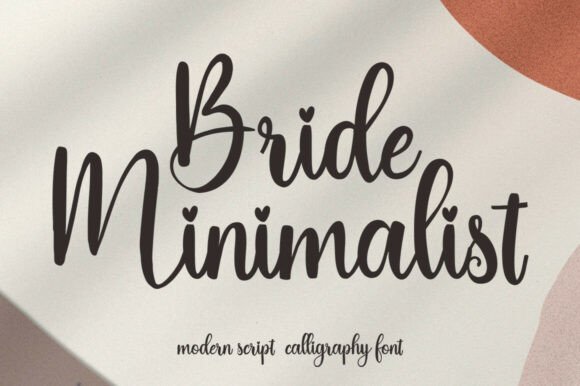
Bride Minimalist Font is a modern script calligraphy face that fuses elegant handwriting with playful, romantic details. Its flowing strokes and refined connections create a graceful silhouette, while tiny heart-inspired dots and subtle swashes introduce a bespoke, sentimental flavor. The result is a script that reads as handcrafted yet composed.
The consistent stroke weight and balanced letterforms make Bride Minimalist surprisingly versatile: it maintains clarity at display sizes and harmonizes beautifully with both serif and sans companions. Designers will appreciate its deliberate spacing and restrained ornamentation, which let the type convey romance without overpowering the layout.
This typeface is a natural fit for wedding stationery, boutique branding, product labels, and social media assets that need a romantic but modern voice. Use it for names, taglines, and signature-style marks where elegance and personality must coexist.
Download Bride Minimalist Font
My Recommendation: I recommend Bride Minimalist for projects that require a romantic, refined script with a contemporary edge. I reach for it on wedding suites, luxe product packaging, and lifestyle brands seeking a personable yet polished identity. Its balanced forms make pairing simple, so you get romance without sacrificing design control.
28. Retro Minimalist Font
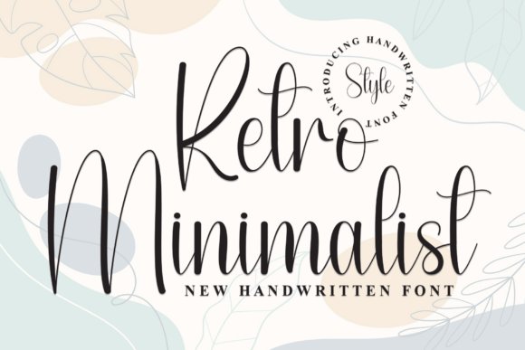
Retro Minimalist sits confidently among Minimalist Handwriting fonts , marrying mid-century charm with deliberately restrained strokes. The letterforms favor gentle, flowing curves over ornate flourishes, which gives the face an elegant but unpretentious character that reads well at display sizes.
Technically, the font balances soft terminals and open counters to retain legibility even when scaled down; its rhythm of stroke contrast creates a steady, human cadence without becoming fussy. Subtle irregularities in baseline and stroke width lend an authentic handwritten feel while keeping overall geometry tidy.
Use it where you want a nostalgic personality without clutter-premium packaging, boutique logos, and editorial headlines benefit most. Pair Retro Minimalist with a neutral sans for body text or with muted textures to amplify the vintage-but-clean aesthetic.
Download Retro Minimalist Font
My Recommendation: I reach for Retro Minimalist when a project needs warmth with restraint. Its retro references add personality without overpowering layouts, making it ideal for boutique branding and tasteful invitations. If you want a handwritten voice that remains readable and sophisticated, this font delivers.
29. Handmade Minimalist Font
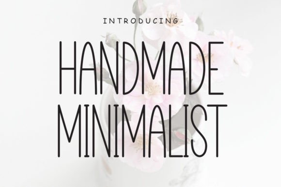
Handmade Minimalist is a delicate cursive that reads like a thoughtful note on textured paper: intimate, airy, and intentionally simple. The strokes are light, slightly irregular, and unforced, giving an organic signature-style result that feels personal rather than overly styled.
Design-wise, it emphasizes open counters, generous letter spacing, and gentle ascenders, which together enhance readability while preserving a handcrafted look. It avoids heavy swashes, so the font stays versatile across both digital and print uses without competing with other graphic elements.
This is a natural choice for wedding stationery, cozy brand identities, or lifestyle blogs where emotion and clarity matter. Pair it with warm palettes and minimal layouts to let its quiet charm act as the focal point without overwhelming the page.
Download Handmade Minimalist Font
My Recommendation: I use Handmade Minimalist when a project needs a sincere, human touch-think boutique stationery or personal websites. Its restrained script gives warmth without becoming decorative, so it pairs well with clean layouts and simple imagery. It’s perfect when you want handwriting that feels genuine and modern.
These 29 Minimalist Handwriting fonts provide a range of understated, versatile options that add warmth and authenticity without clutter. Whether you need a delicate signature script or a clean handwritten display, this list helps you find styles that balance elegance and clarity.
Test a few favorites in your layouts, check licenses for commercial use, and pair them with neutral sans-serifs or light serif companions for best results. Embracing minimal handwriting fonts can keep your designs fresh and effective in 2026.