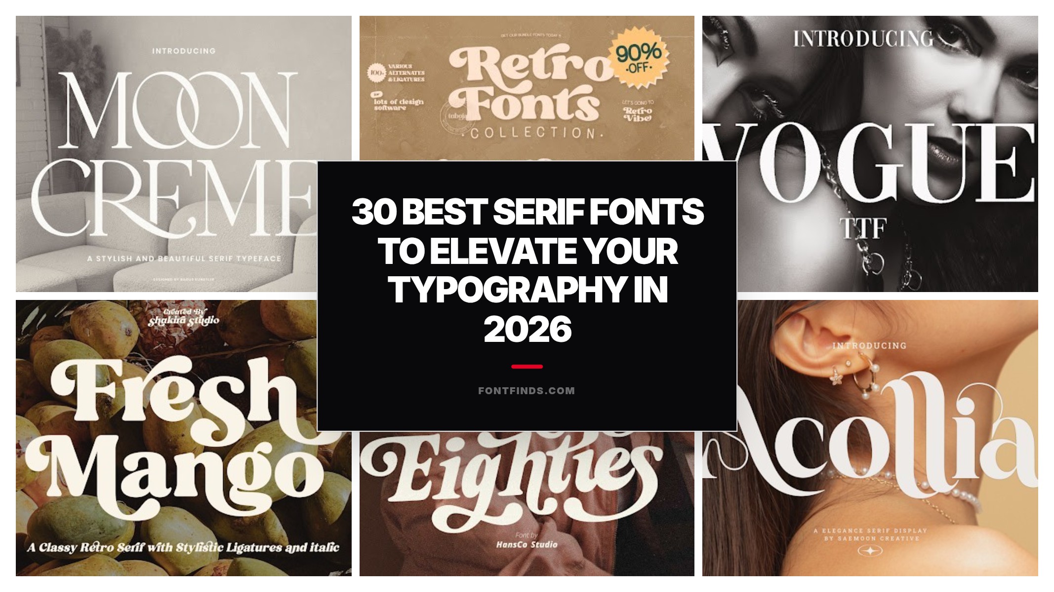
30 Best Serif Fonts to Elevate Your Typography in 2026
Finding the perfect typeface is a crucial step in any design process, and serif fonts continue to reign supreme when it comes to adding a touch of sophistication, readability, and timeless elegance to your work. Whether you are building a modern brand identity, formatting an editorial layout, or designing a high-end website, the right typography can make or break your aesthetic. In 2026, we are seeing an incredible resurgence of classic letterforms reimagined for the digital age. To help you navigate the sea of typography, we have curated a definitive list of the 30 best serif fonts available this year. Get ready to elevate your creative projects and captivate your audience with these stunning choices.
1. Moon Creme Font by Bagus Kunstler
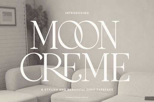
When you are looking for a serif that effortlessly bridges the gap between classic typography and modern design trends, the Moon Creme Font by Bagus Kunstler is an absolute standout. Updated for 2026 with refined kerning and broader language support, this typeface features beautifully rounded terminals and a smooth, almost velvety contrast. It avoids the harshness of traditional old-style serifs, offering instead a creamy, approachable aesthetic that feels both luxurious and inviting. The meticulous attention to detail in the letterforms makes it a true joy for designers seeking a high-end, yet accessible, typographic voice.
In practical application, Moon Creme truly shines in the lifestyle and boutique sectors. I highly recommend deploying it for premium skincare packaging, upscale bakery branding, or elegant editorial headers where you want to evoke a sense of quiet luxury. Because of its softer curves, it performs phenomenally well at larger display sizes, though it remains surprisingly legible in short introductory paragraphs. To maximize its impact, pair it with a stark, geometric sans-serif to create a sophisticated visual tension that anchors your layout perfectly.
2. Retro Fonts Collection Font by Taboja Studio
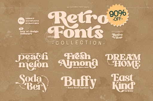
Nostalgia continues to dominate the design landscape in 2026, and the Retro Fonts Collection by Taboja Studio is a masterclass in capturing vintage charm without feeling utterly dated. This collection relies heavily on chunky, high-contrast serif structures reminiscent of iconic 1970s and 1980s editorial typography. What makes this specific toolkit so impressive is how it balances that heavy-footed retro weight with clean, digitally optimized curves, ensuring that your text renders perfectly crisp across both high-resolution screens and print mediums. It is unapologetically bold, bringing a warm, groovy character to any canvas it graces.
From a practical standpoint, this collection is your secret weapon for standout merchandise design, nostalgic café branding, and eye-catching event posters. The inherent weight of these retro serifs means they demand attention, so they are best utilized strictly for headlines, logotypes, and short pull quotes. If you try to use them for body copy, your design will quickly become illegible and muddy. My advice is to embrace the retro aesthetic fully by pairing these chunky serifs with warm, earthy color palettes and a muted, monolinear sans-serif for secondary text to keep the overall composition grounded and balanced.
3. Vogue Font by vladimirnikolic
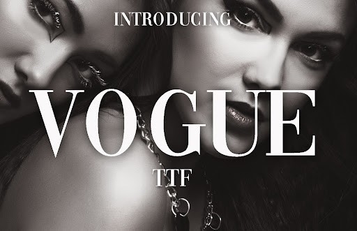
If dramatic, high-fashion elegance is what your project demands, the Vogue Font by vladimirnikolic is a premier choice that instantly elevates a design. This typeface is characterized by extreme contrast between its razor-thin hairlines and profoundly thick main strokes, channeling the quintessential look of iconic fashion magazines. As we push through 2026, the demand for striking, luxurious typography remains high, and Vogue delivers exactly that with its sharp, sophisticated, and slightly aggressive letterforms. It is a font designed to make a statement, exuding wealth, exclusivity, and impeccable taste.
Because of its extreme stroke contrast, Vogue must be handled with precise care. It is strictly a display typeface; using it for body copy is a critical mistake, as those delicate hairlines will entirely vanish on lower-resolution screens or in smaller print. I strongly recommend reserving it for monumental editorial spreads, luxury jewelry branding, or high-end architectural portfolios. To get the best results, keep your tracking relatively tight to create visually stunning word shapes, and always ensure there is significant contrast between the text color and the background to preserve the legibility of its thinnest elements.
4. Fresh Mango Font by Shakira Studio
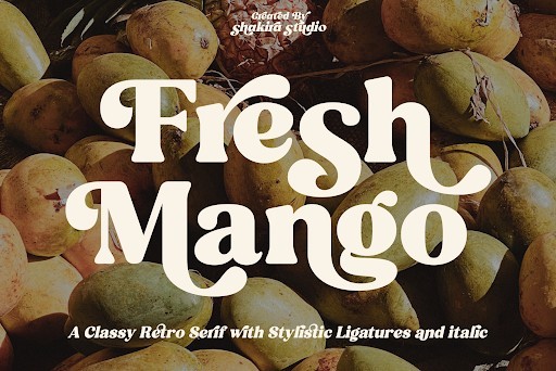
Stepping away from the traditional rigidity often associated with the serif category, the Fresh Mango Font by Shakira Studio is a breath of vibrant, organic air. This delightfully playful typeface features a slightly bouncy baseline, softly rounded edges, and an inherently welcoming personality that rejects formal stiffness. In the current 2026 design climate, where brands are increasingly striving for authentic, human-centric identities, Fresh Mango provides a perfect typographic solution. It manages to retain the structural authority of a serif while injecting a generous dose of whimsy and approachability.
This font is an absolute powerhouse for projects that need to feel fresh, natural, and friendly. It is incredibly effective for organic food and beverage packaging, vibrant children’s book covers, and casual, artisanal lifestyle blogs. When setting Fresh Mango, do not be afraid to let its quirky nature take center stage. I recommend using a generous line height if you are setting it in multi-line quotes or headers to allow the bouncy letterforms room to breathe. Paired with bright, punchy colors and hand-drawn illustrations, this typeface will instantly make your branding memorable and emotionally resonant.
5. Ethereal Font by kereatype
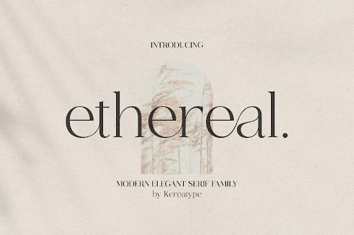
Kereatype’s Ethereal Font truly lives up to its captivating name, offering a delicate, airy serif experience that feels almost weightless on the page. Designed with an incredibly refined, minimalist structure, it features subtle, elongated serifs and sweeping curves that feel remarkably contemporary for top-tier 2026 design trends. Unlike heavier serifs that anchor a design with brute force, Ethereal commands attention through quiet elegance and precision. It is the typographic equivalent of fine silk, providing a level of sophistication that feels effortlessly chic and highly curated.
Ethereal is a dream typeface for projects that require a light touch and a premium feel. I frequently recommend it for high-end wedding invitations, holistic wellness brand identities, and minimalist photography portfolios. Due to its exceptionally delicate nature, you must be extremely mindful of contrast; never place this font over busy background imagery, as its fine details will easily get lost. Instead, give it plenty of negative space and let its quiet elegance breathe. Pairing Ethereal with a highly legible, ultra-clean sans-serif will ensure your design remains exceptionally functional while retaining its luxurious, airy aesthetic.
6. Bride Font by elvinova
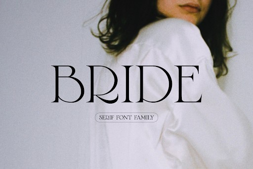
Stepping into the spotlight of modern luxury typography, Bride Font by elvinova is an absolute masterclass in refined serif design. As we navigate the aesthetic trends of 2026, there is a clear shift toward elegance that does not scream for attention but rather commands it through flawless execution. Bride Font achieves exactly this with its sweeping, delicate curves and razor-sharp serifs, bringing a bespoke, high fashion edge to any canvas. The letterforms carry a certain poetic rhythm, offering high-contrast strokes that feel simultaneously classic and undeniably contemporary. It is a typeface that feels custom-tailored for the romantic at heart, yet structured enough to hold its ground in serious editorial layouts.
From a practical standpoint, this font is a powerhouse for boutique branding, high-end wedding stationery, and editorial mastheads. When using Bride Font, I highly recommend letting it breathe; generous leading and careful kerning will allow its elegant ligatures to truly shine. It pairs magnificently with a stark, geometric sans-serif to create a dynamic typographic hierarchy. Because of its delicate hairline strokes, you will want to reserve it for display sizes—think large headers and logo marks—to ensure the sophisticated details remain crisp and legible across both print media and the latest high-resolution displays.
7. Sunday Eighties Font by HansCo
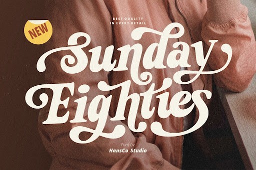
Sunday Eighties by HansCo is a brilliant homage to the bold, unapologetic typography of the 1980s, reimagined through the lens of a sophisticated modern serif. Over the past few years leading up to 2026, the resurgence of retro aesthetics has evolved, moving away from pure kitsch and leaning into polished, nostalgic charm. Sunday Eighties captures this zeitgeist perfectly. It features chunky, confident serifs and subtle curves that evoke the feeling of vintage magazine covers and classic vinyl sleeves. Yet, HansCo has meticulously balanced the proportions to ensure it meets today’s stringent standards for legibility and digital rendering, making it far more versatile than a mere novelty font.
In practice, Sunday Eighties is your secret weapon for standout branding, eye-catching packaging, and punchy social media campaigns. It thrives in environments where you want to inject personality and warmth without losing typographic authority. For optimal impact, try setting it in warm, retro-inspired color palettes like burnt oranges, mustard yellows, and deep teal. Because of its heavier weight and distinct character, it functions best as a display face. Pair it with a clean, unassuming body text font so it does not fight for the reader’s attention, allowing its vintage charisma to anchor the design effortlessly.
8. Letter Magic Font by HansCo
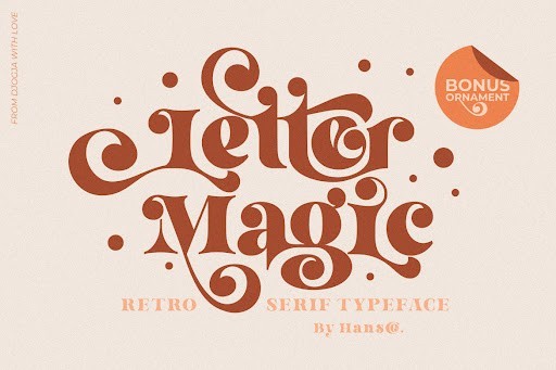
True to its name, Letter Magic by HansCo injects a whimsical, enchanting quality into the traditional serif category. As brand storytelling becomes increasingly vital in 2026, designers need typefaces that carry an inherent narrative voice. Letter Magic delivers this with its bouncy baseline, slightly unpredictable axis, and an array of mesmerizing alternate characters and swashes. It feels like stepping into the pages of a beautifully illustrated fairytale, yet it retains a structural integrity that keeps it from veering into amateur territory. The serifs themselves are gently bracketed, giving the font a soft, approachable, and distinctly human touch that automated, purely geometric typefaces completely lack.
This font is an absolute dream for children’s publishing, lifestyle blogs, artisanal food packaging, and any project that requires a sprinkle of joy and curiosity. To get the most out of Letter Magic, dive deep into its OpenType features. Mixing and matching the standard glyphs with its playful ligatures allows you to create wordmarks that look entirely custom-lettered. My advice is to use it for short, impactful titles or pull quotes where its quirky details can be fully appreciated. Keep the surrounding design elements relatively minimal to let the typography serve as the primary visual anchor.
9. Blushing Rose Font by saridezra
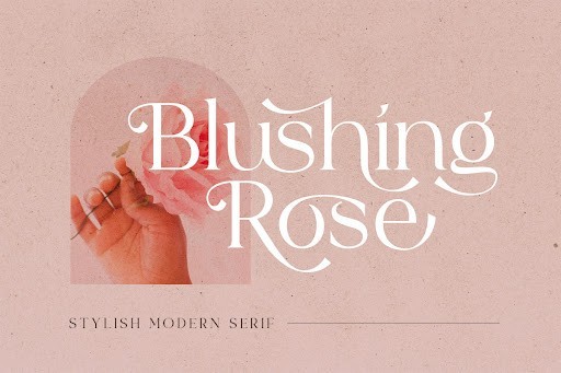
Blushing Rose by saridezra is a masterstroke in feminine typography, offering a delicate, romantic serif that feels both intimate and intensely glamorous. What makes this font stand out in the 2026 design landscape is its breathtaking contrast between the voluptuous, sweeping curves and the needle-thin hairlines. Saridezra has managed to capture the fragile beauty of botanical elements and translate them into a functional, highly expressive typeface. The subtle italicization options and elegant swashes give it a lyrical, flowing energy, making the text look less like a printed word and more like a carefully choreographed dance across the page.
You will find Blushing Rose to be an indispensable asset when designing for the beauty, wellness, and luxury floral sectors. It is tailor-made for perfume packaging, high-end cosmetic labels, and sophisticated editorial spreads. Because the thin strokes are exceptionally delicate, it requires a thoughtful approach to sizing and contrast; always ensure it is set against a background that allows those fine details to pop without getting lost in the visual noise. Pair it with a highly legible, low-contrast sans-serif for body copy to maintain an air of modern sophistication, ensuring your elegant headlines remain the undeniable focal point of your composition.
10. Unexpected Typewriter Font by anasfonts
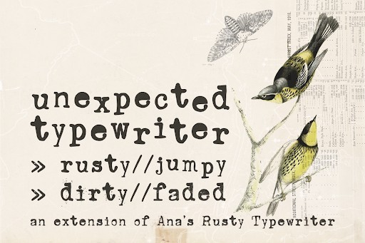
In a world saturated with hyper-polished vector graphics, Unexpected Typewriter by anasfonts brings a much-needed dose of raw, tactile authenticity to the digital workspace. This font bridges the gap between the rigid, mechanical nature of traditional slab serifs and the organic, slightly flawed charm of an antique ribbon typewriter. As we see a growing movement toward analog nostalgia in 2026, this typeface answers the call perfectly. It features slightly distressed edges, uneven ink bleed simulations, and a monospaced rhythm that instantly transports the reader. However, unlike actual vintage typewriters, anasfonts has optimized the kerning and legibility for modern screens, offering the absolute best of both worlds.
The practical applications for Unexpected Typewriter are surprisingly vast. It is an incredible choice for true-crime podcast artwork, investigative journalism layouts, indie zines, and historical fiction book covers. It also works brilliantly as a textural contrast in ultra-modern web design, breaking up clean digital grids with its gritty, analog voice. When utilizing this font, lean into its imperfections. Use it for subheadings, captions, or introductory paragraphs where you want to establish an intimate, conversational, or documentary-style tone. It pairs wonderfully with stark neo-grotesque typefaces, creating a striking visual tension between the handmade past and the digital present.
11. Fantasy Magist Font by Storytype Studio
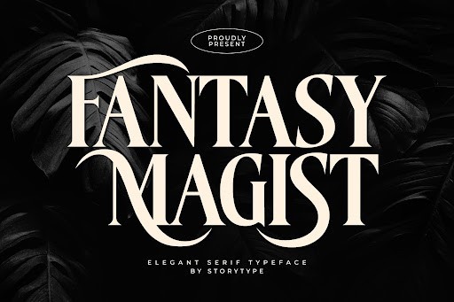
When it comes to blending whimsical charm with traditional typographic structure, the Fantasy Magist Font by Storytype Studio truly stands out in the 2026 design landscape. This gorgeous serif brings an undeniable sense of magic to the table, featuring elegantly sweeping curves and sharp, precise terminals that catch the eye instantly. Unlike many stylized display fonts that sacrifice readability for flair, Fantasy Magist maintains a strong, legible baseline. The craftsmanship here is evident in the meticulous kerning and the balanced weight distribution, making it an absolute joy to work with for designers looking to add a touch of sophistication and fantasy to their projects.
From a practical standpoint, this font is a powerhouse for luxury branding, high-end editorial layouts, and intricate book cover designs. I highly recommend utilizing Fantasy Magist at larger point sizes to fully appreciate the delicate nuances of its letterforms. It pairs beautifully with a clean, geometric sans-serif, allowing the serif’s ornate details to take center stage without overwhelming the composition. Whether you are crafting a boutique winery label or an upscale lifestyle magazine spread, this typeface provides the authoritative yet enchanting tone your artwork needs.
12. Paris Forbel Font by HansCo
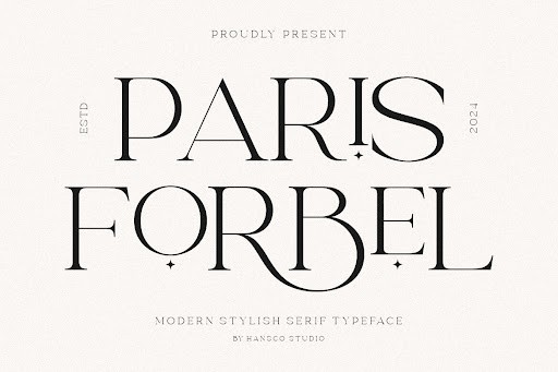
Capturing the romantic, high-fashion essence of its namesake city, the Paris Forbel Font by HansCo is a masterclass in modern Didone-style typography. As we navigate the design trends of 2026, there is a massive resurgence in high-contrast serifs, and Paris Forbel perfectly answers that call. The font juxtaposes razor-thin hairlines with dramatically thick stems, resulting in a luxurious, chic aesthetic that immediately elevates any canvas. Its sophisticated character set is both authoritative and graceful, proving that classic elegance never truly goes out of style when executed with such expert precision.
This typeface is purpose-built for the worlds of fashion, cosmetics, and premium lifestyle branding. Because of the extreme contrast in its strokes, I strongly advise reserving Paris Forbel for display purposes—think majestic headlines, elegant logos, and striking editorial titles. Using it for small body copy could lead to legibility issues on lower-resolution screens. To maximize its impact, give the letters plenty of breathing room; generous tracking will enhance its luxurious feel. Pair it with a subtle, low-contrast sans-serif to create a visually striking hierarchy that guides the reader effortlessly.
13. Bright Font by Dharmas Studio
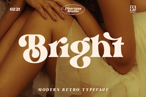
Dharmas Studio has completely captured the current cultural zeitgeist with the Bright Font, a masterful modern retro serif that seamlessly bridges the gap between 1970s nostalgia and contemporary 2026 design standards. What makes Bright so exceptional is its robust, confident weight combined with gorgeously fluid swashes and ligatures. The letterforms carry a slightly warm, organic feel, avoiding the rigid sterility found in more traditional serifs. It is a font with genuine personality—bold, cheerful, and incredibly versatile, making it an essential tool for any modern creative professional.
In practical application, Bright Font shines brilliantly across a multitude of mediums. It is an absolute favorite for trendy cafe menus, artisanal product packaging, and vibrant lifestyle blogs. Its thicker strokes ensure that it remains highly legible even when overlaid on busy photographic backgrounds or complex illustrations. For the best results, take full advantage of the included OpenType features; experimenting with the alternate characters and interlocking ligatures can instantly transform a standard headline into a bespoke, custom-lettered logotype. It is a joyful, authoritative choice that commands attention while remaining entirely approachable.
14. Acollia Font by saemooncreative
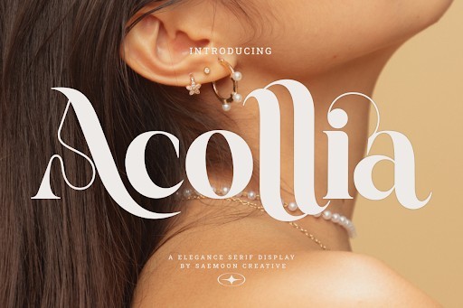
For designers seeking a reliable, structural anchor for their typographic palettes, the Acollia Font by saemooncreative is an outstanding addition to the 2026 serif landscape. Acollia leans into a classic, timeless aesthetic, defined by its sturdy bracketing, highly readable proportions, and subtle humanist touches. It does not rely on flashy gimmicks; instead, it commands respect through flawless geometry and impeccable balance. The quiet confidence of this typeface makes it feel exceptionally professional and grounded, providing a sense of stability and trust to whatever text it carries.
Acollia is an absolute workhorse, perfectly suited for corporate identities, legal firm branding, and long-form editorial environments. Unlike many of the display-heavy fonts in this list, Acollia excels in body copy, remaining crisp and comfortable to read across dense paragraphs. However, it scales up beautifully, revealing crisp serif details that work just as well for strong, authoritative subheadings. When building a brand identity that needs to communicate longevity, reliability, and expertise, pairing Acollia with a clean, modern sans-serif for secondary text will give you a foolproof, highly sophisticated design system.
15. Monster of Fantasy Font by Storytype Studio
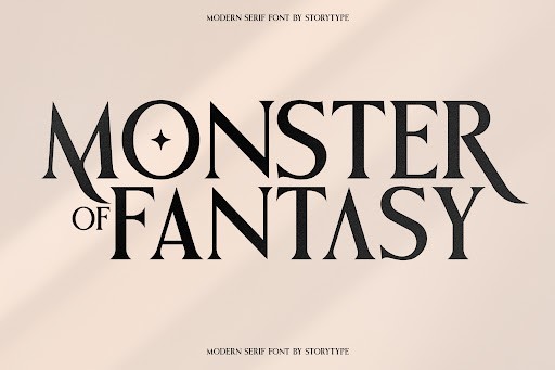
Pushing the boundaries of what a serif typeface can communicate, the Monster of Fantasy Font by Storytype Studio is a daring, adventurous creation that truly lives up to its name. In 2026, audience engagement relies heavily on visual storytelling, and this font delivers a narrative before a single word is even read. It features dramatic, spiky serifs, unexpected angles, and a slightly aggressive yet captivating rhythm. It is a mythical, evocative design that breaks away from conventional typography rules to offer something genuinely unique and memorable for the boldest of designers.
This is undeniably a display powerhouse. Monster of Fantasy is the ultimate choice for video game titles, tabletop RPG manuals, fantasy novel covers, and immersive event branding. Because its letterforms are so intricate and stylized, it is crucial to use this font sparingly to maximize its impact. Confine it to your primary headers and logotypes, and pair it with a highly legible, neutral body font to prevent your design from becoming visually overwhelming. When wielded correctly, this font injects an unparalleled level of energy and intrigue into your creative projects.
16. Elegant Font by Perfectype
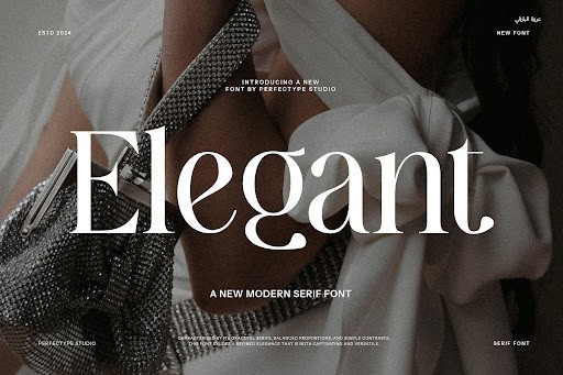
Elegant Font by Perfectype stands out in 2026 as a quintessential modern serif. It balances delicate, high-contrast strokes with refined serifs, creating a luxurious aesthetic perfectly suited for high-end branding. The letterforms carry a subtle vintage warmth but remain firmly rooted in contemporary design trends, making it an incredibly versatile asset for typographic focal points. The designer has paid meticulous attention to the kerning and terminal details, resulting in a typeface that feels bespoke right out of the box.
When working with Elegant Font, give it plenty of breathing room; generous tracking and ample negative space will let its sophisticated details shine. It works beautifully for fashion editorial layouts, boutique hotel branding, and upscale wedding invitations. However, due to its hairline strokes, avoid using it for body copy or at very small sizes on low-resolution screens, as you run the risk of losing its signature crispness. Pair it with a highly geometric sans-serif to create a stunning, high-contrast visual hierarchy.
17. Wildflower Apothecary Font by Manjalistudio
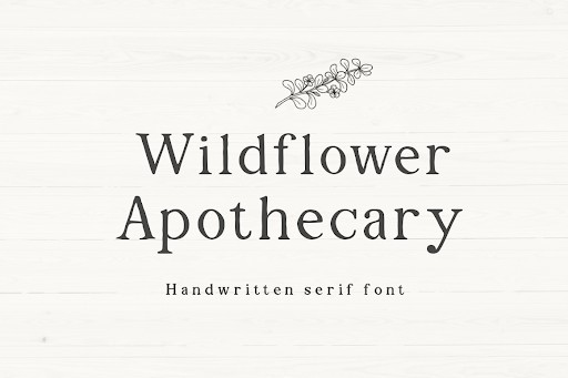
Manjalistudio’s Wildflower Apothecary is a beautifully organic serif that effortlessly captures the essence of natural, handcrafted typography. As its name suggests, this typeface embraces slight irregularities and a gentle rustic charm without sacrificing readability. In the current design landscape of 2026, where brands are increasingly seeking authentic, eco-conscious visual identities, this font bridges the gap between traditional serif structure and approachable, botanical aesthetics. Its warm, slightly imperfect edges give it a tactile, letterpress feel.
This font is a phenomenal choice for wellness brands, artisan skincare lines, organic coffee shops, and sustainable lifestyle blogs. To maximize its impact, pair it with earthy color palettes and textured backgrounds like kraft paper or linen to enhance its physical feel in a digital space. It holds its own perfectly in logo design and product packaging, but remember to pair it with a clean, unassuming sans-serif for secondary text so that your overall composition doesn’t become visually overwhelming.
18. Valdo Font by Pasha Larin
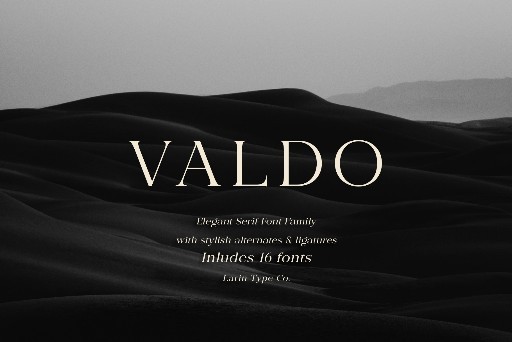
Pasha Larin has delivered a masterclass in typographic balance with Valdo, a serif font that exudes quiet confidence and structural rigor. Unlike overly decorative serifs, Valdo focuses on clean geometry and distinct, sharp bracketing, giving it a highly professional yet distinctive voice. This typeface proves that in 2026, traditional editorial styling can still feel exceptionally fresh and innovative when the proportions are meticulously dialed in. Its sturdy baseline and excellent x-height make it a workhorse for serious design projects.
Valdo is highly recommended for corporate identities, financial institutions, and digital news publications that need to project authority and trustworthiness. It performs remarkably well in both commanding headlines and mid-sized subheadings. For a striking editorial look, try setting Valdo in large, bold weights for your main headers, contrasted with plenty of whitespace and high-quality photography. Be sure to take advantage of its included ligatures to add a subtle, custom touch to your wordmarks and corporate stationery.
19. Strong Font by Graphicxell
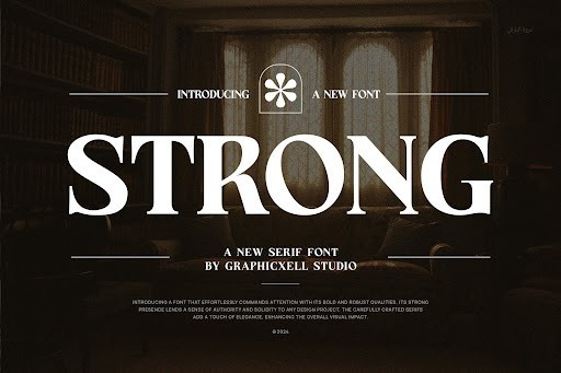
True to its moniker, Strong Font by Graphicxell is a bold, commanding serif that simply refuses to be ignored. Featuring thick, slab-like serifs and an impressive visual presence, it demands attention while maintaining a surprisingly elegant flow across the baseline. In an era where minimalist typefaces have saturated the market, a powerhouse serif like this offers a refreshing, assertive alternative for brands wanting to make an unapologetic statement in 2026. The robust construction ensures it remains legible even when stylized with heavy textures or vibrant gradients.
Deploy Strong Font when your message needs gravity and absolute impact. It is an exceptional choice for bold poster designs, music industry branding, masculine grooming products, and impactful typographic hero sections on modern websites. Because of its immense visual weight, it is best utilized strictly as a display font rather than for long-form reading. Pairing it with a highly legible, lightweight sans-serif will create a gorgeous tension and a clear visual hierarchy that guides the reader’s eye exactly where you want it.
20. Arches Font by dylla studio
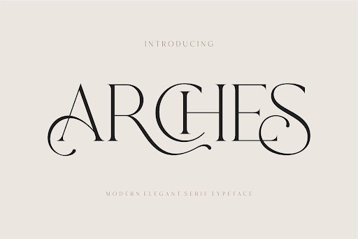
Arches Font by dylla studio introduces a captivating, architectural elegance to the display serif category. Characterized by its sweeping curves and structural arches hidden within the letterforms, this typeface feels like a brilliant nod to classic art deco infused with a modern, bohemian twist. The subtle contrast between its sturdy vertical pillars and graceful loops makes it one of the most visually interesting serifs available this year. It possesses an almost lyrical quality that transforms standard headers into works of typographic art.
This typeface shines brightest when used for lifestyle branding, high-end interior design portfolios, and premium product packaging. The sweeping forms of Arches Font are perfect for creating custom-looking logotypes with very little effort. To get the most out of it, experiment with tight kerning for a modern, overlapping effect, or space it out generously for a more ethereal, luxurious vibe. Always keep the surrounding layout uncluttered so the unique silhouette of these architectural letters remains the undisputed focal point.
21. Koela Font by Pentagonistudio
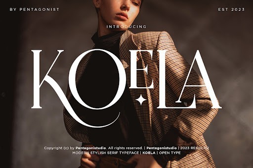
When reviewing the landscape of contemporary serif typefaces in 2026, the Koela Font by Pentagonistudio stands out as a masterclass in transitional elegance. This typeface masterfully bridges the gap between traditional print aesthetics and the demands of modern digital displays. Its letterforms boast crisp, sharp serifs and a moderate contrast that ensures excellent legibility while maintaining a distinctly sophisticated edge. The designers at Pentagonistudio have managed to imbue Koela with a subtle warmth, making it feel inviting rather than stark or overly formal. It is an exceptional choice for designers looking to elevate their typographic repertoire with a versatile, high-end asset.
From a practical standpoint, Koela absolutely shines in luxury branding and editorial design contexts. I highly recommend deploying this font for high-fashion magazine headers, upscale boutique packaging, and minimalist lifestyle websites. To maximize its impact, pair Koela with a generous amount of negative space and use it in larger display sizes where its elegant curves and meticulous detailing can be fully appreciated. When utilizing it for body copy, ensure your line height is slightly increased to let the characters breathe, preserving the font’s inherently luxurious feel across both print and web applications.
22. Astrology Font by saridezra
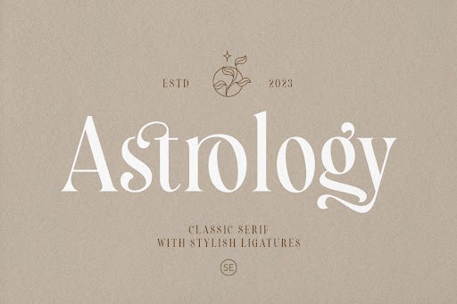
The Astrology Font by saridezra brings a uniquely mystical and delicate charm to the serif category, capturing the current design zeitgeist beautifully. What makes this typeface truly remarkable is its integration of subtle celestial motifs and sweeping, elegant ascenders that give it a highly stylized, esoteric personality. Unlike overly novelty fonts, Astrology remains grounded in solid typographic principles, offering a refined, high-contrast aesthetic that feels both ancient and refreshingly modern. The intricate ligatures and stylistic alternates included in the commercial license provide designers with a playground of creative possibilities to craft bespoke, magical wordmarks.
In terms of application, this font is a dream for niche branding projects that require a touch of elegance and mystery. It is incredibly effective for holistic wellness brands, tarot and astrology applications, artisan jewelry packaging, and boutique book covers. Because of its ornate nature, I advise using the Astrology font primarily for short titles, logos, and headers rather than dense paragraphs. For a perfectly balanced composition, pair it with a highly legible, geometric sans-serif; this contrast will allow the ornate serif details to command attention without overwhelming the viewer’s eye.
23. Alchemist Font by Salt and Pepper Fonts
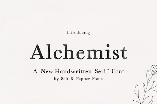
Salt and Pepper Fonts have delivered an absolute gem with the Alchemist Font, a serif typeface that perfectly encapsulates an artisanal, handcrafted aesthetic. In my experience evaluating display serifs, Alchemist distinguishes itself through its organic, slightly textured edges and vintage proportions. It evokes the feeling of old-world apothecaries and mystical manuscripts, yet it is engineered flawlessly for flawless performance across modern Mac, Windows, and Linux operating systems. The typeface carries a weighty, tactile presence that adds immediate character and warmth to any canvas it occupies, making it an indispensable tool for designers seeking to inject soul into their work.
The Alchemist Font is tailor-made for projects that demand a rustic, authentic, or historical vibe. I frequently recommend it for craft brewery labels, artisanal coffee roasters, organic skincare packaging, and vintage-inspired logo designs. To get the most out of this typeface, lean into its earthy, textured nature by pairing it with warm color palettes and tactile paper stocks in print. In digital spaces, try applying subtle letterpress or foil stamp effects to the text, which beautifully accentuates the font’s organic imperfections and enhances its mesmerizing, old-world charm.
24. Lovely Font by fontkong
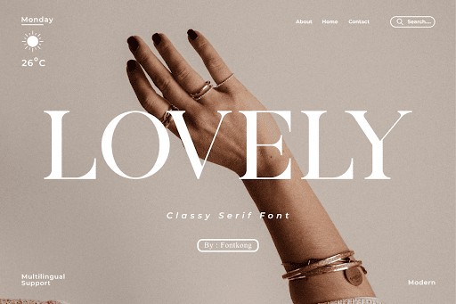
True to its namesake, the Lovely Font by fontkong is a masterwork of romantic typography that brings an undeniable sense of drama and sophistication to the modern serif family. This high-contrast typeface channels the timeless elegance of Didone style fonts, juxtaposing incredibly thick stems with razor-thin, delicate hairline serifs. The result is a visual rhythm that is both striking and deeply graceful. The designers have infused the letterforms with fluid, sweeping curves that evoke a sense of movement and passion, making it one of the most visually arresting serif options updated for commercial use this year.
When it comes to putting the Lovely Font to work, its natural habitat is within the realms of romance, luxury, and premium beauty. It is an unparalleled choice for high-end wedding invitations, luxury cosmetics branding, and upscale editorial spreads. Because of the extreme contrast between the thick and thin strokes, this font performs best at large, display sizes where the hairline serifs will not get lost or muddied. I strongly advise keeping your letter-spacing relatively loose when setting titles to enhance its sophisticated aura, and pairing it with a clean, unassuming body font to let the Lovely Font remain the undisputed star of your layout.
25. Belingar Font by RantauType
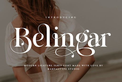
Breaking away from delicate tradition, the Belingar Font by RantauType is a bold, heavyweight serif that commands the page with unwavering confidence. This typeface leans heavily into the retro-modern revival trend that continues to dominate the design landscape, offering chunky, robust letterforms paired with soft, inviting serifs. It is unapologetically loud but possesses a friendly, approachable undertone that prevents it from feeling overly aggressive. The meticulous craftsmanship ensures that despite its heavy weight, the negative space within the letters remains perfectly balanced, resulting in stellar legibility and visual impact.
Belingar is an absolute powerhouse for statement typography and should be your go-to choice when you need a design to pop. It thrives in bold editorial layouts, striking poster designs, modern food and beverage packaging, and quirky brand identities. To effectively utilize Belingar, do not be afraid to scale it up massively and let it dominate the hero section of a website or the cover of a magazine. Because it carries so much visual weight, ensure that your surrounding layout features ample whitespace and use vibrant, high-contrast color schemes to complement its energetic, retro-inspired personality.
26. Roach Font by Sohel Studio
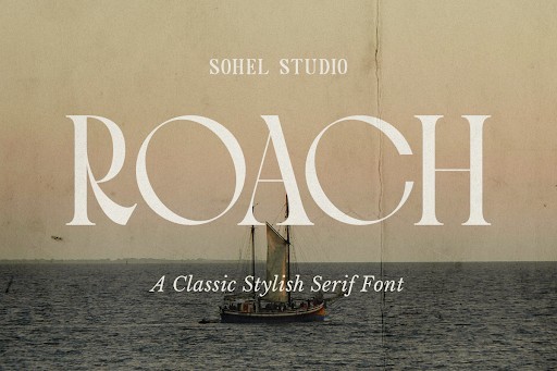
Roach by Sohel Studio is a fascinating serif font that breaks away from traditional constraints, offering a distinctively modern, almost brutalist edge in 2026’s typography landscape. Its sharp serifs and contrasting stroke weights give it an aggressive yet elegant presence that immediately commands attention on the page or screen. Unlike conventional serifs that play it safe, Roach brings a raw, architectural vibe that feels incredibly fresh for high-end branding.
When deploying Roach, less is absolutely more. It thrives as a display typeface where its intricate details and razor-sharp terminals can be fully appreciated, making it a stellar choice for editorial headlines, avant-garde fashion lookbooks, and luxury packaging. I recommend pairing it with a hyper-minimalist sans-serif to let its dramatic letterforms shine. Avoid using it for dense body copy, as its high contrast can cause eye fatigue in long-form reading.
27. Royal Knight Font by Jozoor
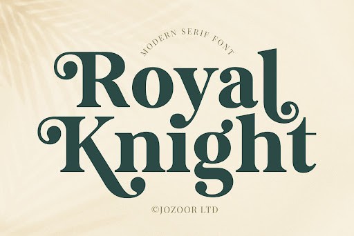
Embodying a regal and timeless aesthetic, the Royal Knight font by Jozoor is a triumph in classic serif design. This typeface carries a majestic weight, with beautifully sculpted serifs and smooth, sweeping curves that evoke the grandeur of historical manuscripts, yet it is refined perfectly for 2026 digital standards. Jozoor has struck a delicate balance between ornate detailing and crisp legibility, creating a font that feels historically rooted but impeccably polished for modern screens.
Royal Knight is the ultimate weapon for brands wanting to project authority, heritage, and uncompromising quality. It works beautifully for boutique law firms, high-end spirit labels, and upscale hospitality branding. To get the most out of this typeface, give it plenty of breathing room—generous tracking and ample negative space will amplify its sophisticated aura. It also performs exceptionally well in foil stamping and debossing applications for premium print materials.
28. Florida Vintage Font by Jasm (7NTypes)
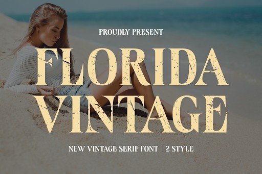
Florida Vintage by Jasm (7NTypes) is a delightful nostalgic trip that captures the sun-drenched, retro charm of the 1970s and 80s coastal aesthetic. This serif font features soft, rounded terminals and a beautifully imperfect, slightly distressed texture that gives it instant character. In a 2026 design era that heavily favors organic, human-centric aesthetics, Florida Vintage stands out by delivering genuine warmth and a laid-back, artisanal feel without sacrificing baseline readability.
This typeface is a dream to work with if you are designing for lifestyle brands, organic skincare packaging, or retro-themed cafe menus. Its friendly, approachable nature makes it perfect for hero banners and social media graphics where you want to evoke a sense of heritage and comfort. For the best visual impact, pair Florida Vintage with warm, earthy color palettes and vintage photography. Since it has a built-in textured look, use it at larger point sizes to ensure those gorgeous rustic details are not lost on smaller screens.
29. Blasing Font by Alfinart
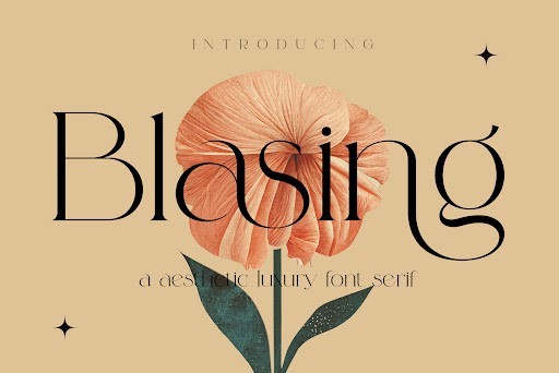
Blasing by Alfinart is a masterclass in elegant, high-contrast serif typography. It brings a sweeping, romantic flair to the table, characterized by its dramatic thick-to-thin strokes and beautifully sweeping ligatures. As we see a resurgence of glamorous, editorial-style typography in 2026, Blasing answers the call with letterforms that feel like they belong on the cover of a high-fashion magazine. It is fluid, graceful, and unapologetically luxurious.
I highly recommend Blasing for projects that require a touch of romance and exclusivity, such as wedding invitations, luxury cosmetics, and editorial mastheads. The true magic of this font lies in its extensive set of alternate characters and ligatures, so be sure to use software that supports OpenType features to unlock its full potential. Keep in mind that its hairline strokes can vanish at small sizes or low resolutions, so reserve Blasing exclusively for large display purposes and pair it with a highly legible, low-contrast sans-serif for secondary text.
30. Lavish Font by HipFonts
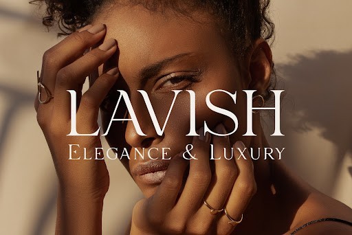
True to its name, Lavish by HipFonts is an opulent, modern serif that radiates sophistication and wealth. It features incredibly sleek, razor-thin serifs combined with sturdy vertical stems, creating a structural masterpiece that feels both delicate and strong. HipFonts has engineered Lavish to be a powerhouse in the luxury design sector for 2026, offering a clean, contemporary take on the classic Didone style that translates flawlessly across high-definition displays and premium print finishes.
Lavish is my go-to recommendation when designing for high-end real estate, fine jewelry brands, or premium lifestyle magazines. Its refined silhouette demands a minimalist design environment—think stark white or deep, moody backgrounds to make the letterforms truly pop. Because of its extreme vertical contrast, you must be careful with line height and letter spacing; give it generous leading to maintain its airy, expensive feel. It is strictly a headline and logotype font, ensuring your brand first impression is nothing short of breathtaking.
Choosing the right typeface is more than just a stylistic preference; it is about communicating your brand voice and values with clarity and impact. The 30 serif fonts we have explored for 2026 offer a perfect blend of tradition and innovation, ensuring your designs remain fresh yet authoritative. Whether you prefer a dramatic high-contrast serif for striking headlines or a subtle, highly legible font for extensive body copy, there is a typography solution here for every creative challenge. Keep pushing the boundaries of your design work, and let these exceptional serif fonts be the foundation of your next masterpiece.