16 Best Wedding Sign Fonts for Reception Signage Ideas
Guests experience wedding signs at different distances. A welcome board is viewed across the room, while a seating chart is read one name at a time. The best wedding sign fonts create a coherent mood across both, even though the decorative script should not be responsible for every table number or surname.
Wedding Sign Fonts: what to test first
Print a full-size name card and a reduced seating chart row. Flourishes can be gorgeous on a two-word welcome message and troublesome in a tightly packed list. Check long surnames, numerals and accented letters before building the full signage suite.
Three places to start
| Font | Try it on |
|---|---|
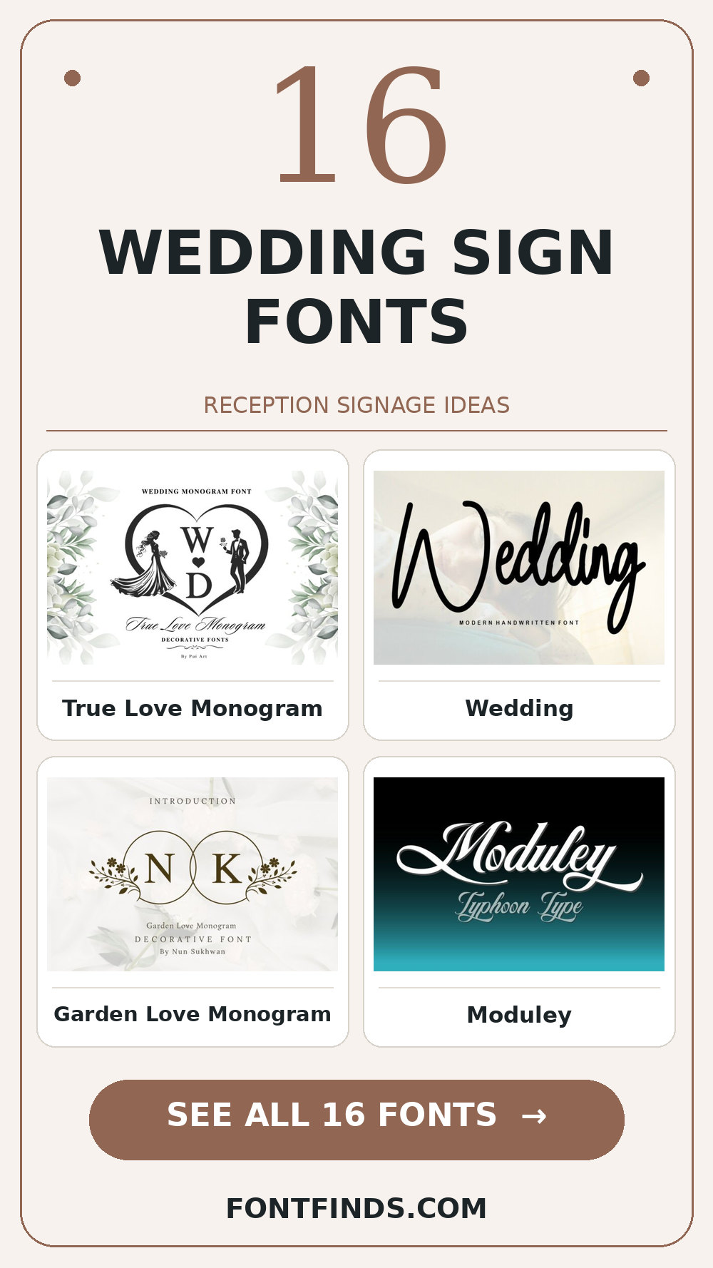
| True Love Monogram | a wedding welcome board |
| Wedding | a seating chart heading |
| Garden Love Monogram | a bar menu title |
A memorable welcome
1. True Love Monogram
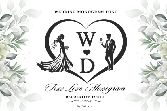
Try True Love Monogram on a wedding welcome board. It uses a distinct display silhouette to set the mood. A second detail to notice is ornamental details. Type your complete phrase, test its legibility away from the enlarged sample, and inspect a print-size draft before trusting the enlarged preview.
View True Love Monogram and download options →
2. Wedding
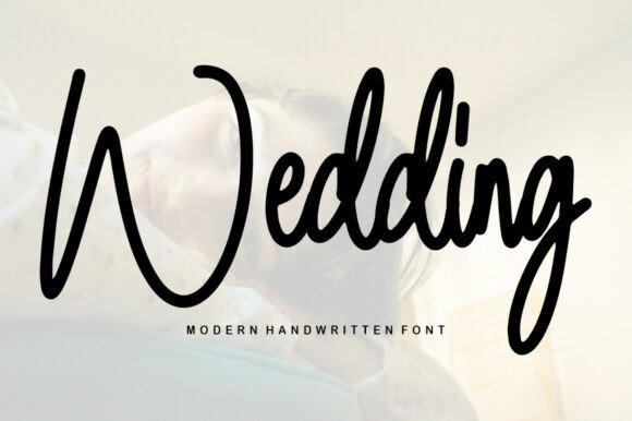
In this shortlist, Wedding is worth testing for a seating chart heading because of its an informal handwritten rhythm. A second detail to notice is human irregularity. Set the actual copy in one color, use a plain sans for practical details, and check how the spacing changes after a line break.
View Wedding and download options →
3. Garden Love Monogram
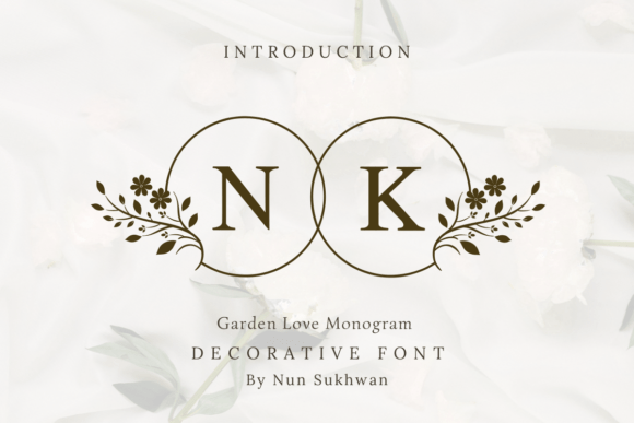
For a bar menu title, Garden Love Monogram offers an informal handwritten rhythm. A second detail to notice is human irregularity. Give it one clear task in the composition. Before choosing it, check the exact capitals and punctuation you need and compare the result with a plain companion face at actual size.
View Garden Love Monogram and download options →
4. Moduley
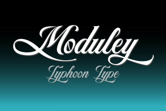
Consider Moduley for a table-number card: visible stroke contrast gives the phrase a clear personality. A second detail to notice is optional letterforms. Leave breathing room around the letters and test the thin parts on your actual printing stock. Pair it with a plain sans for practical details rather than another competing display style.
View Moduley and download options →
5. Northpath
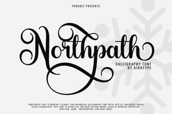
At first glance Northpath reads through decorative details and flourishes. A second detail to notice is optional letterforms. Put it on a thank-you sign, but keep the adjacent information quiet. The real proof comes at final size: reserve the largest alternates for a short heading.
View Northpath and download options →
6. Welcome
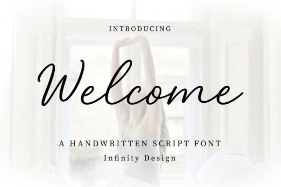
Welcome brings an informal handwritten rhythm to a wedding welcome board. A second detail to notice is human irregularity. I would check the exact capitals and punctuation you need, then choose a plain sans for practical details for the details. That division keeps the headline expressive and the information easy to scan.
View Welcome and download options →
7. Nellflora Monogram
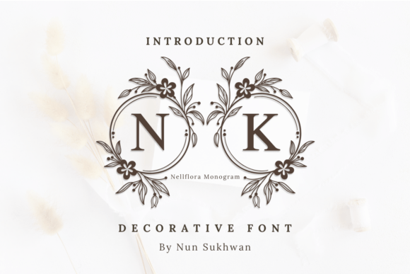
Nellflora Monogram is a decorative option marked by visible stroke contrast. A second detail to notice is thick-to-thin contrast. Its strongest role here may be a seating chart heading. Build a one-color proof and test the thin parts on your actual printing stock; the vendor mockup alone is too generous a test.
View Nellflora Monogram and download options →
8. Pisa
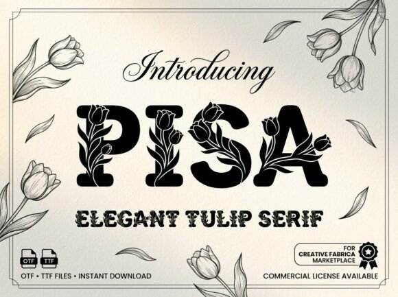
Pisa can give a bar menu title a different pace through visible stroke contrast. A second detail to notice is thick-to-thin contrast. I would place it beside a simple text face for the smaller information, then check the longest word and the smallest practical size before making a final choice.
View Pisa and download options →
Details for tables, menus and seating
9. Asha
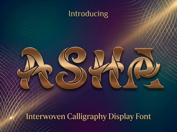
Asha leans on decorative details and flourishes, a useful starting point for a table-number card. If the design has lots of tiny copy, let the expressive type stay large. For the main phrase, reserve the largest alternates for a short heading before you settle on the layout.
View Asha and download options →
10. Velvet Honey

The appeal of Velvet Honey is visible stroke contrast. A second detail to notice is thick-to-thin contrast. Try it first as a thank-you sign, then shrink the artwork to a phone preview. If the word still lands immediately, it can lead; otherwise, use it for a single accent.
View Velvet Honey and download options →
11. Urban Blash
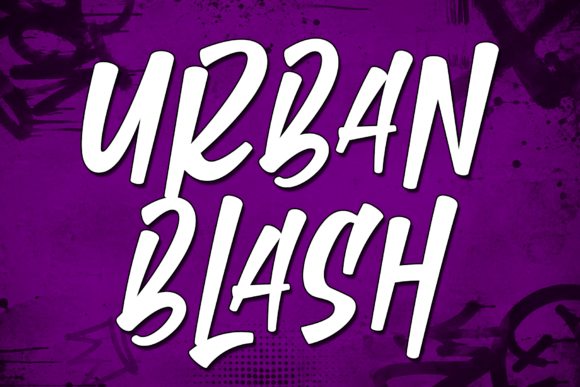
Try Urban Blash on a wedding welcome board. It uses an informal handwritten rhythm to set the mood. A second detail to notice is human irregularity. Type your complete phrase, check the exact capitals and punctuation you need, and inspect a print-size draft before trusting the enlarged preview.
View Urban Blash and download options →
12. Lemon Pantry
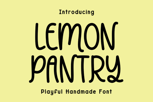
In this shortlist, Lemon Pantry is worth testing for a seating chart heading because of its an informal handwritten rhythm. A second detail to notice is human irregularity. Set the actual copy in one color, use a plain sans for practical details, and check how the spacing changes after a line break.
View Lemon Pantry and download options →
13. Monday
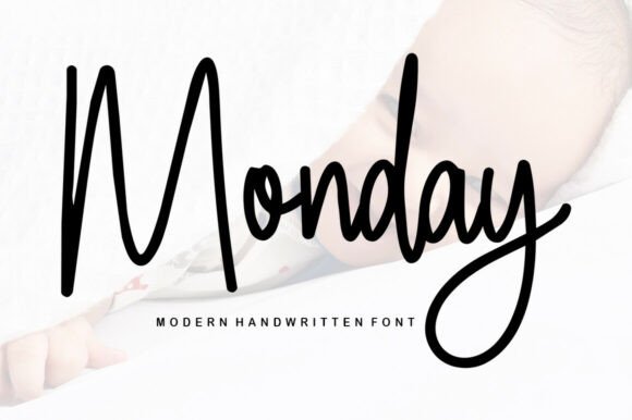
For a bar menu title, Monday offers an informal handwritten rhythm. A second detail to notice is human irregularity. Give it one clear task in the composition. Before choosing it, check the exact capitals and punctuation you need and compare the result with a plain companion face at actual size.
View Monday and download options →
14. Butter Creamy
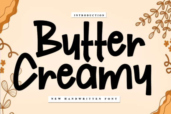
Consider Butter Creamy for a table-number card: an informal handwritten rhythm gives the phrase a clear personality. A second detail to notice is human irregularity. Leave breathing room around the letters and check the exact capitals and punctuation you need. Pair it with a plain sans for practical details rather than another competing display style.
View Butter Creamy and download options →
15. Turin
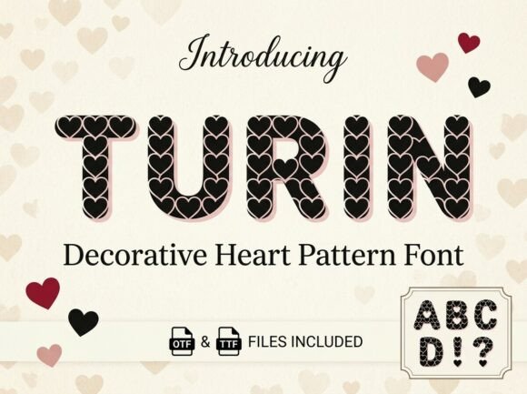
At first glance Turin reads through visible stroke contrast. A second detail to notice is thick-to-thin contrast. Put it on a thank-you sign, but keep the adjacent information quiet. The real proof comes at final size: test the thin parts on your actual printing stock.
View Turin and download options →
16. Memories
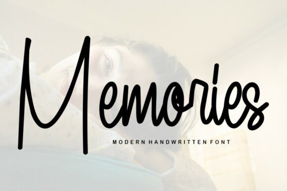
Memories brings an informal handwritten rhythm to a wedding welcome board. A second detail to notice is human irregularity. I would check the exact capitals and punctuation you need, then choose a plain sans for practical details for the details. That division keeps the headline expressive and the information easy to scan.
View Memories and download options →
From specimen to finished project
Carry one display font from the entrance sign to smaller printed pieces, but adjust its role. On the chart it may label ‘Find Your Seat’ while a readable serif handles guest names. A floral or monogram face can frame the couple’s initials without competing with directions.
Frequently asked question
Should a seating chart use a script font for every guest name?
Usually a clearer serif or sans is kinder to guests. A script can headline the chart or highlight the couple’s names.
Want another direction? Compare this shortlist with a related FontFinds font guide. Open each typeface above to inspect the complete character set, current price and license before downloading it for your project.