25 Best Varsity Fonts for Sports Team Banner Ideas
Sports typography is judged in motion. A banner viewed from the bleachers, a photo of a jersey and a small social graphic ask different things of the same lettering. This shortlist covers classic collegiate blocks, distressed finishes and modern high-energy displays, with notes on where each earns its place.
Varsity Fonts: what to test first
Set your longest team name in all caps. Check the space between similar forms such as I, L and T, then test the result at a distance. Texture that gives a banner character can make smaller numbers or sponsor names unclear, so treat those as separate typography jobs.
A three-scale proof
- Set the main heading at its final physical size.
- Reduce the same design to a mobile thumbnail.
- Move the small details into a readable companion.
Traditional collegiate authority
1. Reborn Varsity
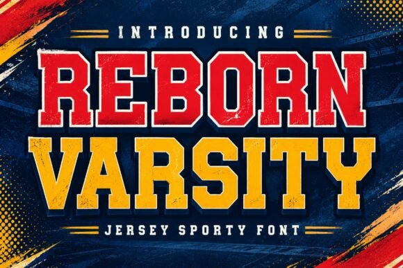
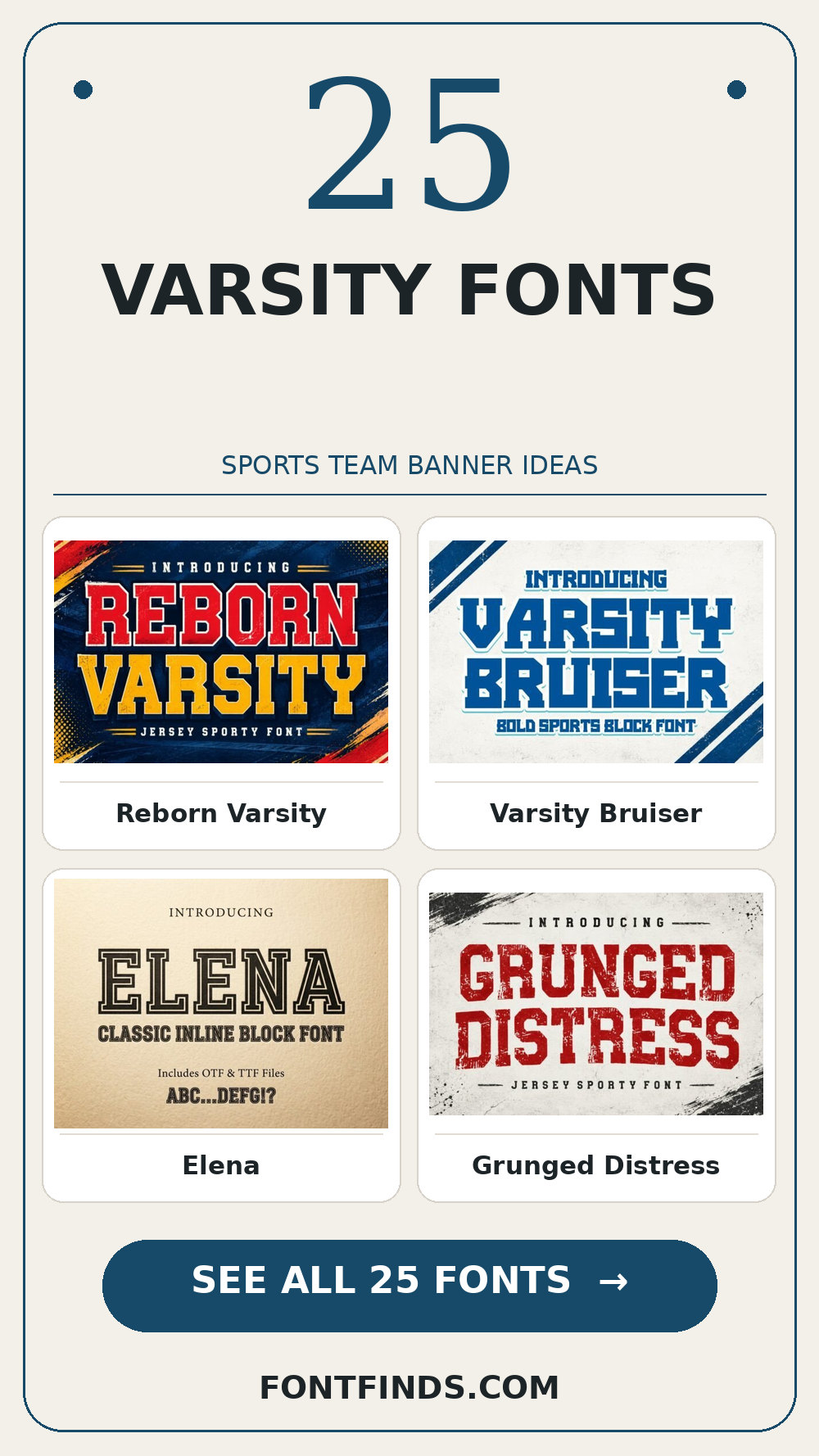
Reborn Varsity brings a distinct display silhouette to a team entrance banner. I would test its legibility away from the enlarged sample, then choose a simple text face for the smaller information for the details. That division keeps the headline expressive and the information easy to scan.
View Reborn Varsity and download options →
2. Varsity Bruiser
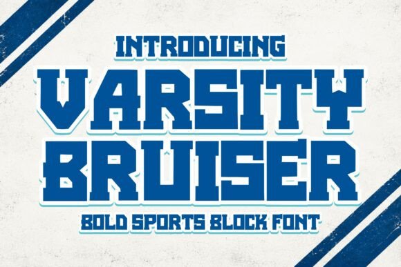
Varsity Bruiser is a display option marked by rounded contours. A second detail to notice is generous curves. Its strongest role here may be a jersey mockup. Build a one-color proof and test the counters with a longer line of text; the vendor mockup alone is too generous a test.
View Varsity Bruiser and download options →
3. Elena
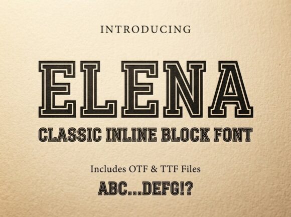
Elena can give a school spirit poster a different pace through a serif-led word shape. I would place it beside a simple text face for the smaller information, then check the longest word and the smallest practical size before making a final choice.
View Elena and download options →
4. Grunged Distress
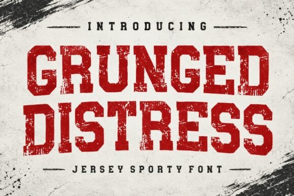
Grunged Distress leans on a textured, weathered finish, a useful starting point for a tournament bracket cover. A second detail to notice is roughened edges. If the design has lots of tiny copy, let the expressive type stay large. For the main phrase, view the rough details at final print size before you settle on the layout.
View Grunged Distress and download options →
5. Rodeo Rustler
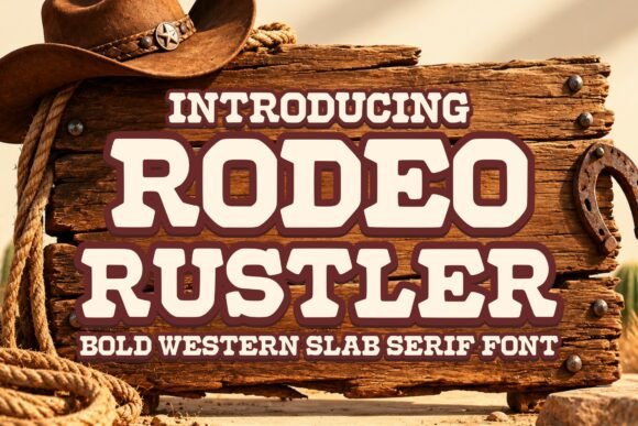
The appeal of Rodeo Rustler is rounded contours. A second detail to notice is generous curves. Try it first as a sports club social tile, then shrink the artwork to a phone preview. If the word still lands immediately, it can lead; otherwise, use it for a single accent.
View Rodeo Rustler and download options →
6. Rabbit
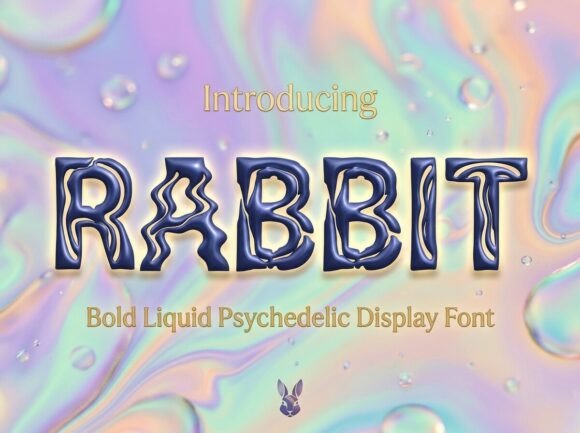
Try Rabbit on a team entrance banner. It uses a distinct display silhouette to set the mood. Type your complete phrase, test its legibility away from the enlarged sample, and inspect a print-size draft before trusting the enlarged preview.
View Rabbit and download options →
7. Hiselo
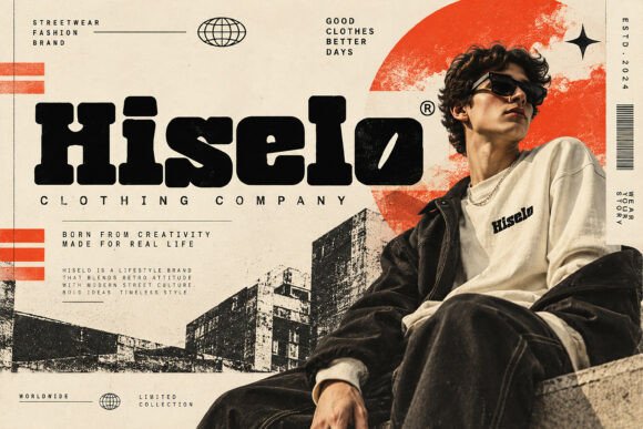
In this shortlist, Hiselo is worth testing for a jersey mockup because of its a distinct display silhouette. Set the actual copy in one color, use a simple text face for the smaller information, and check how the spacing changes after a line break.
View Hiselo and download options →
8. Golden
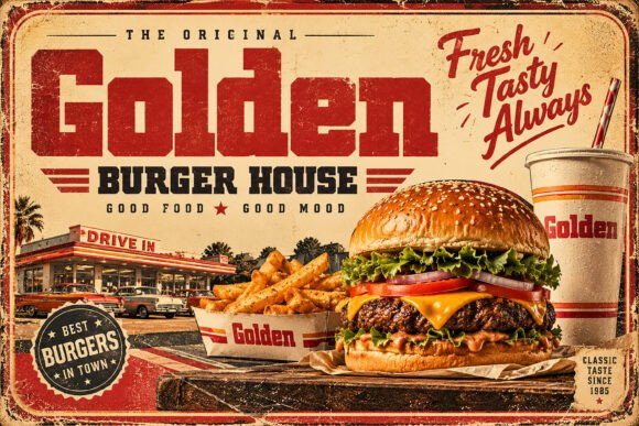
For a school spirit poster, Golden offers deliberate geometric construction. A second detail to notice is geometric rhythm. Give it one clear task in the composition. Before choosing it, compare similar letters at the smallest planned scale and compare the result with a plain companion face at actual size.
View Golden and download options →
9. Dravix
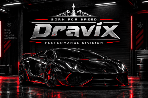
Consider Dravix for a tournament bracket cover: deliberate geometric construction gives the phrase a clear personality. A second detail to notice is geometric rhythm. Leave breathing room around the letters and compare similar letters at the smallest planned scale. Pair it with a quieter sans for captions and credits rather than another competing display style.
View Dravix and download options →
10. Suprime Vintage
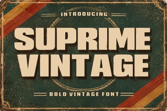
At first glance Suprime Vintage reads through a textured, weathered finish. A second detail to notice is roughened edges. Put it on a sports club social tile, but keep the adjacent information quiet. The real proof comes at final size: view the rough details at final print size.
View Suprime Vintage and download options →
11. Savolt
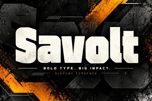
Savolt brings a distinct display silhouette to a team entrance banner. I would test its legibility away from the enlarged sample, then choose a quieter sans for captions and credits for the details. That division keeps the headline expressive and the information easy to scan.
View Savolt and download options →
12. Hostron
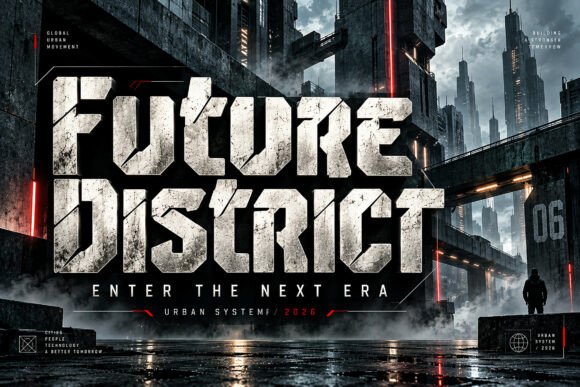
Hostron is a display option marked by compact letter proportions. A second detail to notice is tight proportions. Its strongest role here may be a jersey mockup. Build a one-color proof and make sure adjacent capitals do not collapse together; the vendor mockup alone is too generous a test.
View Hostron and download options →
13. Gravikon
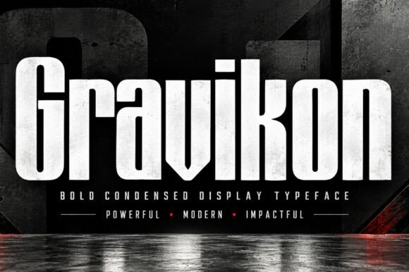
Gravikon can give a school spirit poster a different pace through compact letter proportions. A second detail to notice is tight proportions. I would place it beside a simple text face for the smaller information, then check the longest word and the smallest practical size before making a final choice.
View Gravikon and download options →
Heavy impact for banners and team graphics
When lettering is destined for fabric, review the designer’s full character set and the production method. Broad solid shapes often survive stitching or heat transfer better than hairline distressed detail. Licensing for merchandise also depends on the individual product page; verify it there.
14. Luma
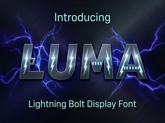
Luma leans on a textured, weathered finish, a useful starting point for a tournament bracket cover. A second detail to notice is roughened edges. If the design has lots of tiny copy, let the expressive type stay large. For the main phrase, view the rough details at final print size before you settle on the layout.
View Luma and download options →
15. Blockstrike

The appeal of Blockstrike is angular blackletter structure. A second detail to notice is geometric rhythm. Try it first as a sports club social tile, then shrink the artwork to a phone preview. If the word still lands immediately, it can lead; otherwise, use it for a single accent.
View Blockstrike and download options →
16. Altzon
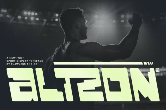
Try Altzon on a team entrance banner. It uses deliberate geometric construction to set the mood. A second detail to notice is generous curves. Type your complete phrase, compare similar letters at the smallest planned scale, and inspect a print-size draft before trusting the enlarged preview.
View Altzon and download options →
17. Kaya
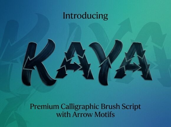
In this shortlist, Kaya is worth testing for a jersey mockup because of its brushlike changes in stroke weight. A second detail to notice is roughened edges. Set the actual copy in one color, use a simple text face for the smaller information, and check how the spacing changes after a line break.
View Kaya and download options →
18. Anfisa
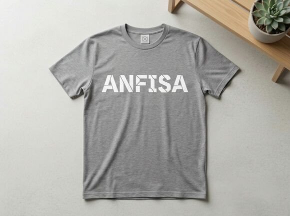
For a school spirit poster, Anfisa offers deliberate geometric construction. A second detail to notice is geometric rhythm. Give it one clear task in the composition. Before choosing it, compare similar letters at the smallest planned scale and compare the result with a plain companion face at actual size.
View Anfisa and download options →
19. Chunko
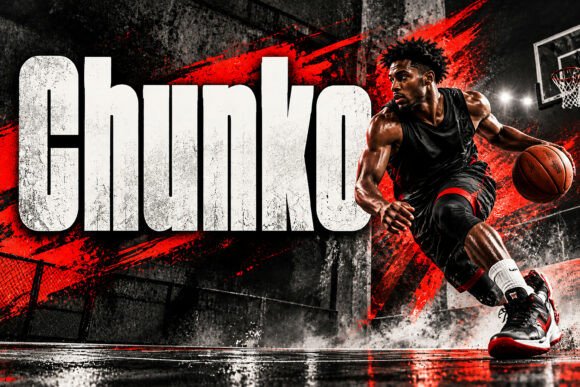
Consider Chunko for a tournament bracket cover: compact letter proportions gives the phrase a clear personality. A second detail to notice is tight proportions. Leave breathing room around the letters and make sure adjacent capitals do not collapse together. Pair it with a simple text face for the smaller information rather than another competing display style.
View Chunko and download options →
20. Angovr
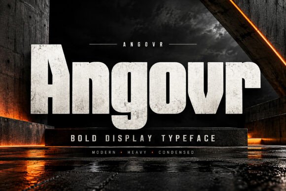
At first glance Angovr reads through compact letter proportions. A second detail to notice is tight proportions. Put it on a sports club social tile, but keep the adjacent information quiet. The real proof comes at final size: make sure adjacent capitals do not collapse together.
View Angovr and download options →
21. Brockve
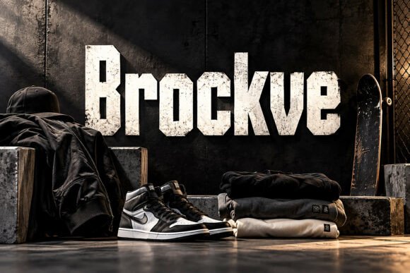
Brockve brings compact letter proportions to a team entrance banner. A second detail to notice is tight proportions. I would make sure adjacent capitals do not collapse together, then choose a simple text face for the smaller information for the details. That division keeps the headline expressive and the information easy to scan.
View Brockve and download options →
22. Maya
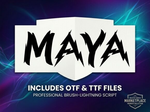
Maya is a display option marked by angular blackletter structure. A second detail to notice is handmade stroke changes. Its strongest role here may be a jersey mockup. Build a one-color proof and keep the inner spaces open at smaller sizes; the vendor mockup alone is too generous a test.
View Maya and download options →
23. Tikhon
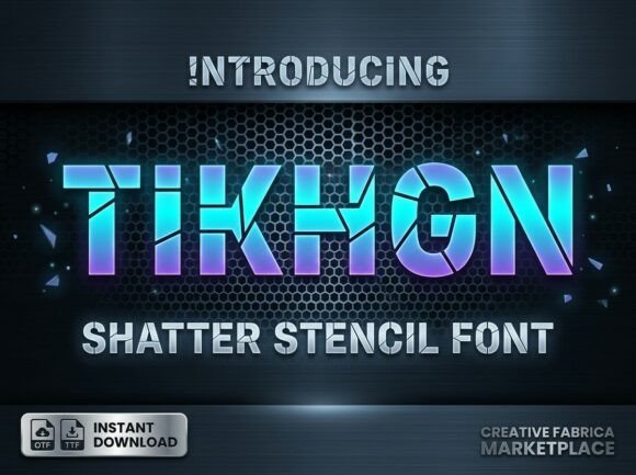
Tikhon can give a school spirit poster a different pace through deliberate geometric construction. A second detail to notice is geometric rhythm. I would place it beside a simple text face for the smaller information, then check the longest word and the smallest practical size before making a final choice.
View Tikhon and download options →
24. Puffer
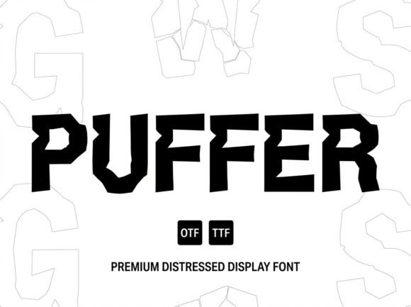
Puffer leans on a textured, weathered finish, a useful starting point for a tournament bracket cover. A second detail to notice is roughened edges. If the design has lots of tiny copy, let the expressive type stay large. For the main phrase, view the rough details at final print size before you settle on the layout.
View Puffer and download options →
25. Downey Jersey
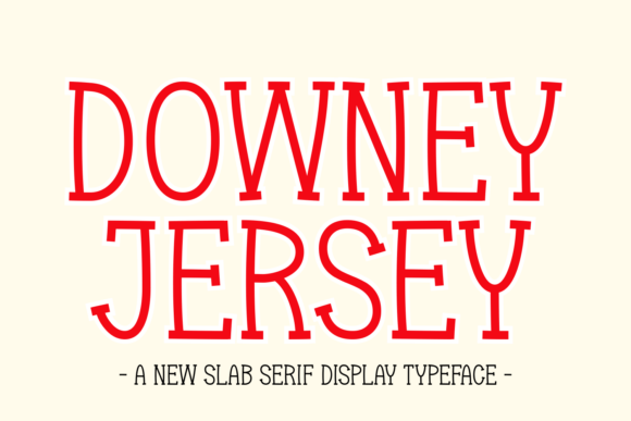
The appeal of Downey Jersey is a textured, weathered finish. A second detail to notice is roughened edges. Try it first as a sports club social tile, then shrink the artwork to a phone preview. If the word still lands immediately, it can lead; otherwise, use it for a single accent.
View Downey Jersey and download options →
Frequently asked question
Should a jersey name and number use the same varsity font?
They can, but test both at actual production size. A display alphabet that handles a short word may have weak or missing numerals.
Want another direction? Compare this shortlist with a related FontFinds font guide. Open each typeface above to inspect the complete character set, current price and license before downloading it for your project.