12 Coffee Loyalty Card Fonts for a Memorable Cafe Reward Card

This post contains affiliate links. If you buy through them, we may earn a commission at no extra cost to you.
A loyalty card spends much of its life in a wallet, so the design needs to work at a small size. These coffee loyalty card fonts focus on the part that customers notice first: the cafe name or the short message above the stamp spaces.
The collection includes chunky handmade lettering, narrow printed styles and lighter decorative options. Think of the font as one part of the card's structure. The reward message, stamp area and practical details still need enough room to do their jobs.
How to balance personality and space on a cafe card
Decide the stamp or punch area before styling the headline. Leave clear space around each position, and keep the final reward visually distinct from the earlier visits. If the card needs terms or contact details, consider putting them on the reverse instead of shrinking everything on the front.
Use the display font for one short line and a plain companion for the offer. Print the card at its intended size and check it under ordinary indoor lighting. A tiny script that looks charming on a large screen may be difficult to read across a counter. Keep any reward wording accurate to your actual offer.
1. Dirty Latte: A friendly stamp-card heading
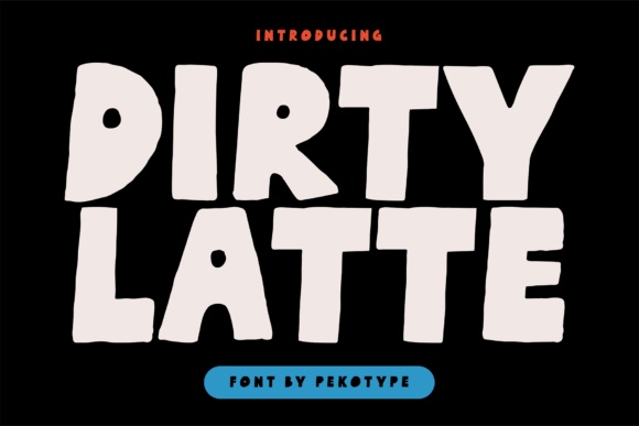
Dirty Latte has chunky, uneven shapes that feel drawn by hand. It would make a welcoming headline for a coffee loyalty card, especially a short phrase such as Your Next Cup or a compact cafe name.
Keep the actual stamp circles clear of the lettering. A solid dark heading above an orderly row of spaces gives the card personality without making the reward progress difficult to follow.
View Font on Creative Fabrica →Preview • Download options • License details
2. Coffee Brunch: A casual neighborhood-cafe voice
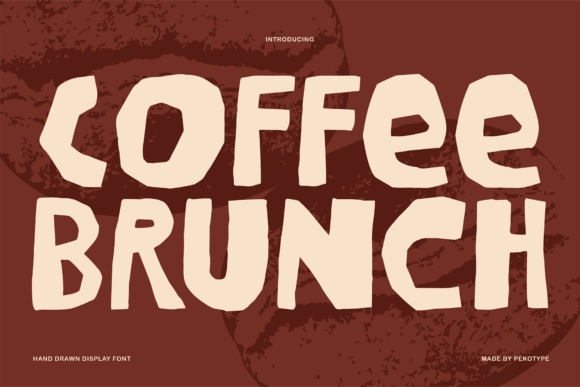
Coffee Brunch uses broad, slightly angular hand-drawn capitals. Compared with a polished serif, it suggests an easygoing place where a regular customer can stop in for a drink and a quick conversation.
Try the name on one side and the reward tracker on the other. The uneven letters look more deliberate when they sit beside a neat grid and a consistent margin.
View Font on Creative Fabrica →Preview • Download options • License details
3. Apricot Club: A soft brush-lettered welcome
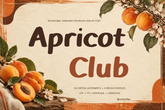
Apricot Club pairs substantial brush-like strokes with softened ends and a gentle lean. It could suit a cafe loyalty card with a warmer, more personal voice, especially when the name has a mix of tall and rounded letters.
Use a short heading rather than a whole paragraph in this style. Leave the reward conditions in a plain face so customers can understand the offer at a glance.
View Font on Creative Fabrica →Preview • Download options • License details
4. Chocolate: A lighthearted counter card

This Chocolate listing shows narrow, quirky letters with a playful rhythm, rather than the rounded geometric Chocolate option later in the list. It would suit a small independent cafe with a simple, cheerful identity.
A wide horizontal heading could sit comfortably above the stamp row. Check the cafe name at its real size; unusual letter shapes can become more noticeable when there are only a few characters.
View Font on Creative Fabrica →Preview • Download options • License details
5. Mocha Cherry: A straightforward cafe identity
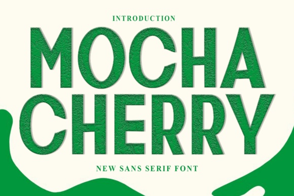
Mocha Cherry has an upright sans-serif appearance in its preview, with clear, substantial letters and modest proportions. I would consider it when the loyalty card needs to feel warm but still organized and easy to scan.
The name already brings a food association, but the lettering does not require a food-themed illustration. A tiny cup symbol and a plain background could be all the decoration you need.
View Font on Creative Fabrica →Preview • Download options • License details
6. Bakery: Tall lettering for a slim card
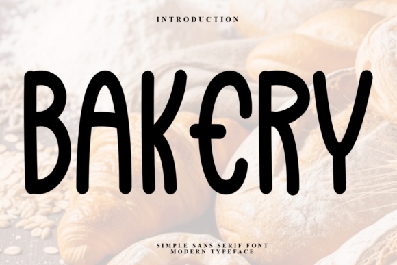
Bakery shows tall, relaxed letters with a handwritten quality. Its narrow rhythm could help a longer cafe name fit across a small loyalty card while keeping the overall design airy.
Do not compress the word to force it into a box. Start with a comfortable size, then adjust the surrounding space or split the name over two lines if needed.
View Font on Creative Fabrica →Preview • Download options • License details
7. Cheese Cookies: An elegant handmade accent
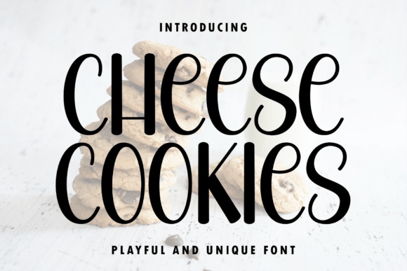
Cheese Cookies mixes slim upright strokes with rounded, curling forms. It offers a lighter alternative to chunky cafe lettering and could work for a pastry counter or a coffee-and-cake loyalty card.
Use it for the brand name or a brief thank-you line. The reward instructions should remain visually separate, particularly if the card is printed on textured stock with a soft ink finish.
View Font on Creative Fabrica →Preview • Download options • License details
8. Kroovy: A cheerful reward message
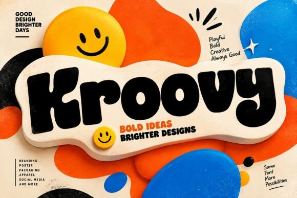
Kroovy has thick rounded letters with a slightly lopsided, friendly shape. It could make the reward message the visual center of a card for a colorful cafe or a pop-up coffee stand.
Limit the heading to a few words. Because the letters are substantial, a crowded background or large decorative stamp icons can quickly compete with the space customers need to mark their visits.
View Font on Creative Fabrica →Preview • Download options • License details
9. Mellow Twist: A whimsical cafe name
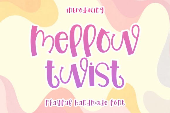
Mellow Twist shows thin, playful letters with unexpected curves and a relaxed baseline. It would suit a softer cafe identity, especially a card that uses a pale background and one darker ink color.
Keep the decorative voice in the heading. A row of simple circles or squares below will feel calmer than a collection of differently shaped stamps competing with the lettering.
View Font on Creative Fabrica →Preview • Download options • License details
10. Hamburger: A minimal handmade layout
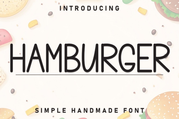
Hamburger is a narrow, simple handwritten-looking option in the supplied preview. I would test it on a loyalty card where the main goal is a quiet, approachable name above a generous stamp area.
Its light appearance needs enough contrast against the stock. Print a small proof before choosing a pale brown or gray that may look attractive on screen but weak on paper.
View Font on Creative Fabrica →Preview • Download options • License details
11. Chocolate: A rounded geometric alternative

The Chocolate font by Weknow has a rounded geometric look, distinct from the other Chocolate product in this collection. Its smooth, broad shapes could work for a modern coffee bar with a cleaner visual identity.
Use the linked preview to compare the exact product before downloading. For a compact card, test both the cafe name and the reward label rather than choosing from the product name alone.
View Font on Creative Fabrica →Preview • Download options • License details
12. Sour Salty: A bold snack-bar crossover
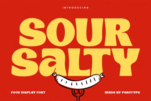
Sour Salty uses broad, rounded display letters with a confident food-brand personality. It could suit a coffee loyalty card for a cafe that also sells sandwiches, snacks or colorful takeaway treats.
Give the heading a wide strip of space and keep the stamp row below it. The substantial letters are already a strong graphic element, so a second large food illustration is optional.
View Font on Creative Fabrica →Preview • Download options • License details
Which font would I try first?
Dirty Latte and Coffee Brunch would be my first tests for a casual neighborhood cafe. Apricot Club offers a softer brush-lettered direction, while Mocha Cherry or the geometric Chocolate option could suit a cleaner identity. Choose the font that leaves the stamp area usable after the card is filled.
Product images are supplied font previews. The cover is an illustrative lettering montage. Layout suggestions are editorial ideas; fonts have not been installed or production-tested for this guide. Check the linked listing for current files, supported characters and license details.
More font ideas
Frequently asked questions
What kind of font works for a coffee stamp card?
A short, distinctive display heading paired with simple supporting text is a useful starting point. Chunky fonts can add warmth, while lighter faces need more careful contrast and print testing.
Why are there two fonts called Chocolate?
They are separate products with different previews and lettering styles. One has quirky narrow forms; the Weknow product has a rounded geometric appearance. Use the individual product links to compare the correct listing.
Can I use a decorative font for the reward terms?
It is better to keep reward conditions and contact details in a clear companion face. Decorative lettering can lead the design without making the small but important information harder to read.