22 Coffee Cup Sleeve Fonts I Would Try Before Printing
This article contains affiliate links. If you buy through them, I may earn a commission at no extra cost to you.
A cup sleeve has only a moment to be read: in a hand, beside a laptop or in a quick photograph. I want the cafe name to survive that moment. These coffee cup sleeve fonts give me several ways to make a small piece of packaging feel recognizable.
Some options suggest a warm bakery counter; others feel graphic, nostalgic or deliberately rough. I would use the list to choose a voice, then test that voice on the actual sleeve shape. The most attractive flat preview is not always the most effective lettering around a cup.
What should the cup say about the cafe?
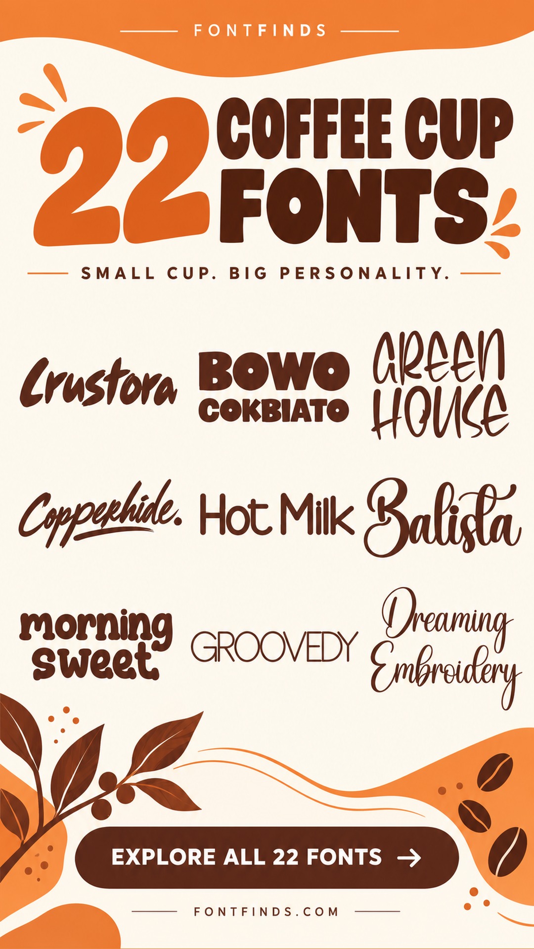
- Energetic and independent: Crustora — A substantial brush name with a clear silhouette.
- Calm and welcoming: Hot Milk — Simple rounded forms for an understated sleeve.
- Warm and layered: Cafe Corner — A printed-and-script contrast worth exploring.
What I would check before ordering sleeves
I would print a paper mockup and wrap it around the intended cup. That reveals where a long word disappears around the curve and whether the brand stays centered in the visible area. A short name or compact mark often has more presence than a long slogan squeezed into one line.
Next I would compare the ink against the sleeve stock. Rough kraft paper and delicate lettering can be an awkward combination, while a substantial silhouette may remain clearer. Keep a web address or small message subordinate to the cafe name and check the printer requirements before production.
1. Crustora: A bold handwritten cafe name
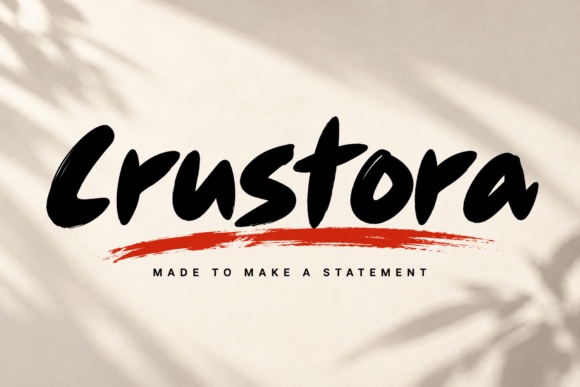
Crustora has thick, forward-moving brush forms that can give a short name real presence. I would try it for a cafe with a warm, energetic personality.
Keep the sleeve layout compact and leave space around the first and last letters. A clear single-color silhouette is a useful starting point before any additional styling.
Explore the Cup Lettering →Preview & download options
2. Bowo Cokbiato: A broad graphic wordmark
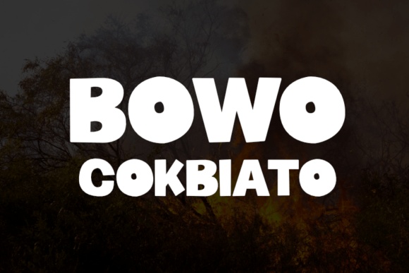
Bowo Cokbiato uses heavy rounded forms with a strong horizontal weight. I would consider it for a short cafe name that should read quickly on a cup.
A two-line arrangement may work better than a long strip. I would test the visible front of the wrapped sleeve before deciding the final proportions.
Explore the Cup Lettering →Preview & download options
3. Green House: A light handmade message
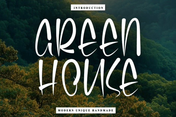
Green House has tall, narrow handwritten forms with open curves. I would use it for a short supporting message or a lighter cafe identity.
The thin strokes need a good contrast with the sleeve stock. Keep practical information separate rather than shrinking the same lettering to handle every line.
Explore the Cup Lettering →Preview & download options
4. Copperhide: A rugged independent-cafe direction
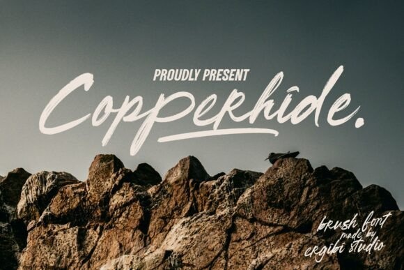
Copperhide has quick brush strokes and a rough, outdoorsy character. I would shortlist it for a cafe identity that should feel independent and informal.
A short name in one ink would be my first test. The mountain photography in the preview is a mood reference, not something the sleeve needs to copy.
Explore the Cup Lettering →Preview & download options
5. Hot Milk: A calm rounded alternative
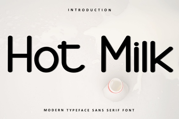
Hot Milk has simple, rounded forms that feel friendly without much decoration. I like it as a quieter option when the cup or sleeve already has a strong graphic color.
Keep the name clear and the supporting message brief. The understated shapes could help the packaging feel consistent across several drink sizes.
Explore the Cup Lettering →Preview & download options
6. Balista: A fuller script for a personal cafe
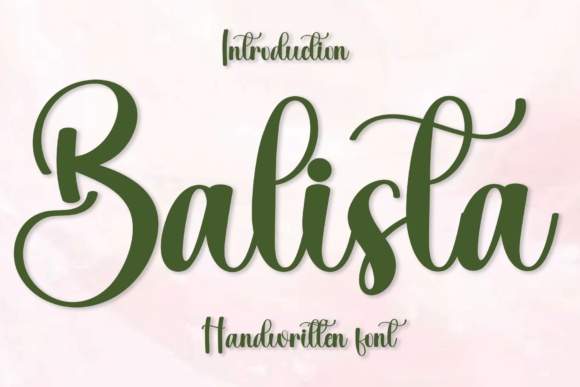
Balista has broad loops and a flowing handwritten rhythm. I would try it for a short cafe name that needs warmth and a recognizable initial.
Leave enough room for the capital and finishing stroke. On a wrapped sleeve, those extensions should remain visible rather than disappear around the sides.
Explore the Cup Lettering →Preview & download options
7. Morning Sweet: A cozy printed wordmark
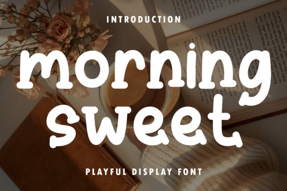
Morning Sweet has rounded, slightly irregular forms with a soft printed character. I would consider it for a bakery cafe or a welcoming neighborhood coffee brand.
A clean single-color treatment can preserve that warmth. I would avoid a busy background so the rounded letters remain the focus.
Explore the Cup Lettering →Preview & download options
8. Groovedy: A slim geometric change of pace

Groovedy has thin, wide geometric lettering that suggests a more modern urban cafe. I would explore it for a short name on a smooth, pale sleeve.
This is a direction that needs a careful print proof. The fine lines should remain visible before any extra patterns or darker paper are introduced.
Explore the Cup Lettering →Preview & download options
9. Dreaming Embroidery: An elegant handwritten cafe signature
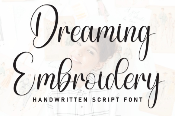
Dreaming Embroidery has fine connected strokes and tall looping capitals. I would use it for a larger brand mark when the sleeve has enough clear space.
I would not assume it is embroidery-ready because of its name. For print, the first question is whether the delicate joins survive at the chosen size.
Explore the Cup Lettering →Preview & download options
10. Jawakbrush: A casual brush message
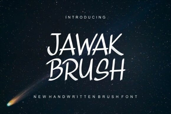
Jawakbrush shows slanted, narrow handwritten forms with a quick rhythm. I would try it for a short friendly message beside a simpler cafe wordmark.
Keep the wording compact and the ink dark. The informal lettering can add warmth without taking over the whole sleeve identity.
Explore the Cup Lettering →Preview & download options
11. Agenbrush: An outlined vintage accent
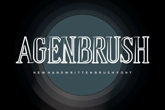
Agenbrush has tall outlined serif forms despite its brush-related name. I would consider it for a large, short cafe title with a vintage direction.
The inner lines need space to stay distinct. I would test the design on the actual stock before using the style for anything small.
Explore the Cup Lettering →Preview & download options
12. Gerabell: A seasonal sleeve with elegant curves
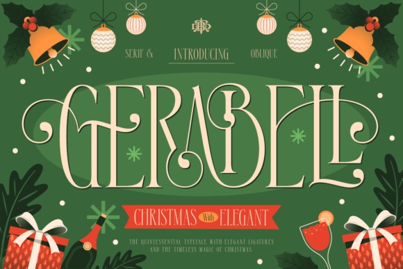
Gerabell has tall decorative serif forms and sweeping extensions. I would reserve it for a holiday sleeve or a special seasonal message rather than an everyday information line.
Keep the main cafe identity recognizable beside it. A limited seasonal accent can feel considered without replacing the whole brand for one drink promotion.
Explore the Cup Lettering →Preview & download options
13. Doris Day: A small handwritten note to the customer
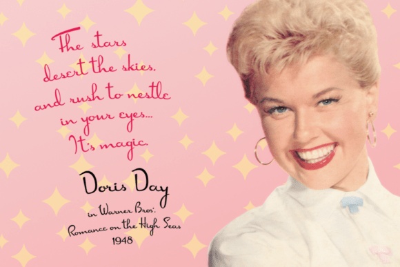
Doris Day shows delicate, loose handwriting with a personal character. I would use it for a brief thank-you or a small human touch on the sleeve.
The main cafe name should stay more prominent. Test the note on paper so the fine strokes do not disappear into the stock texture.
Explore the Cup Lettering →Preview & download options
14. Dean Martin: A light vintage cafe accent
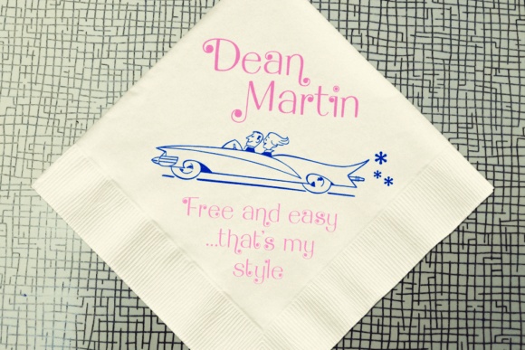
Dean Martin presents slender, playful lettering with a mid-century feel. I would consider it for a short secondary phrase on a sleeve with a simple main logo.
Keep the phrase easy to read and the surrounding graphics restrained. A tiny flourish or rule can reinforce the mood without filling the available space.
Explore the Cup Lettering →Preview & download options
15. Simple Cupcake: A friendly category-style wordmark
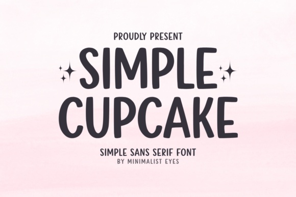
Simple Cupcake has tall rounded capitals with a gentle handmade character. I would try it for a compact cafe name or a clear short sleeve message.
Use comfortable spacing and a simple layout. The lettering offers enough personality that a large illustration is not required to make the sleeve feel welcoming.
Explore the Cup Lettering →Preview & download options
16. Delicious Cookies: An outline treatment for a bakery cafe
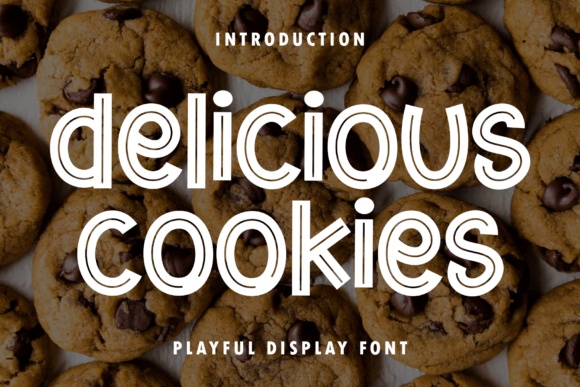
Delicious Cookies has rounded letters with repeated interior contours. I would consider it for a larger bakery-cafe wordmark where those lines can be seen.
Keep the stock and background quiet. I would compare the smallest sleeve size before using the treatment across the entire packaging range.
Explore the Cup Lettering →Preview & download options
17. Mister Sinatra: A retro printed cafe voice
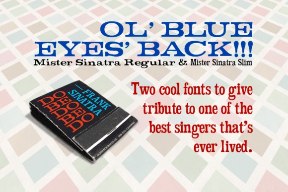
Mister Sinatra's preview presents a substantial retro serif direction. I would explore it for a cafe with a classic printed-paper identity rather than a handwritten one.
Inspect the actual alphabet and supplied styles on the listing. A short wordmark and a plain supporting line would be a useful first layout.
Explore the Cup Lettering →Preview & download options
18. Burn Timber: A rough handmade statement
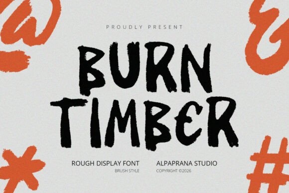
Burn Timber has irregular brush-like capitals with worn edges. I would use it for a cafe that wants a rugged, informal voice and a short memorable name.
Keep the rest of the sleeve clean. Too much additional texture would compete with the roughness already present in the lettering.
Explore the Cup Lettering →Preview & download options
19. Cafe Corner: A ready-made contrast to explore
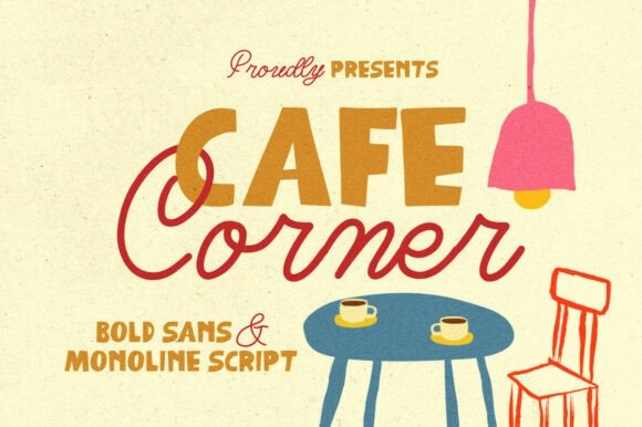
Cafe Corner's preview pairs a bold printed treatment with a lighter connected script. I like that contrast as a starting point for a name and a short supporting phrase.
Confirm the included files before planning the pairing. The two roles should remain clear, with the cafe name carrying the strongest emphasis.
Explore the Cup Lettering →Preview & download options
20. Sugarberry: A warm serif for a sweet counter

Sugarberry has rounded, substantial serif forms with a friendly rhythm. I would try it for a cafe that places pastries and sweet treats at the center of its identity.
Use the name plainly before adding decoration. A warm paper color and generous spacing can support the mood without recreating the elaborate product scene.
Explore the Cup Lettering →Preview & download options
21. Coffee Snow: A rounded seasonal headline
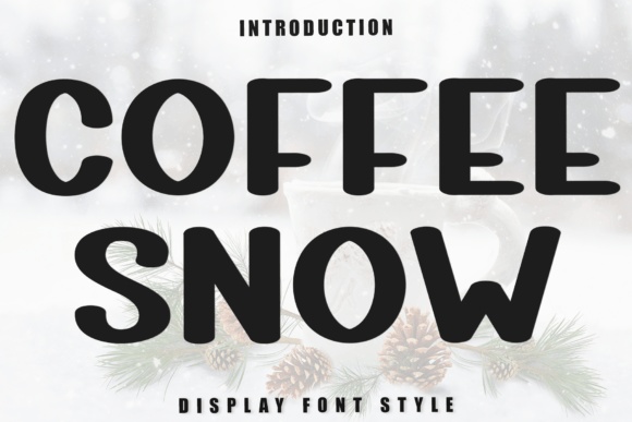
Coffee Snow has broad, soft printed forms with a strong silhouette. I would consider it for a winter sleeve message or a friendly compact cafe name.
Keep the words on one or two clear lines. The heavier shapes can stay prominent while a smaller companion handles any secondary information.
Explore the Cup Lettering →Preview & download options
22. Honey Cookies: A playful outlined bakery identity
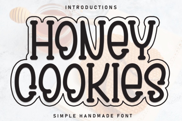
Honey Cookies uses rounded decorative forms with a visible outline treatment. I would try it for a bakery-cafe name when the sleeve allows the lettering to stay fairly large.
Check the outline and interior details on a printed proof. A simple border around the sleeve would be enough additional decoration.
Explore the Cup Lettering →Preview & download options
My shortlist would begin with the cup, not the mockup
I would compare a bold printed option with a warmer script and one restrained alternative, all on the same wrapped sleeve. The choice becomes much easier when the actual name and paper are involved. Open the matching font pages and check the complete lettering before sending a design to print.
My recommendations are based on a visual review of the supplied product previews, not installation or production tests. The cover is an illustrative lettering montage. Open the linked listing to check the full character set, supplied files and current license before downloading.
More font ideas
Frequently asked questions
Can I use a long slogan on a cup sleeve?
You can, but I would keep the cafe name more prominent and test the slogan on a wrapped mockup. Words near the sides may disappear around the cup.
Which lettering works best on kraft paper?
The answer depends on ink and production, but a clear silhouette is a useful starting point. Print a proof and inspect fine strokes rather than relying on a screen mockup.
Should the sleeve match the main cafe logo?
Usually it should feel related. If the full logo is too wide, create a compact arrangement using the same identity rather than choosing an unrelated font just for the sleeve.