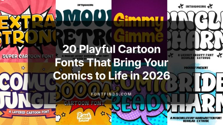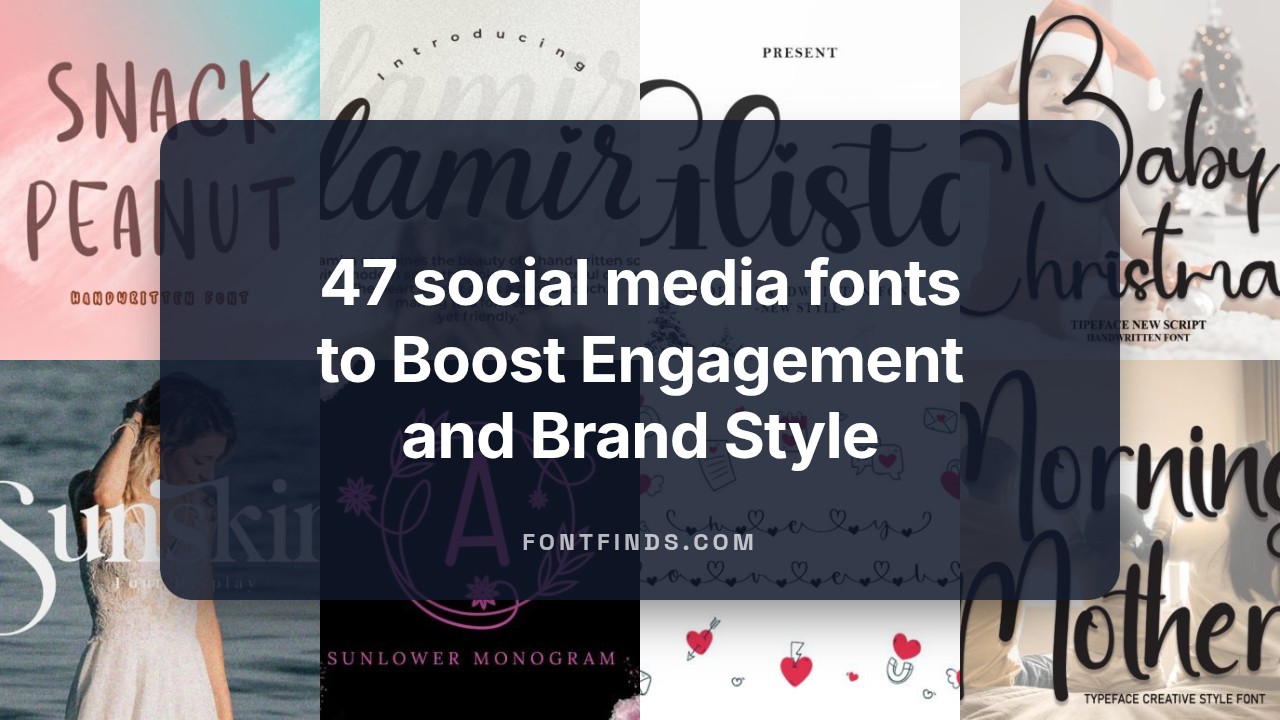
47 social media fonts to Boost Engagement and Brand Style in 2026
In 2026, visuals still lead and the right social media fonts can define your brand’s voice at a glance. This curated set of 47 typefaces includes versatile sans-serifs, bold display fonts, Instagram-ready scripts, and optimized webfonts so you can craft readable headlines, caption styles, and consistent social typography across platforms.
1. Kangen Michella Font
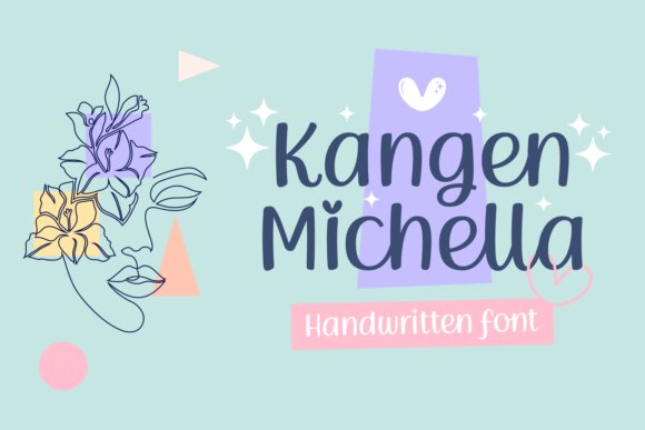
Kangen Michella is a whimsically handwritten script that blends playful loops with delicate, contemporary strokes. The design reads as intimate and artisanal rather than overly ornate, which makes it especially versatile for small-format use like stickers and planner pages as well as larger applications such as event signage. What sets this face apart are its decorative glyphs and swashes: because the font is PUA-encoded, alternates are easy to access and layer into layouts without hunting through complex menus. That accessibility makes it a strong pick for designers who want handcrafted charm without sacrificing workflow speed.
In practice, Kangen Michella brings personality to branding that needs a friendly, handcrafted tone — think boutique stationery, thank-you notes, and lifestyle product labels. The relatively open counters and moderate x-height keep legibility intact even when styled with heavy ornamentation, so you can confidently use it for short headlines or names. For pairing, Kangen Michella shines when set against clean geometric sans-serifs that let the script take visual focus; try it with a neutral grotesque for body copy. Lastly, if you’re into digital planning or crafting custom printable assets, its PUA-encoded swashes and alternates simplify creating elegant, unique compositions without additional toolchain complexity.
My Recommendation: I’d reach for Kangen Michella when I need a handcrafted, approachable look that still reads clearly across small prints and digital planners. Its PUA-encoding is a real time-saver: you get quick access to stylish alternates without extra font software. Use it for wedding stationery, boutique branding, and decorative labels where an artisanal hand-lettered feel is the goal.
2. Snack Peanut Font
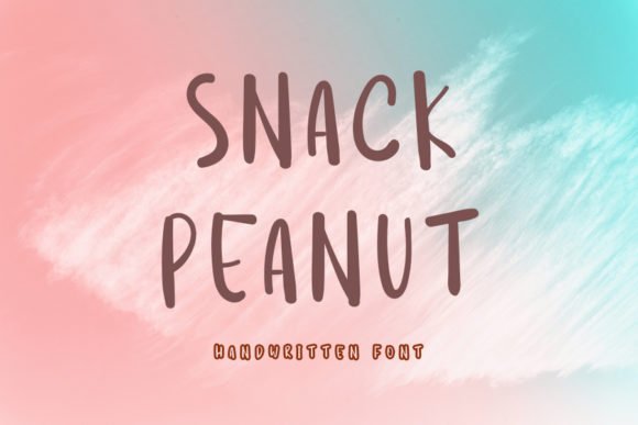
Snack Peanut is a neat, friendly handwritten script engineered for clarity and warmth. The letterforms have generous spacing and a lively baseline rhythm that keeps long strings of text readable at small sizes — a major asset for captions and overlays on busy images. Because of its balanced proportions and clean terminals, Snack Peanut performs exceptionally well on screens, which is why many creators choose it among social media fonts like Instagram and TikTok title work; it holds up on thumbnails, story cards, and pinned posts without clogging visuals.
Beyond its screen-friendly construction, Snack Peanut offers subtle character that suggests approachability rather than casual sloppiness: loops are modest, ascenders and descenders are controlled, and the overall texture reads neat even when letterspacing varies. This makes the typeface a dependable choice for personal brands, food and lifestyle projects, and product packaging that wants an inviting hand-lettered voice. When pairing, combine Snack Peanut with a sturdy slab or condensed sans for a contemporary editorial feel, or layer it over muted photography to create contrast between type and image.
My Recommendation: I use Snack Peanut when I want a warm, legible hand-lettered voice that won’t get lost on small screens. Its friendly shapes make it perfect for captions, product mockups, and content thumbnails where readability matters as much as personality. If your project needs a type that feels handmade but professional, Snack Peanut delivers consistently.
3. Welcome Sunday Display Font
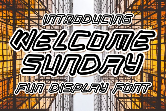
Welcome Sunday is a casual display face built to grab attention with a breezy, modern attitude. Its letterforms are slightly exaggerated in width and stroke contrast, giving headlines a playful punch without veering into cartoon territory. The font excels for short, bold statements — think poster headlines, event promos, and eye-catching web banners — because its shapes scale well and maintain impact at large sizes. Designers working on lifestyle or weekend-market branding will appreciate how Welcome Sunday conveys relaxed optimism with a clean, contemporary edge.
The display nature of Welcome Sunday encourages creative use: oversized titles, stacked wordmarks, and dynamic typographic treatments all benefit from its friendly character. It pairs well with restrained serif or neutral sans typefaces to form a clear visual hierarchy, and it performs strongly in social graphics, email headers, and video title cards where strong personality is required. Consider using tight tracking for compact logotypes or generous spacing for editorial mastheads — the font’s structure is durable in a variety of layout experiments.
Download Welcome Sunday Display Font
My Recommendation: I recommend Welcome Sunday when you want a headline that feels upbeat and modern without being flashy. It’s perfect for weekend event posters, lifestyle blog mastheads, and any project that needs a touch of casual personality. Use it large and let a clean secondary type handle body text to create a distinct, approachable brand voice.
4. Srinita Font
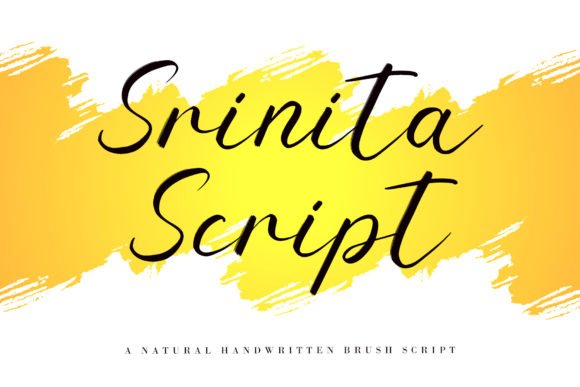
Srinita is a warm, classic handwritten script that balances expressive flourishes with excellent legibility. The letterforms lean slightly right with organic stroke modulation, giving headlines and short blocks of text a handcrafted, editorial feel without becoming fussy. Because it is PUA encoded, advanced glyphs, alternate swashes, and decorative end-letters are immediately accessible in most design apps — a huge time-saver when you want to iterate quickly. Srinita’s lowercase connections are smooth and consistent, which helps it retain clarity even when scaled down for captions or story overlays on mobile devices.
Where this font really shines is in visual content that needs a human touch: lifestyle branding, boutique packaging, and creator-focused posts that demand personality. It was clearly designed with on-screen behavior in mind, so spacing and kerning feel stable across Instagram carousels and promotional banners. If you’re building a cohesive feed, Srinita pairs well with a neutral sans for body copy and a condensed sans for subheads, creating a modern-vintage hierarchy that performs well in feeds and ads. For content creators hunting for social media fonts for Instagram Stories, Pinterest cover images, or YouTube thumbnails, Srinita provides both the flourish of a calligraphic script and the practical readability required for mobile-first audiences.
My Recommendation: I reach for Srinita when I want handwritten charm without sacrificing clarity. Its PUA access to swashes makes it fast to compose polished headers or logo marks, and the letter spacing holds up on small screens. Use it for boutique product labels, influencer branding, or any project where you need an elegant, approachable script that reads well in thumbnails and Stories.
5. Rathury Font
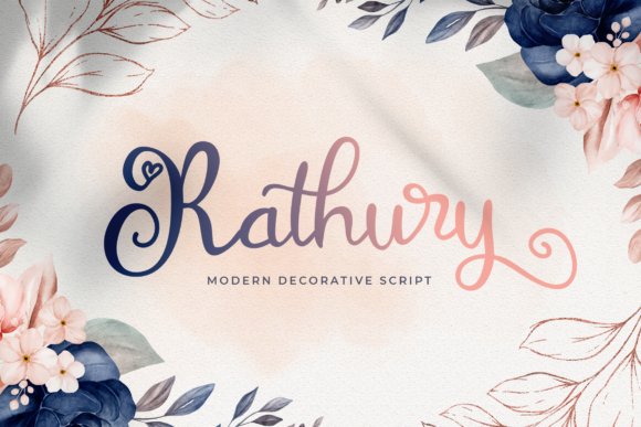
Rathury is a contemporary handwritten script with confident strokes and an abundance of stylistic ligatures that encourage playful typographic rhythm. The design leans toward modern calligraphy: smooth transitions between thick and thin strokes, graceful entry tails, and a curated set of swash alternates that give each word a slightly custom look. Unlike more ornate scripts, Rathury keeps its letterforms relaxed, which makes it surprisingly versatile — usable for everything from editorial pull quotes to hero headers on web banners.
Designers will appreciate how Rathury behaves in composition: the ligatures smooth awkward collisions, and the swashes can be used sparingly for emphasis or liberally for decorative wordmarks. Its modern personality suits lifestyle brands, event graphics, and packaging where a contemporary, handcrafted aesthetic is wanted. When pairing, place Rathury with a crisp geometric or humanist sans to maintain balance and improve readability for body text. I also recommend testing Rathury at smaller sizes and in motion; its rhythm translates well to animated titles and short video captions, making it a strong choice for creators looking to elevate visuals with an expressive script voice.
My Recommendation: I would use Rathury when a project needs a modern, stylish script that still reads well across media. Its ligatures and swashes give logos and headers a bespoke feel without requiring deep OpenType expertise. Ideal for boutique brands, event invitations, and animated social clips where a contemporary handwritten voice helps the content stand out.
6. Story Line Font
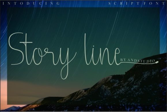
Story Line is an elegant, meticulously crafted handwritten font that favors refined strokes and tidy terminal shapes, making it a go-to for polished visual identities. The design feels deliberate: each character exhibits careful weight transitions and consistent joining behavior, which lends the entire alphabet a calm, professional presence. Because it is PUA encoded, you can access swashes, alternates, and decorative glyphs quickly, enabling custom logotypes and romantic wedding invites without fiddling in complex feature panels. The overall spacing and contrast make Story Line particularly suited to applications where close cropping and overlay text are common — for example, hero images and product lifestyle shots.
Creators and brand designers will find Story Line very adaptable: it brings a handcrafted nuance to packaging, signage, and editorial spreads while remaining refined enough for high-end branding. The font’s neutral but distinctive personality helps it sit comfortably alongside serif or humanist sans companions, allowing clear hierarchical systems on websites and printed materials. For short-form video and vertical content, Story Line’s letter shapes maintain readability even when animated or blurred slightly, which is why many designers consider it among the best social media fonts for curated feeds and professional-looking story templates. It’s a sophisticated choice when you want an artisanal touch that reads consistently across screens and print alike.
My Recommendation: I recommend Story Line when you need a neat, high-end handwritten font that performs across both digital and print. Its PUA-encoded alternates let you craft distinctive wordmarks quickly, and the typeface holds up well in motion and tight layouts. Use it for branding, wedding invitations, product packaging, and curated social content where elegance and legibility must coexist.
7. Eternity Font
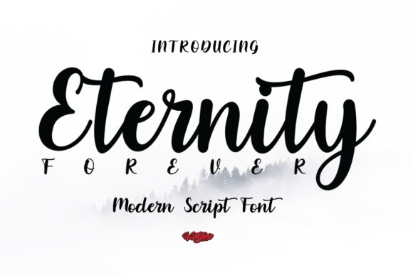
Eternity is a contemporary handwritten script that balances charm with clarity. Its letterforms are rounded and slightly bouncy, giving each word an approachable, handcrafted feel without sacrificing legibility—an important trait when type will appear on small screens or mobile feeds. The font includes several alternate characters and flowing connections that mimic natural pen strokes, which makes it ideal for expressive headers, quote overlays, or branding that needs a personable voice. Designers will appreciate how Eternity preserves consistent spacing across complex letter combinations, reducing the need for manual kerning adjustments when used in wordmarks or product labels.
Beyond aesthetics, Eternity performs well across both print and digital contexts: it reads cleanly on postcards and stickers, and renders crisply in social captions and story graphics. Pairing suggestions include pairing Eternity with a neutral geometric sans for body text, or with a light condensed serif to create an elegant editorial contrast. Because the font leans toward the cute and contemporary, it shines in lifestyle and boutique branding—think handmade goods, beauty packaging, or playful event invites—where warmth and personality are priorities. Overall, Eternity’s thoughtful alternates and balanced rhythm make it a reliable, creative option for designers wanting a friendly handwritten script that scales across multiple channels and formats.
My Recommendation: I’d reach for Eternity when I need a script that feels human and upbeat without being fussy—perfect for boutique product labels, Instagram story headers, or heartfelt event invitations. Its alternate characters let me inject personality while maintaining consistent spacing for quick layout work. Use Eternity when you want approachable charm and dependable legibility across both on-screen and printed pieces.
8. Magnolia Monogram Font
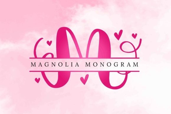
Magnolia Monogram is a decorative monoline script designed around ornate capitals and delicate wreath-like ornaments that wrap and accessorize each letterform. The font’s embellishments are its standout feature: floral ligatures, terminal swashes, and inset ornaments transform simple initials into elegant emblems, making it exceptionally well suited for wedding stationery, artisanal product labels, and boutique logo work. The careful contrast between the slender stems and fuller decorative elements produces a refined silhouette that reads as both classic and contemporary, and stylistic sets let designers dial the level of ornamentation up or down depending on the project.
Because Magnolia Monogram was built with visual impact in mind, it’s a natural pick for visual-first channels—especially when you need to create memorable visual hooks for campaigns across platforms like Instagram and Pinterest. It is one of the more striking options among social media fonts , as the ornate characters help branded posts and profile marks stand out in crowded feeds. Practical features include alternate capitals for custom monograms, vector-friendly outlines for merchandise production, and thoughtful spacing that supports embroidery or etching workflows for mugs, tote bags, and apparel. If you need an ornate identity or want to make initials the focal point of a design, Magnolia Monogram delivers an elegant, handcrafted feel that scales beautifully from digital mockups to finished products.
Download Magnolia Monogram Font
My Recommendation: I would choose Magnolia Monogram when the brief calls for elevated, romantic flair—think wedding invites, boutique labels, or premium packaging where initials act as a focal mark. Its ornaments make it especially effective for merchandise and social campaigns that need a signature, artisanal look. Use it sparingly on large display elements or monograms and pair it with a simple sans for supporting copy so the decorations remain the star without overpowering the design.
9. Rain Font
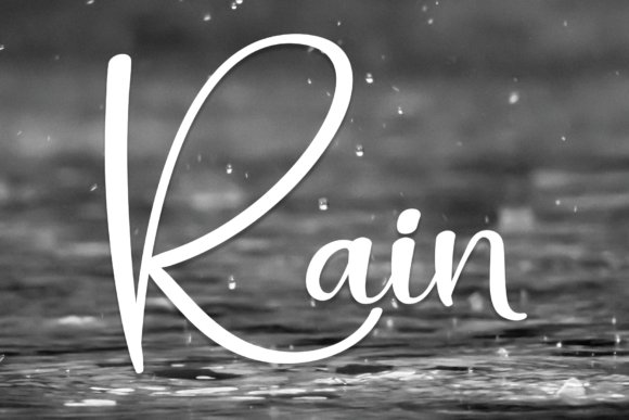
Rain is a straightforward, friendly handwritten typeface that favors simplicity over flourish, offering designers a genuine hand-lettered feel without visual clutter. The strokes are clean and relaxed, giving copy a casual, conversational tone that reads well on greeting cards, presentation slides, and craft labels. Because Rain avoids heavy swashes or excessive contrast, it remains legible at smaller sizes and performs reliably in multi-line settings—useful when you need a personal touch across captions, packaging, or stationery without compromising readability. Subtle irregularities in stroke width lend authenticity, suggesting the font was written with a fine marker rather than mechanically generated.
Functionally, Rain works as a versatile companion to neutral sans-serifs and narrow condensed faces, making it a great accent for headlines, pull quotes, or callouts in layouts. Its approachable personality suits family-focused brands, children’s products, and casual lifestyle projects where warmth and clarity are primary goals. For craft and DIY applications—labels, stickers, and handout templates—the font’s uncomplicated letter shapes simplify production and cutting. If you need a dependable, humanist handwritten style that feels handmade but remains polished across both print and digital outputs, Rain is a pragmatic choice that keeps the message friendly and accessible.
My Recommendation: I’d use Rain when I want an honest, easygoing handwritten voice—especially for greeting cards, educational materials, or informal branding where approachability matters. Its clean strokes make typesetting multiple lines painless, and it pairs well with neutral sans faces for a balanced layout. Choose Rain when you want warmth and readability without decorative fuss.
10. Glista Font
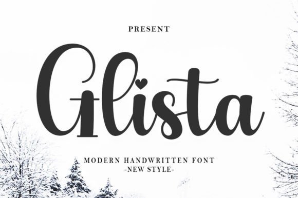
Glista is a warm, handwritten script that reads like an artisan’s pen stroke—fluid but intentional, with a slightly casual cadence that gives designs personality without sacrificing legibility. On large-format uses such as wall displays and signage its graceful ascenders and subtle ink-like texture provide an inviting, human touch; scaled down for product packaging or watermarks, its letterforms retain clarity thanks to well-considered counters and moderate contrast. The typeface includes alternate characters and gentle swashes that let you dial up the elegance for wedding invitations or dial it back for more utilitarian labels, and it plays particularly well with condensed sans-serifs when you need a modern headline paired with handwritten warmth.
From a social and digital perspective, Glista adapts beautifully to visuals and branding across platforms—its hand-crafted rhythm photographs well and layers cleanly over imagery used in advertisements and photography captions, making it a natural choice among social media fonts for creators who want personality without gimmickry. Technically it’s forgiving: consistent spacing, reliable kerning pairs, and a set of stylistic alternates make it straightforward to use in popular design apps and mobile editors. If you care about a bespoke, handcrafted aesthetic for logos, stationery suites, or product design, Glista gives you a range of expressive options that stay readable and polished both in print and on screen.
My Recommendation: I reach for Glista when a project needs a handcrafted, approachable voice—wedding suites, boutique packaging, and brand headers where authenticity matters. Its alternates and swashes let me craft small moments of flourish without breaking visual hierarchy, and it photographs far better than many scripts when layered over texture or lifestyle photos. Use it when you want warmth and personality that still reads clearly at a glance.
11. Hay Cinderella Font
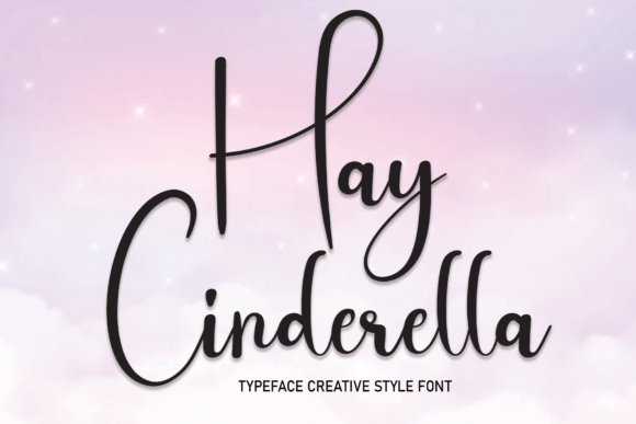
Hay Cinderella is a friendly, uncomplicated handwritten font built for accessibility and charm. Its rounded terminals and steady stroke width make it feel relaxed and personable, which is why it transitions seamlessly from crafting projects and greeting cards to informal presentation slides and digital collaterals. The character set emphasizes straightforward letter shapes rather than decorative flourishes, so it reads well at smaller sizes and maintains a natural rhythm across multi-line text blocks—ideal when you want a human touch without ornate calligraphy.
Designers will appreciate how Hay Cinderella behaves as a utility script: it integrates cleanly with geometric sans fonts for headings or with light serifs for a slightly vintage pairing, and it responds well to color contrast and layering treatments. Because it lacks aggressive swashes, it’s forgiving in layout work and quick to implement in templates, social graphics, and downloadable assets for workshops or classes. If you need a handwriting-style typeface that feels trustworthy, uncomplicated, and versatile, Hay Cinderella is a practical, attractive option that keeps creative friction low.
My Recommendation: I use Hay Cinderella when the brief calls for warmth without fuss—think kid-friendly branding, heartfelt cards, or approachable slide decks. It’s one of those fonts that speeds up design decisions because it’s neutral enough to pair easily yet distinct enough to add personality. For rapid production of printables, craft labels, or casual brand accents, Hay Cinderella consistently delivers.
12. Baby Christmas Font
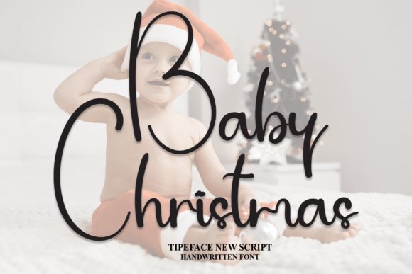
Baby Christmas brings a playful, festive hand-lettered style that’s perfect for seasonal projects and joyful identities. The strokes are bouncy and slightly irregular, giving the text a handcrafted, whimsical flair that reads as both childlike and charmingly polished. It includes a variety of alternates—mini swashes, dotted embellishments, and festive ligatures—that let you create greeting cards, gift tags, banners, and holiday packaging with personality, while keeping the composition readable and fun. When used within short headlines or overlays on photography, these ornamented characters add sparkle without overpowering the imagery.
On digital platforms and interactive campaigns, Baby Christmas performs particularly well: its expressive letterforms stand out in banners, story posts, and seasonal promos where attention is fleeting, which is why designers often select it from collections of social media fonts when crafting holiday-themed content. The typeface also adapts nicely to color and texture effects—metallic fills, snow-dusted shadows, and drop highlights all enhance its festive vibe. For anyone producing seasonal assets across print and screen, Baby Christmas supplies both the decorative flourishes and the practical legibility needed to make cheerful, on-brand designs quickly.
My Recommendation: I recommend Baby Christmas for seasonal branding and holiday merchandise—its joyful letter shapes instantly communicate celebration and charm. Use it when you want festive flair on cards, tags, banners, or social promos; the alternates make it easy to customize each piece without much effort. If you need a cheerful script that reads well on both mobile screens and printed gift wrap, this typeface is a fast, reliable choice.
13. Glamira Script Font
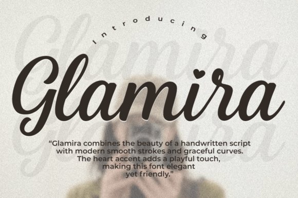
Glamira Script presents a polished, contemporary take on the classic script genre, defined by fluid strokes and delicate heart-shaped terminals that give the face a distinctly romantic personality. The letterforms are drawn with confident, slightly contrasted strokes that read elegantly at headline sizes yet remain detailed enough to survive close scrutiny on print. When used for brand identities, Glamira brings a fashion-house sensibility: it creates a graceful focal point for logos, boutique packaging, and high-end invitations. The heart accents and curated swashes can be deployed sparingly to add flair without overwhelming a composition.
From a workflow perspective, Glamira is versatile: it pairs exceptionally well with neutral geometric sans-serifs when you need modern balance, or with light serif bodies for editorial contexts where a refined, feminine touch is desirable. Pay attention to tracking and line-height—because of the long ascenders and decorative terminals, tighter tracking can look crowded in multi-line text whereas generous spacing helps the script breathe. For social visuals and story overlays, use solid contrasting shapes or subtle drop shadows to preserve legibility at small scales; for packaging, lock up Glamira against minimal textures to let its ornamental details shine. Overall, it’s a fashionable script that reads as both contemporary and timeless when deployed with restraint and good typographic pairing.
My Recommendation: I reach for Glamira Script when a project needs an immediate lift of elegance—think boutique branding, wedding suites, and premium product labels. Its heart accents give it a memorable signature that works beautifully for feminine or romantic identities. Use it as a display element paired with a clean sans for body copy to maintain clarity and visual hierarchy.
14. Lovely Forever Script Font
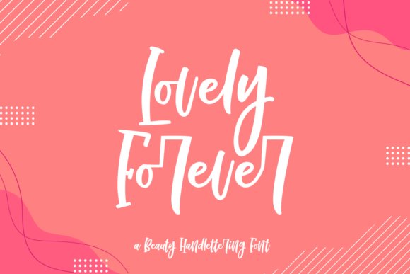
Lovely Forever is a warm, hand-drawn script that reads like an approachable, friendly signature. Its rounded terminals and slightly uneven stroke widths create an organic, human feel that’s perfect for projects aiming for personality rather than polish. The letterforms include playful alternates and modest swashes that let you vary looks across headlines, captions, and on-screen graphics; this makes Lovely Forever especially effective for short bursts of copy where attitude matters more than long-form legibility. Because of its charming character, it’s ideal for packaging, greeting cards, and personal-brand assets that need an inviting tone.
From a digital design standpoint, Lovely Forever performs exceptionally well for attention-grabbing overlays, thumbnails, and story graphics where expressive script can cut through the noise. It scales nicely at typical social sizes, and when combined with bold color blocks or soft gradients it helps thumbnails and posts stand out in feeds. If you’re building content specifically for platforms, Lovely Forever integrates seamlessly with headline styles and sticker-style layouts; it has a friendly voice that complements playful iconography and hand-illustrated elements. For creators who need type that feels handcrafted but reliable, Lovely Forever is an excellent go-to—especially among social media fonts are often chosen for personality and immediacy, and this face delivers both.
Download Lovely Forever Script Font
My Recommendation: I would use Lovely Forever when the goal is to make content feel warm, handmade, and approachable—perfect for lifestyle creators, boutique shops, and kids’ product lines. Its alternates let you create visual variety without leaving the type family, which is invaluable for campaign assets. Pair it with a clean sans for body text and use it prominently in thumbnails and story covers to quickly communicate friendliness and charm.
15. Hello Picha Script Font
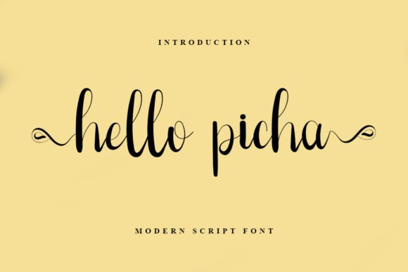
Hello Picha is a delicate, restrained script that favors clarity and refinement over flamboyant ornamentation. The strokes are light and slightly tapered, producing a dainty silhouette that reads as both modern and graceful. One of Hello Picha’s most practical advantages is its PUA encoding, which exposes a wide range of swashes, alternates, and contextual ligatures directly from most design apps without advanced OpenType workflows. That accessibility makes it simple to introduce stylish flourishes for logos, invitations, and editorial pull quotes while keeping the main text clean and readable.
In applied design, Hello Picha excels where minimalism meets a human touch: think pared-back wedding stationery, upscale spa branding, or understated packaging where a subtle script conveys sophistication. Because of its fine line quality, maintain sufficient contrast against background images and avoid placing it on noisy textures without a solid backing. For web and social use, increase tracking and slightly boost font size for small-screen readability; for printed materials, its refined details reward high-resolution production and careful kerning. As a practical tip, combine Hello Picha with a neutral sans or a soft slab serif for balanced hierarchies—use the script sparingly as a focal accent rather than a body text face.
Download Hello Picha Script Font
My Recommendation: I recommend Hello Picha when you want a soft, sophisticated script that won’t overpower supporting design elements. Its PUA-encoded swashes make it easy to add handcrafted touches without complex font features. Use it for minimal branding, elegant invitations, or editorial headers where subtle personality and legibility must coexist.
16. Sirikaya Font
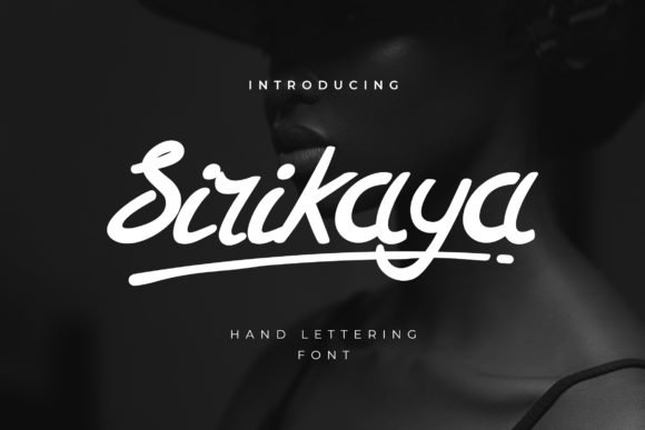
Sirikaya is a handcrafted script with fluid, expressive strokes that feel like a thoughtful note penned with a fine brush. The letterforms combine delicate hairlines with fuller downstrokes to create a lively rhythm across words; this dynamic contrast makes the font feel both personal and polished, ideal for branding that wants a human touch. Designers will appreciate how Sirikaya balances ornamentation and clarity: its swashes and terminal flourishes add flourish without overwhelming short headlines, while the more restrained letter shapes keep longer lines readable. Because of its naturalistic motion, it photographs and animates beautifully—perfect for looping Instagram story clips, animated title cards, and short video overlays where movement enhances the handwritten quality.
From a practical standpoint, Sirikaya adapts well to packaging, editorial pull-quotes, and signature-style logos where authenticity matters. When paired with a simple geometric sans for body copy, it lifts layouts with personality without compromising hierarchy. If you work with color and texture, try Sirikaya on soft pastels or on grainy paper textures to emphasize its artisanal character; conversely, high-contrast solid backgrounds will make its fine strokes pop for social banners and profile headers. For creators building out a visual identity across platforms, Sirikaya brings a consistent, handcrafted tone that reads as modern craft rather than overly ornate script, making it a versatile addition to any designer’s toolkit—especially for projects that benefit from an intimate, boutique aesthetic and need to stand out in feeds dominated by templated styles. social media fonts
My Recommendation: I’d reach for Sirikaya when I want a handcrafted look that still reads clearly across digital layouts—it’s especially good for boutique brands, lifestyle bloggers, and product packaging where you want warmth and personality. Its brush-like movement animates nicely in short videos and creates a memorable signature for logos and Instagram highlights. Use it with a clean sans-serif to ground the design and reserve Sirikaya for headlines and accent text so its flourishes can do the talking.
17. Hey Lovely Font
Hey Lovely is a romantic, handwritten script designed with softness and warmth in every curve. Its characters lean gently, with looping connections that evoke an intimate, handwritten love note—making it a natural choice for wedding stationery, boutique product labels, and feminine brand identities. What sets this font apart is the PUA encoding, which opens up a library of alternate glyphs, swashes, and stylistic variations that you can access without advanced OpenType features; this makes it approachable for hobbyists and pros alike, as you can swap in different caps and tails directly in many design apps.
Beyond invitations and greeting cards, Hey Lovely works wonderfully in editorial mastheads and lifestyle blog headers where a tender, handcrafted voice is needed. Carefully tune tracking and line-height when using it for multi-line text to maintain readability—its ornate caps look gorgeous at larger sizes but can crowd if set too tight on smaller screens. To maximize its romantic feel, pair hey Lovely with muted neutrals, soft gradients, or photographic backdrops that showcase its looping terminals; alternatively, set it against a heavy, structured serif for a modern-classic contrast. The font’s versatile alternates give you many ways to create custom logotypes and monograms without creating new outlines, which saves time while maintaining an authentic, bespoke appearance.
18. Christmas Chalk Font
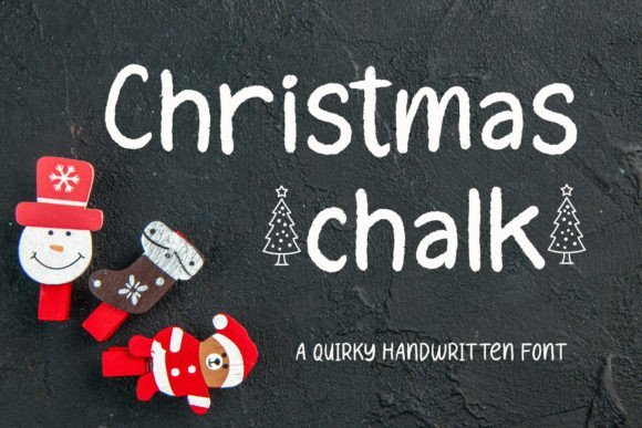
Christmas Chalk brings a charming, slightly rough-hewn handwriting style that captures the joyful imperfection of chalk on a board—playful, textured, and full of seasonal character. The strokes carry a subtle grain and irregular edges that read as handcrafted rather than machine-made, making it a compelling choice for limited-time holiday campaigns, festive menus, and craft-market signage. Its quirky letterforms include whimsical terminals and uneven baselines that feel handmade and friendly; those attributes help copy stand out in crowded feeds where polished, uniform type often looks sterile.
Technically, Christmas Chalk is ideal for stylized headlines and short bursts of copy where texture enhances tone: think social banners, gift tags, story templates, and in-store window displays. It layers exceptionally well—try combining it with a soft drop shadow or a halftone texture to amplify its chalkboard vibe—and pairs nicely with simple sans-serifs or condensed slab serifs to keep the visual hierarchy clear. For seasonal creatives who want type that communicates warmth and nostalgia, this face provides a tactile, analog sensibility that translates well to both printed goods and animated digital assets. Because it reads strongly at display sizes, Christmas Chalk helps seasonal messaging cut through the noise on holiday posts and ads, making it a reliable go-to among social media fonts
My Recommendation: I recommend Christmas Chalk for any holiday-focused project that benefits from a handmade, nostalgic look—holiday promotions, craft fair materials, or cheerful greeting cards all gain personality from its textured strokes. It’s especially useful when you want to evoke shop-front chalkboards or DIY packaging; pair it with rich, festive colors and modest ornamentation to keep the message legible yet charming. Use it for headlines and accents rather than body text to make the most of its distinctive, chalk-like character.
19. Real Super Font
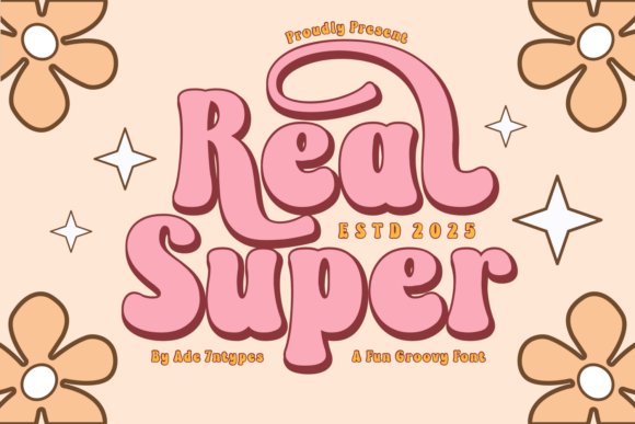
Real Super Font is a sprawling retro-inspired display family that channels the bold, groovy energy of 1970s graphic language while remaining surprisingly adaptable for contemporary projects. This collection doesn’t behave like a single face — it reads like a whole studio of type styles, from chunky, statement-making serifs to airy, playful sans-serifs and ornamental dingbats that feel hand-crafted. The elaborate set of stylistic alternates and decorative glyphs make Real Super especially useful for large-format work such as posters, vintage-style signage, and apparel prints produced via sublimation or Cricut vinyl cutting. Each weight and motif is tuned for showy headings and logotypes where personality matters more than neutral utility, and the designs are forgiving with tight tracking so they perform well when scaled up into display environments.
Beyond the nostalgic surface, Real Super is practical: the letterforms retain clear counters and predictable shapes that improve legibility at medium-large sizes, and the assortment of seasonal and thematic variants (from floral scripts to holiday ornaments) streamlines themed campaigns that need a coherent visual voice. For crafting and merchandise, the dingbat sets act as ready-made embellishments — perfect for stickers, totebag patterns, and party goods — while the handwritten script variants bring a tactile quality to invitations and product labels. If you’re building a colorful brand identity or a series of promotional assets that should instantly read as ‘vintage with a modern edge,’ Real Super provides the decorative vocabulary and functional versatility to execute that look across physical and digital touchpoints.
My Recommendation: I’d reach for Real Super when I want a single family to cover an entire retro-themed campaign — from T-shirts and party banners to bold Instagram posts. Its mix of display weights and ornaments saves time because you don’t have to stitch together multiple disparate typefaces. Use it when the brief calls for character, nostalgia, and plenty of decorative flair rather than strict corporate neutrality.
20. Sunskin Font
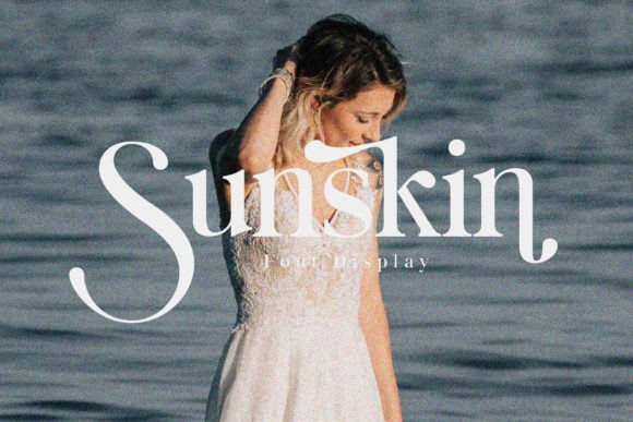
Sunskin Font is a contemporary serif designed with a fresh, slightly warm personality that suits modern branding and editorial projects. Its strokes carry a tasteful contrast that reads refined at headline sizes and still holds character when used for larger blocks such as posters or packaging panels. The letterforms balance the classic with the new: terminals and joins have subtle quirks that make logotypes and wordmarks feel bespoke, while the overall rhythm preserves legibility on digital screens and mobile devices. Designers will appreciate how Sunskin’s shapes perform in tight layouts and how the refined counters maintain clarity when reproduced in print or rasterized for social thumbnails.
In use, Sunskin shines as a primary type for brand identities, polished poster headlines, and stylized editorial layouts — and it translates smoothly into social contexts because the face renders crisply in small image crops and hero banners. It also pairs thoughtfully with clean sans-serifs when you need contrast between voice and body copy; its high x-height and moderate contrast make it particularly effective for short, expressive phrases and logotype treatments. For teams working across both physical collateral and platform-specific assets (stories, carousel posts, and headers), Sunskin integrates well into design systems and is a smart choice if you’re aiming to elevate your visual language without losing readability, especially when you need dependable social media fonts for consistent cross-platform presence.
My Recommendation: I recommend Sunskin when a project needs a chic but grounded serif — think boutique brand identity, editorial mastheads, or premium product packaging. It’s my go-to when I want a serif that reads modern across screens and print without looking overly formal. Pair it with a neutral sans for UI and body text to create a balanced, professional look.
21. Sunlower Monogram Font
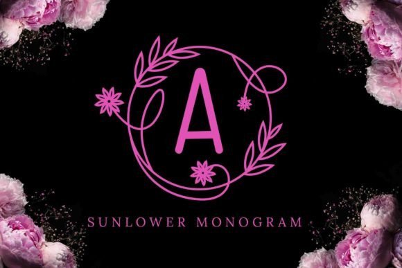
Sunlower Monogram Font is a decorative, ornamented script built around elegantly embellished letterforms intended for personalized and romantic applications. Each character is graced with floral motifs and swashes that interlock beautifully when set as initials, making the face particularly suited to wedding stationery, bespoke labels, and monogrammed goods like mugs and totebags. The intricacy of the ornaments gives a handcrafted flair — designers can isolate individual pieces as graphic accents or combine initials into lockups that feel like custom-engraved insignias. Because of its ornamental nature, Sunlower Monogram works best at display sizes where the decorative details remain legible and impactful rather than in fine-print contexts.
Practical uses for Sunlower include creating memorable product branding for lifestyle lines, crafting eye-catching hero headers for boutique shops, and producing charming social posts and story templates that need a romantic or artisanal touch without looking mass-produced. When preparing files for print or laser engraving, the high-contrast strokes and decorative terminals reproduce well if vectorized; for apparel or transfer printing, experiment with layered color fills to highlight the ornaments. Keep in mind that this face is most effective when treated as a focal graphic element — pair it with minimalist sans fonts to avoid visual competition and reserve it for moments where personality must be the main message.
Download Sunlower Monogram Font
My Recommendation: I’d choose Sunlower Monogram for projects that benefit from a handcrafted, romantic signature — wedding invites, boutique labels, and premium gift items are perfect fits. Its decorative initials make simple monograms feel like bespoke emblems, and it’s especially satisfying when used as a single standout element against clean layouts. Use sparingly, pair with neutral typography, and scale generously so the ornamentation can do the heavy lifting.
22. The Starlight Font
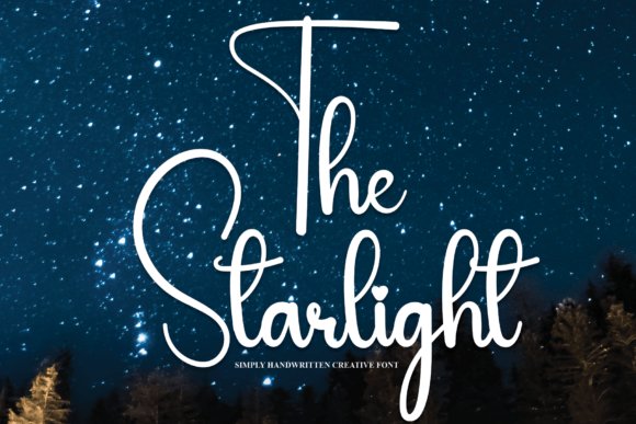
The Starlight is a warm, hand-drawn script that balances casual charm with disciplined legibility. Its rounded terminals, slightly irregular stroke widths, and open counters make text feel friendly without becoming sloppy, which is why it translates so well across small-screen contexts. The letterforms carry a modest x-height and generous spacing that preserve clarity in tight interfaces, and a handful of alternative characters and contextual ligatures give designers subtle control over rhythm and flow. Visually, it sits between a handwritten signature and a polished logotype, so it reads as personal but still reliable when paired with geometric sans-serifs or refined serif captions.
Beyond aesthetics, The Starlight performs particularly well as a headline and accent face for feeds, stories, and profile graphics — it reads crisply in thumbnails and holds personality in motion graphics. I recommend it when you need a type that can function both as a voice for product announcements and as the approachable face of handcrafted goods; it’s also one of the best social media fonts for creators who want an authentic, human tone that remains readable at reduced sizes. The font’s open letterforms also print cleanly for labels, stickers, and greeting cards, making it a versatile bridge between on-screen presence and tactile applications.
My Recommendation: I reach for The Starlight when a project needs warmth without losing professionalism. Its legibility on small screens and natural strokes make it ideal for Instagram story headers, YouTube thumbnails, and boutique packaging. Use it anytime you want to convey friendliness and handcrafted authenticity while keeping readability top of mind.
23. Winter Christmas Font
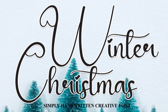
Winter Christmas is a festive, hand-lettered script imbued with holiday cheer through gentle swashes and playful terminals. The alphabet features a slightly bouncy baseline and decorative alternates that mimic hand-traced ink, giving words a joyful motion that feels at home on seasonal cards and event posters. While the strokes are intentionally ornamented, the designer retained clear internal counters and proportional spacing so that the characters remain legible even when layered over photographic backgrounds. Small decorative elements—like snowflake dots on the i and tapered entry strokes—add personality without overwhelming a layout, making this a great seasonal display face.
In practical use, Winter Christmas shines in campaign banners, seasonal packaging, and animated greeting GIFs; its cheerful personality draws attention without requiring heavy effects. Pair it with a low-contrast slab or a neutral sans to ground the composition and prevent visual clutter, and reserve the script for headlines, logo marks, or call-to-action badges where it can carry the mood. For print work such as gift tags or letterpress cards, its ornamentation prints crisply; for digital assets, adjust tracking slightly for smaller sizes to preserve readability on mobile devices and quick-scrolling feeds.
Download Winter Christmas Font
My Recommendation: Use Winter Christmas when you need instant seasonal character—its festive ornaments and friendly rhythm make it perfect for holiday campaigns, party invites, and whimsical product labels. It’s especially effective as a headline or logo accent paired with clean body copy. I like it for projects that require a joyful tone without sacrificing legibility or professional polish.
24. Happy Font
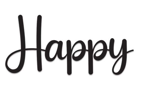
Happy is an upbeat, energetic script with a bouncy baseline and lively stroke endings that give every word a sense of movement. Its rounded terminals and slightly variable stroke pressure imitate a felt-tip pen, producing a friendly aesthetic that works well for youth-oriented brands and playful packaging. The typeface includes a generous set of alternate characters and discretionary ligatures so you can create custom-looking headlines and logos without hand-lettering. Despite its exuberant personality, the spacing and contrast are carefully tuned so that text remains legible at small sizes and on fast-scrolling platforms.
Because of its expressive forms, Happy is especially effective when used as a focal element in social campaigns, thumbnails, and bright, cheerful product shots — it stands out in crowded feeds and conveys a human voice instantly. For designers building layouts, pair it with a narrow grotesque or a light serif to create contrast and give the script room to breathe; it also adapts well to motion graphics and animated overlays where the playful strokes can be emphasized. If you’re optimizing headlines for engagement, Happy consistently boosts click-through impact without sacrificing accessibility, and it behaves predictably across export formats and responsive breakpoints.
My Recommendation: I recommend Happy when you want typography to feel joyful and personal, especially for children’s products, lifestyle brands, or promotional graphics. Its alternates and ligatures let you dial in personality quickly, and it performs well across animated and static assets. Reach for this font when you need to grab attention on a crowded feed while still keeping your message clear and friendly.
25. Selina Daniel Duo Font
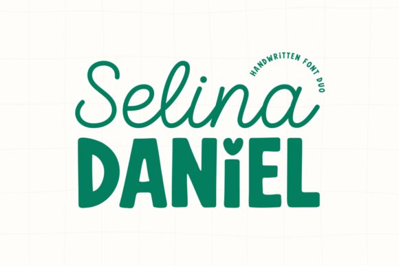
Selina Daniel Duo Font is a study in purposeful contrast, pairing a delicate, free-flowing script with a chunky, friendly sans-serif to produce a single toolkit that solves many branding problems at once. The Selina script offers airy strokes, variable connections and a natural rhythm that reads as personal and handcrafted; it’s ideal for signatures, hero headlines and wedding stationery where a romantic, hand-written feeling is required. The Daniel companion counterbalances that lightness with a grounded, rounded print that features generous x-height and a playful heart-shaped dot on the lowercase ‘i’ — a tiny flourish that gives packaging and social graphics a memorable, approachable personality. Together the two styles create a reliable typographic hierarchy: use Selina for emotive, attention-grabbing headlines and Daniel for supportive labels, pricing, or straplines that need to remain bold and legible.
From a technical perspective this duo is designed with modern makers in mind. Kerning and spacing are tuned so the script holds up at display sizes while the sans remains readable across different background textures, which makes the family useful on everything from textured kraft business cards to bright Instagram stories. Because many alternates and stylistic sets are included, designers can craft subtle variations — switch out swash endings or toggle alternate caps to avoid repetition in repeated promotional posts. The package also plays well with photographic backdrops: set the Selina script over a blurred lifestyle photo and place Daniel in a color block for call-to-action clarity. If you need a single purchase that covers feminine product branding, boutique logos, and coordinated social templates with instant cohesion, this duo delivers both charm and practicality without forcing you into excessive font stacks.
Download Selina Daniel Duo Font
My Recommendation: I reach for Selina Daniel Duo when I want quick, elegant contrast without juggling multiple type purchases. The script brings emotion and the sans provides structure, which makes it perfect for wedding invites, boutique identities, and Instagram quote graphics where hierarchy matters. Use the duo to create consistent campaigns — the heart dot and hand-drawn details give a distinctive voice that reads as artisanal and modern at the same time.
26. Bikini Babe Font
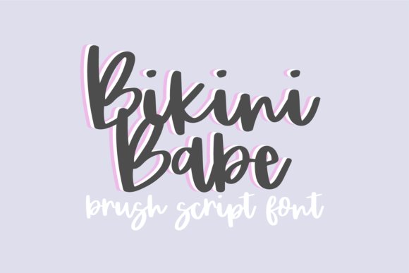
Bikini Babe Font is a lively, bouncy brush script that radiates summer energy and handcrafted personality. Its casual stroke endings and slight slant create an exuberant motion across headlines and captions, making it instantly suitable for playful lifestyle branding, seasonal promotions, and bold social visuals that need to pop in a feed. The typeface includes a complete set of all-caps glyphs, numerals, basic punctuation and extended international characters, which means it will remain functional across campaigns targeting different markets and languages. Designers will appreciate how the irregular stroke widths mimic real brushwork, giving logos, stickers, and apparel prints a human touch that digital fonts sometimes lack.
This font shines when used at display sizes where its textural quirks and brush texture can be appreciated — think Instagram story covers, printable craft templates, and bright TikTok thumbnail text. Because Bikini Babe is built to be expressive, it pairs best with neutral sans-serifs or thin geometric fonts as a counterpoint to avoid visual overload. When creating promotional assets for summer collections or surf-inspired goods, I often layer a subtle drop shadow or textured overlay behind Bikini Babe to enhance legibility while preserving the brush aesthetic. It’s also a top choice for creators who want a friendly, approachable headline voice for social media fonts across platforms; the joyful forms read well on mobile and translate cleanly to print merch like tote bags and stickers.
My Recommendation: I’d use Bikini Babe for any project that needs an instant shot of fun — seasonal product launches, craft-market signage, or influencer social posts that lean into a carefree vibe. Its brushy, hand-painted feel makes designs look handmade without extra production time, and the international glyphs keep it practical for multi-market use. If you want headlines that feel sunny and immediate, Bikini Babe will do the heavy lifting while you focus on color and layout.
27. Bandilla Font
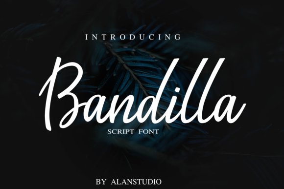
Bandilla Font is a warm, casual handwritten script that feels like a friendly note left by hand — approachable, informal and surprisingly versatile. The letterforms have soft, rounded terminals and a relaxed baseline rhythm that communicates authenticity more than polish, making Bandilla particularly well-suited for brands and creators who want to emphasize personality over perfection. It reads beautifully in mid- to large-scale applications such as cover headlines, Instagram captions rendered as image text, and Pinterest pins where an inviting, human voice can lift engagement. Because the font preserves clear shapes even with its hand-drawn quirks, it’s also a solid pick for product labels, DIY packaging, and personalized stationery that benefit from a cozy, artisanal look.
On the technical side, Bandilla balances charm with usability: spacing and proportions are tuned so that blocks of short text remain legible, and the font pairs naturally with restrained sans-serifs for body copy. Creative directors will like using Bandilla as the expressive headline while deploying a clean geometric or neo-grotesque for subheadings and longer paragraphs — this approach preserves readability without sacrificing the handcrafted aesthetic. For social campaigns, Bandilla helps thumbnails and quote cards feel more intimate; when combined with warm palettes, textured backgrounds or hand-drawn doodles it produces visuals that invite interaction. If you need a single, friendly script that can carry small-batch product design through social storytelling, Bandilla is a reliable, characterful choice.
My Recommendation: I recommend Bandilla when the brief calls for warmth and approachability rather than formal elegance. It’s perfect for lifestyle brands, DIY shops, and creators who want captions and thumbnails to feel personal and handcrafted. Use it as the visual voice for product tags, social templates, or informal invitations where authenticity is the priority.
28. Valentina Fiolete Font
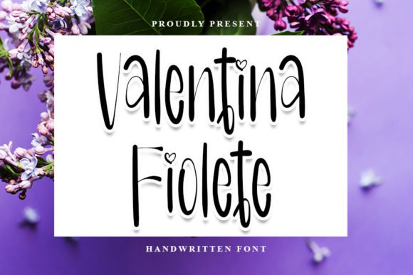
Valentina Fiolete is a refined handwritten script that balances delicacy and clarity in a way few cursive typefaces achieve. Its thin, airy strokes and careful letter spacing give it high legibility at both large and small sizes, which makes it especially useful for captions, pull quotes, and elegant on-screen headers. The font includes several alternates and contextual ligatures that emulate natural pen pressure, so you can create typographic compositions that feel handcrafted without sacrificing consistency. Because it reads beautifully on mobile screens, Valentina Fiolete is a reliable choice for cover images, Instagram story title cards, and other visual assets that need a touch of calligraphic charm while remaining readable.
From a design systems perspective, Valentina Fiolete pairs wonderfully with a neutral sans-serif to ground layouts — use the script for names, taglines, or accent words and keep the sans for body text to preserve hierarchy. The font also supports multiple weights and OpenType features that make it easy to craft varied looks: a light, almost whisper-thin style for refined wedding invites or a slightly bolder application for product badges. Given its balanced shapes and modern aesthetic, this face sits comfortably among the best social media fonts for brands that want a feminine, sophisticated voice without the fuss of excessive ornamentation.
Download Valentina Fiolete Font
My Recommendation: I reach for Valentina Fiolete when a project needs handwritten authenticity without compromising legibility — think boutique product launches, elegant newsletter headers, or stylized quote graphics. Its alternates and ligatures let me add personality without manually adjusting every letter, saving time in fast-paced content production. If you want a script that reads well on phones and still looks special on print collateral, Valentina Fiolete is an excellent go-to.
29. Mokacino Font
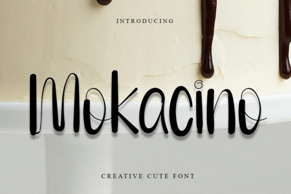
Mokacino brings a playful, neat handwritten voice to any design with a lively, rounded rhythm that feels both youthful and polished. The letterforms sit on a subtly bouncy baseline, which gives headings and social thumbnails a friendly bounce and makes copy feel approachable. Stroke endings are rounded rather than sharply tapered, producing a warm, informal texture that reads particularly well at medium-large sizes — perfect for banner headlines, sticker art, and product labels aimed at families or lifestyle audiences. Mokacino’s animated character makes it a great choice for thumbnail text on visual-first platforms; its personality can help a post stand out without resorting to overly decorative flourishes.
As a practical tool, Mokacino pairs best with geometric sans-serifs or condensed grotesques that provide contrast and readability for body copy. Because the font maintains good clarity even when used at modest sizes, it works well for interface elements on mobile apps and for packaging where space is limited but the brand voice needs to remain friendly. Consider using Mokacino when you’re designing identity systems for cafés, children’s products, or boutique stores: it brings a hand-drawn charm that feels authentic and modern at the same time.
My Recommendation: I use Mokacino when a project needs upbeat personality—think café menus, kids’ activity sheets, and playful brand identities. It’s especially effective for social-first thumbnails and stickers where a warm, human touch drives engagement. Pair it with a clean sans for balance, and you’ll get designs that feel joyful but still professional.
30. Cuddly Kid Font
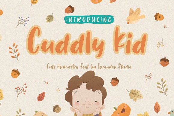
Cuddly Kid is an exuberant, casual handwritten script that immediately conveys warmth and approachability through irregular stroke widths and slightly off-kilter letterforms. The typeface feels like a friendly hand-drawn marker: thick where it matters, a little ragged at the edges, and full of spontaneous energy. This makes it ideal for attention-grabbing social graphics and educational materials aimed at young audiences, and its pronounced personality is particularly effective in headlines, event posters, and cover images where emotional connection is more important than formality. The font’s playful irregularities give designers plenty of expressive options without needing extra embellishments.
On practical grounds, Cuddly Kid scales well for large display work but also retains enough counter space to remain legible on thumbnails if you set adequate tracking. It works beautifully when paired with clean, neutral body fonts that let the script do the expressive heavy lifting — use the script for names, calls-to-action, and sticker-style badges while keeping copy blocks in a simple sans. For creators curating feeds and campaigns, Cuddly Kid sits among the most expressive social media fonts because it communicates friendliness instantly and helps cultivate a distinctly human brand persona.
My Recommendation: I pick Cuddly Kid for projects that need an immediate, cheerful vibe—children’s activity sheets, playful product packaging, or bold social posts aimed at families. Its hand-crafted appearance builds trust and relatability quickly, which is invaluable when you want audiences to feel connected at a glance. Use it as a headline or accent paired with a neutral body font to keep layouts readable while maximizing its personality.
31. The Raink Font
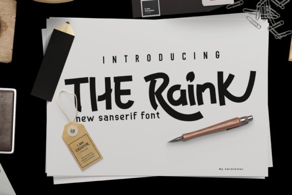
The Raink is a display face that blends whimsical charm with refined construction. At first glance its rounded terminals and slightly condensed letterforms read as friendly and approachable, but a closer inspection reveals carefully crafted contrast and consistent stroke modulation that lift it above novelty fare. One of its most memorable touches is the zoo- and animal-themed extras: pictograms, paw motifs, and stylized animal silhouettes are integrated as alternates and ligatures, giving designers ready-made decorative assets that feel native to the type rather than tacked-on ornaments. The character set supports multiple weights and includes playful swashes on selected capitals, making it easy to move from bold headlines to softer subheads without changing families.
In practice The Raink performs beautifully across large-format titles, packaging, and whimsical editorial spreads where personality is the priority. Because it reads well at display sizes, it works especially well for posters, event banners, children’s products, and lifestyle brand identities that want an upbeat, organic voice. For digital use you can pair it with a neutral geometric sans for body copy to balance its exuberance; for printed invitations try pairing with an elegant serif to add sophistication. The Raink’s OpenType features and SVG/PNG extras accelerate mockup production—saving time when you need themed icons immediately—while its clear punctuation and solid spacing keep legibility high even in colorful, busy layouts.
My Recommendation: I’d reach for The Raink when a project needs big personality with a handcrafted feel—especially for family-oriented brands, pet product packaging, or playful posters. Its animal-themed extras are a huge time-saver for creative directors who want consistent decorative elements without patching in separate icons. Use it when you want type to carry the brand voice strongly at headline scale while still remaining easy to pair with cleaner body fonts.
32. Organic Hand Font
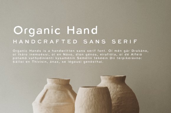
Organic Hand is a contemporary handcrafted sans-serif that balances minimal geometry with the irregularities of real handwriting. Its letterforms retain the cleanliness and spacing of a sans, but subtle stroke variations, slightly imperfect terminals, and alternates give each word an artisanal feel; those qualities translate beautifully to logotypes, packaging labels, and editorial pull-quotes. Designers who favor natural textures will appreciate the built-in variations—contextual alternates and alternate glyphs let you avoid repetition in longer lines and maintain an authentic, human rhythm across headlines and captions.
Where this font really shines is in social spaces: Organic Hand performs exceptionally among social media fonts because it reads clearly on mobile screens while conveying an approachable, bespoke brand voice. It’s excellent for Instagram cards, story templates, and lifestyle blog headers where handcrafted aesthetic is the message. For layouts, pair it with a light serif or a crisp geometric sans to create contrast; try using bolder weights for titles and the lighter weights for body captions to preserve legibility at small sizes. The file package typically includes webfont formats and OpenType controls, so you can deploy it across web, print, and digital advertising without losing nuance or character alternates.
My Recommendation: I recommend Organic Hand when you need the warmth of hand-lettering without sacrificing the cleanliness and scalability of a sans-serif—perfect for boutique brands, wedding invites with a modern twist, and mobile-first social campaigns. Its alternates make long runs of text look intentional, not repetitive, which is invaluable for feed templates. Reach for it when a project needs to feel handcrafted yet current across multiple platforms.
33. Hamtores Font
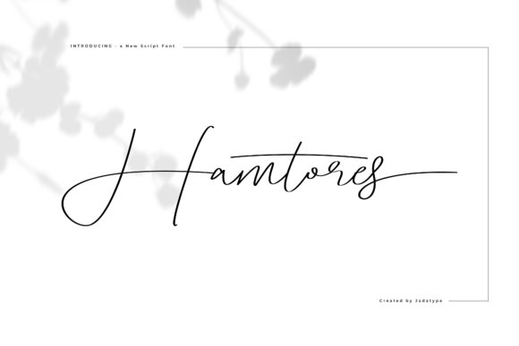
Hamtores is a script-style handwritten font built around fluid, slightly slanted strokes that emulate thoughtful penmanship rather than loose doodling. Each glyph carries subtle joins and varying pressure that suggest a nib or brush in motion, creating an elegant, dynamic texture when words are set in longer phrases. The typeface often includes a generous set of ligatures, discretionary swashes, and contextual alternates which allow designers to craft bespoke word shapes—ideal for mark-making where the letters need to connect naturally and avoid mechanical repetition.
Because Hamtores is designed with both aesthetics and utility in mind, it suits identity work, logo lettering, and quote graphics where personality and readability must coexist. It performs especially well in environments where a human touch elevates the message: boutique product labels, book covers, and premium social headers. For best results, use Hamtores at display sizes or in short lines and pair it with a restrained sans or slab serif for supporting text to preserve hierarchy. Additionally, its kerning and OpenType features help maintain rhythm across multiple languages and diacritics, making it a dependable choice for international branding projects that need a handcrafted signature mark.
My Recommendation: I would choose Hamtores when I want a handcrafted look that still feels polished—excellent for boutique branding, signature logos, or sophisticated social visuals. Its alternates and swashes make it fun to customize wordmarks without resorting to heavy editing. Use it when you need a readable script that reads like a real hand, not a font factory output.
34. Lettering Font
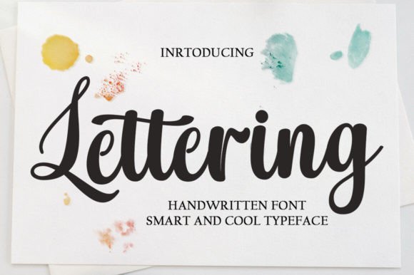
Lettering is a refined handwritten script that blends classic calligraphy influences with contemporary polish. Its letterforms are deliberately balanced: open counters, consistent stroke contrast, and carefully considered terminals make this face feel both luxurious and approachable. Because of its well-shaped joins and generous spacing, Lettering performs beautifully at a range of sizes — from large shop signage to smaller applications like captions and watermarks — and retains clarity on compressed screens and mobile feed thumbnails. As one of the more elegant social media fonts , Lettering adds an instant sense of craftsmanship to brand posts, Instagram story covers, and YouTube thumbnails where a touch of traditional hand-lettering elevates perceived value.
Beyond aesthetics, Lettering brings practical typographic features that designers will appreciate: contextual alternates for natural-looking word flow, discretionary ligatures that enhance connected strokes, and refined kerning pairs that minimize awkward gaps in headlines. It’s a smart choice for wedding stationery, product packaging, and boutique branding where a handcrafted appearance must still read cleanly in headlines and logo marks. Pair Lettering with a simple geometric sans for body copy to keep layouts modern while letting the script handle brand accents and callouts. Overall, Lettering is both a decorative and reliable script face that bridges classic calligraphy and modern digital demands with elegance and technical polish.
My Recommendation: I’d reach for Lettering when a project needs tasteful, hand-crafted charm without sacrificing legibility — think boutique product labels, wedding invites, or premium Instagram posts. Its OpenType features and thoughtful spacing make it surprisingly versatile for both print and digital. Use it as a headline or logo to impart an artisanal, upscale personality that still reads cleanly at small sizes.
35. Mint Font
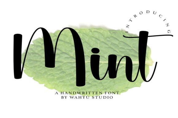
Mint is an effervescent, contemporary script whose rounded curves and playful terminals give it an immediately friendly, youthful voice. The font’s buoyant rhythm and slightly bouncy baseline make it feel informal and inviting, which is ideal for brands targeting younger demographics or lifestyle projects that want to feel hand-drawn without looking messy. Its soft forms translate especially well into colorful packaging, playful logos, and cheerful label work; when used for headlines or product names it injects personality and a pop of approachable charm that catches the eye in feeds and product mockups.
From a functional design standpoint, Mint manages the balance between personality and readability: letter spacing is generous enough to prevent crowding in social thumbnails, and the rounded terminals retain clarity on lower-resolution screens. Mint pairs beautifully with condensed sans-serifs or light geometric typefaces to anchor layouts — the script brings warmth while the sans provides structure. It’s also a strong pick for app UI accents, blog headers, and children’s product branding where a whimsical, modern handwritten tone adds authenticity and cheer without overpowering the rest of the design system.
My Recommendation: I’d use Mint when the goal is fresh, playful branding — for example, a health snack line, kids’ clothing label, or a lifestyle Instagram feed aimed at a younger audience. Its rounded shapes make it feel approachable and fun, and it’s forgiving in tight layouts. Pair it with a clean sans for balance, and rely on it for headlines, stickers, and bold product names.
36. Morning Mother Font
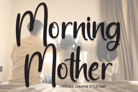
Morning Mother is a warm, hand-drawn script that favors simplicity and friendly character over heavy ornamentation. Each glyph feels like a quick, confident stroke made with a fine brush pen — informal yet intentional — which makes it especially suited to projects that require a human touch: greeting cards, handmade product labels, and lifestyle photography overlays. Because it reads comfortably at modest sizes, Morning Mother works well in both print and on-screen, and it can function as the central voice of a brand or as an accent for captions and banners. Designers often choose it for its unpretentious charm when they need typography that feels handcrafted but still behaves predictably across layouts.
In social contexts Morning Mother integrates seamlessly into templates for story posts, blog headers, and promotional graphics; it’s one of those friendly social media fonts that helps captions and quotes feel personal rather than mass-produced. Technically, the font avoids overly tight ligatures and extreme swashes, which improves legibility in multi-line text and in condensed spaces like bio headers or product tags. For a cohesive visual identity, pair Morning Mother with a neutral serif or a simple geometric sans to create contrast while preserving an inviting, approachable tone that resonates with craft-focused and community-oriented brands.
My Recommendation: I’d pick Morning Mother when I want typography that reads like a neighbor’s handwritten note — perfect for small batch makers, boutique stationery, or cozy lifestyle blogs. It’s an excellent go-to when you need warmth and legibility in equal measure, and it plays nicely as both a headline and a friendly accent. Use it alongside a restrained sans or serif to keep compositions clean while preserving a handmade, authentic presence.
37. Drink Font
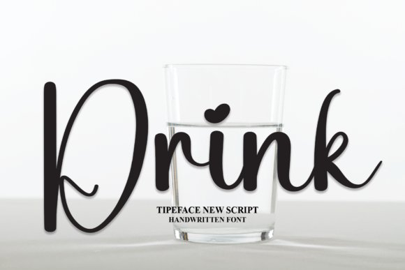
Drink is a warm, approachable handwritten font that reads like a friendly note from a friend rather than a formal typeface. Its letterforms are slightly rounded with consistent stroke widths, which makes it especially legible at small sizes while retaining a handcrafted charm at display scale. Because of its simplicity, Drink acts as a versatile workhorse: it can anchor a DIY greeting card, sit comfortably on craft packaging, or add personality to presentation slides without distracting from the message. The restraint in its design—no over-the-top loops or flourishes—means you can pair it easily with a clean sans for body copy or a condensed display face for bold headlines.
On practical terms, Drink performs well across both print and pixel: it cuts cleanly for vinyl and Cricut projects, renders crisply in PDF exports, and translates to on-screen use for captions and overlays. For designers who need a reliable handwritten look, Drink won’t steal the spotlight but will humanize layouts and make copy feel intimate and immediate. Its neutral friendliness makes it a dependable choice for small business packaging, classroom worksheets, invitations, and any project that benefits from an honest, made-by-hand aesthetic.
My Recommendation: I reach for Drink when I want a human touch that doesn’t shout for attention. It’s perfect for clean, craft-forward projects—think gift tags, educational materials, and low-fuss branding. If you need a versatile handwritten font that pairs well with modern sans serifs and behaves predictably across mediums, Drink is an excellent, low-risk pick.
38. Stylish Handwriting Font
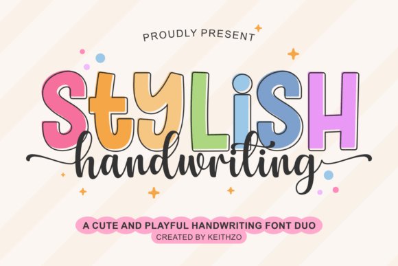
Stylish Handwriting is a thoughtfully paired font duo that combines an assertive, modern display face with a delicate, script-like companion. The contrast between the bold display and the sweet handwritten script creates immediate visual interest while offering plenty of typographic flexibility: use the display for commanding headlines and the script for signature-style accents, captions, or product names. The script includes elegant swashes and stylistic alternates via OpenType features, so you can craft bespoke logotypes or lively headings without manual letter swapping. Because it was designed with clean outlines and good kerning, this duo is a natural fit for Cricut-cut designs, SVG exports, and sublimation printing where precision matters.
From a content and platform perspective, Stylish Handwriting excels across seasonal campaigns, celebration-focused assets, and online presence. Its bouncy, optimistic personality works beautifully on T-shirts, tote bags, and birthday invites, and the duo format gives you the consistency of a brand family across thumbnails, story graphics, and profile art. Importantly for digital creators, the package was built with modern publishing in mind—numbers, punctuation, and full OpenType support mean fewer workarounds when creating templates, planner pages, or promotional social media fonts are used to make cohesive, on-brand visuals. In short, this set streamlines the workflow for makers, teachers, and small-brand owners who want an engaging, versatile typographic toolkit.
Download Stylish Handwriting Font
My Recommendation: I’d use Stylish Handwriting when I need bright, celebratory typography that still feels polished. The duo lets you design entire campaigns—products, packaging, and promotional content—without hunting for complementary fonts. If you create seasonal merchandise, party stationery, or eye-catching social posts, this set saves time and keeps your visuals unified.
39. Raspy Brush Font
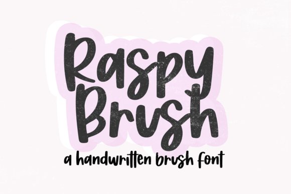
Raspy Brush is a bold, textured brush script that carries the energy of a marker dragged across grainy paper. The letters show intentional roughness at the edges, giving headlines and logos a tactile, handcrafted vibe that reads as both modern and expressive. Because the forms are thick and assertive, Raspy Brush excels in attention-grabbing uses: packaging accents, poster headlines, event signage, and thumbnails where you need instant personality. The built-in irregularities are not random noise but considered texture, which keeps the type legible while lending an artisanal flair that photography and clean vector art often lack.
Where Raspy Brush really shines is in high-impact, expressive branding and content creation aimed at younger, trend-focused audiences. It’s particularly effective for lifestyle brands, streetwear mockups, and thumbnail art for video platforms because it conveys urgency and attitude without resorting to gimmicks. Designers can also use it to contrast sleek UI elements—drop a Raspy Brush headline over a minimal layout to create striking hierarchy. For craft use, the bold strokes cut well for stencils and heat transfer, and for digital campaigns it performs strongly in hero images and post graphics made to stand out in crowded feeds with fonts tailored to social platforms and content creators’ needs.
My Recommendation: I’d pick Raspy Brush when a project calls for bold personality and texture—think event posters, edgy packaging, or attention-grabbing thumbnails. Its rough edges add character that’s hard to fake with smooth type, and it reads well at large sizes. Use it to create contrast against sleek elements or to give a handcrafted, energetic voice to youth-facing brands and creative side projects.
40. Absolute Joyful Font
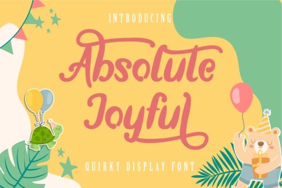
Absolute Joyful arrives as a warm, hand-penned script that balances joyful exuberance with surprising legibility. The letterforms lean into a friendly rhythm—rounded terminals, slightly irregular connections, and playful ascenders that make each word feel like a personal note rather than a typeset block. Because this family is PUA-encoded, designers can easily access a broad set of alternate glyphs, swashes, and stylistic ligatures without jumping through complicated OpenType menus; that immediate access makes crafting on-the-go visuals faster, whether you’re working in Photoshop, Illustrator, or a web editor that supports private-use area characters. In practice, Absolute Joyful translates beautifully into short headlines, Instagram captions, and thumbnail overlays where personality matters but readability cannot be sacrificed.
On brand projects it performs as a conversational voice: try it for boutique packaging, handmade product tags, or email headers to give communications a human touch. The font’s moderate slant and medium contrast enable it to remain readable at small sizes while still offering decorative flourish at larger scales, and pairing it with a clean sans-serif body face creates a compelling, modern contrast. Because of its accessible glyph set and lively rhythm, Absolute Joyful is also an efficient choice for day-to-day content creation — it speeds up workflows for creators producing Stories, reels covers, and promotional cards. Overall, this typeface is less about formal calligraphy and more about authentic, friendly expression that performs across digital and print touchpoints. If you need a script that feels handcrafted without impeding clarity, Absolute Joyful delivers.
My Recommendation: I often reach for Absolute Joyful when I want copy to feel personal and upbeat without losing legibility. Its PUA-encoded alternates and swashes are a real time-saver for quick social tiles and packaging mockups. Use it for boutique brands, handmade product lines, lifestyle blogs, or any project where a warm, handwritten voice helps build connection.
41. Break Fly Font
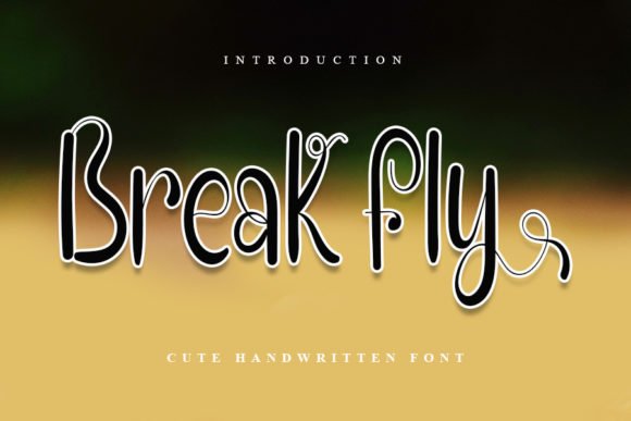
Break Fly is a lively handwritten script that leans into playfulness with a neat, compact stroke structure. The letters display a light bounce on the baseline and slightly compressed counters, which gives headlines and short phrases an energetic, informal presence without becoming chaotic. Alternates and casual ligatures—if included—tend to emphasize rhythm over flourish, making the typeface feel well-suited to tight layouts like social captions, product badges, and compact hero banners. Its tidy strokes also translate well to merchandise, stickers, and children’s packaging where a hand-crafted, friendly look helps convey approachability.
From a practical standpoint, Break Fly works especially well in applications that need personality in limited space: think profile banners, podcast thumbnails, or short promotional overlays on photography. Pairing it with a geometric sans for body copy helps preserve readability while letting the script carry the emotional tone of the piece. Because Break Fly favors legibility at smaller scales, designers can confidently use it for mobile-first designs and story assets that require quick visual impact. Overall, this font is a smart pick when you want an informal, upbeat voice that remains tidy and design-friendly rather than overly decorative.
My Recommendation: I’d use Break Fly when a project calls for cheerful, compact lettering—especially where space is tight and clarity matters. It’s ideal for captions, thumbnails, children’s branding, and sticker art because it reads well at small sizes yet still feels handcrafted. Pair it with a neutral sans-serif to let the script add character without overpowering the design.
42. Diary Panda Font
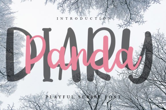
Diary Panda brings a neat, playful handwriting style that reads like an intimate entry in a personal journal—deliberately friendly with a casual cadence. The strokes have a soft, rounded quality that makes text feel approachable, while playful terminal flicks and slightly varied baseline alignment give phrases an organic, handheld charm. For creators, this voice is particularly effective in content that aims to feel authentic and immediate: captions for lifestyle posts, behind-the-scenes story highlights, and hand-lettered overlays on mood photography. It’s also an excellent choice for stationery and editorial spots that benefit from a humanized typographic touch.
Technically, Diary Panda supports the sorts of OpenType niceties designers expect from modern scripts: alternate characters, contextual ligatures, and swash options that let you dial up flair when needed. Because of its clear shapes and friendly rhythm, it pairs well with minimal sans-serifs for longer copy or with textured backgrounds where contrast is key. When you want designs to feel intimate and conversational—like a note from a friend—this font helps create that tone without sacrificing professionalism. For small brands, lifestyle creators, and bloggers, Diary Panda is a go-to for injecting personality into everyday visuals while keeping the message readable and warm.
My Recommendation: I’d reach for Diary Panda when the goal is an intimate, handwritten aesthetic—think personal blogs, journaling apps, or cozy product labels. Its approachable letterforms make it especially useful for story covers and lifestyle social tiles where authenticity is the priority. Use it alongside a clean sans for longer passages to preserve readability while letting the script carry emotional impact.
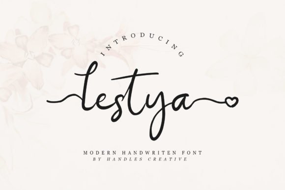
43. Lestya Font
Lestya is a refined script font that leans into classic calligraphic rhythm while remaining unexpectedly modern. Its letterforms move with a light, dancing stroke—thin entry lines that blossom into generous swashes—making it a strong choice for projects that need an elegant, handcrafted touch. Because the designer PUA-encoded the font, every alternate glyph, ornamental swash, and stylistic set is instantly accessible in most design apps without digging through glyph panels. That accessibility makes Lestya particularly efficient when producing multiple variations of invitations, boutique packaging, or personalized stationery where subtle alternates add bespoke character.
Beyond wedding suites and premium logos, Lestya performs well in digital contexts where a personal voice matters: think Instagram story covers, branded Pinterest pins, and hero text for lifestyle blogs. It retains legibility at medium sizes thanks to its balanced x-height, but the longer swashes should be used cautiously on busy backgrounds—opt for generous tracking and clear color contrast to avoid visual clutter. Pair Lestya with a clean sans-serif for body copy to preserve hierarchy and let the script breathe; for quick mockups, try pairing it with a geometric sans like Futura or a neutral humanist like Open Sans to create a contemporary, handcrafted aesthetic.
My Recommendation: I recommend Lestya when you want charming, artisan personality without sacrificing ease of use. Its PUA encoding is a real timesaver for non-specialist designers, and the swash options allow you to create unique compositions quickly. Use it for high-end invitations, boutique branding, or any project where an elegant, hand-lettered feel lends emotional warmth.
44. Kenanga Font
Kenanga presents as a friendly modern script that balances casual warmth with deliberate craftsmanship. The font includes a wide array of ligatures and flowing swashes that help you tailor the tone from playful to polished; swapping in alternate characters can instantly shift a headline from conversational to luxurious. Technically, Kenanga supports robust OpenType features and is easy to integrate into desktop design apps, Canva, or Procreate, which makes crafting consistent branding and product packaging a smoother process. If you’re curating aesthetic posts, Kenanga ranks among the best social media fonts thanks to its expressive terminals and readable forms that maintain personality even at smaller display sizes.
From labels and product tags to watermarking photography and designing logo marks, Kenanga excels where friendliness and legibility must coexist. When using the font for packaging or stickers, try emphasizing its swashes selectively—overuse can reduce readability on small-format prints, but well-placed alternates create a memorable signature. Pair Kenanga with restrained serif or neutral sans faces for body text to avoid competing ornamentation, and consider light drop shadows or subtle embossing in physical goods to bring out its three-dimensional feel. For designers working on lifestyle brands, boutique commerce, or influencer assets, Kenanga provides a flexible, humanizing voice that adapts well across digital and print applications.
My Recommendation: I’d reach for Kenanga whenever a project needs approachability without losing refinement—think artisanal food labels, feminine packaging, or social campaign headers. Its ligatures and swashes let you craft signature wordmarks quickly, and it adapts across Canva, Photoshop, and print workflows. Use Kenanga to add a personable, handcrafted identity to products and digital content where connection matters.
45. Grand School Font
Grand School is a playful script family that blends the spontaneity of hand lettering with a structured, monoline sensibility. Where many scripts skew either overly ornate or too informal, this collection strikes a middle ground—its rounded terminals and consistent stroke width make it highly readable while still conveying approachable charm. The font family is especially useful for projects aimed at younger audiences or lifestyle brands: classroom-themed prints, children’s apparel, and nursery wall art benefit from its friendly proportions and slightly whimsical letter endings. The set’s variety—ranging from handwritten-style headlines to more streamlined sans-like alternates—gives designers the ability to create a cohesive identity across mugs, notebooks, and social assets without switching type families.
Grand School is also craft-friendly: designers working with Cricut, Sublimation, or vinyl cutting will appreciate how its monoline construction reduces fragile cut paths, and its simplified shapes reproduce cleanly on those substrates. On-screen, the font reads well in Canva or Procreate when used for quote graphics, Instagram highlights, and blog feature images; adjust spacing modestly for longer phrases to maintain rhythm. Because the family includes companion decorative illustrations and animal motifs, it’s excellent for product lines aimed at families and educators—use the icons as supporting elements to reinforce a playful brand voice. For projects that need an accessible, handmade appearance, Grand School provides both practical utility and charm in equal measure.
My Recommendation: I recommend Grand School when your brief calls for friendliness and versatility—especially for kid-focused merchandise, classroom materials, or lifestyle products. Its monoline forms are forgiving in cutting and printing workflows, and the included decorative elements speed up cohesive branding. Use Grand School to create warm, engaging designs that translate well across physical products and digital illustrations.
46. Barbie Font
Barbie is a script with an immediate personality: it blends playful, hand-drawn flourishes with surprisingly disciplined letterforms that keep it readable across sizes. At display scale its sweeping swashes and jaunty terminals feel celebratory without tipping into tacky, which makes it an excellent choice for lifestyle brands, wedding stationery, and decorative home goods like wall hangings. The font’s handwritten quality translates well to product packaging and photography overlays, where you want the type to feel personal and handcrafted rather than generic. Technically, Barbie performs well in digital layouts — tight kerning and smooth curves reduce visual noise in thumbnails and banners, helping headlines stay legible even when reduced for mobile feeds.
From a social and promotional standpoint, Barbie is one of those social media fonts that instantly conveys warmth and approachability, making it ideal for accounts that want a feminine, upbeat voice. It pairs elegantly with neutral sans-serifs for body copy or with a subtle serif when you want a vintage, editorial look; avoid pairing it with other heavy scripts to prevent clutter. Designers will also appreciate how its alternate glyphs and optional ligatures allow for subtle customization of logos and watermarks, so a single wordmark can be adapted across printed tags, Instagram highlights, and in-store signage while retaining a coherent visual identity. In short, Barbie is a well-balanced script — decorative enough to be distinctive, but engineered to stay functional in real-world branding and social content workflows.
My Recommendation: I’d reach for Barbie when I need a cheerful, personable script that reads well in both physical and digital contexts. Its playful strokes make it a go-to for wedding invites, boutique packaging, and lifestyle social posts where personality matters. Use it as a headline/display face and pair with a clean sans for body text to keep layouts modern and readable.
47. Bigetons Font
Bigetons arrives with a bold, effusive attitude designed to dominate headlines and capture attention in fast-scrolling environments. Its letterforms are substantial and rounded, giving the face a friendlier, more contemporary voice than rigid display fonts. This makes Bigetons particularly effective for logo work, movie and book titles, and eye-catching posters where a strong, memorable silhouette is required. Despite its robust presence, the font’s internal spacing and consistent stroke weight allow it to handle short blocks of text without becoming visually oppressive, which is a rare quality for a display-oriented family.
Where Bigetons really shines is as a versatile headline partner: it can anchor movie posters, serve as a punchy masthead for editorial spreads, or function as the primary wordmark in product campaigns. Because it holds up at both large and mid sizes, it’s also well suited to thumbnail graphics and promotional banners that need to be legible on small screens. When pairing, use a restrained serif or a neutral grotesque for secondary copy to let Bigetons maintain visual dominance without competing for attention. Overall, Bigetons is a practical, charismatic choice for designers who want a bold, friendly typeface that can transition smoothly between print and digital assets.
My Recommendation: I recommend Bigetons when you need a headline face that’s bold, approachable, and instantly recognizable. It’s perfect for posters, book covers, and branding projects that require strong display impact, plus it pairs well with simple sans-serifs for clean layouts. I often use it in campaign hero imagery and video titles because it reads clearly at various scales and gives work an unmistakable personality.
Whether you’re updating a profile, designing ad creatives, or building a brand kit, these 47 options cover moods and technical formats—from headline and display fonts to web-ready families and handwritten styles. Try a few pairings, verify licensing, and pick the typefaces that best support your social strategy and audience engagement.