35 Elegant Swash Fonts for Wedding Invitation Design 2026
Choosing the right swash fonts can give a wedding invitation a handcrafted, refined look without sacrificing readability. These styles range from airy calligraphic scripts to bold ornamental letterforms, with extended ligatures and flourishes that set the tone for printed and digital invites.
Below I list 35 options with quick notes on weight, x-height, pairing tips, and common use cases like RSVP cards, envelopes, and headers. Try a few candidates with your sample text and check kerning and license terms before finalizing artwork.
1. The Valiroz Font
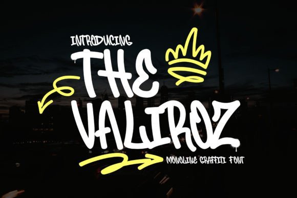
The Valiroz Font – The Valiroz blends a monoline graffiti aesthetic with ornamental swash characters to create striking display lettering. As one of the more playful swash fonts, it keeps a steady stroke width while offering decorative terminals and sweeping alternates that read as hand-painted without becoming fussy. Contextual ligatures and varied caps give designers control over flourish intensity while preserving that urban, crisp silhouette.
At headline sizes the uniform strokes deliver clarity and punch, and the swashes introduce motion that suits posters, record sleeves, and apparel graphics. OpenType features let you switch between restrained and exuberant forms, so the same word can feel minimalist or highly expressive. For practical use, pair Valiroz with a neutral sans to let its ornamentation carry the visual weight while avoiding heavy usage in body copy.
My Recommendation: I reach for Valiroz when a project needs streetwise attitude with a handcrafted flourish; the monoline frame keeps compositions tidy while the swash options add personality. It performs best for posters, garment labels, and single-word logos where ornamentation can communicate tone. Pairing it with a simple geometric sans delivers balance and makes the type sing in editorial or packaging work.
2. Gralise Font
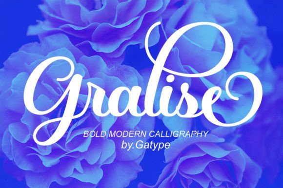
Gralise Font – Gralise presents a modern handwritten style with smooth joins and a gentle stroke contrast that reads as refined but approachable. The set includes tasteful ligatures and discretionary alternates that create natural word shapes and allow subtle customization of ascenders and terminals. Its slightly slanted rhythm and delicate terminals make it well suited to invitations, boutique branding, and editorial headings that need a human touch.
Technically, Gralise offers contextual alternates and stylistic sets to help tune how ornate you want the text to feel, and careful kerning keeps titles neat on printed pieces. It holds up to foil, letterpress, and spot varnish treatments without losing definition. For layouts, pair Gralise with a minimal serif or clean grotesque to keep hierarchy clear and avoid crowding its delicate strokes.
My Recommendation: I choose Gralise for projects that ask for approachable elegance-wedding suites, premium product tags, and quote graphics all benefit from its steady rhythm. The alternates let me dial ornamentation up or down fast, which saves time in tight production windows. In tight spacing I slightly reduce tracking to maintain a cohesive word color.
3. Calita Font
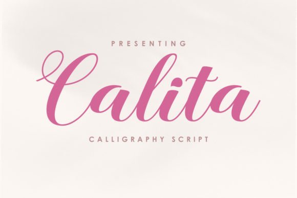
Calita Font – Calita is a firm, thick calligraphy-style script that reads with bold presence and confident terminals. Its broad downstrokes and compact counters give headlines a warm, forceful voice, and the included alternates add decorative endings that work well for celebratory or seasonal designs. The weighty forms make Calita a strong candidate for packaging, greeting cards, and bold social creatives where type must carry the message.
From a technical standpoint, Calita has solid kerning and ligatures that smooth the heavier joins so letters remain legible at display sizes. The heavy stroke construction tolerates color fills, textures, and metallic finishes, though it can clog at small text sizes so use sparingly in copy. I often pair it with a thin geometric sans to create contrast and preserve visual hierarchy across layouts.
My Recommendation: I use Calita when I need immediate visual impact-product labels, holiday promos, or hero social posts where weight and attitude matter most. Its built-in ornamentation reduces the need for extra graphic flourishes, speeding up art direction. If a project needs subtlety, I reserve Calita for headlines and choose a lighter script for supporting text.
4. Rastering Font
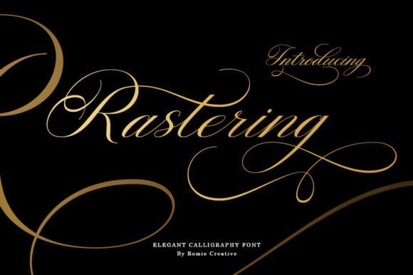
Rastering Font – Rastering presents a graceful calligraphic voice with high-contrast strokes and generous terminal flourishes; its lowercase set contains final swashes and alternate glyphs that allow words to conclude with long, elegant tails. The family includes uppercase and lowercase letters, numbers, punctuation and multilingual support, while OpenType features supply contextual alternates and ligatures for natural connections between letters. Its balanced weight and airy counters make Rastering especially useful when you want handwriting with formal character and readable texture.
The download ships as OTF and TTF with pre-kerned pairs and stylistic sets accessible in most design apps, so you can apply ending ornaments without manual editing. Rastering ranks among contemporary swash fonts suited to wedding suites, boutique packaging and editorial mastheads where flourish-driven words are desired. For reliable results, pair it with a restrained sans and reduce tracking slightly to keep long swashes from colliding with adjacent elements.
My Recommendation: I use Rastering when a project needs expressive calligraphy that still behaves predictably in layout. The alternates and final swashes let me craft varied word-endings without drawing every curve by hand, which saves time on invitations and product labels. It shines where elegance and legibility must coexist, such as premium stationery and feature headlines.
5. Paradisa Font
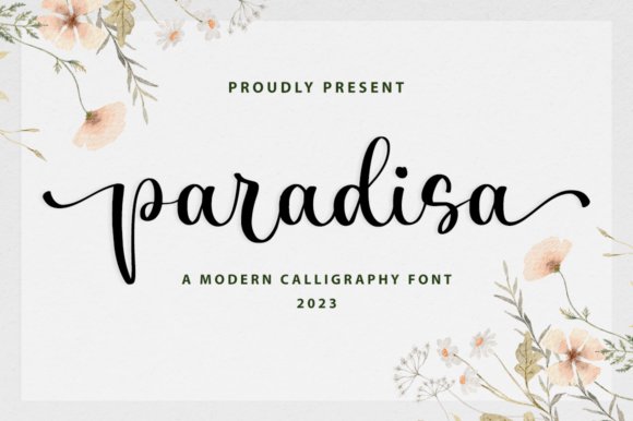
Paradisa Font – Paradisa captures a romantic, airy calligraphic tone: letterforms sway along the baseline with playful loops and soft contrast that read as hand-penned. The design favors long ascenders and lively terminals, and it includes stylistic alternates and discretionary ligatures to introduce subtle variety across words. Those details give text a handcrafted elegance without sacrificing overall readability.
This face adapts well to invitations, boutique identity and editorial accents where a sweet, refined presence is needed; its flourish options let you choose between gentle decoration and more ornate treatment. To keep compositions balanced, pair Paradisa with a clean geometric or humanist sans and limit decorative swashes to display scales. It also handles short lines of copy well when used sparingly for emphasis or headings.
My Recommendation: I reach for Paradisa on projects aiming for intimate, upscale charm-wedding invites, boutique labels and soft-focus branding. The way characters dance along the baseline gives layouts a lively personality while alternates prevent repetitive letterforms. Use it at larger sizes for impact, and reserve its flourishes for key words to maintain a polished look.
6. Faniletta Font
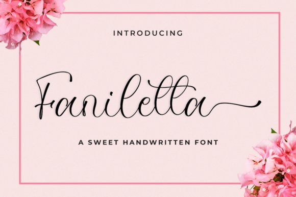
Faniletta Font – Faniletta is a refined script with measured contrast and smooth joins that read both contemporary and elegant; its strokes are neat rather than fussy, producing a clean handwritten effect. The family includes useful alternates and discretionary ligatures that help avoid mechanical repetition and allow for tailored word shapes. Overall, Faniletta balances ornament with restraint so it performs well in logo work and upscale print pieces.
Use this typeface for brand marks, invitations and social media art where a modern, classy script is called for; it pairs particularly well with simple serifs or minimalist sans faces to emphasize its elegance. Pay attention to size – it remains legible at headline scales but benefits from slightly increased tracking in condensed text. The included files work smoothly in common design apps and respond predictably to OpenType controls.
My Recommendation: I recommend Faniletta when a project needs a polished, contemporary script that won’t overwhelm supporting design elements. Its clean joins and alternates make it ideal for logos, editorial headers and wedding suites where clarity matters as much as style. It’s my go-to when clients want elegance with modern restraint, and I often pair it with a thin sans to let the script shine.
7. Just Beauty Font
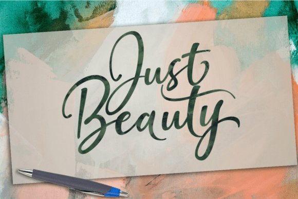
Just Beauty Font – Just Beauty is a smooth brush script with graceful, flowing letterforms and abundant swash alternates; as one of the more graceful swash fonts available, it brings a handwritten flourish to text. It suits personal branding, wedding stationery, logos, headlines and apparel, adding a refined hand-lettered presence to layouts. OpenType features such as stylistic alternates and stylistic sets require design software that supports OpenType like Adobe Illustrator, InDesign or CorelDraw.
The package includes standard ligatures, swash alternates, stylistic sets and PUA Unicode mapping, delivered in OTF and TTF formats. Those alternates let you quickly craft distinctive wordmarks and invitations without extra vector work, and the swashes can be dialed from subtle to dramatic. In print and on fabric the strokes render cleanly, and pairing it with a narrow sans produces clear contrast for modern identities.
My Recommendation: I reach for Just Beauty when a project needs elegant, feminine handwriting-weddings, boutique brands and premium product labels benefit most. The built-in alternates save time because I can test different end-swashes directly in Illustrator. PUA mapping makes accessing decorative glyphs in basic apps straightforward, so it’s fast to produce polished layouts.
8. Maculinc Font
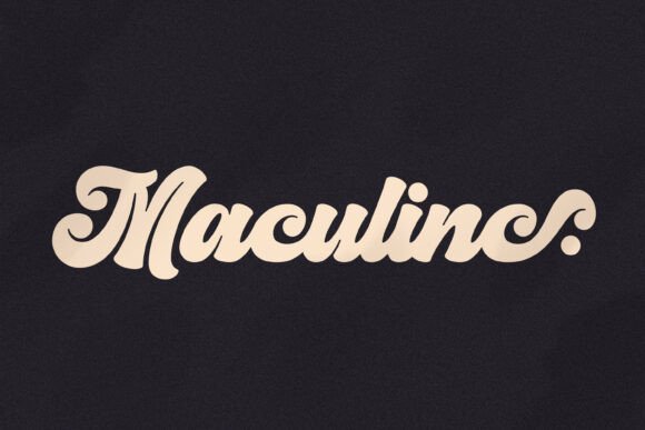
Maculinc Font – Maculinc started as a bespoke logo and evolved into a five-part script family: Original, Stick, Separated, Pro and Swash, each offering ligatures, alternates, numerals and punctuation with multilingual support. Maculinc Pro aggregates characters from the other variants and supplies additional alternates for expanded typographic control. The bold script voice reads with a retro edge and holds up at display and mid sizes.
Mixing the Swash variant with Pro lets designers select anything from restrained signatures to ornate wordmarks, making the family well suited for identity and apparel design. Applications include business cards, t-shirt graphics, restaurant menus and posters where a confident personality is required, and the built-in tester is handy for previewing combinations. Stick and Separated styles provide simplified, high-impact options for tightly set headlines and logotypes.
My Recommendation: I use Maculinc when a brand needs a strong, retro-minded signature-its family structure gives me options without juggling separate type purchases. For logotypes I usually start with Pro for its breadth, then switch to Stick or Separated when clarity at small sizes matters. The Swash version is my go-to when a decorative flourish is appropriate for packaging or apparel.
9. Expant Font
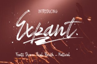
Expant Font – Expant is a hand-painted brush display with two companion fonts-Expant Regular and Expant Swash-designed so the styles layer smoothly. The brush textures feel energetic and textured, lending an authentic made-by-hand character to headlines, album art and product packaging. Because the strokes are bold and irregular, the design performs best at larger display sizes where texture and gesture can be appreciated.
The swash companion supplies long, gestural tails and decorative endings that pair naturally with the raw Regular weight, letting you create expressive typographic compositions without heavy illustration. Expant is excellent for quick branding mockups and poster runs, and it pairs effectively with a geometric sans to stabilize layouts. Font files are straightforward to drop into vector projects and in-page artboards for rapid prototyping.
My Recommendation: I pick Expant when I need aggressive, hand-painted personality-music posters, craft labels and bold retail signage benefit from its energy. The swash companion makes it easy to add handcrafted ornamentation without redrawing letters. Use it at display sizes and pair with a neutral sans to keep text readable while maintaining strong visual impact.
10. Castline Font
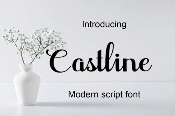
Castline Font is a hand-lettered script that balances fluid swashes with a lively, irregular baseline; it reads like a refined signature and sits naturally among swash fonts for wedding stationery and feminine branding. The strokes are airy and controlled, with smooth hairlines and modest contrast that hold up at display sizes. Those varied baselines lend a homemade charm that feels personal without becoming chaotic.
Castline is coded with PUA Unicode, so alternates, ligatures, and decorative capitals are accessible in common design apps without extra tooling. This character set makes it simple to craft bespoke logos, labels, or invitations that keep consistent across print and web. I also find it pairs well with a pared-back sans for menus or a light serif for editorial spreads.
My Recommendation: I reach for Castline when a project needs a personal, feminine touch that still reads cleanly in logos and headlines. Its PUA alternates and ligatures save time when composing bespoke wordmarks or invitations. Use it for wedding suites, boutique packaging, and apparel where a hand-scripted personality matters but legibility must remain intact.
11. Clarabela Font
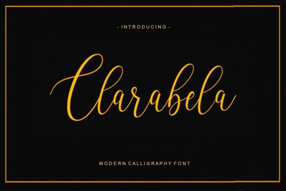
Clarabela Font is a handwritten script with varied baselines and gentle curves that give a subtle, approachable personality. The rhythm of its letterforms stays readable even when paired into lines of text, making it a strong option for magazine headers, menus, and editorial accents. Its overall feeling is feminine and neat without leaning into heavy ornamentation.
Stylistic alternates and modest ligatures allow small bursts of flourish where needed, so designers can temper decoration for different uses. Clarabela works well on printed greeting cards and labels, and it holds up at moderate display sizes for signage. Pair it with a neutral slab or modern sans to create contrast and keep layouts feeling contemporary.
My Recommendation: I’d choose Clarabela when a project needs warmth without excess flourish-think boutique menus, lifestyle editorials, or soft branding. It gives friendly personality while remaining readable across different sizes. Pair it with a no-frills sans for balanced layouts or a clean serif for a touch of tradition.
12. Regards Font
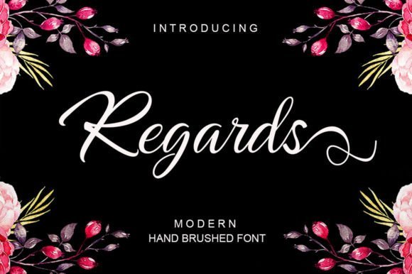
Regards Font is a contemporary script that leans into an irregular baseline and brisk, expressive strokes, lending each word an energetic, hand-painted look. It feels particularly suited to ink or watercolor treatments, where the texture of the mark becomes part of the voice. That irregularity creates motion and a candid, handmade aesthetic that reads strongly in large format.
The character set includes playful connections and open terminals that make it ideal for greeting cards, modern logos, and social graphics. Use it for headline work, packaging accents, or any place that benefits from an artsy, spontaneous touch. For clarity on smaller displays, combine Regards with a sturdy sans to preserve readability while keeping personality intact.
My Recommendation: I pick Regards when a design needs lively, hand-rendered energy-poster headlines, artist branding, and social posts are ideal fits. Its irregular baseline and brush-like marks inject character that feels crafted, not manufactured. Team it with a simple sans for body text so the script can shine without sacrificing legibility.
13. Muthya Font
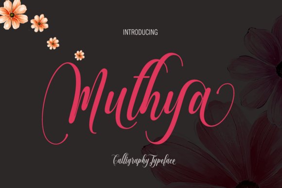
Muthya Font – Muthya reads like calligraphy in motion: letters rise and fall with dancer-like rhythm and deliberate swash ligatures that give words a theatrical silhouette. The face ships with standard and discretionary ligatures, swash alternates, stylistic sets and a private Unicode area, so designers who work with OpenType features can toggle flourishes and alternate shapes for expressive headlines; this makes it one of the more interesting swash fonts for editorial and fashion work.
The glyph set covers most Latin-based European languages and comes in OTF and TTF formats, with instructions for enabling stylistic alternates in Illustrator, InDesign and CorelDraw. Use Muthya for bold display use-logos, wedding suites and boutique packaging-while keeping letterspacing open so the swashes breathe and don’t collide at large sizes.
My Recommendation: I would reach for Muthya when a project needs lively, hand-calligraphed character: it adds personality to invitations, logos, and luxury labels without feeling overworked. Its OpenType alternates let me craft distinct wordmarks fast, but you do need software that supports those features. For best results set it at display sizes and give the swashes room to show.
14. Rolling Bakery Font
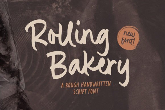
Rolling Bakery Font – Rolling Bakery carries a rough, tactile hand that reads as both aged and immediate; irregular stroke endings and subtle texture make each letter feel handcrafted rather than mechanical. The face’s uneven baseline and organic terminals create a friendly, artisanal voice that works especially well for food brands or retro-inspired packaging where a human touch is desired.
Letters include enough personality to stand alone in logotypes and short headlines, but require careful kerning for multi-word treatments and small sizes. Pair this font with a restrained geometric sans for contrast, and use high-resolution outputs or vector tracing when applying it to product labels to preserve the distressed charm.
╰┈➤ Download Rolling Bakery Font
My Recommendation: I’d pick Rolling Bakery for projects that require warmth and authenticity-artisan food labels, café signage, and handcrafted product branding benefit most. It brings a handcrafted feel without overcomplicating layouts, though it’s best kept to headlines and short phrases. For packaging, I’d rasterize or carefully proof at print resolution to keep the texture intact.
15. Hidden Beauty Font
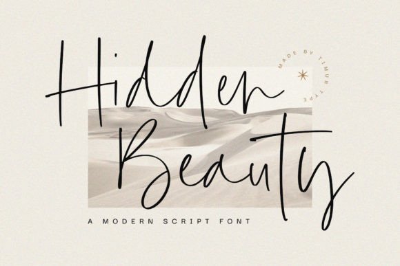
Hidden Beauty Font – Hidden Beauty offers a slender, understated handwritten style with clean strokes and generous spacing that keeps text legible while maintaining a personal touch. Its thin hairlines and subtle terminals lend a refined air suited to editorial mastheads, delicate packaging, and overlays where understated elegance is the priority.
Because the design is so light, it plays well against bold display faces or heavy backgrounds that provide contrast; increase line-height for multi-line use to preserve clarity. Use Hidden Beauty for invitations, social headers, and upscale product labels, but avoid running it as long-form body copy where the fine strokes may lose definition at small sizes.
╰┈➤ Download Hidden Beauty Font
My Recommendation: I recommend Hidden Beauty when a project needs an elegant, whisper-quiet signature rather than loud ornamentation-bridal stationery and boutique branding are natural fits. It pairs nicely with a strong sans or slab for balance, and I always test it across screen and print to ensure the thin strokes remain crisp. Keep it for short phrases and accents rather than dense text blocks.
16. Last Swash Font
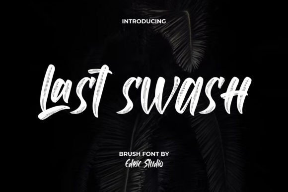
Last Swash Font – Last Swash is a bold brush script that pairs heavy, confident strokes with delicate hairline terminals to create memorable display text. As part of the swash fonts family, it supplies subtle terminal flicks and slight stroke contrasts that lend personality while keeping letterforms legible. The set includes upper- and lowercase characters, numerals and punctuation with thoughtful spacing and kerning for tight layouts.
The visual tension between thick brush marks and fine details makes this face especially useful for logos, product labels and poster headlines where presence matters. It scales cleanly at large sizes and still reads well at moderate display sizes thanks to consistent shapes and well-managed counters. Use it when you want a handcrafted brush energy that remains readable across print and digital formats.
My Recommendation: I reach for Last Swash when a project needs bold, hand-painted character without sacrificing clarity. Its brushy weight and subtle thin strokes give logos, packaging and posters a crafted look that still reads in real-world contexts. It’s a strong pick for apparel branding, café signage and music or lifestyle covers where personality must meet practicality.
17. Sagitarius Swash Font
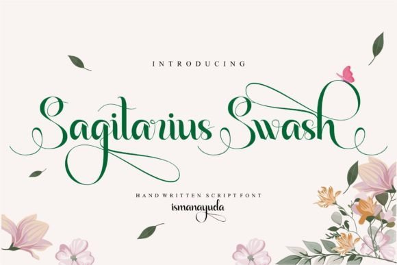
Sagitarius Swash Font – Sagitarius Swash captures the relaxed motion of genuine handwriting with flowing joins and an uneven baseline that feels personal rather than mechanical. The letterforms include gentle ligatures and alternates that prevent repetitive patterns in short phrases, giving headings a human voice. Overall, the type moves with a casual rhythm that suits friendly, creative applications.
This font works well on wedding posters, café displays and content aimed at independent creators because it communicates warmth and authenticity. Pair it with a neutral sans for contrast, or use longer swash alternates sparingly to avoid clutter in dense layouts. Best results appear at medium-to-large sizes where the hand-drawn quirks are visible and legible.
╰┈➤ Download Sagitarius Swash Font
My Recommendation: I would use Sagitarius Swash for projects that need an intimate, handcrafted touch-think small-batch brands and event stationery. Its natural ligatures and baseline variation add personality without feeling overwritten. I like it on invitations, menus, and social graphics where a friendly handwriting voice helps build rapport.
18. Hollando Swash Font – swash fonts
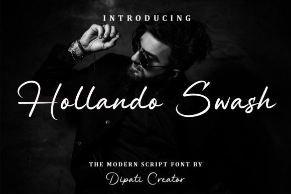
Hollando Swash Font – swash fonts – Hollando Swash presents a refined script voice with elongated swashes and smooth, elegant connections that suit formal and decorative uses. PUA encoding makes all alternates, swash endings and special glyphs straightforward to access, so designers can craft ornate headings and flourishes without hunting for code. OpenType features-contextual alternates, ligatures and stylistic sets-help the text flow naturally across words.
This face excels on wedding invitations, premium stationery and elevated social posts where ornamental tails and tasteful endings add an artisanal finish. Stroke contrast and considered spacing help the font reproduce crisply in print, while the wide glyph set eases accented-language typesetting. Swap swash variants to control decoration on long versus short lines for better readability.
╰┈➤ Download Hollando Swash Font – swash fonts
My Recommendation: I turn to Hollando Swash when a design calls for classic script elegance with plenty of decorative options. The PUA-encoded glyphs and OpenType controls let me craft bespoke headings and invitation lines quickly. It’s particularly fitting for wedding suites, luxury packaging, and editorial covers that benefit from ornate, calligraphic detail.
19. Swash Delight Font
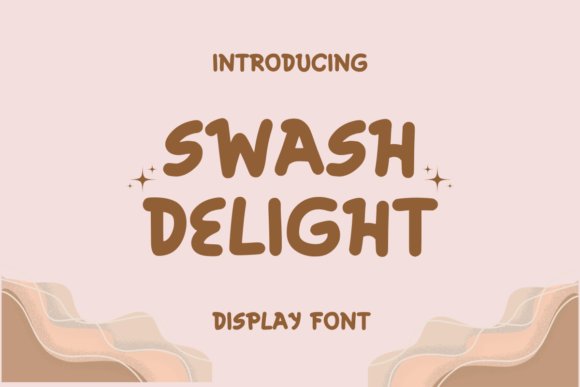
Swash Delight Font – Swash Delight reads like a cheerful handwritten note: rounded terminals, bouncy rhythm, and playful loops give it an immediately personable voice. The lowercase set sits close for compact headlines while tall ascenders and generous descenders allow for dramatic terminals that feel hand-cut rather than mechanical. Use it where warmth matters-party invites, kid-focused packaging, or boutique social graphics.
Under the hood there are alternate glyphs and contextual ligatures that let you craft varied endings and initials without manual tweaking; this kind of flexibility is why designers reach for swash fonts for bespoke headlines. Its moderate stroke contrast keeps legibility strong at display sizes, and pairing it with a neutral sans balances the ornamentation. Keep lines short so each flourish can read cleanly.
╰┈➤ Download Swash Delight Font
My Recommendation: I pick Swash Delight when a project needs charm without appearing amateurish. The alternates let me make logos and labels feel custom without redrawing letters, and the friendly shapes work well on merchandise and greeting cards. Use it for small-batch brands, children’s products, or any piece that benefits from a handcrafted touch.
20. Swash Zillong Font
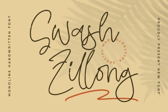
Swash Zillong Font – Swash Zillong is a monoline handwritten font with tidy, even strokes that read modern and approachable rather than overly ornate. Its steady width makes it an excellent choice for product packaging, mugs, posters, and name cards where a neat, personal signature is wanted. The letterforms are open and airy, which helps when placed over textured backgrounds or photography.
This release is PUA encoded so every swash, alternate and special glyph is immediately accessible through a glyph panel-no advanced OpenType knowledge required. Thoughtful spacing and purposeful terminals mean it pairs well with clean sans-serifs for branding or with a subtle serif for editorial covers. It’s a practical script when you want handcrafted character that adapts to multiple surfaces and print runs.
╰┈➤ Download Swash Zillong Font
My Recommendation: I rely on Swash Zillong for branding with a friendly handwritten voice and for merchandise where consistent stroke weight matters. The PUA encoding saves time, making alternate swashes easy to apply in standard apps. Use it for logos, packaging, stationery, and lightweight editorial headings.
21. Big Swash Font
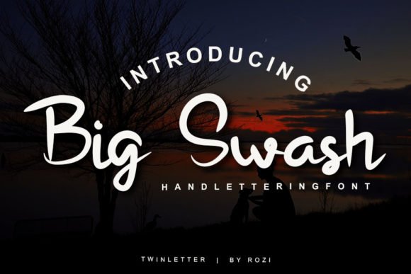
Big Swash Font – Big Swash pairs classical calligraphic gestures with a whimsically generous approach to flourishes; capitals bloom into sweeping strokes that demand attention. The typeface keeps a readable skeleton while offering long terminals and ornate joins that look superb at large display sizes. That combination gives headlines and invitations a ceremonial air without feeling stiff.
OpenType features include discretionary ligatures and stylistic alternates so you can lengthen or shorten tails to fit compositions, and the high-contrast strokes benefit from generous tracking at small sizes. For application, use it on wedding suites, posters, or signage where a bold, elegant statement is needed, and consider pairing it with a crisp sans or a restrained serif for contrast.
My Recommendation: I reach for Big Swash when a project needs theatrical, calligraphic impact-wedding materials, posters, and premium packaging are perfect fits. Its alternates make it simple to vary looks without redrawing, and the strong presence at large sizes ensures legibility. Pair with a minimalist supporting face to keep the focus on the flourishes.
22. Rabbio Swash Font
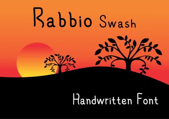
Rabbio Swash Font – Rabbio Swash reads like a contemporary hand-lettered signature with warm curves and generous terminal flourishes that make headlines and packaging feel approachable and handcrafted. Its OpenType alternates and contextual ligatures give designers control over how each word flows, and the set handles display sizes particularly well, so it sits confidently on logos, labels, and poster art while keeping an authentic voice among other swash fonts.
Under the hood Rabbio balances a medium x-height with slightly condensed counters, which helps preserve readability when you tighten tracking or nest it into dense layouts. The soft pressure contrasts and natural ink-like strokes invite textured treatments and pairing with a restrained sans for body copy, while careful kerning and selective alternates turn casual words into polished compositions.
╰┈➤ Download Rabbio Swash Font
My Recommendation: I’d reach for Rabbio Swash when a project needs warmth without losing polish – think boutique packaging, café menus, or seasonal campaign headers. Its alternates make it easy to add personality without manual lettering work, and the readable forms mean you can use it at larger sizes without fuss. For brand work that wants a friendly, human touch, this font brings charm and practical controls.
23. Mickle Swash Font
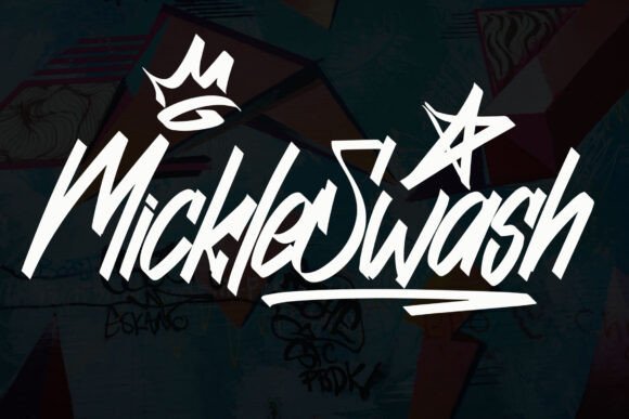
Mickle Swash Font – Mickle Swash arrives as a bold handbrush display that leans into expressive stroke endings and irregular terminals to convey motion and attitude. The character shapes are deliberately idiosyncratic, creating focal points in posters, apparel graphics, and product labels where a loud, handcrafted voice is needed without complex editing.
The family includes multiple stylistic sets and swash-cap options so you can swap dramatic alternatives for tighter copy or extended greetings, and the heavy contrast pairs well with textured backgrounds or duotone printing. Treat the font as a headline system: pair it with a neutral text face for long reads, and spend a moment on kerning to keep the handwritten energy readable at a distance.
╰┈➤ Download Mickle Swash Font
My Recommendation: I recommend Mickle Swash for projects that need bold personality – indie apparel drops, concert posters, or artisanal brand marks are perfect fits. Its brush-driven shapes read well on both screen and print, and the stylistic sets let you dial the expressiveness up or down. Use it when you want handcrafted impact with headline-level presence.
24. Cherry Swash Font
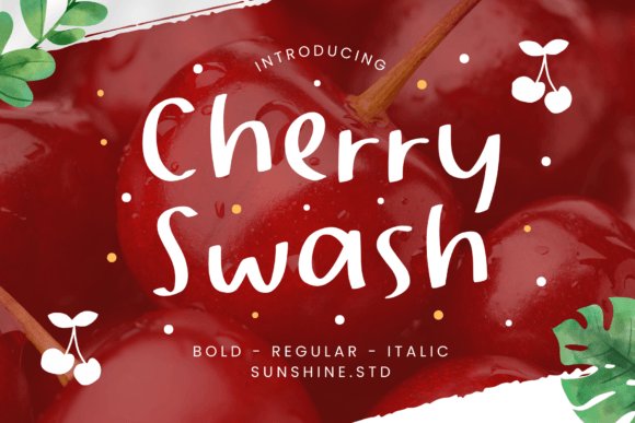
Cherry Swash Font – Cherry Swash channels a playful, slightly whimsical handwriting with flowing connections and small decorative swashes that feel casual rather than ornate. The rhythm of its letterforms produces friendly, readable words that suit stationery, children’s packaging, and social graphics where an intimate, human tone is desirable.
Technically, Cherry offers tasteful ligatures and optional end-of-word flourishes that can be mixed to vary the look without manual redraws, and its moderate contrast keeps legibility intact across web banners and print invites. For tighter layouts use the compact alternates; for invitations or hero headers favor the longer swashes to add motion and personality.
╰┈➤ Download Cherry Swash Font
My Recommendation: I’d pick Cherry Swash when a design needs to feel personal and joyful – think event invites, artisanal food labels, or lifestyle blog headers. The alternates let you customize phrases quickly, and the approachable shapes play well with both serif and modern geometric partners. It’s a go-to when warmth and handcrafted charm are the priority.
25. I Heart You Font
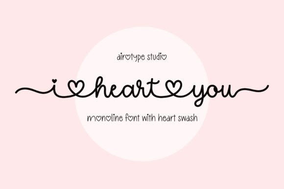
I Heart You Font – I Heart You is a single-line handwritten script that leans playful and intimate, anchored by a signature heart swash that replaces a dot or terminal flourish. The single-line construction makes it suitable for engraving, plotting, and vinyl cutting while maintaining fluid stroke connections for digital layouts. Among swash fonts, its heart motif slots neatly into romantic designs and remains legible at small sizes thanks to open counters and balanced spacing.
It fits valentines, wedding stationery, T-shirt graphics, stickers, and sublimation projects where a cute, handcrafted accent is required. Pair it with a simple geometric sans to keep hierarchy clear or overlay it on watercolor textures to amplify the handmade feel. When preparing files for cutting, convert strokes to outlines and tweak kerning on joined letters to prevent overlaps.
My Recommendation: I reach for I Heart You when a design needs a playful romantic mark without custom lettering-the heart swash gives instant personality and saves editing time. Its single-line nature is ideal for craft projects and small merchandise because it cuts cleanly on plotters and engravers. I also like pairing it with clean sans types for stationery and with soft textures for casual wedding invites.
26. Summer Beach Font
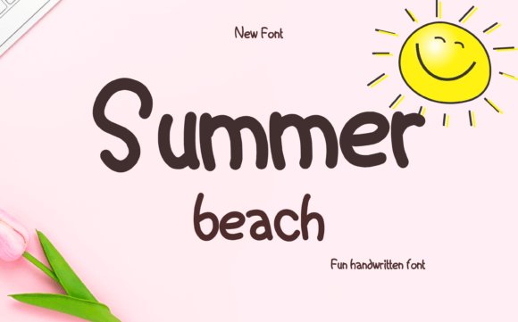
Summer Beach Font – Summer Beach Monoline presents a casual handwriting voice with a soft swash cadence, built as a consistent single-weight monoline that reads cleanly across sizes. The package includes swash alternates and OpenType ligatures, and PUA Unicode encoding makes extra characters accessible in non-design apps. Open counters and generous spacing give it an airy silhouette suited to headlines and relaxed brandmarks.
It works well on logos, product packaging, wedding invitations, posters, signage, and editorial covers when a breezy, approachable script is called for. For balance, set it against a neutral serif or condensed sans to keep layouts anchored while letting the swashes breathe. Before sending to print or cut, review kerning pairs and export as outlined shapes when necessary to preserve delicate tails and alternate forms.
╰┈➤ Download Summer Beach Font
My Recommendation: I pick Summer Beach for projects that need a friendly, modern handwritten feel without complicated weight systems. The PUA encoding is handy for mockups and online shops, and the swash alternates provide stylistic variety for headlines and packaging. It’s a solid option for seasonal branding, product labels, and editorial covers that want relaxed charm.
27. Barley Sign Font
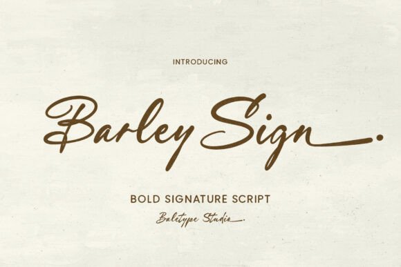
Barley Sign Font – Barley Sign is a bold handwritten script featuring extended alternates and long end swash options that allow words to flow into dramatic flourishes. Its heavier stroke weight gives strong presence for logotypes and poster headlines while stylistic sets and contextual alternates reduce repetitive letterforms. Multi-language support keeps global branding consistent without awkward substitutions.
Best used at medium to large sizes, its pronounced terminals demand space so the end swashes can be appreciated without crowding adjacent elements. Apply it to signatures, packaging wordmarks, and invitation headlines, experimenting with negative space by letting swashes overlap background shapes. When preparing artwork for embroidery or vinyl, convert to outlines to safeguard the long swashes and preserve scale relationships.
My Recommendation: I choose Barley Sign when a project needs a bold handwritten voice that reads like a crafted signature at scale. The long end swashes allow distinctive logotypes without custom lettering, and alternates keep repeat words from feeling repetitive. It shines on product packaging, event signage, and invitations where a strong handcrafted presence is desired.
28. Dream Wish Font
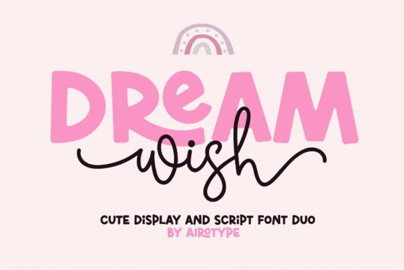
Dream Wish Font – Dream Wish pairs a single-line script brimming with playful swashes and a chunky all-caps companion, giving designers two distinct voices that harmonize. As one of the lighter swash fonts, its looping entry and exit strokes and airy spacing keep the cursive readable even at smaller sizes. The bold caps include subtle ligatures and strong counter shapes that act as reliable anchors for headlines or product names.
The script’s bouncy rhythm and rounded terminals read youthful without feeling amateurish, and its swashes tuck neatly around ornaments and illustrations. Use the duo together for greeting cards, children’s packaging, web headers, or split them up for logo work where you need whimsy plus visual weight. Its modest ornamentation keeps the type from overpowering hand-drawn illustrations or pattern work.
My Recommendation: I’d reach for Dream Wish when a project needs personality and approachability-think kids’ products, playful branding, party stationery, or friendly social headers. The combination of a swashy script and bold caps makes it simple to create contrast without pulling in extra fonts. It’s quick to use and forgiving in layouts, which saves time when I need charming results fast.
29. The Secret Font
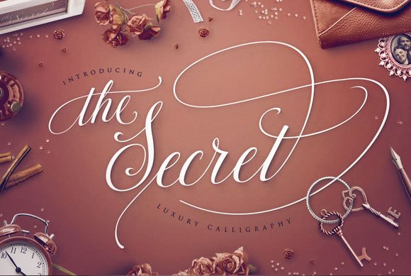
The Secret Font – The Secret is a refined calligraphic script built around an expansive glyph set and dozens of alternate strokes that let letters interlock like genuine handwriting. With nearly 700 glyphs and more than fifty end-swashes, the face gives designers fine-grain control over rhythm, line endings, and decorative flourishes. Included are contextual alternates, discretionary ligatures, stylistic alternates and PUA encoding so that complex combinations are accessible in common design apps.
Each terminal and flourish was repeatedly redrawn and tested to balance ornament with readability, so the font behaves predictably whether used in headlines or longer display lines. It suits high-end invitations, boutique branding, editorial mastheads and artisanal packaging where calligraphic detail conveys craftsmanship. Expect a short learning curve to master alternates, but the payoff is consistently elegant, hand-lettered texture throughout a project.
My Recommendation: I recommend The Secret when a design needs a handcrafted, calligraphic voice that still performs in production workflows. Its rich set of alternates and swashes lets me shape words for specific compositions without manual vector edits. Use it for wedding suites, luxe product labels, or editorial mastheads where ornate, controlled lettering enhances perceived value.
30. Dirty Stroke Font
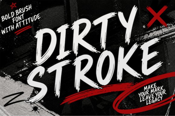
Dirty Stroke Font – Dirty Stroke is a brush-display font with roughened edges, irregular ink breaks and aggressive directional strokes that read like a marker dragged across textured paper. The alphabet includes optional terminal swashes and splatter-style endings that add raw character to short headlines and logos. Its heavy texture and kinetic shapes demand attention at large sizes, turning simple slogans into gritty, tactile statements.
Because of its pronounced roughness, Dirty Stroke pairs best with a plain geometric sans or a restrained serif to provide contrast and legibility. It shines on posters, band artwork, apparel prints and bold social media cards where attitude and grit are desirable. When placing it over photographs, tighten tracking slightly and add a subtle outline or drop shadow to protect the letterforms.
╰┈➤ Download Dirty Stroke Font
My Recommendation: I use Dirty Stroke when a project needs immediate attitude-music posters, streetwear mockups, and edgy promo graphics are ideal. The raw brush marks give compositions an authentic, handmade feel without requiring custom lettering. Pairing it with a minimalist face keeps designs readable while letting the font’s texture do the expressive work.
31. Amastay Font
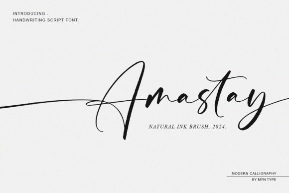
Amastay Font – Amastay feels like ink left to dry on high-quality paper: textured, slightly irregular strokes give this cursive calligraphy font a handwritten personality while a long swash tail adds dramatic motion to word endings. It sits naturally among popular swash fonts thanks to its organic rhythm and well-considered stroke contrast, making single words read like a practiced signature rather than a mechanical script.
The font includes useful alternates and contextual ligatures so connected letters flow without awkward joins, and its ink-like texture reproduces well at print sizes and on textured papers. Use it for boutique branding, packaging, or editorial mastheads where a handcrafted signature is needed; pair with a simple sans for readability in body copy and keep color palettes restrained to preserve its subtle texture.
My Recommendation: I reach for Amastay when a project needs a real handwritten voice rather than a generic script-its ink texture and long swash tails bring personality without overpowering layout. It’s especially strong for boutique logos, artisanal product labels, and stationery where a human touch matters. Because of its alternates and ligatures, I trust it in typesetting where letter connections must look intentional and fluid.
32. Holly Font
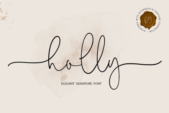
Holly Font – Holly is a seasonal script that balances a lively signature style with practical extras: flowing curves, generous beginning and ending swash tails, and multiple stylistic alternates that let letters link in playful or formal ways. The letterforms lean slightly toward casual calligraphy, which gives holiday cards and wedding invites a cheerful but refined look rather than overt ornamentation.
Aside from festive projects, Holly adapts neatly to crafting workflows-SVG cutting, Cricut projects, and embroidery benefit from its clean outlines and matching swash endings that reproduce well in machines. Designers will appreciate the abundance of alternates and swashes for creating varied wordmarks, while crafters can reuse consistent swash patterns across seasonal merchandise and home decor pieces.
My Recommendation: I recommend Holly when you want a handwritten script with holiday spirit that still behaves in production workflows-its alternates and swash tails make it easy to craft unique greetings or monograms. It’s a go-to for seasonal stationery, handmade gift tags, and small-run product labels. The font’s machine-friendly outlines also make it practical for Cricut and embroidery projects.
33. Rustic Wedding Font
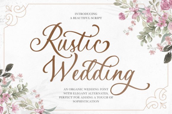
Rustic Wedding Font – Rustic Wedding reads as a contemporary hand-lettered script with a relaxed texture that mimics real brush or pen strokes, giving designs a personal, handcrafted feeling. It ships with uppercase and lowercase sets, symbols, and a healthy roster of alternates and ligatures, including specially designed “AND” glyphs that let connecting words feel intentional and decorative on invitations.
Because it supports multiple languages and includes a range of swash options, the font is flexible across global wedding stationery and boutique branding where a warm, handmade aesthetic is desired. Use it for save-the-dates, signage, or apparel prints-pair with muted palettes and paper stocks that highlight its tactile qualities to emphasize a rustic, intimate tone.
╰┈➤ Download Rustic Wedding Font
My Recommendation: I’d pick Rustic Wedding for projects that need a handmade, intimate voice-wedding invites, place cards, and artisanal labels all benefit from its alternates and ligatures. The specialized “AND” glyphs are a thoughtful touch that saves time and elevates layouts. Its multilingual support also makes it a reliable choice when addressing diverse guest lists or international packaging.
34. Ever After Font
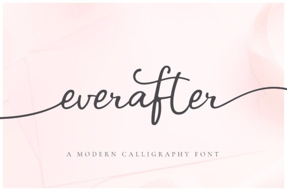
Ever After Font – Ever After is a modern, romantic script built from smooth, flowing letterforms that lean into calligraphic curves. The lowercase set includes plentiful swash alternates and unique “infinity swashes” that bind words together with a continuous figure‑eight flourish – a small but effective trick when working with swash fonts for wedding stationery and identity work. Swashes and infinity variants are also supplied as separate font files for use in software without full OpenType support.
The stroke endings and open counters make vinyl cutting on Cricut and Silhouette less fussy, while the separate swash fonts simplify production in non‑OpenType environments. Kerning feels thoughtfully handled and the alternates let you create natural connections useful for monograms, signage, and invitation suites. Pair it with a neutral display face to keep the typography balanced.
My Recommendation: I use Ever After when I need a romantic script that finishes neatly on vinyl or reads beautifully on printed invites. The infinity swashes are a go‑to for couples’ monograms and apparel because they add graceful continuity between names. Having separate swash font files saved time when I worked inside Cricut Design Space and other limited editors.
35. Lemonhoney Duo Font
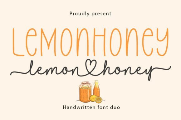
Lemonhoney Duo Font – Lemonhoney Duo matches a tall, hand-drawn all-caps sans with a smooth connecting script to create a homemade, organic voice ideal for packaging and brand work. The script includes thoughtful ligatures and a heart-shaped swash that functions as a decorative flourish for signatures, labels, and invites. All glyphs and alternates are PUA encoded so you can access the full set without relying on OpenType feature panels.
Use the uppercase sans for bold headlines or logotypes while the script brings warmth to secondary text, recipe cards, and product labels; the contrast keeps small text legible. The pairing behaves predictably across raster and vector workflows and the script’s connecting strokes reduce awkward gaps in multi-word names. It’s well suited to boutique food brands, café menus, and lifestyle blogs seeking a handcrafted look.
╰┈➤ Download Lemonhoney Duo Font
My Recommendation: I reach for Lemonhoney Duo when a project needs artisanal personality with clear typographic hierarchy-think jam labels, bakery bags, or wedding signage. The tall sans creates instant presence while the script adds handcrafted charm without compromising legibility. PUA encoding makes it straightforward to access ligatures and swashes in simpler design tools, which speeds up production.
This collection of 35 swash fonts covers a wide span of styles, from subtle flourishes to highly decorative scripts. Use the notes to match contrast, spacing, and character support to your invitation layout.
Test selected fonts in context, confirm license permissions, and adjust tracking and ligatures for best legibility. The right swash choice will add personality and cohesion to wedding stationery while keeping the message clear.