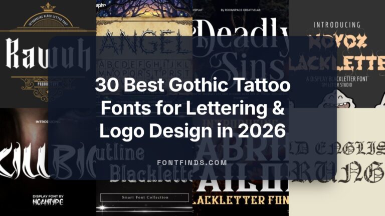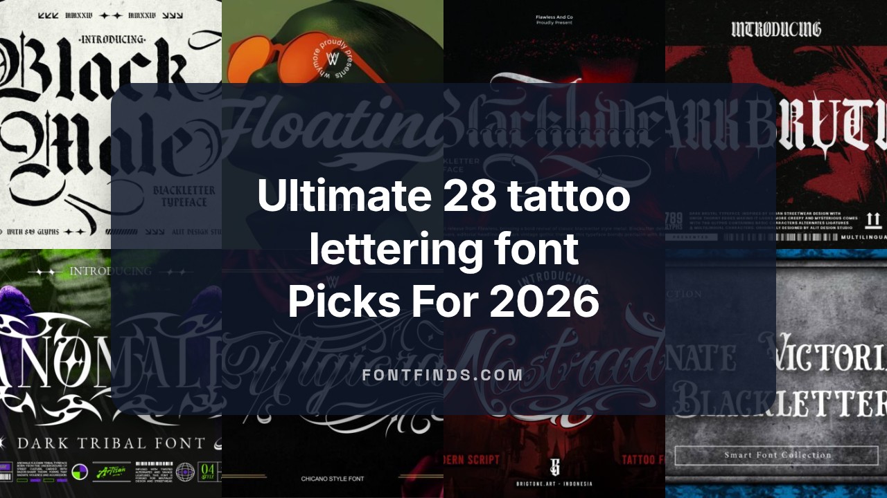
Ultimate 28 tattoo lettering font Picks For 2026
The right tattoo lettering font can make or break a design, whether you’re crafting classic script, bold blackletter, or delicate single-line lettering.
In this curated list of 28 top-tier fonts for 2026 we highlight tattoo script, gothic lettering, calligraphic and hand-lettered typefaces suited for flash sheets, custom pieces, and lettering-only tattoos. Each entry includes style notes and ideal use cases to help illustrators, tattooers, and designers pick the best match.
1. Tattoo Lettering Font
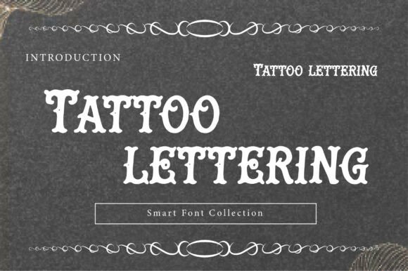
This design channels classic West Coast ink with a hand-rendered Chicano-script voice. Ornate loops, dramatic contrast between thick and hairline strokes, and flourished terminals give it a handcrafted presence that reads as both retro and artisanal. The letterforms feel like they were routed by a steady hand, offering a convincing analogue texture that works well in large display uses.
Technically, the face relies on strong ligatures and generous swashes to create continuous, rhythmic word shapes – ideal for signage and badges where each word becomes a visual motif. Pay attention to kerning with tightly packed words; toggling alternates can prevent accidental collisions when swashes meet. When reproduced, this style benefits from crisp vector outlines and slight embossing to preserve stroke fidelity on packaging and apparel.
Visually, it balances personality with readability: the flourishes read as decorative accents rather than noise, so the message remains legible at display sizes. Pair it with a restrained sans or condensed grotesque to let the ornate script breathe. Overall, it’s an emotive choice when you want heritage and street credibility without sacrificing polish.
Download Tattoo Lettering Font
My Recommendation: I’d reach for Tattoo Lettering when crafting brandmarks, shop signage, or label designs that need an authentic, handcrafted look. Its strong personality makes it perfect for apparel drops, barbershop identities, or premium liquor labels where character matters more than economy of space. Use it sparingly as a headline or logo to keep the ornate details readable and impactful.
2. InuTattoo Script Font
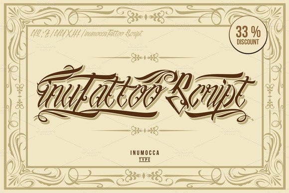
InuTattoo Script is a decorative, swirl-rich typeface inspired directly by traditional tattoo lettering and ornamental handwork. It offers long, graceful swashes, alternative glyphs, and OpenType features that let you craft unique ligatures and extended wordforms. The aesthetic leans theatrical but controlled, making each letter feel like a custom mark rather than a generic display face.
This family works brilliantly for clear application as a tattoo lettering font in branding, tees, and event posters because its strokes translate well across print and textile. At larger sizes the texture of pen-to-paper curves reads beautifully; at medium sizes test stroke thickness to avoid losing interior counters. Consider using stylistic sets for headline lockups and reserve the longest swashes for single-word compositions to maintain legibility.
From a production standpoint, InuTattoo includes alternates that enable creative direction without hand-redrawing every word, while kerning tables keep ornate joins neat. Pair it with a minimal sans or a subtle slab for contrast so the script remains the visual focal point. For projects that want an expressive, handcrafted edge, this script delivers personality with practical features.
Download InuTattoo Script Font
My Recommendation: I’d use InuTattoo Script when a design needs expressive, custom-feeling lettering-especially for merchandise, album covers, or boutique event materials. It’s great when you want dramatic swashes and authentic ink-era flavor but still need digital typographic controls. Test it at the intended final size and pick stylistic alternates to avoid overcrowded joins.
3. Ulgiora Font
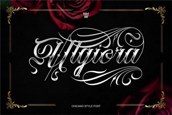
Ulgiora merges bold blackletter weight with the flowing calligraphic sensibility of Chicano scripts to produce a striking hybrid. The result is a high-contrast display face with pointed serifs, sharp terminals, and decorative swashes that add ceremony to each word. It reads as both authoritative and stylish, lending itself to premium identities and fashion-forward labels.
The type includes carefully drawn ligatures and exaggerated ascenders that create strong vertical rhythm in stacked layouts, which makes it excellent for logo marks and vertical signage. Its heavier forms demand generous spacing in extended copy, but shine as monograms, crest wording, or headline treatments. Consider using subtle texture or foil finishes to emphasize the font’s luxury undertones on printed materials.
Ulgiora plays well with clean modern sans-serifs if you need contrast, or with muted script accents for layered compositions. It supports multilingual glyph sets and stylistic alternates so designers can tailor ornamentation without losing legibility. For designers seeking a bold cultural statement that balances tradition and contemporary edge, this face is a confident pick.
My Recommendation: I’d choose Ulgiora for upscale streetwear branding, boutique packaging, or tattoo flash-inspired logos where an assertive visual voice matters. Its mix of historic blackletter energy and Chicano script flair creates memorable marks that photograph and embroider well. Use it as a headline or logotype paired with a neutral sans to let the ornate elements sing.
4. Yodia Mangesti Font
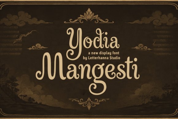
Yodia Mangesti arrives as a bold hybrid: a blackletter display with clear visual ties to Javanese calligraphy. The letterforms carry pronounced contrast and ornamental terminals that read like carved strokes, giving each glyph a narrative presence that feels ceremonial yet contemporary. The name itself-evoking warrior spirit and resolve-matches the font’s dramatic temperament.
Technically robust, this face includes carefully tuned uppercase and lowercase sets, numerals, punctuation, and OpenType extras such as discretionary ligatures, contextual alternates, and stylistic swashes. Those features let you craft flowing logotypes or headline treatments without losing the font’s structured, chiseled feel. Because the shapes are deliberately heavy and resilient, Yodia Mangesti functions very well as a tattoo lettering font, where thick primary strokes and designed negative space help ink hold up over time.
Use it where you need a commanding typographic voice: editorial mastheads, album covers, luxury packaging, and identity systems that require historical resonance. It pairs nicely with minimalist sans-serifs to give designs contrast, or with textured backgrounds to emphasize the font’s carved aesthetic. Provided in OTF/TTF and ready for design apps, it also supports multilingual projects and production workflows.
My Recommendation: I reach for Yodia Mangesti when I want typography that reads like a cultural artifact-strong, ornamental, and unmistakable. Its heavy strokes and swashes make it ideal for high-impact logos, posters, and of course tattoo lettering projects where durability and visual storytelling matter. If you need a typeface that commands attention and carries a heritage-driven personality, this is a top pick.
5. Woliy Font
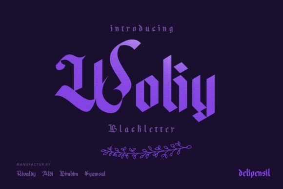
Woliy Medium is a contemporary take on blackletter that balances grit with clarity. Its letterforms are simplified without losing the historical backbone of the style, creating a look that’s both stylish and surprisingly clean. That modern-blackletter aesthetic makes Woliy a go-to choice for display applications that need attitude without clutter.
The weight is tuned for headline use: bold enough to read from a distance, with closed counters and calculated contrast that support strong silhouettes. Kerning and spacing come tuned for tight layouts, which helps when using the face on apparel, posters, or logo marks. Designers can also exploit its graphic personality for tattoo-style lettering compositions where bold shapes and legible forms are crucial.
Woliy shines in seasonal designs like Halloween posters, band merch, and any brand seeking a dark, refined edge. It pairs well with neutral sans-serifs or condensed grotesques to temper the ornamental aspects, and exports cleanly for vector work and stencil production in common formats like OTF and TTF.
My Recommendation: I use Woliy when a project calls for a dramatic blackletter vibe without excessive ornamentation. It performs beautifully on shirts, posters, and logotypes where readability and style must coexist. For tattoo artists who want a sharp, modern gothic look that translates well to stencils, Woliy is a practical and striking option.
6. Vintage Spur Font
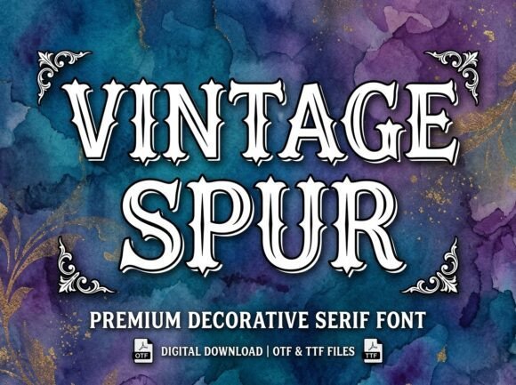
Vintage Spur is a decorative outline display font that channels retro circus and western signage through bold spurred serifs and elegant inline detailing. The outline construction gives each glyph a vintage poster feel, while internal inlines add a refined, engraved touch that reads handcrafted. The overall effect is unmistakably nostalgic and energetic.
Because of its open-outline design, Vintage Spur is fantastic for craft and production work: Cricut and Silhouette users will love how it cuts into clean layered shapes, and SVG designers can build multi-layered color compositions with ease. As a tattoo lettering font it adapts particularly well to traditional flash: use the outline for stencils and the inline for decorative shading when translating the design to skin or printed merchandise.
Apply Vintage Spur for circus posters, biker patches, retro logos, or bold monograms-especially where you want a tactile, old-school voice. The font supports common Latin character sets and exports in web and desktop formats, making it versatile for both physical and digital crafts. For best results, keep it at display sizes to preserve the inline detail.
My Recommendation: I recommend Vintage Spur when you want a nostalgic look that also doubles as a practical crafting resource. Its outline and inline structure make it perfect for layered vinyl projects, vintage branding, and traditional tattoo flash where pronounced outlines matter. If your project needs retro character with clean-cut production-ready shapes, Vintage Spur is an excellent choice.
7. Ink Bloom Font
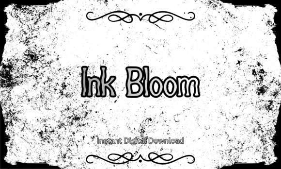
Ink Bloom Font channels the chaos and charm of spilled ink into a bold, handcrafted display. Its uneven stroke widths, ragged terminals, and slightly splattered counters create a tactile impression that reads like a page torn from an artist’s sketchbook-ideal when you want typography that feels made by hand rather than generated.
Technically, Ink Bloom works well at large sizes where its texture can breathe; it also includes alternate characters and messy ligatures that let you vary letterforms for posters, album art, apparel, stickers, and tattoo-style lettering that needs personality rather than polish. File formats are modern and cross-compatible with design suites such as Procreate, Adobe Illustrator, and Cricut, so it adapts to vector work, mockups, and stencil preparation.
For layout, use it as a headline or logo element against simple backgrounds so the gritty texture remains the focal point. Pair it with clean sans-serifs for contrast, and avoid tiny body copy where the distressed details will clog and lose clarity; when used thoughtfully, Ink Bloom gives projects an organic, analog soul.
My Recommendation: I reach for Ink Bloom when I need typography that looks unapologetically hand-made-great for indie record covers, grunge apparel, and creative packaging. Its raw texture adds instant attitude without needing extra effects, and the alternates let me create varied wordmarks. Use it when you want an artistic, imperfect aesthetic that reads as authentic and tactile.
8. Skyforge Webster Font
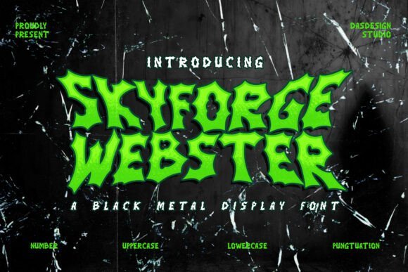
Skyforge Webster Font is a metal-gothic display face with jagged serifs and aggressively tapered strokes that feel forged from steel. Each glyph carries pointed terminals and high-contrast cuts, producing a visual brutality that suits dark, rebellious branding and visuals demanding maximum impact.
Beyond aesthetics, this font was designed with applications like album art, posters, and body-art motifs in mind-it’s an uncompromising tattoo lettering font for artists and designers seeking high-contrast, gothic forms for chest pieces, sleeves, or bold logotypes. The set includes PUA-encoded alternates, numerals, punctuation, and multilingual support so you can build complex words and ornate monograms without manual glyph hunting.
Use Skyforge Webster at headline scale or as a centerpiece mark; its fine inner counters and sharp edges mean it loses fidelity at tiny sizes or low-resolution printing. When translating to skin, simplify intricate joins and consult a tattoo stencil test to preserve the design’s menace while ensuring clean, lasting lines.
Download Skyforge Webster Font
My Recommendation: I recommend Skyforge Webster when you want typography that feels like performance armor-perfect for metal bands, horror marketing, and tattoo artists who want a fierce gothic identity. Its character set and alternates make it flexible for logos and large-format art, but it demands scale and respect for linework. Choose it when your project needs to intimidate and mesmerize at first glance.
9. Old English Grunge Font
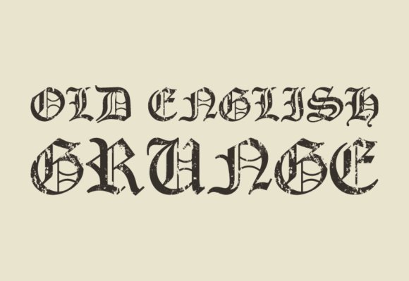
Old English Grunge Font reinterprets traditional blackletter with a distressed, timeworn finish that blends historic formality with urban grit. The letterforms retain the dense, interlocking rhythm of classic Old English but wear purposeful abrasions and ink erosion that communicate age, rebellion, and handcrafted texture.
This variant shines in contexts that benefit from a vintage-meets-streetwear sensibility: editorial mastheads, band merchandise, packaging, and tattoo art where heritage meets edge. It offers stylistic alternates and ornamental capitals to craft ornate initials or monograms while keeping a rugged authenticity suited to posters and brand badges.
Because of its complex strokes and narrow counters, Old English Grunge performs best at headline sizes or as identity marks rather than body copy. For modern layouts, balance it with minimalist sans-serifs to keep compositions readable and let the grunge detail act as a characterful focal point.
Download Old English Grunge Font
My Recommendation: I use Old English Grunge when a project needs historic weight but with contemporary attitude-think craft beer labels, punk zines, or bold logos. Its combination of ornate blackletter shapes and distressed texture gives designs instant character while still feeling familiar. It’s my go-to when I want the gravitas of tradition served up with a raw, rebellious twist.
10. Ryu Japanese Font
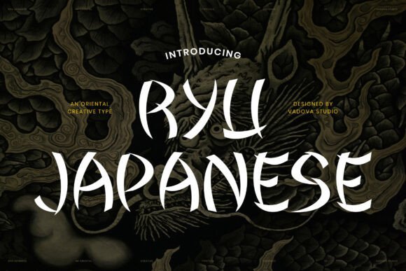
Ryu Japanese channels the volatile energy of sumi-e brushwork into a contemporary display face that reads like motion captured in ink. Strokes terminate with lively flicks and tapered fins that keep every character dramatic yet surprisingly balanced, giving this font an authentic calligraphic presence for headlines and posters.
Designed with expressive alternates and generous contrast, Ryu Japanese adapts well to large-scale uses where texture and gesture matter – it even performs as a tattoo lettering font that mimics hand-brushed kanji and banner scripts. Its organic rhythm and open counters maintain legibility at display sizes while preserving the raw, hand-made character that designers crave for culturally rooted projects.
Practically, the font shines when layered over textured backgrounds, paired with minimal sans serifs for hierarchy, or used as the central emblem in restaurant signage, game titles, and packaging that demand an eastern brush aesthetic. When preparing art for skin, its bold contours translate cleanly to stencil work and flash sheets, but avoid tiny point sizes where brush detail will clog.
My Recommendation: I gravitate toward Ryu Japanese when a project needs genuine brush authenticity-be it a poster, a logo, or a traditional-style tattoo stencil. The expressive strokes convey movement and cultural texture that digital type rarely achieves. Use it for bold display work where you want the viewer to feel ink and brush in every letter.
11. Black Forrest Font
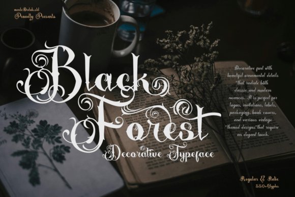
Black Forrest is an ornate decorative typeface built around lavish swashes and an expansive set of over 550 glyphs that recall turn-of-the-century engraving and storybook signage. Its mix of gothic weight and fairy-tale ornamentation creates a nostalgic mood that reads as both theatrical and refined, ideal for designs that need visual drama.
Technically rich, the family ships with Regular and Italic styles plus extensive OpenType features: contextual alternates, discretionary ligatures, and ornamental glyphs let you craft bespoke letterforms and frames without manual illustration. Designers can extract delicate frames, flourish clusters, or headline-only logotypes from the same package, making it flexible for packaging, book covers, and premium invitations.
Because of its heavy ornamentation, Black Forrest performs best at larger sizes or in single-word treatments where details can breathe; it’s less suited to long passage text or tiny labels. Pair it with a restrained sans or a neutral serif to avoid visual clutter, and reserve the most elaborate swashes for focal points like badges, signage, or theatrical posters.
My Recommendation: I recommend Black Forrest when you want to evoke vintage fantasy and handcrafted luxury-think boutique packaging, wedding ephemera, or theatrical branding. Its ornamental tools let you create bespoke logotypes without commissioning lettering. Avoid using it for dense copy or very small-scale applications where the intricate details will be lost.
12. Black Spot Font
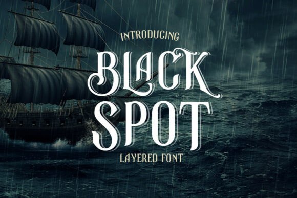
Black Spot is a curvy vintage serif that wears its Victorian and steampunk influences proudly, offering ornamental swashes and a two-layer construction for dramatic depth. The letterforms balance calligraphic flourishes with sturdy serifs, producing a nostalgic tone that reads as both refined and slightly rebellious.
Its layered approach gives designers an easy way to simulate engraved labels or embossed badges: combine the foreground and shadow layers for dimensional headlines or separate them to create inline and textured looks. Black Spot also works extremely well as a tattoo lettering font for classic banner scripts and Victorian-inspired flash, where the interplay of swash and serif brings old-school charm to skin art.
For packaging, labels, and headline treatments, the font’s ornamental options add authenticity without custom drawing; however, take care with tight tracking or very small sizes where decorative terminals may crowd. Pair Black Spot with simple geometric type for supporting copy to let its ornate forms remain the visual hero.
My Recommendation: I reach for Black Spot when a project needs vintage gravitas-whiskey labels, premium product badges, or period-inspired posters are perfect fits. The two-layer system gives instant depth and the ornamental swashes add personality without bespoke lettering. It’s especially rewarding for large-format work or tattoos where the details can be appreciated.
13. Samurise Font
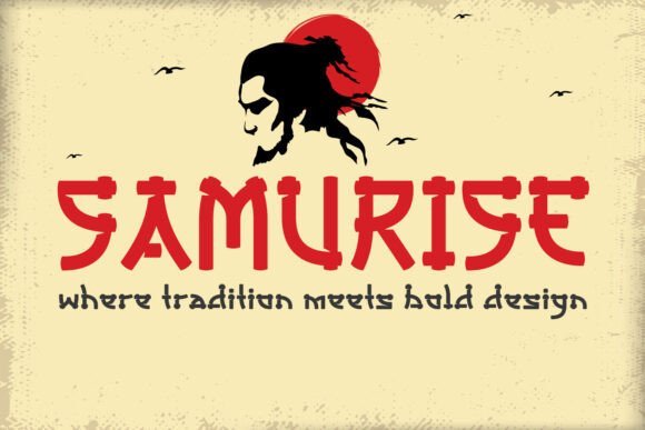
Samurise channels a bold, Japanese-inspired stencil aesthetic with razor-cut strokes that read like modernized samurai calligraphy. The letterforms balance aggressive angles and open counters to deliver a commanding display face that still feels breathable on signage and posters.
Its stencil construction makes Samurise exceptionally versatile for layered treatments – think gritty textures, halftone overlays, and cut-out vinyl. Designers will appreciate how the type stays legible at large sizes while keeping a handcrafted, warrior-like personality suited to gaming covers, martial arts promotion, and Asian-fusion branding.
Technically, Samurise performs well in both print and digital workflows: high-contrast shapes reproduce cleanly for T-shirt prints, packaging stamps, and cinematic title sequences, and the design adapts smoothly to treatments like embossing, engraving, or stencil-cut applications.
My Recommendation: I’d reach for Samurise when a project needs instant visual punch with a distinctly Eastern flavor. Its stencil-ready structure is perfect for apparel runs, poster art, and game logos where you want boldness without losing clarity. If you’re designing for restaurants, martial arts studios, or cyberpunk-inspired campaigns, this font brings crisp attitude and strong silhouette.
14. Crude Legacy Font
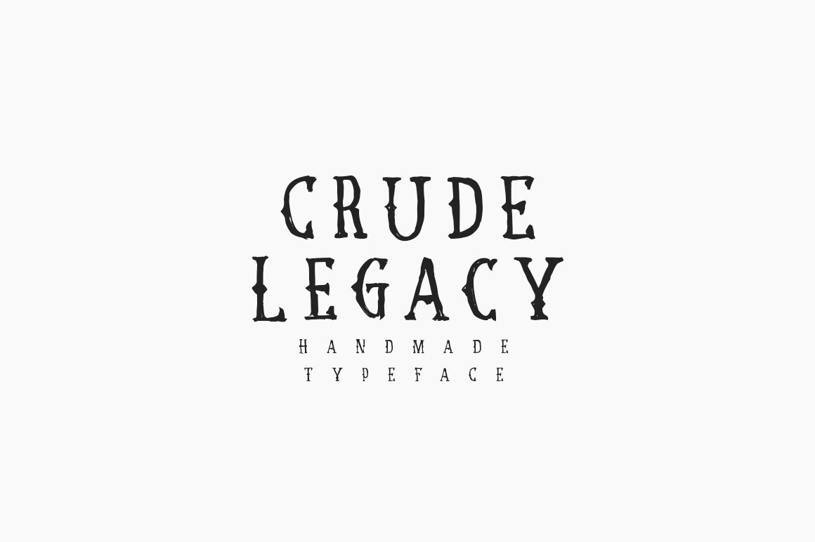
Crude Legacy is a striking blackletter revival that channels the grit and ornamentation of classic flash art – it’s precisely the tattoo lettering font many designers use to recreate old-school parlor authenticity. The type melds dense Gothic forms with ink-ready flourishes so letters read as if they’ve been hand-drawn by a vintage tattoo artist.
Its heavy strokes and dramatic terminals make Crude Legacy ideal for bold logotypes, poster headlines, and apparel where an immediate, nostalgic voice is required. Ornamental capitals and contextual alternates allow you to craft flowing wordmarks or compact, high-impact headlines without losing that retro vibe.
Beyond aesthetics, Crude Legacy works well in vector and print: it scales cleanly for merch, holds up under distressing effects, and pairs surprisingly well with clean sans-serifs for modern editorial or branding systems that reference heritage ink culture.
My Recommendation: I’d pick Crude Legacy when a project needs unmistakable vintage character – think biker patches, tattoo-shop signage, or a clothing label rooted in Americana. Its heavy, hand-drawn feel reads confidently at headline sizes and gives designs an authentic, lived-in edge. Use it when you want heritage and attitude in equal measure.
15. Blacklutter Vol2 Font
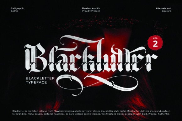
Blacklutter Vol2 updates classic Gothic letterforms with amplified contrast and cleaner curves, producing a typeface that feels both authoritative and contemporary. The sharp serifs and dramatic strokes deliver instant presence, making it a go-to choice when compositions require a commanding headline voice.
Designed with customization in mind, this release is PUA-encoded so designers have direct access to swashes, alternates, and decorative ligatures without extra tools. That makes it ideal for album art, craft branding, and tattoo lettering projects where bespoke glyph treatment and stylistic variation are essential.
The font’s bold weight renders beautifully for print and vinyl applications, and its alternate characters enable tight, ornamental lockups for logos or poster headlines. Apply subtle distressing or metallic effects to highlight its Gothic temperament while preserving legibility at display sizes.
Download Blacklutter Vol2 Font
My Recommendation: I recommend Blacklutter Vol2 for projects that need strength and theatricality – heavy metal covers, premium labels, or statement signage benefit from its dramatic character set. The PUA-encoded alternates let you craft unique wordmarks without complex workarounds. If you want a modern take on Gothic typography that still packs an old-world punch, this is an excellent pick.
16. Torkias Jole Font
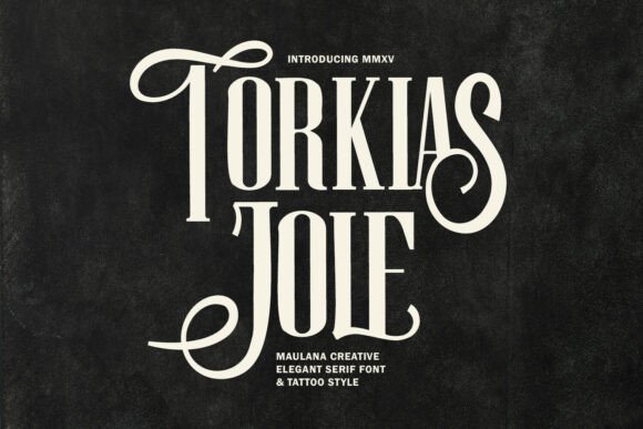
Torkias Jole is an ornate serif display that merges classic typography with the drama of custom lettering. Its tall, narrow stems and extreme contrast create a commanding silhouette, while long swash alternates and curled terminals lend a hand-crafted, engraved quality that feels both vintage and modern. The face reads as luxury packaging or editorial masthead material, and its decorative glyphs are engineered to turn short headlines into signature-like statements.
Technically, Torkias Jole is strong for large-format use where its high-contrast strokes can breathe: think signage, premium bottle labels, and embossed print. The included stylistic alternates and swashes give designers precise control over word shapes so you can craft bespoke logotypes instead of relying on mechanical letterstacking. Kerning pairs and contextual alternates are thoughtfully considered, which makes building complex wordmarks and lockups surprisingly fast.
Because of its deliberate ornamental nature, this typeface also adapts exceptionally well to tattoo-inspired applications – from bold chest pieces to ornamental script accents – so it doubles as a refined tattoo lettering font for mockups and branding tied to ink culture. Pair Torkias Jole with a neutral sans for contrast or a subtle text serif for cohesive editorial systems, and reserve it for short copy to preserve impact. Its tactile, carved aesthetic elevates projects that need to feel handcrafted, heritage-driven, and unmistakably premium.
My Recommendation: I recommend Torkias Jole when you need an authoritative, vintage-luxe voice in a logo or label. Its swashes and alternates let you create unique wordmarks that feel custom-lettered, which is ideal for boutique brands, wedding suites, and upscale packaging. Use it at large sizes or in single-word headlines for maximum legibility and dramatic effect.
17. Noctyrr Font
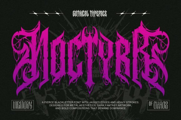
Noctyrr is an uncompromising blackletter design that channels ritualistic intensity and heavy music aesthetics into each angular stroke. The letterforms lean into sharp spurs, pointed terminals, and dense counterspaces, producing an aggressive texture that dominates posters, album art, and dark fantasy covers. Its ligature system and decorative fills provide a handcrafted, runic feeling without becoming visually cluttered at display sizes.
Because of its visual weight, Noctyrr performs best when used as a focal emblem rather than for long paragraphs – think band logos, mastheads, and hero titles that need to convey menace and authority. It also translates well into inked work where crisp edges and bold silhouettes become tattoo motifs, but designers should test scale and simplify complex ligatures for stencil-ready applications. Pair it with sparse layouts and open negative space to let the type breathe and read clearly.
From a practical standpoint, Noctyrr is a strong choice for projects wanting a gothic or underground identity; it reads as ritualistic yet refined when spaced deliberately. Use vector outlines for print or textile reproduction to keep strokes sharp. For a contemporary twist, combine it with minimalist sans elements to juxtapose old-world formality against modern design systems.
My Recommendation: I reach for Noctyrr when a project requires unfiltered attitude – album covers, metal band branding, and horror titles all benefit from its forceful presence. Its heavy, glyphic nature makes it ideal for standout logos and emblems rather than body copy. Be mindful of spacing and simplify where necessary for clean reproduction on skin or merchandise.
18. Armetya Font
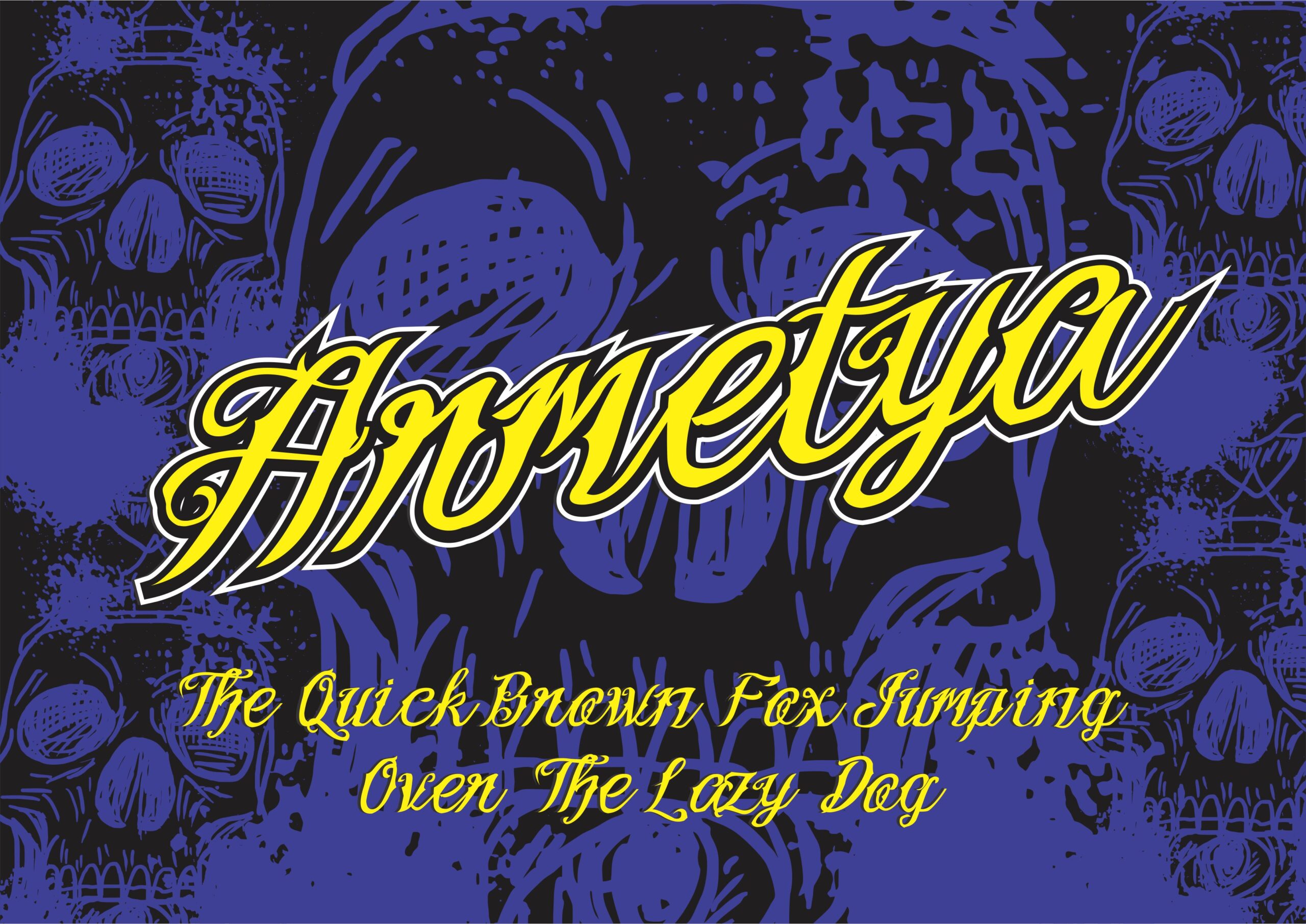
Armetya is a script-inspired display that draws on classic tattoo calligraphy while retaining contemporary polish. Its flowing strokes and well-balanced contrast form a masculine yet graceful persona, with accentuated terminals and connected joins that mimic hand-drawn lettering. The design includes alternate characters and contextual substitutions enabling authentic-looking lockups and logotypes that read as bespoke signatures.
Functionally, Armetya excels in identity work where personality matters: shop logos, apparel graphics, and packaging that benefits from a handcrafted vibe. It’s fitted for applications that require a sense of motion and attitude – from vintage motorcycle badges to barbershop signage. The type behaves predictably in vectors and embroidery when you simplify extreme flourishes, making it practical across print and merchandise.
Because the family channels inked script traditions, it’s an excellent tattoo lettering font for designers creating flash sheets, mockups, or brand systems tied to the tattoo scene. Pair Armetya with sturdy geometric sans-serifs to ground its rhythm, or use it solo for badges and signage where hand-lettered authenticity is the primary message. Its versatility lies in being both rugged and refined, giving projects an expressive, lived-in character.
My Recommendation: I’d use Armetya when a project needs the soul of hand-lettering with modern reliability – think shop identities, apparel lines, and tattoo-styled branding. Its alternates let you craft distinctive wordmarks that feel custom-made, while the script rhythm keeps things readable and stylish. It’s a go-to when you want an energetic, masculine script that still plays nicely with contemporary design systems.
19. Ornate Victorian Blackletter Font
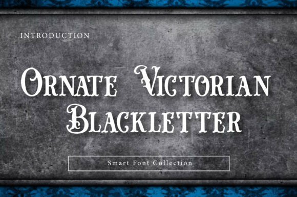
Ornate Victorian Blackletter revives the florid drama of 19th‑century typographic engraving with thick, knife‑sharp serifs and high‑contrast strokes. The face reads like an antique printing press specimen-each character given ornamental treatment and delicate curls that feel carved rather than drawn. Its visual weight commands attention while retaining a refined, historical personality.
Technically, the family is tuned for display use: generous counter shapes and exaggerated flourishing make it ideal for large headlines, monograms, and decorative logotypes. The type’s decorative terminals and engraved texture pair beautifully with metallic foils, textured papers, and embossed effects common in boutique packaging and premium labels. As part of a curated “Smart Font Collection,” it balances ornamental detail with modern kerning and OpenType features for practical layout work.
Applications range from luxury invitations and vintage liquor labels to posters and book covers that need regal or gothic atmosphere. Designers seeking tattoo fonts with an Old‑English or engraved aesthetic will find this typeface translates well to inked lettering motifs, band art, and heritage branding. Use it where you want a project to read as storied, artisanal, and unmistakably ornate.
Download Ornate Victorian Blackletter Font
My Recommendation: I’d reach for Ornate Victorian Blackletter when a project needs historical gravitas-think boutique spirit labels, wedding suites with a gothic edge, or poster art that wants to feel handcrafted. Its ornamental detail makes it especially strong at large sizes and on premium substrates. I love using it to give modern brands a sense of lineage and ceremony without feeling costume-y.
20. Reverse Fraktur Font
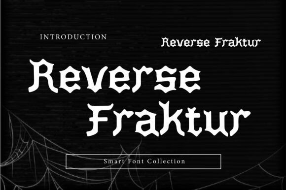
Reverse Fraktur takes the classic Fraktur skeleton and flips expectations through inverted weight distribution and unusually wide stems, producing a bold, contemporary reinterpretation of Gothic lettering. The heavy, blocky structure reads aggressively, while retained Fraktur details-angled terminals and pointed spurs-anchor it in old‑world craft. It’s a striking display face that feels both archaic and experimental.
On a feature level, this design emphasizes contrast through reversed massing: strokes that normally recede are made prominent, creating a monolithic visual that dominates layouts. The result is a type that performs like heavy‑metal art direction-perfect for album covers, editorial spreads with attitude, and identity work for brands wanting to subvert classical tropes. Tight tracking communicates density; open settings reveal decorative nuances.
Because of its unapologetic presence, Reverse Fraktur also works extremely well as a tattoo lettering font for clients seeking gothic or blackletter tattoos with a modern twist. Use it for band logos, streetwear labels, posters, and any application where you want to pair historic blackletter texture with contemporary rebellion. The reversed weight makes it especially memorable on merch, signage, and headline treatments.
My Recommendation: I recommend Reverse Fraktur when you need a display face that refuses to fade into the background-its reversed weight is ideal for visual identities that want to feel defiant and iconic. It’s my pick for band artwork, streetwear drops, and editorial covers where attitude matters. If you want blackletter that reads both familiar and fresh, this one delivers punch and personality.
21. Dark Brutal Font
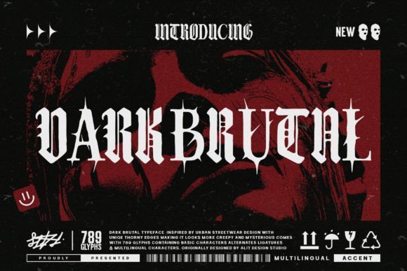
Dark Brutal is a raw, uncompromising blackletter display that embraces rugged texture and visceral form. Its jagged terminals and distressed stroke endings mimic the imperfections of hand‑carved and timeworn signage, lending work a primal, almost ritualistic character. The face reads loud and uncompromising-built to make statements rather than sit politely in body copy.
The typeface’s roughened edges and heavy, angular construction suit projects that lean into counterculture aesthetics: punk posters, heavy‑metal album art, and streetwear campaigns all benefit from its aggressive energy. Designers can exploit its textured forms on gritty print runs or simulated distress effects for merchandise and apparel. Although intentionally imperfect, Dark Brutal includes consistent spacing and robust metrics so it remains usable in practical layouts.
It’s also highly effective for tattoo designs and custom lettering where a hand‑tatted, ancient feel is desired-think bold flash pieces or identity marks that read like carved stone. Pair it with clean sans serifs to let the brutality breathe, or layer it over photographic textures for maximum attitude. Use it where you want grit, weight, and a fierce visual voice.
My Recommendation: I’d choose Dark Brutal for any creative brief that calls for raw intensity-album covers, merch lines, or edgy branding come to mind. Its distressed textures give designs an instant lived‑in authenticity, and it holds up well across print and fabric. If you want typography that feels lived‑in and confrontational, this font is a reliable go‑to.
22. Floating Script Font
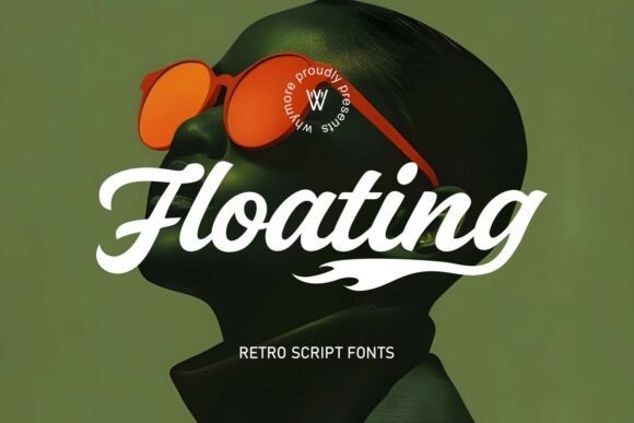
Floating Script channels a bold retro attitude with fluid, calligraphic strokes inspired by Chicano lettering and vintage signage. Its sweeping swashes and strong contrast give it the punch of a classic tattoo flash piece-this is a genuine tattoo lettering font for designers who want text that reads like handcrafted ink.
Beyond style, Floating Script offers multiple alternates and contextual ligatures so words can be tuned into unique wordmarks or logotypes. The letterforms are built to layer with outlines and shadows, making it ideal for high-impact titles on merchandise, album covers, and studio signage.
Technically, the family is ready for professional use: well-kerned pairs, OpenType features, and clean vector outlines ensure crisp reproduction across print, embroidery, and digital mockups. Use it large for display work or selectively at mid sizes where personality matters most.
My Recommendation: I reach for Floating Script when a project needs instant street-credible character-tattoo studios, streetwear brands, and lowrider culture pieces benefit most. Its handcrafted feel cuts through clutter and reads authentically as custom lettering, which saves time while preserving personality. Use it when you want a loud, stylish headline that still feels handcrafted.
23. Auskane Font
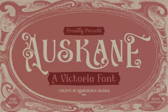
Auskane is a Victorian-inspired display type that marries ornate calligraphic detail with refined proportions from 19th-century typography. The design includes delicate terminals, decorative hairlines, and an overall elegance that instantly signals heritage and luxury without feeling fussy.
The family ships in both clean and rough versions, plus a set of ornamental caps and alternate characters ideal for badges, labels, and editorial headlines. It works beautifully on book covers, premium packaging, café branding, and wedding stationery where a vintage, formal voice is required.
On the production side, Auskane supports stylistic sets and OpenType alternates so designers can create authentic period lettering while keeping technical control for print and digital use. Pair it with a neutral sans for body copy when you want clear hierarchy and a classic, high-end presentation.
My Recommendation: I’d use Auskane for any project that needs Victorian flair-think boutique liquor labels, artisanal product branding, and formal invitations. Its ornamentation reads as handcrafted luxury, making it perfect where tradition and premium quality must be communicated at a glance. It’s also a great choice when you want an elegant display face that scales cleanly from print to signage.
24. Black Male Font
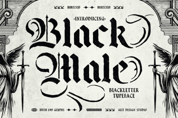
Black Male is a blackletter stencil that fuses historical calligraphy with modern industrial precision, creating a striking tattoo lettering font rooted in gothic tradition. The design conveys weight and edge while retaining readable counters and carefully placed stencil bridges for durability in physical fabrication.
The family includes an extensive glyph set with alternates, swashes, and ligatures that let you craft dramatic logotypes, apparel art, and poster headlines. It was engineered for applications like screen printing, engraving, and vinyl work where stencil gaps must remain functional without compromising the aesthetic.
Practically, Black Male offers tight kerning, OpenType features, and robust vector outlines so the type holds up under high-contrast reproduction and large-format prints. Use it to give brands, bands, and tattoo shops an uncompromising, gothic statement that reads both historic and contemporary.
My Recommendation: I pick Black Male when a project needs uncompromising attitude-band merch, tattoo shop signage, or laser-cut signage are perfect matches. Its stencil-friendly construction makes it ideal for production processes that demand both form and function. If you want a bold, gothic voice that survives print, cut, and repeat wear, this font delivers.
25. Anomale Font
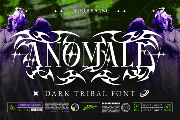
Anomale is an uncompromising blackletter with a tribal edge – its letterforms favor aggressive terminals, hooked curves and ornamental spikes that read like modern runes. The typeface feels ritualistic and raw, evoking underground aesthetics without becoming unreadable; each glyph balances dense ornamentation with carefully carved negative space to preserve shape at display sizes.
What sets Anomale apart are its alternate glyphs and decorative variants: swap-ins transform a basic wordmark into a sigil-like logo, and layered alternates let you craft bespoke ligatures and monograms for identity work. Because the characters are heavy and sculptural, the face excels in large-format usage where texture and silhouette matter more than small-copy legibility.
Apply Anomale to album art, band merchandise and fantasy or game titles when you want a menacing, ritual-inspired presence; it also adapts well to tattoo-style flash and gritty streetwear graphics. For contrast, pair it with a narrow geometric sans or a muted serif to give the ornate shapes breathing room and maintain reading hierarchy in mixed layouts.
My Recommendation: I’d reach for Anomale when a project needs a confrontational, emblematic voice – think metal band logos, dark fashion labels, or occult-inspired game branding. Its decorative alternates make custom marks quick to generate while keeping a handcrafted feel. Use it at large sizes and give the letterforms space so their carved details read cleanly.
26. Nostrad Font
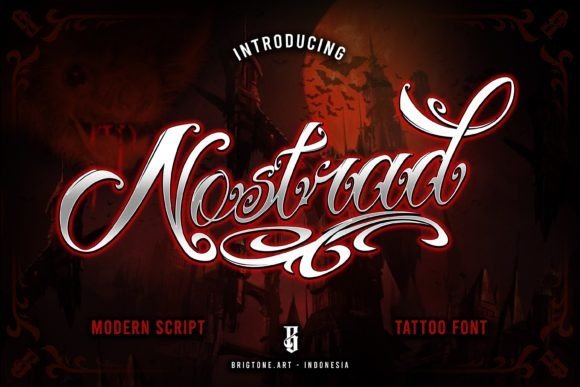
Nostrad is a refined handwritten script that functions beautifully as a tattoo lettering font, delivering an elegant, inked aesthetic with restrained flourish. Strokes vary from soft hairlines to rounded terminals, creating a classy, handcrafted rhythm that reads both intimate and professional on logos and small packaging.
The family is PUA encoded, so you can access swashes, alternates and discretionary ligatures directly from common design apps without extra tools – that makes building unique wordmarks and custom lettering quick and intuitive. Kerning is thoughtfully tuned for connected scripts, and the contextual alternates smooth out joins when you set longer words or nameplates.
Nostrad shines in branding, product labels, stickers and boutique packaging where a personable yet polished signature is desired, and it translates well into tattoo studio signage or custom flash sheets. For best results, use it with subtle textures or soft metallic foils to emphasize its calligraphic charm while keeping contrast high for legibility.
My Recommendation: I often pick Nostrad when a project needs a warm, handcrafted signature look that feels both modern and timeless. Its PUA glyphs let me craft expressive wordmarks without hunting for extra software features, and the refined swashes work beautifully on labels, logos, and tattoo-related branding. It’s my go-to when I want elegant script that still reads cleanly at small sizes.
27. Ristogea Font
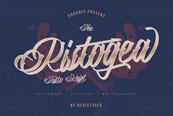
Ristogea is a flowing script with a pronounced curvy motion, built around sweeping swirls and playful terminals that suggest dynamic hand lettering. The letterforms tilt and bounce subtly across the baseline, giving compositions a lively, contemporary calligraphic texture that feels custom-made rather than generic.
Technically, Ristogea balances decorative swashes with readable counters, so it works well for mid-size display uses like posters and apparel prints as well as identity treatments. It responds nicely to outline and fill effects, which designers can exploit for layered signage, vinyl decals and embroidered patches where the swirl elements become focal points.
Use this typeface for boutique branding, tattoo studio logos, invitations and merchandise where a charismatic, artistic signature is desired. To avoid visual clutter, pair it with a neutral sans or subdued slab to anchor layouts and let the curvy script play the starring role.
My Recommendation: I’d choose Ristogea when a project calls for playful, handcrafted energy – especially for boutiques, tattoo studios, or lifestyle brands that want personality in their mark. Its swirled terminals give designs instant character while remaining versatile across print and merchandise. For best impact, reserve it for headline use and complement it with a clean supporting typeface.
28. Fadli Script Font
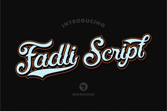
Fadli Script is a hand-drawn script that channels vintage tattoo aesthetics with a contemporary twist. Influenced directly by a tattoo lettering font tradition, its flowing strokes and balanced contrast evoke hand-inked signage and classic flash art while remaining polished enough for modern branding. The letterforms sit between calligraphic flourishes and tight logotype shapes, giving the face a confident, worn-in character without feeling sloppy.
Under the hood Fadli offers a robust set of features important for expressive typography: smooth ligatures, contextual alternates and tasteful swashes that let you craft unique wordmarks and typographic compositions. Its rhythm and spacing were designed to maintain legibility across mid to large sizes, which makes the face excellent for apparel prints, packaging headlines, and tattoo-inspired logos. The inked texture works well against both flat color and distressed backgrounds so you can preserve that hand-crafted look in print and on-screen.
When pairing Fadli Script, consider restrained sans-serifs or slab serifs to anchor its energetic curves-this contrast keeps compositions readable and modern. It excels in projects that need personality: band merchandise, boutique labels, poster art, and identity systems that want an artisanal or reclaimed vibe. Be mindful of very small sizes where fine swashes may lose detail; instead, let the script take center stage as a display element or logo treatment to maximize its visual impact.
My Recommendation: I recommend Fadli Script when you want the honesty of hand-lettering with professional typographic control. Its swashes and alternates make it ideal for creating memorable logos, apparel graphics, and tattoo-inspired branding where character matters. Use it as a display headline paired with a simple sans to balance its ornate nature and you’ll get striking, on-trend results.
Choosing the right tattoo lettering font starts with considering style, legibility at different scales, and how the design will age on skin. Our 28 selections cover a wide range of aesthetics so you can find reliable options for most projects.
Test sizes, tweak spacing, and combine fonts or custom hand-lettering when necessary. Keep this list handy as a reference for tattoo typography decisions throughout 2026.