31 Ultimate Amazing Instagram Post Font Picks for 2026
Choosing the right Instagram post font can make the difference between a scroll-past and a double-tap. In this guide you’ll see 31 curated options, with notes on readability, mood, and best use cases for social media typography.
Whether you need bold display type for carousel covers, elegant script for brand stories, or clean sans-serif for captions, these Instagram post font choices cover every aesthetic. Expect tips on pairing, accessibility, and quick styling ideas to improve your IG feed visuals in 2026.
1. Jenniy & Kary Font
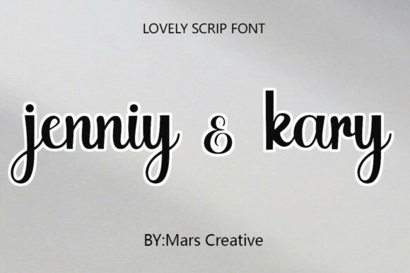
Jenniy & Kary is a modern monoline script that balances handcrafted warmth with crisp, contemporary legibility. The strokes are even and forgiving, which makes the typeface unusually tolerant of tight tracking and small sizes – an advantage when you need a signature-style headline that still reads on mobile feeds. Its connected letterforms feel personal without tipping into fussy ornamentation, so it reads as both intimate and professional.
Designers will appreciate how well Jenniy & Kary pairs with neutral sans-serifs and thin display faces; the script adds a human touch while the sans maintains structure. The face also adapts to tactile production: its consistent stroke weight renders cleanly for laser-cut signage, vinyl decals, and embossing. On textured paper or kraft packaging the light, airy counters create an appealing contrast that preserves readability.
For social assets, this script performs best as a featured wordmark or short headline rather than long body copy. Use it with generous line-height and high-contrast colorways to keep the charm without losing clarity. Small OpenType alternates and contextual ligatures can introduce subtle variety for signature lines or packaging monograms.
My Recommendation: I’d reach for Jenniy & Kary when I need a romantic, understated script that won’t overpower a layout. Its clean monoline construction is ideal for wedding invites, boutique branding, and product labels where a handcrafted feel is required. Use it for short headlines, logos, and personalized merchandise to add warmth without sacrificing legibility.
2. The Silk Road Font – Instagram post font
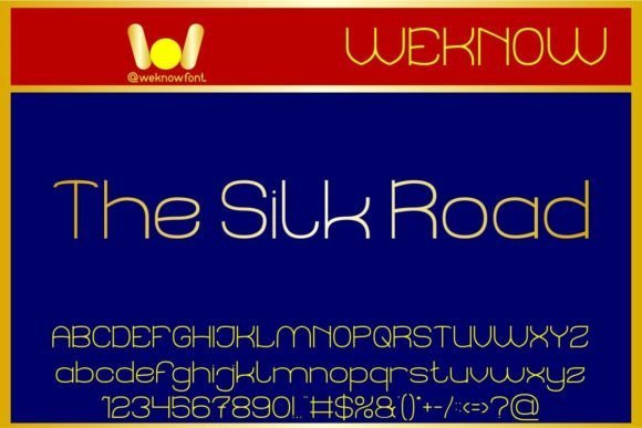
The Silk Road is an elegant thin sans-serif designed for light, airy layouts and refined brand identities. As an Instagram post font it excels at creating minimalist headers and chic captions that read well on screens, especially when paired with ample white space. Its narrow, deliberate letterforms give a high-fashion, editorial quality that elevates simple imagery into a polished visual story.
Because the design favors slender strokes, pay attention to contrast and background texture to avoid legibility loss on small mobile displays. Tight kerning and slightly increased tracking help the type breathe in Instagram carousels and story tiles, while its aesthetic strength lies in headline and logo applications rather than dense paragraphs. Consider using it with bold accents or an earthy serif to create hierarchy.
For digital work, The Silk Road works beautifully as a display webfont and pairs well with high-resolution photography and muted color palettes. It’s particularly effective for lifestyle brands, fashion labels, and curated portfolios aiming for a minimalist social feed. Subtle letter-spacing tweaks and uppercase variants will make your posts feel intentionally editorial and cohesive across a grid.
Download The Silk Road Font – Instagram post font
My Recommendation: I recommend The Silk Road when you need a sleek, editorial look for social media and web projects. It’s perfect for fashion, beauty, and lifestyle accounts that want a refined, high-end aesthetic in their posts and stories. Use it for headlines, product names, and logo marks where an elegant, understated presence is required.
3. Cupcake Font
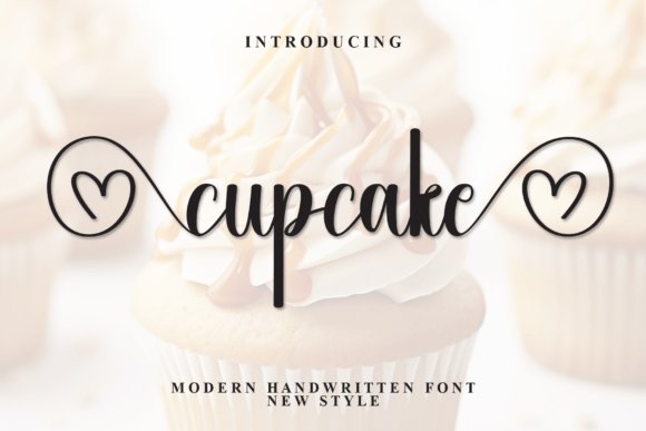
Cupcake is a cheerful hand-lettered script built to inject joy into packaging, invitations, and playful branding. Its flowing curves and occasional heart-themed swashes create instant personality, making it feel like a warm handwritten note. The font’s charm comes from lively terminals and variable baselines that mimic natural writing, giving designs an authentic, home-baked sensibility.
Technically, Cupcake’s PUA-encoded glyphs and decorative alternates make access to swashes and ornaments seamless for non-OpenType workflows, which is ideal for quick social posts or DIY printables. It shines in short phrases, product labels, and greeting cards where the decorative elements can be used sparingly to avoid visual clutter. Bright color palettes, illustrated backgrounds, and soft drop-shadows complement its playful tone.
Because of its exuberant style, Cupcake is best reserved for accent text rather than body copy; too many lines of script will hinder readability. Use it as a logo accent, sticker text, or Instagram story headline paired with a neutral sans to stabilize the composition. When applied thoughtfully, it turns ordinary assets into delightfully tactile pieces.
My Recommendation: I’d use Cupcake for projects that need upbeat, friendly personality-think bakery branding, baby shower invites, and fun product packaging. Its decorative swashes and accessible PUA characters speed up production while keeping the hand-lettered feel intact. It’s a go-to when you want designs that feel personal and irresistibly charming.
4. Lovely Rose Font – Instagram post font
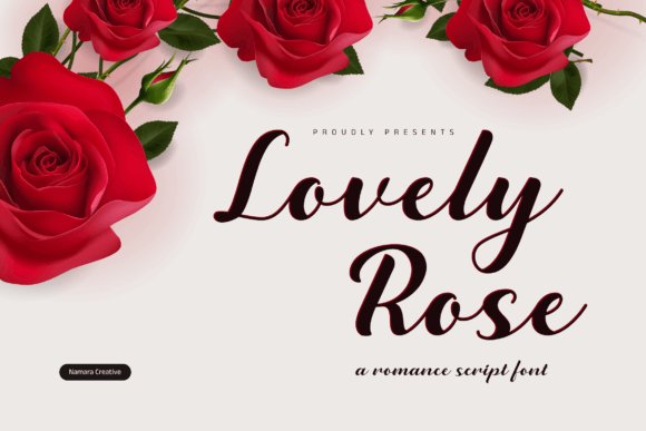
Lovely Rose is an elegant, hand-lettered script that shines as an Instagram post font with flowing strokes and refined swashes. Its calligraphic line endings and gentle variable stroke widths give posts and headlines a romantic, artisanal look without feeling fussy. The overall rhythm of the letterforms creates an immediate sense of handcrafted charm that reads as both modern and timeless.
Under the hood Lovely Rose includes useful alternates and tasteful ligatures that let you tune each word for better balance in short captions or story graphics. Because the shapes are designed with a slightly generous x-height, the font stays legible on mobile screens while keeping its decorative personality. For compositions, pair Lovely Rose with a restrained geometric sans to anchor layouts and highlight typographic contrast.
On practical terms the font kerns smoothly and responds well to light tracking adjustments, so it’s easy to tweak for thumbnails, banners, or wedding stationery. Use high-contrast color combinations or subtle drop shadows to keep delicate strokes visible against textured backgrounds. I also recommend converting long swash runs into stylistic alternates to avoid overcrowding in tight layouts.
Download Lovely Rose Font – Instagram post font
My Recommendation: I reach for Lovely Rose whenever a project needs an intimate, handcrafted voice-wedding invites, lifestyle posts, and boutique branding benefit most from its refined swashes. Its legibility on mobile feeds and built-in alternates make it easy to tailor words for impact. If you want a romantic, editorial script that still behaves well in social thumbnails, Lovely Rose is a favorite.
5. Ahsley Font
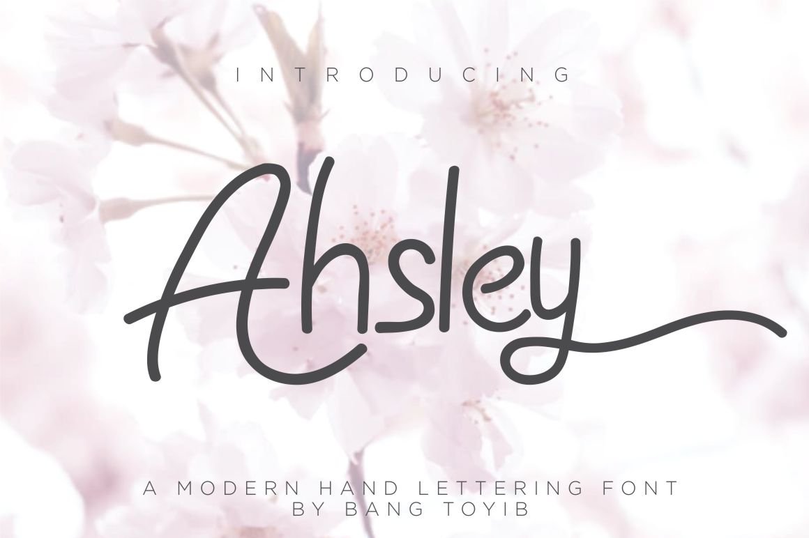
Ahsley is a bold, expressive handwritten script designed to command attention in headlines and logos. Its thick strokes and confident terminals give it a fashion-forward attitude that reads strongly at display sizes, making it especially effective for branding, labels, and book covers. The personality is distinctly romantic and assertive rather than delicate, so it translates well where presence matters.
Because Ahsley leans into weight and character, it performs exceptionally for packaging or apparel where distance readability is essential – the forms hold up in thumbnails and on signage. For layouts, pair it with a minimalist sans-serif to avoid visual competition; reserve uppercase treatments for monograms or short wordmarks. The font’s rhythm also allows for tight leading which keeps stacked headlines compact and elegant.
From a technical perspective, Ahsley benefits from careful kerning and slight negative tracking when used in logotypes to sharpen its silhouette. Contrast-rich palettes and textured paper stocks amplify its tactile, handmade feel in print. For social graphics, use it to create bold cover quotes or branded headlines that cut through a busy feed.
My Recommendation: I use Ahsley when a design needs bold romance-think fashion ads, wedding marquees, and limited-edition labels. Its heavy strokes ensure visibility across screens and physical media, and it pairs beautifully with clean sans-serifs. If you want something with attitude that still feels handcrafted, Ahsley delivers every time.
6. Glowvibe Script – Instagram post font
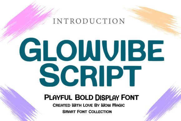
Glowvibe Script is a warm, smooth script crafted to perform as an Instagram post font and beyond, blending modern elegance with a hint of retro charisma. The letterforms are rounded and balanced, giving a friendly, approachable voice that works for lifestyle brands, quote graphics, and signature marks. Because the strokes are generous and consistent, Glowvibe reads crisply on phone screens while maintaining expressive motion.
The family’s OpenType features include alternate glyphs and contextual swashes that let you dial up flourish without losing legibility, making it flexible for both short captions and larger headlines. Its moderate x-height and uniform stroke contrast make it a strong candidate for packaging logos, hero banners, and social tiles alike. Use subtle texture or gradient fills to boost its retro-modern vibe on brand collateral.
From a workflow perspective, Glowvibe responds well to subtle tracking tweaks and performs reliably when exported for web or print. For pairing, choose narrow sans-serifs to accentuate the script’s fluidity, or complementary serif accents for editorial pieces. Overall, it’s a versatile choice when you need lively, humanistic typography that translates smoothly across channels.
Download Glowvibe Script – Instagram post font
My Recommendation: I recommend Glowvibe Script for projects that need a warm, approachable personality-lifestyle brands, social campaigns, and product packaging are ideal. Its balanced forms are generous on small screens yet decorative at display sizes, which makes it very practical. If you want a script with stylish versatility and a nod to classic charm, Glowvibe will cover most bases.
7. Arcane Botanica Font
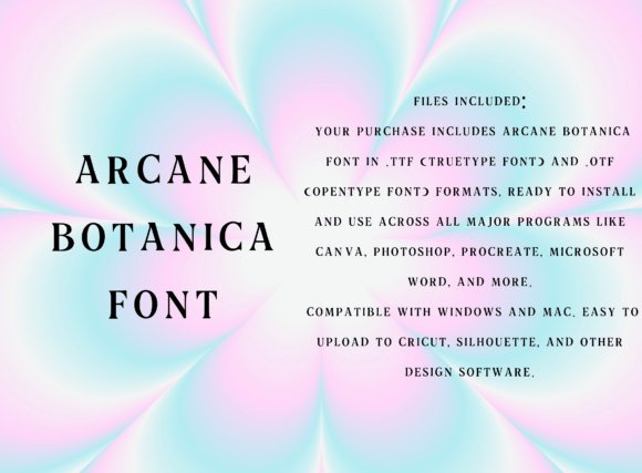
Arcane Botanica is a serif that feels like a discovered relic rather than a modern design tool. Its letterforms combine crisp serifs with gently flared terminals and modest contrast, creating an antique personality that reads as both delicate and authoritative. The type’s uppercase set, numerals, and punctuation are finished with subtle quirks-small ink-trap-like hollows and tapered strokes-that give headlines an evocative, handcrafted quality.
Because of its ornamental yet restrained nature, Arcane Botanica excels at large-format uses: book covers, brand wordmarks, and headline treatments for niche lifestyle projects. On-screen it maintains character at display sizes but loses detail when reduced, so avoid using it for tiny captions or dense body copy. Pair it with a neutral grotesque or a soft humanist sans to keep layouts modern while preserving the font’s mystical charm.
Design-wise, this face benefits from layered treatments-gold foil textures, soft vignette backdrops, or muted botanicals-to amplify its spellbound aesthetic. Consider adjusting tracking slightly for all-caps headlines to let the serifs breathe, and experiment with duotone backgrounds to make the thin strokes pop without flattening the vintage feel. Its temperament skews feminine, gothic, and fantasy-forward, making it a go-to for projects that need evocative, storybook typography.
My Recommendation: I’d reach for Arcane Botanica when I need typography that tells a story immediately-think artisan labels, tarot-inspired branding, or moody editorial covers. It brings a handcrafted, nostalgic voice without feeling overly ornamental, and it pairs beautifully with clean sans-serifs for balance. Use it large, give it texture, and let its subtle serifs carry the atmosphere.
8. Starlets – Instagram post font
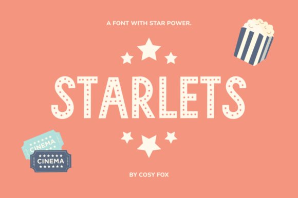
Starlets channels 1920s dressing-room glamour into a hand-drawn sans that sparkles in social layouts. The letters are slightly irregular and monoline, with rounded terminals that suggest marquee bulbs and theatrical lights-perfect for creating a retro-glam focal point. Its charm is instantly communicative, so it works brilliantly for single-line headlines, promotional banners, and on-image text in social campaigns.
As an Instagram post font it performs best at medium-to-large sizes where its imperfections read as personality rather than noise. The face tolerates heavy effects well-neon glows, drop-shadows, and frame strokes enhance the vintage stage vibe without obscuring legibility. Pair it with a minimal condensed sans or a delicate script to create contrast between display energy and refined supporting text.
Technically, Starlets benefits from tightened kerning for certain letter pairs and from slight tracking increases when set in uppercase to keep the marquee rhythm airy. For designers aiming for retro branding or event promos, this type converts quickly into on-brand social assets; for motion work, the hand-drawn irregularities give animated reveals a charming, human beat.
Download Starlets – Instagram post font
My Recommendation: I would use Starlets when I need an upbeat, nostalgic headline that commands attention on social feeds-especially for party promos, beauty launches, or boutique announcements. It’s a playful display face that thrives with bold treatments like glow and outline, and it pairs well with clean supporting type for a polished look. If you want vintage glamour without sounding kitschy, Starlets is my pick.
9. Whaiel Oldies Font
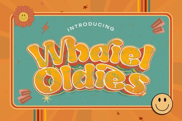
Whaiel Oldies is a flowing, handwritten display with a distinctly retro temperament that leans into elegant swashes and plentiful ligatures. The designer’s emphasis on embellished joins produces sweeping connections between letters, making words feel like single continuous gestures rather than isolated characters. This fluidity gives it strong personality for headlines, logos, and decorative packaging where a handcrafted voice is desired.
Because of its ornate connections, the font reads best at moderate to large sizes and benefits from generous leading so the swashes don’t collide. It shines on printed goods-wedding invites, poster art, and boutique labels-where the texture of ink or foil can elevate the lively curves. For digital use, opt for high-resolution assets or SVG exports to preserve the fine swirls at larger scales.
When composing with Whaiel Oldies, balance is essential: combine it with a restrained sans or a neutral serif to prevent visual overstatement. Consider using alternate glyphs sparingly to keep a consistent tone across lines, and test kerning on key logotypes to ensure the ligatures enhance rather than confuse the word shapes. It’s a decorative workhorse for projects that demand personality and vintage flair.
My Recommendation: I’d choose Whaiel Oldies for projects that need romantic, handcrafted lettering-wedding suites, boutique logos, and statement posters are perfect fits. Its ligatures create memorable wordforms, and the font adds tactile charm when paired with paper textures or foil. Use it as a focal display element and let simpler type take the supporting role.
10. Hana Cute Font – Instagram post font
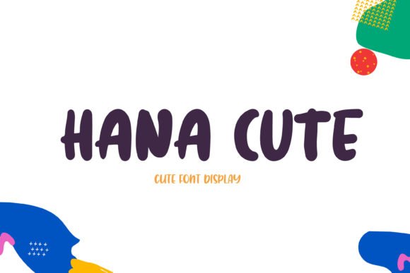
Hana Cute is a cheerful display face built around round, friendly letterforms that instantly read as approachable and playful. Its clean strokes and generous counters make it a natural choice when you want bright, youthful messaging that stands out on feed layouts – it works especially well as an Instagram post font for colorful announcement cards, event promos, and nursery-brand visuals.
The geometry favors short x-heights and wide letter spacing, which preserves legibility in square crops and story slides. Because each character leans toward a soft, hand-drawn aesthetic, the font pairs beautifully with bold sans serifs for body copy or with simple icons to extend a whimsical identity across packaging and T-shirts.
Practical touches include solid readability at medium display sizes and forgiving kerning that reduces the need for constant manual tweaks when placing text over photos. Use saturated palettes, subtle drop shadows, or outline styles to make Hana Cute pop on mobile screens; it also shines in print projects like stickers, labels, and kids’ décor where tactile charm matters.
Download Hana Cute Font – Instagram post font
My Recommendation: I reach for Hana Cute when I need an instant dose of warmth and friendliness – it’s perfect for children’s brands, playful Instagram campaigns, or product tags. The font’s readable shapes and bright personality make it easy to build cohesive visuals quickly. If you want something that reads fun at a glance and scales well across posts and physical goods, this is a strong pick.
11. Grandest Font
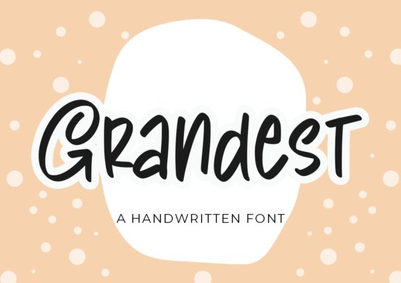
Grandest offers a handwritten script that feels spontaneous and artful, with a slightly whimsical slant that adds personality without coming off as fussy. The strokes vary organically, giving each word a gentle motion that suits boutique brands, lifestyle blogs, and title cards where an authentic, human touch is valuable.
This family includes a wide assortment of alternates and swashes accessible via PUA encoding, so you can quickly swap characters to avoid repetition and craft unique headlines. Because it’s crafted for display use, Grandest performs best in larger sizes where its flair and ligatures can be appreciated rather than in dense blocks of text.
For best results, pair Grandest with a restrained sans or a simple serif to provide balance; use high-contrast backgrounds or subtle text shadows to preserve legibility on image overlays. Designers will appreciate how the font’s rhythm contributes to brand storytelling without needing heavy customization.
My Recommendation: I use Grandest when I want a warm, handcrafted vibe that feels personal – think boutique product labels, header graphics, or signing off a newsletter with personality. Its built-in alternates and swashes let me create bespoke headlines without building custom lettering. Choose this font for projects that benefit from expressive, human-focused typography.
12. Calistha Calligraphy Font – Instagram post font
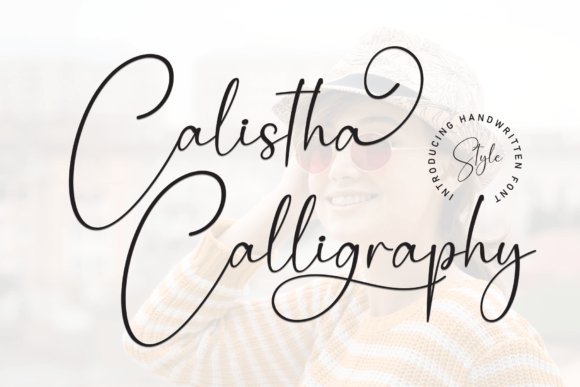
Calistha Calligraphy is a refined script that balances fluid calligraphic strokes with contemporary proportions, making it an excellent choice as an Instagram post font for elegant quote cards and brand announcements. Its high-contrast lines and flowing connections evoke classic ink work while remaining modern enough for digital layouts.
The font includes thoughtful ligatures and ornamental swashes that let you build graceful headers and monograms without resorting to additional graphic elements. Because Calistha favors clarity in its thin strokes, it pairs exceptionally well with textured backgrounds or muted gradients that accentuate its refined curves.
In practice, tighten tracking slightly for longer phrases and reserve the most elaborate alternates for short headlines so the letterforms retain their impact. Use Calistha for wedding stationery, luxury packaging, and social tiles where an elevated, handcrafted tone is desired – it transforms simple words into stylized visuals with minimal effort.
Download Calistha Calligraphy Font – Instagram post font
My Recommendation: I pick Calistha Calligraphy when a project needs sophistication with a handcrafted feel – ideal for wedding invites, upscale branding, and striking Instagram quote posts. Its ornamental options let me create varied looks while keeping typography consistent across platforms. If you want a script that reads luxurious yet approachable, Calistha does that beautifully.
13. Yogaday Script Font
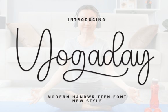
Yogaday Script Font is a graceful, hand-drawn script that balances delicate swashes with restrained letterforms. The strokes feel organic and slightly brush-like, creating an intimate, artisanal voice that works beautifully for lifestyle brands and handcrafted packaging. Its alternates and contextual ligatures give you subtle variations so repeated words never look identical.
On social platforms this typeface reads as warm and approachable – ideal for story stickers, wellness post headers, or captions where personality matters. It maintains clarity at mid-range sizes and provides just enough ornamentation to feel special without overpowering imagery. Designers will find it easy to pair with a clean sans for readable body text.
Beyond posts, Yogaday translates well into print collateral like invites, labels, and product tags where a personal touch is desirable. Use its softer curves for feminine or relaxed aesthetics, and reserve the bolder alternates for headlines and calls-to-action to keep hierarchy clear in multi-platform layouts.
My Recommendation: I reach for Yogaday when I need a calming, handcrafted feel-think yoga studios, organic product labels, and slow-lifestyle feeds. Its ligatures and alternates let me produce bespoke-looking headlines without custom lettering. Pairing it with a neutral sans keeps body text legible while the script provides the brand’s warm signature.
14. Crazy Party Font – Instagram post font
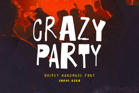
Crazy Party is a bold, quirky handmade display typeface that shines as an Instagram post font thanks to its energetic letterforms and wildly different weights between uppercase and lowercase. The mismatch between heavy caps and lighter lowercase creates playful tension that reads like whimsical handwriting or a carnival sign. It includes idiosyncratic shapes and irregular terminals that give every word an offbeat personality.
Mixing uppercase and lowercase in a single headline produces unexpected visual rhythm – perfect for quotes, party invites, and cover images that need to stop the scroll. Despite its eccentricity, the font remains surprisingly legible at larger sizes; to preserve clarity in smaller captions adjust tracking and avoid overly condensed layouts. It’s also excellent for sticker-style graphics and bold story covers.
For best results, pair Crazy Party with a minimal sans for supporting copy so the headline can roar without competition. Use color and outlines to emphasize its handmade charm, and consider subtle shadows or textures for printed pieces. This typeface is a strong choice for youthful brands, event promos, and social campaigns that crave personality over polish.
Download Crazy Party Font – Instagram post font
My Recommendation: I use Crazy Party when a project needs loud, joyful typography-perfect for event promos, fun product drops, and bright IG covers. The mismatched weights let you craft dynamic compositions without mixing fonts. Tweak spacing and add simple outlines on small formats to keep the quirk visible and legible.
15. Koiga Serif Font
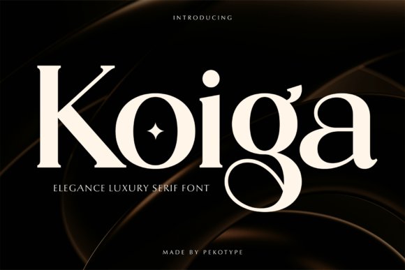
Koiga Serif Font is an elegant, high-contrast serif designed to convey refinement and timelessness. Its smooth curves and carefully tapered serifs create a feeling of luxury while remaining very readable across sizes, giving headlines an editorial flare without sacrificing clarity. The letterforms are calibrated for clean, crisp reproduction on both print and screens.
This typeface excels in premium branding scenarios – think boutique logos, perfume packaging, and upscale magazine headers – where a distinguished tone is required. Koiga’s balanced proportions also make it suitable for longer display lines in lookbooks or stylish social tiles. Multilingual support and full punctuation ensure it performs across diverse projects.
In social layouts, Koiga brings a sophisticated anchor to imagery-heavy posts: use it for product names, price tags, and elegant quotes to communicate value instantly. Pair with a neutral geometric sans for body copy or UI elements to maintain modern usability while preserving the serif’s classic character.
My Recommendation: I pick Koiga when a project needs understated luxury-excellent for jewelry brands, boutique identities, and editorial covers. Its high-contrast strokes read beautifully on hero images and packaging alike. Combine it with a simple sans to retain modern legibility while letting Koiga communicate the premium tone.
16. Observant and Aware – Instagram post font
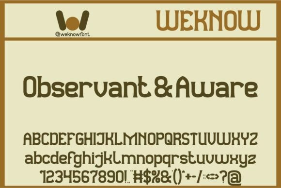
Observant and Aware arrives as a display serif with geometric sensibilities: clean, assertive stems paired with unusual terminals that nod to retro signage. Its letterforms are sculpted for headline use – strong contrast and slightly condensed proportions give it presence without feeling heavy, making it a memorable choice for identity work and posters.
On-screen it holds detail well: the spacing and carefully considered kerning make small runs of capitals readable, while alternate glyphs and ligatures bring flair where you need it. As an Instagram post font it translates especially well into bold, single-line captions or typographic tiles where personality matters more than body copy.
Pair it with a neutral geometric sans for modern brands, or a textured script for editorial spreads that demand character. It’s excellent for logos, apparel labels, music covers, and editorial heads – but because of its display nature I’d avoid using it for long paragraphs or fine-print legal copy.
Download Observant and Aware – Instagram post font
My Recommendation: I’d reach for Observant and Aware when I need a headline that feels vintage yet contemporary – it brings instant identity to covers, posters, and brand marks. Its crafted glyph shapes make it perfect for apparel and music packaging where a memorable wordmark matters. Use it large or in tight typographic compositions to let its quirky details sing.
17. Ballison Font
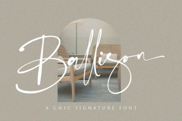
Ballison is a chic, handwritten script that leans toward elegant casualness: smooth stroke modulation, informal baseline shifts, and a generous set of connecting ligatures give text a natural, human touch. The strokes feel inked rather than mechanical, which makes the type ideal for projects that want to convey warmth and authenticity without looking amateur.
Technically, Ballison shines in display sizes where its subtle terminals and swashes can be appreciated, and its alternates help avoid repetitive letterforms in logos or repeating captions. For social media overlays and Instagram posts, the font’s organic flow pairs especially well with minimal photo backgrounds or soft color blocks to maintain legibility.
For best results, combine Ballison with a clean sans for body text, or use it solo for wedding invites, fashion tags, and brand wordmarks that want a refined handwritten voice. It also adapts nicely to packaging and book covers where a personal signature-like look is desired.
My Recommendation: I’d use Ballison when a refined handwritten tone is needed – it adds effortless elegance without feeling fussy. It’s perfect for wedding stationery, boutique branding, and social captions where personality matters. I especially appreciate its alternates and ligatures for logotypes and repeated-use applications.
18. Restoe Iboe – Instagram post font
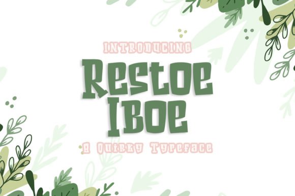
Restoe Iboe is a playful display face with cartoon-inspired shapes and an exuberant rhythm: rounded bowls, exaggerated counters, and jaunty terminals give it an immediate kid-like energy. The design reads as friendly and bold, built to command attention on posters, stickers, and packaging where whimsy is the message.
Its robust forms scale well for social thumbnails; the heavy strokes remain legible in compressed images, and the character set includes quirky alternates that let you inject extra personality into short headlines. When used as an Instagram post font it creates a lively focal point for announcements, event promos, or album art where emotion and tone are more important than subtlety.
Balance Restoe Iboe with a restrained sans to avoid visual overload, or let it run free in single-word shout lines and sticker-style badges. It’s especially suited to children’s products, playful apparel, and any creative where character and approachability are priorities.
Download Restoe Iboe – Instagram post font
My Recommendation: I’d pick Restoe Iboe for projects that need joy and immediacy – think kids’ packaging, festival posters, and colourful social content. Its bold, rounded shapes deliver strong visual impact at small sizes and in thumbnails. Use it when you want a typeface that instantly communicates fun and personality.
19. Veloria Font
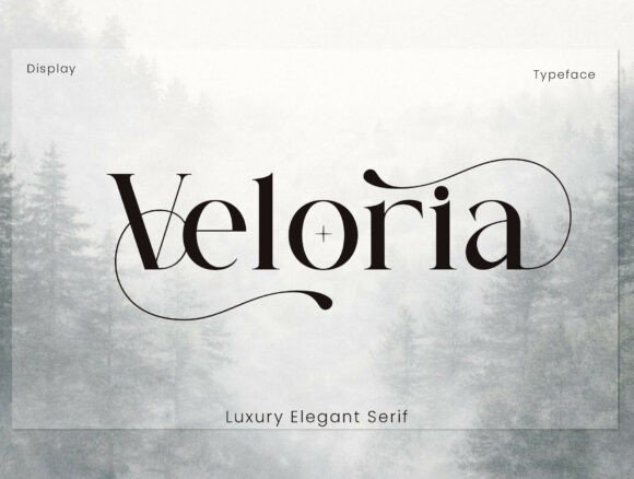
Veloria is a high-contrast serif display that lives at the intersection of couture and editorial typography. Its razor-sharp serifs and dramatic stroke contrast create an unmistakable luxury voice that reads like a bespoke logotype rather than a generic headline face. The included sweeping ligatures and stylistic alternates let you craft distinctive wordmarks and titling that feel handcrafted and singular.
Because Veloria was conceived for large-format use, it performs best at headline sizes where its fine details can breathe-think magazine mastheads, perfume cartons, and boutique store signage. Despite its ornamentation, the letterforms retain enough clarity to work on high-resolution social graphics and Instagram captions when used sparingly as a focal headline.
Technically robust, Veloria ships with uppercase and lowercase sets, numerals, punctuation, PUA-encoded alternates, and decorative ligatures for quick access in most design apps. Pair it with a neutral sans or a soft script to temper its formality; the contrast will make calls-to-action and short taglines pop without competing with the main headline.
My Recommendation: I reach for Veloria when a project demands instant prestige-think premium packaging, bridal stationery, or high-fashion headers. Its expressive ligatures give logos a custom look without the cost of bespoke lettering, and its PUA support makes alternates easy to use in my workflow. Use it as a headline accent rather than body text to preserve legibility and maintain that luxury feeling.
20. Talipati Font – Instagram post font
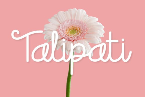
Talipati is a playful script with warm, rounded strokes that mimic friendly handwriting and bring an approachable personality to visual content. Its smooth loops and moderate contrast make it both decorative and legible, ideal for short phrases, overlays, and brand names where charm and readability matter. The hand-drawn energy gives your captions and graphics an intimate, human touch.
As an Instagram post font it excels at mobile-first scenarios: letter spacing and stroke weight were designed to remain clear on small screens while still looking organic and artisanal. Built-in alternates and contextual ligatures let you vary repeated letters so captions and story slides never feel repetitive, which helps sustain visual interest across a feed.
Talipati pairs beautifully with geometric sans-serifs for balance-use a clean sans for body copy and let Talipati own the headline or call-to-action. It’s also friendly to product packaging, wedding invites, and boutique logos, making it a versatile choice when you want a casual yet polished identity.
Download Talipati Font – Instagram post font
My Recommendation: I use Talipati when a project needs warmth and personality-especially for lifestyle brands, small-batch products, and social campaigns aimed at younger audiences. Its mobile-friendly letterforms make captions and overlays pop on feeds and stories, and the alternates prevent designs from feeling repetitive. Choose Talipati when you want an approachable, handcrafted look that still reads clearly on-screen.
21. Asteria Font
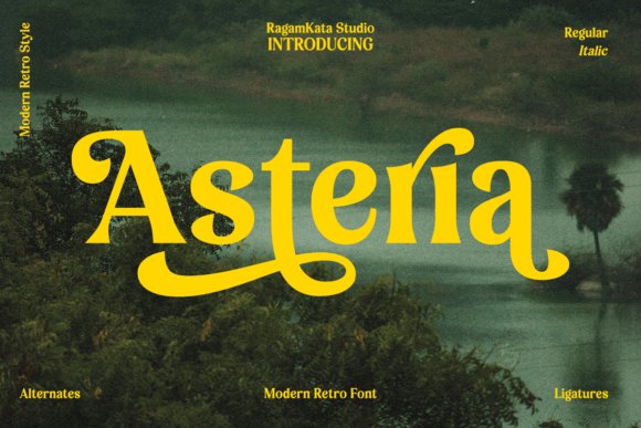
Asteria is a retro display face that channels mid-century poster energy with bold shapes and stylized terminals. It was designed to catch the eye: heavy forms, compact spacing, and decorative elements give it an instant vintage headline presence that suits posters, t-shirt designs, and brand badges. The type’s personality reads loud and confident without requiring heavy ornamentation.
Because Asteria leans into display use, it’s best deployed for short lines-titles, logos, and subheads-where its characterful silhouettes can anchor layouts. It scales well for print and high-res digital artwork, and when used on social story graphics it creates a nostalgic vibe that stands out in a modern feed. Pair with minimal body copy to let the type do the talking.
The family supports various project needs like packaging and editorial covers, and it adapts to vector workflows for screen printing and large-format signage. For a contemporary twist, combine Asteria with a thin sans to juxtapose its vintage weight with modern minimalism, giving posters and social headers extra visual pop.
My Recommendation: I keep Asteria in my toolkit for projects that need retro flair-album art, event posters, and boutique apparel designs are perfect fits. Its bold display forms grab attention in both print and social story graphics, and it pairs well with minimalist supports to avoid visual clutter. Use it when you want a nostalgic, high-impact headline that reads unmistakably vintage yet fresh.
22. Kelisha Aesthetic Font – Instagram post font
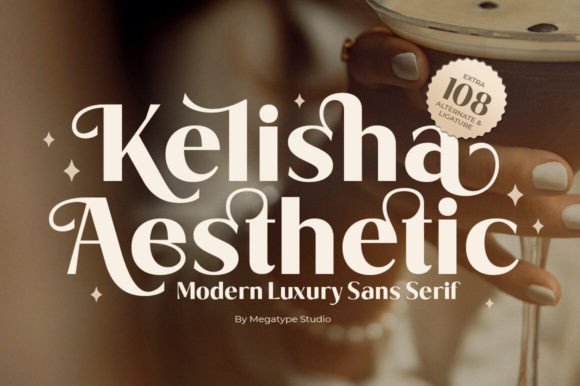
Kelisha Aesthetic is a modern luxury sans serif that balances restraint with artistic flourish. Its refined letterforms and subtle high-contrast strokes give designs an upscale, editorial feel without feeling fussy; alternate characters and carefully drawn ligatures add a bespoke quality that reads as handcrafted luxury.
Because it was designed with alternates and natural ligatures, Kelisha adapts beautifully to tight compositions and large display settings alike. Use it for magazine mastheads, business branding, or as an Instagram post font when you need an elegant, high-end look that still reads cleanly on mobile screens.
Technically, Kelisha ships with multiple stylistic sets, tuned kerning, and nuanced alternates that let you switch tone from minimal to ornamental in seconds. My experience: treat it as a headline or marquee face and pair it with a neutral sans for body text to preserve clarity while maximizing visual impact.
Download Kelisha Aesthetic Font – Instagram post font
My Recommendation: I reach for Kelisha Aesthetic when a project needs instant polish-think boutique branding, luxe wedding suites, or premium editorial covers. Its alternates let me craft unique wordmarks without creating custom lettering, and the clean base shapes ensure legibility on phones and social feeds. If you want an elevated, modern look that still reads well on Instagram and printed pieces, Kelisha is a top choice.
23. Ameriya Font
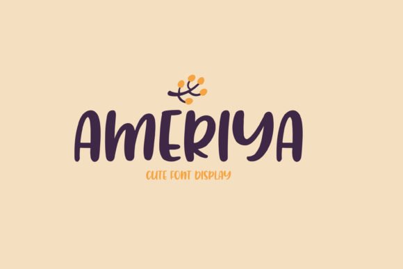
Ameriya channels the energy of a hand-painted brush with tidy, playful strokes that feel both organic and deliberate. The textured terminals and irregular edges give each letter a warm, tactile presence that stands out in crowded visual feeds without appearing messy.
This display face shines on packaging, apparel, and social headlines-especially for lifestyle brands, crafts, or kids’ products where personality matters more than strict formality. When designing social graphics, treat it as a headline asset and pair it with a simple, neutral type for body copy to maintain hierarchy and readability.
For best results, place Ameriya against high-contrast backgrounds or add a subtle drop shadow to preserve clarity at smaller sizes. I also like layering it over photographic textures and using bold color palettes to enhance its playful brush character while keeping text legible on mobile screens.
My Recommendation: I use Ameriya when a project calls for charm and spontaneity-think quirky product labels, sticker lines, or eye-catching social tiles. Its painted texture brings handcrafted authenticity that works well for small-batch brands and DIY makers. It’s best as a headline or focal wordmark rather than long paragraphs, and it pairs nicely with clean geometric sans-serifs.
24. Post Rock Font – Instagram post font
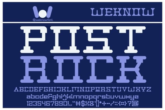
Post Rock is a bold, themed display type built to carry attitude across posters, album art, and brand statements. Its stylized cuts and dramatic proportions give each wordstage a cinematic pull that’s ideal for expressive identities and attention-grabbing headlines.
When you need a distinct visual voice for online marketing or social campaigns, Post Rock performs strongly as an Instagram post font, YouTube thumbnail staple, or merch headline. The font’s personality works well for music and entertainment projects, but it also translates cleanly into lifestyle and editorial contexts where a striking title face is needed.
Under the hood, Post Rock includes alternate glyphs and robust kerning that make layered and textured treatments easy to execute. I recommend using it at display sizes and experimenting with color gradients or overlays to amplify its dramatic character while retaining legibility on small screens.
Download Post Rock Font – Instagram post font
My Recommendation: I pick Post Rock when a design must feel cinematic and unmistakable-album covers, concert posters, or bold brand launches. Its strong silhouettes command attention in feeds and print, and the alternates let me customize a headline without extra illustration. Use it as the primary display type and combine it with restrained supporting fonts to keep compositions balanced.
25. Coffee Font
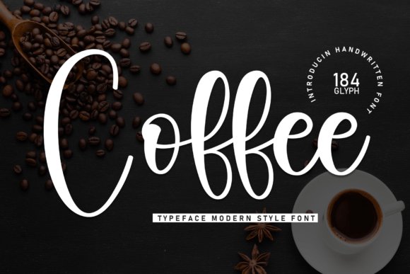
Coffee Font is a warm, hand-drawn script that blends modern calligraphy with slightly rounded brush strokes to create a cozy, approachable personality. The letterforms feel intimate without being fussy, making this script ideal for premium cafe branding, greeting cards, packaging, and social graphics where you want a handcrafted look. Its moderate contrast and open counters keep the text legible at display sizes while still preserving decorative flair.
Under the hood Coffee offers a range of alternate glyphs and flowing connections that let you craft varied word shapes for headlines and logos; these stylistic sets help avoid repetitive letter patterns in short lines of text. For digital posts and banners, pair Coffee with a clean geometric sans to provide visual balance and help captions or body text remain readable. When using it over photos, increase tracking slightly and add a subtle drop shadow or outline to enhance contrast against busy backgrounds.
As a design element, Coffee excels as a focal headline or accent word rather than long paragraphs of body copy – its charm shows best in short phrases, signatures, and product names. Treat swashes and ligatures as decorative flourishes: reserve the longest swashes for hero images and keep tighter forms for thumbnails. Overall, this script gives you a handcrafted voice that feels both elegant and friendly across print and social formats.
My Recommendation: I reach for Coffee Font when I want a handcrafted, welcoming tone-think artisan coffee shop menus, cozy product labels, and warm Instagram captions. Its alternates let me customize word shapes so brands don’t look generic, and it pairs beautifully with clean sans-serifs for modern layouts. Use it for short headlines and logos rather than long copy to preserve its charm.
26. Welcome Valentine Font – Instagram post font
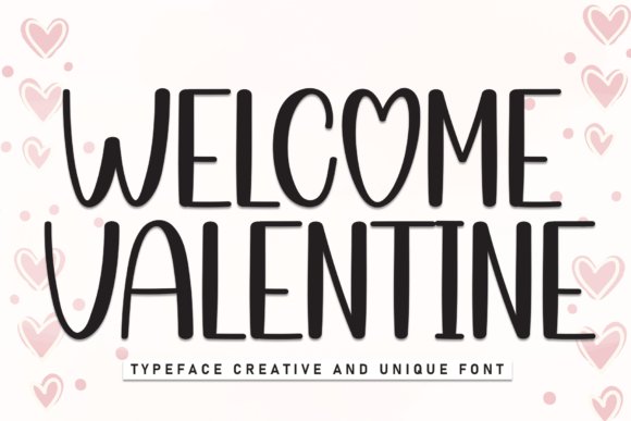
Welcome Valentine Font is a romantic script crafted for occasions that call for elegant flourish and expressive movement. Its sweeping swashes and tapered strokes deliver instant emotion, making it a go-to choice for wedding invites, seasonal promos, and any visual that benefits from a soft, hand-lettered vibe. In particular, Welcome Valentine functions exceptionally well as an Instagram post font for heartfelt overlays and single-line captions that need to read clearly on mobile screens.
Design-wise, the font includes abundant alternates and contextual ligatures so words look uniquely handwritten rather than repeated or mechanical. Use the longer swashes sparingly on hero graphics and reserve tighter letterforms for smaller thumbnails or story stickers to maintain clarity. For pairing, contrast Welcome Valentine with a restrained serif or a minimalist sans to let the script shine without competing for attention.
Practical tips: when placing the font over photography, add a semi-opaque band or subtle shadow to keep letters legible; adjust kerning between ornamented characters to avoid collisions. The overall effect is both decorative and readable, and it scales attractively for high-resolution prints as well as digital posts. This typeface gives romantic projects polish and personality with minimal effort.
Download Welcome Valentine Font – Instagram post font
My Recommendation: I’d use Welcome Valentine when I want an instantly romantic, polished look-perfect for wedding announcements, Valentine’s campaigns, and boutique product launches. Its extensive alternates allow me to create bespoke wordforms that feel artisanal, and it reads well on mobile when used as a short headline or overlay. For best results, pair it with a simple background or a muted sans to keep focus on the script.
27. Melanthios Font
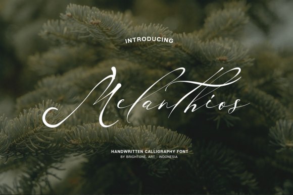
Melanthios Font is a stylish, natural handwritten face that balances energetic brush strokes with controlled letter shapes, giving a confident yet casual aesthetic. The rhythm of its pen strokes makes it an excellent choice for lifestyle branding, apparel prints, and product labels where personality matters. In social media applications-stories, banners, and thumbnails-Melanthios brings a handcrafted authenticity without sacrificing readability.
One of the font’s strongest selling points is its PUA encoding, which unlocks extended glyphs, swashes, and decorative alternates directly from common design apps. That accessibility lets you swap in flourishes and ligatures without complicated software, so you can create distinctive logotypes and stylized captions quickly. For balanced layouts, pair Melanthios with a neutral sans or condensed grotesque to prevent the script from overpowering other page elements.
When working with this font, favor it for short display lines and mark graphics rather than long paragraphs-the expressive strokes look best as focal type. Pay attention to letterspacing with lively characters and test on mobile at multiple sizes to keep curves from collapsing. Overall, Melanthios is a versatile handwritten choice for designers seeking a modern, handcrafted edge across print and digital projects.
My Recommendation: I use Melanthios when I need a modern handwritten look that still reads at small sizes-great for logos, apparel tags, and social graphics. The PUA-encoded alternates save time and let me craft bespoke word shapes without advanced typography tools. It’s especially useful for brands wanting an approachable, artisanal feel while keeping designs clean and contemporary.
28. Bertuah Font – Instagram post font
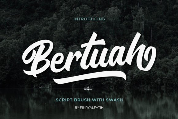
Bertuah arrives as an approachable handwriting script with spontaneous strokes and a relaxed baseline that reads like real penwork. Its organic texture makes it a strong choice when you want an authentic, handcrafted mood in headlines and promotional visuals, and it performs especially well as an Instagram post font when you need something that feels personal rather than overly polished.
The family is PUA‑encoded, so accessing alternate characters, contextual ligatures, and swash glyphs is straightforward in most design apps; those extras let you craft distinctive logotypes, labels, and greeting cards without hunting for separate ornament sets. Because the alternates are thoughtfully drawn, swapping characters can dramatically change the tone of a wordmark while retaining legibility.
For practical use, Bertuah shines against high‑contrast backgrounds and scaled up as a display element, but it keeps good readability at social sizes when letterspacing is tightened slightly. Pair it with a neutral sans for body copy or a restrained serif for editorial layouts; its handwritten personality suits fashion, stationery, packaging, and lifestyle accounts that need a friendly, human voice.
Download Bertuah Font – Instagram post font
My Recommendation: I reach for Bertuah when a project needs warmth and a handcrafted feel-think boutique packaging, wedding graphics, or lifestyle Instagram tiles. The PUA glyphs let me create custom-looking headlines quickly, and the natural stroke contrast reads well on mobile. Use it when you want approachable elegance rather than a stiff, formal script.
29. Sub Conscious Font
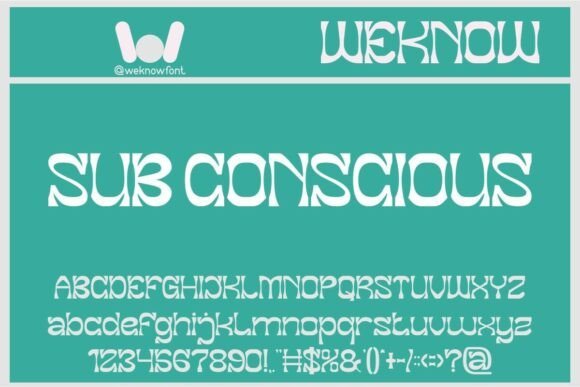
Sub Conscious is an experimental display type that blends geometric precision with ornamental asymmetry, producing a typographic voice with attitude. The letterforms are sculptural, making the face ideal for commanding headlines, editorial spreads, and identities that require an unmistakable visual signature.
Designed to stand out, this sans‑inspired display works across fashion editorials, book covers, posters, and motion graphics where personality is paramount. It translates especially well to large scales-think hero banners, magazine mastheads, or title sequences for film and games-where its abstract counters and sharp terminals can be appreciated.
In practice, Sub Conscious benefits from tight kerning and thoughtful tracking adjustments; pair it with a subdued sans or a clean serif for supporting text so the display forms stay center stage. Consider bold color blocks or animated reveals to amplify its ornamental details, and reserve it for projects that need bold, avant‑garde expression rather than long paragraphs of copy.
My Recommendation: I use Sub Conscious when a project demands bold, unconventional typography-brand launches, posters, and title treatments where the font becomes the headline act. Its dramatic shapes give instant personality, but it needs space to breathe, so I avoid heavy body text. Great for editorial and multimedia work that wants to push visual boundaries.
30. Darcey Oliver – Instagram post font
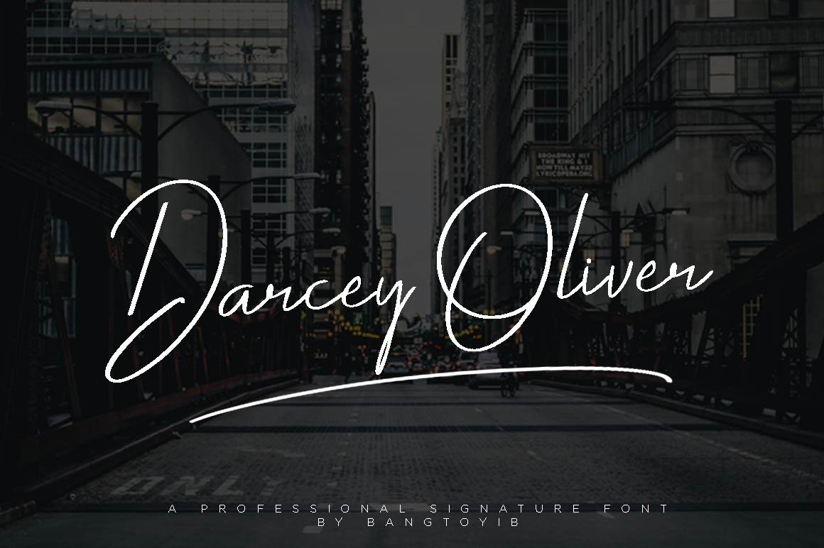
Darcey Oliver is a refined signature-style script with delicate strokes and an intimate rhythm that reads like a handwritten autograph; it’s purpose-built for romance and upscale branding. As an Instagram post font it brings immediacy and elegance to social captions, story covers, and profile highlights, creating a luxury-feel without appearing fussy.
The design excels as a display asset-logos, wedding invites, and product labels benefit from its fluid ligatures and elegant terminal treatments. OpenType alternates and contextual swashes allow you to alternate between subtle and showy looks, making it easy to customize logotypes or create varied social tiles while maintaining a consistent visual persona.
For best results, limit Darcey Oliver to headers or focal phrases and pair it with a clean geometric sans for body copy; increase tracking slightly when using it in all‑caps and test contrast on small devices to preserve clarity. Print applications like foil-stamped stationery or embossed packaging also amplify its sophisticated, handcrafted charm.
Download Darcey Oliver – Instagram post font
My Recommendation: I choose Darcey Oliver when I want an intimate, signature touch-perfect for wedding suites, boutique branding, and upscale social content. Its ligatures and alternates make headlines feel bespoke, and it pairs beautifully with minimal sans serifs. Use it sparingly as an accent to keep layouts feeling elegant rather than busy.
31. Rakanzha Script Font
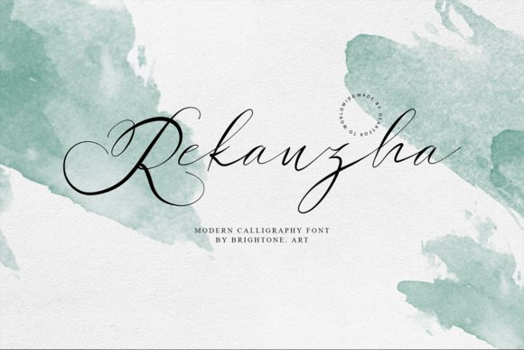
Rakanzha Script is a fluid, hand-drawn calligraphic face that mimics the rhythm of a loaded brush. Its letterforms feature lively contrasts and tapered terminals, producing an authentic, handmade appearance that works well for expressive headlines and brand marks. OpenType extras-contextual alternates and discretionary swashes-give you organic variations so repeated words feel bespoke rather than mechanical. Despite its decorative nature, Rakanzha retains good legibility at display sizes typically used in social graphics and mobile screens.
This font is built to shine in identity work: think boutique logos, t-shirt prints, and artisan product labels where personality matters. On social platforms it elevates stories, highlight covers, and promotional graphics by adding a warm, human touch that helps content stand out in busy feeds. For balanced layouts, pair Rakanzha with a neutral sans or a restrained slab serif so the script remains the focal point without overwhelming body text.
From a production perspective, Rakanzha usually ships as OpenType with multiple stylistic sets and swash glyphs you can toggle for variation. For small-scale uses like stickers or mobile banners, slightly increase tracking to preserve clarity; for print applications, convert to outlines for crisp reproduction. Always confirm the license for commercial use on merchandise and packaging to ensure the right usage terms for your projects.
My Recommendation: I’d reach for Rakanzha Script when I need an artisanal, human touch-perfect for boutique branding, handcrafted product labels, or expressive t-shirt designs. Its swashes and alternates let me create distinct headlines across a campaign while keeping a consistent voice. Use it with a clean sans for supporting copy and reserve its flourishes for focal elements in social posts and packaging to maximize impact.
These 31 Instagram post font picks give you a fast, practical toolkit for upgrading your social media visuals. Use the suggested pairings and context notes to match font personality to your content goals and audience.
Test a few on real posts, check legibility on mobile, and keep a shortlist for consistent branding. The right Instagram post font will boost clarity, emotion, and engagement across your profile.