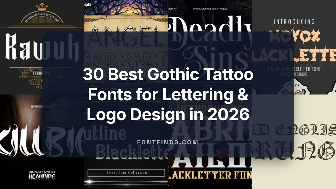
30 Best Gothic Tattoo Fonts for Lettering & Logo Design in 2026
gothic tattoo fonts bring a timeless, dramatic edge to both body art and branding. In this curated collection of 30 styles, you’ll find blackletter, Old English, medieval scripts, and modern gothic-inspired lettering tailored for tattoos, logos, and apparel.
Whether you need heavy, textured lettering for a back piece or refined calligraphic strokes for a wrist tattoo, these fonts cover a wide range of aesthetics. Read on for selection tips, sizing and kerning advice, and licensing reminders so your chosen typeface performs well in ink and print.
1. Aghony Font
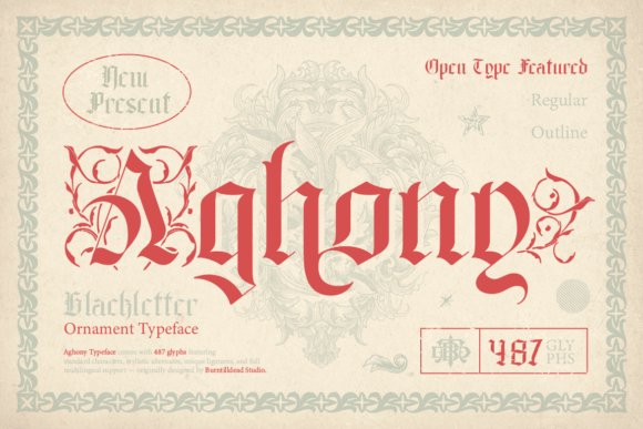
Aghony is an ornamental blackletter that marries heavy, angular strokes with delicate filigree and subtle swashes. Its letterforms echo medieval manuscripts while introducing contemporary contrast and rhythm, producing an atmosphere that feels both antique and immediate – a natural pick for designers who want dramatic, inked effects. This font is an excellent addition to collections of gothic tattoo fonts because it balances bold presence with decorative nuance.
The family ships in Regular and Outline styles; the Regular delivers solid, high-impact fills for posters or album covers, while the Outline offers airy, tattoo-friendly shapes that read well at large sizes without overpowering surrounding elements. Kerning has been tuned for display use, and the set includes stylistic alternates and discretionary ligatures to customize word-level ornamentation.
Use Aghony for heavy display headlines, occult-themed packaging, metal and hardcore artwork, or stylized logo marks where a historic tone is needed. Its detailed terminals and alternate glyphs make it easy to create bespoke wordmarks and stencil-ready artwork for tattoo flash or large-format signage without losing visual clarity.
My Recommendation: I’d reach for Aghony when I need a commanding, medieval mood that still feels contemporary – for example, album covers, poster headlines, or gothic brand identities. Its alternates let you personalize initials and lockups quickly, and the Outline version is great when you want a lighter tattoo-like trace. Overall, it’s ideal for projects that demand ornamentation without sacrificing legibility.
2. Fly Feather Font
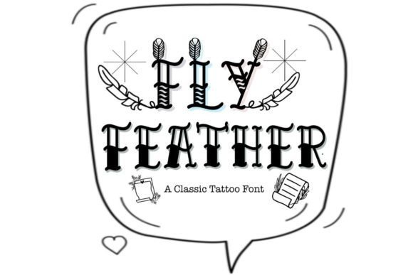
Fly Feather blends a classic tattoo lettering spirit with a quirky serif sensibility, embellished by feathered ornaments that give each character a hand-crafted charm. The design reads casual and approachable rather than austere, making it suitable for creative projects that need personality rather than pure historic replication. Decorative terminals and playful serifs make it feel like a stamped or hand-drawn mark.
At display sizes the feather motifs become focal points, perfect for custom logos, apparel prints, signage, and illustrative badges. The font performs well for branding that wants a vintage or retro-tattoo vibe without diving into heavy blackletter forms – think indie barbershops, boutique labels, and lifestyle goods.
Pair Fly Feather with a clean geometric sans for body text to keep compositions legible, or combine it with subtle texture treatments to enhance its crafted look. Because of its ornamentation, it shines in short phrases and monograms where each decorative flourish can be appreciated.
My Recommendation: I’d choose Fly Feather when a project needs charm and a handcrafted tattoo aesthetic without the weight of Old English styles. It’s fantastic for small-batch product labels, shop signage, and apparel where ornamentation reads as quality. Use it for short headlines or initials so the feather details remain clear and impactful.
3. Rawuh Font
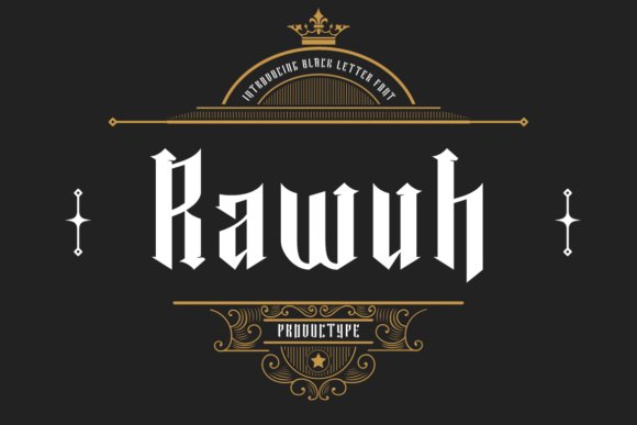
Rawuh is a striking display blackletter that emphasizes verticality and narrow counters, delivering a modernized gothic attitude. Its sharp terminals and compact proportions create a dense, intense texture ideal for attention-grabbing wordmarks. The design leans toward minimal ornamentation, favoring sculpted strokes that read clearly in bold treatments.
This condensed approach works particularly well for packaging labels, band logos, and signage where horizontal space is limited but a powerful typographic signature is required. The face retains legibility at medium display sizes and translates well into vector stencils or carved signage due to its decisive stroke endings.
Rawuh pairs nicely with understated sans or slab serifs that let the blackletter take center stage, and its tight spacing encourages creative use of ligatures or custom letter combinations for monograms. It’s an excellent choice for designers seeking a contemporary gothic look without excessive flourishes.
My Recommendation: I’d pick Rawuh for projects that need a compact, aggressive blackletter voice-think labels, posters, and brand marks that must command space without sprawling. Its condensed form makes it efficient for logotypes and tight layouts, and the bold, clean strokes adapt well to both print and digital applications. Use it when you want a modern gothic presence rather than ornate historic replication.
4. Molly Dingbats Font
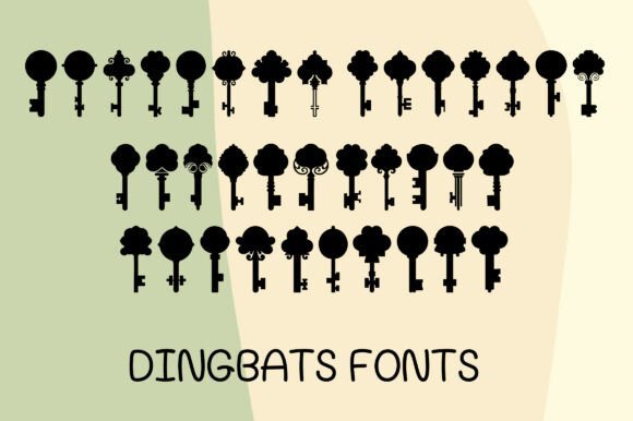
MOLLY is a decorative dingbats collection built around antique key illustrations and playful ornamental flourishes. Each glyph reads like a tiny engraved charm: graceful curves, floral-inspired finials, and silhouette shapes that feel hand-cut and lovingly aged. The overall texture leans vintage without being fussy, giving designs an heirloom quality that still reads modern at a glance.
Where MOLLY really shines is in themed work-wedding invites, jewelry packaging, boutique logos, and creative stationery benefit from its whimsical accents. Designers looking to pair small icons with darker lettering will find MOLLY blends particularly well alongside blackletter or script styles; designers seeking supporting art for gothic tattoo fonts will discover the keys and floral tops echo classic motifs used in skin art. Because each symbol is distinctive, you can mix and match icons to create unique seals and monograms.
On a practical level the dingbats are clean and reproducible at a range of sizes, holding detail for stickers and labels while still legible when reduced for branding stamps. Exporting as vector-friendly outlines preserves the delicate terminals for engraving or laser-cut work, and the shapes lend themselves to one-color prints or two-tone inlays. If you need decorative cues that read both handmade and refined, MOLLY offers a compact, versatile set that’s easy to layer with type and texture.
╰┈➤ Download Molly Dingbats Font
My Recommendation: I’d reach for MOLLY when a project needs small, characterful ornaments that carry a nostalgic, gothic-tinged sensibility-especially for boutique branding, jewelry, and tattoo-inspired collateral. Its vintage key motifs add story and depth without overwhelming primary type, making it perfect as a supporting visual language. For projects that require a handcrafted look with reliable reproducibility, MOLLY is a delightful, practical choice.
5. Novox Blackletter Font
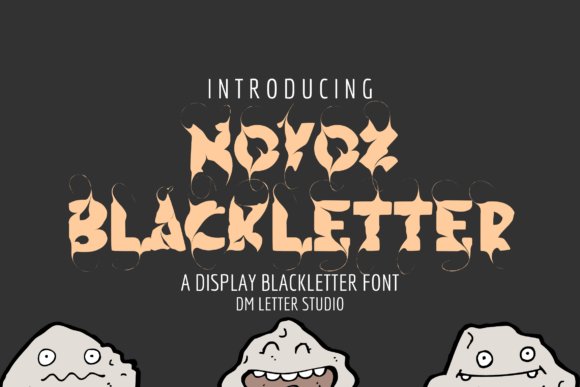
Novox Blackletter is a bold contemporary take on Old English letterforms, emphasizing heavy strokes, sharp serifs, and ornate internal counters. The typeface balances the dramatic personality of medieval calligraphy with subtle refinements that improve modern legibility, so it reads strongly at headline sizes without collapsing into ornament. Its stylized terminals and pronounced thicks-and-thins give text an authoritative, theatrical presence.
This blackletter thrives in identity work that needs intensity-band logos, apparel graphics, film or book titles, and themed event posters all benefit from Novox’s theatrical voice. When used for emblematic marks, its lettershapes create instant attitude; for typographic compositions, pairing Novox with a neutral sans provides visual breathing room and hierarchy. Designers should mind optical spacing and avoid tiny point sizes where heavy ink traps can fill in.
Technically Novox ships in common desktop formats (OTF/TTF) and supports robust kerning and alternates to handle tight wordmarks and logotypes. It’s a great candidate for vector outlines when producing screen prints or embroidered patches, because the strong strokes translate cleanly into production artwork. If you need a powerful blackletter that bridges historic weight and contemporary use, Novox delivers drama with practical control.
╰┈➤ Download Novox Blackletter Font
My Recommendation: I’d use Novox Blackletter for projects that demand a commanding, gothic-infused personality-think metal band logo, theatre posters, or premium streetwear. Its heavy, ornamental forms read as heritage and attitude, making it ideal for brands that want to project intensity and history. Use it large and paired with a modern sans to keep compositions balanced and readable.
6. Classy Tattoo Font
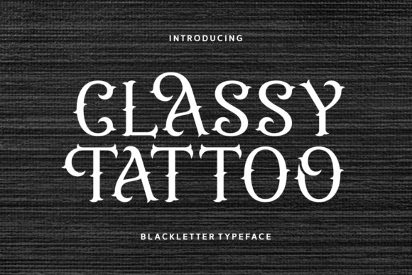
Classy Tattoo is a refined blackletter designed specifically with tattoo aesthetics in mind, blending crisp cuts with subtle ornamental hooks. Its letterforms are anatomically balanced so strokes flow well at larger scales and translate into bold, clean outlines suitable for skin or print. The overall temperament leans sophisticated rebellion-there’s edge without gratuitous flourish, which gives the typeface surprising versatility.
For studio branding, apparel, packaging, and album art this font provides an authentic tattoo-style voice while remaining legible across mediums. When used on skin, the defined terminals and moderated stroke contrast help minimize ink spread over time; when used on merchandise, the same structure gives impactful silhouettes that reproduce reliably. Consider pairing it with minimal sans-serif elements to create modern contrast and hierarchy.
From a production standpoint, Classy Tattoo responds well to vector treatment and supports alternates and stylistic swashes for custom wordmarks. Tight kerning looks intentional with this design, but always proof at intended size-especially for stencil transfers or embroidered patches. If you want a blackletter that nods to traditional tattoo culture without sacrificing contemporary clarity, this one strikes a thoughtful balance.
╰┈➤ Download Classy Tattoo Font
My Recommendation: I’d recommend Classy Tattoo for tattoo studios, merch designers, and musicians seeking a tasteful blackletter look that reads well in both ink and print. It captures the spirit of classic tattoo lettering while staying clean enough for logo work and apparel. Use it when you want authenticity paired with modern control-especially for brand identities that need to age gracefully.
7. Overwork Font
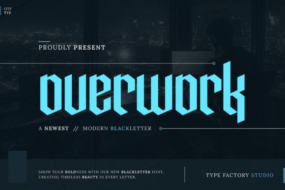
Overwork is a contemporary take on blackletter that pares down medieval ornament to a bold, architectural skeleton. Its vertical stress and pointed terminals honor the gothic tradition while simplified counters and cleaner joins give it modern clarity, making it readable at display sizes without losing intensity.
The typeface projects strong personality for branding and visual identity work-headlines, album covers, and apparel all benefit from its compact spacing and assertive uppercase forms. Designers seeking a bridge between historic blackletter and street-level attitude will also find it sits comfortably among tattoo-inspired art and gothic tattoo fonts applications.
Technically, Overwork performs well in tight layouts thanks to considered kerning and consistent stroke contrast; it scales cleanly for vector production and screen use. Pair it with a neutral sans or a restrained serif to let the letterforms dominate, and experiment with heavy distress or metallic textures for merchandise and poster work.
My Recommendation: I’d reach for Overwork when a project needs the drama of blackletter but with contemporary legibility-think band posters, limited-edition tees, or edgy editorial covers. Its compact, geometric construction makes it ideal for logotypes and headline treatments where space is tight but impact is non-negotiable. If you want a gothic voice without sacrificing modern layout flexibility, Overwork is a dependable choice.
8. Old English Grunge Font
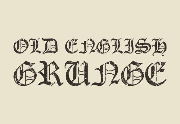
Old English Grunge is a textured reinterpretation of the classic Old English alphabet, where ornate letterforms meet rugged surface noise. The distressed edges and ink-splattered details lend an aged, hand-printed quality that reads as both historical and punk-influenced, perfect for projects that favor attitude over polish.
This face excels on posters, band merch, and editorial spreads that call for a raw, analog feel-its weathered strokes imply history and rebellion rather than formal ceremony. Use it sparingly at display sizes to preserve the decorative intricacies, and consider layering it over photographic or grunge backgrounds for maximum effect.
For pairing, balance its dense texture with minimal sans serifs or open, modern layouts so the type doesn’t overpower the composition. It’s also well-suited to tactile production methods like screen print or embossed stationery, where the distressed detail can translate into memorable, tangible surfaces.
╰┈➤ Download Old English Grunge Font
My Recommendation: I recommend Old English Grunge when you need a typeface that injects vintage character and a rebellious edge-ideal for rock posters, streetwear labels, and nostalgic packaging. It adds instant personality and tells a story of wear and attitude, especially when printed or textured. Use it as a headline or logo treatment rather than body copy to preserve its visual drama.
9. Tattoo Monogram Font
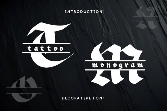
Tattoo Monogram is an ornamental decorative font built around bold initial-letter designs and curling embellishments. Rather than a full utilitarian text face, it leans into stylized glyphs and ligatures that create striking initials, seals, and badge-like marks for personal or brand identity work.
This typeface works beautifully for stationery, custom mugs, and apparel where a single-letter focal point elevates a design into something bespoke. Its flourishes and tight internal counters make it particularly suited to monograms, signature marks, and small-scale prints that benefit from handcrafted flourish.
From a production standpoint, Tattoo Monogram converts well to embroidery, laser-cut vinyl, and decal work-you’ll want to adjust stroke weight for tiny sizes to maintain legibility. Pair it with clean, neutral text faces so the decorative initials remain the center of attention without visual competition.
╰┈➤ Download Tattoo Monogram Font
My Recommendation: I’d choose Tattoo Monogram for projects that need a strong personalized mark-wedding stationery, boutique labels, or custom merch where a decorated initial can carry the brand. Its ornamental nature makes it a standout for monograms and emblematic logos, and it translates nicely into tactile production like embroidery and print. Use it as a focal accent rather than continuous copy to preserve its ornamental impact.
10. Young Dark Font
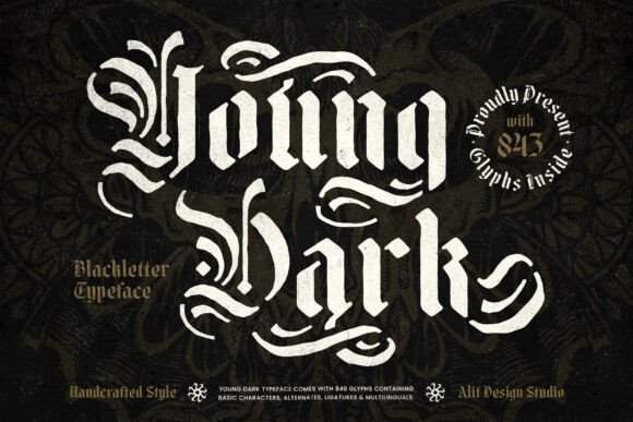
Young Dark is a blackletter stencil that balances historical gravitas with an urban, rebellious cut. Its letterforms carry the weighty, triangular strokes of traditional blackletter while negative-space stencils carve a modern, industrial silhouette-an attention-grabbing choice for logos, album art, and apparel where attitude matters.
Technically the face excels at contrast: thick downstrokes, razor-sharp spurs, and engineered gaps give each character a rugged charm without losing the ornate feel of medieval calligraphy. For designers and tattoo illustrators exploring gothic tattoo fonts, Young Dark’s carved counters and alternative glyphs make it especially useful when you want that inked, hand-cut appearance reproduced at scale.
In practice the type remains legible on large headlines and merch prints but can become dense at very small sizes-use heavier tracking and simplified caps for compact layouts. It pairs beautifully with a clean geometric sans for secondary text, and its stencil openings invite photo-fill or distressed textures for layered compositions; deliverables like OTF/TTF and careful kerning tables make it production-ready.
My Recommendation: I reach for Young Dark when I need a font that feels both historic and confrontational-perfect for band branding, tattoo flash mockups, and gritty apparel. Its stencil detailing lets you create layered effects quickly while keeping a handcrafted edge. Use it for bold headlines and posters where visual impact is the priority.
11. Outline Blackletter Font
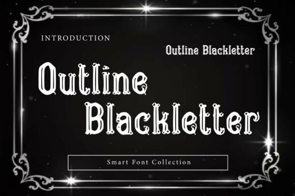
Outline Blackletter revives Old English character with a hollow, inline twist that immediately reads as decorative and theatrical. The outlined counters create a dramatic negative space that makes type appear luminous or neon-like when layered over photos or gradients, making it an ideal headline face for posters and merch.
Design-wise the hollow treatment accentuates the classic pointed terminals and flowing curves of blackletter while keeping the overall weight light on the page. That open center lets designers experiment with texture, photography, or color bleed-through-particularly effective for streetwear, gaming headers, and dark-fantasy campaigns where ornate lettering meets modern styling.
For production, remember that the outlined shapes require clean vector output for crisp reproduction, and the thin inline paths can be fragile in embroidery or very small print. Pair it with a bold sans or a grungy script to balance ornamentation, and leverage the inline as a window for photo fills or metallic treatments to maximize visual drama.
╰┈➤ Download Outline Blackletter Font
My Recommendation: I recommend Outline Blackletter when you want statement typography that reads both vintage and contemporary-great for t-shirts, posters, and sticker art. Its hollow centers give you creative layering options that other blackletter faces lack. Use it big and loud; it’s less suited to body copy but perfect for names, titles, and logo marks.
12. Thornblade Font
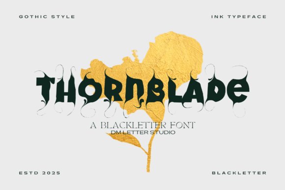
Thornblade brings a ruthless, high-contrast blackletter style that leans into spiky terminals and exaggerated flourishes. The type feels hand-forged-its aggressive strokes and sculpted curves channel heraldic banners and battle-worn signage-making it compelling for projects that crave a bold, medieval personality.
Look closer and you’ll find intentional ligatures and ornamental swashes that elevate headlines into visual statements; these features make Thornblade perfect for single-line logotypes, album covers, and poster focal points. Because of its complexity, it performs best at larger sizes where the nuances of each thorn-like serif can be appreciated rather than lost in small-format reproduction.
Stylistically it pairs well with muted textures, metallic foils, or distressed parchment backdrops to enhance its historic drama. For modern branding, try combining Thornblade with a restrained sans for navigation or captions, and reserve the blackletter for hero usage where its character can dominate without competing elements.
My Recommendation: I would use Thornblade for projects that need uncompromising character-think heavy-metal albums, fantasy titles, and bold tattoo flash concepts. Its ornamental details create instant atmosphere and strong focal points. Deploy it large, on textured surfaces or metallic finishes, to let the craftsmanship of each glyph shine.
13. Gothic Bamliero Font
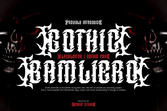
Gothic Bamliero arrives as an unapologetically heavy display face: thick strokes, sharply flared terminals, and ornamental blackletter details that read as modern punk armor. Its attitude leans hard into underground aesthetics while preserving the letter proportions that make classic blackletters legible and commanding, a combination that places it squarely among the more expressive gothic tattoo fonts available for designers.
At large sizes the font’s dramatic contrast and carved counters produce intense visual texture that’s ideal for posters, merch, and band or streetwear logos. Built-in alternates and exaggerated swashes give designers flexible options for creating monograms, lockups, or tattoo-inspired wordmarks without resorting to manual redraws.
For practical use, it thrives with high-contrast colorways-think bone or metallic ink on black-and benefits from generous tracking to avoid visual clutter. Avoid setting it for small body copy; instead, treat Bamliero as a headline weapon paired with neutral sans serifs to balance its maximalist energy.
╰┈➤ Download Gothic Bamliero Font
My Recommendation: I’d reach for Gothic Bamliero when a project needs instant attitude and cultural grit-music branding, tattoo shop identity, or streetwear labels all gain bold personality from its aggressive forms. Its alternates make custom logotypes fast to execute, and the ornamental touches help it stand out on merchandise and posters. Use it where impact matters more than subtlety, and pair it with clean supporting type to keep compositions readable.
14. Black Calong Font
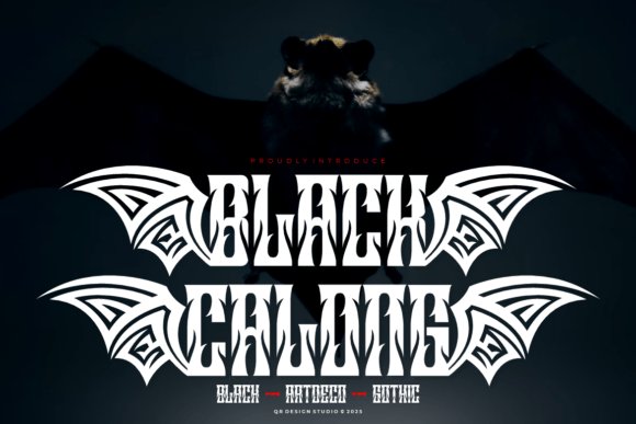
Black Calong cuts a fierce silhouette with tribal wing motifs and intentional negative-space carvings that feel handcrafted and primal. The font fuses blackletter weight with tribal tattoo cues to deliver a look that’s both ceremonial and confrontational, making it particularly effective for dark fantasy, metal band identities, and alternative apparel where symbolism is everything.
Its high-contrast strokes and pronounced inner bowls create a strong center of gravity in each glyph, which reads powerfully on album covers, sleeve prints, and posters. Designers will appreciate the purposeful irregularities-subtle asymmetry and sharp terminals-that translate well into distressed printing techniques and tattoo flash art.
Use Black Calong as a dominant display face and reserve simpler type for body text so the composition doesn’t compete. It responds well to metallic inks, deep saturated backgrounds, and scale variations, and pairs exceptionally with condensed sans types for clear hierarchy in packaging or promo graphics.
╰┈➤ Download Black Calong Font
My Recommendation: I recommend Black Calong when you want iconography that feels ritualistic and aggressive-perfect for bands, streetwear labels, and visual projects that need a bold, tribal edge. Its carved-in counters reproduce beautifully on textured substrates and distressed prints, giving designs an authentic, worn-in vibe. Use it as the focal logotype or headline font and balance it with minimal supporting typography for best results.
15. Swonez Font
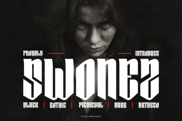
Swonez is a polished blackletter that marries gothic grandeur with art deco geometry, producing an unexpected blend of vintage gravitas and modern elegance. Vertical elongation, razor-sharp angles, and refined terminals give it a stately presence suited to high-fashion layouts, editorial covers, and identity work that demands both drama and composure.
The letterforms have a disciplined rhythm that reads beautifully at display sizes-each glyph feels considered, with balanced counters and clean stroke transitions that avoid the chaos of overly ornamental blackletters. Alternates and extended characters allow for stylized logotypes and headline treatments while maintaining legibility and compositional control.
Swonez performs best against muted or monochrome palettes where its structure can sing; layered photography and subtle texture enhance rather than overwhelm the type. For designers, it’s a great choice when you want gothic moodiness without sacrificing the refinement required for fashion-forward branding or editorial art direction.
My Recommendation: I’d use Swonez when a project needs gothic intensity presented through a sophisticated lens-luxury editorial spreads, boutique fashion brands, or theatrical posters benefit from its poised drama. Its art-deco influences make it surprisingly versatile for upscale applications, and the alternates help create distinctive wordmarks. Pair Swonez with airy layouts and restrained color schemes to let its architectural forms dominate the composition.
16. Black Domed – gothic tattoo fonts
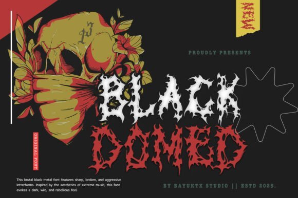
Black Domed projects a raw, uncompromising personality that borrows directly from underground black metal and extreme horror visuals. Its jagged terminals, dripping contours and distorted counters create a volatile, almost ritualistic texture that reads like hand-carved sigils-an aesthetic that slots naturally into gothic tattoo fonts and other dark lettering applications.
The letterforms favor atmosphere over neutrality: heavy contrast, irregular stroke width and “melted” edges give each character a chaotic energy. That intensity makes it spectacular for album art, band logos, concert posters and bold tattoo flashes where mood matters more than micro-legibility.
Technically, Black Domed works best at large display sizes or as a layered logo element-pair it with clean sans or narrow caps to balance the composition. It ships with alternate glyphs and roughened fills that simulate inky texture, making it straightforward to adapt for distressed prints, apparel and ink-ready designs within the gothic tattoo fonts family.
╰┈➤ Download Black Domed – gothic tattoo fonts
My Recommendation: I’d reach for Black Domed when a project needs maximum attitude and a visceral, underground look-think black metal covers, horror film posters, or a tattoo shop’s signature identity. Its chaotic letter shapes offer instant visual story-telling that standard blackletter faces can’t match. Use it as a headline or logo anchor and balance with minimal supporting typography.
17. Grave Shade Font
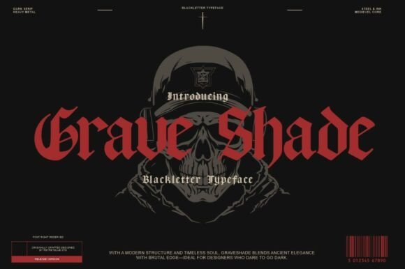
Grave Shade reinterprets classic blackletter with a heavy, modernized backbone-sharp serifs meet compact counters for a look that feels both ancient and immediate. The type leans into carved-stone gravity rather than ornamental flourish, delivering a bold, austere presence that suits gothic branding and tattoo-inspired lettering with equal ease.
Each glyph is crafted with purposeful weight and tension: tight spacing and pronounced verticals create a striking silhouette ideal for logos, posters, and packaging that demand a commanding heritage vibe. Unlike more decorative Fraktur revivals, Grave Shade maintains clarity at moderate sizes while preserving a medieval temperament.
For designers, it pairs beautifully with restrained sans-serifs or textured backgrounds to emphasize contrast; consider metallic inks or foil for premium merch and occult-themed products. Its robust construction also adapts well to tattoo stencils where traditional blackletter gravitas is desired.
My Recommendation: Choose Grave Shade when you want a timeless blackletter look that reads well in print and on skin-perfect for band identities, vintage-inspired labels, and gothic branding. I appreciate its balance of historical reference and contemporary clarity. It’s my go-to when a design needs authoritative, old-world character without excessive ornamentation.
18. Angel Font
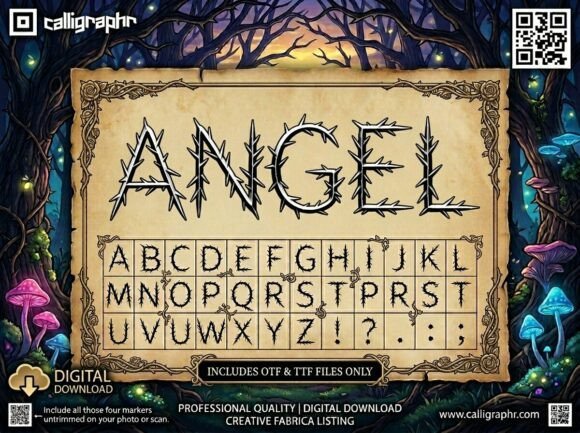
Angel Font channels dark fantasy with a lyrical, thorn-laced aesthetic: letters appear woven from briars and skeletal vines, creating a rhythmic but unsettling cadence. The high-contrast strokes and spiky terminals give it a ritualistic, fairy-tale-gone-wrong quality that reads as artisanal and arcane-perfect for evocative display uses.
Its decorative construction makes Angel ideal for book titles, poster headlines, and apparel where atmosphere is paramount. The font excels at conveying story-based themes-haunted forests, cursed romances, or gothic streetwear-without relying on overt horror clichés.
Because of its intricate silhouettes, Angel performs best at larger sizes or as focal artwork rather than body text; combine it with muted colors, negative-space backgrounds, or tattoo-flash motifs to accentuate the thorned detailing. Use subtle distressing to simulate hand-inked textures for a more authentic, tattoo-inspired finish.
My Recommendation: I’d pick Angel Font for projects that need poetic menace-dark fantasy covers, illustrated concert posters, or boutique apparel lines with gothic leanings. Its botanical-but-barbed letterforms offer unique visual storytelling that elevates a layout into atmosphere. Use it sparingly as a headline or emblem to keep its intricate charm readable and impactful.
19. Delkota Font
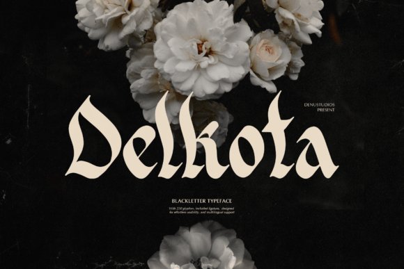
Delkota arrives as a refined blackletter with razor-etched terminals and a poised vertical stress that feels equally at home on a vaulted manuscript or a modern brand lockup. Its letterforms balance high-contrast strokes with tidy counters, delivering a regal silhouette without becoming decorative clutter. This makes Delkota an excellent choice when you need historical weight with contemporary restraint.
What sets Delkota apart is how it translates medieval calligraphic energy into tattoo-ready lettering; designers will find it blends smoothly with gothic tattoo fonts and other Old English inspired styles for layered compositions. Alternates for capitals and ornamental swashes give you the ability to dial up drama for album art or pull back to a cleaner mark for a boutique label. Spacing and kerning are handled thoughtfully, so the type keeps integrity at both headline scale and mid-size applications.
Use Delkota for bold mastheads, apparel graphics, and skin-safe flash where crisp edges and legible contrast matter. It pairs especially well with restrained sans-serifs or thin script accents to prevent the layout from feeling too heavy. Whether printed on textured stock or etched into vinyl, Delkota retains a dignified, slightly aggressive presence that reads as both historic and modern.
My Recommendation: I’d reach for Delkota when a project needs the gravitas of blackletter without tipping into camp. Its clean counters and ornamental alternates make it perfect for band logos, premium packaging, or tattoo flash that requires clear linework. I especially like it when pairing with a minimalist sans to keep designs grounded and readable.
20. Killbie Display Font
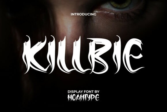
Killbie is a display face built around jagged, talon-like serifs and exaggerated stroke endings that scream high-energy menace. The set feels hand-carved, with irregular angles that create visible motion across a wordmark. It’s theatrical by design, evoking pulp horror posters and comic-book villainy without losing typographic finesse.
The character shapes lean hard into dramatic contrast, making Killbie best used at large sizes where its texture and edge detail can breathe. Designers will appreciate the alternate glyphs and ligature choices for custom word treatments, and the font supports both upper and lowercase for layered typographic play. This is a go-to when you want aggressive personality and cinematic tension in a single type solution.
Killbie excels on album covers, film titles, and merchandise that call for a menacing aesthetic, and it also translates well to screen-printed apparel and poster art. Pair it with distressed textures or stark photographic backgrounds to amplify the horror vibe, or combine it with narrow sans weights for contrast. Its loud, visceral character guarantees your headline won’t be ignored.
╰┈➤ Download Killbie Display Font
My Recommendation: I’d use Killbie when a project needs unapologetic attitude and visual bite-think slasher film posters, metal band branding, or edgy merch. Its clawed serifs and alternates let you craft bespoke headlines with maximum personality. For best results, reserve it for display use and balance it with cleaner supporting type.
21. Avestrava Tattoo Font
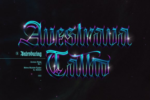
Avestrava Tattoo is a blackletter-inspired typeface tuned specifically for tattoo aesthetics, combining ornate flourishes with sturdy stroke endings for clear reproduction on skin. The design emphasizes readable letter shapes while retaining classical gothic ornamentation, making it suitable for both signage and body art. Its overall feel is decorative yet disciplined, avoiding the fussy extremes of overly ornate Old English designs.
Small details-like tapered terminals and softened bowls-help Avestrava translate well under different inks and skin textures, which is why it’s a practical option for tattoo flash and logo work alike. The font includes several stylistic alternates and swash characters to create unique single-word treatments without hand-drawing each letter. Those alternates make it easy to customize names, mottos, and crest-like compositions with an authentic vintage vibe.
For designers, Avestrava works beautifully on tattoo shop branding, merchandise, and editorial headers that need gothic character without sacrificing legibility. Combine it with subtle paper textures or restrained color palettes to let the letterforms shine. Because the shapes are robust, the font also adapts well to embroidery and woodcut-style printing for a tactile, handcrafted finish.
╰┈➤ Download Avestrava Tattoo Font
My Recommendation: I recommend Avestrava Tattoo when you want gothic styling that remains practical for real-world applications like tattoo flash, shop logos, and merchandise. Its alternates let you create custom wordmarks quickly, and the sturdier forms mean better reproduction across surfaces. I often choose it as a bridge between classical blackletter and contemporary branding needs.
22. Duskfang Font
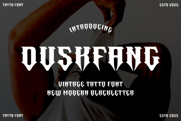
Duskfang is a punchy, modern blackletter with razor-edged terminals and exaggerated contrast that reads like a streetwise heir to Old English calligraphy. The letterforms are condensed and aggressive, with hooked serifs and diagonal cuts that create a sense of motion and menace without becoming illegible at medium sizes. It feels handcrafted yet contemporary, a good bridge between classic inkwork and today’s bold display typography.
Where Duskfang really earns its keep is in applications that demand attitude: band insignias, tattoo lettering, and apparel badges. As one of the more contemporary gothic designs, it sits comfortably among gothic tattoo fonts while retaining crispness for print and vector use. Careful kerning and modest tracking improve legibility when set in longer lines, but its strength is as a headline or single-word emblem.
Designers will appreciate how Duskfang performs with textured treatments – subtle distressing, metallic foil, or heavy black fills accentuate its fang-like strokes. It pairs well with open, geometric sans-serifs when you need contrast, or with ornate flourishes for vintage-inspired pieces. For tattoos, the high-contrast strokes translate into bold outlines and dramatic negative space that stand out over time.
My Recommendation: I’d reach for Duskfang when I need a typeface that reads as rebellion on sight – perfect for metal band logos, streetwear labels, and single-word tattoos. Its sharp terminals and compact forms give designs instant character while remaining versatile for print, embroidery, and stenciling. Use it as a focal point and pair with a clean sans to balance the visual weight.
23. Blome Life Font
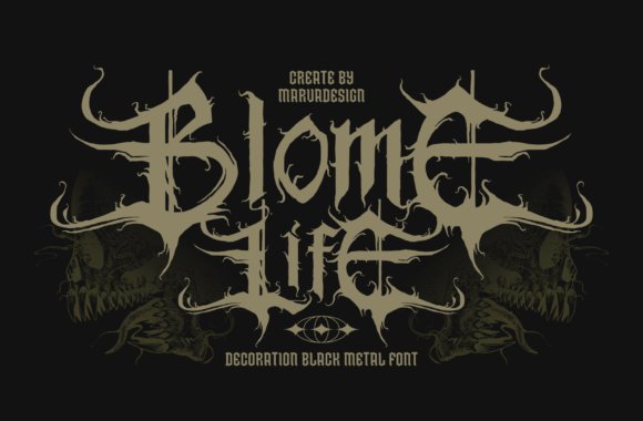
Blome Life leans heavily into black metal and tattoo aesthetics, with intricate spiky terminals and dense flourishes that read like hand-inked badges of chaos. Uppercase glyphs are treated with a flame-like motif that conveys motion and aggression; this decorative edge makes headlines and logos pop with a visceral intensity. The font’s complexity is its personality: it demands attention and benefits from generous spacing when used in more than a few words.
Legibility takes a back seat to mood here, which is ideal for album covers, poster art, and merch where iconography is as important as text. For tattoo-inspired pieces, the glyphs evoke the raw energy of traditional tattoo flash while pushing into more ornamental territory. Designers should reserve Blome Life for short, high-impact phrases or single-word marks where the artwork is meant to dominate.
Technically, the typeface excels in large-format printing and digital mockups where its details can breathe; it also adapts well to layered printing techniques like spot varnish or foil to heighten the fiery caps. Pair it with minimal backgrounds and coarse textures to maintain clarity and amplify its aggressive tone. For branding, use it sparingly as a signature element paired with a neutral body face.
My Recommendation: I’d pick Blome Life for projects that require theatrical, high-energy lettering – think extreme music, underground zines, or statement tees. Its elaborate uppercase treatment makes short words feel monumental, perfect for covers or logos that need a dark, expressive edge. Treat it as showpiece type and combine with simple supporting fonts to avoid visual overcrowding.
24. Fabric Tailor Font
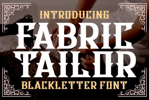
Fabric Tailor channels a refined vintage blackletter voice with tailored edges and measured ornamental strokes that recall artisanal trades and old-world signage. The design balances solidity with decorative flair: sharp cuts give it a bespoke, engraved look while modest flourishes keep it readable in smaller display uses. This restrained blackletter bridges retro packaging aesthetics and contemporary brand systems with a crafted sensibility.
It shines on labels, barbershop identity, and premium packaging where tactile authenticity matters; applied textures like letterpress or embossing enhance its workshop charm. The font also adapts well to merchandise and small logos, where its clear counters and weighted stems preserve definition. Use capitals for marquee lines and a secondary sans for supporting copy to maintain hierarchy.
For designers, Fabric Tailor is an excellent choice when you need historical flavor without sacrificing modern production needs – it vectorizes cleanly, prints crisply, and responds well to color blocking. Subtle distressing can age it into truly retro territory, while a full-color approach keeps it contemporary. Its versatility makes it an approachable blackletter for brands that want handcrafted character without overt aggression.
╰┈➤ Download Fabric Tailor Font
My Recommendation: I recommend Fabric Tailor for branding that wants to evoke craftsmanship – think whiskey labels, barbershop signage, and boutique apparel. It offers a tasteful blackletter presence that reads well across packaging and print processes, and it pairs effortlessly with clean sans-serifs for modern layouts. Use it as a headline or badge to give projects an artisan, heritage-driven voice.
25. Old English Font
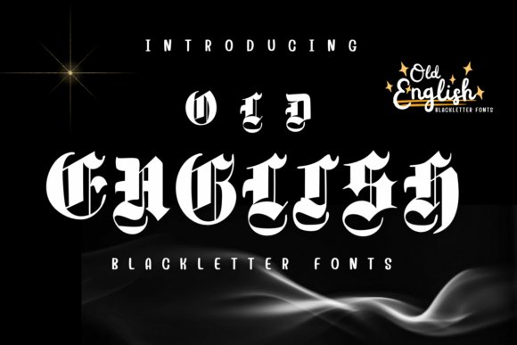
Old English is a commanding blackletter display that channels medieval calligraphy with crisp, high-contrast strokes and ornate terminal flourishes. If you’re assembling a set of gothic tattoo fonts for vintage-inspired ink or branding, Old English sits squarely in that tradition-its dense, angular forms read as both noble and rebellious when scaled for body art or poster work.
The letterforms favor vertical stress and tightly compressed counters, which makes headlines and nameplates sing but asks for larger sizes and careful kerning when used on skin or small merchandise. Its sharp serifs and iconic majuscules perform exceptionally well in vector art and stencils, allowing tattooists to translate the design into clean linework.
For design pairing, let Old English dominate: team it with a minimal sans for contrast or use subtle texture overlays to emphasize its historic patina. Consider customizing alternates or removing extreme swashes for legibility on curved body areas; with modest tweaks it becomes a versatile headline face for medieval, metal, or heritage-themed projects.
My Recommendation: I reach for Old English when a project needs instant period character and a strong visual anchor-think shop logos, band merch, or headline tattoos. Its dramatic terminals and compact rhythm give a timeless, authoritative feel that’s hard to replicate with modern serif faces. For tattoo work, I appreciate how well it converts to stencils and how adjustments to stroke weight preserve readability on skin.
26. Tattoo Magic Font
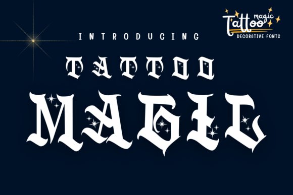
Tattoo Magic blends classic blackletter energy with whimsical star and sparkle motifs, producing a decorative typeface that reads like a dyed-in tattoo flash sheet. Rather than strict historical fidelity, it leans into tattoo culture’s theatricality-bold strokes paired with playful ornaments deliver a look that’s both rebellious and enchanted.
Because of its ornamental accents, Tattoo Magic excels at logos, signage, and poster work where personality is paramount; the small stars and twinkles give designs a branded charm without overwhelming the letterforms. That said, tight tracking or tiny sizes will obscure its finer embellishments, so prioritize large-format use or vector conversion for crisp reproduction.
Pair this face with flat color backgrounds and minimal supporting typography to let the decoration breathe; for apparel and album covers it instantly adds an arcane, subcultural vibe. It’s a great choice when you want blackletter attitude softened by a hint of fantasy rather than pure historical strictness.
╰┈➤ Download Tattoo Magic Font
My Recommendation: I’d use Tattoo Magic when a project calls for dramatic ink-inspired style with a touch of whimsy-perfect for boutique merch, tattoo shop branding, or festival posters. Its decorative stars make designs feel handcrafted and distinctive, while bold letterforms maintain presence at a distance. I avoid it for body-copy or tiny labels but love it for statement headlines and apparel prints.
27. Grimersia Font
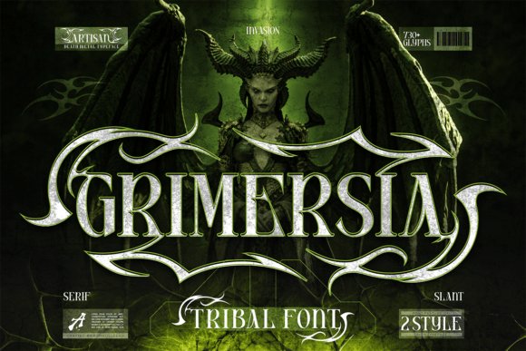
Grimersia fuses tribal edge with gothic temperament, producing a typeface that feels ritualistic and fiercely contemporary. Its sharp serifs and aggressive ornamental swashes create an immediately intense atmosphere-ideal for projects seeking a mythic or underground identity rather than a soft vintage look.
Built with alternates, ligatures, and two distinct styles (Regular and Slant), Grimersia is intentionally flexible: the alternates let you craft jagged wordmarks or smooth, interlocking headlines depending on mood. The typeface’s heavy weight and compact proportions give it strong presence on album art, streetwear graphics, and tattoo concepts that need to read from a distance.
Multilingual support and a full punctuation set make it practical for branding, while its tribal-inspired glyphs are perfect for custom logo work or bold poster headlines. For delicate applications, moderate the swashes or use the slanted cut to reduce visual noise and keep text legible at mid sizes.
My Recommendation: I recommend Grimersia for creative work that must feel muscular and mythic-metal album covers, alternative fashion labels, and bold tattoo concepts are its sweet spots. Its alternates and ligatures allow for highly customized typography that stands out on merch and posters. When I need a typeface that communicates intensity and ritualistic flair, Grimersia is the first one I try.
28. Deadly Sins Font
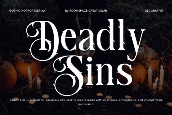
Deadly Sins arrives as an intensely atmospheric blackletter display with razor-sharp serifs, dramatic curves, and ornamental swashes that call to mind medieval calligraphy and modern tattoo flash alike. If you’re exploring gothic tattoo fonts for ink-ready lettering or branding that needs a sinister elegance, this design balances ornate detail with legibility at headline scale.
The typeface excels in high-impact applications: movie titles, horror book covers, poster art, and Halloween campaigns all benefit from its theatrical presence. Its decorative alternates and swashes give designers a palette of expressive forms to craft custom wordmarks, making it equally useful for tattoo-inspired artwork and gothic branding projects.
Technically, Deadly Sins is PUA-encoded so you can access glyphs and stylistic sets without extra tooling; kerning and stroke contrast are optimized for display sizes rather than body text. Pair it with a neutral sans or a distressed texture for wearable merch, and reserve tight tracking for compact logos to preserve the font’s sinister clarity.
My Recommendation: I’d reach for Deadly Sins when a project needs theatrical gravitas with a dangerous edge-think album covers, tattoo flash sheets, or premium packaging for dark fashion. Its decorative alternates let you create one-of-a-kind logotypes, while PUA encoding keeps workflow friction low. Use it at large sizes where the intricate details can breathe; swapping in a clean sans for supporting copy keeps the overall design readable and modern.
29. Skyforge Webster Font
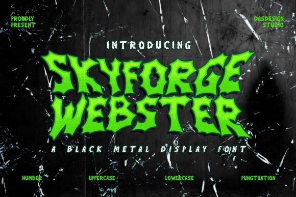
Skyforge Webster is a metal-infused blackletter crafted to feel like a weapon: jagged terminals, acute angles, and aggressive counters create an immediate sense of menace and motion. Rather than traditional old-English refinement, this display font channels black metal aesthetics and underground punk attitude, producing a raw, confrontational voice for headlines and logos.
Every glyph has been sculpted with high-impact edges and deliberate asymmetry, which makes the font ideal for black metal band logos, horror posters, and streetwear graphics that demand a hostile visual identity. It includes numerals, punctuation, and multilingual support so you can apply it across album layouts, flyers, and international merchandise with confidence.
PUA encoding ensures alternate forms and special characters are easy to access, while the heavy contrast and sharp strokes mean Skyforge Webster performs best at larger sizes or on textured backgrounds where its silhouette reads clearly. Consider using it with distressed textures, metallic foils, or layered outlines to amplify the brutal aesthetic without losing legibility.
╰┈➤ Download Skyforge Webster Font
My Recommendation: I’d pick Skyforge Webster when the brief calls for uncompromising attitude-perfect for band identity, horror event posters, and rebellious streetwear labels. Its sculpted, jagged forms create instant recognition and translate beautifully to prints, patches, and album art. Use it as the focal element and pair with minimalist supporting typography to let the font’s aggression dominate the composition.
30. Ghazkar Font
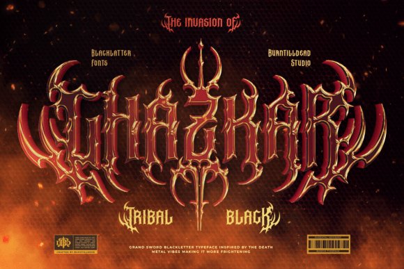
Ghazkar blends tribal ornamentation with blackletter structure to produce a bold, primally decorative display font. Spikes, thorn-like terminals, and vine motifs are integrated into each letterform, giving the typeface a feral energy that reads both ornamental and confrontational-perfect for designs that need visual dominance and character.
The family ships in Regular and Outline styles and includes a large set of ligatures and alternates to build tightly interlocking words or dramatic wordmarks. The Outline version is especially useful for layered treatments: offset fills, gradients, or textured backers let you create multi-dimensional tattoo flash or merch graphics without redrawing the forms.
Ghazkar works best at headline scale where its detailed motifs remain readable; spacing and kerning are tuned to favor compact, emblematic layouts. For contrast, place it alongside a neutral geometric sans or a lightly distressed slab to balance the feral ornamentation with modern clarity and hierarchy.
My Recommendation: I’d use Ghazkar when a project needs raw, tribal flair-think tattoo designs, heavy metal branding, and festival posters. The alternates and ligatures make it easy to craft distinctive logos and lockups, while the Outline style enables layered, print-friendly effects. Rely on it as a visual centerpiece and choose a simple supporting type to avoid competing ornamentation.
These 30 gothic tattoo fonts offer a comprehensive starting point for designers and tattoo artists seeking bold, characterful lettering. From traditional blackletter to contemporary gothic calligraphy, each style can be adapted for scale, placement, and stencil work.
Before finalizing a tattoo, test your chosen font at actual size, adjust spacing for readability, and verify licensing for commercial use. With the right font and preparation, you can achieve striking, long-lasting lettering in 2026 and beyond.