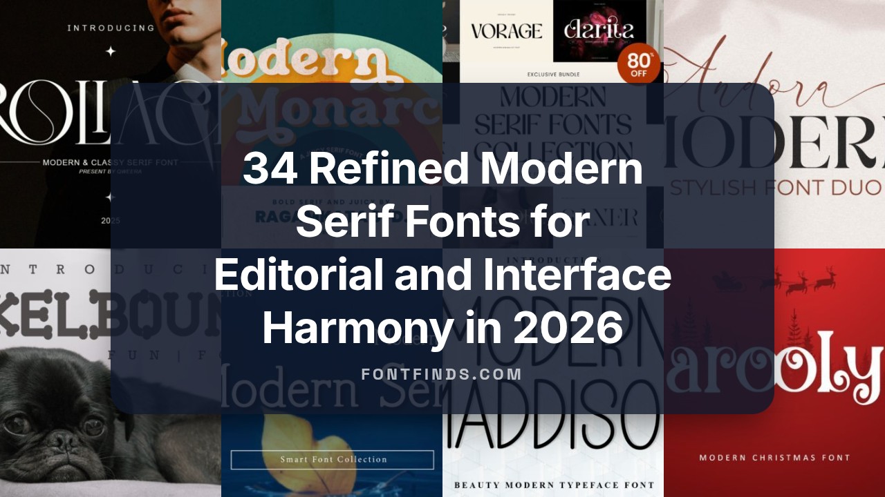
34 Refined Modern Serif Fonts for Editorial and Interface Harmony in 2026
Modern Serif Fonts are finding renewed favor across editorial layouts, boutique packaging, and user interfaces, marrying heritage letterforms with cleaner proportions. This collection presents 34 picks, each annotated with suggested pairings, spacing notes, and best-use scenarios.
Whether you need a warm, tactile headline face or a crisp, high-contrast book text option, these selections make testing faster and decision-making clearer. You’ll also find quick tips for web embedding, variable font features, and practical licensing notes for projects in 2026.
1. Modern Bundle Font
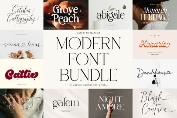
The Modern Bundle collects twelve premium typefaces – a mix of contemporary serifs, refined scripts, editorial cuts and retro-leaning display faces – crafted by Typoraith Co. Each font ships with extended glyph sets, alternates, stylistic sets and thoughtful kerning so layout decisions feel intentional; webfont kits and language support make cross-channel work simpler. If you favor Modern Serif Fonts for brand systems, this package delivers a useful range of weights and optical sizes to match everything from delicate invites to bold mastheads.
File formats include OTF/TTF with clear licensing for print and digital use, which helps maintain the same typographic voice across packaging, websites and social feeds. Pair a high-contrast serif from the bundle with a softer script for wedding collateral, or pick the editorial cut for long-form spreads – every face is tuned to hold up at large display sizes and in tight typographic compositions.
╰┈➤ Download Modern Bundle Font
My Recommendation: I reach for this bundle when a project needs a cohesive set of type voices that travel from logo to packaging. The mix of serifs, scripts and display faces cuts time spent pairing fonts and ensures consistent tone across materials. Use it for boutique identities, wedding suites, magazines and product launches where a polished typographic toolkit speeds production.
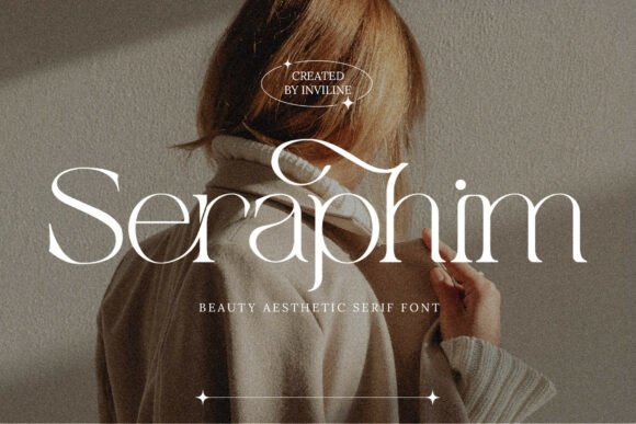
2. Marquis – Elegant Modern Serif Font
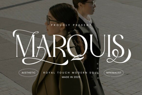
Marquis marries a clean geometric skeleton with graceful terminals and soft curves to produce a refined modern serif suited for high-fashion headers and editorial mastheads. The family offers stylistic alternates and refined ligatures so you can add discreet personality without compromising legibility, and its open counters read well at display sizes. The result is a font that feels both sophisticated and deliberately restrained, making it ideal for refined brand expression.
Use Marquis for luxury logos, premium packaging or magazine mastheads where subtle detail matters; it pairs particularly well with a low-contrast sans for body copy. Pay attention to tracking and optical sizing when using heavier weights, and exploit the alternates for monograms or wordmarks to give identity work an unmistakable signature.
╰┈➤ Download Marquis – Elegant Modern Serif Font
My Recommendation: I use Marquis when a design calls for quiet luxury rather than loud ornamentation. Its ligatures and alternates let me craft distinctive wordmarks while keeping copy readable. It’s perfect for fashion brands, boutique packaging, and editorial covers where refined letter shapes carry the brand tone.
3. Modern Font
Modern Font is a high-contrast serif with elongated ascenders and a narrow stance that lends an editorial, cinematic character to headlines and titles. The face favors display use – think book and movie titles, luxury brand marks, or fashion editorials – where a commanding typographic presence is needed without ornate flourishes. Uppercase forms and small-cap support give it sculptural impact in logos and posters.
Tight kerning and crisp terminals make it excellent for logo work and packaging where letter-by-letter control matters, while lighter weights work well for pull quotes and subheads. Pair it with a friendly humanist sans for body text to maintain readability, and deploy webfont versions for consistent reproduction across print and screens.
My Recommendation: I pick this font when a headline must carry the visual weight of a campaign or a title needs to feel cinematic. Its high-contrast shapes read beautifully at large sizes and make strong statements on covers and packaging. Use it for marquee logos, editorial spreads, and identity work that benefits from dramatic, well-crafted serifs.
4. Shelina Modern Font
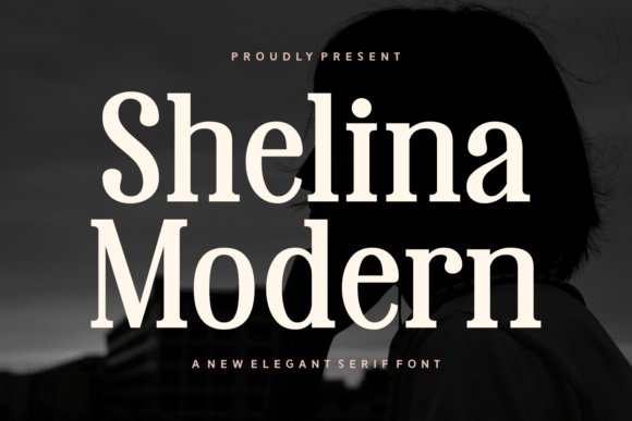
Shelina Modern presents a high-contrast serif voice that marries classical proportions with restrained contemporary detailing. The black-and-white promotional look emphasizes its vertical stress, delicate bracketed serifs, and open counters, which together give letterforms both presence and refinement. As part of a curated selection of Modern Serif Fonts, Shelina reads as a confident display face while remaining surprisingly legible at smaller sizes.
Technically, the family includes multiple weights, thoughtful kerning, and useful alternates that let designers tune tone without rebuilding layouts. It performs well in editorial mastheads, fashion branding, and hero headlines on responsive sites thanks to a moderate x-height and tidy spacing. Pair it with a low-contrast sans for a contemporary-luxury pairing that still reads clearly across print and web.
╰┈➤ Download Shelina Modern Font
My Recommendation: I reach for Shelina when a project needs a luxe headline that still reads comfortably across devices. Its alternates and small caps give subtle variety for logotypes, while the robust strokes print crisply on textured stock. Ideal for fashion, editorial covers, and premium product identity where refined detail matters.
5. Modern Monarch Font
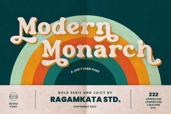
Modern Monarch channels mid-century display serif traits with broad bowls, playful terminals, and compact proportions that create strong headline personality. Each character shows careful attention to contrast and rhythm, so the face reads as expressive without feeling fussy. Its retro sensibility makes it an immediate choice for posters, boutique packaging, and logos that want a tasteful nod to the past.
The family ships with alternates and stylistic sets to dial the vintage flavor up or down, and robust uppercase spacing that holds up on signage and labels. Use it at larger sizes where its ornamentation can breathe, pairing it with a neutral grotesque for long-form copy to maintain readability. For print work and tactile materials, the heavier strokes register reliably under varied printing conditions.
╰┈➤ Download Modern Monarch Font
My Recommendation: I use Modern Monarch when a design needs character-driven headlines that evoke nostalgia without feeling clichéd. Its alternates are useful for logo experiments and bespoke lettering, and it prints very well on textured papers and labels. Perfect for poster art, boutique packaging, and editorial spreads with a retro mood.
6. Marquis – Elegant Modern Serif Font

Marquis blends classic serif refinement with minimalist restraint through slender terminals, subtle contrast, and refined ligatures. The shapes lean toward calm geometry, making the face suitable for luxury editorial work and identity systems that require understated presence. Small caps and polished italics add typographic depth without drawing attention away from the content.
In practical use, Marquis maintains clarity at body sizes while lifting headlines with a quiet authority thanks to balanced x-height and consistent stroke modulation. It pairs naturally with humanist sans families on websites and menus, and its predictable kerning eases tight compositions like monograms. Try the italics for pull-quotes or refined callouts to make the text sing in a subdued way.
╰┈➤ Download Marquis – Elegant Modern Serif Font
My Recommendation: I pick Marquis when a project calls for measured elegance rather than loud display styles; it brings calm, readable typography to brands and magazines. The ligatures and italics offer tasteful personality for labels and logotypes, and the family behaves reliably across print and digital layouts. Best for luxury branding, editorial typography, and premium product packaging.
7. Andora Modern Font
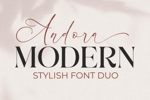
Andora Modern pairs a poised serif with a lively script and is PUA encoded so every alternate and ligature is easy to access; it feels like a type family built for contrast-driven identities. As part of Modern Serif Fonts offerings, the serif’s moderate contrast and sharp terminals read confidently in headlines while the script supplies expressive signatures and custom wordmarks for branding and invitation work.
The OpenType feature set is generous: stylistic sets, contextual alternates and discretionary ligatures let you refine kerning and rhythm without manual letter-swapping, and hinting keeps shapes crisp on screen. Use the serif for set pieces and the script for logos or accent lines-together they let you create polished, editorial compositions with personality.
╰┈➤ Download Andora Modern Font
My Recommendation: I reach for Andora Modern when a project needs both a structured headline and a human, handwritten touch-wedding suites, boutique identities, and premium packaging are perfect fits. The ready-made alternates and PUA access speed up concepting, and the duo behaves consistently across print and web. For me the practical benefit is being able to build a complete visual voice from one cohesive package.
8. Modern Serif Font
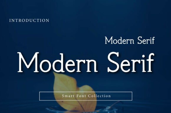
Modern Serif blends classical serif proportions with restrained stroke contrast, giving it a professional yet understated temperament that suits editorial and corporate identities. The family’s measured x-height and tight but readable spacing let it form compact mastheads and clear subheads without losing compositional balance. Multiple weights and italics create a predictable hierarchy that designers can trust when laying out complex documents.
On long-form pages it preserves even color and rhythm, and its letterforms scale cleanly on responsive sites thanks to careful hinting and kerning. Use it for magazines, portfolios, and luxury packaging where a poised typographic voice is required, and pair it with a neutral sans for body copy to maintain clarity across devices.
╰┈➤ Download Modern Serif Font
My Recommendation: I use Modern Serif when a project calls for a calm, capable typographic presence-editorial spreads and brand systems benefit from its consistent rhythm. The weight range makes it simple to build typographic scales, and the clean italics add personality without distraction. It’s my go-to for refined layouts that need to feel modern without ornament.
9. Modern Chengo Font
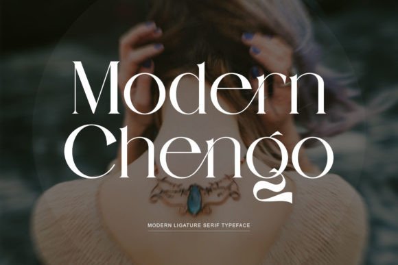
Modern Chengo fuses a hint of nostalgia with current proportioning, producing slender serifs and graceful terminals that read as fashion-forward but familiar. Built with OpenType features and PUA encoding, it ships with ligatures, alternates and extended punctuation so you can craft distinct logotypes and expressive headlines without hunting for extras. The letterforms favor display use, where their subtle contrast and sculpted shoulders create memorable typographic silhouettes.
As a pairing choice, Modern Chengo plays nicely against a plain geometric sans for body text or with a soft script for event collateral, delivering a chic voice across social graphics and packaging. Its multilingual support and tuned kerning make it practical for cross-market campaigns, while the alternates help you tighten wordmarks into polished identities.
╰┈➤ Download Modern Chengo Font
My Recommendation: I pick Modern Chengo when I want a brand to feel polished and a little nostalgic-boutique labels, invitations, and lifestyle socials all gain from its look. The built-in alternates make it easy to generate unique wordmarks quickly, and language support keeps it usable for international clients. In practice I pair it with a neutral sans to retain readability while keeping the headline character intact.
10. Grimoire Modern Font
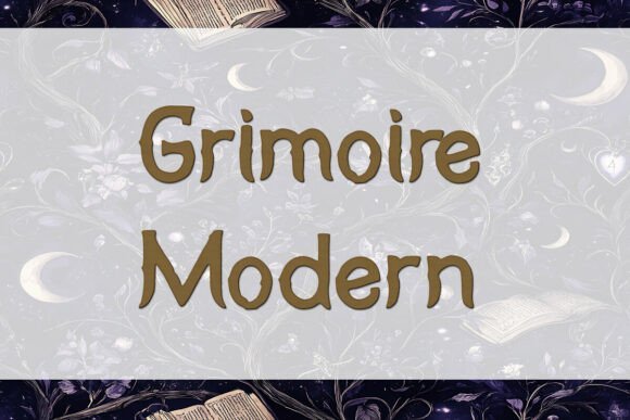
Grimoire Modern Font is a high-contrast serif that pairs sharp, thorn-like terminals with soft, calligraphic curves to create a distinctive editorial voice. Among Modern Serif Fonts, it reads like a contemporary spellbook: architectural details and razor edges give headlines a carved, tactile presence while the open counters preserve legibility at smaller sizes.
The family feels crafted for display work – book jackets, boutique product labels, and luxe event branding – and the included glyph set covers standard Latin needs for most projects. Sensitive kerning and pronounced contrast reward careful typesetting; pair it with a neutral geometric sans for body copy to keep layouts balanced and modern.
╰┈➤ Download Grimoire Modern Font
My Recommendation: I turn to Grimoire Modern when a project needs theatrical personality without losing polish. Its sharp terminals add character to covers and identity systems, while the subtler curves keep text readable on labels and invitations. I’d use it for dark romance titles, artisanal apothecary branding, and high-end seasonal campaigns where mood matters as much as clarity.
11. Gibme Foggie | Modern Elegant Serif Font
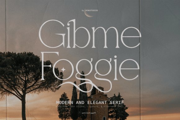
Gibme Foggie | Modern Elegant Serif offers a refined silhouette with over 280 glyphs, alternates, and discretionary ligatures that let designers shape distinctive wordforms. The strokes are slender with modest contrast and gently flared serifs, lending the face a poised, fashion-forward look suited to logos, editorial mastheads, and wedding invitations.
Because of its deep glyph palette, it handles typographic flourishes without resorting to manual outlines; swapping alternates can shift tone from formal to relaxed in seconds. The face works well at headline scale and pairs effectively with a warm humanist sans for longer editorial text or web content where clarity and style must coexist.
╰┈➤ Download Gibme Foggie | Modern Elegant Serif Font
My Recommendation: I reach for Gibme Foggie when a project demands elegant, editorial typography with plenty of expressive options. The alternates and ligatures make bespoke wordmarks fast to create, which is great for boutique brands and stationery suites. Use it for fashion spreads, high-end invitations, and minimalist logos that need a graceful voice.
12. Caroolyn Font
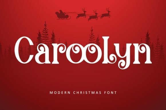
Caroolyn Font is a modern, luxurious serif originally aimed at holiday designs but crafted for broader use across seasonal and evergreen projects. It includes PUA-encoded swashes and glyphs, so decorative alternates are easy to access from the glyph panel and can instantly dress up headlines, covers, and logos.
The letterforms balance ornament with clarity: lively terminals and generous counters keep display settings readable while the swashes inject personality. It pairs nicely with a restrained sans for body text and performs well in print packaging, posters, and branded seasonal campaigns.
My Recommendation: I use Caroolyn when I want ornate headings that remain legible and quick to set, especially for seasonal marketing or boutique packaging. The PUA encoding speeds production because decorative glyphs are tied to single keystrokes. It’s an excellent choice for holiday collateral, book covers with flair, and small-batch product labels that benefit from a handcrafted look.
13. Retro Bundle Collection Font
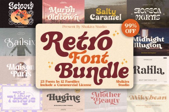
The Retro Bundle Collection gathers a dozen retro-inflected serif and display faces that flirt with boho tails, groovy letterforms and hand-drawn charm. It sits comfortably next to Modern Serif Fonts in any branding toolkit when you want a nostalgic voice without feeling dated. Each face reads well in short headlines and logotypes where personality must coexist with clarity.
Files arrive ready for Procreate, Cricut and Canva workflows and many include SVG and layered glyphs for quick styling. The set leans on swashes, alternate endings and friendly ligatures-small details that lift a headline or wedding suite. If you design posters, t-shirts or boutique packaging, this pack gives a variety of period flavors without purchasing individual licenses one by one.
╰┈➤ Download Retro Bundle Collection Font
My Recommendation: I reach for this bundle when a project needs a retro attitude-think indie wedding suites, record cover art, or apparel labels. The variety of tails and alternates makes quick mockups feel bespoke, and compatibility with Procreate and cutting machines speeds production. For anyone crafting nostalgic branding on a budget, these fonts provide distinct voices with minimal fuss.
14. Modern Bundle Font
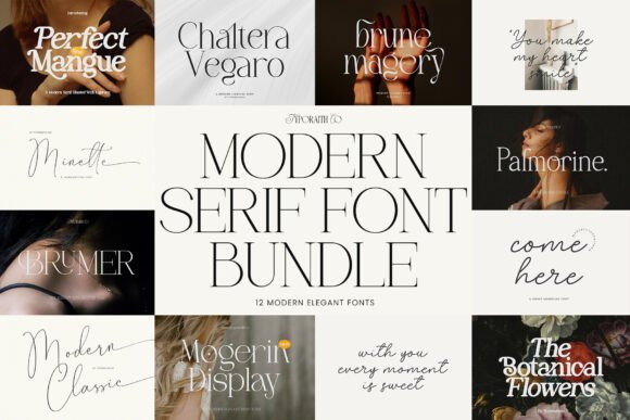
The Modern Bundle collects twelve typefaces that pair high-fashion serifs with delicate script accents to deliver polished, editorial-ready typography. You’ll find hairline serifs, chic ligatures and romantic handwritten scripts designed to sit well in identity systems and long-form layouts. Thoughtful contrast and spacing help headlines stand out without competing with body copy.
Most files include OTF and webfont formats, with alternates and discretionary ligatures that make crafting unique wordmarks straightforward. Pairing a crisp serif from the set with a loose script yields instant hierarchy and personality. This collection performs reliably across print, web and digital invitations where a refined tone is required.
╰┈➤ Download Modern Bundle Font
My Recommendation: I use this bundle when clients want a refined, editorial voice-fashion lookbooks and boutique identities benefit most. The ready-made script-serif pairings cut design time and reduce guesswork in composition. Webfont availability also makes deployment simple for online portfolios and brand sites.
15. Modern Serif Bundle Font
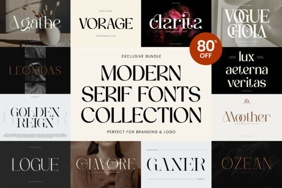
The Modern Serif Bundle offers eight carefully crafted serif families ranging from minimalist text serifs to bold display cuts with strong character. Several fonts include alternate characters and swashes plus PUA-encoding for easy glyph access, and weight options that suit both headlines and body copy. Designers seeking a coherent set of serif voices will find both restraint and expression here.
The collection balances spare, geometric options with more expressive faces that show pronounced terminals and pleasing contrast. Names like Agathe and Clarita cover neutral, workhorse roles while Vogue Chola and Logue provide attitude for display use. Purchasing the bundle is a sensible way to build a cohesive type palette across multiple projects without repeatedly sourcing single families.
╰┈➤ Download Modern Serif Bundle Font
My Recommendation: I’d pick this bundle when building a brand system that needs multiple serif moods-from calm text faces to attention-grabbing headlines. PUA support speeds access to alternates during layout, and the range of weights keeps typography consistent across print and web. It’s especially handy for fashion magazines, luxury packaging, and identities that require both restraint and distinct character.
16. Modern Romance Font
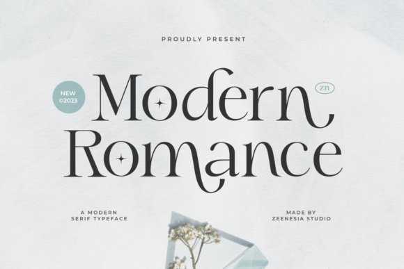
Modern Romance presents a soft, refined serif voice where gentle terminals and subtle contrast create a distinctly romantic tone. The shapes favor slightly extended counters and graceful curves, which makes large display work-wedding collateral, magazine covers, and premium packaging-feel polished without being fussy. As part of the Modern Serif Fonts family, it reads as both contemporary and slightly nostalgic, a balance that helps it sit comfortably in upscale print and digital compositions.
In practical use the face shines when set big: letterforms reveal fine detailing and delicate stress that reward careful kerning and generous leading. Try pairing it with a neutral grotesque for body copy to maintain readability while keeping the headlines expressive, and consider small caps or subtle alternates for a more finished identity system. The overall impression is refined warmth rather than flash, which makes it reliable for projects that need emotional weight without ornament overload.
╰┈➤ Download Modern Romance Font
My Recommendation: I pick Modern Romance when a project needs an intimate, elegant voice-wedding suites, boutique brand marks, or premium invitations. Its graceful strokes bring personality to headlines while pairing neatly with simple sans faces for readable body copy. If you want a serif that reads warm and considered rather than overtly traditional, this is one I reach for.
17. Modern Muse Font
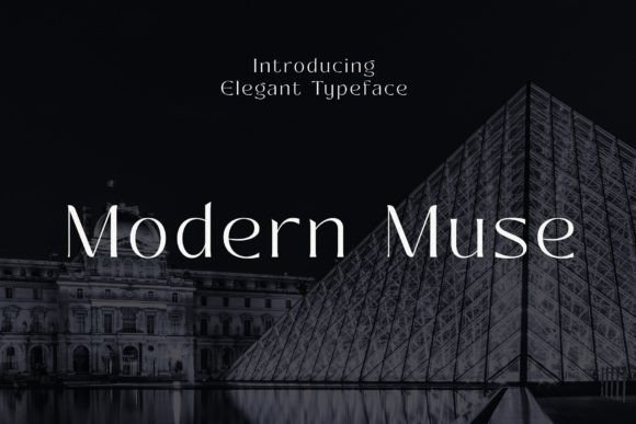
Modern Muse is a high-contrast serif with pronounced vertical stress and refined terminals that read as deliberately upscale. Its letterforms favor elongated serifs and crisp hairlines, which give headlines a statuesque presence ideal for logos and editorial mastheads. The design carries a poised, polished identity that suits luxury labels and refined packaging where typography must feel composed and intentional.
The type family works well in settings that require strong typographic hierarchy: pair a bold weight for display with a lighter companion for captions and pull quotes to maintain visual rhythm. OpenType features such as ligatures and elegant italics amplify its character without overwhelming layouts, so it holds up in both print and web use. Treat it as a headline-first face that brings measured glamour to brand-facing applications.
My Recommendation: I use Modern Muse for projects that demand a dignified, fashion-forward look-high-end packaging, boutique identity systems, and editorial covers. Its contrasty strokes make it an attention-grabbing headline face while remaining legible at larger sizes. For brand work that needs a restrained but luxurious typographic voice, this font is a strong option.
18. Hermione Modern Serif – Modern Serif Fonts
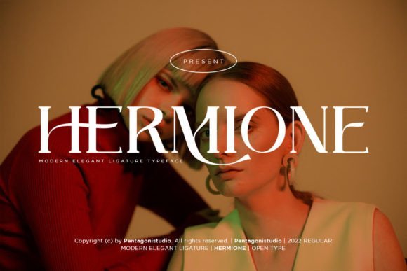
Hermione Modern Serif offers a contemporary take on classical letterforms, equipped with stylistic alternates and a thoughtful set of ligatures that let designers add personality without custom drawing characters. The alternates switch terminals and flourish shapes subtly, so you can adjust tone from reserved to decorative without upsetting overall rhythm. It’s a practical design feature set for designers who like control over small expressive details.
Spacing and kerning are tuned to keep longer set matter readable while still allowing the faces to sing in headline sizes, which makes Hermione suitable for editorial runs and brand systems that need typographic variety. Its ligatures smooth awkward pairs and help avoid mechanical letter collisions, improving flow in tight tracking. Use it where you want classic proportions with a few contemporary quirks that make copy feel handcrafted.
╰┈➤ Download Hermione Modern Serif – Modern Serif Fonts
My Recommendation: I recommend Hermione Modern Serif when a project benefits from typographic refinement plus a palette of alternate shapes-editorial identities, boutique catalogs, and invitation work. The alternates and ligatures give me quick ways to inject personality without redesigning letterforms. It’s especially useful when the brief asks for a serif that can shift tone across applications while keeping a cohesive look.
19. Modern Maddison Font
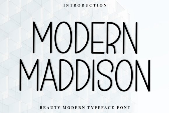
Modern Maddison pairs soft stroke endings with measured contrast, producing a polite but lively voice that suits upscale packaging, editorial headlines, and boutique identity work. Its hand‑touched terminals and subtle ball terminals give each glyph personality without sacrificing readability, and its restrained flourishes make it a notable example among Modern Serif Fonts for projects that need warmth and clarity. The face behaves well at display sizes and, with modest tracking, remains readable in longer set text.
The family ships with a healthy glyph set including stylistic alternates, discretionary ligatures and small caps, plus decent kerning and OpenType features to support multilingual typesetting. It installs cleanly on Windows and open platforms and renders predictably as a webfont when subsetted for performance. Pair it with a neutral grotesque for modern branding or a soft script for invitation work to shape mood precisely.
╰┈➤ Download Modern Maddison Font
My Recommendation: I would use Modern Maddison when a design needs handcrafted charm without losing authority; it brings subtle personality to covers, packaging, and identity systems. The alternates and ligatures let me refine typographic moments, which is handy for editorial headlines and boutique labels. I often pair it with a simple sans to keep layouts contemporary while preserving character.
20. Modern Cowboys Font
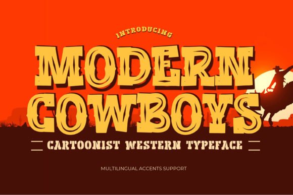
Modern Cowboys channels vintage western signage into a playful, cartoonist serif that reads as both nostalgic and theatrical. Chunky serifs, irregular curves and lively terminals inject a comic energy that works especially well for posters, children’s books, themed menus and rustic packaging. At larger sizes the letterforms stay crisp and expressive without tipping into kitsch.
The typeface is optimized for display use with bold weights and stylistic alternates that let you dial the attitude from friendly to rugged. Generous spacing improves legibility on signage and labels, and the family handles headline hierarchy with confidence. Try it for product packaging, festival posters or logo marks that want an unmistakable Americana accent paired with a condensed sans or textured background.
╰┈➤ Download Modern Cowboys Font
My Recommendation: I reach for Modern Cowboys when a project needs strong personality-think festival posters, themed packaging or novelty signage. Its bold shapes make headlines stand out, and the alternates let me adjust tone quickly from playful to gritty. Use it where character is the priority and neutral typefaces would feel forgettable.
21. Modern Authors Font
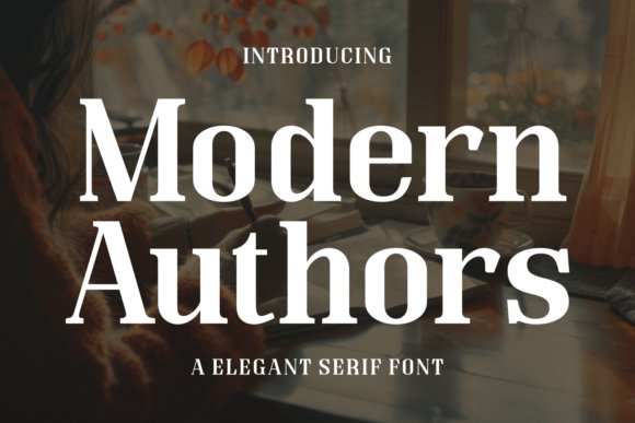
Modern Authors balances a solid structural backbone with refined contrast to deliver letterforms that feel both readable and composed. A tall x‑height, moderate stroke contrast and open counters make it excellent for long reads and editorial spreads where tone and clarity matter. The overall voice nods to classic book typography while subtle contemporary details keep it appropriate for modern branding.
OpenType features include oldstyle figures, small caps and discretionary ligatures that improve setting for running text and chapter titles, and multiple weights allow clear hierarchies without swapping families. It prints crisply at typical body sizes and renders reliably on screen, supporting thoughtful typography across formats. Pair it with a humanist sans for approachable corporate identity or use it alone for sober, literary layouts.
╰┈➤ Download Modern Authors Font
My Recommendation: I would choose Modern Authors for books, essays, and magazine work where calm authority and legibility are essential. Its feature set-small caps, oldstyle figures and ligatures-makes setting long-form text more precise, and the range of weights keeps hierarchy simple. It’s my pick for editorial projects that require a contemporary take on traditional serif types.
22. Modern Inspira Font
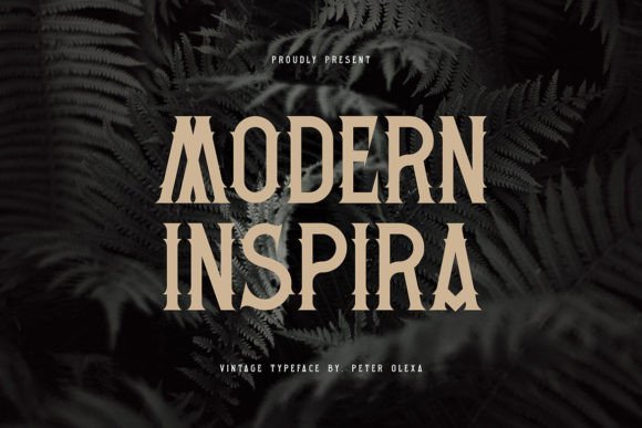
Modern Inspira channels mid-century poster typography with confident strokes and a retro silhouette. Its sharp terminals and generous bowls create lively contrast between angular serifs and soft counters, giving headlines presence without tipping into ornamentation. As part of Modern Serif Fonts, it injects vintage character into modern layouts while remaining highly readable at display sizes.
The family includes a broad range of weights plus tasteful alternates and tightened kerning for compact titling; swash and condensed options make it simple to craft distinctive wordmarks. Apply it to posters, boutique packaging, editorial mastheads or logos when you need bold personality rather than a delicate text face.
╰┈➤ Download Modern Inspira Font
My Recommendation: I reach for Modern Inspira when a design needs bold retro attitude with clear legibility. The alternates and range of weights let me move quickly from poster headlines to compact logos without swapping families. It’s ideal for record sleeves, fashion lookbooks, boutique labels and any project that benefits from vintage character.
23. Modern Heritage Font
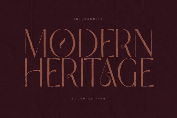
Modern Heritage pairs classical proportions with pronounced contrast to produce a refined, expressive serif that reads both stately and contemporary. Sculpted serifs, elegant terminals and carefully drawn numerals give the family a strong typographic voice that holds up across long settings. Its multilingual coverage and considered spacing make extended typesetting feel deliberate and polished.
The collection splits into Delicate and Rough editions, offering a clean editorial cut for luxury publications and a textured version for tactile branding. Use Delicate for magazines, catalogs and book covers, and select Rough for packaging or artisan identities where surface character and warmth are desirable.
╰┈➤ Download Modern Heritage Font
My Recommendation: I choose Modern Heritage when an identity must convey refinement with personality. The Delicate cut works beautifully for upscale editorial spreads, while the Rough edition brings handcrafted warmth to packaging and labels. Its consistent proportions and wide character set make it straightforward to deploy across print campaigns and product systems.
24. Modern Minimalist Font
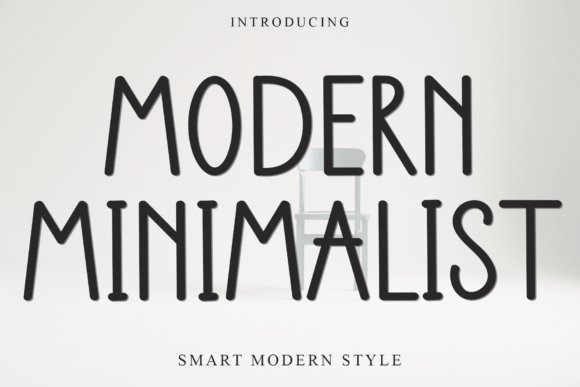
Modern Minimalist favors rounded terminals and playful strokes to create a relaxed, hand-rendered tone that reads approachable in both digital and print contexts. Open counters and generous forms improve readability at modest display sizes while preserving a handcrafted charm suited to invitations and social graphics. The lowercase runs have a conversational rhythm without feeling unpolished.
Technically, the font ships with PUA-encoded glyphs for decorative alternates and works across Photoshop, Illustrator and browser-based editors like Canva, though converting to a webfont is recommended for production sites. Pair it with a neutral sans for body copy to balance the warmth, or use it alone for badges, event materials and friendly brand identities.
╰┈➤ Download Modern Minimalist Font
My Recommendation: I use Modern Minimalist for projects that need a personable, low-key voice-party invites, indie blogs and playful branding. The alternates speed up custom headings and the rounded shapes print nicely on textured stock. For long bodies I switch to a neutral sans, but for display work this family adds charming, accessible character.
25. Morthwicks Font
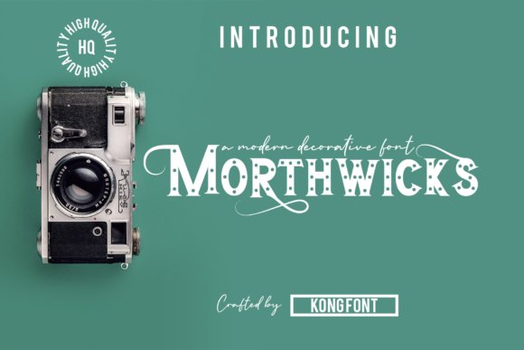
Morthwicks is a bold, assertive serif whose confident strokes and crisp terminals make it a strong choice among Modern Serif Fonts intended for display work. The letterforms show moderate contrast and compact proportions that hold up at large sizes, giving headlines and logotypes a distinct personality without losing readability. Its sturdy serifs and clear shapes respond well to tight tracking for polished typographic compositions.
Practical across print and digital workflows, Morthwicks feels at home on product packaging, posters, invitations, and social headers where typographic presence matters. It pairs cleanly with neutral sans faces for supporting body copy, and OpenType alternates add subtle variety for crafted wordmarks. When used carefully with kerning tweaks, the typeface becomes the visual anchor of a design system.
My Recommendation: I use Morthwicks when a project needs a strong typographic voice that reads clearly at display scale. Its bold forms give logos and editorial covers instant impact, and the alternates let me adjust personality without custom lettering. Ideal for boutique brands, packaging, posters, and any layout that benefits from a powerful serif headline.
26. Skelboune Font
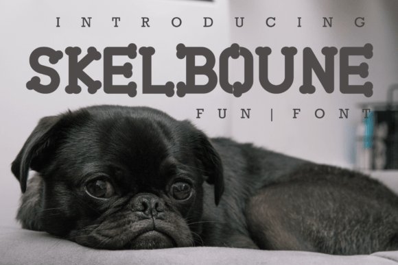
Skelboune adds a playful, approachable twist to classic serif traits with softened brackets and friendly terminals that read as whimsical yet composed. The face maintains open counters and modest contrast, which keeps it legible across craft prints, greeting cards, and small-format packaging while still feeling characterful. Its set of alternate glyphs invites subtle customizations that make headlines feel hand-styled rather than generic.
Built to work with common creative tools, Skelboune moves smoothly from Photoshop mockups to Silhouette cut files, saving time for makers and small studios. Pair it with a simple geometric sans to balance its cheerfulness, and tighten tracking slightly for compact wordmark treatments. Its personality often reduces the need for extra ornamentation in crafty, playful layouts.
My Recommendation: I reach for Skelboune for projects that need warmth and a handcrafted vibe without sacrificing readability. The alternates let me tweak letter shapes for playful logos and stationery, and its tool compatibility speeds production for craft-based businesses. Great for boutique stationery, kids’ products, and packaging where charm is the primary asset.
27. Allover Modern Font
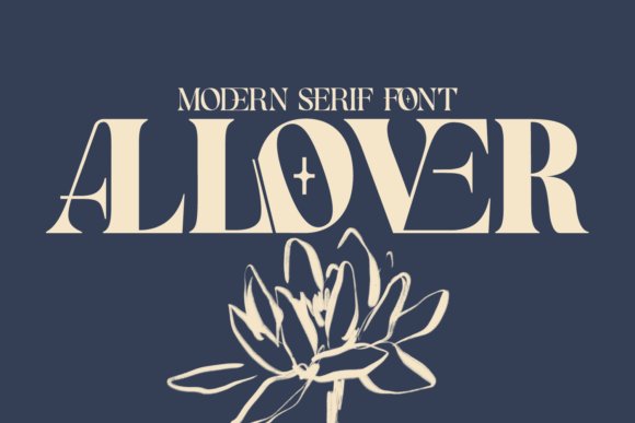
Allover Modern combines bold, decorative letterforms with restrained proportions so each character reads as both ornamental and usable across sizes. Distinctive terminal details work like tiny motifs, giving headlines and product labels clear identity while generous counters preserve legibility at display scale. The overall feel sits between classic fashion typography and contemporary display serifs, making it well suited to editorial and luxury contexts.
Because its shapes translate cleanly at large scales and remain readable when reduced, Allover Modern is reliable for magazine mastheads, product packaging, and stylish web headers. Tight tracking emphasizes the decorative cuts for logo treatments, while testing against textured backgrounds ensures the detailing doesn’t get lost. Built-in alternates and ligatures help create bespoke monograms without resorting to hand-drawn lettering.
╰┈➤ Download Allover Modern Font
My Recommendation: I choose Allover Modern when a brand needs refined, decorative typography that still performs in real layouts. Its ornamental strokes add instant character to packaging and headers, and the reliable forms keep copy legible. It’s an excellent pick for fashion, beauty, hospitality, and editorial projects that want a distinctly polished look.
28. Roliace – Modern Classy Serif Font
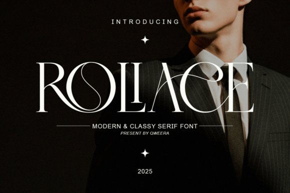
Roliace pairs sharp contrast with calm, measured terminals to create a poised serif that reads luxurious without being fussy. Its clean counters and deliberate stroke modulation give editorial spreads and premium packaging a composed, upscale voice. As part of any Modern Serif Fonts selection, Roliace balances presence and restraint for high-end identity work.
The family ships with multiple weights, small caps, discretionary ligatures and stylistic alternates, which let you craft bespoke headlines and wordmarks without heavy post‑production. At display sizes the hairlines sing; at text sizes the moderate x‑height preserves legibility. Use it when you need typographic refinement that still feels contemporary.
╰┈➤ Download Roliace – Modern Classy Serif Font
My Recommendation: I reach for Roliace when a brief calls for a polished, high‑end tone-its alternates and ligatures make logotypes feel handcrafted while the weights cover editorial hierarchy. It shines on magazine covers, fashion branding, and luxury packaging where typographic detail signals quality. The font family saves time when building cohesive systems across print and web.
29. Papillon Serif – Elegant Modern Luxury Font
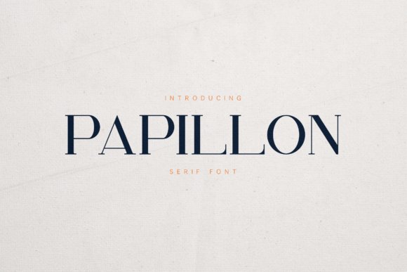
Papillon blends refined stroke contrast with gently organic terminals to produce a serif that feels both elegant and softly human. The letterforms display tasteful curves and slightly bracketed serifs that read well in luxury logos, fashion editorials, and boutique packaging. Its polished character works particularly well for large display settings where shape and rhythm matter.
Included ligatures, italics and alternates give Papillon expressive options without compromising clarity, so it adapts from bold headlines to subtle subheads. For digital layouts, pair it with a neutral sans to maintain hierarchy while letting the serifs add personality. The result is a stylish typeface that carries a handcrafted sensibility into modern branding systems.
╰┈➤ Download Papillon Serif – Elegant Modern Luxury Font
My Recommendation: I pick Papillon when a project needs a refined, slightly warm aesthetic-its curves bring a handcrafted touch that luxury brands appreciate. It’s excellent for logos, lookbooks, packaging, and editorial spreads where detail must read at large sizes. Pair with simple supporting typefaces to keep the overall system readable and elegant.
30. Chanceux Modern Stylish Serif Font
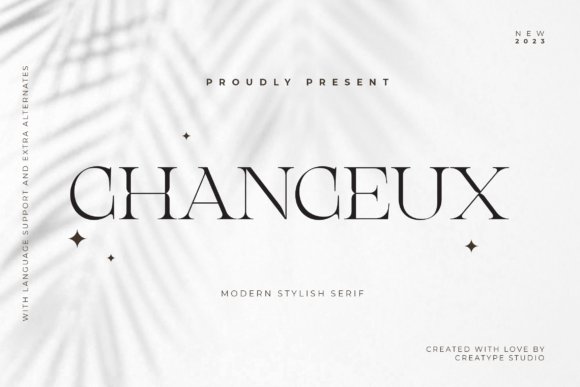
Chanceux combines crisp serif structure with script‑like swashes for a fashionable, expressive voice that’s built for display use. The PUA‑encoded glyph set exposes alternates, swashes and ornaments directly in most design apps, so creative headlines and invitations gain distinctive flair quickly. The overall effect feels contemporary with a decorative, personable edge.
Because the face includes many flourishes, it performs best in logos, wedding suites, product labels and social headers where ornamentation is an asset rather than a distraction. Pair it with a restrained geometric sans for body text to keep emphasis on the display forms. Licensing covers desktop and web use, making it flexible across channels.
╰┈➤ Download Chanceux Modern Stylish Serif Font
My Recommendation: I use Chanceux for projects that benefit from a signature look-wedding invitations, boutique branding, and hero banners where personality matters. The ready access to swashes speeds up iterations and reduces manual keystroke work, which is a big time saver. It’s not my choice for long copy, but it’s ideal when a memorable headline or mark is the goal.
31. Stetling – Elegant Modern Serif Font
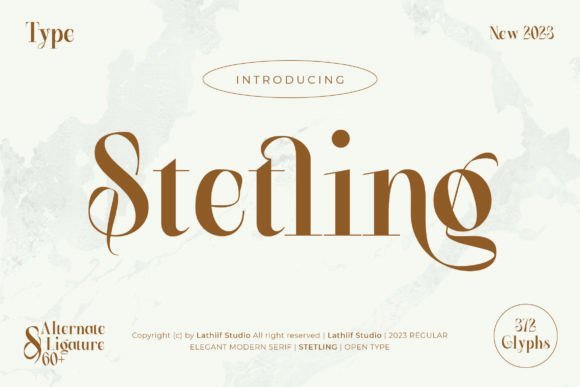
Stetling balances graceful, high-contrast strokes with soft terminals and refined brackets, giving layouts a poised, editorial presence. Its alternate characters are organized into stylistic sets, alternates and ligatures so you can shift tone from formal to intimate within a single family. Because OpenType features and PUA encoding are present, swashes and special glyphs are reachable in common apps for print and web.
Files include OTF, TTF and WOFF along with broad multilingual coverage, which makes Stetling reliable across identity, packaging and long-form headings; the delicate curves remain readable at display sizes and keep texture at smaller scales. The font’s combination of ornament and restraint positions it well among Modern Serif Fonts when a project asks for elegance without fuss.
╰┈➤ Download Stetling – Elegant Modern Serif Font
My Recommendation: I use Stetling when a brand needs a literary, upscale voice-its alternates let me nudge warmth into headlines or keep a crisp corporate look for logotypes. It’s my go-to for wedding invites, boutique packaging and editorial spreads where swashes add personality without undermining legibility. The PUA encoding and standard formats keep it quick to deploy across both Adobe apps and Microsoft Word.
32. Modern Bundles Font Bundle
This collection groups eight serif typefaces that share a contemporary aesthetic, from sculpted display serifs to softer text faces, offering several distinct moods in one purchase. Each font is PUA-encoded so ligatures, alternates and ornamental glyphs are accessible inside everyday editors, which accelerates mockups and client options. The bundle’s compact range lets you compare tonal directions without hunting separate licenses.
Practical file formats and straightforward installation mean you can assemble cohesive identity samples quickly, pairing sharper serifs with rounder companions to create contrast across headlines, subheads and accents. The set is useful for rapid prototyping, client presentations and small-brand toolkits where cost and variety matter equally.
╰┈➤ Download Modern Bundles Font Bundle
My Recommendation: I stash font bundles like this when kicking off brand work because they let me test several personalities fast and keep the visual direction flexible. The PUA encoding saves me time assembling decorative alternates for mood boards and sample lockups. Use this bundle for client explorations, packaging comps and projects that need several coordinated typographic voices.
33. Modern Royale Font
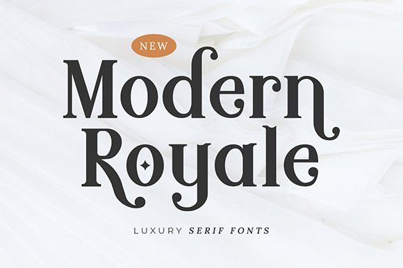
Modern Royale combines playful letterforms with classical serifs, producing a headline face that feels both stylish and slightly offbeat. Built-in swashes and alternate terminals provide decorative options that are easy to access thanks to PUA encoding, while thoughtful spacing prevents ornament from overpowering the base shapes. The result is a font that reads as editorial and bespoke at display sizes.
Designed for attention-grabbing headlines, Modern Royale also performs well for product names and boutique logos where personality matters; generous counters preserve clarity at smaller scales. Pair it with a restrained sans or a plain slab to give the serifs room to sing, and experiment with alternates early to pin down the exact mood you want.
╰┈➤ Download Modern Royale Font
My Recommendation: I pick Modern Royale when a project calls for a memorable headline voice that still reads professionally-its alternates let me craft variations that feel custom without extra lettering. It shines on labels, fashion editorials and boutique identity work where a little flourish makes a big impact. For best results I test several swash combinations in the layout stage so the chosen style integrates smoothly with imagery and spacing.
34. Modern Negra Font
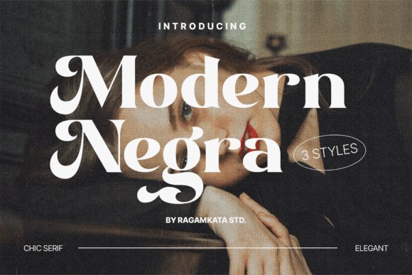
Among Modern Serif Fonts, Modern Negra presents a poised contrast between crisp vertical stems and softly tapered terminals, producing a refined silhouette that works at both display and modest text sizes. Its alternate characters and ligature set introduce subtle personality without compromising clarity, while careful kerning and extended Latin glyph coverage make it reliable for multilingual layouts. Designers will appreciate a medium x-height that preserves legibility at small sizes yet still reads elegant in large headlines.
Use Modern Negra for fashion editorials, premium packaging, and editorial mastheads where controlled contrast and characterful details matter. Pair it with a neutral geometric sans for longer copy or lean on its alternates for logos and pull-quotes to create rhythm with a single family. The face performs cleanly on screen and in print-tighten letterspacing for big headlines and increase leading in blocks of styled text to keep counters open.
╰┈➤ Download Modern Negra Font
My Recommendation: I reach for Modern Negra when a project needs quiet glamour: it gives headlines and marks a poised voice without feeling ornate. The alternates let me tweak tone quickly, and the thorough kerning plus multilingual support reduce fiddly adjustments. Great for fashion brands, boutique packaging, book covers and any layout where type needs to convey refinement and adaptability.
These 34 Modern Serif Fonts cover tones from reserved and scholarly to lively and expressive, with practical pairing and spacing guidance so you can match type to a project’s mood and medium. Short samples and setup notes reduce guesswork when moving fonts from concept to production.
Test the recommendations in context, check hinting and variable behavior across platforms, and confirm licensing before deployment. A well-chosen serif can anchor your typography while keeping readability front and center in 2026.