29 Playful Kawaii Fonts for Posts, Stickers and Shop Labels in 2026
kawaii fonts bring a bubbly, friendly personality to designs aimed at kids, hobby crafters, and boutique makers. This collection of 29 typefaces spans rounded sans, chubby display letters, and hand-drawn scripts that work well for stickers, packaging, and cheerful headers.
This guide highlights mood groupings, pairing tips, and simple licensing notes so you can test fonts on mockups before committing. Try a few combinations on sample art to see which style matches your color palette and artwork.
1. Chibi Girls Font
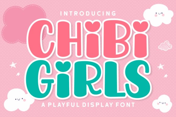
Chibi Girls reads like a hand-lettered set of bubble forms: soft, rounded strokes, slightly uneven baselines and playful offsets that feel intentionally handmade. It leans into kawaii fonts style with lively letter heights and irregular counters, which makes headlines, stickers and short copy feel like they’re smiling back at the reader.
The family includes upper- and lowercase characters, numerals, punctuation and multilingual accents for wider reach. For best results use generous leading, pastel palettes and a neutral sans for body text; small kerning nudges and modest drop shadows help the letters retain clarity at display sizes.
My Recommendation: I use Chibi Girls when a project needs immediate cheer-party invites, kid-focused packaging and social graphics all benefit from its handcrafted warmth. Its bold personality reduces the need for extra illustration, letting typography do the emotional work. Pairing it with a simple sans keeps layouts readable while preserving the font’s expressive charm.
2. Barbie Kawaii Font
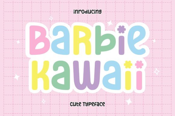
Barbie Kawaii combines high x-height and rounded terminals to deliver a friendly display face that reads clearly at large sizes. The shapes have a toybox charm with subtle retro hints that suit children’s books, posters and educational materials where approachability matters. It carries energy without becoming fussy, making it reliable for short headlines and cover text.
This type shines with pastel color schemes, sticker-style illustrations and simple icons; modest tracking keeps its warmth while preventing crowding. Ideal for branding, packaging and greeting cards, it pairs well with restrained sans serifs for longer copy and works cleanly as a webfont at display sizes after basic testing.
╰┈➤ Download Barbie Kawaii Font
My Recommendation: I pick Barbie Kawaii for projects aimed at young audiences or playful brands because it reads cheerfully and feels nostalgic without heavy ornament. It’s great for toy labels, event posters and classroom materials where instant recognition is key. I usually combine it with soft illustrations and muted pastels to maintain clarity and visual charm.
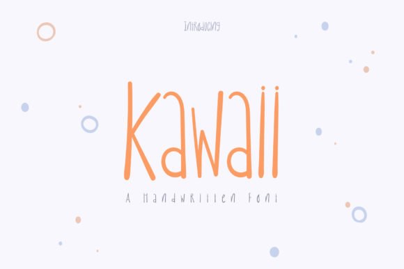
3. Kawaii Font
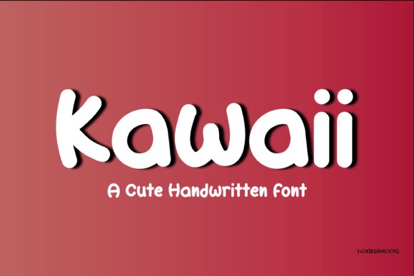
Kawaii Font is a rounded, script-adjacent display face that favors soft curves and flowing connections, giving copy a handwritten, upbeat cadence. Bold strokes and looping terminals lend personality to logos, party invites and social headers, while a gently bouncy baseline keeps the tone lively yet controlled. Short phrases become expressive marks rather than plain type.
OpenType alternates and ligatures help avoid repetition and create a more organic rhythm when the same letters repeat. Pair it with a neutral sans for body text, watch tracking at large sizes to prevent collisions, and use candy-colored palettes or frosting-like gradients to amplify its cheerful presence. Reserve it primarily for headlines and brand accents rather than extended paragraphs.
My Recommendation: I reach for this Kawaii Font when a project needs the feel of friendly handwriting without messy strokes-perfect for bakery logos, stickers and celebration graphics. The alternates let me craft bespoke wordmarks quickly and avoid repetitive patterns. It’s my go-to when I want a joyful signature that still reads cleanly across print and screens.
4. Kira Kawaii Font
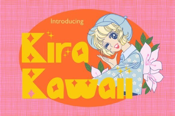
Kira Kawaii mixes playful roundness with tiny decorative sparkles borrowed from classic shojo manga; the letterforms feel handwritten but intentionally stylized, with soft terminals and gentle swashes that nudge each character toward the cute end of the spectrum. The design includes alternate glyphs and tiny star-like ornaments that sit well as accents, and it sits squarely among popular kawaii fonts for designers who want personality without sacrificing clarity.
This face performs well at display sizes for invitations, posters, apparel, and digital planner headers where the glittery alternates can punctuate words; it also keeps acceptable legibility on merchandise when set moderately large. Pair it with a neutral sans for balance, use pastel palettes to amplify its charm, and pay attention to tracking since the ornamented forms need breathing room to read cleanly.
My Recommendation: I reach for Kira Kawaii when a project needs a clear dose of sweetness-its sparkled alternates and warm curves give headlines and merch a hand-drawn personality. The font shines on party invites, kid-focused packaging, and cute apparel where decorative elements are welcome. It’s an easy win when you want adorable visual character without adding extra graphic assets.
5. Chibi Cheer Font
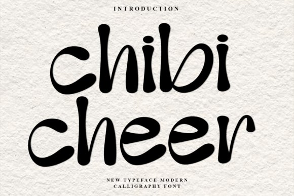
Chibi Cheer presents a modern-calligraphy feel with buoyant, bulbous strokes that bounce along a slightly irregular baseline, giving words a rhythmic, friendly cadence. The high-contrast stroke weights and liquid-like terminals bring a confident flair while staying approachable, and the overall letter rhythm reads quickly even in short phrases.
This script works well for character branding, stickers, playful stationery, and personality-driven social headers where a lively handwritten voice helps a brand stand out. For practical use, combine it with a clean geometric sans for body copy, limit long blocks of text, and lean into colorful palettes or sticker-style outlines to emphasize its buoyant charm.
My Recommendation: I use Chibi Cheer when a project needs a spirited, personable script that still reads well at headline scale. It’s particularly strong for stickers, creator logos, and pet- or kid-oriented brands because the letter motion feels joyful and familiar. The typeface gives identity projects an instant approachable mood without feeling childish.
6. Kawaii Font
This Kawaii font favors casual elegance with fluid strokes and slightly uneven baselines that mimic natural handwriting, lending warmth and immediacy to any composition. The forms are intentionally relaxed rather than ornate, which keeps the overall look friendly and easy-going while preserving a handcrafted sensibility.
Use it for branding that needs character without fuss, invitations that call for a personal touch, or social media graphics where a soft, human tone is desired; it pairs especially well with minimalist layouts to avoid competing textures. For best results, reserve it for headlines and short blocks of text, and tune letterspacing to maintain readability at small sizes.
My Recommendation: I pick this Kawaii font when I want a soft, authentic handwriting vibe that feels modern and relaxed. It’s ideal for boutique brands, lifestyle blogs, and greeting cards where a personal touch matters more than formal structure. The simplicity of the strokes makes it easy to pair with cleaner type for balanced layouts.
7. Kawaii PNG Pack Font
This collection delivers high-resolution transparent PNGs packaged in a single zip, each file at 3000×3000 pixels and 300 DPI for dependable print output. The hand-painted watercolor elements retain visible brush textures and soft edge detail, scanned and cleaned so backgrounds stay fully transparent and ready to layer. File names are organised for quick access and the set includes multiple color variations to suit a range of compositions.
Because the artwork favors pastel tones, rounded shapes, and cheerful motifs, these assets pair especially well with kawaii fonts when building stationery, product packaging, or playful web badges. The transparent backgrounds and generous resolution also make the pieces ideal for stickers, fabric transfers, and social-media overlays where crisp edges matter. They’re an efficient way to add handcrafted charm without rebuilding motifs from scratch.
╰┈➤ Download Kawaii PNG Pack Font
My Recommendation: I would reach for this PNG pack any time I need authentic watercolor charm with print-ready reliability. The large 300 DPI files save time when preparing invites, apparel mockups, or sticker sheets, and the hand-painted textures keep projects feeling artisanal. I recommend it for small-batch product labels, children’s party suites, and whimsical branding where tactile detail matters.
8. Kawaii Smile Font
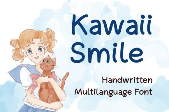
Kawaii Smile expresses a friendly handwritten voice through rounded terminals, slightly irregular strokes, and a bouncy baseline that reads as cheerful rather than fussy. Alternate characters and soft swashes give it extra personality for short phrases and headlines, while the spacing and kerning are tuned for display use. The overall balance keeps the look approachable and legible on screen and in print.
It performs best as a headline or decorative wordmark for kids’ packaging, party goods, informal logos, and playful web banners where an inviting tone is needed. Pair Kawaii Smile with a neutral geometric sans for body copy to preserve readability while the script carries the mood. Built-in ligatures and stylistic sets make it straightforward to craft varied, friendly typographic compositions.
╰┈➤ Download Kawaii Smile Font
My Recommendation: I use Kawaii Smile when a design needs warmth and approachability without losing clarity. Its alternates allow quick customization for greetings, labels, and sticker art, and it prints cleanly at display sizes. Ideal for children’s brands, casual product packaging, and social media headers that benefit from a friendly hand-lettered look.
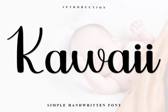
9. Kawaii Font
This Kawaii script leans bolder than many hand-lettered styles, offering confident strokes and slightly condensed letterforms that read strongly at headline scale. Open counters and thoughtful stroke contrast preserve legibility, while the handcrafted motion in each character gives text a tactile, human quality. The font maintains presence without becoming visually heavy, which makes it useful across physical and digital signage.
Because of its assertive personality, it works well on posters, apparel, café signage, and any application where short, punchy text must stand out. Combine it with thin or neutral body fonts to create clear typographic hierarchy and avoid visual clutter on longer passages. The result is a distinctive, bold handwritten voice that anchors brand marks and printed headlines effectively.
My Recommendation: I reach for this Kawaii script when a project calls for a strong hand-lettered identity that remains readable from a distance. It’s excellent for merchandise, event posters, and label work where bold shapes help messages pop. Use it for short headlines and pair it with understated body type to keep layouts balanced.
10. Chibi Unicorn Font
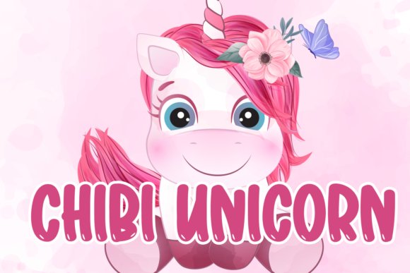
Chibi Unicorn Font brings plump, rounded letterforms with soft terminals and a buoyant rhythm that reads as joyful at first glance. It sits firmly among kawaii fonts thanks to generous counters, slightly condensed widths, and cheerful punctuation marks that feel hand-placed. The face immediately commands attention in titles, book covers, toy labels, and any layout that prioritizes charm over seriousness.
At display sizes the weight balances legibility with a friendly silhouette; tighter tracking often preserves the bubbly profile while preventing cramped shapes. Pair it with a neutral sans or a light script for secondary text, and favor pastel palettes or muted neons to amplify the cute sensibility. Keep in mind this design performs best as a headline or logo rather than long-form body copy.
╰┈➤ Download Chibi Unicorn Font
My Recommendation: I reach for Chibi Unicorn when projects need an instant warm personality-party invitations, toy packaging, and playful branding all benefit from its rounded energy. It prints reliably and scales well for large signage, which makes it a go-to for event posters. If you want a headline that reads friendly from a distance, this font delivers without fuss.
11. Kawaii Smile Font
Kawaii Smile Font is a cheerful decorative face with exaggerated x-heights and smiling counters that mimic casual, hand-drawn scribbles. The letterforms feel candid and approachable, so text reads less like typeset and more like friendly handwriting-perfect for kids’ activity sheets, classroom signage, and playful product tags. Its lively rhythm pairs well with sticker art and social-media headers where personality is the main objective.
Because of its strong character, use it sparingly as a display element and keep longer instructions in a simpler sans to preserve clarity. Try combining the face with bright duotones or textured paper to emphasize its handcrafted vibe, and slightly increase tracking for small-scale print to keep shapes open. It shines when used as a focal title rather than continuous text.
╰┈➤ Download Kawaii Smile Font
My Recommendation: I use Kawaii Smile for school-themed assets and craft labels because its approachable forms reduce visual distance with families and children. It adds warmth without feeling overly juvenile, which works well for community events and family brands. I usually balance it against a clean geometric sans so the layout remains readable and upbeat.
12. Lucky Kawaii Dingbats Font
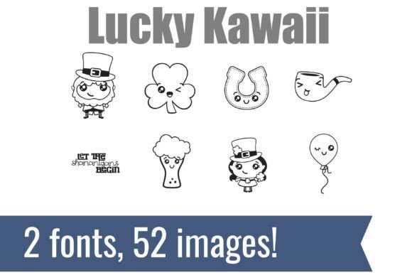
Lucky Kawaii Dingbats pairs two complementary display faces with 52 tiny, hand-drawn icons that put smiling expressions on classic holiday motifs. The set includes blushing shamrocks, happy horseshoes, cheerful leprechauns, and a smiling pint-glass character rendered with simple strokes that stay legible at sticker scale. These compact glyphs function as instant accents for seasonal stickers, children’s apparel, festive stationery, and classroom decorations.
The artwork reads like hand-inked sketches with clean vector edges, so exporting for print or digital use is straightforward and reliable. Use the dingbats as inline glyphs, decorative bullets, or repeat-pattern elements; contrast them with a neutral body font and limit the palette to avoid visual noise. This kit is ideal when you want joyful, ready-made icons rather than commissioning bespoke illustrations.
╰┈➤ Download Lucky Kawaii Dingbats Font
My Recommendation: I reach for Lucky Kawaii Dingbats during holiday campaigns when I need quick, charming motifs for stickers and kids’ clothing. The icons save time compared with custom illustration and slot easily into print and digital layouts. They’re particularly useful when paired with simple type and restrained color choices to keep the overall design playful but orderly.
13. Kawaii Christmas Dingbats Font
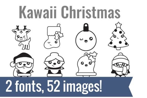
Kawaii Christmas Dingbats pairs two matching dingbat fonts packed with tiny holiday characters and animal ornaments. The bundle supplies 52 glyphs drawn in a rounded Kawaii style-big eyes, simple contours, and friendly silhouettes-rendered as clean outline vectors that scale without losing crispness. Typing a letter produces a ready-made graphic, which speeds up card layouts, gift tags, and planner-sticker sheets.
As a collection of kawaii fonts, the set installs into any design or cutting app so you can cut, sketch, or print right away with minimal prep. The outline forms invite coloring and vinyl transfer, and the consistent visual language across both faces keeps mixed compositions harmonious. It’s an efficient shortcut for makers who want cohesive seasonal icons without building assets from scratch.
╰┈➤ Download Kawaii Christmas Dingbats Font
My Recommendation: I keep this dingbat set on hand for holiday crafts and small-batch products because the matching glyphs remove guesswork when assembling themed artwork. The outline style is great for coloring pages, iron-on transfers, and vinyl decals, saving time I would otherwise spend tracing or reworking clip art. Use it when you need cheerful, scalable icons that look handcrafted but printable at any size.
14. Nice Dream Font
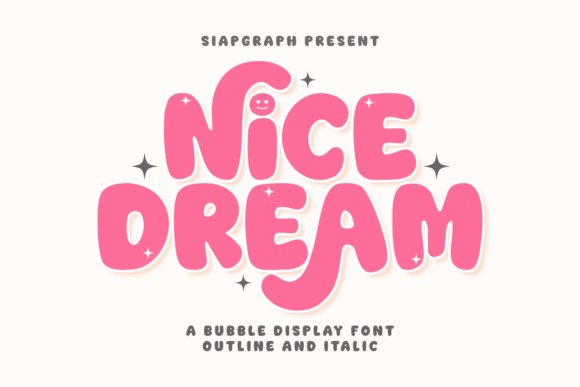
Nice Dream Font is a pillowy bubble display face with ultra-rounded terminals and thick, friendly strokes that read warm and inviting. Little touches-an i dotted with a smiley and tiny sparkle accents-inject personality that suits candy labels, toy tags, and vibrant social graphics. Because it fills shapes solidly, it performs well for short headlines and packaging art where a comforting tone is desirable.
The family includes PUA-encoded stylistic alternates that let you swap in decorative glyphs without complex font tools. That makes it simple to add subtle ornaments or switch to a softer form for subheads during layout work. Treat this face as a headline tool: pair it with minimal supporting elements to keep its bubbly character legible and effective.
My Recommendation: I reach for Nice Dream when a project needs a soft, cheerful headline-dessert menus, party invites, and playful brand marks are perfect fits. The PUA extras are handy for quickly adding personality without extra assets. Keep it large and high-contrast to retain its friendly feel and ensure readability on small screens or labels.
15. Kawaii Ghost Font (kawaii fonts)
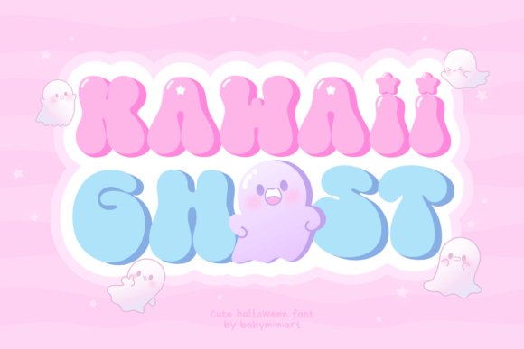
Kawaii Ghost Font blends retro groovy letterforms with tiny spectral mascots and star motifs to create a vintage-meets-cute display face. The rounded curves nod to ’60s and ’70s type while the small ghost ornaments and decorative stars add a whimsical accent that doesn’t overwhelm. Its decorative terminals and playful counters work well for greeting cards, themed posters, and brand marks that want a nostalgic wink.
Because the glyphs use steady stroke widths and generous counters, the type reads cleanly in short headlines and badge graphics; pair it with pastel palettes or bright accents to shift mood quickly. Included ornaments mean you can scatter ghosts and stars without assembling separate vectors, speeding up logo mockups and kids’ book headings. It’s best applied to display tasks where personality matters more than long-form readability.
╰┈➤ Download Kawaii Ghost Font (kawaii fonts)
My Recommendation: I pick Kawaii Ghost when a brief, characterful headline is needed-shop promos, party posters, or book covers aimed at younger readers work especially well. The embedded ghost and star motifs make pattern and merchandise mockups fast to produce. It’s a fun choice when you want nostalgic charm that reads instantly and adds a playful personality to packaging or signage.
16. Kawaii Voodoo Font
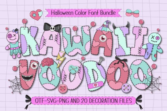
Kawaii Voodoo is a color font that pairs voodoo motifs-mini stitched hearts, tiny charms, and ritual-inspired patterns-with soft pastel fills to create a spooky-cute look. It includes four color font styles plus twenty matching doodles that speed up layout work and give designs a handcrafted, sticker-ready feel. This playful mashup sits firmly among kawaii fonts by turning Halloween themes into approachable, child-friendly artwork.
The letterforms remain legible even when layered with multicolor fills, which makes this set reliable for t-shirt printing, party banners, and large-format signage. The doodles work as repeating borders, accents, or standalone stickers, so you can build cohesive visual sets without extra illustration work. For tight layouts, pair it with a neutral sans to keep type readable while the pastels and icons take center stage.
╰┈➤ Download Kawaii Voodoo Font
My Recommendation: I’d reach for Kawaii Voodoo when designing Halloween invites, kid-focused party goods, or seasonal merch that needs playful charm. The built-in doodles and multiple color styles dramatically reduce compositing time for stickers and scrapbooking. This font is ideal for crafters, indie makers, and anyone producing festive packaging or event collateral.
17. Kawaii Font
Kawaii Font is a relaxed handwritten script with rounded terminals and a generous x-height that reads as friendly and informal. Slight baseline shifts and airy letter spacing give headings a genuine, hand-crafted presence while preserving legibility at smaller sizes. Its single-weight brush texture makes it particularly suited to social posts, greeting cards, and product labels that aim for a personal touch.
Subtle alternates and ligatures create natural word shapes so phrases feel hand-lettered rather than mechanically set. The style pairs well with a clean geometric sans or monoline iconography to balance its warmth. When using it in print, keep ink coverage low; on screens, slightly increased tracking improves clarity.
My Recommendation: I use this font for blog headers, craft packaging, and kid-centric branding where a handmade voice matters. It brings warmth to Instagram graphics and small DIY projects like stickers and tags. Pair it with minimal layouts so the script’s personality reads as intentional rather than decorative.
18. Chibi Eminem Font
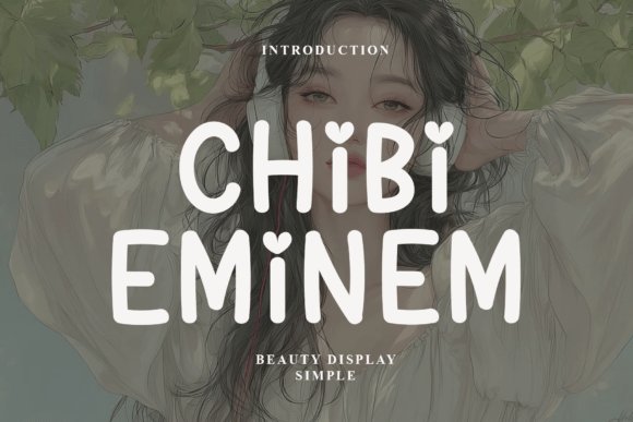
Chibi Eminem is a display font that combines compact, rounded letterforms with refined stroke contrasts to deliver a memorable headline voice. Decorative terminals and small flares on many characters give logos and posters a bespoke feel while preserving the speed of a ready-made font. It holds presence at large sizes without looking heavy, making it useful for storefronts, labels, and promotional posters.
The spacing balances well for both short wordmarks and bold statements, which is helpful when producing merchandise or stickers. Use its characterful shapes to create brand recognition, then set body copy in a restrained serif or sans to avoid visual competition. For tight pairings, reduce headline tracking slightly to emphasize rhythm and personality.
╰┈➤ Download Chibi Eminem Font
My Recommendation: I’d pick Chibi Eminem when I need a bold, playful headline that stands out on packaging or posters. Its distinctive details create instant recognition while remaining highly legible across sizes. It’s particularly effective for boutique brands, album art, and products aimed at younger audiences.
19. Kawaii Font
Kawaii is a chunky color display font built around bold, rounded letterforms and multi-layered fills that feel like hand-applied stickers. As part of the kawaii fonts family, it uses stacked chroma to give each glyph a tactile, sticker-like presence that reads clearly on posters and packaging. The heavy strokes and soft terminals preserve legibility at large sizes while keeping a playful, friendly voice.
Its colour layers include pastel gradients, confetti fills, and outline weights that work together to create lively headlines and title treatments. The font performs well over simple illustrations and clean backgrounds, and its generous counters help maintain clarity when printed or used in kid-focused digital layouts. Pair it with minimal body copy to let the display letters do the talking.
My Recommendation: I reach for this design when I need bright, joyful headlines that feel handcrafted. The multi-layer color options save time for sticker-style graphics and party invites. It’s a strong pick for children’s activity sheets, toy packaging, and any identity that benefits from chunky, friendly lettering.
20. Kawaii Kyarakuta Font
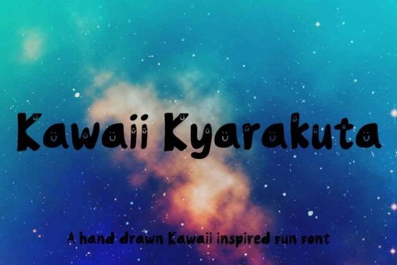
Kawaii Kyarakuta channels Japanese-inspired charm with tiny accents, starry terminals, and lively ligatures that give each word a cheerful bounce. The letterforms skew slightly narrow and feature playful counters, making short headlines and badge copy pop without overwhelming an image. Extra alternates and emoticon-like glyphs let designers inject personality into titles and social media assets.
The font works best at display sizes where its quirky details are visible, and it pairs nicely with flat-illustration styles and soft palettes for a cohesive look. It supports stylistic sets so you can dial up or tone down the cuteness depending on the project, though longer paragraphs will need spacing adjustments. Use it on merch, greeting cards, and playful UI headers for an instant friendly tone.
╰┈➤ Download Kawaii Kyarakuta Font
My Recommendation: I use Kawaii Kyarakuta when a project needs cheeky, sticker-like personality – think Instagram story covers, children’s stickers, or playful product labels. Its alternates let you vary the level of whimsy quickly. It’s ideal when you want expressive headlines that feel hand-drawn without custom lettering.
21. Kawaii Script Font
This Kawaii script font is a handwritten design with airy strokes, springy loops, and an irregular baseline that mimics casual penmanship. The rhythm sits between friendly and refined, lending logos, social headers, and packaging a personal touch without feeling overly formal. Ligatures and contextual alternates add a spontaneous, human hand to short lines of text.
Because the letters are light and flowing, the script shines when paired with a bolder display face or plenty of negative space so strokes remain legible. It’s well suited for café menus, artisan labels, and event invites where a warm, handcrafted vibe is needed. Keep tracking relaxed and let the characters breathe for the best results.
╰┈➤ Download Kawaii Script Font
My Recommendation: I reach for this script when I want warmth and personality without being overly sweet. It gives headlines and tags a handcrafted note that reads intimate and human. Perfect for small-batch brands, artisan packaging, and cozy editorial pieces where a personal touch matters.
22. Kawaii Stitch Font
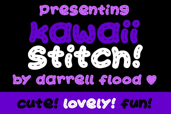
Kawaii Stitch channels a hand-stitched personality with letterforms that look like soft fabric patches sewn together; visible stitch marks and slightly uneven baselines give the type a handcrafted charm. Rounded counters and gentle terminals keep the face readable at display sizes while still feeling playful, and the deliberate irregularities create a tactile, homemade vibe. As one of the more playful kawaii fonts, it makes packaging, labels, and craft signage feel personal and approachable.
The set works well for headings, product tags, and scrapbooking where a sewn aesthetic adds narrative to a piece, and its solid fills export cleanly for vinyl cutting or sticker sheets. Pair it with a neutral sans for contrast or a delicate script for a boutique, handmade look. The glyph inventory is straightforward, which keeps production simple when you need consistent results across print and digital media.
╰┈➤ Download Kawaii Stitch Font
My Recommendation: I reach for Kawaii Stitch when I want a project to read as handmade at first glance – it sells the artisanal story without fiddly setup. It’s perfect for craft fair banners, sewn-product labels, and children’s goods where warmth matters. Use it when you want a cozy, tactile aesthetic that still performs reliably in print and vinyl cutting.
23. Lucky Kawaii Font
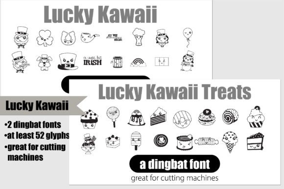
Lucky Kawaii comes as a duo of dingbat fonts: one set of 26 Saint Patrick’s motifs and a matching set of 26 dessert icons rendered with cheerful facial details. The icons are designed with solid shapes and closed counters so they cut cleanly on vinyl and paper, making them practical for Cricut and other cutting machines. Each glyph carries a lighthearted tone that suits party décor, gift tags, and confectionery labels.
The bold, single-color forms slot into layouts easily at small scales, so they translate well to cupcake toppers, stickers, or pattern borders without extra editing. Because the dessert and holiday motifs share a similar design language, you can mix the two for layered compositions or keep them separate for focused themes. The compact set speeds up production of themed printables and small-run craft projects.
╰┈➤ Download Lucky Kawaii Font
My Recommendation: I keep Lucky Kawaii in my toolkit for quick seasonal crafts and party-ready assets because the glyphs cut and print with minimal fuss. They save time when assembling invitations, sticker sheets, or edible toppers. Choose it when you need cheerful, reliable icons that read well at small sizes and work across vinyl, paper, and digital mockups.
24. Kawaii Unicorn Font
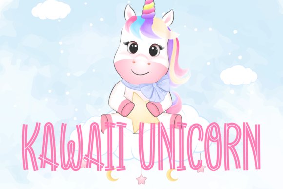
Kawaii Unicorn is a display face built around wide, rounded strokes and whimsical ornamentation-think tiny stars, heart terminals, and optional alternates that give words a fantasy-tinged personality. The decorative details are balanced so headings stay legible while still conveying a playful, confectionary mood suited to menus, posters, and product packaging. Its voice is lighthearted yet disciplined, which makes it adaptable to both print signage and digital banners.
Try using generous tracking for headline treatments to emphasize the airy letter shapes, or combine the type with a neutral sans for longer copy so the ornamentation can stand out. The font supports stylistic alternates and ligatures for crafting unique wordmarks, and it reproduces cleanly in both offset and digital print. It’s a solid choice when you need a sweet, fairy-tale look without sacrificing readability.
╰┈➤ Download Kawaii Unicorn Font
My Recommendation: I’d pick Kawaii Unicorn for dessert menus, birthday posters, or boutique candy branding where a bit of whimsy needs to feel deliberate. Its alternates let you create playful logos while keeping body text straightforward. Pair it with soft pastels and a quiet sans to let the decorative shapes sing without cluttering the layout.
25. Kawaii Display Font
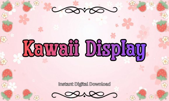
Kawaii Display pairs a chunky slab-serif backbone with softly rounded terminals, giving type a pillowy, friendly presence that performs well on stickers, t-shirts and planner spreads. The heavy weights keep counters closed for die-cut stickers and the broad stroke contrast makes pastel fills and simple outlines pop at display sizes. Because it supports common design apps like Canva, Procreate and Illustrator, you can produce crisp mockups for print-on-demand and sublimation projects without extra conversion fuss.
As part of a curated set of kawaii fonts, this face works especially well when matched with a delicate handwritten script or a low-contrast geometric sans to avoid visual clutter. Pay attention to kerning with two-letter combinations and tighten tracking for short headlines to preserve its bubbly rhythm. I find it ideal for kids’ logos, pastel packaging, and social posts where charm must read clearly at small scales.
╰┈➤ Download Kawaii Display Font
My Recommendation: I reach for Kawaii Display when a project needs an immediately friendly headline that survives vinyl cutting and fabric printing; its slab forms hold up through production. The rounded edges give colorwork a handcrafted vibe without extra illustration. Use it for children’s merch, planner stickers, sweet-shop packaging and any design that benefits from a sturdy, cute display face.
26. Kawaii Heart Font
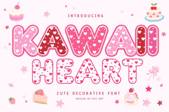
Kawaii Heart fills each letterform with tiny heart motifs, converting text into decorative emblems that work beautifully on greeting cards and seasonal packaging. The bubbly proportions keep the ornamentation legible, so the font still reads at label sizes and in social thumbnails. Swap solid fills for soft gradients or an outline layer to let the internal hearts stand out on textured paper.
This decorative type shines where charm matters more than paragraph copy-think Valentine’s promos, party invites and sticker sheets for kids. Pair it with a simple mono or geometric sans to ground layouts while the letters provide the playful focus. Test a printed sample at the intended scale, since the heart details read best at medium headline sizes.
╰┈➤ Download Kawaii Heart Font
My Recommendation: I’d pick Kawaii Heart when I want instant sweetness without drawing every element by hand-its patterned letters do the heavy lifting. It’s perfect for valentines, party invites and merchandise aimed at young audiences or playful brands. Reserve it for headlines, badges and accents rather than body text for the cleanest results.
27. Kawaii Dog Doodles Font
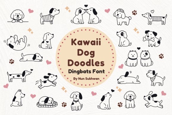
Kawaii Dog Doodles packages sketchy canine icons and playful marks into a dingbats font that feels hand-drawn and approachable. The loose, pencil-like strokes bring a warm, imperfect personality ideal for wedding signage, pet-product labels and scrapbook pages. Each glyph behaves like a little vector stamp, so you can scale them for tags or tiny stickers, though very fine lines may need a slight stroke boost to print consistently.
Use the glyphs as repeating borders, surprise characters in a pattern, or single spot illustrations paired with clean typography to keep compositions light. Exporting selected glyphs into layered documents lets you recolor and add textures in Procreate or Photoshop for a more tactile look. Treat this set as an illustration toolkit to speed layouts and add handcrafted accents rather than as a body text solution.
╰┈➤ Download Kawaii Dog Doodles Font
My Recommendation: I drop Kawaii Dog Doodles into pet-themed and kids’ projects when a hand-sketched touch adds more warmth than polished icons-the glyphs feel like quick ink sketches from a sketchbook. They speed up mockups for labels, invitations and crafts and are easy to recolor or layer. Use them as embellishments alongside simple type, and thicken fragile strokes before printing for best results.
28. Chibi Chubby Font
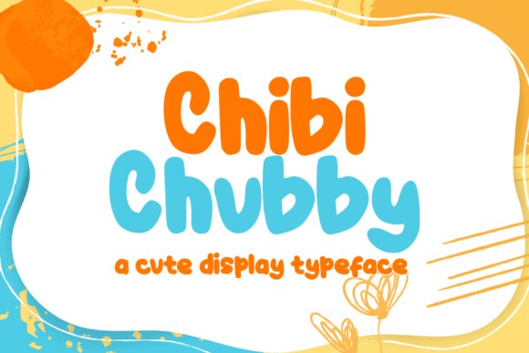
Chibi Chubby is a thick, handwritten-inspired display font built around plump, rounded letterforms that mimic a child’s pen strokes. Its heavy stroke weight and soft counters place it squarely among popular kawaii fonts and cute typefaces used for family-focused designs. The letters sit comfortably at large sizes, making headlines feel friendly rather than formal. The hand-crafted feel avoids mechanical uniformity, giving each word a personal, approachable tone.
This style works well for picture book covers, party invitations, toy packaging, and playful posters aimed at young audiences. Because of its bold shapes it prints cleanly on stickers and labels and pairs nicely with thin sans accents for contrast. If you want typography that reads like a kid’s handwriting without losing impact, Chibi Chubby fills that niche with warmth and clarity.
╰┈➤ Download Chibi Chubby Font
My Recommendation: I reach for Chibi Chubby when I need type that reads warm and immediate-it’s ideal for children’s products, event flyers, and casual branding. The heavy strokes hold up in print and on lower-resolution screens, and the rounded forms make pages feel friendly. Use it for large headlines, packaging, or any project that benefits from a playful, handwritten voice.
29. Chibi Love Font
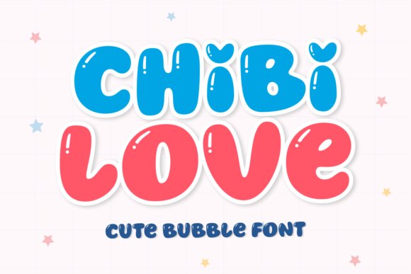
Chibi Love offers a bubbly, affectionate take on rounded display letters, with gently flared terminals and tight counters that give each character a lively bounce. The font evokes sweet, conversational handwriting and suits projects that need a tender, handwritten mood without appearing childish. Its rhythmic shapes feel upbeat and make titles sing, drawing attention without shouting. Small details-like subtle heart-like curves and soft joins-add personality while keeping text readable.
Apply Chibi Love to greeting cards, social media graphics, product labels, and kid-focused branding where a cheerful, intimate tone is required. It pairs especially well with light scripts or neutral sans faces and performs best at display sizes where its quirks can be appreciated. For invitations, candy wrappers, or friendly logos, this face brings a playful, cozy identity to your words.
My Recommendation: I choose Chibi Love when a design needs a friendly, bubbly voice-its rounded forms feel like a handwritten note. It works beautifully on cards, product labels, and social posts that should read warm and inviting. Combine it with soft colors and simple supporting type to let its personality shine without competing for attention.
These 29 kawaii fonts make it easy to add a lovable, approachable tone to small-run products and social content. Test weights and readability at tiny sizes, preview designs on mockups, and check license terms if you plan to sell items.
Picking the right type often comes down to matching emotion and legibility rather than choosing the flashiest option. Spend a little time pairing fonts with your illustrations and colors, and support independent type designers when you can.