41 Vibrant Typeface Summer Fonts for Packaging and Social Graphics in 2026
If you want typography that reads like a warm day, typeface summer fonts are the fastest way to set a sunny mood for your designs. This list gathers 41 options spanning playful scripts, airy sanses, retro surf lettering, and bold display faces suited to print and screens.
Each entry includes usage tips and pairing ideas so you can match tone and medium: labels, social templates, event invites, or product packaging. Expect examples that work equally well for casual branding and seasonal campaigns.
1. Sweet Summer Font
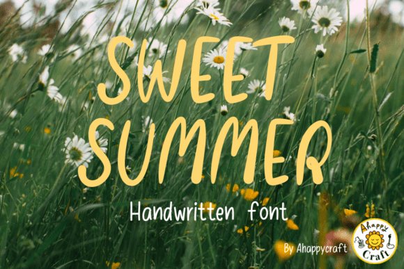
Sweet Summer feels like a handwritten note left on a picnic blanket: tall, slightly tapered forms with soft, organic terminals that read airy and personal. As part of curated typeface summer fonts , this design balances legibility with a playful irregularity-small swashes and variable baselines give headings a handcrafted personality without sacrificing clarity. It carries a faint vintage warmth while keeping a fresh, modern rhythm that works well at large sizes or in short lines.
Use it for seasonal branding, artisanal packaging, festival posters, or social headers that need a human touch and sunny temperament. It pairs elegantly with muted terracotta, warm sand tones, or vibrant citrus palettes and sits nicely over soft bokeh photography to create an intimate, sunlit mood. The face also performs well as a single-line display or layered with a subtle shadow for extra depth.
╰┈➤ Download Sweet Summer Font
My Recommendation: I reach for Sweet Summer when a project needs a friendly, handcrafted headline that still feels polished-wedding invites, small-batch food labels, and lifestyle blog mastheads all benefit. Its slightly narrow letterforms conserve space without looking cramped, and the organic curves lend genuine warmth that stock scripts often lack. For projects aiming to feel artisanal and approachable, this font delivers personality with reliable readability.
2. Summer Ambience Font
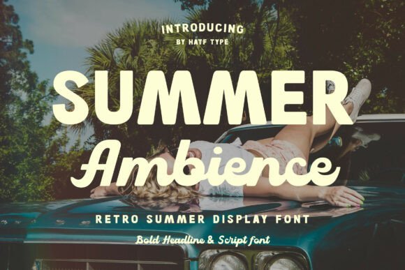
Summer Ambience channels retro coastal signage with bold, rounded forms and a subtle mid-century bounce in its letter shapes. The clean contours and moderate x-height make it immediately readable while retaining decorative character, thanks to selective flared terminals and soft geometric counters. It reads confidently at billboard scale but also holds up for smaller printed goods where a vintage flavor is desired.
This display face is a natural fit for holiday posters, seaside event invites, branded merchandise, and social media campaigns that want a sun-soaked, nostalgic vibe. Try it against sun-faded gradients, linen textures, or hand-painted backgrounds to amplify that warm, beachside feel. Mixing it with a neutral sans for body copy keeps layouts balanced and modern without losing the retro charm.
╰┈➤ Download Summer Ambience Font
My Recommendation: I use Summer Ambience when a project needs bold personality with clear readability-think festival banners, surf shop logos, or summer collection lookbooks. Its retro cues read immediately familiar, which helps brands tap into an easygoing, vintage mood. Pair it with textured photography and warm color palettes to make headlines pop while keeping supporting text clean and restrained.
3. Summer Crush Font
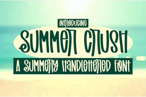
Summer Crush is a quirky, handcrafted script with lively connections and slightly irregular brush strokes that feel made by hand rather than generated. The glyphs include friendly ligatures and alternate forms that add a bespoke touch to each word, and the letter joins are optimized for clear outlines-handy for cutting machines and vector exports. Overall it reads intimate and playful, with a compact rhythm that works well across digital and print formats.
This typeface excels for Cricut and Silhouette craft work, SVG design shops, digital planner covers, and apparel graphics where a personal handwriting aesthetic is desired. It pairs especially well with minimalist sans-serifs for body text and shows great contrast against soft pastels or bold neon accent colors. Because the strokes translate to clean vectors, it’s an efficient choice for both print-on-demand apparel and social quote graphics.
╰┈➤ Download Summer Crush Font
My Recommendation: I pick Summer Crush for projects that need a handcrafted, boutique feel-small brand identities, planner stickers, and tee designs benefit most from its quirks and alternates. It’s forgiving in production: the joins and stroke endings export cleanly for vinyl cutting and on-demand printing. If you want type that reads like a friendly signature but still behaves technically, this is a strong, dependable option.
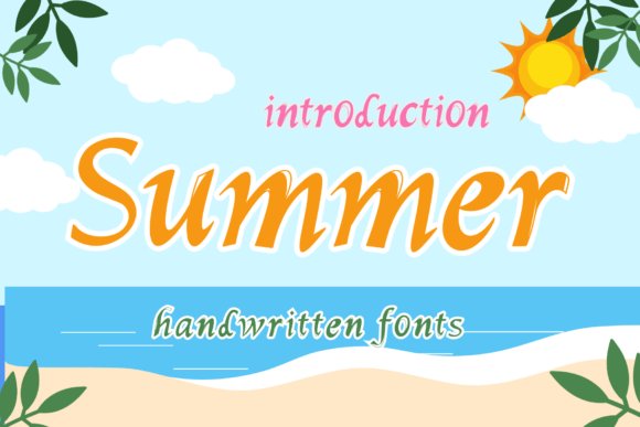
4. Summer Font
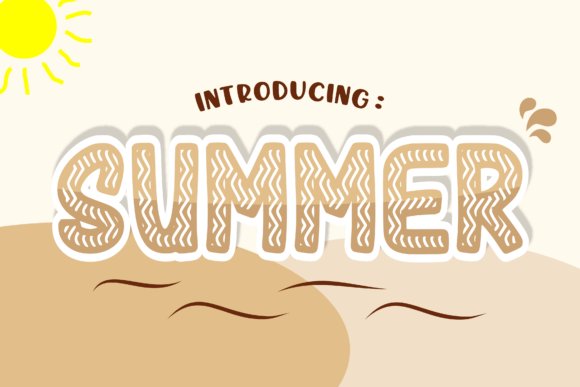
Summer channels the warm immediacy of sunlit coastlines with a relaxed script and soft terminals that mimic hand-lettered signs. The letterforms feature loopy ascenders, sunburst-like terminals, and optional swash alternates that read well at display sizes. As part of typeface summer fonts , it brings a bright, friendly voice to headlines and editorial pull-quotes.
Open counters and generous spacing keep legibility intact on posters, banners, and digital headers, while subtle roughening injects a tactile, analog feel. Multiple stylistic sets and ligatures allow playful compositions for logo work or product packaging. Pair with a low-contrast sans for text blocks to balance its lively rhythm.
My Recommendation: I reach for Summer Font when a project needs instant warmth and a handcrafted touch. Its swash alternates and readable forms make it ideal for travel editorials, coastal product labels, and seasonal campaigns. I like using it at large scale against muted backgrounds so the lettering breathes and the sunlit character comes through.
5. Ice Cream Cone Font
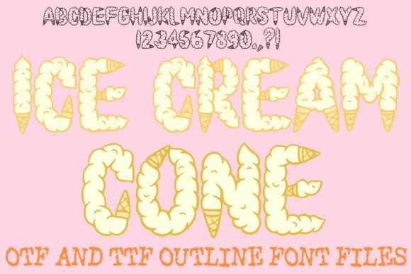
Ice Cream Cone turns type into a playful treat with soft-serve curls, melting drips, and subtle waffle-texture accents woven into each character. The bubbly letterforms keep strong counters and consistent strokes, so the whimsy reads clearly on print and screen. A hand-drawn outline gives the set a craft-market charm while alternates let you adjust the level of sweetness.
Best used at display sizes, the font brings personality to shop signage, birthday invites, festival posters, and playful social content. Layered color options and built-in alternates let you create convincing two-color scoops or classic cone effects. For balance, pair it with simple icons or solid pastel backgrounds to avoid visual clutter.
╰┈➤ Download Ice Cream Cone Font
My Recommendation: I pick Ice Cream Cone Font for briefs that require instant friendliness and food-forward personality. It works beautifully for dessert shops, seasonal promotions, and kids’ party pieces where the type itself becomes part of the illustration. Keep compositions airy and use high-contrast fills so the melting details stay legible and fun.
6. Cartton Style Bold Font
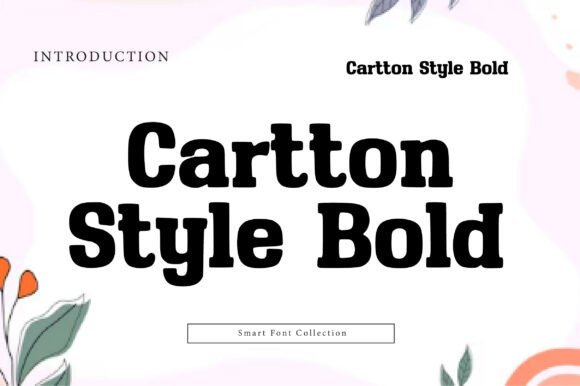
Cartton Style Bold is a chunky slab with rounded terminals and exaggerated proportions that nod to cartoon signage and sticker art. Heavy stems and wide bowls create a lively, attention-grabbing headline voice without collapsing the counters, so it remains readable at short viewing distances. The family includes outline and shadow layers for instant cutout effects and playful mockups.
This typeface excels on toy packaging, event posters, snack branding, and summer-camp materials where bold attitude is required. Thick strokes tolerate bright fills and heavy outlines while still maintaining form clarity. Pair with a compact sans for captions to preserve typographic hierarchy and keep layouts focused.
╰┈➤ Download Cartton Style Bold Font
My Recommendation: I reach for Cartton Style Bold when a design must shout with personality and remain legible across formats. Its weight and optional layers make it perfect for packaging and large-format posters, and it accelerates mockups thanks to built-in outline and shadow styles. For kids’ branding I combine it with playful illustrations and a punchy color palette to maximize shelf impact.
7. Mermaid Summer Font
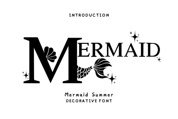
Mermaid Summer turns ocean-inspired calligraphy into a decorative display that brims with curl-tipped swashes, delicate tails and carefully designed alternates. The face includes contextual ligatures and ornament glyphs that allow you to vary word endings and create marquee-style headlines while keeping tight readability at larger sizes. Its rhythm feels hand-lettered without the messiness of true brush scripts, so color fills and texture overlays sit cleanly on print and product mockups.
On a practical level, the font prints crisply on mugs and apparel transfers and the open counters maintain legibility on labels-making it a natural pick when curating typeface summer fonts for seasonal packaging and social campaigns. Pair it with a restrained sans for contrast, mind the tracking on tightly set lines, and lean into seaside color palettes to emphasize its mermaid mood.
╰┈➤ Download Mermaid Summer Font
My Recommendation: I reach for Mermaid Summer when a project needs a playful, seaside personality without extra illustration work. Its swash alternates and ligatures let me craft unique wordmarks and greeting-card headlines quickly. Great for boutique packaging, event posters, and any piece that benefits from hand-lettered charm with reliable print behavior.
8. Dolphino Font
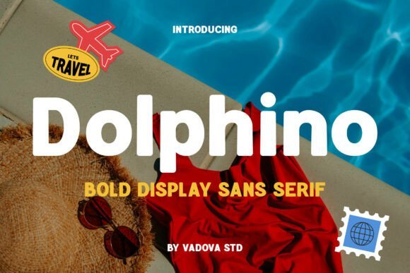
Dolphino is a bold sans serif display with heavy strokes, softened terminals and a confident, sun-ready silhouette. The generous x-height and smooth curves create strong legibility from a distance, while compact counters keep letterforms readable in tight compositions. Its weight and clarity make it an obvious choice for short headlines and stacked typographic treatments.
Designed to perform across digital banners and printed posters, Dolphino anchors travel-branded layouts, product labels and event signage where clarity and attitude matter. Use it in uppercase blocks for posters, or mix with lighter body text for editorial spreads; the type holds color fills and textured backgrounds without losing presence.
My Recommendation: I use Dolphino when a design calls for confident, beachy energy with high-impact visibility. It’s particularly effective for travel posters, packaging that must read at a glance, and promotional graphics for outdoor events. The family’s weight works well for bold logotypes and display headlines where simplicity and punch are priorities.
9. Disnay Summer Font
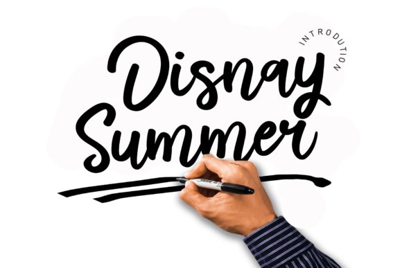
Disnay Summer is a delicate handwritten script with flowing strokes and a light, graceful rhythm that reads like a practiced signature. It balances airy ascenders with steady baseline anchors, offering alternate forms that help avoid repetition in repeated words. The result is an approachable script that feels personal without appearing chaotic.
Because the letterforms keep open counters and modest contrast, Disnay Summer performs well on wedding invites, boutique logos and editorial pull-quotes where an elegant hand is desired. Activate its OpenType alternates for natural-looking letter joins, pair it with a clean serif for contrast, and prefer vector exports for tight print runs to preserve fine stroke detail.
╰┈➤ Download Disnay Summer Font
My Recommendation: I pick Disnay Summer for projects that need an intimate, handcrafted touch-think invitations, boutique branding and signature-style logos. Its alternate glyphs provide subtle variety so repeated phrases feel fresh. It’s a reliable choice when you want elegance that still reads clearly across print and high-resolution digital uses.
10. Hand Drawn Beach Font
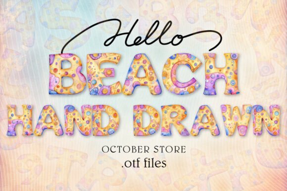
Hand Drawn Beach feels like a summer scrapbook rendered in type: 36 charming characters (26 letters plus 10 digits) with sketchy strokes, uneven baselines and playful gaps that mimic crayon and marker work. The alphabet doubles as a coloring-ready asset, inviting kids’ activity-sheet layouts and craft projects while keeping a breezy, seaside personality; this quality makes it an obvious pick among typeface summer fonts for playful seasonal work. The irregular shapes capture sandy textures and casual loops, so titles read as handcrafted notes rather than polished display type.
This is an OpenType-SVG color font, so Photoshop, Illustrator, Silhouette and Inkscape all show its built-in fills and textures; plain OTF/TTF builds are not included and will not function with Cricut. For print, export high-resolution PDFs and nudge kerning for compact headlines; layered mockups and sticker art leverage the color fills best, and the supplied guide helps with app-specific setup and troubleshooting.
╰┈➤ Download Hand Drawn Beach Font
My Recommendation: I’d reach for Hand Drawn Beach when crafting party invites, kids’ activity sheets, or any beach-themed packaging that benefits from a hand-sketched aesthetic. The built-in color fills save time on multi-layer mockups and make it simple to produce playful printables. It’s especially useful for seasonal merchandise, camp flyers, and DIY stickers where a handcrafted, childlike look is the goal.
11. Sunfun Summer Font
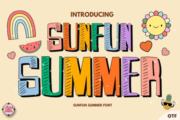
Sunfun Summer is a display font with rounded terminals and open counters that read happily large or small, giving headlines a sunny, punchy presence. Its letterforms lean slightly condensed with friendly curves, so short phrases carry strong personality without losing legibility on posters and social banners. Use it when you need a bold summer mood that still respects tight layout space.
Color choices change its voice dramatically-warm corals and golds push retro surf feelings while bright cyan and lemon favor a pop-art vibe-so the family adapts well across menus, festival flyers and seasonal packaging. Pair Sunfun Summer with a neutral geometric sans for long copy, and consider subtle shadows or outlines when placing it over complex photos to keep contrast clear. The font scales cleanly for large-format prints and digital hero headers alike.
╰┈➤ Download Sunfun Summer Font
My Recommendation: I pick Sunfun Summer for campaign headers, seasonal product labels, and event posters that demand instant recognition and a cheerful tone. Its open shapes and strong presence make it a reliable display choice, while color treatments allow quick mood shifts between retro and modern. It’s especially handy for pop-up markets, beach festivals and seasonal promos where headline personality matters most.
12. Summer Time Font
Summer Time is a casual script that mimics relaxed handwriting with a gentle slant and moderate stroke contrast, giving projects a warm, human touch without sacrificing readability. Letters connect loosely rather than forming tight chains, which produces a breezy, informal rhythm that suits short phrases, logos and postcard headers. The overall impression is friendly and personal-ideal for materials that should feel handcrafted rather than formal.
The script’s spacing and open counters make it easy to tweak for logotypes or to add ornaments like sunbursts and swashes for seasonal flair. Pair it with a clean sans for body copy or layer it over textured backgrounds for apparel and packaging with a nostalgic summer vibe. Small adjustments to letterspacing turn the font from a casual headline into a custom wordmark.
My Recommendation: I use Summer Time when a project needs an approachable, handwritten voice-think boutique labels, lifestyle blog headers, or T-shirt designs. Its legible loops perform well in both print and on-screen contexts, and modest kerning tweaks yield a bespoke look for branding. It’s a go-to when warmth and personality are more important than strict formality.
13. Hellonesia Font
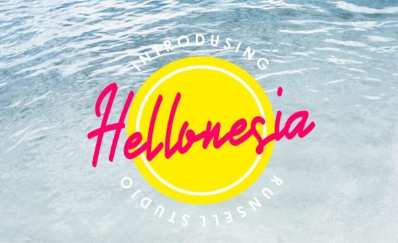
Hellonesia is a lively handwritten script with broad, flowing swashes and a slightly tilted baseline that reads like a sun-bleached signature. The letterforms show modest stroke contrast and textured endings, which keep display treatments readable while feeling handcrafted. Contextual alternates and open tails give designers room to vary headlines without repeating the same motifs.
As part of curated typeface summer fonts , Hellonesia brings beachy warmth and a bold voice suited to posters, surf labels and seasonal packaging. Its swash set is extensive but tasteful, so limit decorative forms in tight layouts and reserve them for hero type or logotypes. Pair with a neutral geometric sans for captions to maintain balance and clear hierarchy.
My Recommendation: I reach for Hellonesia when I want a relaxed, seaside signature that still performs at headline scale. The alternates and swashes let me create bespoke wordmarks without adding extra illustration. Use it for surf brands, seasonal promos, event posters and packaging that need handcrafted warmth.
14. Summer Font
Summer Font channels a breezy, cheerful handwriting with rounded terminals and generous spacing that makes short headlines feel friendly and open. The even stroke weights and soft curves give it instant legibility on screens and print, while a casual baseline rhythm keeps the tone relaxed. It works well for playful branding, kids’ book covers and bright social graphics where clarity and warmth matter.
The font behaves predictably at small sizes, so you can use it for captions as well as titles, but watch tracking when setting long sentences. Color choices and light gradients amplify its holiday vibes; try warm corals, pale yellows and ocean blues to match the mood. Pair it with a condensed sans for tight layouts or with hand-drawn icons for invitation suites.
My Recommendation: I pick Summer Font for upbeat social campaigns and children’s projects because its rounded shapes feel approachable and legible. It fast-tracks cheerful mockups, and a few thoughtful color choices make the voice even stronger. Ideal for invitations, seasonal emails, and casual brand touches.
15. Orange Fruit Font
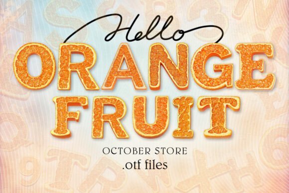
Orange Fruit Font is an OpenType-SVG color alphabet where each character carries layered color and texture, mimicking citrus peels and juicy highlights. When opened in compatible apps the letters render as full-color artwork, creating instant, snackable headlines that read as playful, food-themed graphics rather than plain type. The design excels in labels, summer festival posters and any packaging that benefits from a tongue-in-cheek, fruity personality.
Note that the color glyphs require software support (Photoshop, Illustrator, recent Inkscape builds) and the vendor does not provide compatible OTF/TTF versions for Cricut use. For cutters or older apps, outline the letters or export rasterized art to preserve the look. I recommend reserving this color font for display text and pairing it with a neutral sans for body copy to avoid visual competition.
╰┈➤ Download Orange Fruit Font
My Recommendation: I use Orange Fruit Font when a project needs instant, colorful character-especially for packaging or event posters tied to food or summer markets. The SVG glyphs save time producing textured lettering, but I always verify export and cutter compatibility before starting a full run. Great for labels, menus, and festival branding where a literal fruity motif is the main idea.
16. Summer Afternoon Font
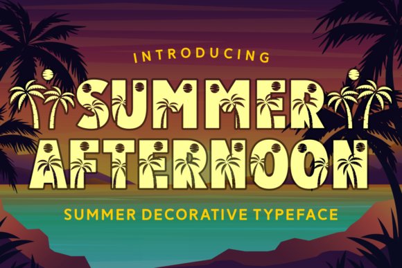
Summer Afternoon Font channels tropical beach energy into a decorative display face: each glyph carries sunset hues and tiny palm silhouettes carved into its counters, so the type reads as ornament as much as letterform. That distinctive styling makes it one of the more playful typeface summer fonts for seasonal headers, posters, and product art, especially when set against orange, white, or sun-yellow palettes. Aim for large sizes where the palm details remain readable, and avoid over-tight tracking which can collapse the tiny motifs.
This design shines on sale banners, event posters, album covers, and party tees where a vacation attitude is the message-use it sparingly as a headline or logo accent rather than body copy. For balance, pair it with a clean sans for supporting text and consider emboss or spot-gloss print finishes to accent the sunset strokes; online, subtle drop shadows help separate the ornaments from busy backgrounds.
╰┈➤ Download Summer Afternoon Font
My Recommendation: I’d pick Summer Afternoon when I need instant summer character-its palm and sunset detailing gives a playful, branded feel without extra illustration work. It’s ideal for seasonal campaigns, beach event posters, and limited-run merch where the headline needs personality. Use it where the message benefits from ornamented letters rather than long paragraphs.
17. Kiwi Fruit Font
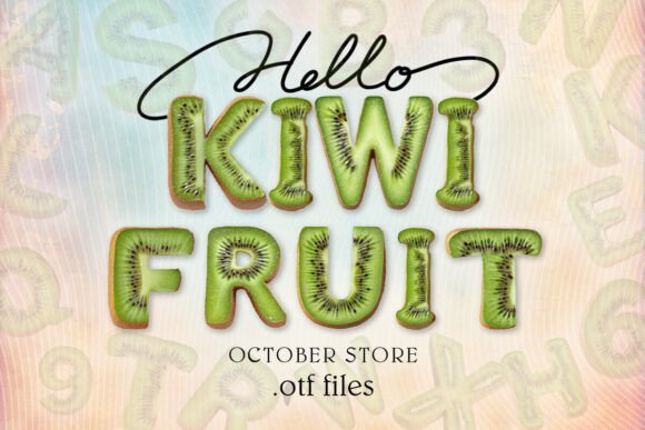
Kiwi Fruit Font is delivered as an OpenType-SVG color font that layers juicy textures and bright fills into each character, producing a tactile, juicy look that reads like hand-painted signage. Because the color layers render inside compatible apps-Photoshop, Illustrator, Silhouette, and Inkscape-the glyphs keep their shading and multi-color structure instead of flattening to single-color outlines. Note that there are no OTF/TTF variants suitable for Cricut, so production workflows that depend on traditional font formats will require a different approach.
At display sizes the fruit-filled letters make an immediate impact for packaging, smoothie menus, kids’ party invitations, and sticker sheets; the playful shapes pair well with minimal backgrounds to keep the color fields legible. For layouts, use a neutral supporting type for captions and body text to avoid visual competition and export test files from your target app before committing to bulk print or cut jobs.
My Recommendation: I’d reach for Kiwi Fruit when a project needs bright, edible personality-food packaging, pop-up café menus, or playful web hero art are perfect fits. Its SVG color layers save time on illustration while delivering hand-painted texture. Just be mindful of compatibility limits and test in the target design app before final production.
18. Summer Dear Font
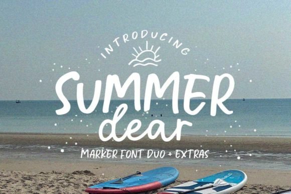
Summer Dear Font Duo combines a relaxed, handwritten script with a complementary set of extras that introduce weight and ornament without heavy editing. Built-in OpenType ligatures smooth letter joins for a natural pen-flow appearance, and the over 30 handcrafted alternates and ornaments give designers quick options for bespoke word treatments and elegant endings. The overall tone is warm and personal, making it easy to produce names, logos, or invitations that feel handcrafted.
Apply the script at medium to large display sizes on wedding stationery, lifestyle branding, greeting cards, and product labels where a human touch improves relatability; the alternates help avoid repetition in repeated words or initials. To preserve flow and legibility, pair Summer Dear with a restrained serif or geometric sans for body copy and spend a little time adjusting kerning on headline compositions to retain the handwritten rhythm.
My Recommendation: I’d use Summer Dear when a project needs an approachable, handwritten voice-wedding invites, boutique logos, and artisanal labels benefit most from its alternates and ligatures. The extras let me vary repeated text without manual redraws, and the script’s warmth reads as authentic rather than overly styled. It’s a reliable choice when personality matters but legibility can’t be sacrificed.
19. Holiday Font
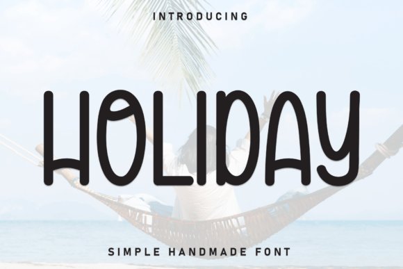
Holiday Font channels the easygoing mood of beach days with a handmade, monoline style and extremely rounded terminals. Its tall, narrow proportions and consistent stroke width give headlines a friendly, breezy cadence that reads like a postcard from the shore. For posters, camp flyers, and bright social tiles, this typeface summer fonts brings a sunny voice without fuss.
Despite the playful look, Holiday stays highly legible at a range of sizes thanks to open counters and a generous x‑height. It pairs well with tropical illustrations, bold color blocks, or clean photography to maintain approachability while still standing out. The font’s simplicity makes it especially useful for family-focused events and children’s materials where clarity and charm matter most.
My Recommendation: I reach for Holiday when a project needs cheerful, readable lettering that feels relaxed rather than precious. Its rounded monoline strokes cut through busy layouts while keeping a friendly tone, ideal for summer events, kids’ programs, and casual brand moments. Use it on posters, invites, and packaging when you want designs that feel warm and easygoing.
20. Wadingr Font
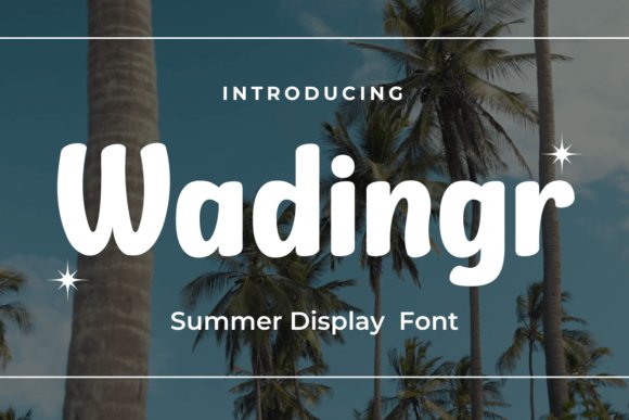
Wadingr Font presents a fresh, contemporary display voice with slightly condensed letterforms that suggest sunlit geometry and confident headlines. The design balances playful character with control, so large-scale titles remain striking and clean across print and screen. PUA‑encoded characters add decorative options without extra software hurdles.
This sans approach reads like modern beach signage: minimal ornament, clear presence, and easy pairing with photography or simple illustrations. It’s a solid pick for poolside banners, event posters, and seasonal packaging where a crisp summer attitude is needed. Broad language support and even weight distribution make layout choices straightforward for multi‑market campaigns.
My Recommendation: I use Wadingr when I want a modern, summery headline that stays bold without feeling busy. Its condensed proportions help fit longer words into tight spaces while maintaining a punchy personality. Ideal for posters, seasonal campaigns, and product labels that require a confident, sun‑soaked tone.
21. Bettaria Font – typeface summer fonts
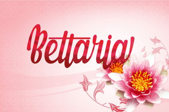
Bettaria is a bouncy script with thick, rounded strokes that read like warm, handwritten lettering-great for projects seeking a handcrafted, joyful vibe. Its rhythmic bounce and upbeat rhythm give logos, bakery marks, and social headers an instant smile without becoming twee. Pair it with floral motifs or pastel palettes to emphasize a sunny, romantic feel.
Generous counters and smooth joins make Bettaria more readable than many scripts, so it works well on invitations, tags, and short body copy. Alternates and ligatures offer variety and prevent repetitive patterns in display settings. Use it for boutiques, gift packaging, and seasonal collections that benefit from an approachable, cheerful signature.
╰┈➤ Download Bettaria Font – typeface summer fonts
My Recommendation: I pick Bettaria when a brand needs personality that feels handmade and sincere rather than slick. Its charming bounce and hearty strokes suit bakeries, florists, and small labels where warmth matters. Combine it with illustrated accents and soft colors to amplify its friendly, summery character.
22. Cloudy Font
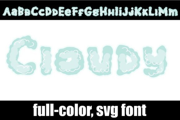
Cloudy is a full-color SVG font that looks as if each letter were brushed from a summer sky: soft blues, misty whites and delicate transparency live inside round, hand-drawn shapes. As one of the more playful typeface summer fonts , Cloudy builds subtle texture and translucency into every glyph so you get depth without extra layering. It reads best as a display face and keeps its charm at large sizes.
Use it for nursery wall art, children’s book titles, wellness packaging and social headers where a calm, dreamy tone matters. Because Cloudy is an SVG font, be mindful of platform support-export flattened PNGs for older workflows or keep vectors for modern web and app use. The font’s handcrafted feel pairs well with a simple sans-serif body to keep layouts from feeling visually busy.
My Recommendation: I’d reach for Cloudy when I want a soft, handmade headline that reads like watercolor. Its built-in SVG textures save time in mockups and give products a crafted, gentle vibe-excellent for children’s goods and wellness packaging. Just double-check format support when handing files off to printers or developers.
23. Summer Octopus Font
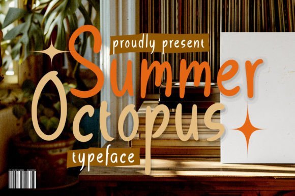
Summer Octopus is a hand-written script with playful, wavy strokes that mimic a carefree marker scribble. Letterforms vary in slant and length, giving text an energetic, beachside personality without losing legibility. The sculpted irregularity makes short phrases feel personable and spontaneous.
It works beautifully for casual invitations, surf-shop signage, kids’ party art and small-batch packaging where a lively hand matters. Keep body copy minimal-this font performs best as headlines, badges and logo wordmarks rather than long paragraphs. Pair it with a tidy geometric sans to give compositions a clear reading order.
╰┈➤ Download Summer Octopus Font
My Recommendation: I use Summer Octopus when a design needs a friendly, informal voice-party invites, posters and boutique packaging are natural fits. The wavy strokes add movement that photographs well on textured paper or screen. For brand work I combine it with a neutral sans to keep longform copy readable.
24. Tropical Times Font
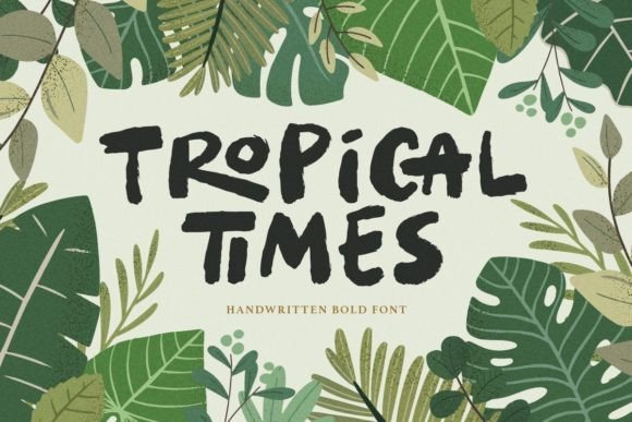
Tropical Times is a bold handwritten display with generous strokes and playful ligatures that recall island signage and sun-soaked posters. Characters carry weight and motion, so words hold attention across large-format prints and apparel. The included alternates help avoid repetitive shapes and give headings a handcrafted rhythm.
Apply it to quotes, branding, book covers and merchandise when you want a lively, confident headline. Work in vibrant palettes-coral, deep teal and sandy neutrals-and add a touch of extra tracking at very large sizes to prevent crowding. It pairs well with a simple serif or sans for supporting captions to maintain visual hierarchy.
╰┈➤ Download Tropical Times Font
My Recommendation: I pick Tropical Times for projects that need bold personality, such as tees, posters and storefront signage. Its ligatures and alternates make wordmarks feel bespoke, while the strong strokes survive screen and print at scale. For polished layouts I usually combine it with understated body text to keep attention where it belongs.
25. Marettimo Font
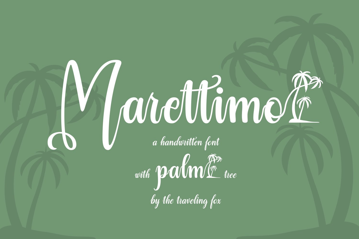
Marettimo channels a laid-back, island‑chic handwriting that reads like a sunlit note from a seaside café; soft joins and casual slants give text an approachable, human quality. It sits squarely among typeface summer fonts that aim for warmth rather than formality, with two weights-Regular and Italic-covering quick branding needs. The included palm-tree glyph serves as a compact decorative mark that pairs neatly with initials or logotypes.
Letterforms favor open counters and slightly generous spacing, which makes short headlines and social posts pop without feeling tight. Use it for beach event invites, product labels, or editorial pull-quotes where friendly handwriting sells the mood; the palm glyph and ligature textures help maintain personality at small sizes. Pair with a simple geometric sans for body copy to keep compositions balanced.
My Recommendation: I favor Marettimo when I need typography that smells of sun and salt-it’s immediate, legible, and charming. The palm glyph is a tiny tool that can turn a logo into something unmistakably tropical, and the two weights make it versatile for both headings and captions. Great for seasonal product packaging, travel blogs, pop-up cafés, and single-page event posters.
26. California Summer Font
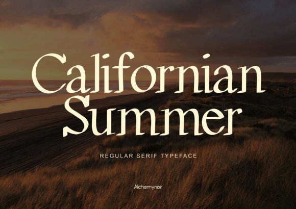
California Summer is a restrained serif with crisp terminals and a calm presence; its moderate contrast and steady x-height give type an elegant but unshowy voice. The shapes read as carefully considered rather than ornate, which makes it useful for logos, editorial headings, and merchandise where a touch of refinement is desired. Because the letterforms are straightforward, the type works well at medium to large sizes without fuss.
Small details-slight bracketed serifs and careful proportions-lend a quietly luxurious feel that pairs well with matte textures and muted palettes. Try it on apparel tags, premium stickers, or boutique branding where clarity and class matter more than ornament. Combine with a light script for accents or a neutral sans for longer copy to maintain visual order.
╰┈➤ Download California Summer Font
My Recommendation: I use California Summer when the brief asks for quiet luxury rather than flash; it gives designs a tasteful, legible backbone. Its clean serif details translate well across print labels, signage, and upscale packaging. Ideal for boutique clothing brands, editorial covers, and identity systems that prize clarity.
27. Summer Vintage Font
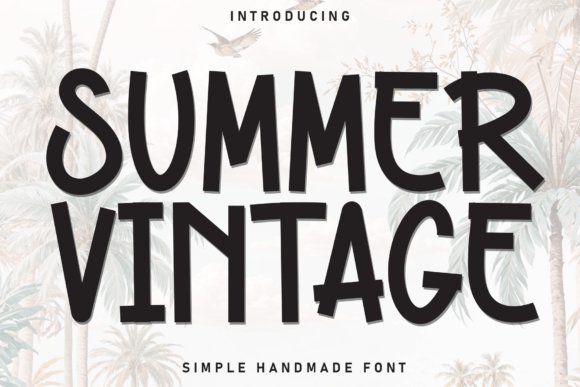
Summer Vintage is a bold, hand-drawn brush display that carries retro beach energy through condensed, tall letterforms and angled stroke cuts. Textured edges and imperfect fills give it an analogue, screen-printed charm that reads loud and friendly on posters and tees. The design’s heavy weight and narrow stance deliver immediate impact even when used at a glance.
Because the face is intentionally gritty, designers can stack it over distressed backgrounds, use duotone color treatments, or pair it with minimal geometric shapes for contrast. It shines on surf shop logos, festival posters, and capsule clothing lines where nostalgic attitude needs to be legible from distance. Treat kerning and tracking with attention-small tweaks help avoid cramped wordmarks.
╰┈➤ Download Summer Vintage Font
My Recommendation: I turn to Summer Vintage for projects that demand visible throwback character-its brushiness prints beautifully and reads clearly from far away. The type is a go-to for bold posters, band merch, and seasonal product runs that favor a handcrafted look. Adjust spacing and color to keep it readable at different scales.
28. Jeggerz Typeface Font
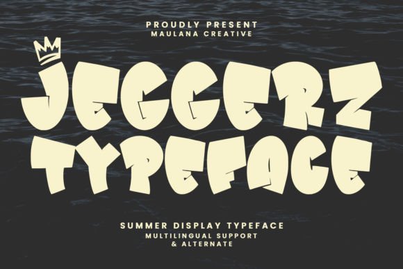
Jeggerz Typeface is a heavy-stroked display face that balances boldness with a playful spirit: thick stems, open counters, and friendly terminals give headlines an immediate personality. Selective ligatures and slightly bouncy letterforms lend a handcrafted flavor without sacrificing clarity, so words read confidently at large sizes. The overall rhythm keeps momentum across words, which helps preserve impact when used in shorter blocks like titles or social posts.
Because of its presence, Jeggerz moves smoothly between identity work and promotional graphics; it holds its own next to other typeface summer fonts and seasonal display faces for sun-forward campaigns. Pair it with a light serif or a simple script to provide contrast, and allow its ligatures to act like custom lettering in logos, posters, and book or film title work.
╰┈➤ Download Jeggerz Typeface Font
My Recommendation: I reach for Jeggerz when a project needs bold personality without ornate flourishes. Its heavy strokes give immediate presence for logos and posters while ligatures make headlines feel bespoke. Use it for summer promotions, indie film titles, or any brand that benefits from an upbeat, confident display voice.
29. Summer Holiday Font
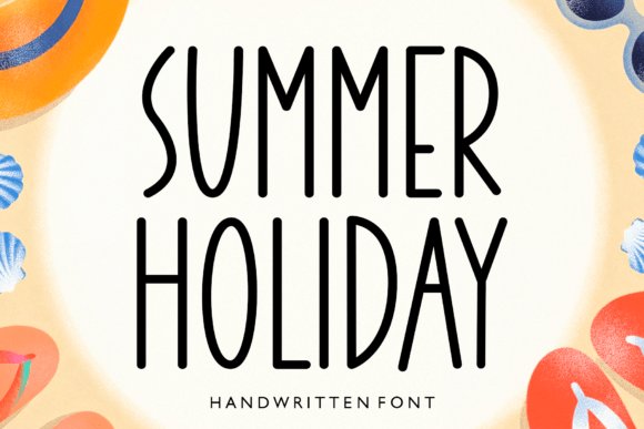
Summer Holiday reads as a tall, slender handwritten sans with monoline strokes and elongated proportions that communicate an airy, coastal mood. Stroke endings are restrained rather than decorative, which keeps the face legible at display sizes while preserving a casual, hand-made quality. The open spacing and slight irregularities make it feel relaxed rather than rigid, ideal for layouts that need a light touch.
Use Summer Holiday for seaside event posters, travel headers, and lifestyle branding where an optimistic headline is required; it pairs especially well with textured paper, vibrant imagery, and minimal geometric companions. On the web it scales cleanly for hero banners and sale promos, and small tracking tweaks usually improve reading rhythm across longer lines. Alternates and caps give designers quick ways to change tone without swapping faces.
╰┈➤ Download Summer Holiday Font
My Recommendation: I’d pick Summer Holiday for projects that call for a breezy, handwritten headline-think surf shop posters or boutique travel newsletters. It photographs beautifully with colorful beach imagery and maintains legibility in digital ads. I often pair it with a neutral sans for body copy to keep layouts balanced.
30. Lemon Fruit Font
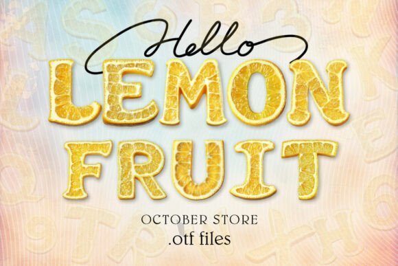
Lemon Fruit is an OpenType-SVG color font whose glyphs are built from layered fills, highlights, and saturated hues to feel like fresh citrus on the page. The playful shapes and decorative terminals create immediate cheer, which works great for packaging, menus, kid-oriented collateral, and event posters that need bold color without hand-painting. Decorative alternates add variety so words can read lively and expressive across marketing assets.
As a color font it requires software support-Photoshop, Illustrator, Silhouette, and Inkscape handle the SVG glyphs, while OTF/TTF fallbacks will need exported artwork for cut machines or older apps. For print, export layered vectors or flattened bitmaps to control color separation; pair Lemon Fruit with a simple sans or narrow serif for captions and body text to avoid fighting for attention. The included compatibility notes are handy when preparing assets for physical products or web mockups.
My Recommendation: I use Lemon Fruit when a brief calls for instant playfulness-drink labels, summer flyers, and children’s covers come to mind. Its color glyphs speed up mockups and let you trial lively palettes without illustration work. For final print I usually flatten or vectorize layers to guarantee consistent results across printers and cutters.
31. Hallo Summer Font
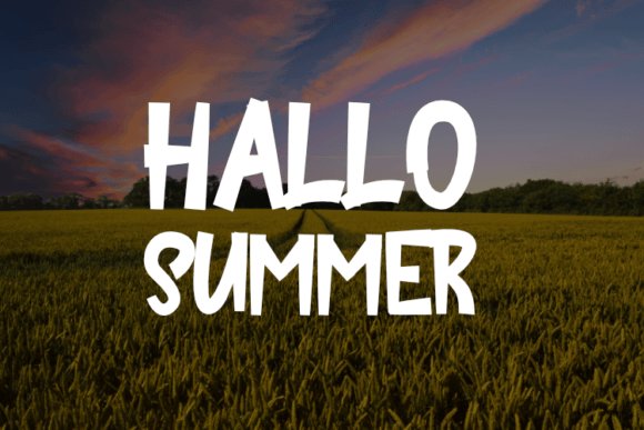
Hallo Summer feels like sun-bleached hand-lettering, its rounded terminals and playful swash alternates giving designs a relaxed, sunny attitude. Letterforms sit slightly condensed with a friendly bounce between letters, so short phrases read punchy yet remain legible from across a stall or storefront. The designer included multiple stylistic sets and a full punctuation suite, allowing small tweaks that keep the look fresh without tipping into gimmickry.
Works across apparel-t-shirts, hoodies, caps-and prints cleanly on cotton and synthetics; vector outlines scale well for banners and display pieces. If you need typeface summer fonts for a merchandise run, Hallo Summer ties headlines and badges into one coherent aesthetic. I often pair it with a plain grotesque for body copy and apply tighter tracking for embroidered labels to preserve distinctive shapes.
╰┈➤ Download Hallo Summer Font
My Recommendation: I reach for Hallo Summer when I want a laid-back, sunny voice for merchandise or seasonal promos. Its alternates let me shift moods-playful to a little rugged-without swapping families. Great for surf brands, festival merch, and any apparel line that needs instant, approachable personality.
32. Simple Summer Font
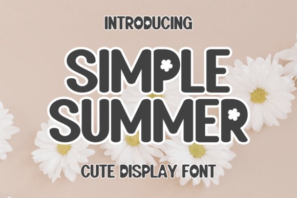
Simple Summer is built around delicate botanical flourishes that read hand-painted rather than mechanically applied. Small floral terminals and modest swashes appear on capitals and select lowercase letters, lending a craft-focused character to headlines and logo marks. The type favors open counters and airy spacing, so it remains readable at display sizes on invites, labels, and seasonal packaging.
Because the decorations are restrained, Simple Summer performs best when used sparingly-an embellished word alongside a clean sans creates effective contrast. Natural color palettes like sandy beige, leaf green, or soft coral amplify the floral details without clashing with imagery. Slight increases in line-height and letterspacing help when the font sits over textured or photographic backgrounds.
╰┈➤ Download Simple Summer Font
My Recommendation: I use Simple Summer for stationery, boutique packaging, and seasonal campaign headlines where a handmade, floral touch is needed. It adds warmth to wedding suites and artisanal food labels without overwhelming other design elements. Pairing it with a neutral sans keeps layouts modern and readable.
33. Curry Font
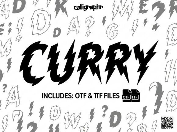
Curry charges the page with jagged, high-contrast letterforms that suggest lightning and raw motion. Sharp diagonal strokes and alternating thick-thin edges create an aggressive visual rhythm that reads as movement even in still layouts. The handcrafted edges give it an artisanal punch, making it ideal for posters, album covers, and athletic branding that needs attitude.
Because the shapes are extreme, Curry excels at large sizes and short copy; it loses clarity in long passages or small captions. The family includes alternates and ligatures to tweak silhouettes so headlines retain distinctiveness without adding extra families. Contrast Curry with a simple slab or mono to preserve legibility while keeping the layout energetic.
My Recommendation: I pick Curry when a project demands bold, unapologetic character-festival posters, action-sports logos, or edgy editorial covers. It grabs attention instantly and reads as motion, which is perfect for youthful, high-energy identities. Use it sparingly and pair it with calm, neutral text faces to avoid visual fatigue.
34. Hello March Font
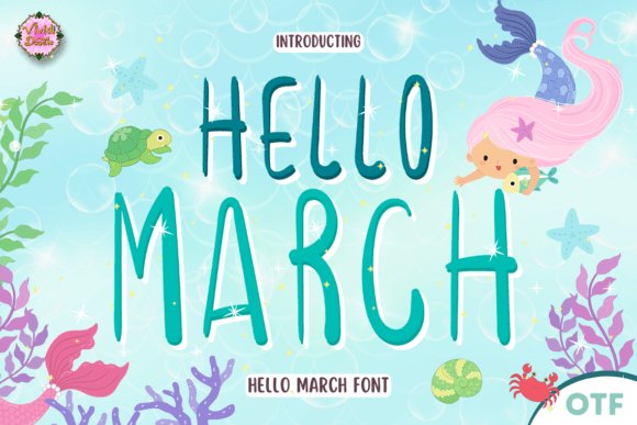
This hand-script feels like a sun-warmed note: looping ascenders, soft terminals, and a slightly bouncy baseline that reads friendly at display sizes. The designer packed in alternates, contextual ligatures, and swash variants, so you can switch alternates for headings without tracing each glyph. Hinting and careful kerning make it reliable on both posters and social media art.
Listed among contemporary typeface summer fonts , Hello March brings a warm, coastal sensibility that pairs well with pastel palettes, sunburst graphics, and subtle grain textures; it sings in large sizes where its brush texture shows. Use it for beach party invitations, seasonal packaging, or a relaxed logotype, and balance its playfulness with a neutral sans for body text.
My Recommendation: I’d reach for Hello March when a project needs approachable summer personality-it’s punchy in headlines and the alternates prevent repetitiveness in repeated words. Its readable forms make it suitable for both print and digital promos, and the swashes let me craft decorative wordmarks quickly. Great for event posters, travel newsletters, seaside shop signage, and any design that benefits from sunny, hand-lettered charm.
35. Puffi Font
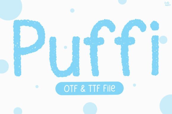
Puffi is a rounded display face with a stippled, hand-textured edge that reads like a soft cloud or cotton candy. Thick, friendly strokes and generous counters keep the letterforms legible while preserving a tactile, stamped look that works beautifully on labels and packaging. The family includes heavier weights for headlines and lighter forms for playful touchpoints.
Because Puffi favors bold shapes, it excels on children’s products, nursery prints, and snack packaging where a cozy vibe matters. Try offset shadows, halftone fills, or subtle emboss effects to amplify the fluffy feel, and pair it with a narrow geometric sans to maintain hierarchy. Files come as OTF plus webfont kits for easy deployment across channels.
My Recommendation: I choose Puffi when a brief calls for softness and a handmade impression-its stippled edge gives packaging and posters an artisanal stamp. It scales well from product headers to social banners, and the quirky shapes inject personality without sacrificing clarity. Perfect for kid-focused branding, playful packaging, and cheerful event graphics.
36. July Season Font
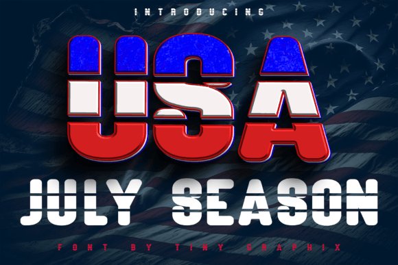
July Season is a headline-first display font that borrows Americana cues-staccato serifs, star ornaments, and slice-style offsets that hint at flag motifs without literal depiction. The set includes layered color styles so you can compose two- or three-tone headlines directly in vector editors, which is handy for festival posters and parade banners. Its substantial top-weight and open counters keep large-format text readable and attention-grabbing.
Treat this face as a decorative headline tool rather than for long passages; the ornamental details shine on badges, T-shirt prints, posters, and limited-run merchandise. Pair it with a plain grotesque for body copy and experiment with distressed textures or halftone masks to age the piece. Delivery includes layered EPS, OTF, and webfont options for both print and digital use.
My Recommendation: I turn to July Season when a design needs bold, patriotic character-its layered options speed up two-color print workflows and marquee-style headlines. It performs well at billboard and poster scale and the ornament set reduces the need for extra illustration. Ideal for holiday campaigns, festival branding, and retro-inspired apparel or merchandise.
37. Summer Holiday Font
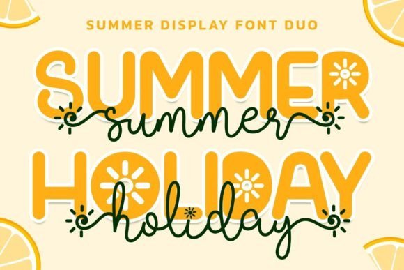
Summer Holiday Font pairs a breezy script with a sunny display face to give projects an unmistakably playful mood. The script offers long swashes and alternate forms while the display companion supplies chunky, rounded caps; both are PUA encoded so you can access glyphs and ornaments without hunting through a character map, which speeds up mockups and product art. This makes it one of the go-to typeface summer fonts for beachwear and party invites.
Use the script for short phrases, hand-lettered logos, and decorative accents while the display font carries headlines and badges with confidence. It holds up on t-shirts, mugs, and promotional stickers, but keep letter spacing tight in dense copy to preserve legibility and let the swashes breathe on larger compositions.
╰┈➤ Download Summer Holiday Font
My Recommendation: I would reach for Summer Holiday Font when a project needs lighthearted personality-think retro beach flyers, craft labels, or seasonal merch. The PUA-encoded alternates let me quickly swap swashes for different moods without opening a font editor. It’s a great pick for playful branding where charm matters more than strict formality.
38. Draft Font
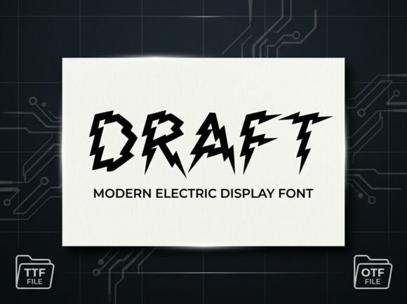
Draft Font is built from jagged, lightning-like strokes that create a raw, kinetic presence on the page. Each character feels hand-sketched with sharp angles and Z-shaped motifs, giving headlines a charged, in-your-face attitude that commands attention at event posters and album covers. The rhythm is aggressive, so it reads best in short bursts rather than long paragraphs.
Pair Draft with a neutral sans or a simple geometric to prevent visual competition and preserve hierarchy, and avoid small sizes where the intricate bolt shapes collapse. It excels for sports branding, comic or festival posters, and any identity that benefits from a high-energy, slightly anarchic visual voice.
My Recommendation: I’d use Draft Font when a design needs raw energy and a distinct silhouette-think sports promos, punk gig posters, or bold editorial headings. It punches through clutter and defines a mood instantly, but should be limited to display uses because the letterforms sacrifice readability at tiny sizes. For best results, balance it with calm supporting typography.
39. Sunflower Script Font
Sunflower Script Font has an easy, hand-rendered flow with soft terminals that read as warm and approachable rather than overly ornate. The strokes are organic and slightly irregular, which lends authenticity to wellness branding, eco-friendly packaging, and garden-themed materials while still maintaining good legibility for short blocks of text. It pairs naturally with earthy textures and floral photography to create a relaxed, boho-chic aesthetic.
Alternates and contextual forms give you subtle variations for logo marks and social headers, and the lighter weight works particularly well on labels and greeting cards where a human touch matters. Keep line lengths short and let the letters breathe; Sunflower performs best when treated as a friendly headline or accent rather than body text.
╰┈➤ Download Sunflower Script Font
My Recommendation: I choose Sunflower Script Font for projects that need a sincere, handmade feel-product packaging for natural goods, boutique logos, or social graphics for lifestyle blogs. Its organic curves make messaging feel personal and relatable, and the alternate characters allow small variations that prevent repetitive looks across a campaign. It’s a dependable choice when warmth and authenticity are primary goals.
40. The Sunshine Font
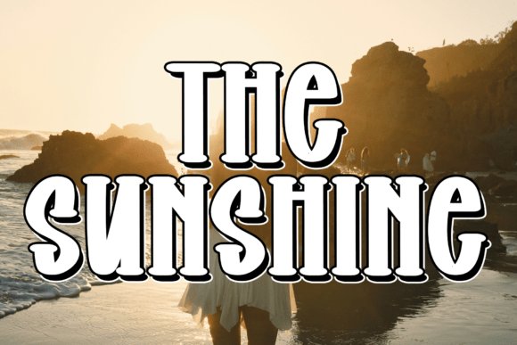
The Sunshine Font is a boisterous display face built from chunky, rounded strokes that echo retro beach signage. Its thick shadows and bouncy, hand-lettered proportions give headlines an immediate holiday mood suited to posters and seasonal merchandise. As one of the typeface summer fonts , it sings when used with warm palettes, textured print effects, or layered drop-shadows to amplify a seaside personality.
At large sizes the letterforms keep bold character, while generous counters help preserve legibility where space is tight. It thrives in layered compositions-screen-printed tees, event posters, or social media headers that need attitude rather than subtlety. Pair The Sunshine with a neutral grotesque for body copy or a delicate script for accents to maintain readability while keeping the playful tone intact.
╰┈➤ Download The Sunshine Font
My Recommendation: I’d reach for The Sunshine when a project needs instant, sun-soaked personality-think surf shops, retro festival posters, or vacation packaging. Its chunky forms print beautifully and resist losing character in noisy layouts. Use it where boldness and nostalgia are the brief, and balance it with restrained supporting type to avoid visual fatigue.
41. Aplicia Summer Font
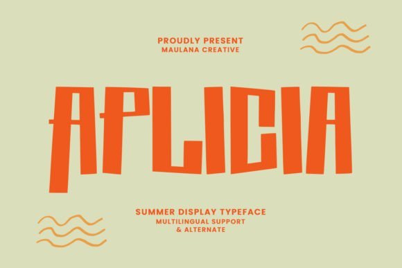
Aplicia Summer Font folds broad multilingual support into a composed display design, offering diacritics for more than a hundred languages. The letterforms feel measured and stable, which helps titles and covers read cleanly even when type runs long. Because it behaves predictably across sizes, it suits logo work, editorial headings, and cinematic title cards that demand reliability.
Its steady stroke widths and open counters make dense lines breathe, and thoughtful spacing keeps text blocks tidy under tension. Designers can anchor bold headlines with a soft serif or a light geometric sans for supporting copy to create calm contrast. Aplicia leans on clarity over ornament, making it a practical choice for international branding and print-heavy title work.
╰┈➤ Download Aplicia Summer Font
My Recommendation: I would pick Aplicia Summer for projects where multilingual support and steady headline performance are priorities, such as global branding, book covers, or film posters. Its restrained shapes let imagery or layout play the louder role while the type remains consistent and readable. It’s a dependable display face when you need clear, professional titles across formats.
These 41 selections offer a wide range of personalities, from relaxed handwritten styles to punchy headline faces, all tuned for summer-themed work. Try pairing a flowing script with a clean geometric sans for contrast and readability.
Use the samples as starting points: tweak weights, letter spacing, and color to fit your project, then test on the intended medium to ensure the right feel and legibility.