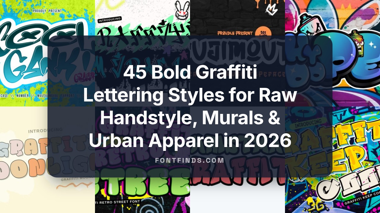
45 Bold Graffiti Lettering Styles for Raw Handstyle, Murals & Urban Apparel in 2026
Graffiti lettering is a visual code that communicates attitude, tempo, and personality. Whether you study tags, wildstyle, or handstyle scripts, these letterforms shape the look of a piece instantly.
This post breaks down 45 distinct styles-from tight single-line tags and bold throw-ups to loose brush scripts and stencil work-so you can spot influences, mix approaches, and adapt them to walls, clothing, or digital layouts.
1. Boy Graffiti Font
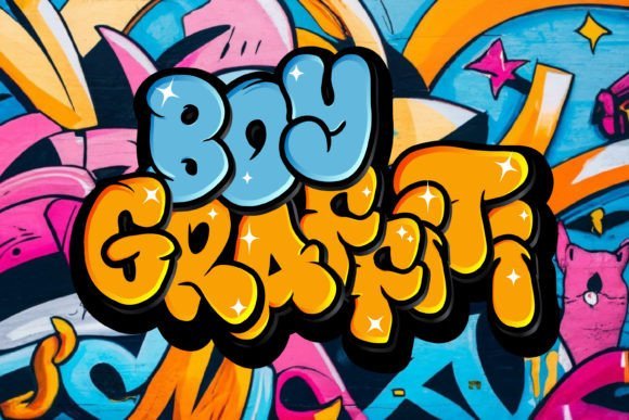
The Boy Graffiti Font delivers raw, spray-painted letterforms with uneven edges and lively drips that convincingly mimic hand-made tags. Its heavy caps and jagged terminals create a confrontational display voice that reads clearly at large sizes. OpenType alternates and contextual ligatures introduce subtle variation so repeated words look hand-rendered rather than mechanical.
Use this face for concert posters, urban apparel, and signage where a distinctly streetborn identity is required. Pair it with a neutral sans for body copy and add halftone or paint-splatter layers to reinforce texture. Files include OTF, TTF, and webfont kits, with tightened kerning for confident horizontal runs.
╰┈➤ Download Boy Graffiti Font
My Recommendation: I reach for Boy Graffiti when I need a headline that feels like authentic spray paint-brash and tactile. It injects immediate street attitude without relying on photographic backgrounds. Perfect for band posters, skate labels, and any project that benefits from a raw, handmade look.
2. Boy Graffiti 2 Font
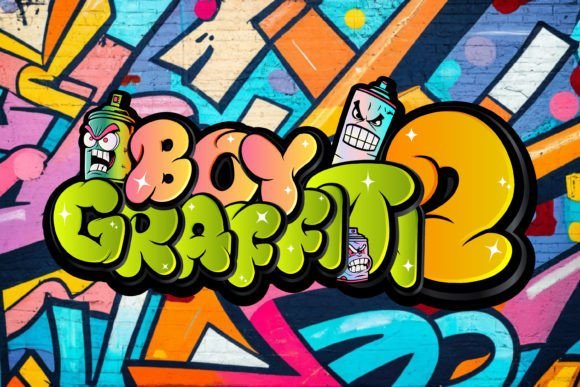
Boy Graffiti 2 takes the tag aesthetic into a more playful register with rounded, bubble forms and exaggerated counters that still retain a gritty finish. The family includes layered outlines and a shadow companion so you can build dimensional wordmarks without extra assets. An expanded glyph set and extended Latin coverage make it usable across different languages and playful brand systems.
This version adapts well to stickers, event flyers, and youth-focused packaging where bold personality matters at small scales. Color overlays and adjustable stroke widths let you mimic marker fills or soft aerosol blends. Variable-weight files and web-ready formats speed up mockups and A/B tests on live pages.
╰┈➤ Download Boy Graffiti 2 Font
My Recommendation: I’d choose Boy Graffiti 2 for campaigns that need cheeky, street-smart typography with instant charm. The layered styles cut prototyping time for merch and badges. It works especially well for festivals, sticker runs, and lively editorial spreads targeted at younger audiences.
3. Go Graffiti Font
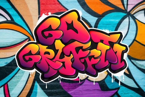
Go Graffiti leans toward a stenciled graffiti aesthetic, featuring crisp cutouts and high-contrast fills that reproduce well across print and digital surfaces. Distressed masks and scattered glyph alternates simulate weathered walls and real-world paint erosion, while multiple baseline offsets create a convincing improvised tagging rhythm. Spacing is engineered for tight headlines and stacked lockups that read at a glance.
The family ships with variable axis files and a separate stencil set for quick application in packaging, posters, and merch. Pair it with serif captions to create an unexpected editorial contrast, or use it alone for cinematic poster titles that need raw urban texture. Bundled SVG masks, swatches, and licensing notes make the face straightforward to deploy in both web and print workflows.
My Recommendation: When I want gritty precision rather than chaotic scrawl, Go Graffiti is my pick because it balances control with street texture. The stencil options are ideal for reproducible logo work and product runs. I recommend it for film posters, label design, and editorial projects that need a rough, tactile headline voice.
4. Bazoka Font
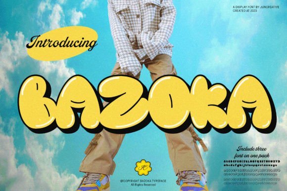
Bazoka reads like a bubbly marker tag left on a subway car: broad, rounded counters and inflated stroke endings give every word a cheerful pop. The letters feel hand-sketched rather than mechanically perfect, which injects personality without sacrificing the boldness you want for posters and event headers.
At display sizes Bazoka holds color fills and layered outlines very well, and its open shapes make custom effects-halos, drips, or textured overlays-easy to apply. It struggles at tiny sizes, so reserve it for headlines, badges, stickers, and packaging where the form can breathe.
My Recommendation: I reach for Bazoka when a project needs outsized personality and a playful urban tone-festival posters, kids’ skate events, and product labels all benefit from its chunky forms. Its hand-sketched feel reads friendly and informal, so it’s great when a brand wants to seem approachable rather than corporate. Pair it with a neutral sans for body text to keep contrast clear.
5. Bubble Graffiti Font
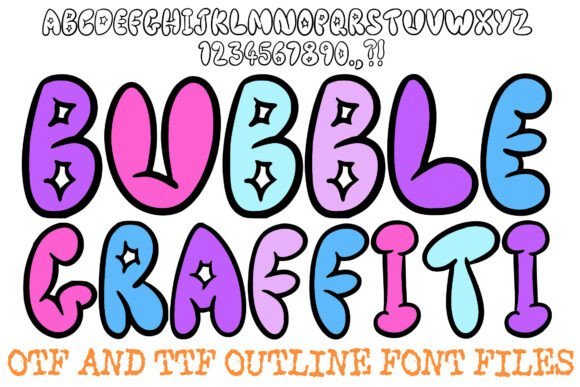
Bubble Graffiti channels the classic throw-up style with big, fat-cap silhouettes and glossy star highlights that mimic spray-can shine. The design leans into cartoonish volume, giving each glyph a polished, sticker-ready surface that looks intentional rather than messy.
The font ships in both OTF and TTF with high-contrast outlines that help color fills pop and maintain legibility at medium poster sizes. Note the limited character set-mostly caps, punctuation, and numbers-so plan for supporting type if you need extended language coverage or lowercase text.
╰┈➤ Download Bubble Graffiti Font
My Recommendation: I’d pick Bubble Graffiti for streetwear labels, skate deck art, and sticker sheets where a bold emblematic wordmark matters more than long passages of text. Its star highlights and thick outlines make it ideal for layered printing and vinyl cuts, and the built-in shine effect saves time in mockups. Use a simple geometric sans alongside it for menu items or product descriptions.
6. Graffikid Font
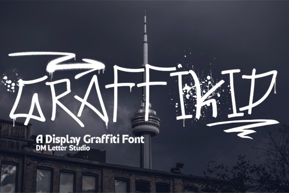
Graffikid delivers a youthful, animated take on graffiti lettering with playful curves and energetic stroke terminals that feel very handwritten. The rhythm between letters creates a lively headline voice that reads cheeky and confident, suitable for posters, album art, and apparel tags.
Its letterforms maintain strong readability while keeping attitude, so you can use it on scans, promotional graphics, and merch without losing clarity. Consider pairing Graffikid with a subdued typeface for supporting copy and reserve its wildest styles for focal phrases and logos.
My Recommendation: I use Graffikid when design needs attitude without sacrificing readability-think gig posters, youth brand headers, or T-shirt slogans. It brings street-smart character that connects with younger audiences and creative communities. Combine it with a restrained body font to keep layouts balanced and let Graffikid carry the personality.
7. Hype Dope Font
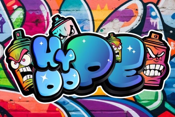
Hype Dope Font slams bold, spray-stencil letterforms into the foreground with rough, uneven strokes, angled terminals and the occasional drip that reads authentically hand-applied. The family supplies alternate glyphs, stacked ligatures and ink-splatter swashes so repeated headlines feel varied rather than mechanical. It sits loud and proud in posters, album art, skate branding and packaging, and pairs well with a calm geometric sans to keep designs from tipping into chaos.
Spacing is tuned for large-scale display, so tighten tracking and fine-tune kerning if you use it smaller; the shapes hold grain overlays and color fills without collapsing. Vector outlines export cleanly for screen printing or vinyl, and the typeface tolerates heavy texture work, though it loses clarity when forced into body copy. Plan artwork time for distressing and layered treatments to get the most personality from each piece.
My Recommendation: I reach for Hype Dope when I want a headline that genuinely feels like street art – it gives posters and apparel an immediate lived-in attitude. The alternates let me avoid repeating identical glyphs across a campaign, which keeps visuals fresh. Use it for bands, skate labels, and events where character matters more than polished neutrality.
8. Hip Hypothermia Font
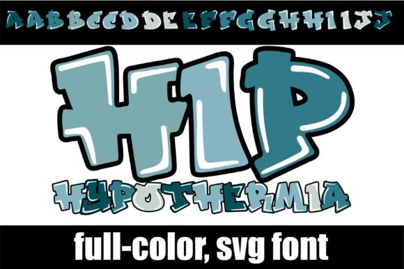
Hip Hypothermia Font is a full-color SVG display that builds cyan fills, soft highlights and bold contours into each glyph so text looks hand-painted straight out of the box. Because color is embedded in the font file, you can type multi-hued headlines without assembling separate assets, giving titles an illustrated quality. It excels at posters, social graphics, and headline-only layouts that benefit from instant color drama.
Install it like any OpenType font, but expect monochrome previews or black glyphs in programs that lack SVG support; actual color usually appears once you type on the page. Current consumers that render the color correctly include recent Adobe apps, Silhouette Studio, Quark and Inkscape, though compatibility can change with updates. For print or older workflows, convert text to outlines or rasterize at high resolution to lock in the hues and gradients.
╰┈➤ Download Hip Hypothermia Font
My Recommendation: I use Hip Hypothermia when I need decorative headlines without building multiple layered files – it saves production time and keeps styling consistent. It’s great for event posters and playful packaging, but I always check the target app first to confirm color rendering. For print jobs I outline the type to avoid surprises on press.
9. Designes Font
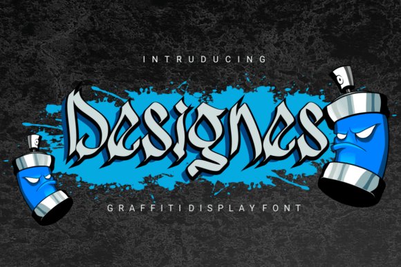
Designes Font drives sharp, staccato strokes and compact counters into a bold graffiti voice that reads like deliberate tagging with design control. The set includes several alternate capitals and tapered terminals, which let you compose dense typographic textures ideal for album sleeves, streetwear logos and high-impact covers. Its high-contrast silhouettes thrive in tight layouts and strong color palettes that emphasize shape over ornament.
Because the letterforms are aggressive, reserve Designes for headlines and mark-making and balance it with neutral supporting text to maintain readability. Vector outlines transfer cleanly for vinyl cutting and print production, and the glyphs tolerate duotone and heavy color contrast without losing identity. Watch kerning in compact clusters – small spacing tweaks dramatically improve perceived balance.
My Recommendation: I pick Designes when a project needs a raw, confrontational voice – it’s perfect for underground music art and bold apparel graphics. The alternate characters allow quick customization for logos and wordmarks, which saves time when sketching concepts. Use it sparingly and pair it with calm body type to keep layouts legible.
10. Freedom Standing Font
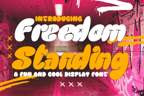
Freedom Standing Font mixes bubble lettering, graffiti energy and skate-culture attitude with a clear sans skeleton, producing letterforms that feel playful while remaining highly readable. Rounded terminals, measured weight contrast and occasional painterly drips give the typeface a lived-in street look without collapsing into chaos. It performs especially well at headline sizes and holds up as an overlay on textured photography thanks to open counters and confident proportions.
Apply it to streetwear wordmarks, poster campaigns, magazine covers or product tags where attitude matters as much as clarity. The family includes alternates and cap-only treatments for badges, and the generous default spacing reduces time spent on kerning. Use the swash options sparingly to create unique seals or embroidered patches that read clearly at small scales.
╰┈➤ Download Freedom Standing Font
My Recommendation: I reach for Freedom Standing when a project needs authentic street cred but still demands legibility. Its alternates let me shape distinct wordmarks, and the open apertures survive busy backgrounds-ideal for tees, posters, and editorial fronts. For longer text I pair it with a neutral geometric sans so the headline keeps the spotlight without overwhelming the layout.
11. Nasty Habit Font
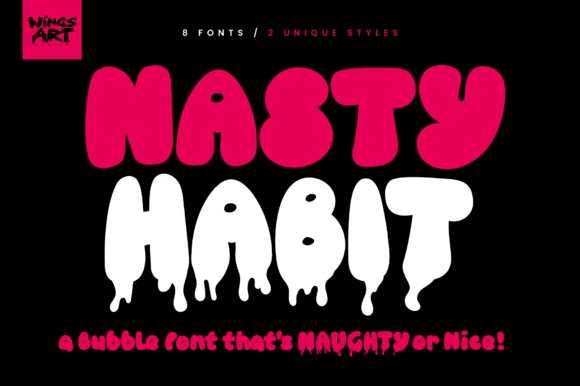
Nasty Habit is a flex-ready bubble family with eight contrasting styles that range from tight, friendly blobs to stretched, dripping forms that look as if they’ve been pulled from a comic panel or a graffiti wall. The outlined variant reads like hand-drawn lettering and the supplied drip shapes can be used as masks to cut texture directly into letterforms for layered effects. The set ships with full case support, numerals, punctuation and broad language coverage so it’s production-ready for print and web.
Because the family spans playful and sinister tones, a single toolkit covers children’s packaging, snack branding, festival promos or horror posters just by switching style and color treatment. Designers will find it forgiving when stacking color overlays, displacement maps or halftone textures. It also exports cleanly for large-format printing where those drips become focal decorative elements.
My Recommendation: I use Nasty Habit when I want titles that carry personality and built-in production tricks-the drips become usable assets, not afterthoughts. It makes snack packaging feel tactile, gives festival posters a messy charm, and can flip to something darker for genre posters. The family’s variety saves me from stitching multiple typefaces together and keeps visual voice consistent across applications.
12. Blupsky Font
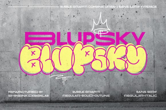
Blupsky channels skate-park attitude into tidy headline typography by combining a sturdy sans core with playful glyph details: asymmetric strokes, short tails and rounded joins that read as crafted rather than rough. The letter shapes maintain consistent metrics so the font behaves predictably in tight lockups, while subtle quirks provide personality at larger sizes. It’s a strong candidate for signage and digital graphics where immediacy matters.
Use Blupsky for logos, stickers, event posters and social banners where you want instant character without sacrificing layout control. Pair it with a thin geometric for body copy or apply a modest outline to simulate sticker die-cuts and apparel prints. The type holds up under high-contrast color blocking and scales well from small stickers to wide-format banners.
My Recommendation: I pick Blupsky when a project needs a playful voice that still plays by the rules of typography. Its clean skeleton keeps legibility in check while the quirky terminals give projects a memorable signature-perfect for skate brands, seasonal merch, or punchy editorial headings. I often tighten tracking for logotypes and add a light stroke for sticker-style applications.
13. Hip Heart Font
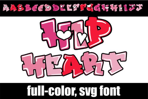
Hip Heart Font is a full-color, graffiti-inspired display that weaves pink and red heart motifs into chunky hip-hop lettering. SVG glyphs include multi-color fills and subtle shading so letters read like sticker art rather than flat type. The aesthetic blends playful romance and street attitude, ideal for party posters, queer-friendly branding, and cheeky apparel labels.
Installation follows any standard OpenType workflow: install like an OTF via Font Book or the Windows Control Panel, and the font will appear in compatible apps. Programs without color-SVG support will render glyphs as monochrome black or show a black preview in the type menu; true color appears once text is placed on the document canvas. If your tool lacks SVG rendering, convert text to outlines or export rasterized artwork from a vector editor to preserve the look.
My Recommendation: I reach for Hip Heart when a project needs bold, joyful lettering that already carries color and ornamentation because it eliminates hours of manual layering. The built-in heart motifs inject instant personality, so the font shines on event posters, stickers, and youth-oriented apparel tags. Just verify color-SVG compatibility before production and have an outline or raster fallback ready if needed.
14. Bloochas Font
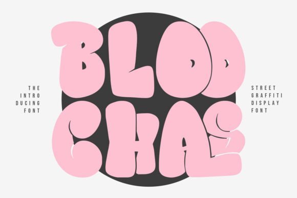
Bloochas Font throws a bold, energetic punch with thick, angled strokes and intentionally rough terminals that scream urban grit. The uppercase forms are compact and high-impact, designed to grab attention from a distance while staying legible up close. It’s a great fit for concert posters, skate graphics, and packaging that needs a confident, raw voice.
The font ships as an OTF with sensible kerning and spacing so it behaves predictably in layout software; minor tracking tweaks usually finish the treatment. Pair Bloochas with a calm geometric sans or an airy script to prevent visual overcrowding, and favor single-color or high-contrast duotone treatments to keep textured strokes readable. On low-resolution screens, slightly increase letter spacing to avoid optical crowding.
My Recommendation: Bloochas is my go-to when a headline must refuse to blend into the background – it gives immediate attitude to posters, zines, and product labels. I recommend it for projects that benefit from raw character rather than polished elegance. Keep supporting elements restrained so the type can drive the design without competition.
15. Vandal Revolt Font
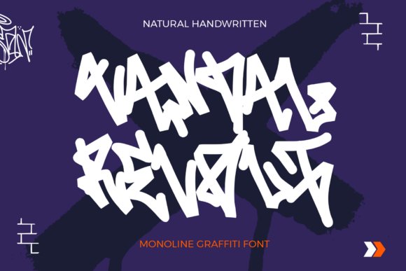
Vandal Revolt Font offers a monoline hand-lettering style that reads like a practiced tag traced in one continuous motion. Consistent stroke weight keeps the letters readable at small sizes while the hand-drawn quirks preserve authentic graffiti energy without visual clutter. The result is casual, decisive lettering that fits apparel, album covers, and edgy editorial spreads.
The face’s single-stroke construction makes it friendly to outline effects-think clean strokes, shadow layers, or neon glows-without upsetting balance. It adapts well to logo scripts or repeating patterns when converted to paths, and the simplified forms speed digitization for embroidery or laser-cut applications. A few spacing adjustments tailored to your output medium will yield the best results across print and screen.
╰┈➤ Download Vandal Revolt Font
My Recommendation: I reach for Vandal Revolt when a project needs a human, streetwise signature that still behaves predictably in layout. It’s particularly useful for apparel brands, band identities, and editorial headlines seeking handcrafted credibility. Test several words at production size and tweak spacing for the final medium to get the most natural result.
16. Goldy Font
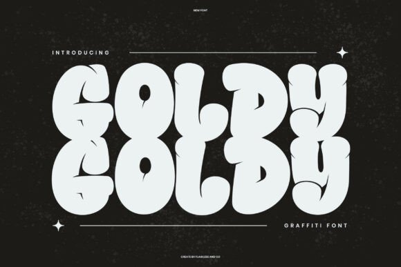
Goldy is a bold, playful display font that channels street art energy through chunky bubble shapes and dripping terminals. The characters read like quick hand-lettering rather than a polished type system, which gives headlines and posters a tactile, improvised feel that stops the eye. Generous stroke widths make it forgiving in print and ideal for large-format applications where personality matters as much as readability.
Apply Goldy to apparel graphics, sticker runs, and urban event posters when you want attitude without sacrificing clarity; it prints reliably on fabric and vinyl thanks to its substantial counters. Use it against gritty photo backdrops or layered over textured patterns to emphasize a spray-painted look, and balance the exuberance with a restrained sans for supporting text. It’s best when the headline must dominate the composition.
My Recommendation: I reach for Goldy when a piece needs loud, streetwise personality-concert posters, skate brand badges, and limited-run merch are perfect fits. Its chunky forms survive practical production constraints like screen printing and vinyl cutting, so what you design on-screen holds up in real-world runs. Pair it with simple secondary type to keep the message readable while letting Goldy own the mood.
17. Fujimout Graffiti Brush
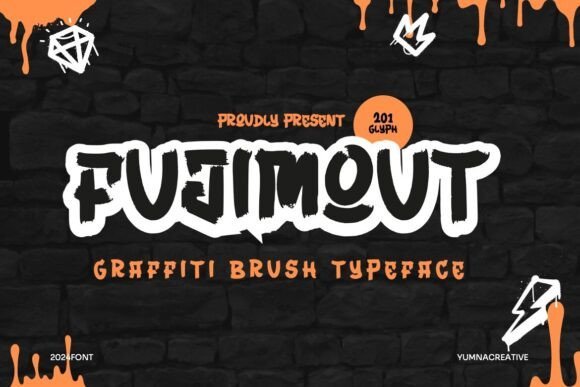
Fujimout Graffiti Brush simulates spray-can behavior in a digital brush, producing soft edge diffusion, variable speckle, and opacity shifts that respond to stylus pressure. The brush engine includes tilt and jitter settings so strokes get the unpredictable scatter of real aerosol without resorting to static bitmaps. That makes it possible to sketch tags, fills, and wall-style murals with convincing texture and realistic overlap in a vector or raster workflow.
Its presets cover a range of nozzles and distances, so you can switch between fine tags and broad fades without rebuilding brushes mid-session. Layer blending and mask-friendly shapes help integrate the marks into photos or mockups for apparel and poster design. For quick concepting and refined final art alike, Fujimout saves time while keeping the raw, gritty character of spray paint.
╰┈➤ Download Fujimout Graffiti Brush
My Recommendation: I use Fujimout when I need authentic spray effects without setting up physical shoots-it’s a huge time-saver for mockups and concept passes. The varied presets let me mimic different cans and distances, which helps when matching a client’s reference. It’s especially handy for album art, mural previews, and T-shirt graphics where texture and spontaneity matter.
18. Rebel Sharp Font
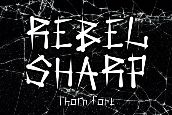
Rebel Sharp Font balances rough, thorn-like terminals with a disciplined monoline structure, creating a look that feels both hand-sketched and purposeful. The inked edges and scribble textures suggest rapid marker work while retaining clarity, so short headlines read with an aggressive, contemporary attitude. Thoughtful kerning and uppercase emphasis make it perform well in logotypes and poster titles where presence is everything.
Choose Rebel Sharp for creative identities, film credits, or packaging that require a confrontational voice without collapsing into chaos; the glyph shapes hold contrast at large sizes and remain legible in thumbnails. Alternates and stylistic sets prevent repetition across repeat words, and pairing it with a clean condensed sans keeps the design from becoming visually crowded. It’s a font that asks to be seen.
My Recommendation: I pick Rebel Sharp when a project needs to feel rebellious but still readable-indie film posters, band art, and edgy product labels are obvious matches. Its alternates add variety so repeating words don’t look cloned, which is great for headlines and merch. I usually pair it with a minimal sans for body copy so the sharp characters keep center stage without overwhelming the layout.
19. Giant Caps Font
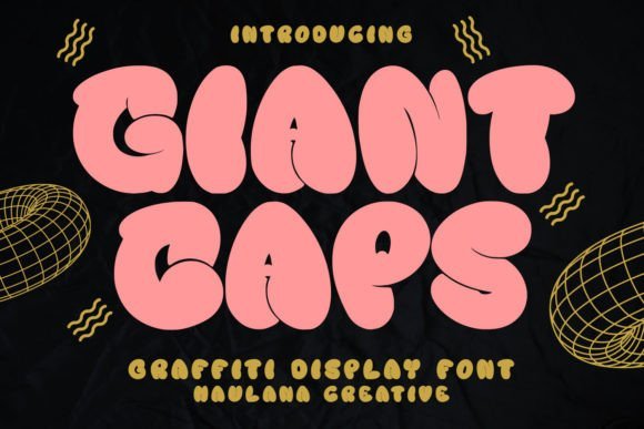
Giant Caps Font slams a graffiti attitude into oversized capital letters, with exaggerated terminals, irregular stroke widths and jagged swashes that push each glyph toward a raw, streetwise character. The heavy weight and tight spacing make headlines punch through busy layouts, while intentionally rough edges keep the appearance hand-drawn rather than machine-smooth. It ships PUA-encoded so alternates, swashes and stylistic sets are available without fiddly character maps.
This all-caps design reads loud across posters, vinyl stickers, screen-printed tees and event banners where legibility from distance matters as much as personality. Try it layered over worn textures or high-contrast photography to amplify a gritty, urban identity without losing readability. Stack, stagger or condense the letters for compact logos or sprawling typographic murals that feel like real street lettering.
My Recommendation: I reach for Giant Caps when a project needs an unapologetic headline that feels like it was spray-painted overnight; the shapes cut through visual noise and give instant attitude. The PUA glyphs save time during concepting-swashes and alternates are ready to use. Best for skate brands, live-music posters, event banners and any design that should read as hand-marked rather than corporate.
20. Artsytechra Font
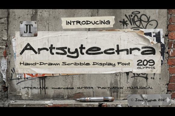
Artsytechra Font mimics quick marker scribbles and spontaneous tags, with letterforms that wobble, overlap and vary in pressure to imitate ink on textured surfaces. The family includes upper- and lowercase, numbers, punctuation and extended Latin support across 209 glyphs that capture quirky ligatures and uneven baselines for a hand-made feeling. Files arrive in both OTF and TTF so you can drop it into most design apps without fuss.
The small imperfections-blotchy terminals, off-kilter joins and irregular spacing-give copy an expressive, human edge that reads as candid rather than polished. It packs visual personality for album covers, zines, indie fashion labels and social graphics where attitude must come through at first glance. Use its glyph set to craft lively wordmarks or chaotic headlines while keeping diacritics and non-English names intact.
My Recommendation: I use Artsytechra when a brief needs raw personality and hand-drawn character-music posters, underground zines and edgy apparel mockups benefit the most. The irregular letterforms do the emotional work quickly, so you don’t have to redraw every word by hand. The extended glyph set makes it practical for projects that require accents or creative ligatures.
21. Spice Hype Font
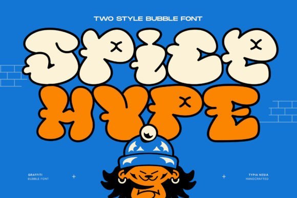
Spice Hype Font channels bubble-letter graffiti with inflated counters, thick outlines and playful proportions that read like a cartoon tag. Rounded terminals and chunky strokes keep legibility high while projecting a cheerful, streetwise personality suited to youth-focused brands and kids’ packaging. The outline treatment holds well in vinyl, screen print and digital thumbnails where crisp edges are essential.
This face works especially well for logos, comic headers, product labels and energetic posters that need to feel friendly and bold rather than subtle. Pair the bulbous forms with saturated color fields and minimal textures to maximize visual pop without cluttering the layout. It also adapts neatly to stickers, mascots and merchandise where instant recognition matters.
My Recommendation: I pick Spice Hype when designs must feel upbeat and urban-snack packaging, event posters and playful brand marks are ideal fits. Its rounded, loud shapes read clearly across different production methods and print runs. Use bright palettes and simple compositions to let the bubbly letterforms carry the tone.
22. Christmas Graffiti
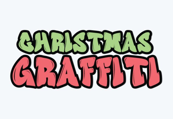
Christmas Graffiti delivers a buoyant bubble-graffiti look that reads like a party on the page: swollen letterforms, playful swashes, and rounded terminals that feel handmade rather than mechanical. The face leans heavily into seasonal cheer without being kitschy, so it works for greeting cards, market posters, gift tags, and playful logos where personality matters more than restraint.
On print it holds clean edges even with heavy ink coverage, and the generous counters mean it remains legible at moderate sizes while shining on large-format banners. Try simple drop shadows or metallic foil on headings, tighten tracking for logos, and vectorize outlines for craft cutters or sticker art to preserve the bubbly stroke details.
╰┈➤ Download Christmas Graffiti
My Recommendation: I’d reach for Christmas Graffiti whenever a design needs loud, friendly holiday spirit-party invites, window vinyl, and kid-focused packaging all benefit. Its bold shapes cut well for stickers and signage, and the handmade feel avoids the usual holiday clichés. For best results pair it with a restrained sans for body copy to keep the composition balanced.
23. Dunara Font
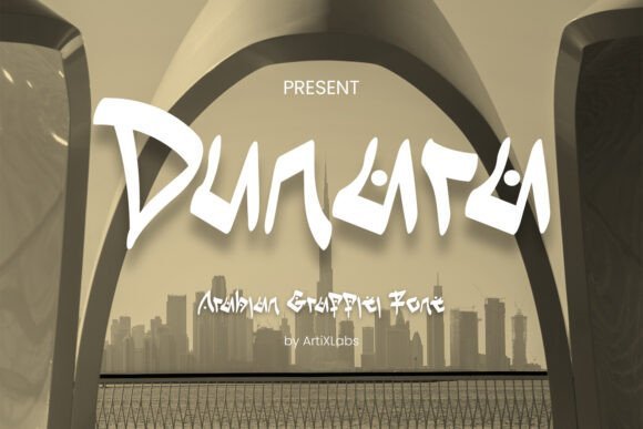
Dunara blends broad, calligraphic strokes with sharp, angular terminals to create a streetwise script that nods to Arabian letter forms without copying them. The rhythm of its baseline and the tension between thick strokes and hairline flicks make it a real headline performer, pulling attention in posters, event art, or cultural branding that wants an assertive, editorial voice.
The set includes alternate characters and a handful of swashes that let you shape names into compact logos or extended headlines, and it pairs well with minimal geometric sans faces for contrast. Use rich jewel tones or high-contrast duotones to emphasize its structural drama, and consider bilingual layouts where a complementary Arabic script sits alongside for authentic presentation.
My Recommendation: I would use Dunara when a project needs expressive, culturally aware lettering-music events, gallery posters, and crossover fashion labels are ideal. It brings a raw calligraphic energy while still fitting into refined layouts if you control spacing. I like pairing it with clean sans-serif text to prevent the headline from overpowering supporting content.
24. Bold Graffiti
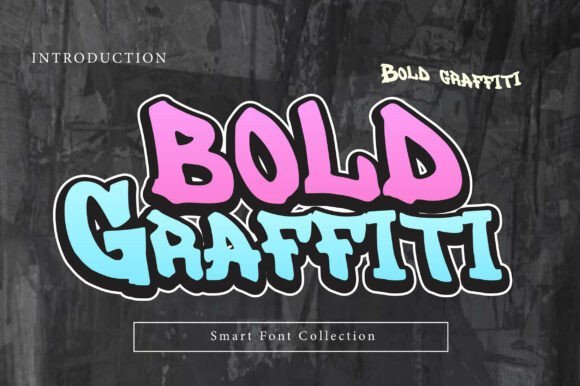
Bold Graffiti is built around thick, hand-drawn strokes and playful curves that imitate marker and spray techniques without becoming messy, delivering clear, hard-hitting headlines that feel immediate. The typeface keeps a slightly irregular baseline and varied stroke widths so each word reads like a quick tag while remaining legible across posters, album covers, and thumbnails.
It scales especially well for apparel and large signage, and the chunky outlines translate nicely to vinyl cutting and embroidery after you expand the outlines. For visual depth, layer halftone textures or torn-paper edges behind the letters, and pair with narrow sans weights when you need a calmer counterpoint to the type’s loud personality.
My Recommendation: I grab Bold Graffiti when a project demands attitude-youth marketing, streetwear labels, and promotional posters benefit most. Its heavy forms hold up under photo overlays and print textures, and the organic irregularities give designs a handcrafted edge. I always check tight kerning on stacked words, but otherwise it’s a quick way to add bold presence.
25. Scribble Moos Font
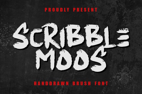
Scribble Moos Font reads like a quick brush tag left on a storefront – grainy strokes, uneven pressure and jagged terminals give each character a lively, hand-sketched personality. The letterforms balance bold display weight with a rough immediacy, so headers feel loud without becoming unreadable and lowercase shapes maintain a casual, human rhythm.
It performs strongly in logos, poster headlines, album art and packaging where a raw, urban voice is wanted; scale it up for mural-style headlines or tighten tracking for stickers and badges. Pair Scribble Moos with a clean sans for body copy and consider textured backgrounds or ink splatter effects to emphasize its brushed grain.
╰┈➤ Download Scribble Moos Font
My Recommendation: I reach for Scribble Moos when a design needs a streetwise signature that still reads clearly. Its hand-brushed strokes give headlines character and work especially well for youth brands, indie publications, and event posters. I often combine it with a minimal sans to keep layouts readable while preserving that lived-in, crafted look.
26. Beat Mark Font
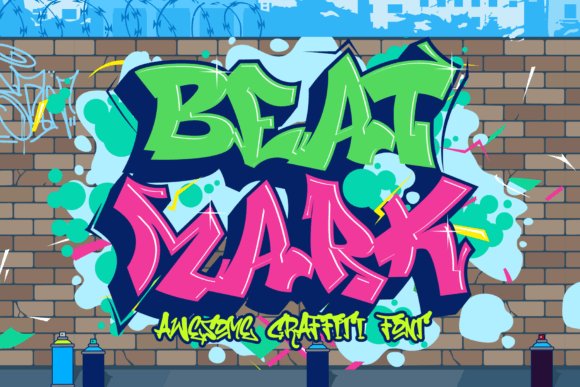
Beat Mark Font channels graffiti motion into letters with tapered sweeps, sudden swashes and spray-like halos that suggest momentum and tempo. The typeface favors impactful forms – thick stems and sharp contrasts that demand attention and read best at display sizes where their attitude can dominate a layout.
Use Beat Mark for apparel graphics, concert posters, social art and large-format prints like murals or vehicle wraps where boldness matters; it thrives when treated with layered offsets, duotone fills or halftone textures. For longer copy, reserve it for titles and captions and balance it with a simple geometric face to prevent visual overload.
My Recommendation: I pick Beat Mark when a project must feel immediate and a little unruly, such as gig posters, streetwear campaigns or album covers. Its heavy character reads well from a distance and adds instant grit to visual identities. I like to use it sparingly so the lettering becomes the focal point while surrounding elements recede.
27. Coolgank Font
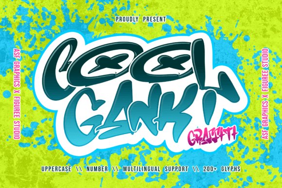
Coolgank Font delivers a tag-inspired attitude with compact counters, uneven baselines and expressive alternates that mimic quick hand motions. Letters have just enough irregularity to feel authentic without collapsing into chaos, making the face ideal for expressive headlines that still need to be legible.
It works well on skate graphics, festival posters, streetwear labels and any design that wants an underground edge; try it on textured surfaces like painted wood or concrete to amplify the lived-in effect. Keep Coolgank to display use, mix with a neutral serif or sans for longer text, and pick high-contrast colorways to let its personality pop.
My Recommendation: I use Coolgank when I want a raw, tag-like aesthetic that remains usable across print and digital. The alternate characters let me craft unique logotypes without building custom lettering from scratch. It’s perfect for projects aimed at skate, music, and urban lifestyle audiences where a gritty but controlled tone is needed.
28. Drift Wood Font
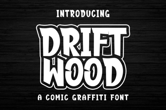
Drift Wood arrives like a comic-style fist of personality: chunky, hand-drawn letterforms with thick strokes and playful irregularities that read like sprayed lettering with a cartoon wink. The characters carry motion and attitude without sacrificing clarity, which makes headlines, posters, and brand marks feel lively and unmistakable. Use bright fills, rough outlines, or layered color shadows to push its streetwise humor into view while keeping text readable at display sizes.
On the technical side the font behaves well in tight layouts despite its bold shapes – trim tracking a little for long lines and keep cap-heavy lines short to retain the rhythm of each letter. Pair it with a quiet geometric sans to avoid visual clash, or stack it over textured photography to give packaging and social art a punchy, tactile feel. Drift Wood is a great choice when your copy needs attitude without becoming illegible.
My Recommendation: I reach for Drift Wood when I want a headline that feels alive-youthful, cheeky and unmistakably urban. Its weight and hand-made quirks give posters, apparel graphics, and game covers instant character, and it holds up at large sizes. If a project needs a strong voice that reads well from a distance, this font gets the job done with personality.
29. Graffiti Keep Cool Font
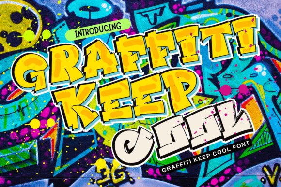
Graffiti Keep Cool wears its grunge influence openly: rough edges, scratchy fills and uneven baselines that read like a marker on concrete. That handcrafted roughness gives invitations, greeting cards and seasonal posters a lived-in, informal charm while keeping each glyph distinct enough for short headlines and display use. The font’s irregular rhythm works especially well when layered over paper textures, torn edges or halftone backgrounds to emphasize its handmade stance.
Designers should treat it like a texture-rich asset – use it in short bursts, avoid long paragraphs, and combine it with clean, neutral typography to provide breathing room. Color choices that contrast a little (muted neutrals paired with a single bright accent) will keep the rough detail visible without overwhelming the layout. It’s an ideal pick for projects that need a casual, streetwise look with a craft-driven feel.
╰┈➤ Download Graffiti Keep Cool Font
My Recommendation: I pick Graffiti Keep Cool for work that benefits from a gritty, handcrafted voice-party invites, indie zines, and collaged posters come to life with its rough strokes. It’s particularly useful when you want lettering that feels printed or pasted rather than polished. Use it for short headlines and accents paired with clean body text to maintain balance.
30. Simple Graffiti Font
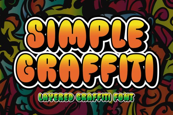
Simple Graffiti strips street lettering down to a bold, readable silhouette: confident strokes, minimal ornament, and an attitude that reads instantly on T-shirts, signage, and header art. The design favors clarity over excess detail, so letters remain legible at a distance and reproduce cleanly in single-color processes. Its straightforward nature makes it fast to work with in both digital and print workflows where speed and impact matter.
The font excels in situations that demand an urban look without visual clutter – stencil-style layouts, posters with strong typographic hierarchy, and product labels that need an edge without fuss. Tighten tracking for stacked lines and keep generous leading for longer headlines to preserve its balance. If you want a no-nonsense graffiti voice that punches through crowds and photos, this is a dependable option.
╰┈➤ Download Simple Graffiti Font
My Recommendation: I use Simple Graffiti when a project needs immediate urban attitude but also practical readability-streetwear mockups, shop signage, and promotional banners are ideal. Its clean shapes make production and screen printing straightforward. For fast, confident messaging where nothing must get lost in the type, this font is my go-to.
31. Trigger Graffiti Font
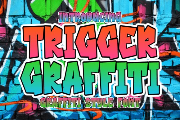
Trigger Graffiti slams a raw, spray-painted attitude into every character: thick, uneven strokes, sharp angular cuts, and a tactile marker quality that reads like a captured tag. The built-in color treatments-hot pink shifting to neon green-sit behind heavy black outlines and white counters to create a punchy, high-contrast silhouette that holds up at a distance. Punctuation and quirky symbols follow the same improvised grammar, so the set feels like a complete street crew rather than a formal type family. Use of gradients and bold outlines gives the face an almost three-dimensional spray effect without extra production work.
This face shines as a headline tool for posters, skate graphics, album art, and streetwear badges where attitude must be visible from across a room. It pairs naturally with gritty backdrops-brick, concrete, paint splatters-or with minimal layouts that let the color fills dominate. Small edits to stroke weight and color stops can shift the mood from brazen to playful, offering flexible options for branding and campaign work while keeping a distinctly rebellious voice.
╰┈➤ Download Trigger Graffiti Font
My Recommendation: I reach for Trigger Graffiti when a project needs instant, unmistakable personality and high-impact color. Its strong silhouettes read well on merchandise and outdoor posters, and the prebuilt punctuation saves time during tight deadlines. Use it for youth-focused brands, music promotion, skate culture, or any look that needs to feel loud and handcrafted.
32. Graffiti Summer Beach Font
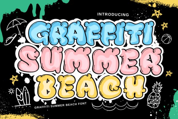
Graffiti Summer Beach translates a breezy, hand-lettered sensibility into a graffiti-inflected script with warm, casual strokes and playful ligatures. The letters feel sun-bleached and slightly irregular, creating a relaxed rhythm that reads as handcrafted rather than polished. Open counters and soft terminals maintain legibility at medium sizes while preserving the doodled charm of street murals made on hot afternoons. The overall texture leans toward friendly and improvised rather than aggressive.
Apply this font to surf shop branding, festival posters, seasonal packaging, or scrapbook-style social posts where a laid-back vibe is required. It pairs well with washed pastels, halftone textures, and retro photo treatments that emphasize nostalgia. Because the voice is informal and approachable, it also suits children’s event materials, boutique holiday goods, and casual signage that benefit from a personal touch.
╰┈➤ Download Graffiti Summer Beach Font
My Recommendation: I choose Graffiti Summer Beach when a design needs warmth without looking overworked; its imperfect strokes give layouts an immediate handcrafted feel. It blends beautifully with retro palettes and textured backgrounds, making it ideal for seasonal promos, surf and skate labels, and playful packaging. Use it when you want friendly character and a sunlit, DIY mood.
33. Graffiti Angel Wings Font
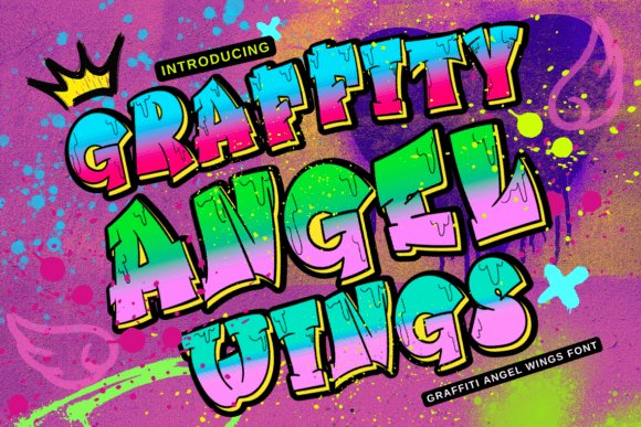
Graffiti Angel Wings is a display face that marries gritty street textures with delicate, wing-like flourishes, producing a decorative yet forceful headline voice. Many glyphs include feathered terminals and jagged ink edges that imply upward motion without sacrificing readability at larger sizes. The style walks a line between ornament and edge, delivering decorative accents while retaining a strong, gestural backbone suitable for bold titles. It reads as hand-modified lettering rather than sterile ornamentation.
Use this font for posters, sticker sheets, album covers, boutique invitations, and any application that benefits from an ethereal counterpoint to urban grit. It works best with limited color palettes or monochrome treatments that highlight silhouette and detail, and it looks particularly striking over textured papers or vinyl. Treat it as a headline accent and avoid long blocks of text so the ornamental details remain visible.
╰┈➤ Download Graffiti Angel Wings Font
My Recommendation: I recommend Graffiti Angel Wings when a project needs poetic contrast-ornamental details that still feel street-savvy. The wing motifs add personality to band art, limited-run apparel, and event graphics, and they read especially well at large sizes. I use it sparingly as a focal headline to keep the decorative strokes legible and impactful.
34. Graffiti Miracle Font
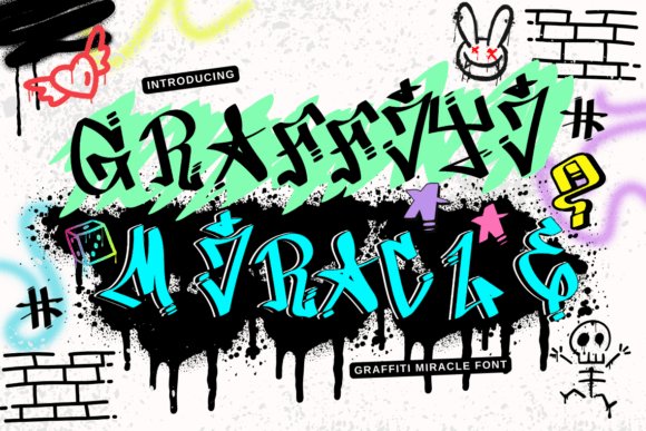
Graffiti Miracle Font channels spray-can energy into letters that feel improvised yet readable. Thick strokes, abrupt terminals and hand-drawn ligatures give each glyph a streetwise personality that holds up at headline sizes. Subtle baseline shifts and alternate characters mimic freehand tagging, lending authenticity to apparel, posters and stickers.
It responds well to textured backgrounds and layered treatments – ink splatters, halftone overlays or metallic fills add depth without masking form. Pair with a neutral geometric sans for longer copy, and tighten kerning at display sizes to preserve rhythmic flow. For logos, favor heavier tracking and high color contrast for outdoor visibility.
╰┈➤ Download Graffiti Miracle Font
My Recommendation: I reach for Graffiti Miracle when a project needs raw urban attitude with legibility intact. Its alternates and ligatures let me craft varied headlines that avoid repetition, and the irregular baseline gives designs a human, spontaneous feel. Use it for band posters, retail window decals, zines and streetwear labels where expressive lettering matters.
35. Graffiti Pink Road Font
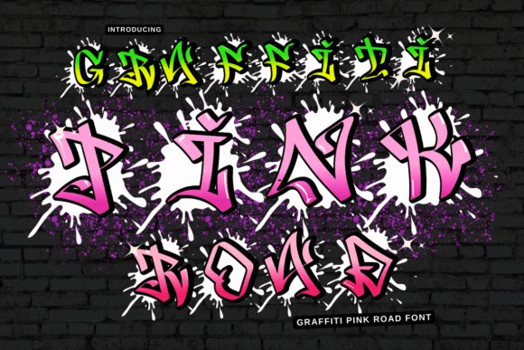
Graffiti Pink Road Font softens the usual edge of street lettering with rounded forms and playful loops, producing a bold yet friendly voice. Swashes and weighted terminals create a hand-painted rhythm that reads well on posters and packaging alike. The letter shapes pop against pastel or neon palettes, offering a cheerful retro energy.
It suits lifestyle branding, event invites and product labels where street credibility meets approachability; add a subtle drop shadow for instant presence. Swap alternate capitals to keep short phrases fresh, and apply halftone or foil textures to emphasize tactile print surfaces. Tight leading and boosted contrast help maintain clarity on small screens.
╰┈➤ Download Graffiti Pink Road Font
My Recommendation: I choose Graffiti Pink Road for projects that need street flavor without grit-think boutique launches, party posters and clothing tags. The soft edges feel inviting while the alternates provide typographic variety without fuss. It excels on glossy labels, social graphics and packaging that want color-driven personality.
36. Graffiti Crazy Love Font
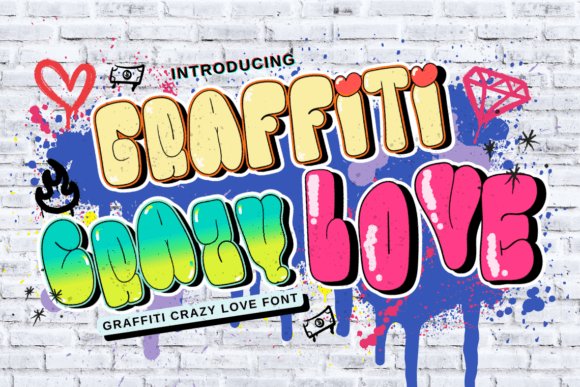
Graffiti Crazy Love Font communicates urgency through jagged strokes, drips and uneven counters that look like a mural done in a single fast session. The type creates strong silhouettes at large sizes while keeping surprising legibility, making it ideal for gritty headlines, album covers and campaign posters. Distress alternates and exaggerated ascenders offer striking visual hooks.
For print, balance it with a clean condensed sans to avoid visual clutter and add a subtle screen-print texture to sell authenticity. Try duotone separations or stroked outlines for a hand-printed feel and avoid long blocks of copy. Its aggressive character works best where attitude is the primary message.
╰┈➤ Download Graffiti Crazy Love Font
My Recommendation: I grab Graffiti Crazy Love when a brief calls for raw motion and attitude-perfect for punk merch, protest posters and edgy book covers. The built-in distressed styles speed up the creative process while the bold forms remain readable in both screen and print. It isn’t shy; use it when you want to make a loud, immediate statement.
37. Graffiti Hello Brother Font
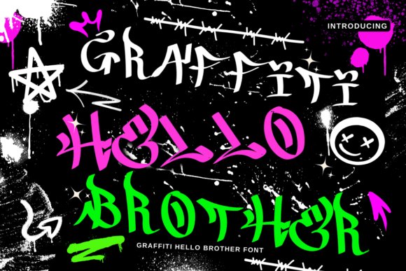
Graffiti Hello Brother Font channels raw, hand-sketched energy with glyphs that feel sprayed and paced by rapid motion. Each character shows uneven strokes, occasional drips and jagged terminals that read like authentic street tagging rather than a polished script. Use it when type needs to shout-edgy poster headlines, album art or skate graphics benefit most.
Tracking trends slightly tight here, so loosen letter spacing for longer lines; the heavier capitals work as eye-catching display elements. Pair it with a clean condensed sans or a bold slab to offset the chaos, and favour large-format applications where textures and spray marks can breathe.
╰┈➤ Download Graffiti Hello Brother Font
My Recommendation: I reach for Graffiti Hello Brother when a design calls for palpable street grit-it’s immediate and raw. Its spray-like textures make it ideal for band posters, skateboard art and gritty event branding. Use it for headlines and graphics that must carry personality rather than serve long paragraphs.
38. Graffiti Happy Mood Font
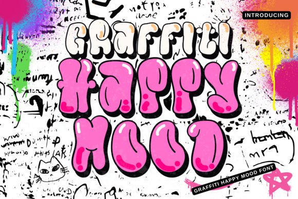
Graffiti Happy Mood Font has a buoyant rhythm where rounded terminals and open counters give letters a friendly, upbeat character. The lettering leans toward cheerful tagging rather than aggressive spray, lending layouts a hand-made, joyful air. It works especially well on colorful backgrounds and sticker-style applications where tone matters first.
Legibility remains strong at moderate sizes thanks to clear counters, so the face suits party flyers, children’s packaging and lively social posts. Try combining it with simple geometric icons or flat-color panels to keep compositions bright without becoming cluttered.
╰┈➤ Download Graffiti Happy Mood Font
My Recommendation: I use Graffiti Happy Mood whenever I need a brief, cheerful voice-think birthday invites, playful logos or whimsical packaging. Its readable, loose stroke makes content feel approachable without losing character. Pair it with bright colors and sticker motifs for best results.
39. Graffiti Retro Street Font
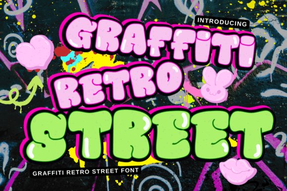
Graffiti Retro Street Font channels a vintage urban vibe with slightly condensed letterforms, worn edges and a stencil-adjacent cadence that evokes subway tags and old neon posters. The type carries authentic retro personality without leaning on tired brush clichés, so it feels curated and authentic. It injects warmth when the brief calls for nostalgia with a bite.
OpenType alternates and repeat motifs add subtle variation, and the face responds well to distress textures and duotone palettes common in retro treatments. Scale it up for merchandise, album covers or themed events where a lived-in, analog look is the design objective.
╰┈➤ Download Graffiti Retro Street Font
My Recommendation: I recommend Graffiti Retro Street for projects that want late-20th-century city flair-band flyers, vintage apparel and coffee-shop signage with attitude. Its weathered forms pair beautifully with paper textures and limited-color printing. Reach for it when you want type that reads nostalgic yet punchy.
40. Graffiti Crazy Smile
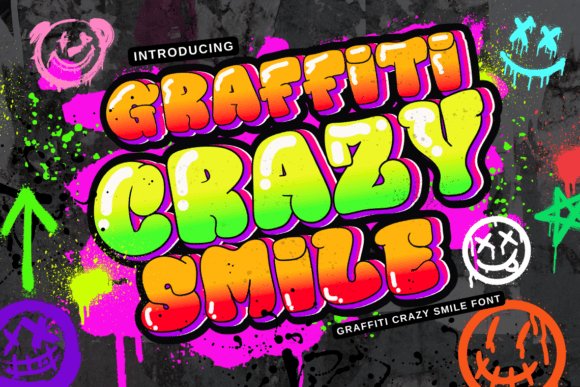
Graffiti Crazy Smile reads like a friendly scrawl pulled from a back alley sticker wall: playful, slightly wonky letterforms with quick flicks and rounded terminals that keep the mood light rather than hostile. The uneven baseline and hand-sketched imperfections give it personality suited to posters, party invites, stickers, and youth-focused packaging where a casual, handmade look matters. Large display sizes highlight the inked texture and motion; small sizes neutralize the charm and can feel cluttered.
Because the face intentionally breaks tidy rules, plan for manual kerning and generous line spacing when composing headlines. Pair it with a neutral sans for body copy so the handwriting reads clearly, and test overlays or halftone textures to reinforce the street-art feeling without masking legibility. For print banners, convert type to outlines and experiment with paper grain or screen-print effects to preserve the tactile quality.
╰┈➤ Download Graffiti Crazy Smile
My Recommendation: I reach for Graffiti Crazy Smile when a piece needs to feel spontaneous and friendly rather than polished. Its loose strokes inject movement into event posters, sticker sheets, and casual apparel graphics. I usually combine it with low-contrast backgrounds and bold color pops so the letter shapes remain readable and full of character.
41. Graffiti Moonlight
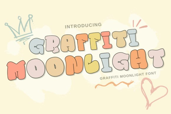
Graffiti Moonlight leans into a nocturnal, slightly mysterious character: elongated stems, soft terminals, and subtle contrasts that suggest tagging under street lamps rather than harsh daylight spray. The overall silhouette keeps a rough edge while hinting at calligraphic motion, a mix that works well for nightlife flyers, alternative fashion labels, or editorial spreads seeking an atmospheric street tone. Dark gradients and neon accents amplify the font’s name and intent.
Keep usage at display sizes so the textured marks remain readable; small text can lose the intended detail. For merchandise and print, convert to vectors and inspect how splatter effects reproduce at scale, simplifying where necessary for embroidery or small-format printing. A minimal geometric sans serves as a tidy partner in layouts, letting Moonlight carry headline drama without visual fatigue.
╰┈➤ Download Graffiti Moonlight
My Recommendation: I recommend Graffiti Moonlight when a project benefits from moody street-art character with a bit of refinement. It’s especially effective on posters, album covers, and product art where atmosphere matters more than dense copy. I tend to pair it with neon tones or muted photography to let the letters breathe and establish focal points.
42. Absolute Graffiti
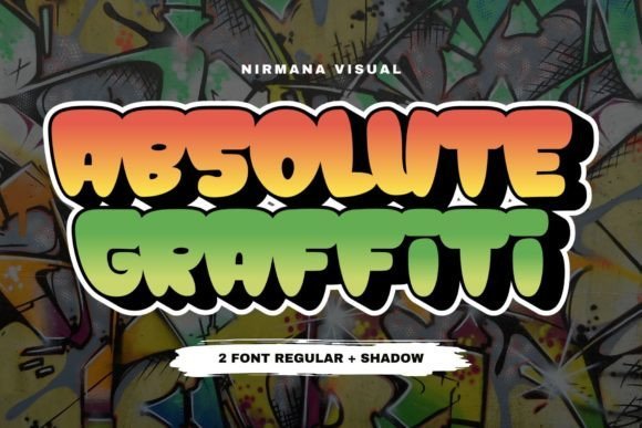
Absolute Graffiti leans hard into spray-painted attitude: bold counters, saturated strokes, and deliberate drips and splatters that mimic fresh paint on rough surfaces. The design reads loud and immediate, making it a natural choice for album covers, posters, and limited-edition packaging that require an authentic hand-painted presence. Its weight and texture make the face a focal element rather than background ornamentation.
When producing work with this font, outline the text for large-format printing and simplify excessive drips for small reproductions to avoid print artifacts. Use restrained supporting typography-like a clean serif or mono-to balance the loudness and maintain hierarchy. Controlled color palettes and spacing adjustments keep the bold shapes legible while preserving the raw energy of the lettering.
╰┈➤ Download Absolute Graffiti
My Recommendation: I pick Absolute Graffiti for projects that need immediate, handcrafted impact-things like band promos, streetwear drops, and gritty editorial spreads. The heavy strokes and paint textures cut through busy visuals and set a rebellious tone quickly. For best results I convert to outlines for print and pair it with calm, neutral type so the lettering dominates without overpowering the layout.
43. City Spray Font
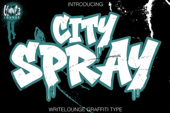
City Spray Font channels graffiti lettering with raw hand-drawn strokes, sharp outlines, and a lively sense of motion that reads like a painted tag across concrete. The letterforms balance jagged points and flowing curves so words sit with immediate street attitude while remaining legible at display sizes. Its built-in contours and heavy outlines give each headline weight without needing complex effects.
This face works particularly well for album art, streetwear graphics, posters, and bold social visuals where you want instant presence. Try pairing it with gritty textures, saturated color fills, or layered stencils to accentuate the spray-paint character; modest tracking adjustments bring the letters together for tighter logo treatments. Use it where raw personality must read clearly from a distance.
My Recommendation: I reach for City Spray when a project needs unmistakable street character and big, readable lettering. It gives designs a lived-in graffiti feel without sacrificing clarity, which makes it reliable for merch, posters, and game art. If you want a headline that looks hand-painted and punches through noisy visuals, this is my go-to.
44. Graffic Font
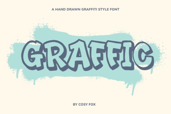
Graffic Font captures an energetic, hand-sprayed aesthetic while keeping letter shapes tidy enough for modern layouts. The strokes suggest quick motion and a practiced wrist, so the type carries attitude without devolving into chaos; each glyph has subtle irregularities that read as personality rather than noise. It finds a careful balance between rebellious brushwork and typographic control.
Use Graffic for posters, apparel branding, and social headers where tone matters as much as readability. It pairs well with minimalist sans faces to let the script-like forms sing, and it tolerates overlays such as halftone screens or concrete textures for added grit. This is a practical choice when you want voice and clarity in equal measure.
My Recommendation: I choose Graffic when a design needs expressive motion but must remain tidy for production. Its lively letter shapes bring character to T-shirts, event posters, and brand marks without fighting layout structure. For projects that mix attitude with practical legibility, Graffic consistently performs.
45. Gang Bang Slang Font
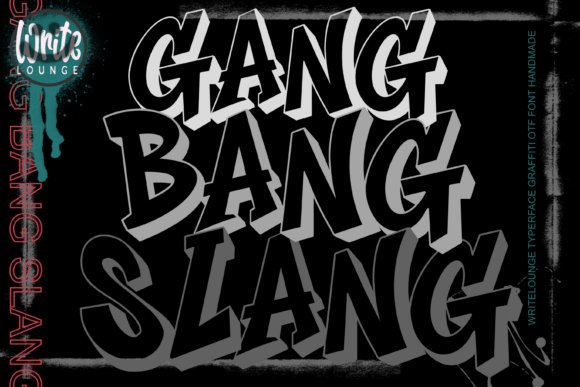
Gang Bang Slang Font is built on chunky block letters, acute angles, and a pronounced 3D shadow that gives type immediate depth and presence. The geometric backbone keeps forms bold and authoritative while the shadow treatment adds a stencil-like, spray-painted impression that commands attention at large scale. It’s designed to read as constructed graffiti-bold, clean, and heavy on visual punch.
Ideal for rap covers, streetwear branding, esports logos, and poster work, this face responds well to high-contrast palettes and layered outlines. Combine it with grainy backdrops, neon edges, or distressed masks to amplify urban tension; tightening the tracking and smoothing corners helps when converting the type into vinyl or embroidery. Use it when you need weight and dimensionality in one package.
╰┈➤ Download Gang Bang Slang Font
My Recommendation: I reach for Gang Bang Slang when a design requires visceral impact and sculpted depth. The 3D shadow detail makes it perfect for album art and merch that must stand out in crowded feeds or on a stage backdrop. It’s especially useful for projects that benefit from heavy forms and tactile, graffiti-inspired styling.
These 45 styles offer a wide map of approaches to street lettering: lean, chunky, flowing, distorted, and experimental. Use them as reference points to refine your own hand, select type for projects, or brief a muralist with precise visual cues.
Practice clean execution, respect legal limits for public surfaces, and study how color, scale, and placement change a letter’s energy. Keep sketching, compare tags and pieces, and let these forms inform fresh work throughout 2026.